After usability testing 18 mobile e-commerce sites and subsequently benchmarking 50 major e-commerce sites on mobile usability performance and finally analyzing the 5,000+ manually reviewed UX parameters in that benchmark database, we found that:
- 78% of mobile e-commerce sites perform poorly when reviewing the combined mobile product finding experience: that is primarily the mobile homepage, category navigation, and on-site search experience.
- 54% of mobile sites have a good or acceptable product page performance.
- Mobile users’ ability to complete their purchase is severely halted as 84% of sites have severe mobile checkout usability issues, and 46% of mobile sites have issues with basic form field usability (such a labels or touch keyboards).
Our benchmark did however also reveal that a few sites stand out from this generally sad state of affairs and provide their users with an overall great mobile shopping experience. One such site is the electronics retailer B&H Photo, which rank #1 in our mobile usability benchmark database of the 50 highest grossing US e-commerce sites (closely followed by Home Depot, Sears, Target, and Nike).

To explore why B&H Photo’s mobile site performs so well, we summarized the 5,000+ mobile UX scores of the 50 mobile sites (blue bars) spread across the above 4 themes and singled out B&H’s scores (green bars).
It’s clear that much of B&H Photo’s great overall mobile UX performance stems from a fantastic product navigation and search experience – almost 600% above the average score of the remaining 49 major mobile US e-commerce sites. B&H Photo’s mobile experience also moves ahead of the pack with decent Product Pages and a good Checkout Process.
In this article we’ll explore 7 specific mobile UX implementations at B&H Photo. These mobile implementations not only make B&H Photo perform great but are implementations that our large-scale usability testing verified to be high-performance mobile designs applicable to nearly all m-commerce sites – although, as illustrated throughout this article, nearly all mobile sites get them wrong in practice…
Table of Contents / the 7 UX Implementations:
- Allow Users to Infer Type of Site from Homepage Content (42% Don’t)
- Provide Thematic or Guided Navigation (34% Don’t)
- Allow Users to ‘Search Within’ Their Current Category (94% Don’t)
- Product Page Should Display a Detailed list of Accessory Products (56% Don’t)
- Ensure Distinct Hit Areas in Product Lists (28% Don’t)
- Perfect the Touch Keyboard Implementation (85% Don’t)
- Display ‘Store Pickup’ Directly in the Shipping Selector (47% Don’t)
1) Allow Users to Infer Type of Site from Homepage Content (42% Don’t)
As users land on a mobile site’s homepage we observed that test subjects new to the site or with moderate prior site experience relied heavily on the homepage content to determine the type of site they’d landed on. In fact, 70% of the test subjects exhibited a “scroll and scan” behavior where they first scrolled down and up across nearly the entire mobile homepage, quickly scanning its contents to get a “feel for” the site they had landed on.
Unfortunately, this initial scan of the site’s homepage content often misled the test subjects, and had them draw misconceptions about the breadth of the site’s product catalog – either because too little content was available on the homepage or, more commonly, because the content displayed wasn’t sufficiently diverse.


Note how it’s not particularly clear from scanning these homepages that Home Depot is the right site for users if they are looking for power tools, large appliances, and building supplies. Nor that Crate & Barrel is the right location if looking for dinnerware or blenders, or that Best Buy carry health products and furniture.

At B&H Photo the homepage feature direct links to 11 of the site’s 12 top level categories. Each of the links is furthermore accompanied by a thumbnail.
The test sessions also revealed that the issue can be resolved by having a minimum of 30-40% of the top-level categories represented via the homepage content – either directly or indirectly:
- Directly via simply listing a collection of category links (or simply all top-level categories) prominently on the homepage.
- Indirectly by ensuring that the combined collection of thumbnails on the homepage visually represent 30-40% of the breadth of the site’s top-level categories – allowing users to visually infer the type of site they’ve landed on.
Alas, our benchmark of the top 50 selling mobile US e-commerce sites reveal that 42% have a homepage design that fails at both of the above, and thus risk setting wrong expectations for their users, who may come to adopt an overly narrow interpretation of the site’s product selection.
Of course, one can also combine the direct and indirect methods (like B&H does, by visually representing 92% of their top level categories). This will enable all users doing an initial “scroll & scan” of the homepage to correctly infer the type of site they’ve landed on, helping establish an accurate mental model of the breadth of the site’s product catalog.
Also notice how the category thumbnails at B&H display multiple products. During our study of Category Navigation on desktop sites we observed that including multiple products in category thumbnails is important to avoid users misinterpreting the thumbnails for specific products.
Tip: To learn more on how users rely on the homepage to infer the type of site they’ve landed on, see our article: 42% of Mobile Homepages Risk Setting Wrong Expectations for Their Users.
2) Provide Thematic or Guided Navigation (34% Don’t)
34% of mobile e-commerce sites do not offer “thematic” product browsing, making it very difficult for users with common thematic purchase patterns to find e.g. a pair of “casual men’s shoes”, a “spring jacket”, a “camera for wildlife photography”, etc.
While users’ desire to navigate products by themes is equally strong on desktop sites, we found the lack of thematic navigation to be most important to support on mobile, because the limitations of the mobile platform (notably screen size) makes it almost impossible for users to get an overview of even a mid-sized product list. On mobile users were observed to give up on a site much faster when forced to do pogo-sticking (i.e. going back and forth between product pages and the product list to screen products).


B&H has taken a very manual (but perfectly fine) approach to offering thematic navigation on their site: creating thematic blog posts that describe and link to the most relevant products within that theme.
During mobile testing we found that thematic product browsing doesn’t necessarily have to be “traditional” product categories. It can also be product guides or “finders”, which help the user locate the right product through a series of thematic criteria. For instance, a camera finder or gift finder where users can specify recipient or usage type, rather than specific product attributes.
Another and very low-tech version of thematic navigation is through manually created editorial content (such as a blog, as seen in the B&H example above), describing the best products for a specific theme or use-context. This type of editorial content has the upside of offering a more descriptive context than a finder widget, although it does set requirements for more structured navigation than what is typically provided by blogging tools (e.g. chronological order isn’t good for finding a specific topic).
What we found during mobile e-commerce testing is that the format for how the thematic navigation is provided is somewhat secondary. In other words, site designers have a large degree of flexibility in how they want to provide this type of navigation. What is important is that thematic navigation is available and that users can easily find the path(s) to it. At B&H this is solved with an expandable item featured prominently in the main navigation, which contains all the site’s thematic content.
3) Allow Users to ‘Search Within’ Their Current Category (94% Don’t)
During the mobile usability tests, we observed an interesting category and search behavior. As the test subjects browsed a mobile site’s category navigation, more than 50% of the subjects tried to “search within” their currently navigated category path.
Here’s how it went: after the test subjects had navigated down the category hierarchy to a product list, they would scan some of the products and then decide that the selection was too broad. The subjects would then scroll back to the top of the page where they would immediately spot a large empty search field. It was at this point that more than 50% of the test subjects believed the field would ‘search within’ the product category they had just looked over.
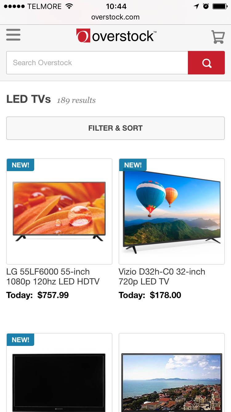


The majority of the subjects who had first navigated to a category, such as “TVs” here seen on Overstock (first image), would then try to search using queries such as “40”, believing this would narrow the TVs seen to only display 40-inch TVs (middle). However, because Overstock performs a site-wide search, this behavior will provide users with a list of highly irrelevant results.
This mobile user behavior of assuming the site will “search within” the currently navigated category conflicts with the implementation of 94% of mobile sites where the search field always searches site-wide – naturally leading to numerous irrelevant search results being returned to those users attempting to “search within”.


At B&H Photo the currently navigated path is suggested in the auto-complete suggestions. (The mock-up to the right shows a slight tweak to the placement that align better with the assumption held by most users that the field will simply search with the current category.)
We generally find there’s three ways to deal with / cater to this “search within” behavior:
- Suggest the currently navigated path in the auto-complete suggestions.
- Have a scoped search field.
- Collapse the site-wide search field behind an icon and then provide a dedicated search-within field.
At B&H the “Search Within” behavior is supported by simply suggesting the currently navigated path in the auto-complete suggestions. (Although they could improve the placement of the suggestion, as illustrated above.)
Tip: You can read all of our findings on mobile users’ “search within” behavior, along with the three different design solutions that all proved equally effective.
4) Product Page Should Display a Detailed list of Accessory Products (56% Don’t)
During our large-scale usability study of e-commerce Category Navigation we observed how product page suggestions for alternative products help the user find the “right” product, while suggestions for supplementary products help users find additional items to go along with that product to “finish the package” or “complete the look”. In fact, during all of our studies we’ve consistently found that users benefit greatly from both alternative and supplementary product suggestions directly on each product page – yet, slightly more than half of all desktop and mobile e-commerce sites offer only one type of cross-sells (or none at all!).
During mobile usability testing, it quickly became evident that cross navigation is very cumbersome – so much so that users on mobile devices will often skip looking for related products altogether if they have to start their category navigation all over. Indeed, cross navigation is often so painful that we find many test subjects to consider it “good service” when sites display relevant up- and cross-sell suggestions on their product pages – and this tendency is even stronger during mobile testing when compared to desktop.
In particular finding compatibility-dependent accessories and products often proved almost impossible for the test subjects when browsing mobile sites. Typical compatibility-dependent products include accessories (e.g., a sleeve for a laptop that has to fit), products used in conjunction with other products (e.g. an audio system that needs to plug into a TV or media player), spare parts (e.g. an fitting O-ring for an old faucet), consumables (ink that has to fit an exact printer model), and so on.
While sites that don’t deal with compatibility products can get away with just a section of relevant accessory products, sites that do sell compatibility-dependent products will need an actual compatibility database. While resource-intensive, our test found that successful findability rates when trying to find matching accessories were twice as high on sites with compatibility databases compared to sites without.
When further considering that compatibility databases don’t just improve usability and conversion rates, but also increase average order values (typically with high-margin accessories) the business case is often highly positive, despite being an resources-intensive undertaking to implement initially.
Tip: You can read more on the concept of compatibility databases and suggesting both alternative & supplementary products.
5) Ensure Distinct Hit Areas in Product Lists (28% Don’t)
One mobile interaction detail that proved important is clearly indicating the hit areas in product lists with multiple hit areas, or alternatively have each list item be one large hit area. During the test sessions multiple issues arose when the test subjects were unsure of where to tap in order to select a given option in a list, what was even “tappable” in the list, and where a given option would take them when they tapped it.

When testing Fandango, each theater row had 4 different hit areas and numerous “appears to be a hit area” options, leading to an 80% failure rate among the test subjects as they tried to select a movie ticket.
Hit area confusion is a particularly big problem on mobile due to the lack of a mouse hover state, making it impossible for users to “test” whether an element is and isn’t selectable without actually trying to select it. On mobile, all users therefore have to go by is the visual styling of the interface and what they learn through trial and error.

At B&H Photo the hit area is indicated by using a “card” list item design in combination with having each list item being one large hit area, leading to the product page. Additionally a subtle hint is added in the form of a shadow around the list item border which is shown when the list item element is tapped.
This can naturally lead to severe issues since users can experience discomfort and confusion around something as fundamental and basic as select a desired option. During mobile testing, unclear hit areas led unaware test subjects down completely irrelevant paths, and were even the cause for site abandonments in some instances.
The solution is to either style each hit area in the product list very distinctly (necessary if wanting to include things like a buy button, compare option, color toggle, etc), or to have the list item for each product be one large hit area that takes the user to the product page. Which approach to adopt depends on the product verticals of your site.
In general, we recommend the simpler one-large-hit-area approach, since the product list interface is often more than complex enough on mobile and any toggle and buy options therefore tend to be more suitable for the product page. However, if a site has product verticals where configuration or comparison is essential, the benefits of having some of those features directly available in the product list may outweigh the added complexity they introduce.
Tip: For more on the mobile issues of having multiple hit-areas within one visual element, see Mobile Product Lists Need Very Distinct Hit Areas.
6) Perfect the Touch Keyboard Implementation (85% Don’t)
Good touch keyboard usability goes beyond simply invoking the most appropriate touch keyboards available, like a numeric keyboard for credit card field. During our large-scale mobile e-commerce usability study, we found that configuring auto-correction and auto-capitalization settings appropriately were very important to mobile form field usability as well.

Amazon fails to disable auto-correct for ‘Address Line 1’, resulting in problematic auto-(in)corrections.

Grainger fails to invoke a numeric keypad for the credit card field, resulting in an inferior typing experience that is more likely to produce typos.

Newegg fails to disable auto-capitalization in the email field, resulting in miscapitalized entry that many users will feel they need to correct.
The optimal touch keyboard settings vary from field to field. In total, there’s (at least) 5 touch keyboard guidelines that must be adhered to ensure users the most trouble-free typing experience possible. Yet 85% of mobile sites fail on one – and 60% fail on two or more – of these 5 touch keyboard principles:
- Disable auto-correct for fields like abbreviations, street names, e-mail addresses, person names, and similar words that are not in the dictionary (and incorrect “auto-corrections” therefore are more likely than correct ones).
- Invoke optimized keyboards for relevant fields, like the numeric keypad for inputs like Credit Card, or the Phone keyboard for the Phone field. This provide users with up to 500% larger keys and has been observed to greatly reduce typos.
- Honor “Next” and “Previous” keys to tab between fields, and always make sure to proceed to the next logical field in the form (a surprising number of sites fail to do this because of things like non-native custom drop-down implementations).
- Disable auto-capitalization for fields where the input is unlikely to be capitalized (such as the e-mail field), since users will worry about form validation errors if the casing doesn’t match.
- Invoke touch keyboards consistently throughout the entire checkout flow (e.g. numeric keyboard for both zip code, card number, and security code), as users may otherwise begin to second-doubt what they are supposed to type in fields where an inappropriate keyboard appears (since appropriate keyboards appeared for other fields).


B&H Photo is among the 15% of sites that deliver a “perfect” touch keyboard implementation on their mobile sites and adheres to all 5 principles.
If wanting to ensure touch keyboard perfection consider exploring our cheat sheet with demos and code examples for most field types common for a checkout flow.
7) Display ‘Store Pickup’ Directly in the Shipping Selector (47% Don’t)
While store-pickup is one of the competitive leverages omni-channel sites have over their “online only” competitors, our mobile study showed that users often overlook Store Pickup features on many of the sites where it’s offered due to a mismatch between where users expect to find the feature and where it’s typically located on the site.


Toys’R’Us offer users free store pickup. However, the option is only displayed in the cart step (left image), and not seen anywhere in the Shipping Method selection step (right image). On mobile this breaks some users’ expectation of where to find the Store Pickup feature, and makes it difficult for users to evaluate if store pickup is worthwhile, because it isn’t juxtaposed next to the cost and speed of all the available shipping options.
83% of the subjects testing REI’s mobile site overlooked the “Find in Store” button on the product page. Instead, these subjects looked actively in the shipping method selector during checkout, but to no avail since REI (like Toys’R’Us) doesn’t display the store pickup option in their shipping step. In fact, 47% of the omni-channel sites that offer store pickup don’t display it during the shipping method selection in their mobile checkout flow – instead they only display store pickup on their product pages and/or the shopping cart.
Only displaying the Store Pickup option in the cart and/or product pages break user expectations, as many expect it to be part of the delivery method selection. Store Pickup is perceived as an alternative to getting the order shipped – an alternative which is free and sometimes faster (possibly even same day). Having store pickup displayed alongside the shipping options during checkout supports this user perception and of course doesn’t prevent a site from also displaying the option at their product pages or shopping cart.


At B&H the store pickup option is presented during the shipping method selection in the checkout flow. If the option is tapped additional information on location and speed is revealed.
To evaluate if store pickup is a worthwhile alternative to shipping, users need the two options presented next to one another so they can compare their respective cost and speed, and thus evaluate whether they should go through the hassle of picking up the order. (In fact, this is the one area where B&H could improve slightly – by tweaking their interface to describing the cost and speed of Store Pickup up-front so users could perform a direct comparison without having to interact with any of the options).
While store pickup perhaps in a strictly semantic sense isn’t a “shipping” option, acknowledging that a great deal of users expect the feature to be there, and that a large portion of users consider store pickup as a direct alternative to shipping to home, certainly trumps semantic trivialities.
Tip: For more of our findings on Store Pickup see: Users Overlook ‘Store Pickup’ When Not Presented as a Shipping Option.
B&H Photo: Great Product Navigation and Search
When it comes to crafting a great mobile user experience, B&H Photo gets several aspects right, especially within the realms of: category navigation, on-site search, product pages, and cross-navigation. The 7 mobile B&H implementations highlighted throughout this article illustrate this well and are all examples of mobile designs that a majority of mobile e-commerce sites tend to have issues with:
- Allow Users to Infer Type of Site from Homepage Content (42% Don’t)
- Provide Thematic or Guided Navigation (34% Don’t)
- Allow Users to ‘Search Within’ Their Current Category (94% Don’t)
- Product Page Should Display a Detailed list of Accessory Products (56% Don’t)
- Ensure Distinct Hit Areas in Product Lists (28% Don’t)
- Perfect the Touch Keyboard Implementation (85% Don’t)
- Display ‘Store Pickup’ Directly in the Shipping Selector (47% Don’t)

While B&H get many things right they do suffer from somewhat mediocre form field usability. For instance, because B&H don’t explicit denote both required and optional fields, a user in the above context will have to guess whether ‘Phone Number’ is required or not.
That said, we do want to wrap this article with a word of caution. As is true for every benchmark we’ve conducted so far, it’s difficult to find a “perfect site” acting as a source of good inspiration “all around”. B&H is no exception. While B&H deliver an outstanding product finding experience, have good product pages and a stellar checkout process – their mobile form field usability is only mediocre. This is caused by severe mobile form field issues such as:
- B&H fails to denote both required and optional fields (they only state optional fields). This is severe as it force users to look elsewhere in the form when trying to figure out if e.g. phone is required or not. This is problematic on mobile where users have incredibly little screen real estate available to them when filling out forms (the virtual keyboard and other OS chrome easily takes up more than half of the screen).
- B&H use the highly problematic inline labels, making it difficult for users to fill out fields if they get even slightly distracted, and makes it almost impossible to spot errors without great effort. (Note: since benchmark B&H has updated to floating labels, which does help matters; although they’ve unfortunately removed their ‘search within’ option, making them worse in that area!)
Finding a perfect site is rare indeed (in fact, we have yet to do so!). And we therefore also recommend broadening your design inspiration to a range of top performing sites rather than a single one, so you can draw inspiration from their good implementations while ignoring their individual weak spots.
When it comes to great mobile experiences, you may consider taking a look at Home Depot (particular well-rounded), Sears, Target, and Nike, all of which performed as worthy runner-ups among the 50 benchmarked mobile sites.
This article presents the research findings from just 1 of the 650+ UX guidelines in Baymard Premium – get full access to learn how to create a “State of the Art” e-commerce user experience.