During our large-scale Self-Service E-Commerce usability testing, test sites employed a variety of layouts for user account dashboards.
Each layout — e.g., icon-based dashboards, dashboards with sidebar navigation, or dashboards that are simply collections of links — has its strengths and weaknesses. However, what became clear from testing is that the implementation details are crucial when it comes to making a dashboard easy to navigate.
‘Cards’ dashboard designs group related account features in boxes that are allowed to flow on the page, so that cards (and account features) are unevenly distributed on the dashboard (i.e., not a fixed grid design).
Testing revealed that a ‘Cards’ dashboard can work well for users — as long as the layout and styling meet user expectations. Otherwise, users have trouble navigating ‘Cards’ dashboards — with the end result being users find it very difficult to access account features they’re looking for.
In this article, we’ll discuss the test findings from our Accounts & Self-Service E-Commerce usability study related to the layout and styling of ‘Cards’ dashboards. In particular, we’ll discuss:
- The importance of consistency when it comes to ‘Cards’ dashboards
- The crucial role of ‘Cards’ headers and text
- Why images, graphics, and other prominent visuals should be approached cautiously
Why Consistency Is King for Card Dashboard UIs
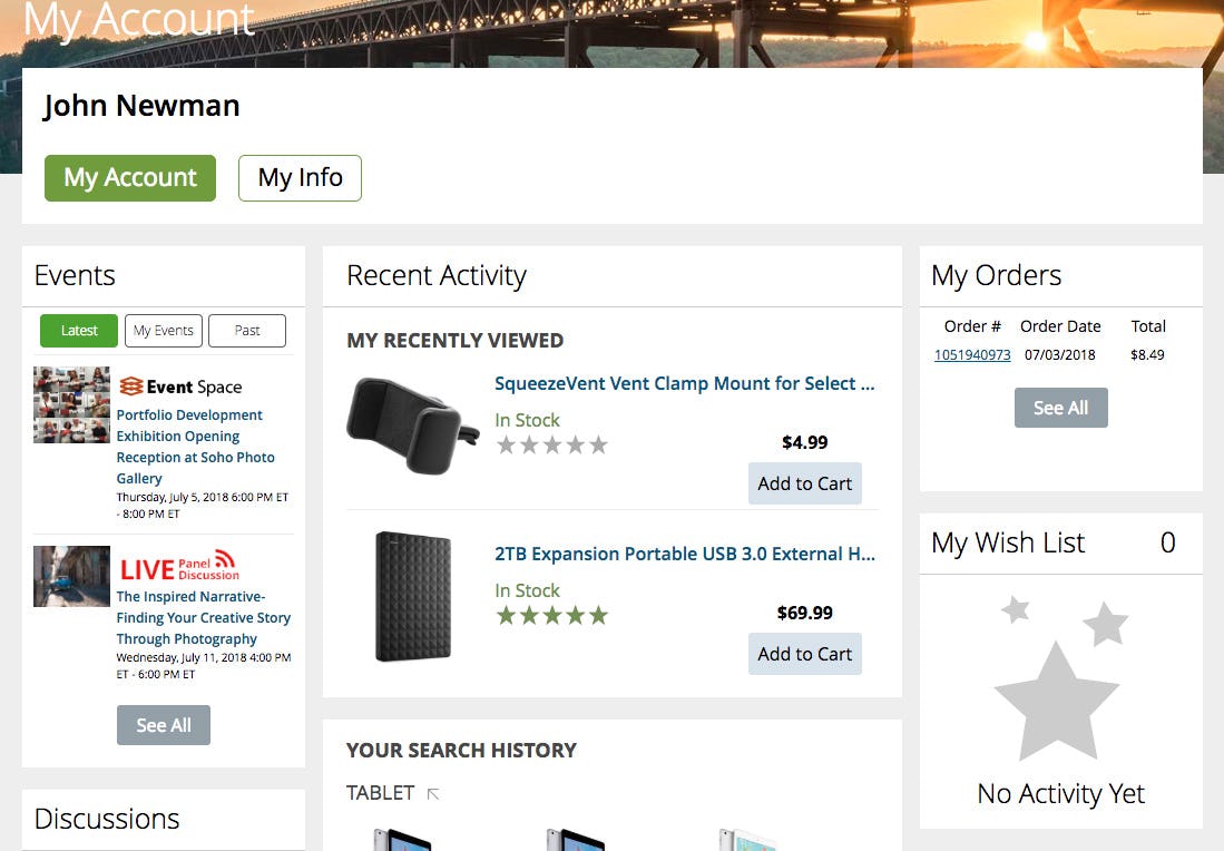
Best Buy uses a Cards dashboard layout. Note the wildly varying designs across the cards: for example, a link to “Manage Your Shipping Address” is in a large font and on a grey background, while “my list” is in a small font without a background color, and “All Saved Items” has a large blue button — inconsistencies that make it difficult for users to detect the navigational pattern and consequently get an overview of the dashboard. Note: Best Buy has since changed their dashboard design.
Card designscan be effective at improving the scannability of the dashboard, as users should be able to quickly find the account feature they’re looking for by scanning card headers or prominent card content (e.g., “Your Lists”, “Purchase History”, etc.).
During our testing, however, ‘Cards’ dashboard UIs performed poorly when card content wasn’t implemented with a very high level of consistency.
When cards content and the styling of the content varies widely from card to card, users have trouble getting an overview of what account features are available.
Generally, this occurs when the card UIs lack a consistent pattern — for example, some cards have image thumbnails, while others don’t; some cards have buttons, while others have text links; some cards have background colors for text links, while others don’t, etc.
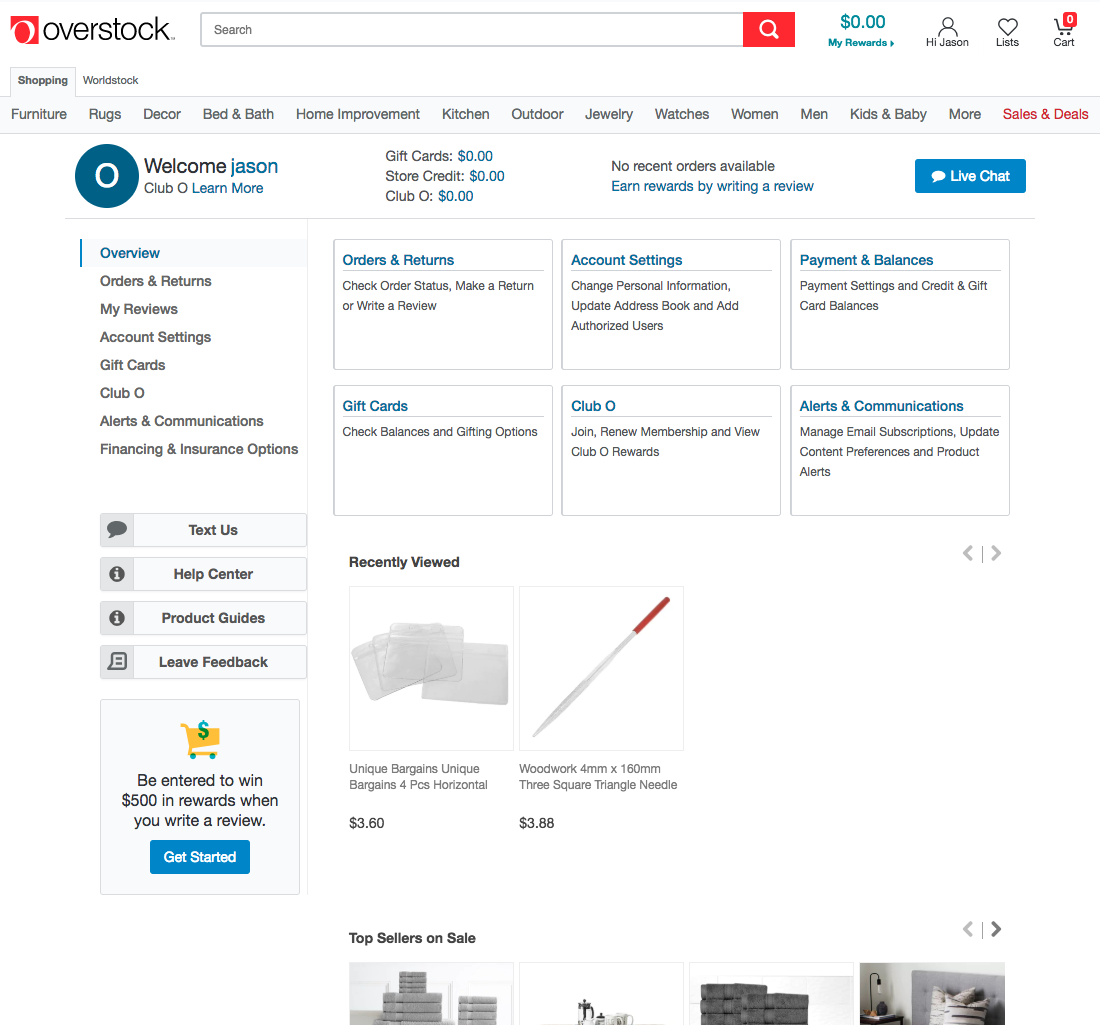
Overstock uses a combination of an account sidebar and a Cards dashboard layout. The card layout is consistent, helping users scanning the dashboard quickly locate the account feature they’re looking for. Additionally, cross-sells are less likely to distract users, as they’re placed beneath the account features.
For ‘Cards’ dashboards to be scannable the content must be implemented consistently. This includes the font size and style used for different types of card content, as well as the use of background colors, images and icons, primary button size and styling, and links to account features.
In other words, the same types of content should have the highest visual consistency from card to card. Otherwise, users are likely to miss account features they’re looking for, even if they’re visible in the viewport, due to the overly “busy” and “cluttered” look of the dashboard.
Card Headers and Text
Special attention should be paid to the card headers to ensure they’re highly visible, as they provide crucial information scent for users scanning the dashboard.
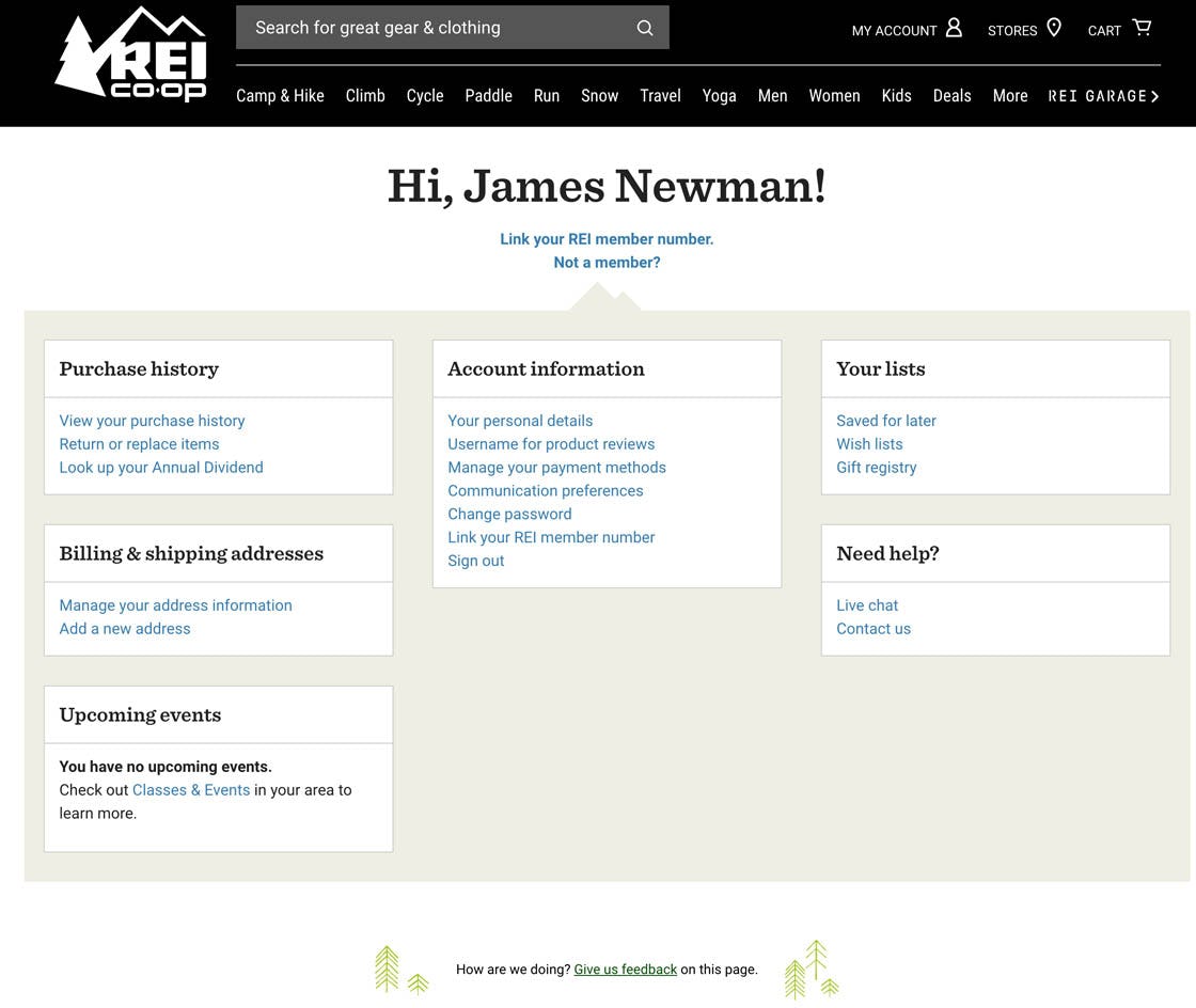
REI’s Cards dashboard might look slightly boring, but performed very well during testing, as subjects were able to quickly spot the account features they were looking for. Note the uniformity of the styling of the same elements across cards — in particular, the very visible card headers — allowing users to get a sufficient overview of the account options before scanning a particular group of account features (the blue links).
For example, this could include ensuring there’s sufficient white space between the header and surrounding elements or links, ensuring headers have a sufficient font size and weight, and so on.
Additionally, it should be considered how much information to display to users in each card.
Displaying too-much information on the dashboard results in very tall cards, which in turn results in longer dashboards that users must scroll extensively to get an overview of all of the available account features.
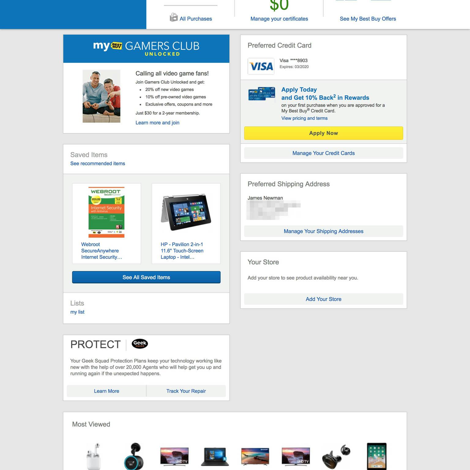
Instead, most sites are likely better off simply displaying the path to the account feature and saving the actual feature information for the subsequent page. For example, this could mean displaying a link to the shipping address account feature (e.g., “Manage Your Shipping Addresses”), rather than displaying the actual address information on the dashboard (e.g., “James Newman, 5500 N ST Louis AVE…”).
That said, deciding how much information to show users in cards is very site specific, as it depends on the number and complexity of account features available.
Sites with few or very basic account features may opt to show more information in cards, as users will still be able to get an overview of all the account features available. Or if site statistics show users frequently accessing a few specific account features it may be beneficial to provide that information directly in the dashboard (e.g., the number of rewards points a user has).
However, sites with more account features, or more advanced account features, will very often need to group and nest account subfeatures on the dashboard, making it infeasible to also display the subfeature information.
Images, Graphics, and Ads in Card UIs
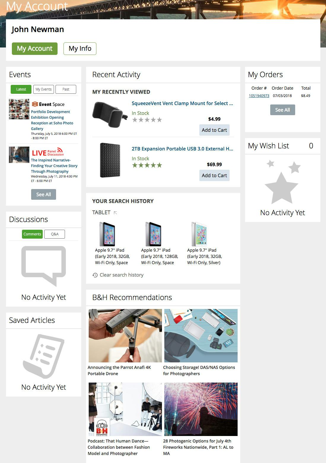
B&H Photo relies heavily on images in cards, with the end result being that users will find it difficult to scan the dashboard for the account feature they’re looking for, as the images make it difficult to get an overview of account features.
Sites should be cautious about including images or graphics in cards due to the amount of user attention such visuals have consistently been shown to attract (also observed in our Product Page and Checkout research).
Simply using text headers and links, perhaps in addition to subtle icons to provide information scent for specific account features, will help to avoid attracting too-much user attention to one card over another.
Because each individual user will be looking for a specific account feature, it’s detrimental to users’ goals if the account dashboard tries to visually nudge all users into a particular account-management feature (e.g., the address book) by using images or graphics to draw attention. For some users it will happen to be the right path but it will also be the wrong path for a large subset of users.
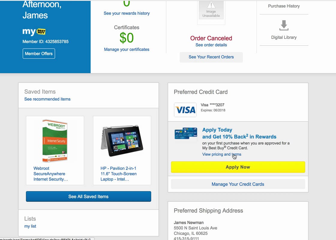
“Sneaky Devils…I don’t like that….That’s a little off-putting. It doesn’t make me want to do more business with a store or company if their attempts to get me to do something are tricky like that.” A subject reacted very negatively to an ad for a Best Buy credit card placed in the account dashboard, directly above the link for the credit card management feature.
Ads, even for internal site promotions, should be avoided. Ads have proved distracting in other site areas (e.g., in product lists), and are also problematic when placed in the account dashboard, as they tend to distract and annoy users trying to manage their account features.
If ads must be included on the dashboard, they should be deemphasized and set apart from the other account-feature cards to avoid confusing users.
Ensure Your ‘Cards’ Dashboard Performs Well for Users
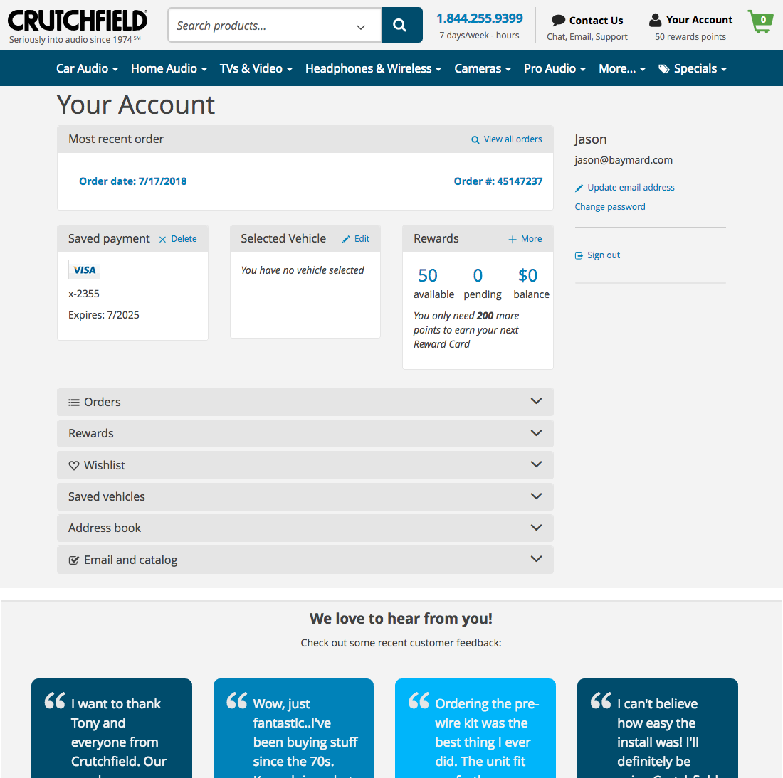
Crutchfield highlights the most recent order in the dashboard by having it be the first card and stretch across three columns. Less-important features (for this particular site) are placed below, but all cards are treated consistently: note the grey background for headers, similar fonts used, lack of overly prominent images or graphics, and the limited text shown, helping to avoid overly tall cards. It’s relatively easy for users scanning this dashboard to get an overview of the features available.
A ‘Cards’ design can be an excellent choice for an account dashboard. (In fact, we’ve implemented a ‘Cards’ layout for Baymard Premium.) However, to ensure users are able to find the account features they’re looking for,
-
use a consistent layout that treats all cards equally (with exceptions for particular account features you especially want to draw users’ attention to),
-
use prominent, clearly written headers to provide information scent for users scanning the dashboard, and avoid providing more textual information than is necessary in each card, and
-
use images and graphics cautiously and avoid ads.
This article presents the research findings from just 1 of the 640+ UX guidelines in Baymard Premium — get full access to learn how to create a “State of the Art” Accounts & Self-Service user experience.