(This is part three in a series of posts about designing a new webpage from scratch, before you have any concrete data to guide your design-decisions.)
In this post we’ll take your design drafts and turn them into a finished layout. You’ll be tweaking the proximity of the different elements on your page as well as adjusting the sizes and nuances to give each element the appropriate amount of visual importance.

After having combined the drafts into one coherent layout we tweak proximity, sizes and nuances of all the elements.
1) Turn Drafts Into HTML
Grab your initial design drafts and begin coding each of them in HTML, starting with the most important design draft first (as determined back when you created your priority lists).
Make a new HTML page for each of your drafts. It’s important that you only add the exact elements from your initial design draft to this HTML page as this will help you keep focused. E.g. if you’re designing the posts-area of a blog, don’t add the sidebar to it just yet (you’ll do this in step 3).
2) Get the Basic Elements in Place
Now it’s time to give your HTML pages some basic styling. This is about getting the basic elements in place and making sure they work really well.
The most important thing to focus on in this step is the font. The font’s family, size, padding, color, nuance and line-height. It’s always a good idea to design the “standard” font first (the one you’ll be using for your body text) as this will make it much easier to find the right proportions for the other types of fonts such as the ones for the different headers.

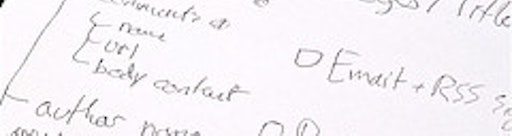
Designing each element on the page separately.
Proximity is golden here as it visually determines which elements belong together and which don’t, so spend some time on finding just the right amount of white-space e.g. above and below your sub-headers. You’ll typically want more spacing between the upper paragraph and the sub-header than between the sub-header and its following paragraph since these two last elements are related. By putting elements in close proximity to each other you’ll visually tell the visitor that they are related. It may seem like a small and extremely obvious thing but a lot of people (including some calling themselves web designers) still don’t get this right.
It’s a good idea to spend a little time on writing your CSS styles in a flexible manner that makes it easy for you to make overall adjustments down the road. Personally I like to wrap each of my HTML pages in a div-tag with a unique class name so it is easy for me to e.g. decrease the font-size of everything in the sidebar by 10% once all the design drafts are put together on the same page.
Repeat this step for each of your design drafts until you have all of the elements on your site in a separate styled HTML page.
3) Combine Drafts to one Coherent Layout
Finally! It’s time to put everything together, this is what you’ve been waiting for all along: to see the different elements play together in one coherent layout.
Placing the different elements on the same page should in and by itself be pretty easy, however, you’ll have to make a ton of minor adjustments before the layout will work as intended. Especially the positioning of different elements is important, making sure all elements are in perfect proximity to each other. One thing you can do is print out each of the styled HTML pages and move them around on your table. What would it look like if the sidebar was on the left side of the content and not the right?
You’ll want to play around with font-sizes and colors of the different elements as well, emphasizing the most important areas of your page while downplaying the less important parts. Try decreasing the font-size of your sidebar a bit so it’s visually less dominant than the page’s actual content. Perhaps give it a dash of white so the font-color is dark gray instead of black.
Now tweak. Then tweak a bit more. Grab a cup of coffee and tweak some more. When you think you’ve found the right balance, take a walk outside for 30 minutes and then go back and tweak some more. Depending on the page you’re designing (and the time you have at hand) this process may take a few hours to an entire week. You’ll eventually end up with a finished layout that’s in perfect balance and where the visual importance of your different elements align perfectly with their actual priority. This is design at its best.
There’s a million different adjustments you can make during this step and in my experience your options depend very much on the page you’re designing. Even the few elements that do apply to almost all designs don’t benefit from being done in a particular order. With that being said, here’s some things I usually devote a fair amount of my time to get just right:
- Proximity - how close are the different elements on the page to each other? If two elements are in close proximity are they also related? If not, add more spacing. Use this to show the relationship between the elements on your page.
- Size and nuance - these two factors determine an element’s visual dominance. Spend some time making sure that there’s a correlation between the actual priority of each element and the visual importance you’re devoting to it.
- Backgrounds and lines - you can use these graphical elements to separate different parts of your page from each other and make some stand out more than others. Use sparingly and wisely, or it may turn into visual clutter.
Is there something you’d like to add to this list? Impart us with your wisdom by posting a comment.