(This is part two in a series of posts about designing a new webpage from scratch, before you have any concrete data to guide your design-decisions.)
With your priority lists in hand, it’s time to begin on the actual design of the site. This step in the overall process is about getting the basics right and making sure the most important elements are designed really well.

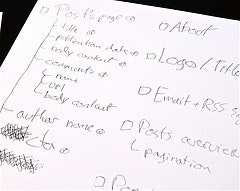
The initial design draft for the posts on this blog.
Designing Inside Out
Start out by grabbing the most important priority list - this is what you’ll be designing first. Having the priority lists in place makes it much easier to design things from the “inside out” - an important concept that forces you to build your design around the most important elements on the page.
If you were designing a blog, the most important elements would probably be the posts and the sign-up options. Designing these elements first would mean that other less important elements such as navigation for the categories would be designed later and have to be built into a layout where posts were already designed.
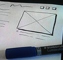
Sketch Initial Design Drafts
With your most important priority list next to you, you’re ready to begin on the first sketches for the design. For the sake of consistency, let’s say you’re designing a blog and that this is the priority list about the posts.
You may seem tempted to quickly draw a header and sidebar to contain the posts. Don’t. While it might feel a bit strange and even uncomfortable to design what a post looks like without having any visual anchors around it, this is exactly what you need to do. Again, this will force you to build the rest of the site around the posts, and not the posts around the rest of the site.
So start sketching out the different elements of your site (separately!). You may do multiple design variations for the same elements. This is good. Now is the time to explore - to try out new things - as the cost of making a change is close to zero.
Repeat this for all the priority lists, going through them by importance, designing the most important, then second most important, and third and fourth, etc.
Example

Final version of post-data colors, weight, proportions, etc.
In the very first sketch for this blog we wrote a big title and then the publication date next to it (on the same line) but in a considerably smaller size. Then we placed the author name and comments count on a new line and gave them the same size as the publication date. Then we placed the body text on a new line below all this “meta data” and bumped down the font-size once again.
In the final design we would leave post title on a line for itself to underscore its importance. Publication date was faded out and placed after author name as it wasn’t supposed to call attention upon itself. You can see how designing cornerstone elements first without any other elements distracting you, really helps you focus.
Do you also design “inside out”? Does it help you focus?