Our testing shows that 42% of users will try to grasp the size of a product though the product page images, but without an “In Scale” image this becomes needlessly difficult and inaccurate.
When users shop at brick and mortar stores, it’s easy for them to judge the scale of products they’re interested in. This immediate and intuitive grasp of a product’s physical size is easily lost when viewing images of a product on the web — in fact, it often requires active effort from the site to establish a sense of size and scale in its product images.
It’s an effort worth undertaking, however, as our latest large-scale Product Page usability study revealed that users consistently seek out this information. The research study revealed that 42% of users will attempt to gauge the overall scale and size of a product from its product images.
42% of users will attempt to gauge the overall scale and size of a product from its product images
When it’s difficult to judge scale from product images, users have to work needlessly hard to determine product sizes, and were repeatedly observed to instead simply draw inaccurate conclusions about the size of the depicted item. During testing, such misinterpretations of product sizes frequently led users to wrongly discard perfectly relevant products and even resulted in site abandonments in some cases.
Despite this, our Product Page UX benchmark shows that 28% of sites do not provide any “In Scale” images” among their product images. And that’s despite benchmarking the product page implementations from 60 of the world’s largest e-commerce sites, and only looking at their best-selling products.
This article will therefore cover our usability test findings on “In Scale” images, specifically:
- Why and how users try to evaluate a product’s scale from its product images
- Why users often misinterpret the size of products when “In Scale” images aren’t provided, and how it leads users to inadvertently discard items perfectly relevant to them
- How e-commerce sites can best implement “In Scale” images, incl. automation techniques for sites with thousands of products
Users Try To Establish a Product’s Size from Its Images
The product images are among the most utilized product page content, and absolutely vital to online shopping. In our Product Page usability study we found that 56% of the test subjects’ first actions upon arriving at a new product page was to begin exploring the product images, before reading titles, descriptions, or scrolling down the page to get a more comprehensive overview.
Our research reveals that in addition to the normal “Cut Out” product image type, there are 6 different types of product images that all have a significant positive impact on users’ ability to evaluate the product depicted. One of the most important of these image types are “In Scale” images.
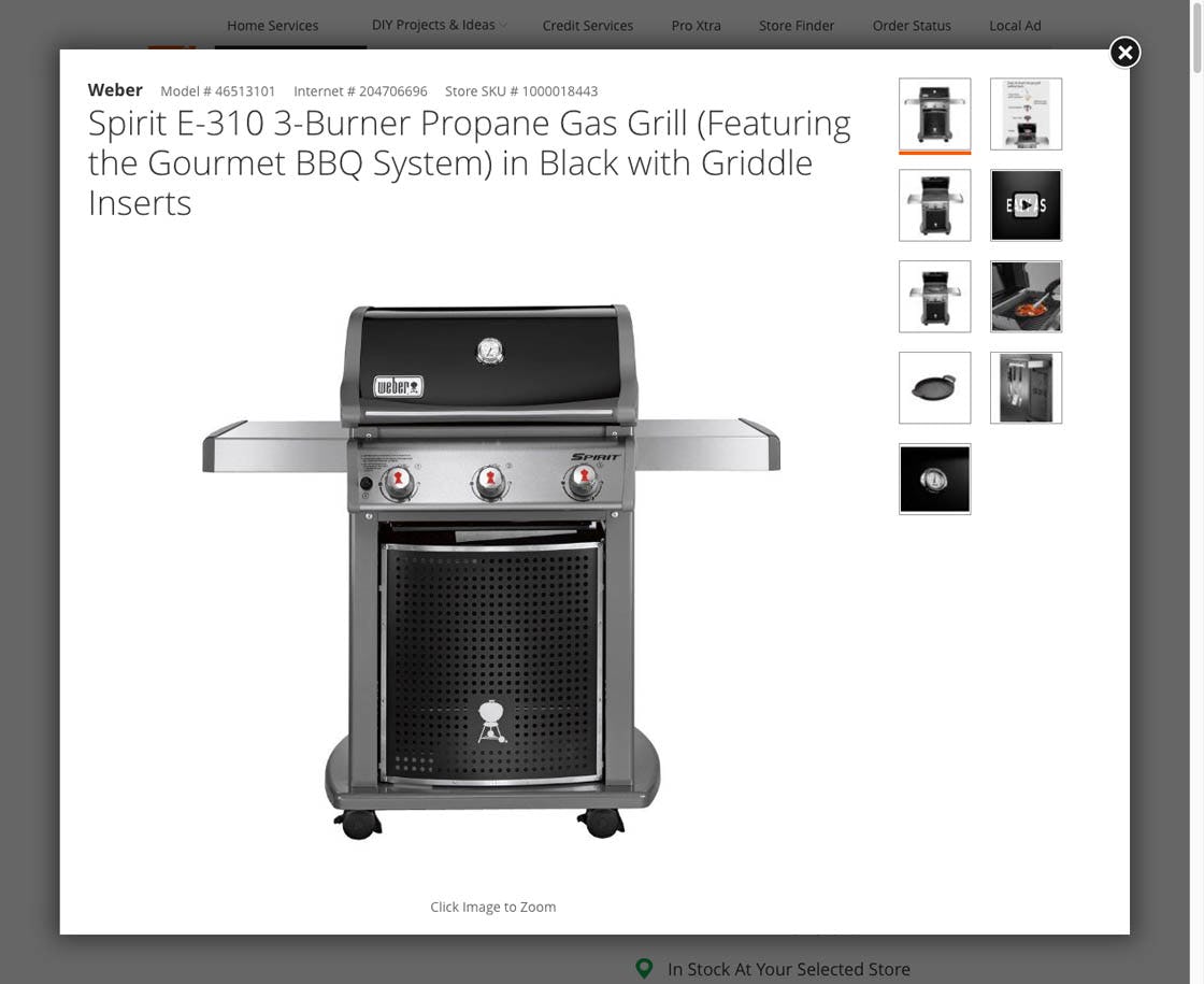
“I guess I’m not sure how big it is…if it was in context, it would be helpful,” a subject complained at Home Depot. Notice how the lack of an image that displays the product in context or next to other products will make it very difficult for users to easily get an impression of the product’s size.
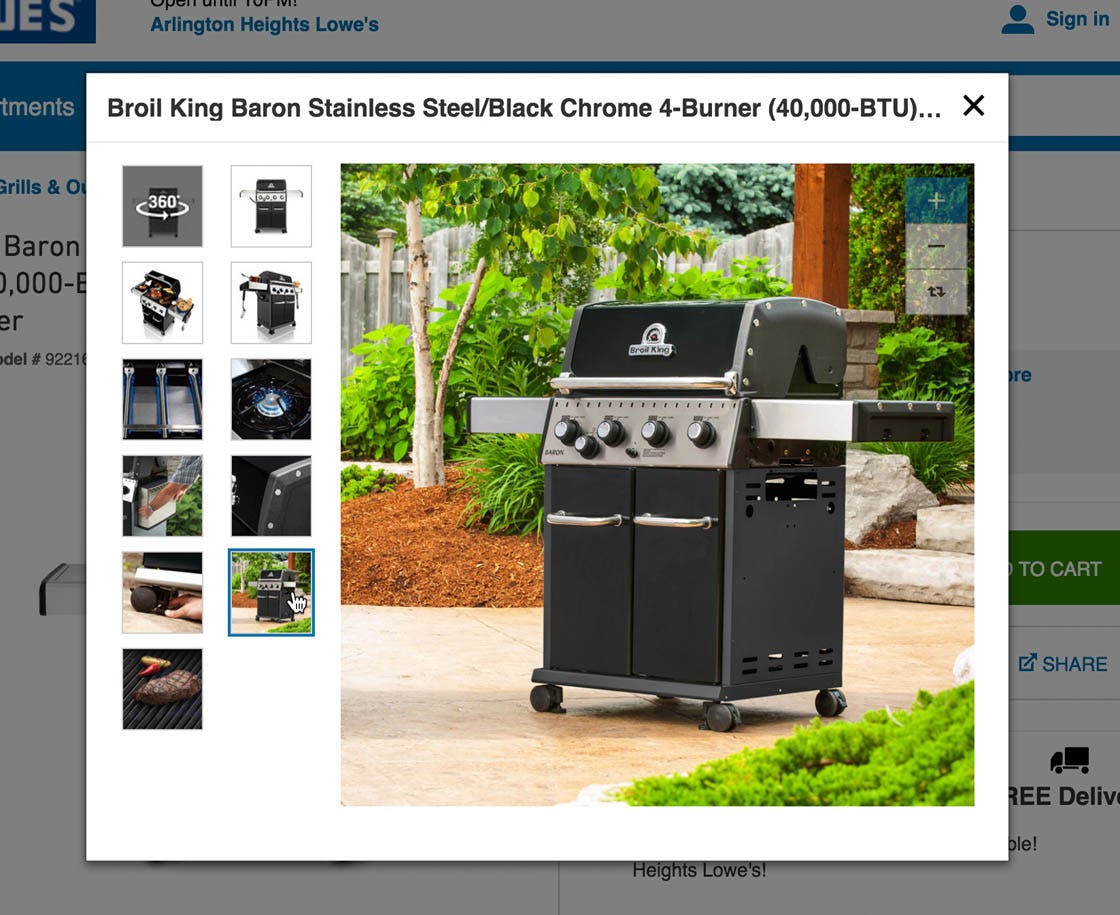
“[Lowe’s] shows it in the yard…just looks to be bigger,” the same subject said when viewing a similar grill at Lowe’s. This is a good example of an “In Scale” product image, where the product is presented in relevant surroundings, giving users a better sense of the size of the grill.
When users shop at physical stores, it’s easy for them to judge the scale of products they’re interested in. For example, if they’re interested in buying a refrigerator, they will immediately be able to gauge its approximate size just by looking at it, and can also compare its size relative to other products in the store. For smaller items, e.g. shoes or beauty products, users can furthermore pick up the product and hold it in their hands to see if it would fit in their everyday bag.
This crucial and immediate grasp of a product’s size is much more difficult to get when viewing images of products on the web. When only traditional “Cut Out” images — just showing the product on a white background — are offered, users have a very difficult time getting an accurate impression of the product’s overall size.
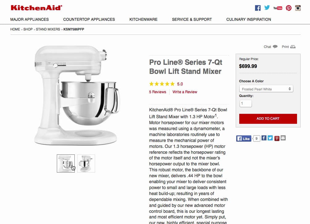
“This one looks larger but that’s also because…the photos give no proportion or scale.” The fact that a “Pro Series” mixer at KitchenAid only had “Cut Out” images left most subjects feeling like they didn’t have a good sense of its size. Others said “In terms of the images, I like [when] you have it in a kitchen so that you get it for scale…so that you can see the size of it. With this one I have no concept of what size it is.”
Size is information that many users are extremely interested in. For example, a subject at Home Depot clicked through five thumbnails showing a Weber Grill in a vain attempt to get a better sense of the grill’s size. He eventually abandoned the site in frustration. Showing users “In Scale” images — for example, placing the product within a typical use environment, showing people interacting with the product, and showing the product in use — will all help users get a sense of the product’s scale.
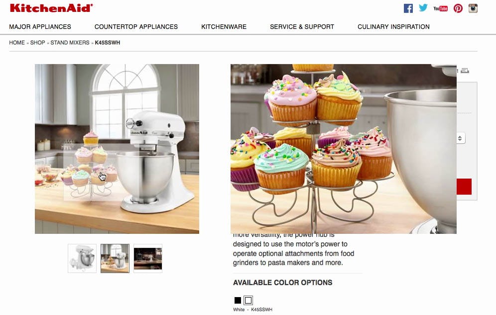
“Here you have things they put out specifically to give you a sense of its proportion…I think it’s quite clever with the cupcakes cause I know on average what size cupcakes are so this [mixer] seems quite small to me.” Unlike the “Pro Series” mixer, this “Classic Series” mixer at KitchenAid provided “In Scale” images that helped the test subjects get a sense of the product’s relative size, to the point where they could imagine it within their own kitchen, as illustrated by this subject, who added, “You can see it’s able to fit in my kitchen better.”
During testing, the difference between providing only “Cut Out” images, and providing “In Scale” images in addition to “Cut Out” images, became very clear when subjects were directly comparing two similar products, trying to decide which one to buy (as in the grill and mixer examples above). Users respond much more positively to products that include “In Scale” images because they can quickly establish a good sense of the product’s size from both types of images provided. Providing “In Scale” images has the side benefit of inducing users to begin imagining the product in their own space.
The Solution: ‘In Scale’ Images
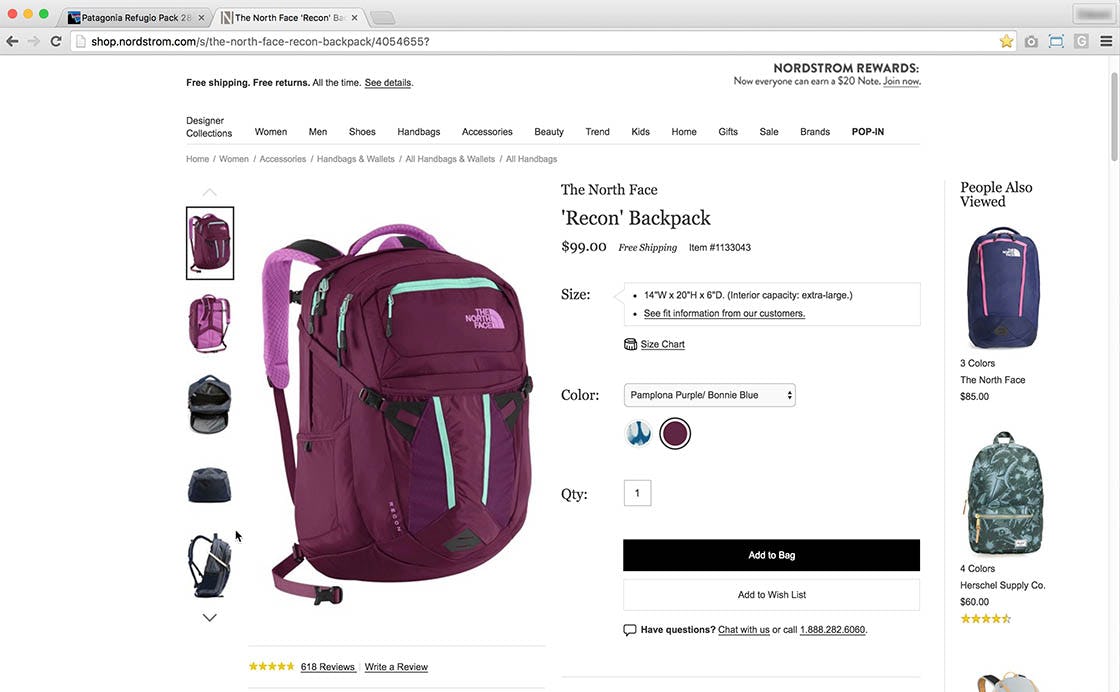
“Let’s see a picture here, if anyone is wearing it…There’s no photo of anyone wearing it.” The test subjects had trouble judging the size of the North Face backpack at Nordstrom because there were no images showing it on a model.
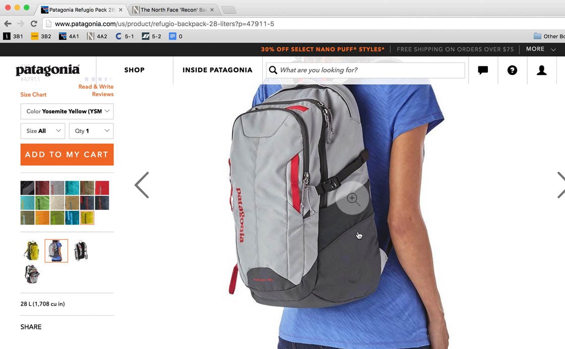
On the other hand, by showing the backpack on a model, Patagonia provided the test subjects with a good sense of its size: “I like that they show it on a person…gives a nice sense of scale.”
When deciding how to illustrate scale it’s important to consider how the product will be used. For products that will be worn directly by users, the item should be shown on a human model. As one subject said during testing, when comparing one backpack at Nordstrom to another at Patagonia, “This is good cause I can see it on a model. The North Face backpack [on Nordstrom’s site, ed.] didn’t have a picture with a model. It’s hard to see how big the backpack is until you actually see it on somebody.”
Similarly, in the earlier KitchenAid example, it makes sense that the mixer is shown on a kitchen island (its most likely use environment) and next to cupcakes (an item of a standard size and associated with mixers). Similarly, refrigerators should be shown in kitchens, grills on patios, watches on wrists, and so on, to allow users to see products in their most likely use environments, and next to items of a known approximate size.
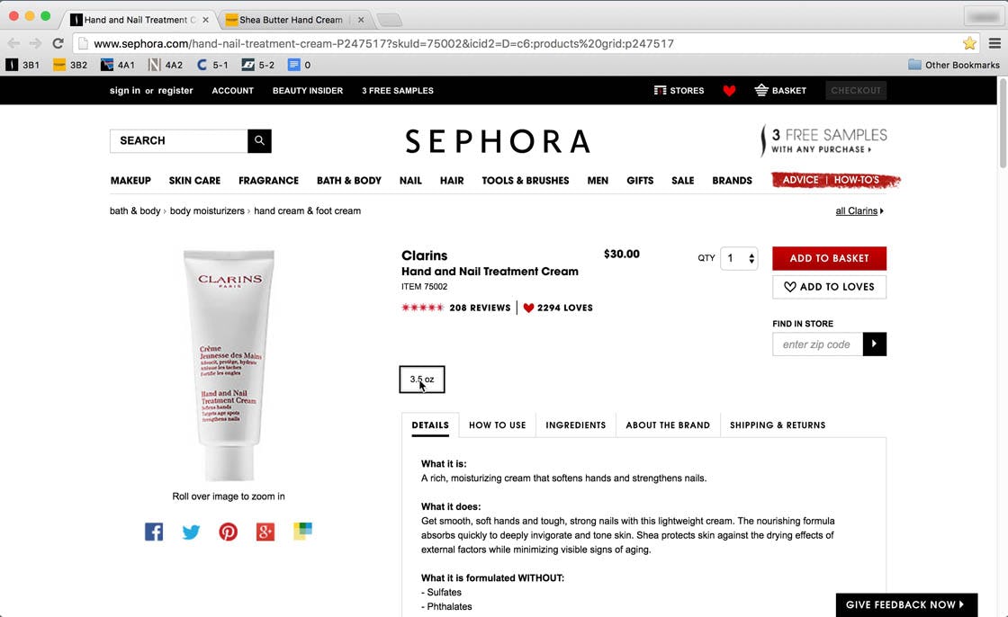
“This doesn’t really give you any frame of reference as to like how big that bottle is.” At Sephora, several subjects had trouble visualizing how big the bottle of hand cream was as only a single “Cut Out” image was provided. “I’m assuming 1 [oz] is like the travel, pocket book size, and 5 [oz] is the one you keep in your desk. I’m not sure.”
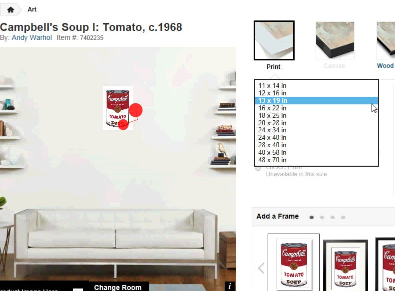
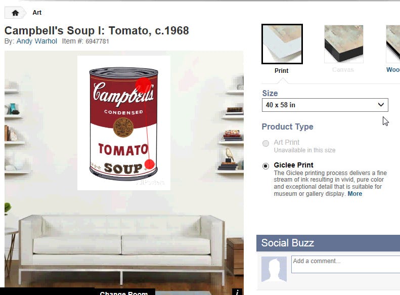
AllPosters offers an augmented reality “in room” visualization tool that allowed the test subjects to select different sizes of posters and see the resulting poster size in a virtual room. This gave them a much better idea of how big different-sized posters were compared to only providing users with the poster measurements in inches.
“In Scale” images are also important for users to clarify the sizes of various units of measurement. During testing, many subjects had difficulty visualizing ounces, cubic feet, inches, and weight. However, users will understand product size better when an “In Scale” image is provided.
As a subject on Sephora’s product page said, “Show the bottle [hand cream] and then show, I don’t know, a water bottle, to have the comparison. I don’t think most people could imagine what 5.4 oz is, or 3.5.” (In fact, even if a user did happen to have an excellent idea of the physical volume occupied by 5.4oz of hand cream, that wouldn’t necessarily give them an accurate sense of the product’s actual size since it doesn’t account for the volume added by the packaging.)
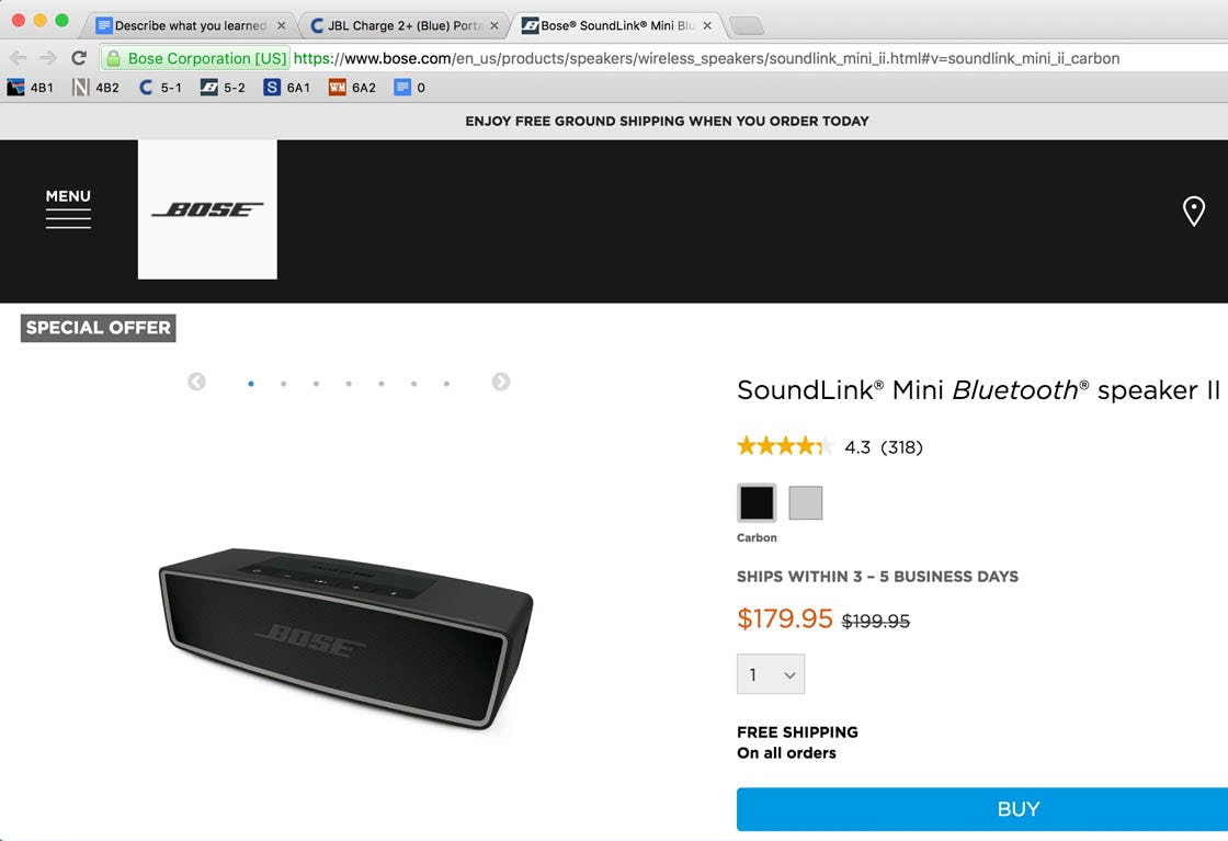
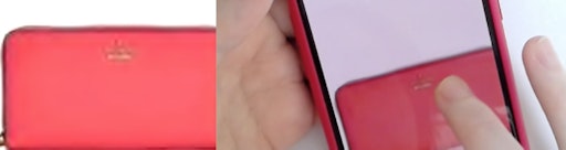
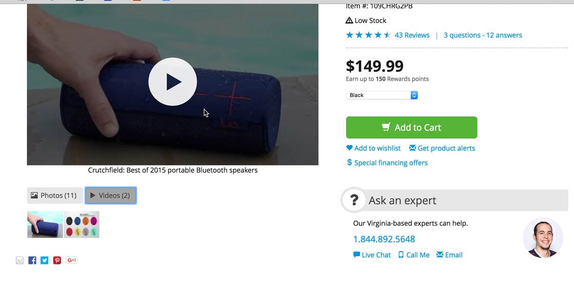
“I can’t immediately tell from this picture but the fact that it says it ‘fits in the palm of your hand’ means it is quite small.” This subject initially couldn’t find any “In Scale” images due to other usability issues with the image gallery UI carousel, and had to rely on the product description instead.
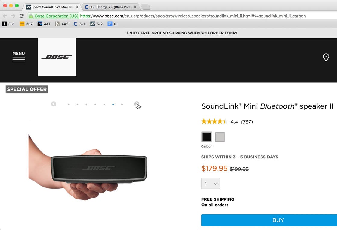
“That’s helpful, showing scale,” another subject said, who did find the “In Scale” image and immediately grasped how big the speaker was by seeing the product held in a hand.

“It’s kind of hard to judge, they have capacity amounts, like space…having a picture helps me, I’m a visual person, so when I see a number, even if it’s cubic feet, it’s hard for me to imagine what will fit in 13.62 cubic feet.” Users generally prefer obtaining their information from product images rather than specifications.
When one of the main features of a product is its size, “In Scale” images can also support feature descriptions such as “ultra-compact” or “extremely portable,” as they provide the user with a visceral sense of these unique product attributes. In these cases, it not only helps the user understand the product’s dimensions but also helps them to appreciate the small size as a product feature. With a good “In Scale” image, users will grasp that feature right away, without having to rely on the product description or specs.
Generally, we observed throughout our product page testing that users are loath to read through long product descriptions or specifications. The process is slower than simply looking at a product image, puts more strain on the product page by requiring much more information to be provided, and doesn’t take into account users’ general preference for images over text when browsing product pages.
Furthermore, the “In Scale” image can also often be used to excite users about the product by showing both the product’s size as well as how it can fit into their lifestyle – for example, an image of a model taking a portable bluetooth speaker out of her purse at a party. These images can therefore often double as “Lifestyle” images (more on “Lifestyle” images in another article).
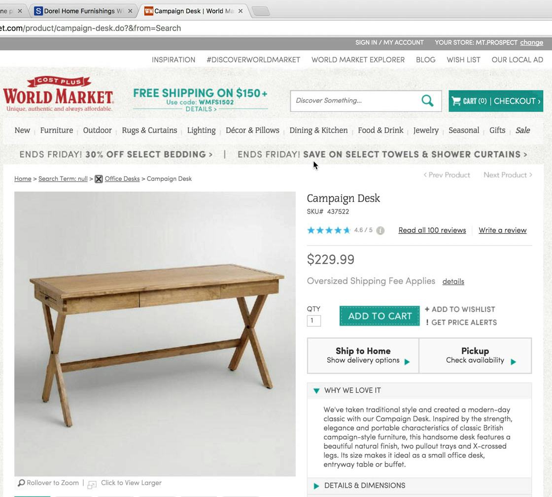
“This desk is the opposite of what I would be looking for, it’s really huge.” A subject at World Market thought the “Cut Out” image of the desk looked “huge.”
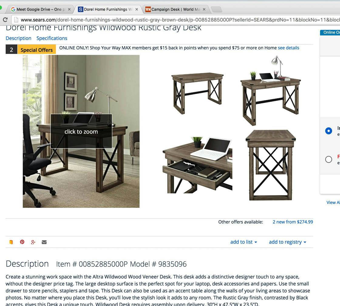
The desk at Sears looked much more like the size she was after, even though the Sears desk was only roughly 20% smaller in width and shared the same height and depth dimensions. Only having “Cut Out” images makes users much more prone imprecise judgements of a product’s actual size.
Without the frame of reference provided by “In Scale” images, users may develop misconceptions about a product’s size. Products in “Cut Out” images may look too large or too small, depending on the variables in the photography (e.g., shadow, angle). Misinterpreting a product’s size will lead users to “wrongly” discard perfectly relevant products, and can consequently result in site abandonments — something that occurred multiple times during testing on sites without “In Scale” images.
“That would be the one useful thing [in watching the video, ed.] now that I think about it, is really seeing the size of it based on the video in relationship to a person or their hands or whatever.” This subject chose not to watch the product video but understood how it could help to determine the product’s size.
Product videos can provide users with excellent product size information by showing all sorts of scale “images.” For example, a video that shows a speaker that’s held in a hand, placed on a desk, and then moved to a bookshelf next to a set of books will give users a great idea of the product’s size. Note, however, that we found during testing that a large group of users will not watch product videos, so product videos should only provide additional scale information and not serve as a replacement for “In Scale” images.
‘In Scale’ Images for Sites with 10,000+ Products
“In Scale” images play a central role in closing the gap between the experience users would have had in a physical store — where grasping a product scale is instant and occurs subconsciously — and the online experience where scale must be inferred through the product images provided by the site. Hence, e-commerce sites should always offer at least one “In Scale” image showing the product relative to a surrounding environment, humans, or other objects of a size known by the site audience.
Yet, as already mentioned, our product page UX benchmark reveals that 28% of the 60 major e-commerce sites neglect to offer “In Scale” images — even for their best-selling products. However, even mass merchants cannot be excused for failing to provide “In Scale” images, because there are ways to automate the process.
When it comes to providing “In Scale” images there’s naturally a difference between what’s feasible for brand sites (e.g., nike.com), where it’s certainly doable to shoot high-quality “In Scale” images for all products sold at the site, as opposed to traditional e-commerce sites that sell thousands of products from multiple vendors (e.g., walmart.com), where it may be unrealistic to shoot or acquire “In Scale” images for the entire product catalog.
Yet even sites that deem it unfeasible to shoot “In Scale” images for all products ought to at a very minimum source, buy, or shoot “In Scale” images for their most important product verticals, as well as the best-selling products. Of course, automation techniques may be applied as well, in order to computer-generate “In Scale” images based on the available product specifications.
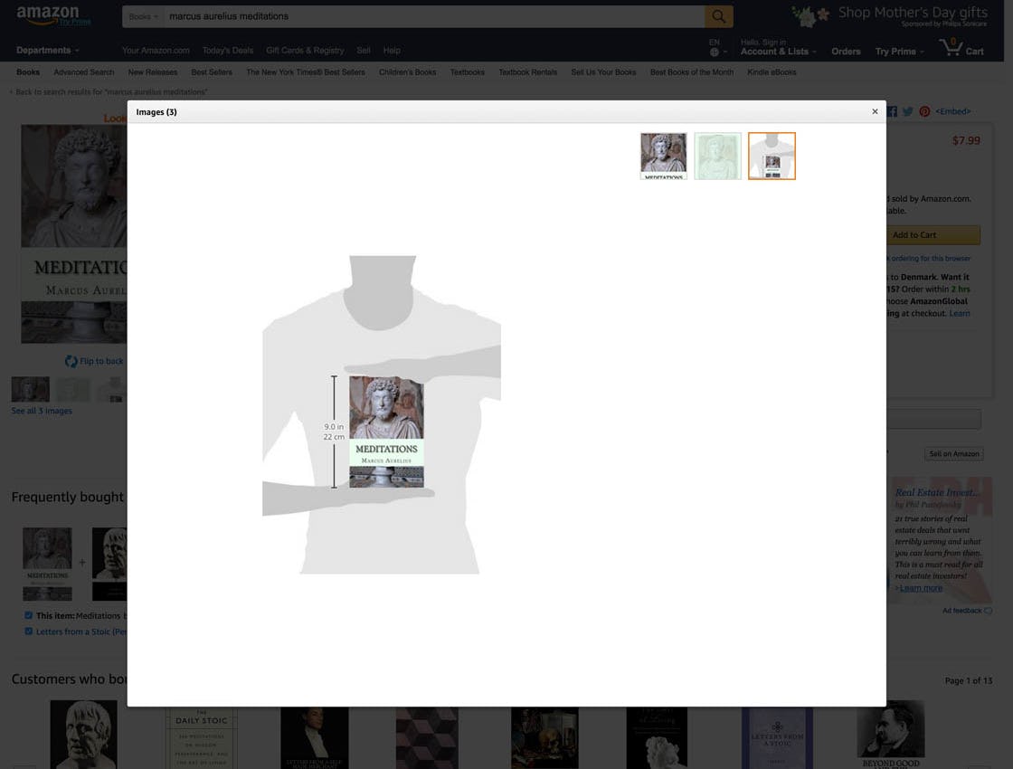
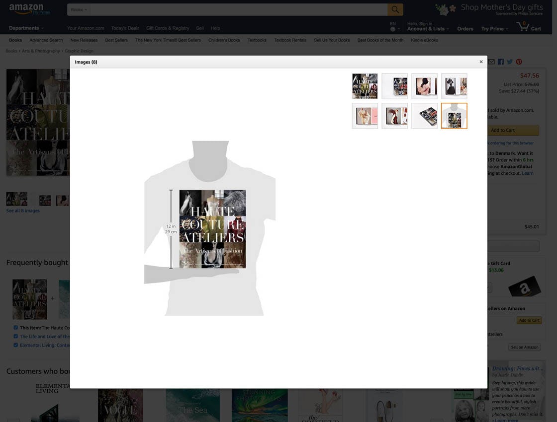
Amazon provides users with a sense of scale by using graphics as stand-ins for real human models. While not as rich as a real model, it is a good alternative, allowing Amazon to provide fully automated “In Scale” images for literally million of products.
Providing computer-generated images that illustrate scale based on the product dimensions in the spec sheet, as shown in the prior AllPosters in-room visualization tool example, or in the above Amazon example, can be a cost-effective way for mass merchants to auto-generate “In Scale” images for thousands of products in their catalog.
Computer-generated images will often be a more feasible approach for sites with a large product catalog. However, it should be considered to be a supplement to real “In Scale” photography, and not a total replacement for it, since these computer-generated images don’t provide anywhere near as powerful an experience to the end user (it provides them with a sense of scale, but fails to invoke the same visceral response as “real” product photography does).
This article presents the research findings from just 1 of the 650+ UX guidelines in Baymard Premium – get full access to learn how to create a “State of the Art” e-commerce user experience.