This is the 4th in a series of 8 articles on mobile usability that draw on findings from our mobile e-commerce usability report.
Many responsive mobile sites are using native drop-downs (as in: a select tag) for main navigation and many plugins have been developed for this specific purpose, yet our usability research shows that this is a poor strategy. On the tested mobile e-commerce sites that used native drop-downs for navigation, the test subjects showed decreased control and overview of the menu items.
During testing, nearly all subjects scrolled up and down category lists before selecting an option, many explicitly stating that they wanted to see all the categories before selecting one – even if they felt they had spotted a good match early in the list, the subjects still scrolled the remaining items just to make sure they knew what their other options were (before then scrolling back and selecting the good match). The subjects exhibited the same behavior on homepages where they often scrolled up and down to get an idea of what their options were, even if they saw what they were looking for right away.
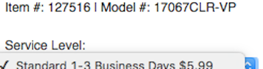
This strong tendency towards scanning all options before selecting one is at the core of why native drop-downs are a poor choice for navigation. When open, a native drop-down only utilize ~50% of the screen, which made it needlessly difficult for the subjects to get an overview of their options.

With only half of the screen used to display the available options, users will have a difficult time scanning and comparing the available options. To make matters worse, the drop-down often starts out at the top with only 3 options visible to the user (left image), and even when scrolled to align optimally, no more than 5 options can be seen at once (right image).
Another issue with the navigation options only taking up 50% of the screen is that the scroll area for those options is similarly small. The smaller scroll area resulted in less accurate scrolling as there was so little room to “drag” the content that many subjects flicked to scroll instead (which of course is a much more inaccurate way of scrolling).
Finally, we also observed a few instances where subjects mistook the navigation for filtering options. This was especially true of category and search result pages where subjects were on the lookout for filtering options and then simply jumped to the conclusion that the drop-down was such a feature.
Solution: Custom Mobile UI Drop-Downs
It’s very important to underscore that drop-down navigation isn’t bad at all, it’s native drop-downs (as in: a select tag) which are unsuitable for navigation due to the way they have been implemented in the major smartphone operating systems (such as iOS and Android).

While the navigation at The Boston Globe is very similar to how the native drop-down works in terms of interaction (you first click “Sections” and then a set of simple items are revealed) it is significantly better because the options aren’t limited to a dialog but can take up the entire screen if necessary. In the above all 10 items are shown at once; quite the improvement in terms of overview, scannability and “scroll control” when compared to the meager 5 items that can be shown in a native drop-down dialog. (The navigation items on Boston Globe are, however, on the short end, being only ~5,3mm tall.)

Another benefit of implementing custom drop-down UIs for navigation is that you have complete control over the design of the options. This means you can optimize the design and layout of the shown options (which you can’t with a native drop-down). CSS-Tricks, shown above, is a great example of this where, when expanded, the menu items are displayed in two columns and each has a descriptive icon next to it. It can also be more subtle, like the earlier Boston Globe example where arrows have been added to indicate virtual space.
During testing the subjects had no issues using these types of custom UI navigation as long as they followed basic design conventions, had adequate hitarea sizes (device manufacturers recommend a minimum of ~7x7mm), and the trigger element was designed as a link / button (so that the subjects knew it was clickable).
It should be noted that native drop-downs are not poor for all purposes – they can work well in forms where keeping page context can be as important as the options themselves. However, native drop-downs should not be used for main navigation as they simply afford too little overview of the available options and are needlessly difficult for users to scroll accurately.
This article presents the research findings from just 1 of the 650+ UX guidelines in Baymard Premium – get full access to learn how to create a “State of the Art” e-commerce user experience.