

During our large-scale mobile e-commerce usability study, we observed that when the test subjects landed on the homepage of a new mobile site, 70% of them scrolled up and down across nearly the entire homepage, quickly scanning its contents. Most described this as “getting an overview of my options”.
Test subjects new to the site or with moderate prior site experience were observed to rely heavily on the homepage content to determine the type of site they’d landed on. This is problematic as 42% of mobile e-commerce sites have a homepage design that doesn’t allow users to accurately deduce the type of site they’ve landed on. That is, the site’s homepage doesn’t feature a sufficiently diverse collection of their primary product categories, which is as essential on mobile sites as it is on desktop sites.
When the test subjects misinterpreted the type of site they had landed on, it nearly always had a significant performance penalty later on during their testing of that site, resulting in severe product finding issues, site abandonments, and even long-term brand complications.
In this article we’ll present our test findings on how users will often try to infer a site’s scope based on its homepage contents, show examples of how to best design mobile homepages with this user behavior in mind, cover various implementation considerations, and illustrate why the issue is far more severe on mobile sites than on their desktop counterparts.
Users Try to Infer the Type of Site Based on Its Homepage Contents
When landing on the homepage of a new site, users will try to infer the scope of the site they’ve landed on. Unsurprisingly this behavior is especially strong when the site’s brand is new to the user as well, but the behavior is by no means limited to this segment – even test subjects tasked with browsing well-established brands they were already familiar with, such as Best Buy, Amazon, and Macy’s, would still scroll up and down the homepage to “get an overview” of what options were available to them. In fact, the test subjects exhibited this behavior on 70% of the tested homepages.

While it’s clear from Best Buy’s homepage that they sell consumer electronics, it’s easy for the uninitiated user to conclude that this is all Best Buy sells on their website, since there’s no references to any of their other product types (such as kitchen appliances, health products and furniture).

It’s immediately clear that REI sells hiking equipments, however, it’s not obvious from the initial impression that road bikes, yoga mats and skis make up a significant part of their catalog too.
On several sites this initial scan of the homepage content led the test subjects to draw misconceptions about the breadth of the site’s product catalog – either because too little content was available on the homepage or, more commonly, because the content displayed wasn’t sufficiently diverse.
Users with no or only moderate prior knowledge of the site’s brand will largely base their perception of the site’s product range based on the homepage content and main navigation categories. If the homepage content therefore displays a very narrow selection of products, many users are likely to adopt a similarly narrow understanding of the site’s product catalog as a whole. After a test subject had made their initial “homepage scan” they would often make a comments like “Okay, this is not a store where I’ll find a laptop sleeve” and “It’s maybe not the best place to look [for a camera, ed.]”.
During testing we observed this type of misinterpretation of the site’s product selection to be highly problematic, as users will rarely look for products they don’t believe the site will carry. As a consequence, these misinterpretations would alter how users navigated the site, since they naturally wouldn’t browse or search for product categories they didn’t believe to exist. It even caused direct site abandonments in some instances, where test subjects were looking for a particular product type, but then after scanning the site’s homepage contents concluded the store didn’t carry those items.
To make matters worse, the penalties go even beyond these direct implications to the user’s current browsing session – it can also cause long-term brand damage, since users are unlikely to return the site when interested in those types of products in the future (because they – wrongly, but understandably – believe the site doesn’t carry products of that sort).
Feature the Main Product Categories on Your Homepage
The test sessions did luckily reveal a homepage design that helped the test subjects form an accurate interpretation of the site’s product catalog: prominently featuring a diverse selection of the site’s primary product categories directly on the homepage.
By indicating a diverse set of categories and/or content directly on the homepage, a site caters to users inclination to “scroll & scan” and the diversity of content displayed help those users form a much more accurate picture of what is (and isn’t) offered on the site.
As a rule of thumb we’ve found that a minimum of 30-40% of the top-level categories should be represented via the homepage content – either directly or indirectly.

At Williams-Sonoma, a mix of graphics and categories are used but to the same effect – at top some key product types are visually illustrated with thumbnails, and below a list of links for the full site hierarchy.

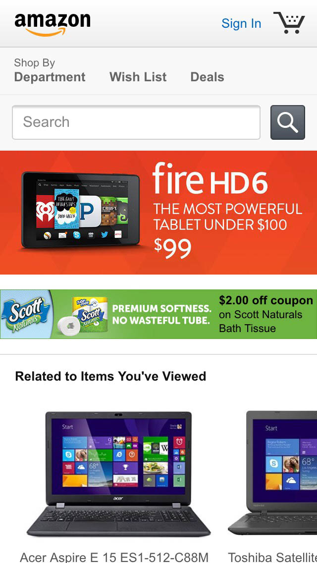
When testing Amazon, a mix of visually featured products, visually featured categories, and a list of key categories are displayed, which proved sufficient to accurately convey the site’s product catalog diversity to the test subjects.

Build.com’s homepage features their entire top-level hierarchy allow users to see the full diversity of the site’s product selection.
Our desktop testing finds that for desktop homepages the site diversity is often best achieved by representing the catalog’s breadth through the visuals on the homepage as these tend to attract the most user attention. That is, thumbnails for featured categories or products. Whether the featured product types were specific products or categories didn’t prove to have any influence on the subjects’ ability to correctly infer the site’s product range from the homepage.
On mobile the findings differ slightly as we observed that featuring a diverse set of the top-level navigational text links directly on the homepage also solved the issue. Likely the extremely limited viewport on smartphones ensures that the text links receive much more focused exposure than they do on a desktop screen because there will be times on mobile where all the user can see on their screen are these navigational links (as opposed to desktop where other visual elements would almost always be visible and vying for attention regardless of the user’s scroll position).
Some sites display the entire site top-level hierarchy (like Build.com above), others rely on a mix a visually featured categories and the entire hierarchy (Williams-Sonoma), and some use a mix of visually featured products, visually featured categories, and a select part of the top-level hierarchy links (Amazon). All three approaches can work, so long as sufficient diversity is ensured.
Embedding part of (or the entire) top-level category navigation doesn’t just help uninitiated users establish a better perception of the site they landed on. During testing, many of the test subjects who were “repeat users” with prior experience on the site, were observed to utilize embedded homepage categories as shortcuts to popular product verticals and site scopes.
Implementation Considerations
Testing revealed that to accurately convey a site’s product diversity, 30-40% of the top level hierarchy should be featured (either visually or textually). However, the closer you get to this range, the more important it becomes that the 30-40% selected are high-contrast product types. For example, in the earlier REI example, instead of showcasing two hiking-related categories, it would be better to feature one hiking-related product alongside another completely different product type (such as their road bikes, yoga equipment, etc) to indicate that this isn’t a hiking-equipment-only site.

When featuring a selection or the full set of navigational links for the top-level categories, be sure not to collapse them behind a ‘departments’ or ‘categories’ link, as seen in the screenshot of Northern Tool. It doesn’t help users to infer the type of site they’ve landed on as user’s initial “scroll & scan” of the homepage won’t expose them to any of the site’s top-level categories. This design pattern only support repeat users in the form of a navigational shortcut.
During testing we often observed subjects that only used the embedded categories to establish a better understanding of the site and the options available to them, and then based on that decided on their product findings strategy. For example, many subjects would scroll back to the top of the homepage and perform a search query based on their new and now more accurate understanding of the site they had landed on.
So while a few users may interact with these embedded top-level categories, it is important to understand that the real purpose of featuring them on the homepage isn’t that users so click them – rather the purpose is to expose users to the breadth of categories available and thus increase their awareness of the products types available on the site. Collapsing the main categories embedded on the homepage behind a ‘departments’ or ‘categories’ link defeats this purpose.

Choosing any one of the displayed categories here at Walmart will not take you to that product category – instead, it will send you to a special page with “On Sale” items of that product type. The “Save big in every department” header does imply this, but during testing we often observe users overlooking such “scope” headers.
When featuring categories, in particular if accompanied with a thumbnail, be very cautious of scoping them (e.g. having a deal scope with “TVs on Sale”). When testing such implementations, we often observed the test subjects choose these categories without realizing they’d selected a “Sale” category, because they were scanning the graphics rather than reading their surrounding text (i.e. they were looking for a TV category, saw a picture of a TV, and then chose it).
While this may perhaps seem like a minor hiccup, it can actually be a direct cause for site abandonments, because the user may think the products listed on that page represent the site’s entire selection of that product type. If you need to feature categories of items on sale (or “in season”), it’s therefore recommended to send the user to the generic category instead (e.g. “TV’s”) but with an “On Sale” filter pre-applied. This way, users are informed of the narrow “deal scope” that’s currently applied to the products they are seeing and offered a way to easily modify it. (This ties into what attributes are implemented as filters vs. categories. Homepage & Category report owners see guideline #14, and Product Lists & Filtering report owners see guideline #53.)
A More Severe Issue on Mobile
While we’ve observed this behavior during our desktop studies as well, the issues proved to be far more problematic in a mobile context. On mobile we observed that 70% of users scrolled up and down the homepage when first landing on a new e-commerce site, while on desktop – during our Homepage & Category Navigation study – we found only 25% of users exhibiting the same behavior.
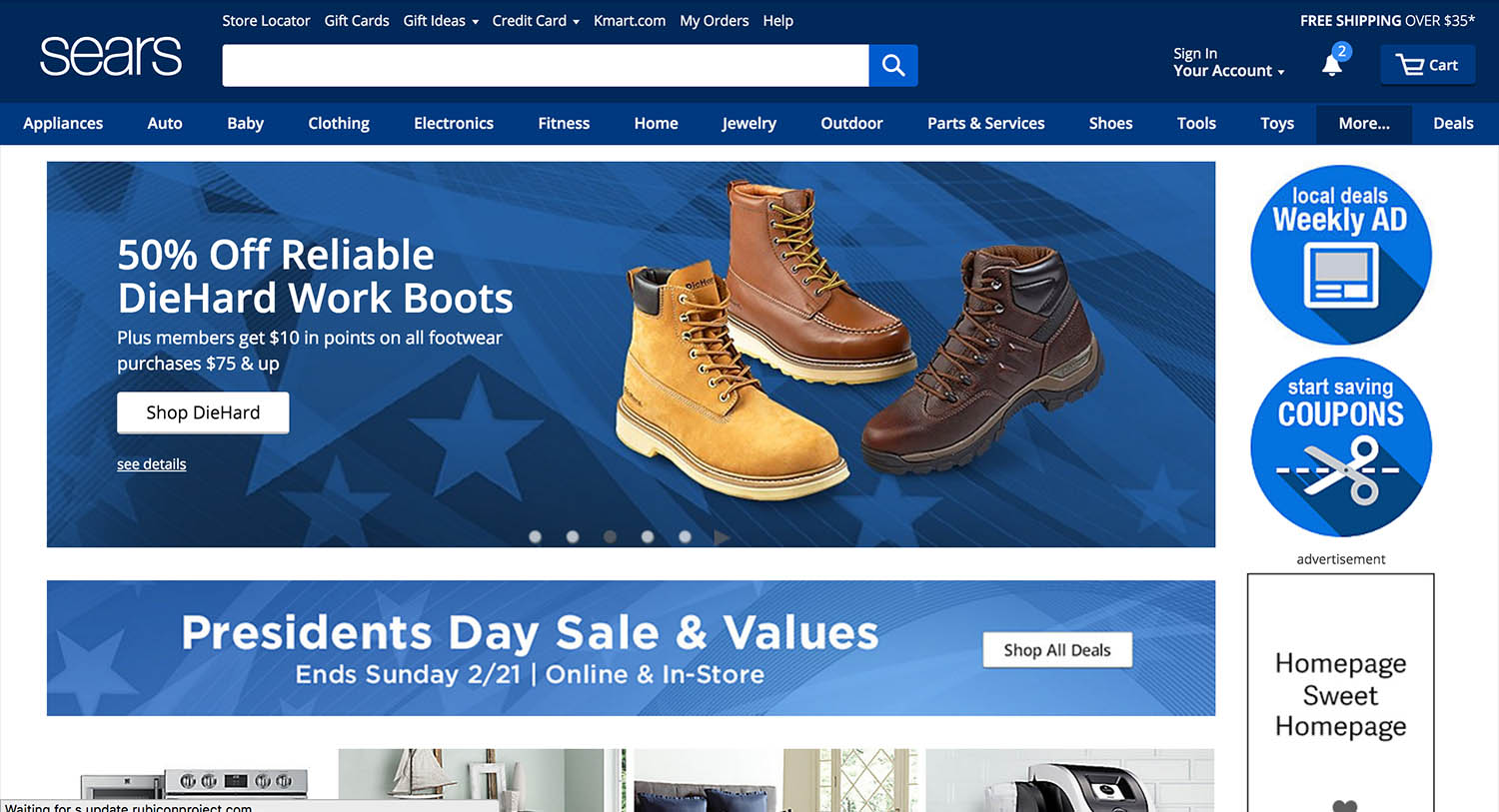

A comparison of Sears’ desktop and mobile homepage. Notice how the main navigation is collapsed on the mobile site, making the user much more likely to rely on the homepage content to establish their perception of the site’s product catalog.
The tendency to scroll the homepage to “get a feel for the site and the type of products available on it” is likely stronger on mobile because of two factors:
- Tiny Viewport – Users can simply view less of the mobile homepage than the desktop homepage due to the limited screen real estate, hence they have less of the site diversity featured within their default viewport.
- Collapsed Navigation – On the vast majority of mobile sites the main navigation is by default hidden away until the user actively expands it. Contrast this to desktop e-commerce sites, where 84% of sites display the first layer of the main navigation without any user interaction.
Despite mobile users having a greater need for a homepage design that allow them to infer the type of site, our desktop and mobile benchmarks reveal that mobile homepages tend to be oversimplified compared to their desktop counterparts. On desktop “only” 28% of the top 50 US grossing e-commerce sites have a homepage design that doesn’t allow their users to accurately infer the site’s product catalog – on mobile, the figure is 42%.
Mobile sites often have their main navigation collapsed throughout the site because sites with more than a handful main categories would otherwise have to relegate the entire upper part of each and every page to these navigational links, or they’d need to rely on horizontal scrolling which can introduce a whole host of interaction issues on their own. However, a collapsed navigation means that new users landing on the homepage are no longer greeted by the site’s main product categories.
This must therefore be remedied by embedding the site’s main categories as homepage content. This way, the navigational links can be kept collapsed throughout the site, yet users landing on the homepage will still be greeted by a list of your most important product catalog categories which enables them to form an accurate perception of the range of products on your site.
This article presents the research findings from just 1 of the 650+ UX guidelines in Baymard Premium – get full access to learn how to create a “State of the Art” e-commerce user experience.