Key Takeaways
- Baymard’s testing reveals that a wide variety of payment-selection interface design patterns perform well for users on both mobile and desktop sites
- But 21% sites fail to offer more than 1 payment method in the first place
- Offering alternative payment options, and updating the primary button at payment, is key to meeting the needs of a subgroup of users
Payment method selection is a key step towards finalizing an e-commerce order.
After all, issues here — with regards to either selecting a payment method or using a preferred payment method — can stop users in their tracks.
Yet Baymard’s e-commerce UX benchmark reveals that 21% of sites have issues when it comes to offering payment options to users — directly resulting in abandonments as some users won’t want to, or be able to, proceed without their preferred payment method.
In this article, we’ll discuss our Premium research findings on payment method selection:
- Why the overall design of the payment method selection interface is unlikely to severely affect users
- How offering a variety of payment methods helps users complete their checkout orders
- Why it’s important to update the primary button for third-party payment selections
Why the Overall Design of the Payment Method Selection Interface Is Unlikely to Severely Affect Users
Our most recent checkout research, for both desktop and mobile sites, indicates that the payment-selection interface can be presented to users in a variety of ways — all of which we observed to perform well in testing.
This differs somewhat from our previous findings, where drop-downs and some radio button designs for selection were observed to perform poorly for a subgroup of users.
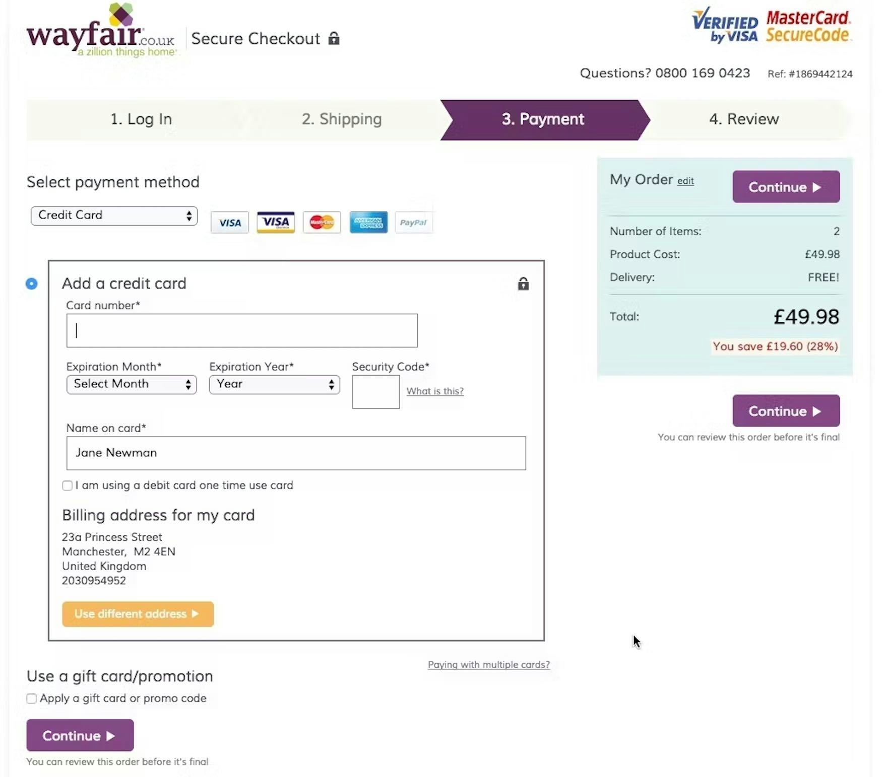
Drop-down payment-selection interfaces are rarely observed anymore, as seen here in a previous design at Wayfair.
For drop-downs, it’s a payment method selection interface that is observed rarely if at all anymore, compared to when we previously tested payment method selection during checkout.
Indeed, our test participants didn’t encounter a single drop-down interface during checkout testing, despite testing a variety of different interfaces across many sites.
Moreover, our most recent e-commerce UX benchmark supports this, as no sites used drop-downs for payment selection.
In short, drop-downs have — rightly — seemingly been determined to be a poorly performing design pattern, and have fallen out of favor completely with the largest e-commerce sites.
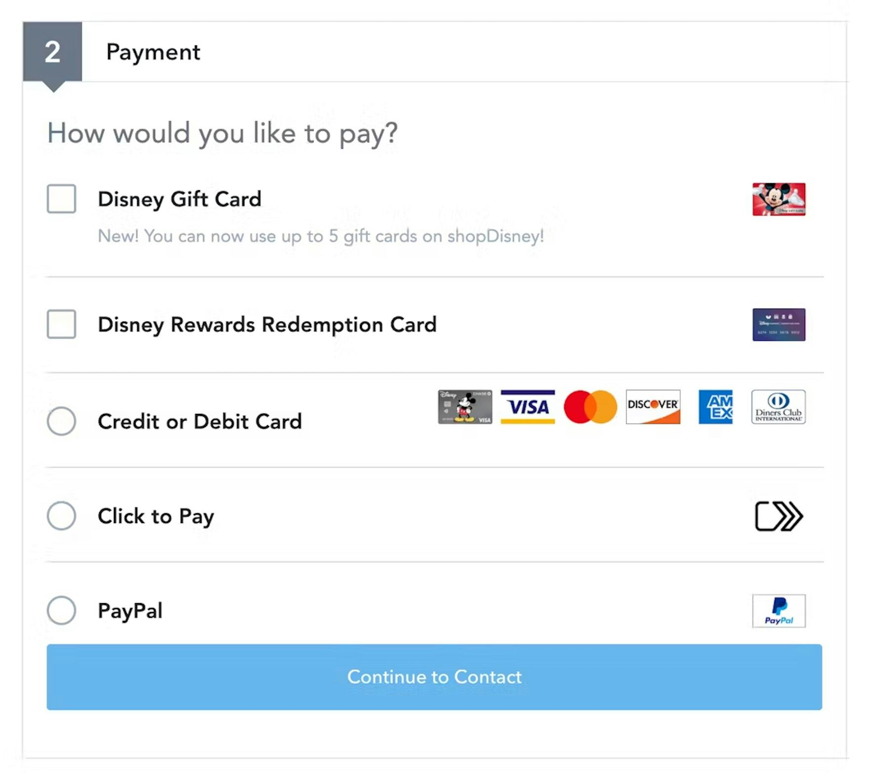
Users are unlikely to have difficulty navigating payment interfaces that use radio buttons, such as seen here at Disney Store. However, selecting a default payment method should be considered if there’s a strong preference among the site’s users (typically, credit card for US users).
For radio buttons, our findings indicate that users will generally have no difficulty navigating radio buttons for payment selection.
As third-party payment methods have become more popular, it’s increasingly likely that users have been trained to look for multiple payment methods and, in particular, their preferred payment method.
Thus, users seeking to pay with a third-party payment method will scan the interface closely to see if their preferred payment method is offered, and are unlikely to overlook it if it’s available.
Thus, the proximity issues that can arise with radio button interfaces were observed to not noticeably affect participants during our latest round of testing navigating the payment method selection interface.
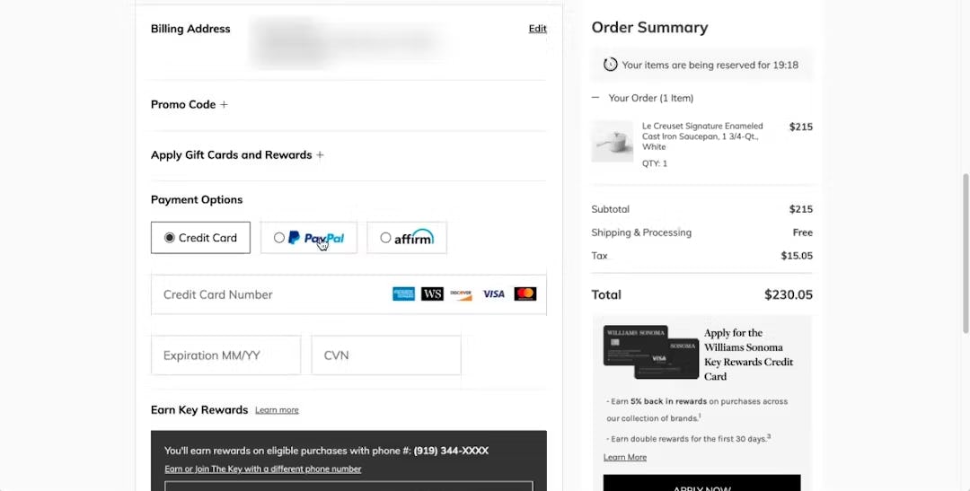
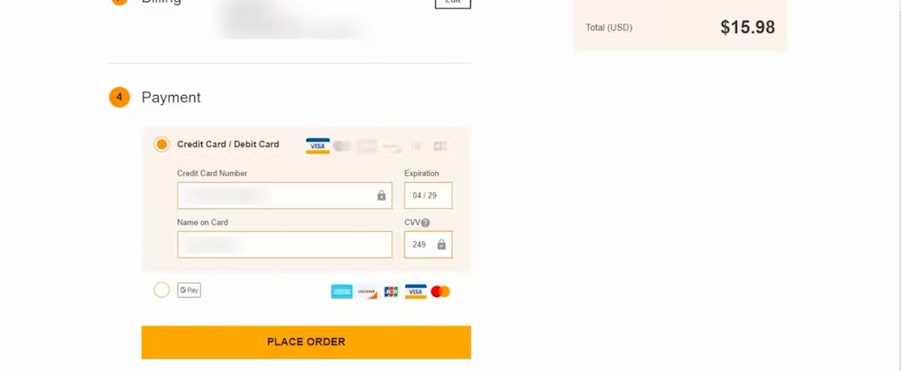
During testing at Williams Sonoma, the popular “Credit Card” option was selected by default, allowing users to immediately begin inputting their credit card details without needing to manually select the option first.
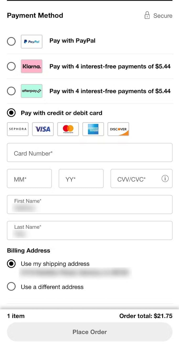
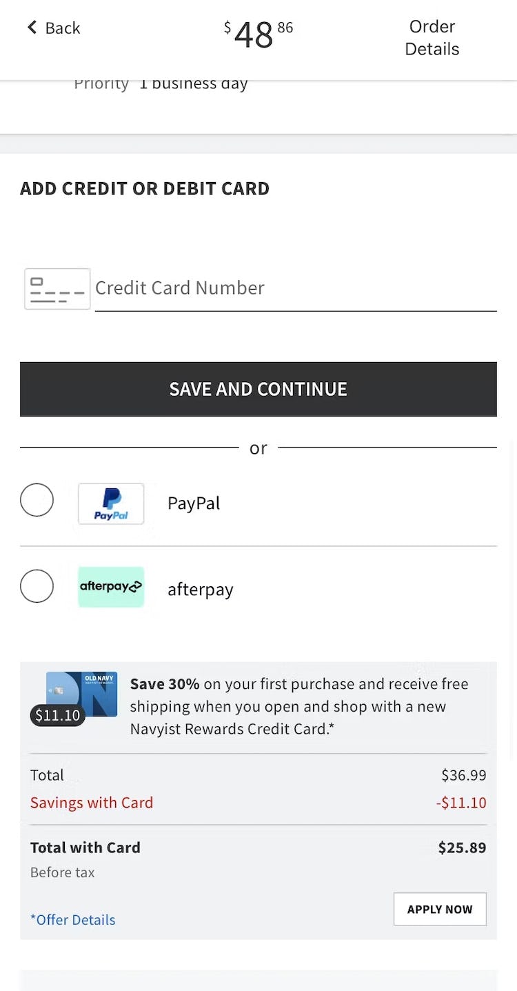
All mobile payment interface designs tested were observed to perform equally well for end users, including the ones seen here at Sephora (iOS, first image) and Old Navy (iOS, second image). Additionally, both default to “Credit Card” payment, streamlining progress through the payment step for most users.
Finally, our payment method selection interfaces previously identified to perform well — that is, a vertical or horizontal tabbed interface — still perform well for end users, along with having a default selection.
The payment-selection interface can be presented to users in a variety of ways on desktop and mobile sites — all of which we observed to perform well in testing.
To summarize, then,
- drop-downs should still be avoided for payment method selection (though they seem to be mostly gone anyways from the e-commerce payment method selection landscape),
- radio buttons can be used,
- horizontal or vertical tabbed interfaces continue to perform well, and
- setting the most popular payment method as the default — typically credit cards for US users — is still recommended, though not required.
Thus, our desktop findings now align well with our findings for mobile payment selection interfaces, in which a variety of payment selection interfaces were tested and all were observed to perform well for end users.
(Tip: see 800+ mobile and desktop payment interfaces by going to our Payment Page Design Examples page.)
How Failing to Offer a Variety of Payment Methods Hinders Users
However, the above findings don’t mean that there’s no room to improve the payment method interface for users.
On the contrary, third-party payment method selection is still a source of user frustration and disruption.
“I am disappointed that PayPal’s not an option.” This participant wasn’t able to use her preferred payment method at Theo Chocolates. For some users, the unavailability of their favorite payment method makes purchasing more cumbersome — and can potentially lead to abandonments.
In particular, the lack of desired third-party payment methods continues to be an abandonment point for some users.
Indeed, while the majority of US users still prefer to pay with a credit card, a small but very clear subgroup in testing maintained a strong preference for using third-party payment options.
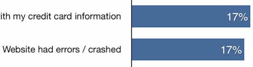
In fact, according to our quantitative study of reasons for checkout abandonments among 2,219 US online shoppers (2023), 11% had abandoned a checkout during the past three months because the site didn’t offer their desired payment option.
Furthermore, beyond having a strong preference for third-party payment options, other users may rely on them as a fallback when their primary method fails during checkout.
Indeed, our same quantitative study on reasons for checkout abandonments showed that 6% of users have abandoned a purchase during the checkout flow in the past three months because their credit card was rejected.
From a user and business standpoint, it’s therefore highly sensible to offer at least 1 or ideally more third-party payment options as alternative choices.
Offering third-party payment options caters both to the small segment of users who will abandon their purchase if third-party payment isn’t an option (up to 11%) as well as credit card users who experience validation errors (up to 6%) and who may use the third-party payment option as a fallback payment method.
Additionally, the specific third-party payment options to offer will vary significantly depending on the location of a site’s users.
To get started, consider including 1 or more of the following third-party options, depending on the location of users:
- US: PayPal, Apple Pay, Google Pay, Amazon Pay, Venmo, Klarna, Afterpay
- Austria: EPS, Sofort
- Belgium: e-wallets
- Estonia: e-wallets
- Germany: Bancontact, SEPA, Sofort, Giropay, Invoice
- Netherlands: iDEAL, SEPA
- Poland: Przelewy24
- Romania: Cash on delivery, online banking
- Russia: e-wallets
- Sweden: Open Invoice, online banking
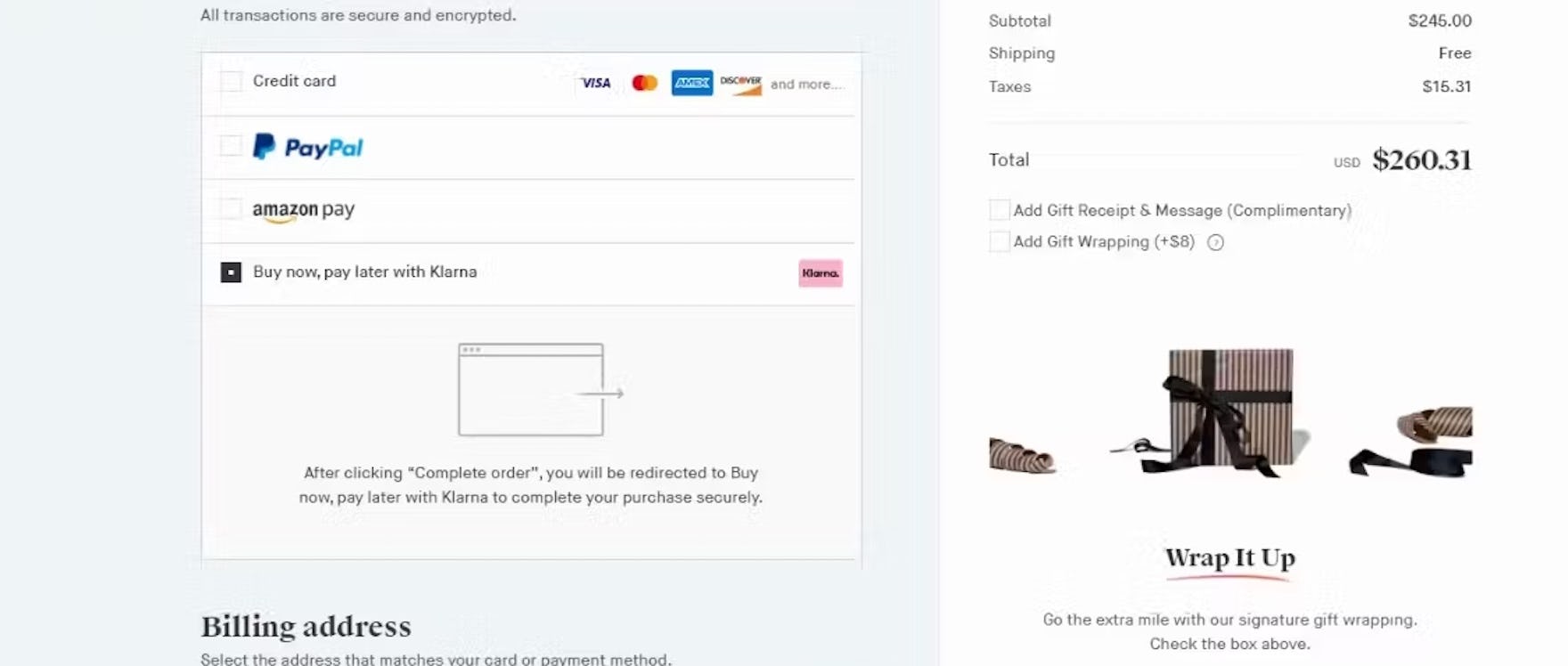
Why It’s Important to Update the Primary Button for Third-Party Payment Selection
During testing we observed that participants who opted for third-party payment options at the payment step of checkout hesitated to move forward when the next step was unclear.
Specifically, most third-party payment methods temporarily route users off-site before returning them to the retailer for the order review or confirmation step.
“To me it’s a little bit weird, saying that I’m completing my order, but I haven’t put in a payment yet…how can I complete the order if I haven’t put in any of my information yet?…I thought I was doing this right, the explanation of what Klarna is made sense, but this seems kind of weird.” This participant opting to pay for his order at Snowe using Klarna came to a halt because the primary button microcopy implied that the order would be complete on the next step, when in reality he expected to be redirected to Klarna (which was indeed the actual next step). While the payment-selection interface displayed some explanatory text, he overlooked these details and instead focused heavily on the primary button itself.
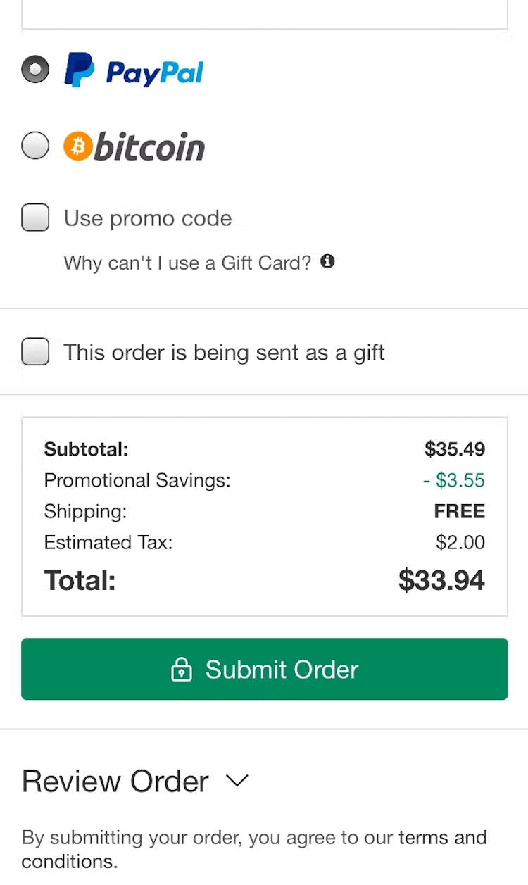
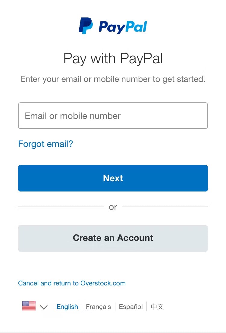
At Overstock, the primary button microcopy reads “Submit Order” (first image). However, when tapping “Submit Order” users are instead taken to Paypal’s site to complete the purchase (second image). Users who aren’t expecting to be taken from Overstock’s site will be confused, and some may abandon if they’re disoriented enough.
In testing, participants faltered when the site did not provide clear signals about this next step.
In particular, the primary button is key to setting user expectations.
In testing, participants often hesitated to move forward with their desired third-party payment method when the button microcopy remained generic, ambiguous, or misleading — for example, continuing to read “Submit Order”, as it would for a credit card payment, when users would in fact be directed to Paypal.
In practice, both users who are and are not used to third-party payment flows can be uncomfortable when the next step is ambiguous or unclear, causing them to delay their progress through checkout.
In addition, during testing some sites relied on a description of the selected third-party flow to set correct expectations.
However, the explanation itself was often not enough if it was combined with generic primary button microcopy, with some participants overlooking the description or becoming worried over the contradiction with the primary button microcopy.
As such, relying only on reassuring text is insufficient.
After selecting Afterpay as his payment type, this participant at Wayfair immediately identified the next step as being transferred to Afterpay’s site due to the clear primary button microcopy reflecting his payment choice. Note that this participant had no issues even though there was no explanatory text provided.
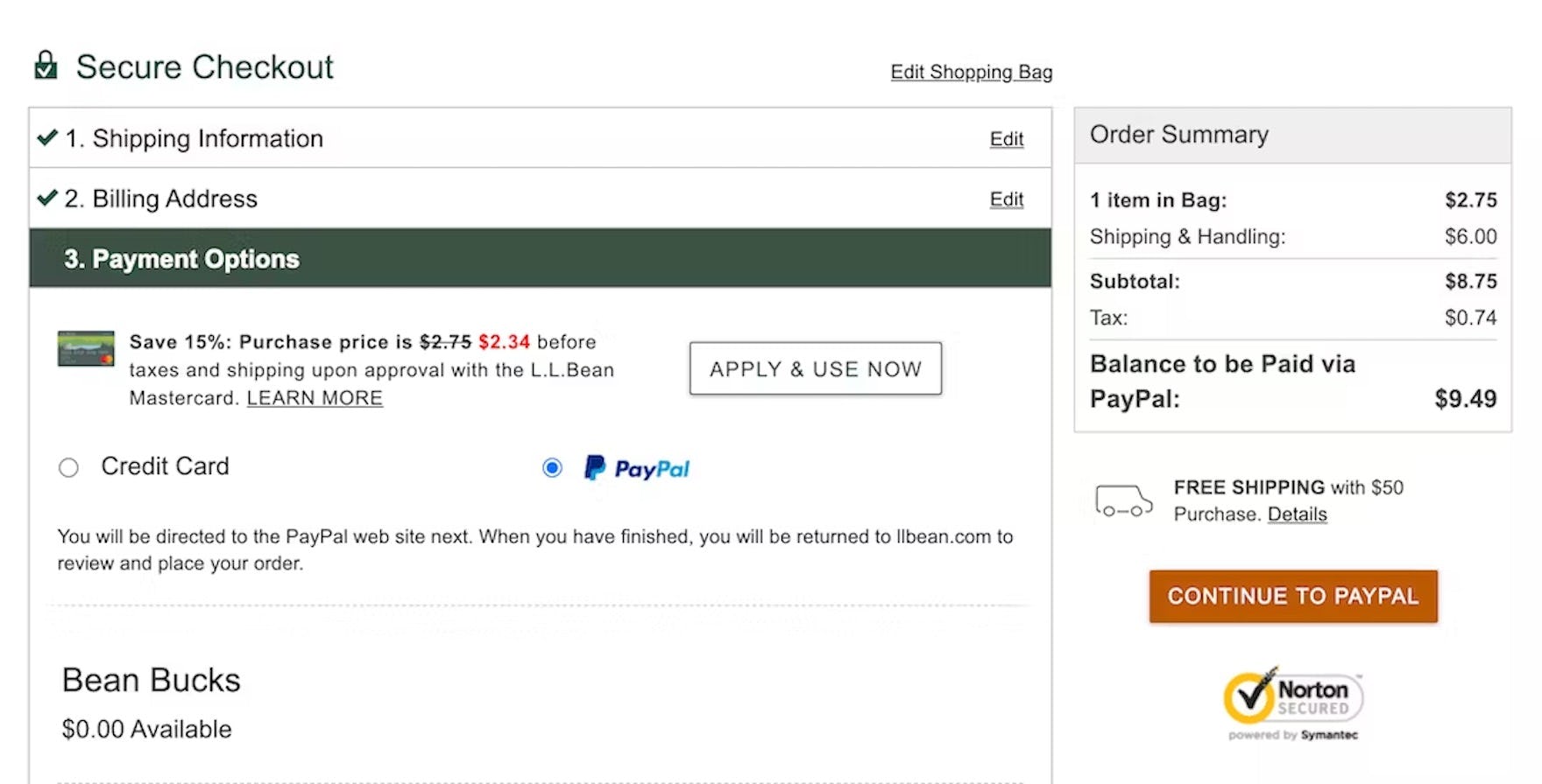
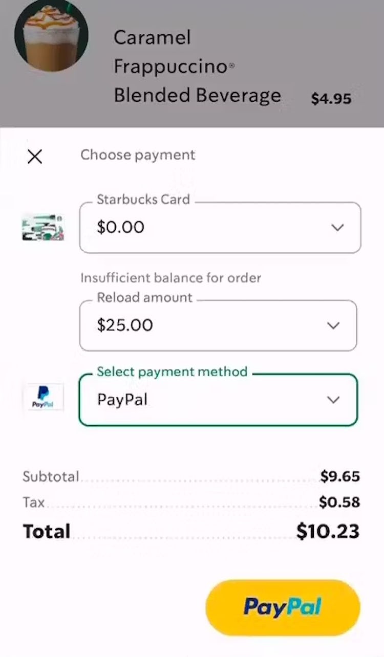
During testing on the Starbucks app, this participant selected PayPal as their payment method, and the primary button updated to reflect this selection and match the new next step of being directed to PayPal.
Therefore, to best set expectations, at the payment step the primary button should update to precisely reflect when users have selected a third-party payment option.
Reflecting the next step in the primary button microcopy lets users know exactly what to expect and helps them feel more comfortable moving forward.
For example, if the primary button microcopy reads “Complete Order” when a credit card is selected as the payment method, it should update to “Continue to Paypal” if Paypal is selected.
Support Users’ Needs by Offering a Diversity of Payment Options
Neither KiwiCo (first image) nor Menards (second image) offer any third-party payment options, severely limiting users’ choices, and likely guaranteeing a subgroup of users will abandon their order.
While the vast majority of users (in the US) continue to use their credit card as their preferred payment method, testing has revealed a consistent subgroup desires to pay with an alternative method.
If that alternative method isn’t available, most users will fall back to using a credit card.
However, our quantitative research indicates 11% will choose to abandon instead.
It’s therefore key to support as many users as possible by offering a diversity of payment methods, depending on the location of a site’s users.
Furthermore, it’s key to support users’ expectations at the moment of payment by updating the primary button microcopy to reflect the third-party payment method chosen by the user.
Yet our e-commerce UX benchmark reveals that 21% of sites fail to offer at least 1 third-party payment method — leaving themselves at risk of lost sales or disgruntled users.
This article presents the research findings from just a few of the 650+ UX guidelines in Baymard Premium – get full access to learn how to create a “State of the Art” e-commerce user experience.
If you want to know how your desktop site, mobile site, or app performs and compares, then learn more about getting Baymard to conduct a UX Audit of your site or app.