The primary purpose of the Product List is for users to easily and accurately determine which products to investigate further. When information is lacking, inconsistent, or inadequate, then the users will experience a plethora of usability issues, which can ultimately lead to site abandonment.
While there have been some improvements since we first started benchmarking Product Listing implementations at 60 top-grossing US and European e-commerce sites back in 2015, the issues are still apparent.
Our most recent usability tests and benchmark reveal that:
- 42% of sites display too little product information in their product lists for users to accurately evaluate if a product page is worth exploring or not (a marginal improvement from 46% in 2015).
- 42% of sites display information so inconsistently in the product list that it’s impossible for users to make a basic comparison of the products (an improvement from 64% in 2015).
- 11% of sites use a thumbnail size that is “inadequate” for most users to perform a basic visual product evaluation in the product list (up from 32% in 2015).
A few sites actively mitigate these issues with a simple technique: utilizing the mouse hover state to display additional information or images — right within the list item, when the user moves their cursor over it. Our usability testing consistently shows that this extra layer of hover-enabled textual or visual information is observed to drastically reduce users’ wasteful “pogo-sticking”, where the user heads back and forth between the product list and product pages only to discard irrelevant products.
We consistently observe that displaying additional list item information on mouse hover leads to less time spent on irrelevant products, and more time spent with relevant ones — resulting in an overall higher rate of success at the tested e-commerce sites adopting this design.
Yet, our benchmark reveals that just 3% of e-commerce sites display additional textual information on hover, and only 28% show additional images on hover (up from 18% in 2015). In other words, around 70% of e-commerce sites don’t utilize this powerful hover state at all.
In this article, we’ll present our large-scale e-commerce usability test findings on displaying additional list item information and thumbnails on hover, in particular:
- The many usability issues that additional hover information is observed to solve,
- The 6 types of hover enabled list item info that performs well during testing,
- Discuss how this should be handled on mobile and touch devices where there is no hover state.
Product List Design is a Balancing Act
From our usability test sessions it’s clear that the product list is essentially a balancing act: each list item should display sufficient information for the user to properly screen and compare the products to one another (to determine which items are of relevance to them). Yet, the list items shouldn’t display so much information that the product list as a whole gets cluttered and causes users to lose their overview of the options available.
Insufficient list item information increases the likelihood that users will overlook relevant products, while excessive information makes it difficult for users to get an overview and can make the page appear intimidating. It’s not a matter of “less is more” but rather “just enough is more.”
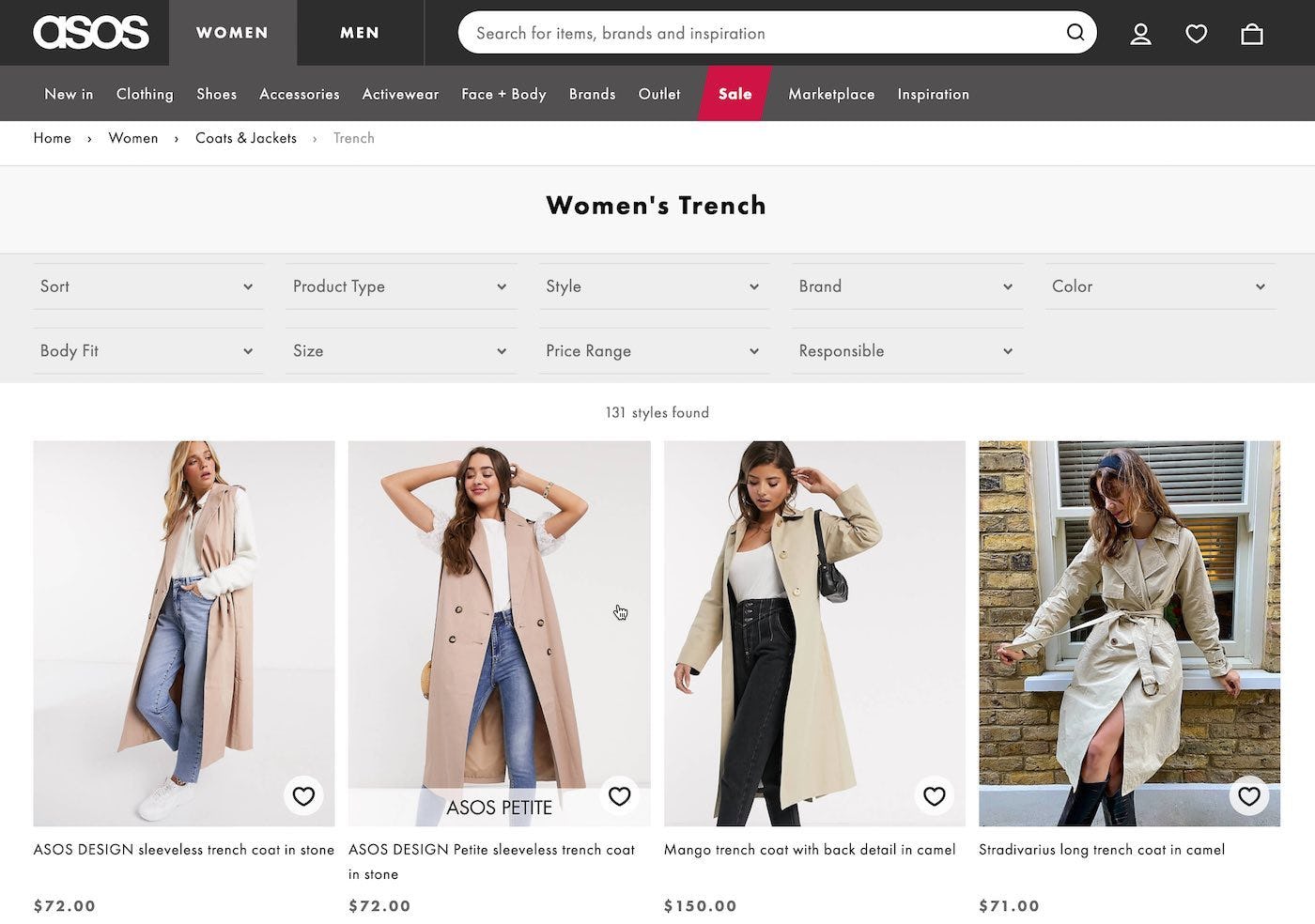
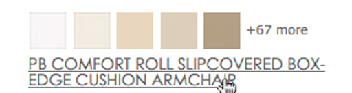
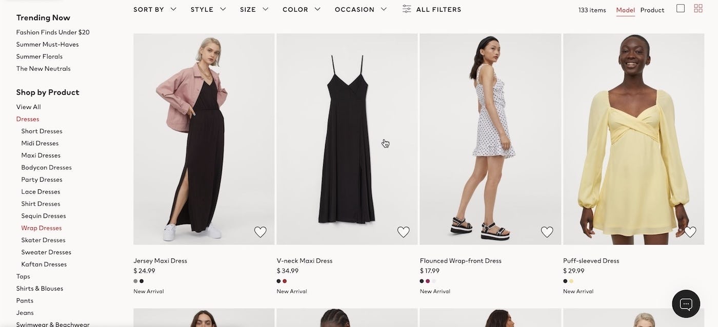
In testing, some users became frustrated when they were unable to see products without the models, such as seen here on ASOS, and ended up opening the product page of numerous items that she immediately discarded once she saw their “coat only” images.
In practice we observe both during usability testing and benchmarking that most sites opt for a “clean looking” list item design. The problem is that this very often leads to too little information being available in the product list. It’s a classic case of false simplicity as it actually makes it more difficult for the user to decide which products to explore.
During testing, too little visual or textual information in the product list was observed to lead the test users to extensive “pogo-sticking” — when a user jumps back and forth between the product list and the individual product pages to learn the very basics about a product (product types, the key spec, or visual impression). In this tedious process the user often only stays at the product page for a few seconds before realizing the item is completely irrelevant to them.
In practice, this leads users to spending the majority of their time on completely irrelevant products, and often cause them to overlook relevant items — something we observe time and against during our research studies. Unsurprisingly, after 3-15+ minutes of looking for a needle in a haystack, fatigue sets in and many of the test users simply give up and abandon the site.
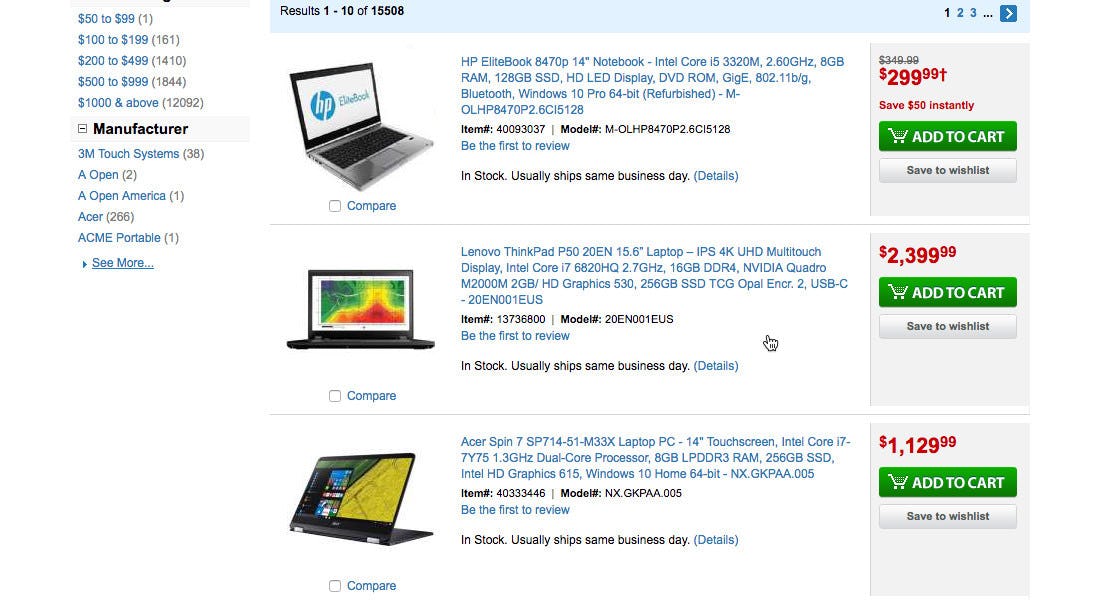
While TigerDirect provide a lot of information about their products, they do so in a way that makes it difficult for the user to easily scan and understand the product details (see our article 3 Key Design Principles for Product Listing Information for more details on how best to show product list information).
Displaying too much information in the product list is a much less common problem but that too is an issue when it does occur. Excessive list item information can make the page seem overwhelming and make it difficult for users to get an overview of the options available to them because the product list becomes difficult to scan.
In short: Displaying too much textual or visual product information directly in the list items can clutter the product list — yet at the same time extra information can clearly also provide the user with helpful product insights that are essential to the product finding process. As mentioned in the beginning of this article, it’s a balancing act. Luckily, the mouse hover state can help us strike that balance gracefully.
Display Secondary Images and Info on Hover
During the usability test sessions, when sites displayed an alternate thumbnail or secondary product information on mouse hover, the users had a much easier time screening and identifying relevant items in the product list.
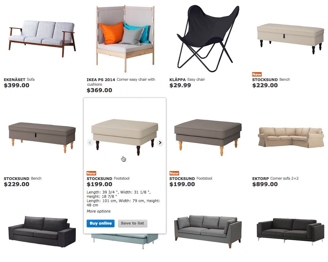
At IKEA, both product dimensions, and repetitive buttons, are presented on hover. This enables a very simple product list with minimal clutter yet also manages to convey a lot of information about each product the user might be interested in – and perhaps most importantly enables the user to compare the products in the list to one another across the two key attributes of the category (product aesthetic and price) without hovering.
The big benefit of revealing additional information on mouse hover, is that it allows you to keep the default un-hovered state of the list items fairly simple. The default product list can thus be designed for optimal scannability (which helps users “screen” the list), while the hovered item can be optimized for product insights (which helps users inspect and identify relevant items that appear relevant to them during the “screening”).
This provides us with the best of both worlds: the user is presented with a more manageable and less intimidating product list upfront. Yet, because additional information is available on hover, the user also avoids having to bounce back and forth between the product list and numerous product pages just to figure out which products are relevant to them.
But what information and images should we show in the default view, and what should we show on hover?
6 Types of Information to Show on Hover
1) Visually Driven Industries
When testing e-commerce sites in visually driven industries, such as apparel and home decor, one of the best-performing combinations for showing additional content on hover, was displaying both a thumbnail of the product in a “use context” as well as a “cut out” version, showing the product on a blank background. This combination helped the test users easily imagine how the product might look in a real-world scenario (the “use context” version) while also allowing them to inspect the product isolated from any clutter (the “cut-out” image).
At H&M, users can see both a contextual “in use” thumbnail (the clothing worn by a model, first iamge) and a “cutout” image on hover (second image). We observe that this allows users to both see “what they are actually buying” and at the same time see the product in an inspirational context of use — something that was greatly appreciated by the test users.
Cut-out images are good for comparing one product to another, while contextual images can “sell” the products on their aesthetics, mood and associated lifestyle, as seen here on Marks & Spencer.
The test data didn’t show any conclusive evidence to suggest which one of these two image types should be displayed by default and which should be relegated to the hover state — both variations proved to perform well depending on the context. We did find consistency to be key. So make sure that all list items display either “cut out” images or “use context” images by default and then switch to the opposite when however — never mix the two, as the lack of consistency caused great frustration for the test users.
2) Textual Product Information
Besides showing additional images in the list item (i.e., making extra visual information available on hover), showing additional textual product information on hover increased product list performance as well. In particular spec-driven products will often have long lists of key features and specs, which can be candidates for displaying as secondary hover information. The possibility of having a relatively “clean” default state is much more achievable when secondary product specifications can be relegated to a hover state.
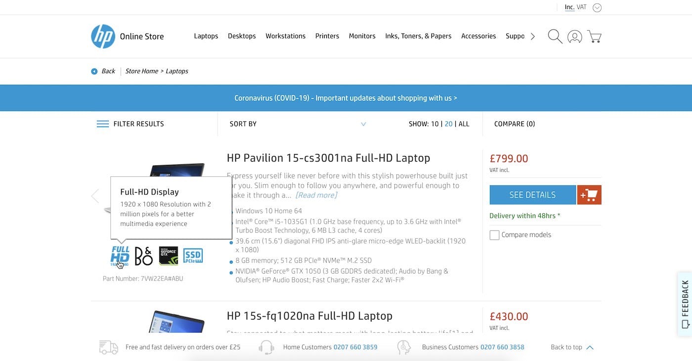
Many sites require a degree of domain knowledge to help understand certain product specifications. HP aid the user by explaining some of the core features and technical information about the product on hover.
Displaying secondary textual product information is a great way to strike the balance between simple and clean product lists while still giving users the option to perform an initial screening before deciding to visit the product page or not, as the default un-hovered list item can be kept simple and clean with the hover-state offering up additional information about key product attributes.
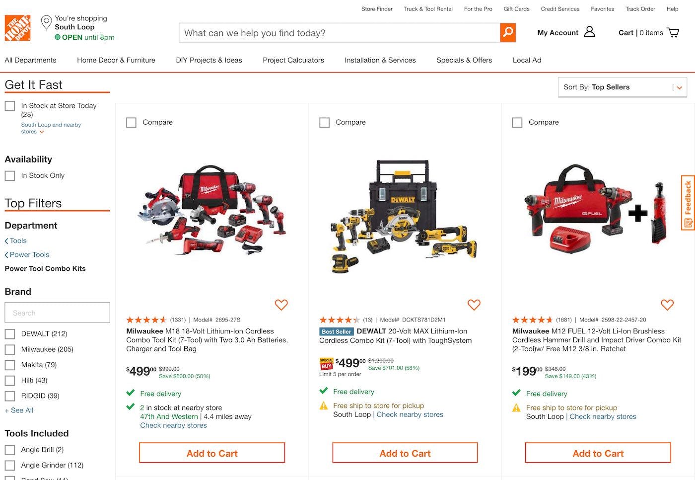
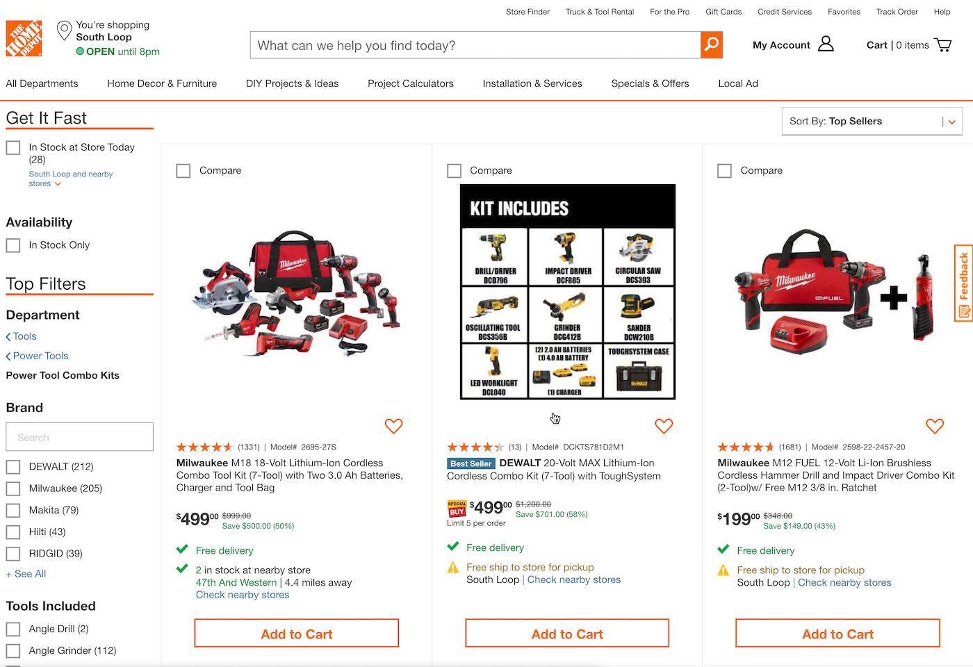
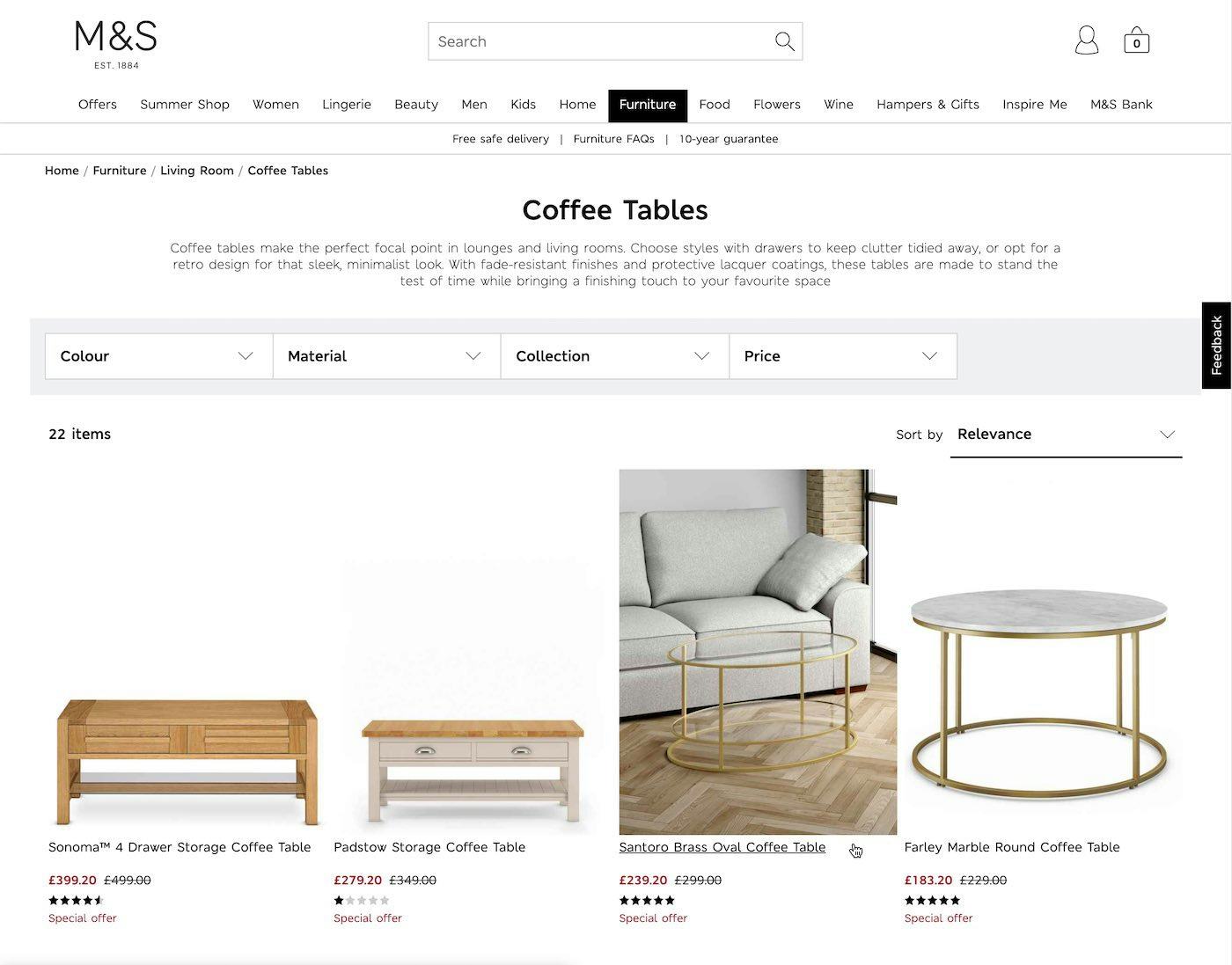
Home Depot provide a mix of textual and visual information for kit products to communicate to the user exactly what is available within the kit in closer detail. This helps users looking for a specific component via both the name and the visual appearance.
3) Product Variations
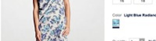
If multiple variations of a product exist, such as different colors, materials, patterns, sizes or styles, it is highly advisable to indicate this to the user at the un-hovered default list item, so that they are aware that different variations can be found at the product page. Typically this is best done by providing information scent like “6 sizes available”, or for colors by displaying colored dots or swatches (see our article on How to Implement Interactive Swatches on Mobile Product Listing Pages). However, the hover state can be utilized to elaborate upon which types of variations the user will be able to find.
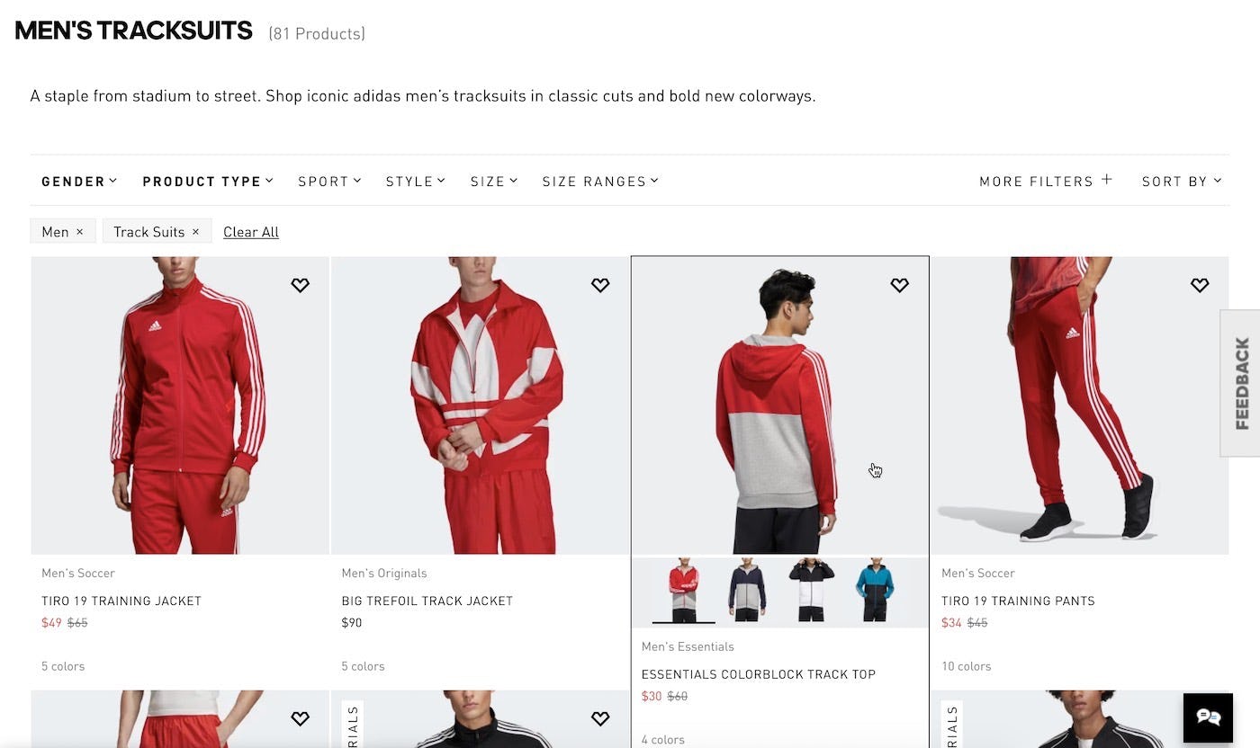
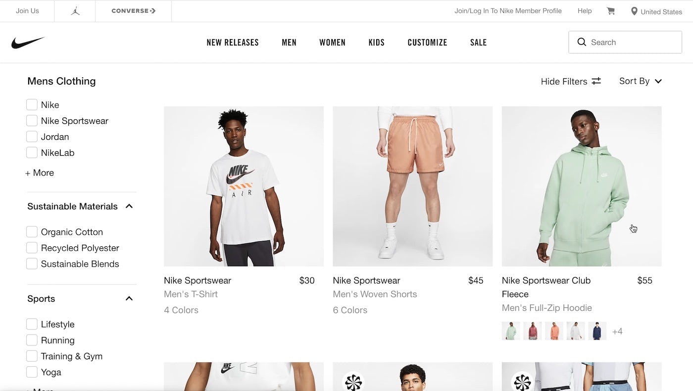
In the default non-hovered state at Nike and Adidas, users are told that multiple product variations exists, but once an item is hovered, an image gallery appears with thumbnails of these additional variations — making it much more likely that users will visit the product page even if they aren’t keen on the variation shown by default. Note that in both of the above cases, the sites should be showing color swatches on the non-hover state.
For visual variations, the indication of product variations can be expanded to show thumbnails of the other variations. This gives the user a much better idea of what the other variations look like. This can be critical for variations with major aesthetic differences where it may make the difference between the user discarding the product as irrelevant or worthy of further exploration.
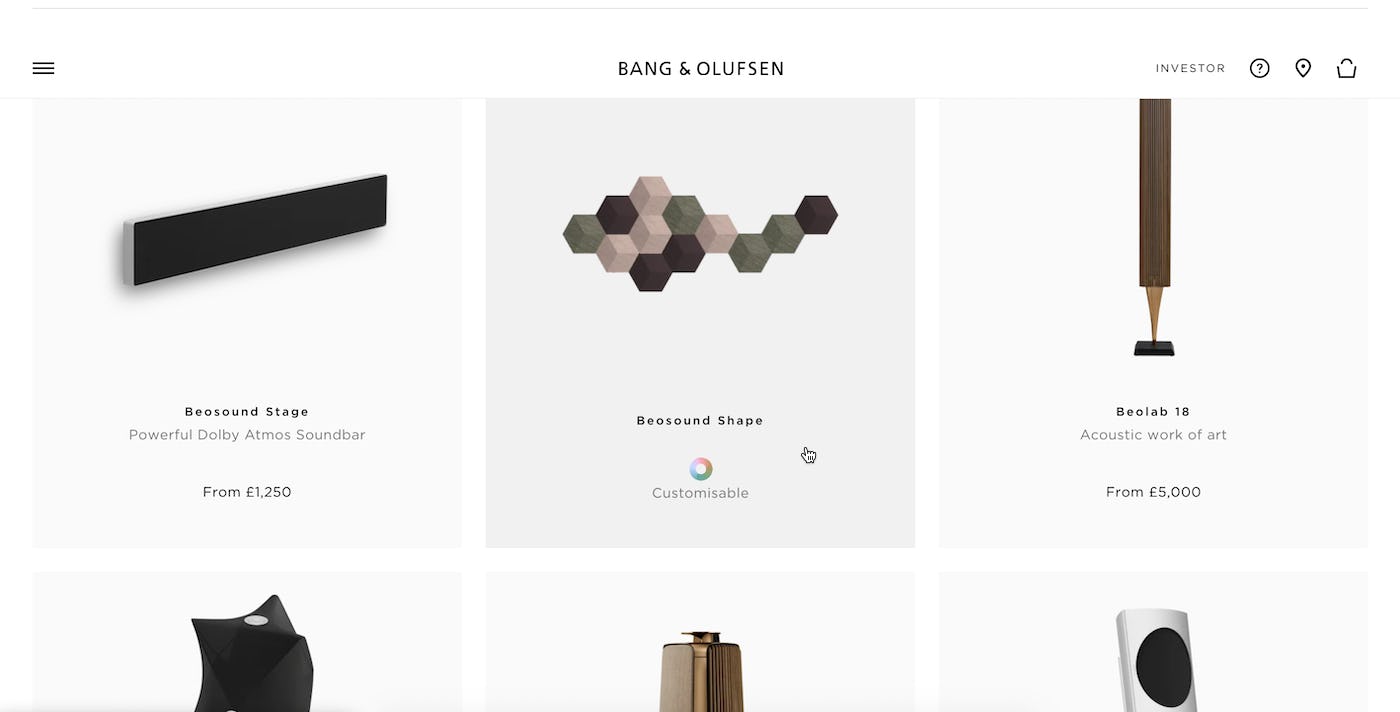
Bang & Olufsen indicate the products that are customizable by featuring this information on hover within the product list. Customization can be an attractive feature for many products and will encourage users to find out more.
For non-aesthetic/textual variations, the summary could be expanded to show the actual variation values. So for a pair of pants a summary like “6 fits available” could be expanded into “Available in Slim Fit, High Waist, Low Waist, Skinny Fit, Regular Fit, and Loose Fit”.
4) Repetitive List Item Elements
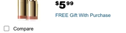
Some product list features are ideal candidates for being served as secondary hover information. This includes repetitive buttons such as “Add to cart”, “Wishlist”, and “Compare” — after all, users can’t click two buttons at the time. Nonessential list item info generally includes site policies (e.g., “Available Online”) or product deals (e.g., “On Sale” ) and is added to inform users or entice them to make a purchase. Additional examples include “New Arrival”, “Free Shipping”, “Home Delivery Available”, “Click and Collect Available”, ”Pickup Free”, “90 minute delivery” “Buy Online”, “Ship to Store”, etc.
Displaying these types of features on hover therefore helps reduce the visual clutter in the product list without limiting list item functionality.
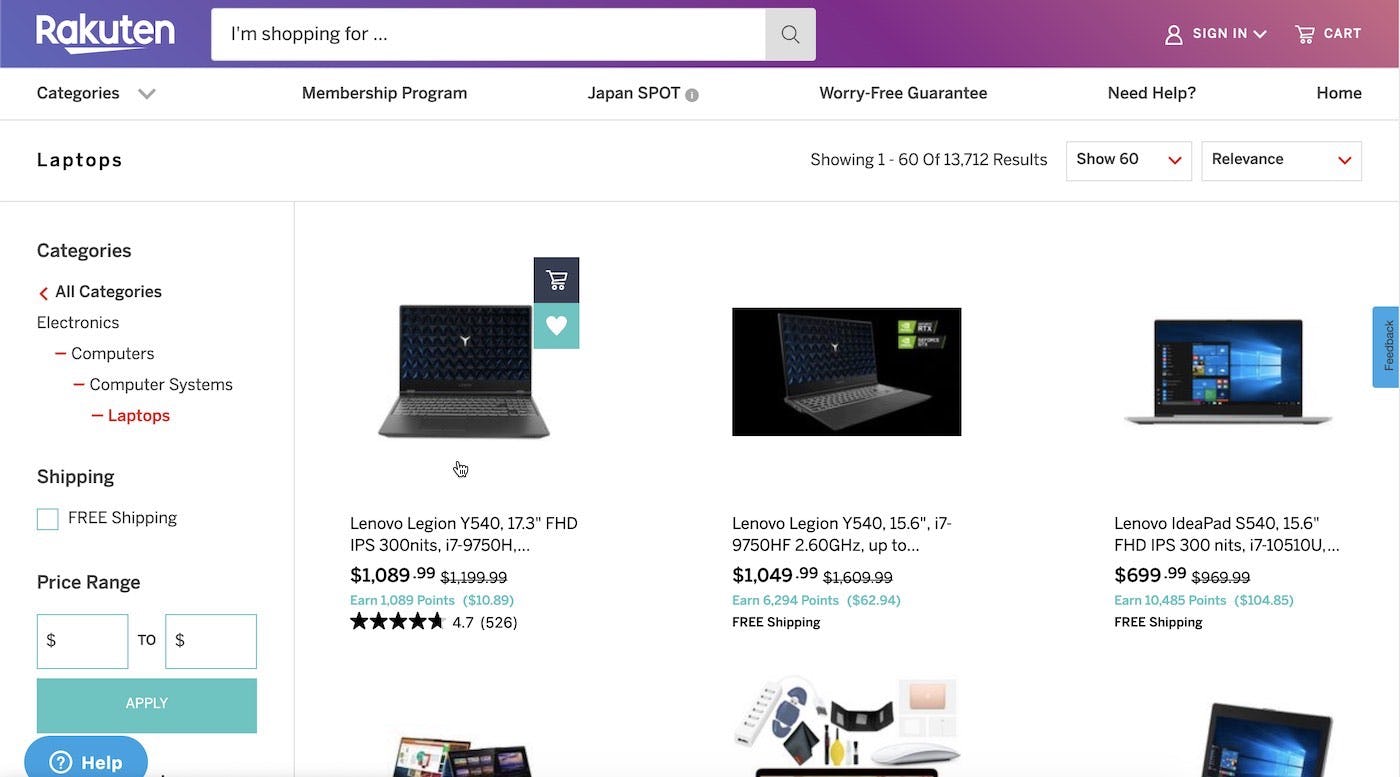
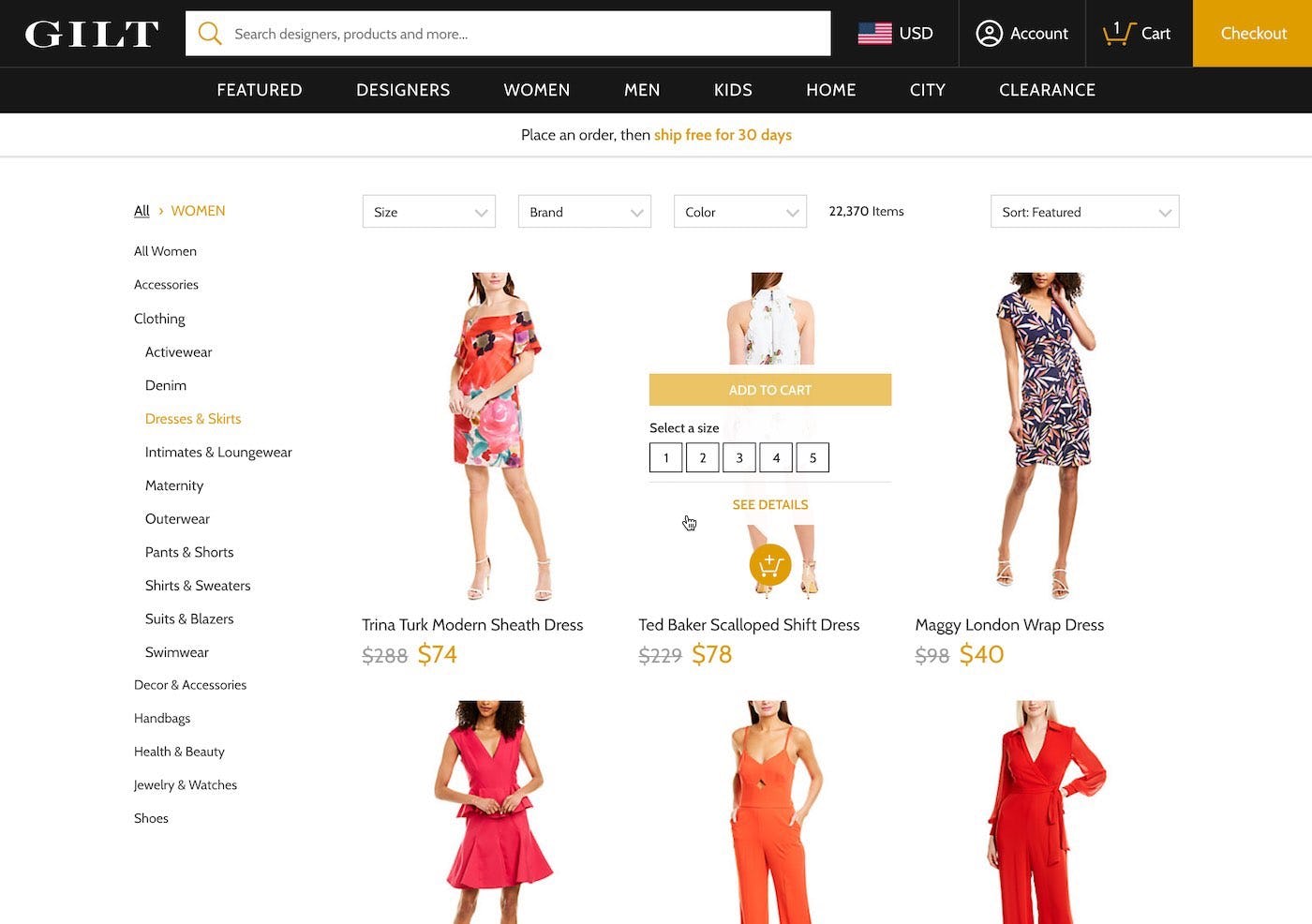
Rakuten only display the repetitive “Add to Cart” and “Add to Wishlist” features on hover while Gilt showcases the product’s available sizes along with repetitive UI elements, such as the “Add to Cart” button. Permanently showing such repetitive elements can significantly clutter an interface and remove focus from the actual product information.
On desktop sites, there’s generally no need to permanently display nonessential interactive elements like “Add to Cart” buttons, “Save” features, or “Compare” checkboxes. Instead these can all be shown when users hover the individual list item.
In addition to reducing the clutter in the product list and making it easier to scan, saving nonessential elements for hover on desktop also has the advantage of drawing users’ attention to the nonessential elements at the exact moment when they might actually be useful — when a user is indicating their interest by hovering a list item, and thus may want to select it to compare, add it to the cart, or save it to a wishlist.
5) Compatibility-Related Thumbnails
A bit surprisingly, we observed that displaying an additional thumbnail in certain spec-driven industries can also improve product list navigation by providing compatibility-related thumbnails on hover. For instance, during testing the users were observed to explore sleeping bags based on “how warm they looked” and browse laptop adapters based on which one looked like it would fit their laptop.
A good example is camera bags, which can beneficially display both a closed outside view of the bag (to showcase the product aesthetics), along with another “compartment” view where the bag is open with a camera placed inside it (i.e., the compatibility-related thumbnail, showcasing the “fit” of the product). This can provide users with an idea of how the product will perform in its intended use.
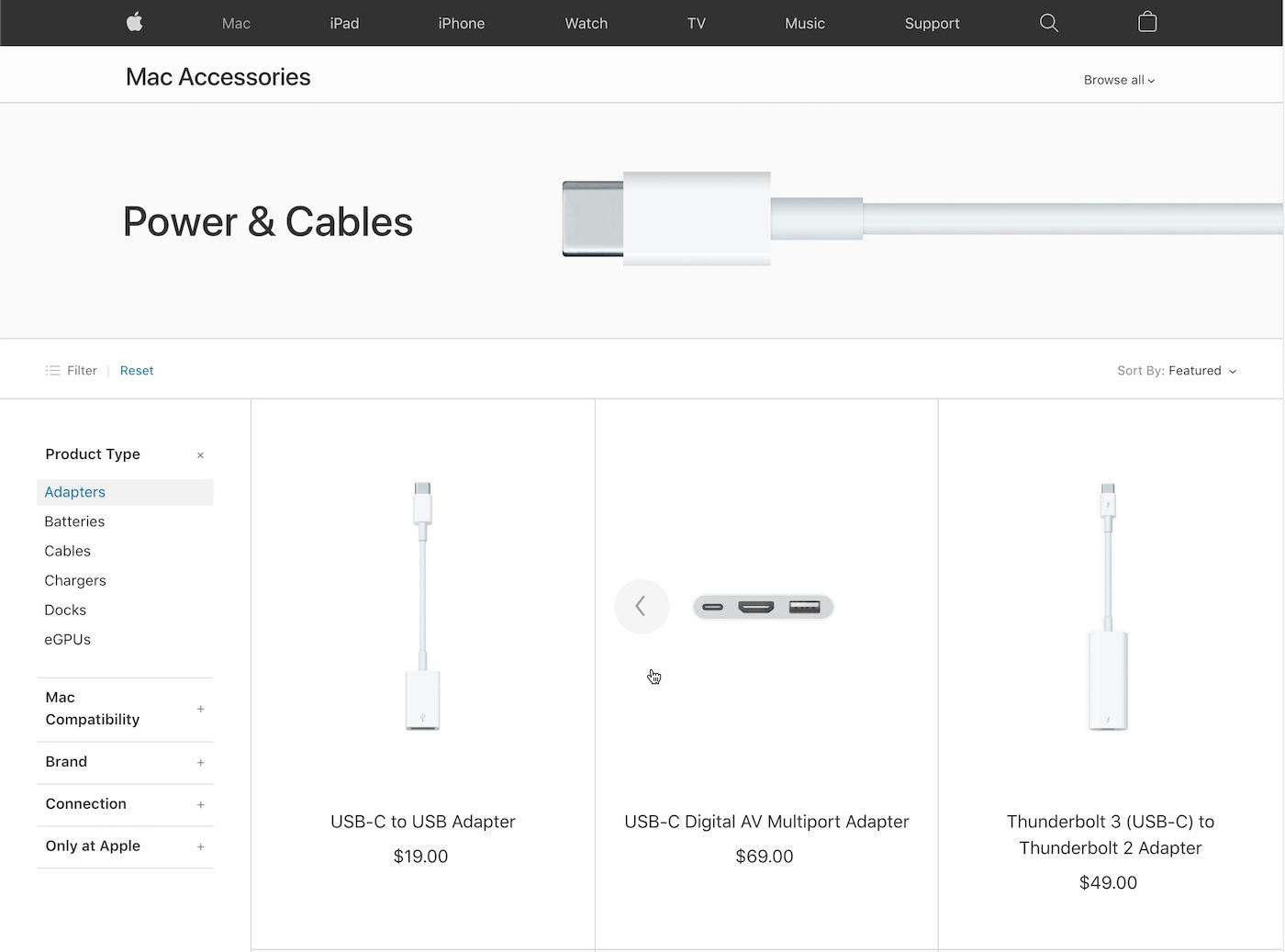
In particular for technical products where compatibility aspects typically require extensive domain knowledge, users often rely on close up images of the comparability aspects. Apple recognize this behavior and therefore have a secondary compatibility-related thumbnail for many of their accessories, as seen here where a close-ups are displayed for the various plugs and connections of various adapters.
Even strict compatibility relationships can also benefit from an additional visual layer as users will often try to determine compatibility based on product visuals. Especially close-up images of plugs, ports, and connections can help users in doubt of what the correct technical name is for their needed connections. Additional thumbnails can provide these users with visual reassurance of compatibility. Systematically including and tagging compatibility thumbnails can be a part of a larger compatibility database structure as well as ensuring that your site supports compatibility search.
Do note that while certain compatibility products need to be displayed together with their “dependency” product to make sense (for example, a camera lens will often be attached on a camera or a cushion sleeve fit onto a cushion, etc.), this may confuse users as it can become unclear what is actually being sold — is it a camera bundle with a bag and camera, or is it just the camera bag with a sample camera, or vice versa? This can be an otherwise tricky dilemma to resolve, but well-chosen secondary thumbnails proved effective at it during testing.
6) Displaying Vital Features
Another practical use of a secondary hover thumbnail is for highlighting a key product feature in addition to the regular “cutout” image. For instance, when purchasing a sleeper sofa, users will obviously not only be interested in “how it looks as a sofa” but also how the sofa works as a sleeping space (i.e., when it is unfolded) – the ideal job for a secondary hover thumbnail.
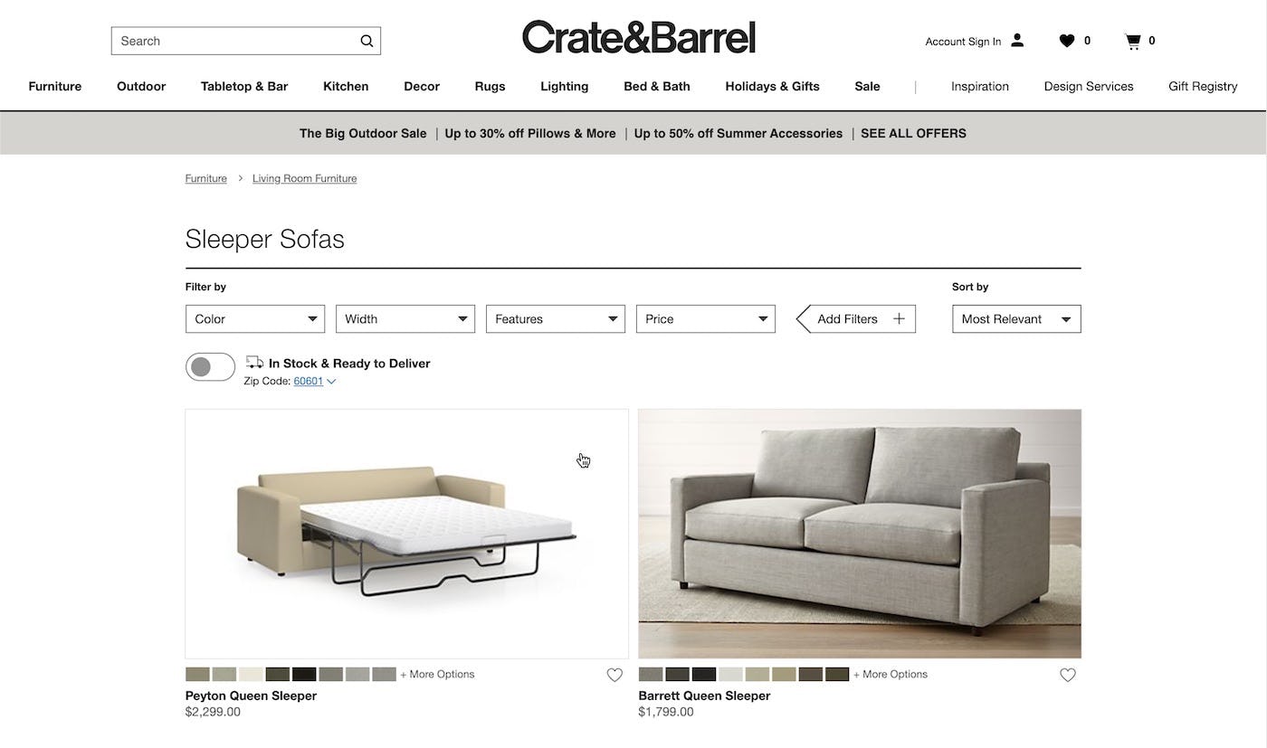
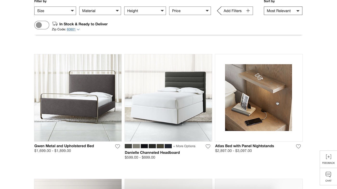
Crate & Barrel highlight the key product feature with the hover image, such as “Sleeper Sofas” unfolded bed state or details of a nightstand. Users will benefit from seeing both states on the product list page.
When considering vital features, it is important to note that certain products’ vital features might be self-evident. For example, the vital feature of a laptop sleeve is that it can fit and protect a laptop — this doesn’t necessarily need to be shown if other aspects of the product might be more relevant to highlight.
A product’s “vital” feature may therefore change depending on the user’s context. For instance, a user searching for “sleeper sofa” is likely to consider the “sleeping” aspect the vital feature. However, another user searching for “living room sofa” might actually be more interested in seeing the sofa in a usage context, as they are interested in other aspects of the product. Of course, this not only applies to search but can also be adapted based on the current categories as well as any applied filters — anything that may hint at a user’s interest or preference.
Don’t Go Too Far
While these hover effects proved to help out users greatly, and the product lists without such features (currently 70% of sites) generally caused a lot more needless back and forth, it can be taken too far.
While it might be tempting, especially in visually-driven industries, to push almost all text into the hover state, the usability tests showed that this can cause severe usability issues. When basic product information is relegated to a hover state, it makes it very difficult for users to quickly glance over the product list and gauge the relevance of each product.

An early Ann Taylor product list design took things to the extreme by hiding all textual product information (including price!) in the default state, only revealing this information on hover.
When vital product attributes are permanently displayed in the product list, the user can simply glance over the list and make basic comparisons. Whereas if, say, ‘Price’ is relegated to the hover state as secondary production information, the user will have to move their mouse over each and every product in the list to learn something as basic as its price, memorizing the position of all the items that have just the slightest interest.
How About Touch Devices?
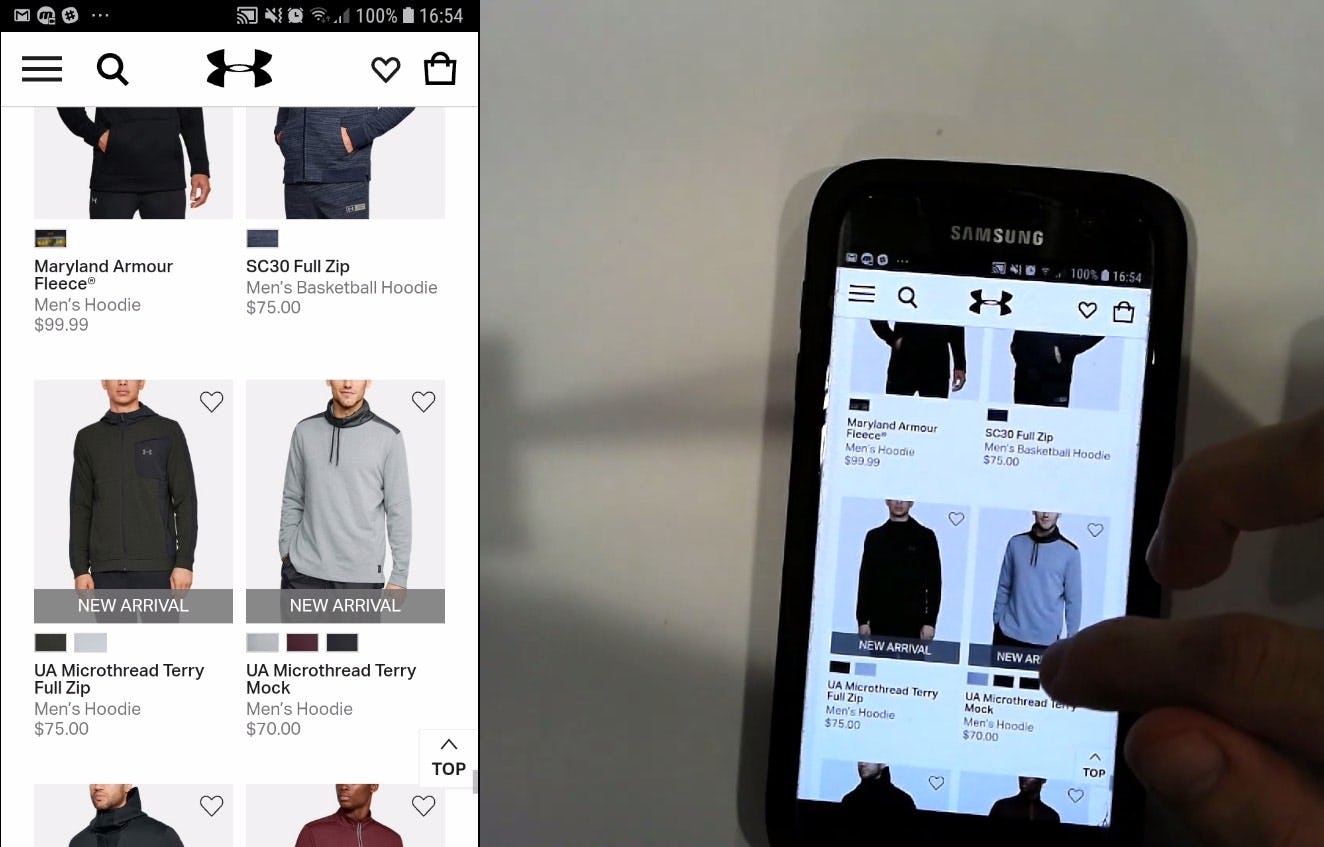
Under Armour’s mobile site chooses to display relevant information straight onto the product list page (such as using swatches to indicate variations) and includes repetitive elements like the “Wishlist” feature (though not in the center of the image, which should avoid unintended taps).
On touch devices there is no hover state. So how do we deal with this in our smartphone and tablet designs?
The test data in our large-scale studies on Mobile E-Commerce and Product List usability suggest that this secondary data simply shouldn’t be shown in the mobile product lists. It actually feeds back into the “don’t go too far” principle: that is, make absolutely sure to only relegate secondary information to the hover state.
Any basic product information must be permanently visible in the list item or the hover-effect ends up doing more harm than good. The extra hover information should thus be seen as “bonus” content that can help provide the user with even more information about the product but it shouldn’t be essential to their browsing and basic interpretation of it.
Now, returning to mobile site designs, trying to display this “bonus content” leads to one of two issues:
- Included in Default View — If the secondary information is included in the default view in mobile product lists, it often ruins the last shred of already thinly stretched overview the user may have on mobile devices when browsing a product list. Including “nice to have” content simply makes the list items grow much too large, meaning very few of them will fit in the user’s viewport, which in turn results in a loss of overview. In practice, we observe that navigation issues arise when a list item takes up 50% or more of the viewport height.
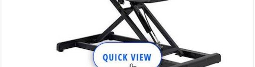
- Revealed on Tap — An alternative that also performs poorly is having the first “tap” on the list item invoke the “hover design”. This breaks the user’s expectation of how a product list works — the user expects to be taken to the product page. It’s basically a variation of a “quick view” feature and therefore tends to run into the exact same issues of adding a significant amount of conceptual complexity to the product list hierarchy and list item hit areas, which we found to be very difficult for users to understand even in a desktop environment.
Secondary hover information should be treated as a “progressive enhancement” of the list item design. On capable devices (environments with mouse hover) users are served an interface which also includes secondary information. On devices where the context doesn’t allow for it (no hover and small screen) we remove the additional layer of information — i.e., on touch devices tapping the list item once will take the user to the product page. (This is similar in principle to what we examined in our article on Responsive Upscaling, where users on large desktop monitors are served an enhanced interface.)
Summary: Display Secondary Information on Hover
Having an extra layer of hover-enabled textual or visual information can drastically improve the user’s ability to scan and evaluate list items.
During usability testing extra hover information helped the users spend less time pogo-sticking which in turn became more time spent on relevant product pages, which consequently lead to a higher rate of product finding success. However, our benchmark reveals that only 3% of e-commerce sites display extra textual information on hover, and 28% show additional images on hover.
Secondary hover information can be particularly helpful for:
- Visually driven products — Consider showing both a “cut out” thumbnail and a “use context” image as this allows users both the direct visual comparison and the aesthetically richer experience. (Caution: be consistent in which image type is displayed by default.)
- Spec-driven products — Additional textual product information can be displayed to provide further details about the hovered item. This will typically be product specs not already in the default display, such as product features, materials, and dimensions, whereas basic information such as brand, product type, and price, should typically already be in default list item view.
- Product variations — If an item exists in multiple variations, consider showing one or more of the other product variations. Especially visual variations are important as users may otherwise ignore items when only a single default image is available for inspection.
- Repetitive list item features — Consider moving static list item features which are repeated for every single product in the list to the hover state, like “Add to Cart”, “Save to Wishlist”, “Compare” etc. This can significantly improve the signal-to-noise ratio in the product list.
- Compatibility-related thumbnails — For compatibility-dependent items, consider having an additional close-up thumbnail highlight the various compatibility-related aspects of the product.
- Displaying vital features — For items that have a key feature or component that users would benefit from seeing, use hover to highlight that product feature within the product list.
And again: remember only to relegate secondary information to the hover state — going too far will cause more harm than good, as the information won’t be available on touch devices without a hover state. Treat it as “bonus information”, a progressive enhancement for devices where it can be suitably implemented.
This article presents the research findings from just 1 of the 650+ UX guidelines in Baymard Premium – get full access to learn how to create a “State of the Art” e-commerce user experience.