Account creation, or “sign up”, is vital to many web businesses - yet it’s a pain for most web users.
Here’s 9, 12, 17, 19 ways to simplify your sign up process and make it more user-friendly.
1) Use my e-mail address as account identifier

Dropbox only asks for your e-mail and then simply uses that as your username too.
Most people have endless user names and frankly can’t remember which user name goes to what site. However, most people have just one, or perhaps a few, email addresses. So instead of having a username, simply use your users’ email as account sign in. But remember to always allow the user to edit his email address at a later point.
One less form field during sign-up, and a lot less users forgetting their “username”. Easier sign-up and easier sign-in.
Note: if you for some reason need a username, then at least allow “special characters” in it so people can use their email address if they want.
2) Allow me to use the password I always use

Instead of disallowing weak passwords, inform your users and then let them make the decision.
Most people have a couple of standard passwords they reuse, and there’s a chance it won’t fit if you require passwords to include either a number, a capital letter or be at least X characters long.
If security is a concern then have a password strength indicator that warns the user when the password isn’t all that secure - then it’s up to the user to judge if the extra security is worth the hassle of creating a unique password just for your site.
Note: there’s obviously exceptions where requiring a strong password is the right thing to do, such as websites that deal with private information or monetary transactions (e.g. online banking).
3) Ask for additional information after I’ve created my account

Twitter ask for additional information after you sign up so they can keep the sign-up form clean and simple.
By asking your users for any non-vital information after sign-up, your sign-up form will be less intimidating and your users will get off their feet faster. Once users start seeing value in using your web app, they start seeing value in adding additional information to it.
Account image, date of birth and country are rarely necessary to create a user account, so consider asking for this kind of information later on.
4) Tell me if the username is already taken

Yahoo suggest alternative usernames if the one you want is already taken.
If an account already exists for the entered e-mail address, then immediately:
- Tell the user an account with this email already exists – don’t wait to do this until the form is submitted, do it live.
- Show a password field that will sign the user in with this email.
- Show a “do you want a new password sent to this email?” link.
It’s very likely the user just forgot he already had an account.
If you don’t use e-mail as account identifier, then suggest other related but available usernames.
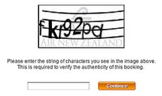
5) Do I really have to type “fkr93pd”?

CAPTCHA can be difficult to decipher and adds friction to your sign-up process.
For most visitors a CAPTCHA can be difficult to decipher since the code often carry no meaning and is essentially an eye check and typing exam combined – so don’t use one unless it’s absolutely necessary.
Make an A/B split test to see how much your conversion increase without the CAPTCHA and compare it to the actual amount of spam accounts created. Then make an informed decision based on this data. If you end up needing a CAPTCHA then at least have a look at these 6 CAPTCHA usability tips.
6) Sign me in automatically

An activation e-mail adds unnecessary friction to the sign-up process.
The reason your users create an account is probably because you required them to so in order to do/view/get whatever - so give it to them instantly after they signed up. Don’t require them to sign-in to the account they just created.
Oh, and do you truly need me to activate my account?
7) Make my welcome e-mail easy to find

Make the welcome e-mail easy to find so people can search for it.
It’s inevitable that some of your users will forget their password, so make sure your welcome email (containing both username and a password reset feature) is easy to find later on.
You can do this by having a proper e-mail subject like “Your [app name] account details” instead of things like “Welcome” or “Your new account”. Also, make sure the “from address” has you business name or URL as the nametag, and isn’t a cryptic mail server name.
8) Show me the sign-up form on your home page

Facebook puts their sign-up form right on the home page.
Your sign-up form shouldn’t consist of much more than 2-3 form fields and a button, so if sign-up is the main goal of your marketing site, then there’s no reason to create a separate page for this. Instead show the sign-up form directly on the home page.
When you place your sign-up form on another page, you make the user consider abandonment before she even had a chance to see just how easy it is to sign up for your web app.
9) Give me a good reason to create an account

Sun lures users in with the promise of single-sign-on for their entire site.
Nobody likes creating yet another user account, so at least give your users a couple of reasons – why should they sign up? What are the benefits? The more friction there is, the more important this becomes.
10) Suggestions?
Do you know other tips to simplify the sign-up experience? Then share them in a comment.