
I was buying pet food the other day (online of course) and stumbled upon one of the strangest flows in checkout process history: you had to provide different parts of your credit card details at different steps during checkout.
It’s a great example of how a chain is no stronger than its weakest link, and that you shouldn’t do “something new” just for the sake of it when designing a form flow.
Don’t Break the Expected Flow
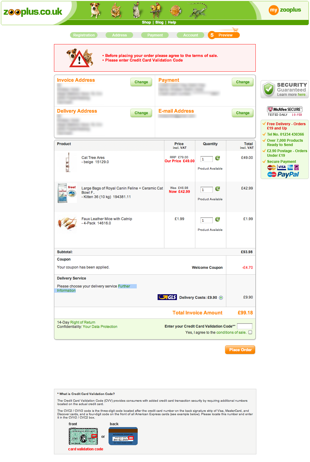
The checkout process consisted of five steps: 1) Registration, 2) Address, 3) Payment, 4) Account, and 5) Review.
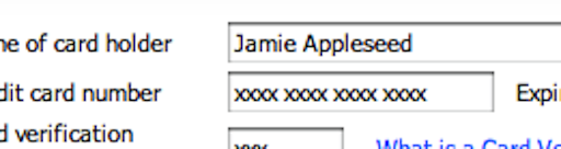
Step 1 and 2 were fairly simple, getting some of the basic checkout usability guidelines right. In step 3 you were asked for your credit card number, card expiration date and cardholder name. At step 4 you provided account details such as password.
However, at step 5, things went awry. The step looked like this:

The credit card validation code field needs to be filled out on the review page!
Take a close look. What’s the next action? On most sites, you’d normally expect that you were supposed to review the order details and then click “Place order”. But doing that at ZooPlus.com resulted in this error:

You get this error if you just click Place order. (Full page screenshot.)
Why? Well, it turns out that you have to provide the credit card CVV code / security code at the review page. This is despite that fact that you entered credit card number and expiration date two steps earlier in the checkout process!
There are many reasons this results in a really poor user experience:
- It breaks the mental model of when and where you provide credit card details - and thus breaks the expected flow.
- The CVV form field blends into the overall styling and is consequently difficult to spot.
- The customer has to pull out his credit card again.
- The error message is placed out of context, making it difficult to correct.
So What Can We Learn From This?
Okay, so placing the CVV field on the “Review” page instead of the “Payment” page is a bad idea. This isn’t exactly a revolutionary insight.
Let’s abstract this into 2 more general observations about designing user experiences:
1) A chain is no stronger than its weakest link
ZooPlus had a pretty decent checkout process usability-wise up to the “Review” page, yet orders are more likely to be abandoned due to this one poorly designed element.
There is no point spending a whole lot of time and money, tweaking and polishing your design, if you get basic elements wrong. You simply lose more by getting a basic element wrong than you gain by getting three details right.
2) Don’t be special just for the sake of it
Jakob Nielsen have a great saying “users spend most of their time on other sites” – that is, users expect your site to behave the same as most other sites. This also include tasks where there’s a high risk of abandonment, such as filling out forms and navigating flows.
Sure, doing what everyone else is doing can be boring. It’s more interesting to invent a new and “revolutionary” design, but when it comes to form design and flows you should generally stick to the convention unless you have a very compelling reason not to. And whenever you do divert from the standard approach, at the very least perform a quick small-scale usability study before launching, so you avoid major usability problems.