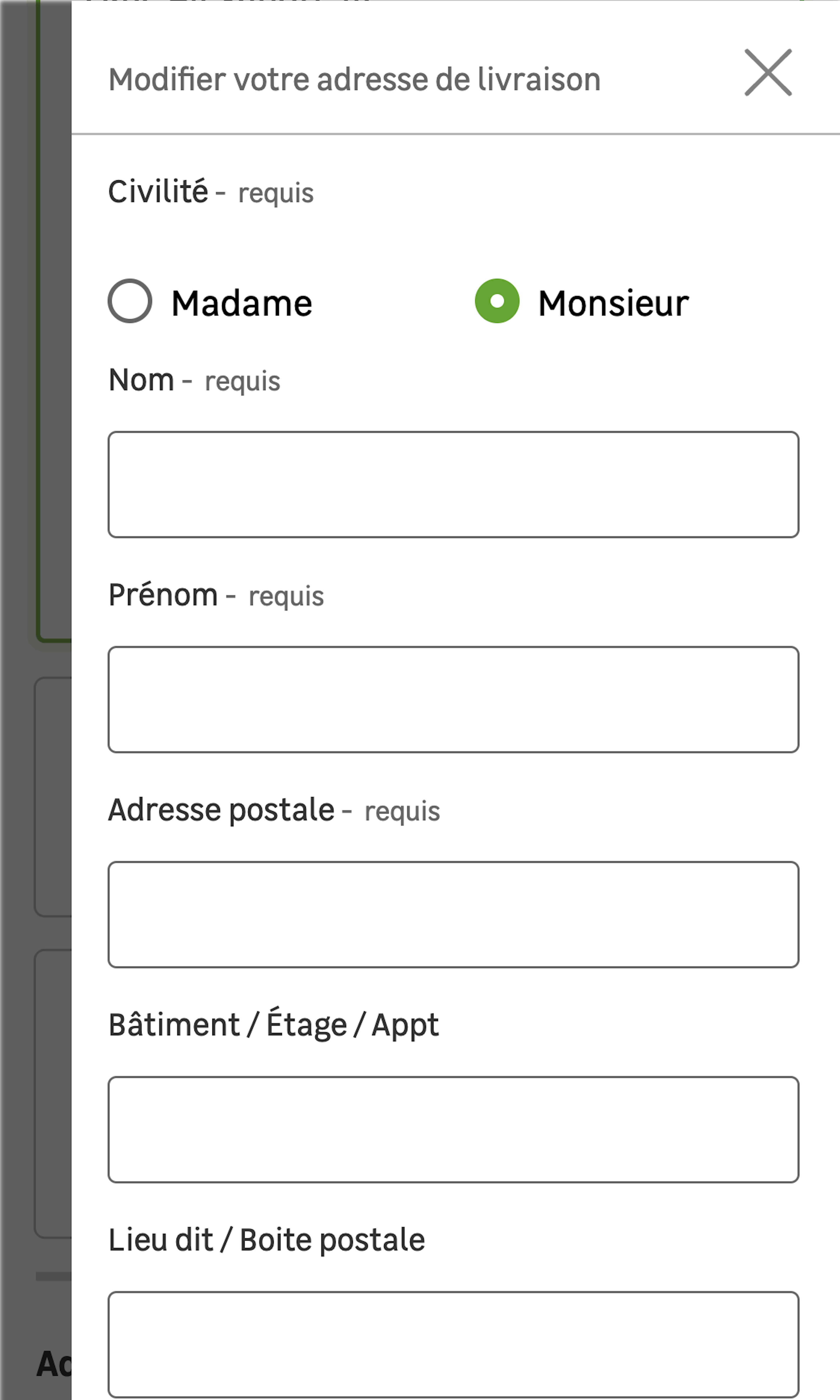
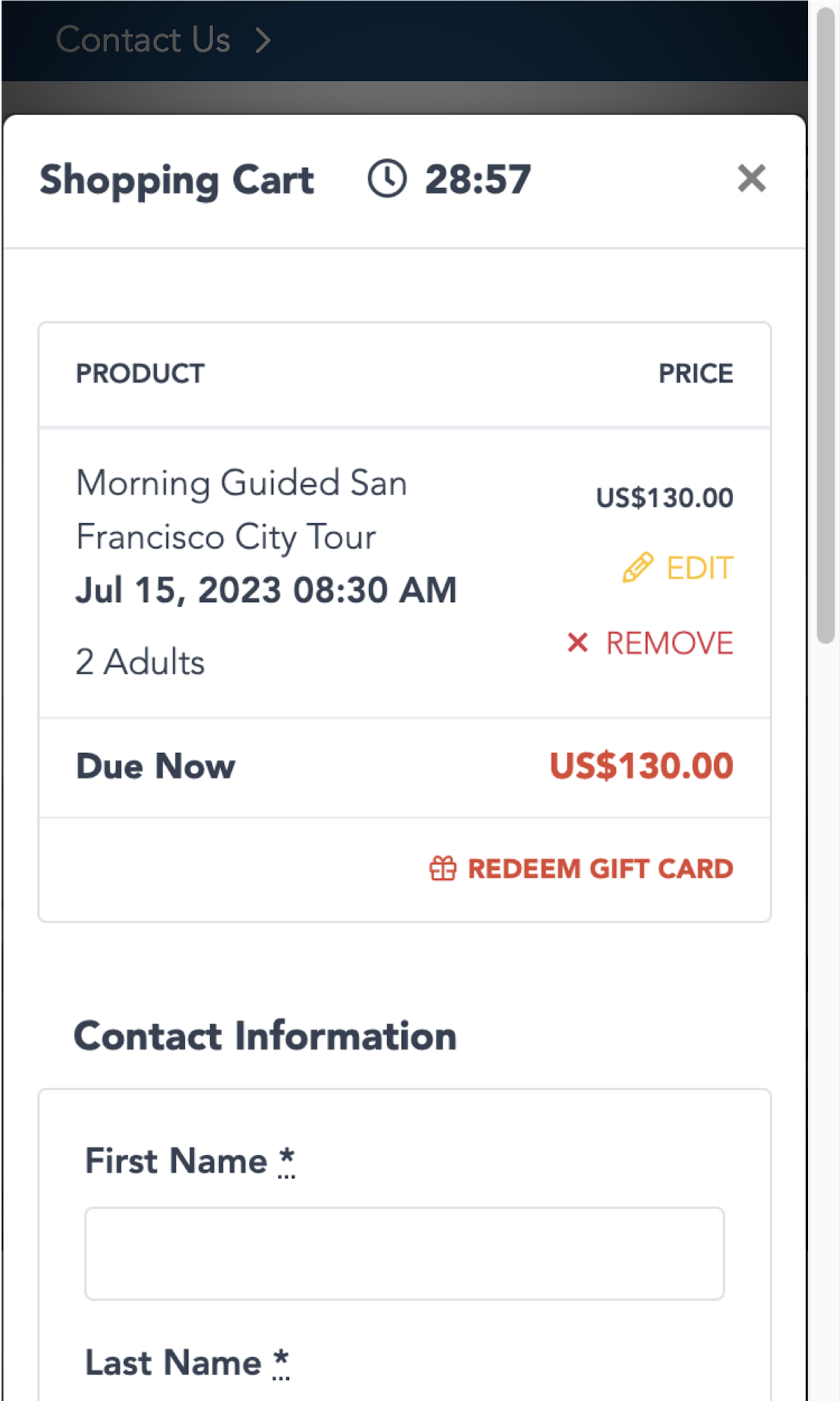
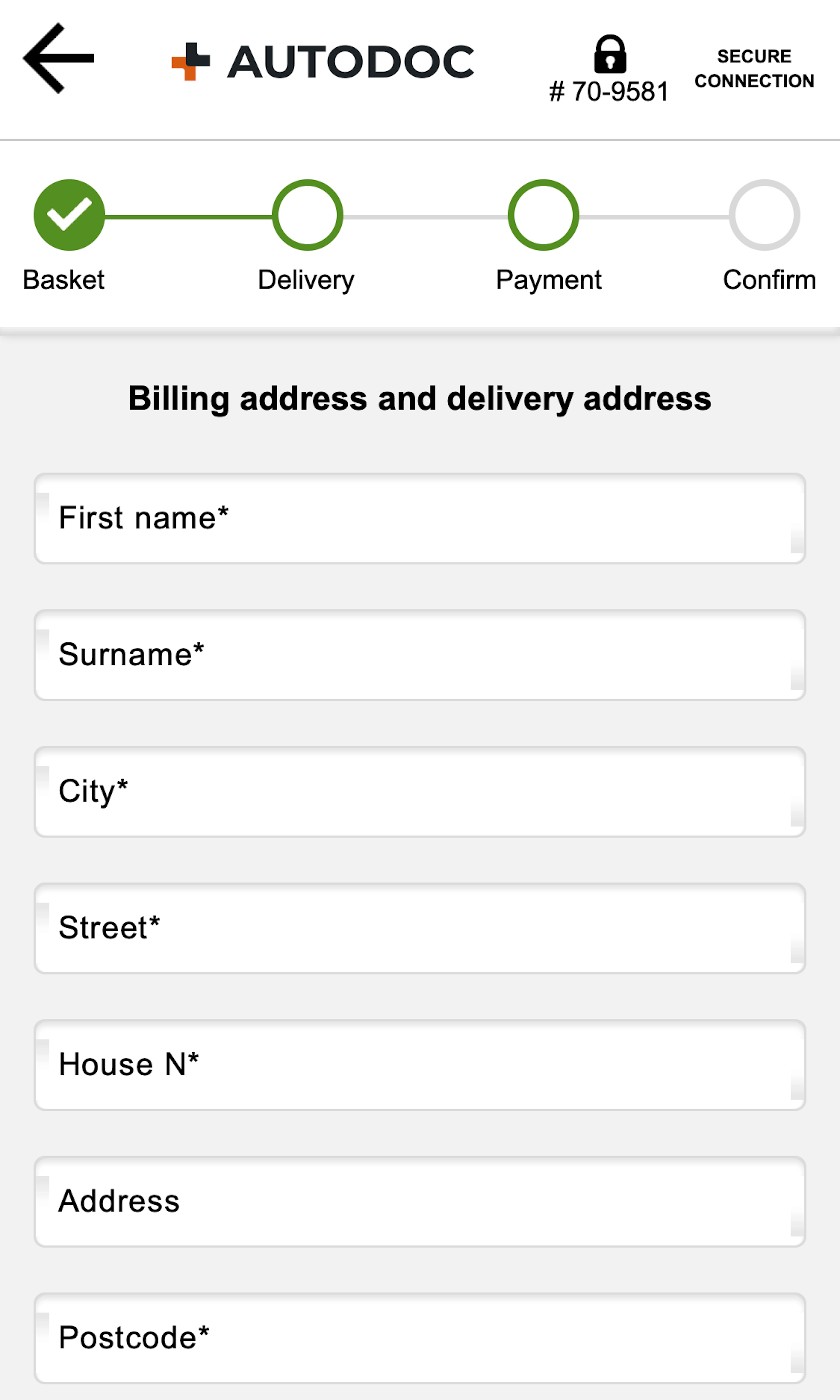
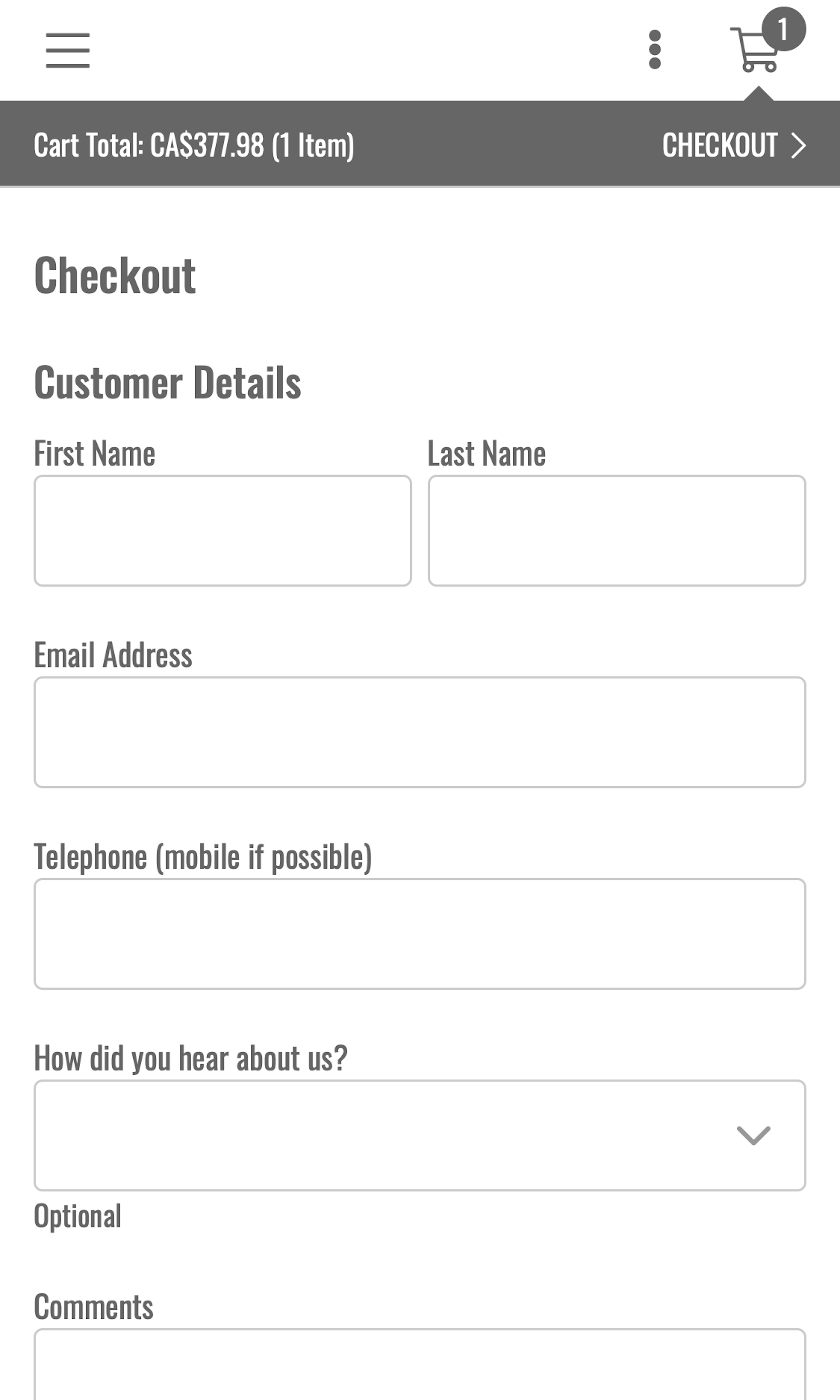
What’s this? Here you’ll find 355 “Mobile: Shipping Address” full-page screenshots annotated with research-based UX insights, sourced from Baymard’s UX benchmark of 93 e-commerce sites. (Note: this is less than 1% of the full research catalog.)
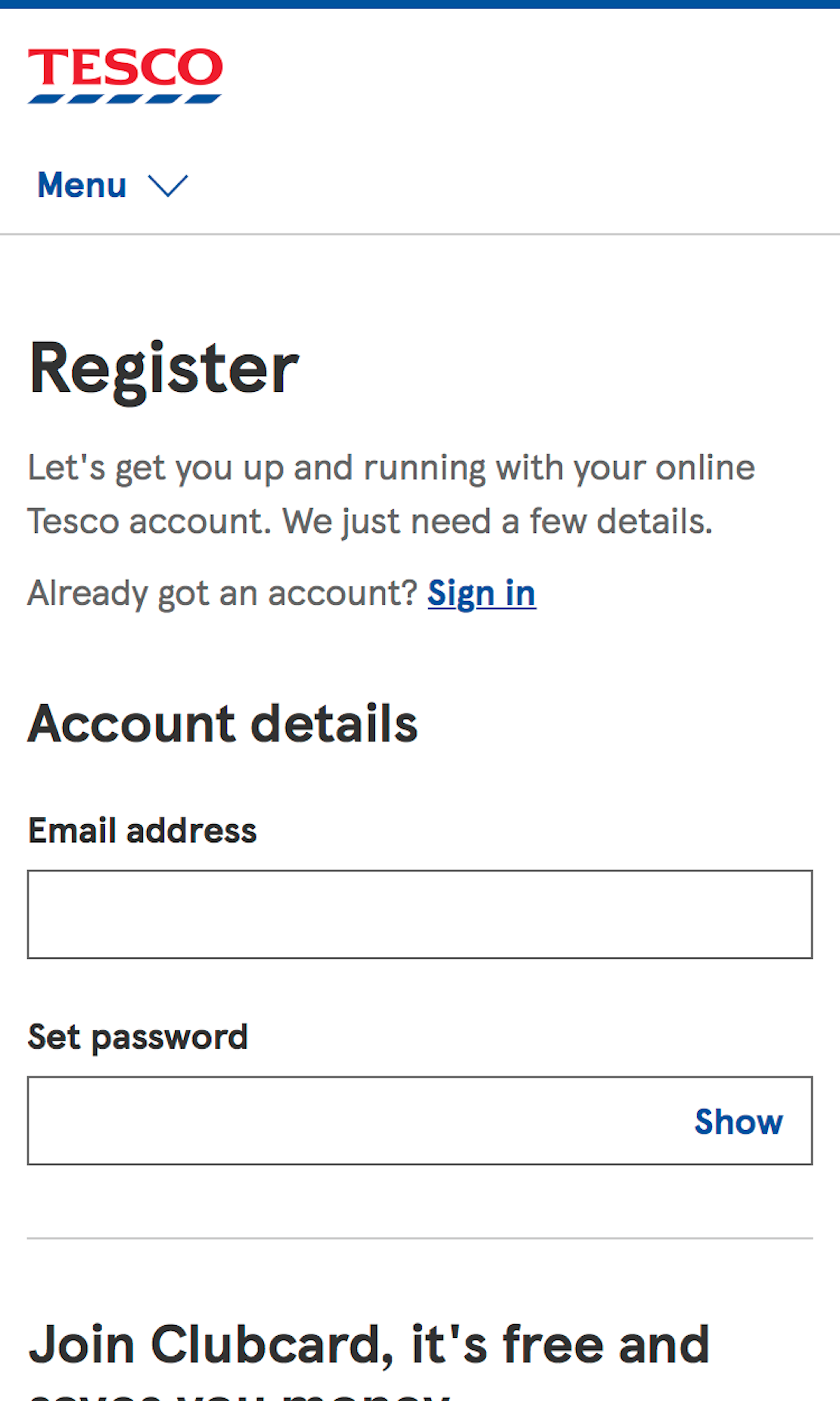
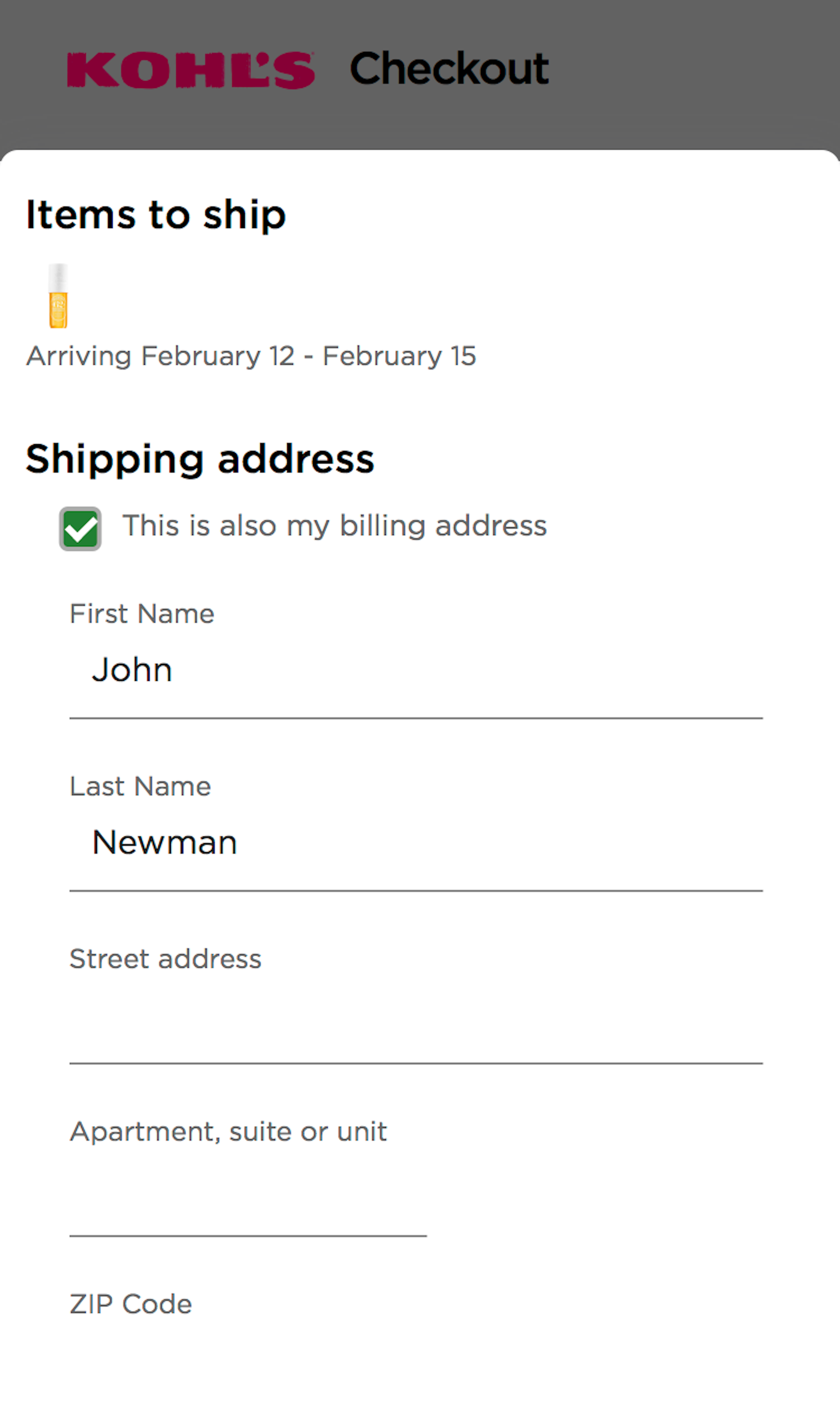
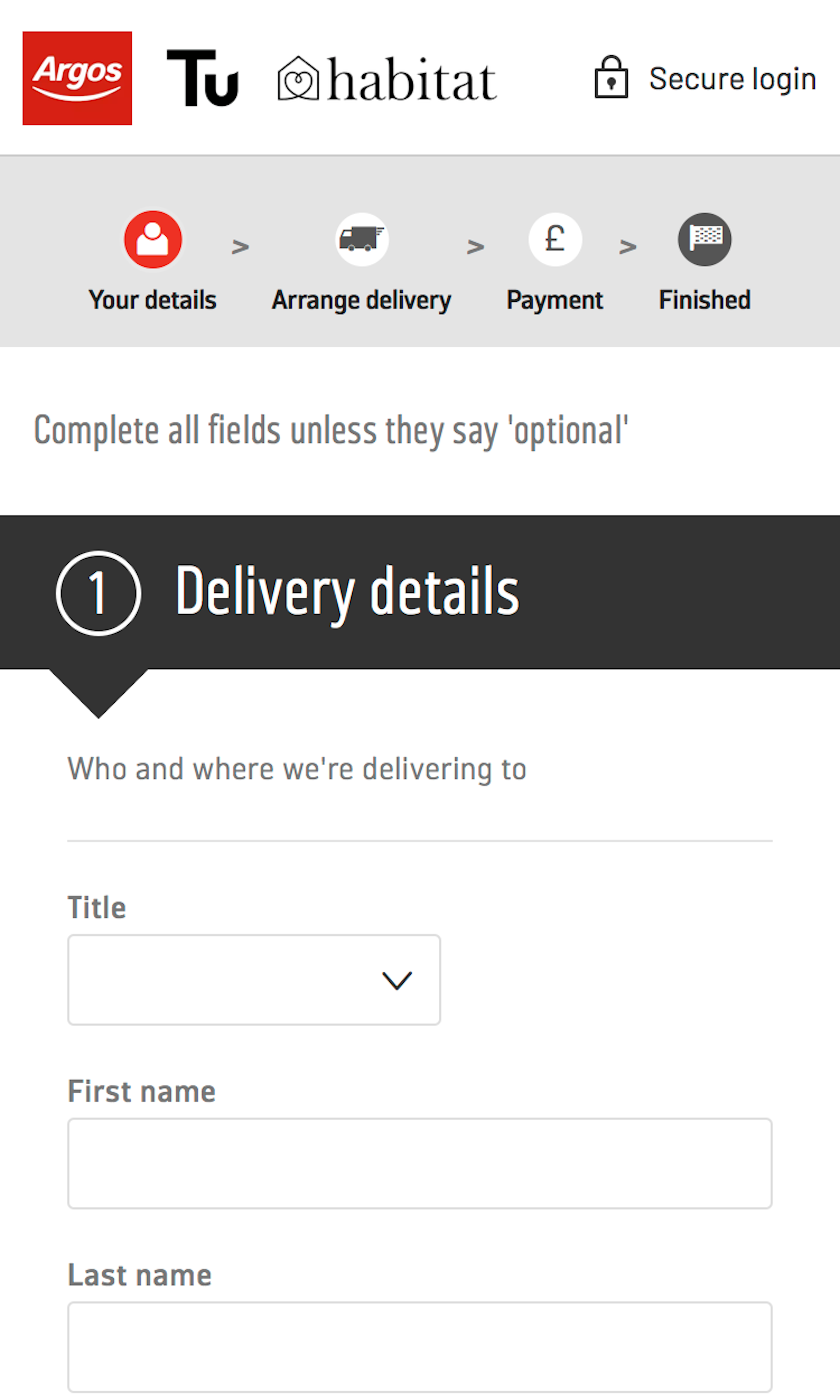
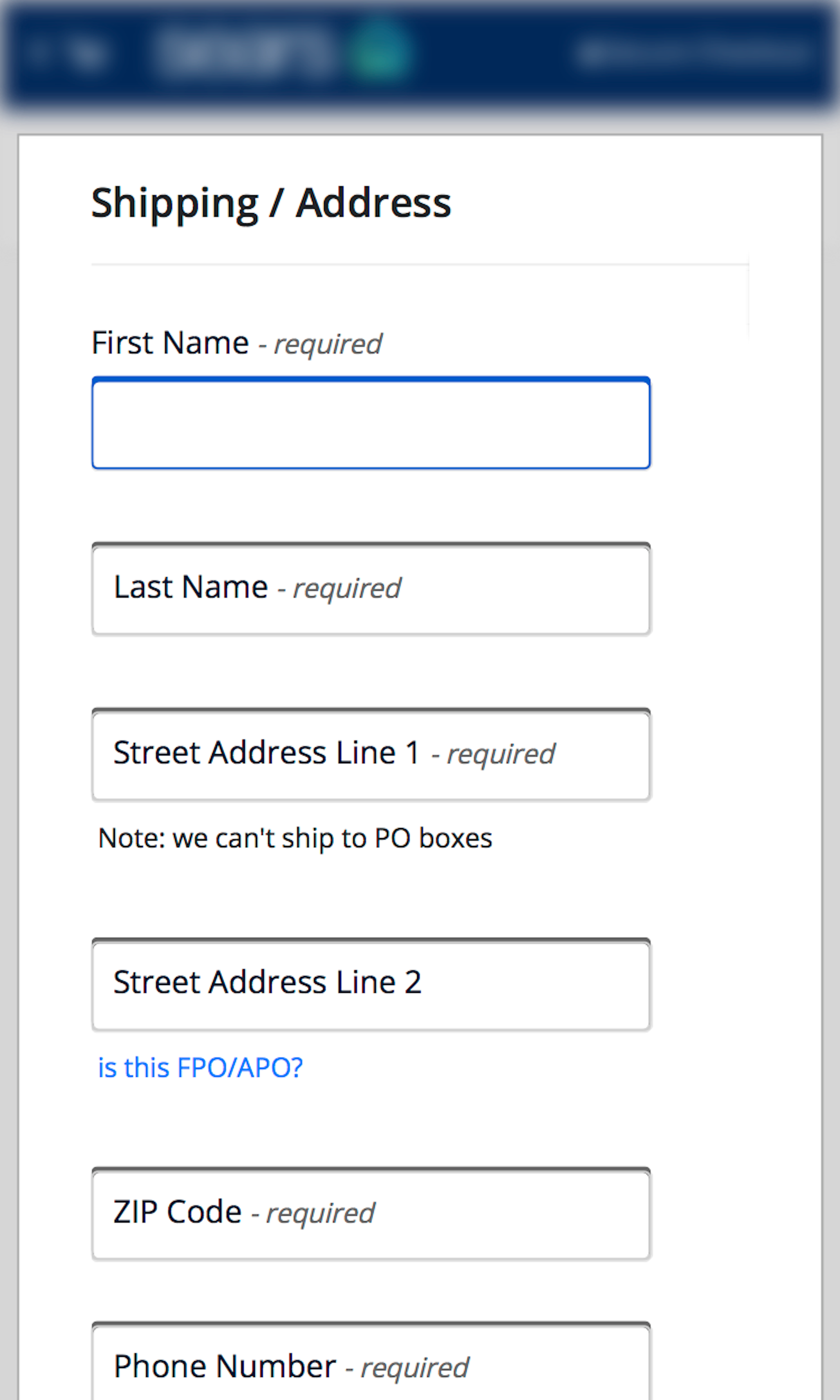
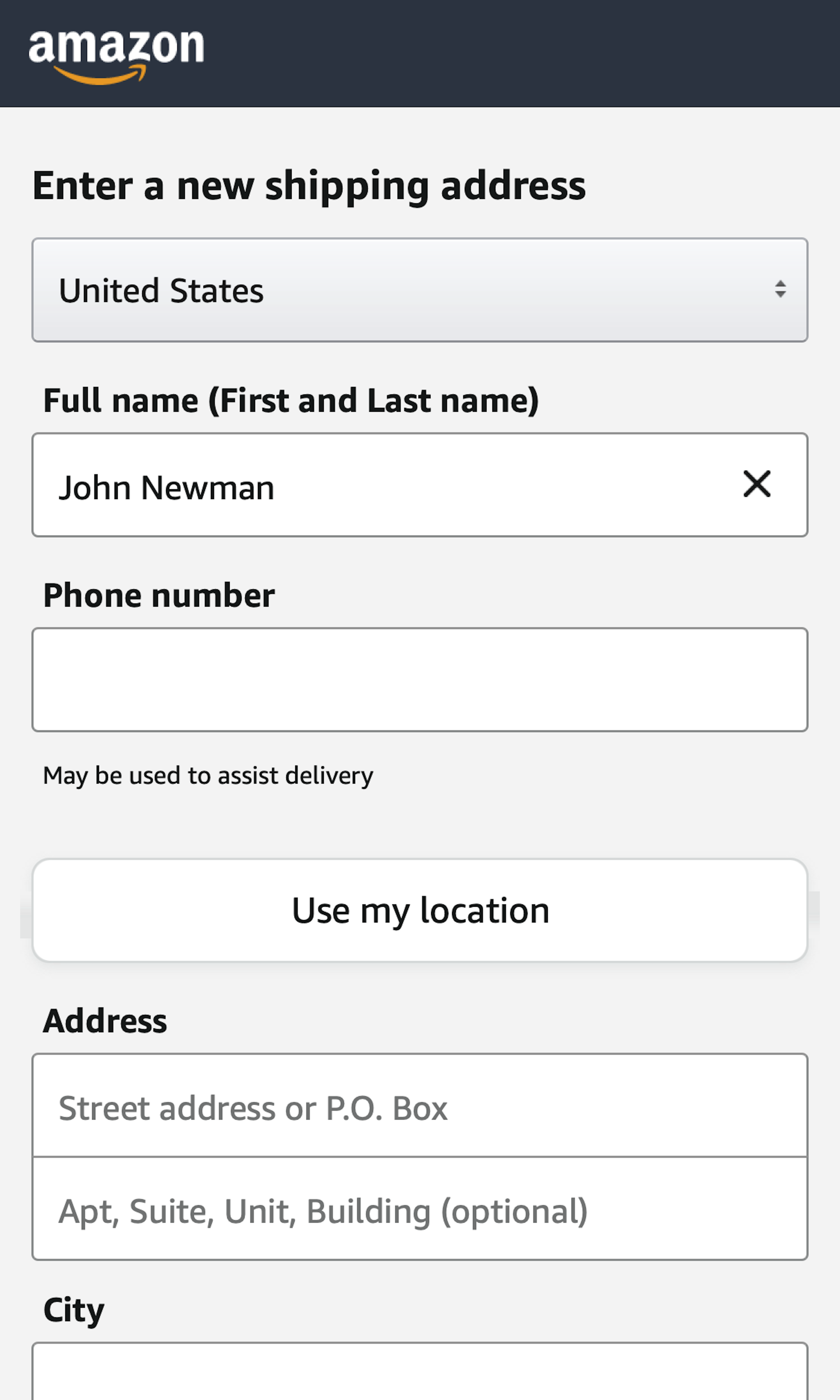
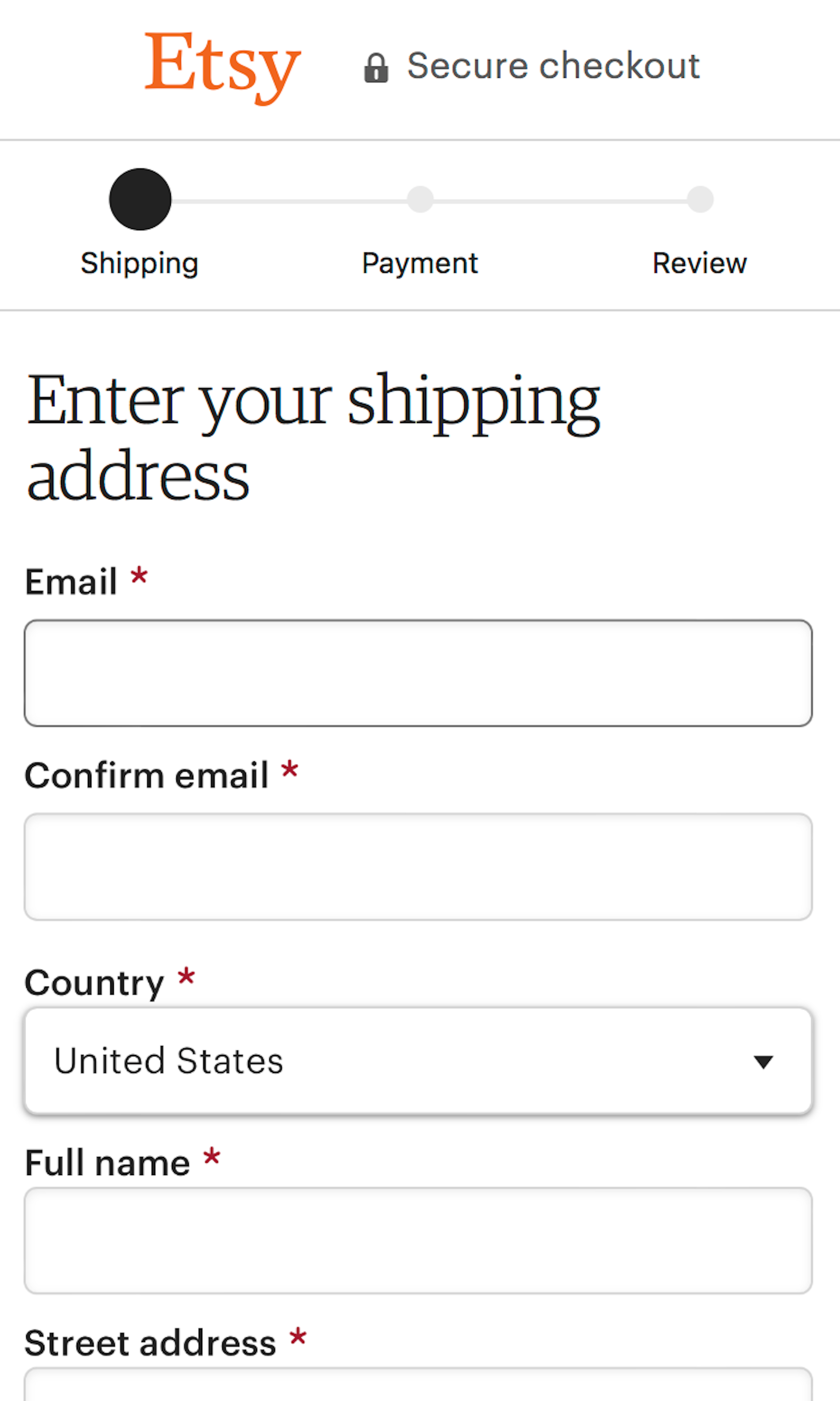
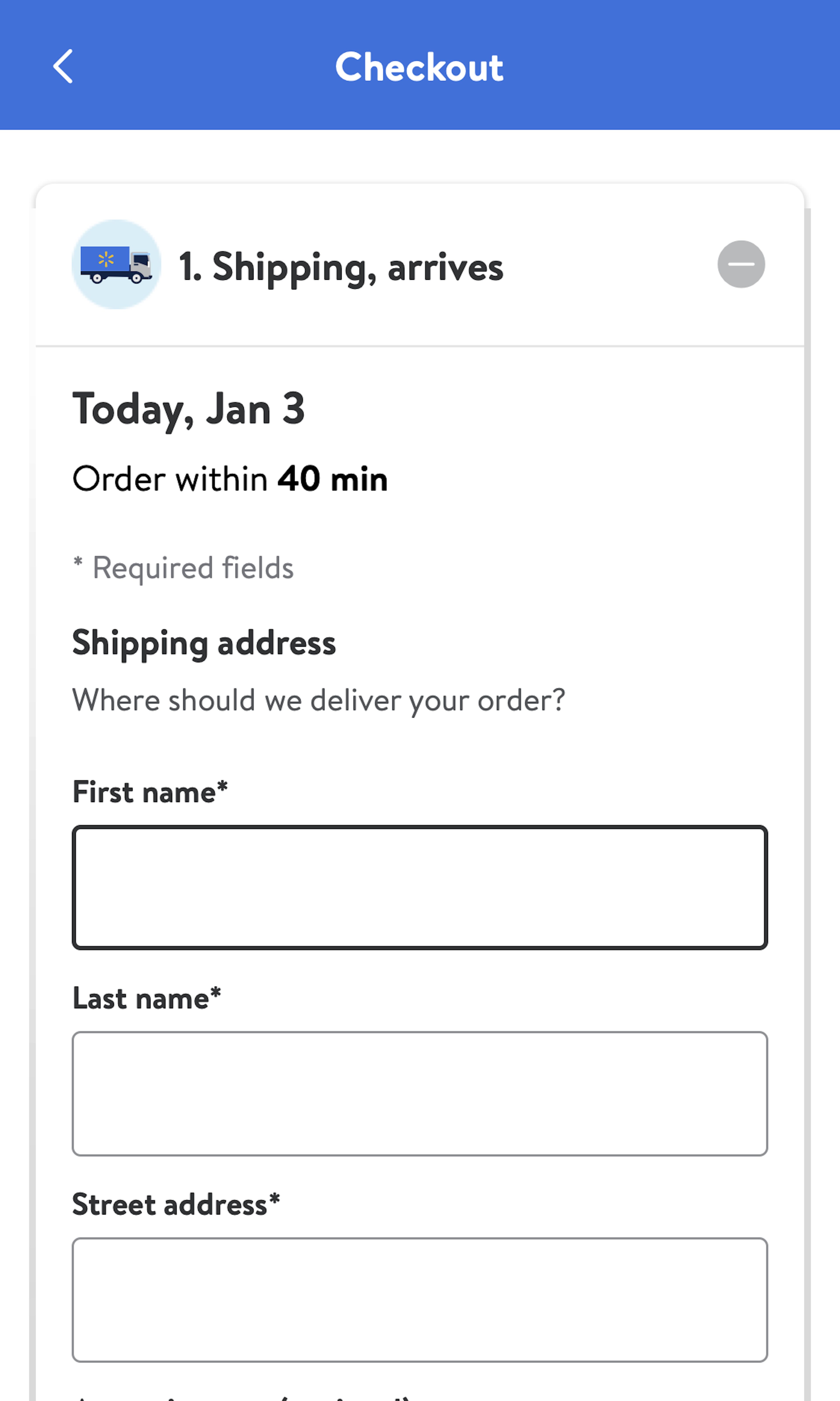
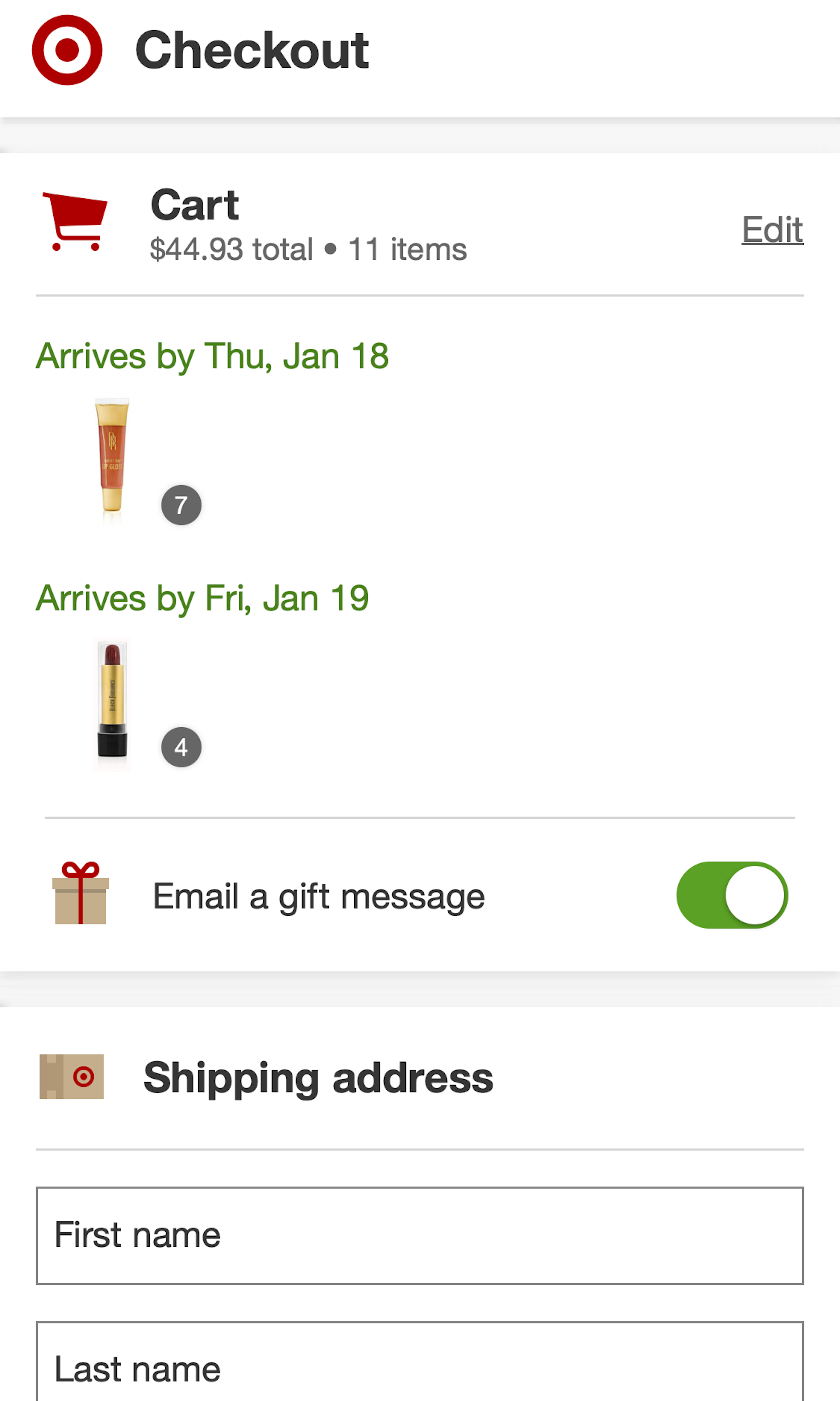
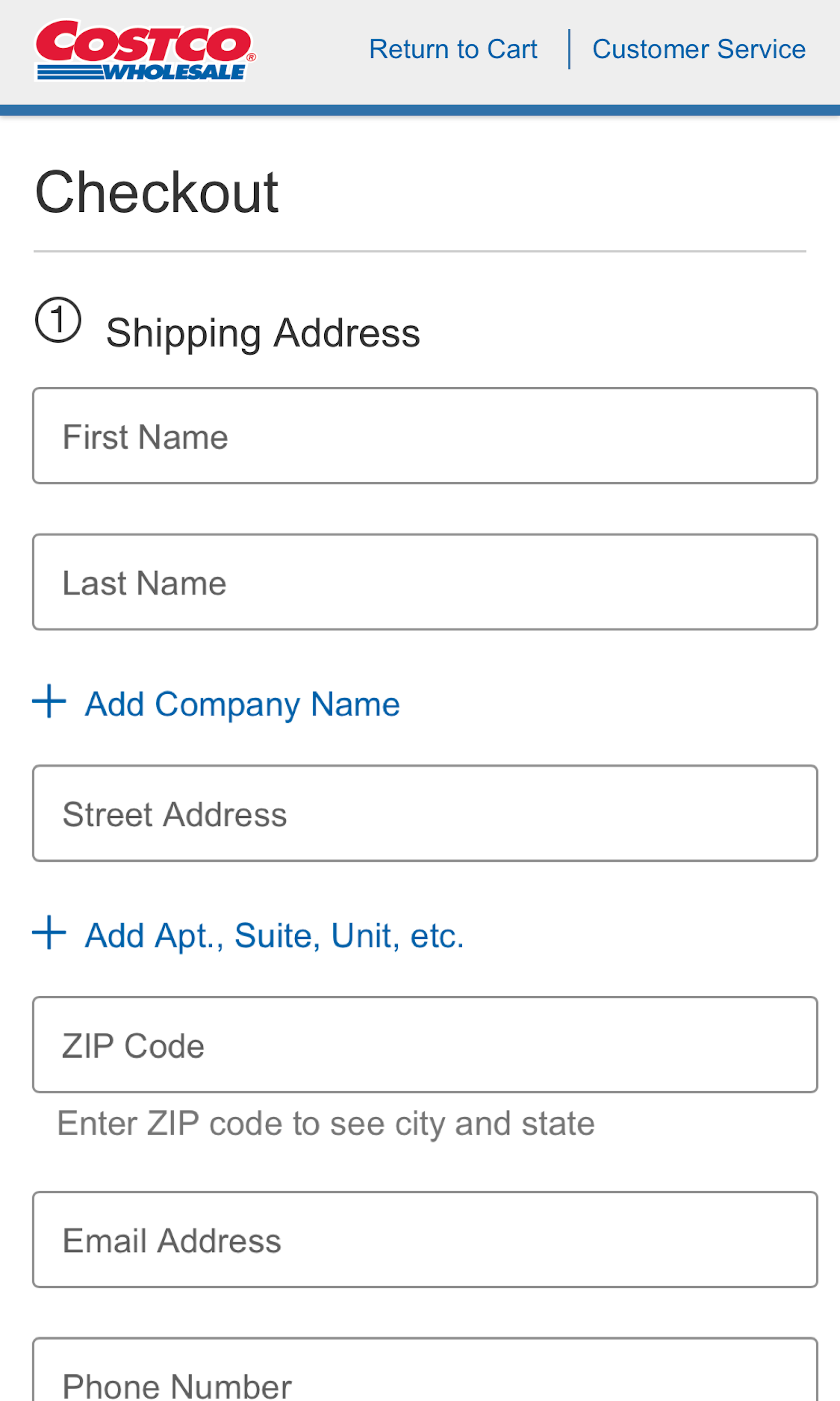
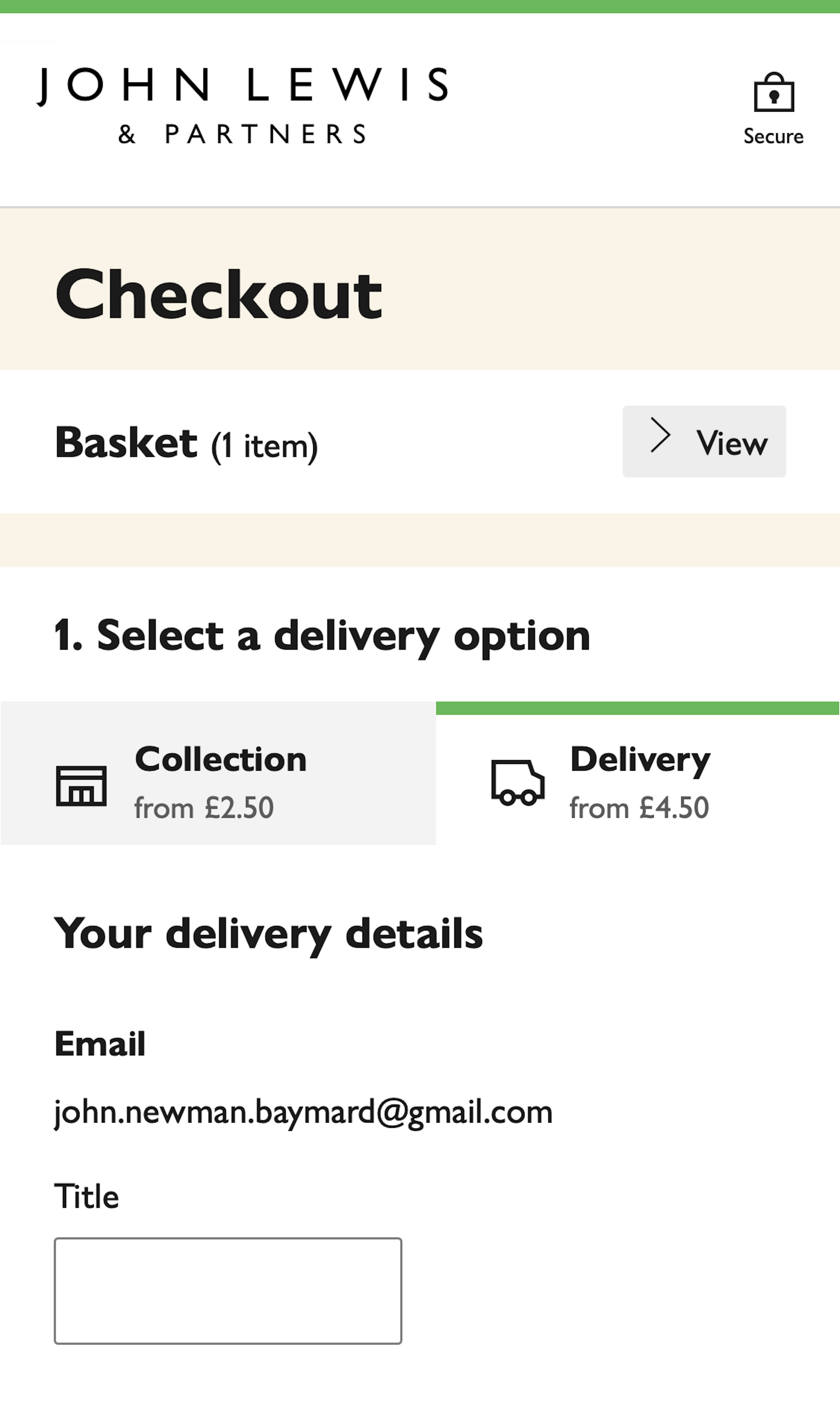
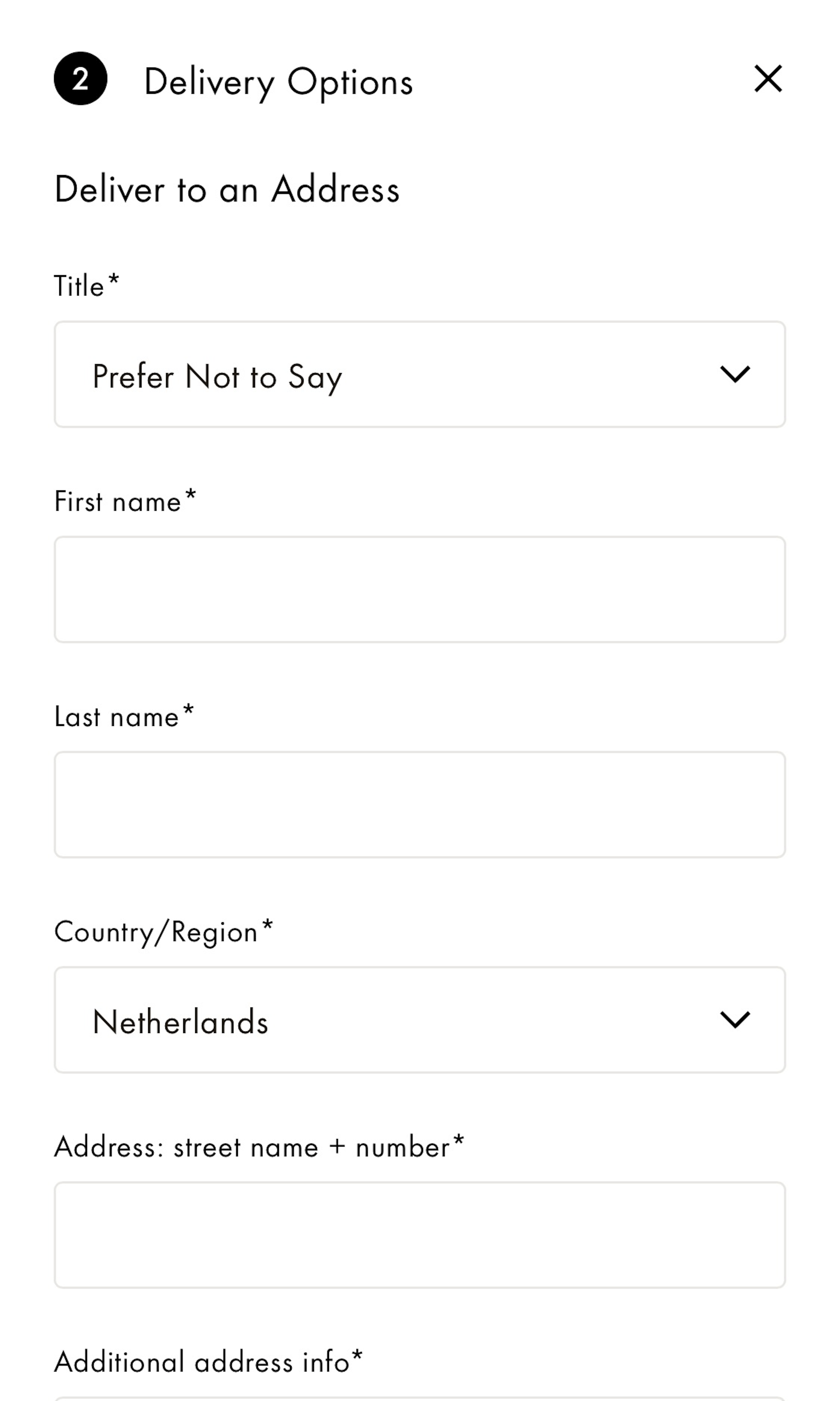
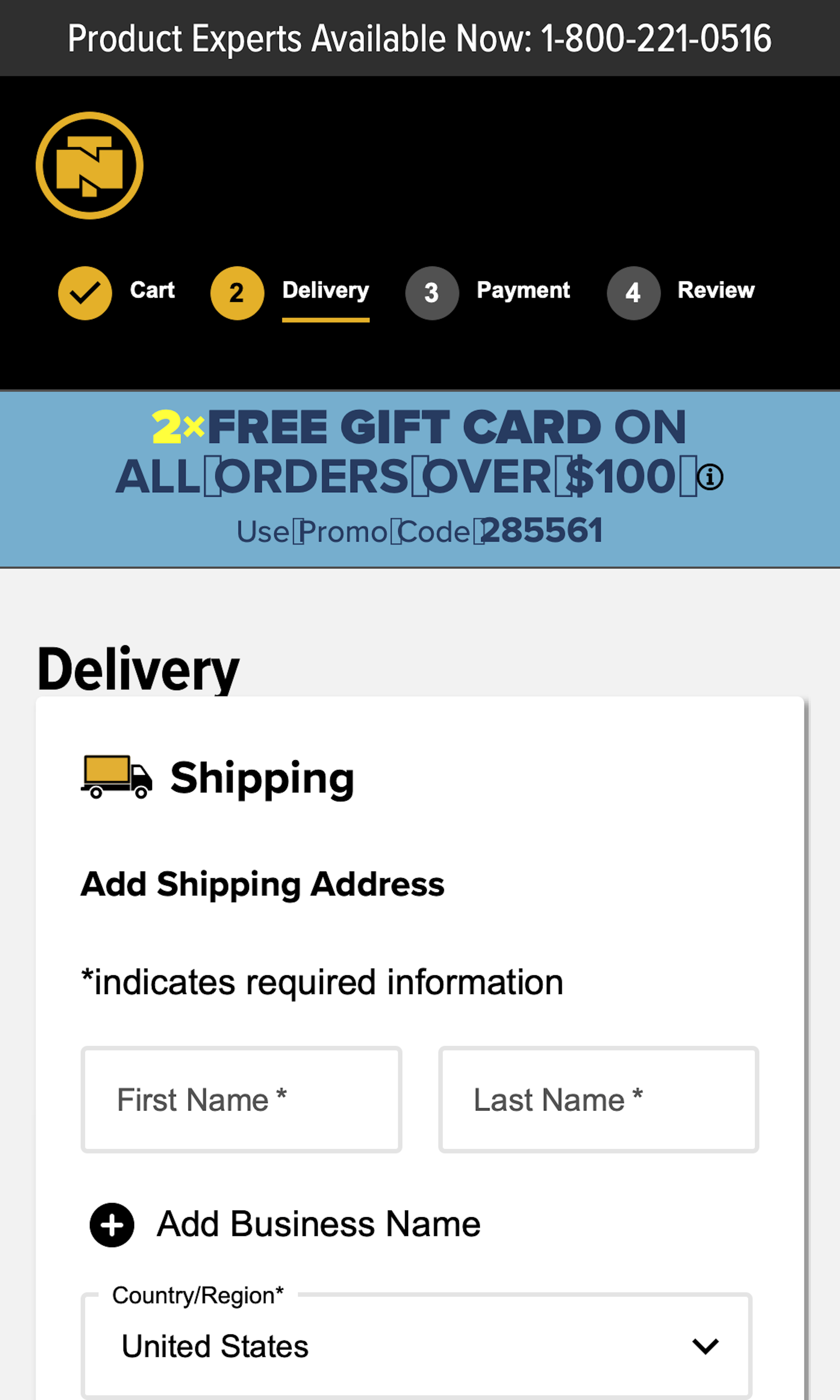
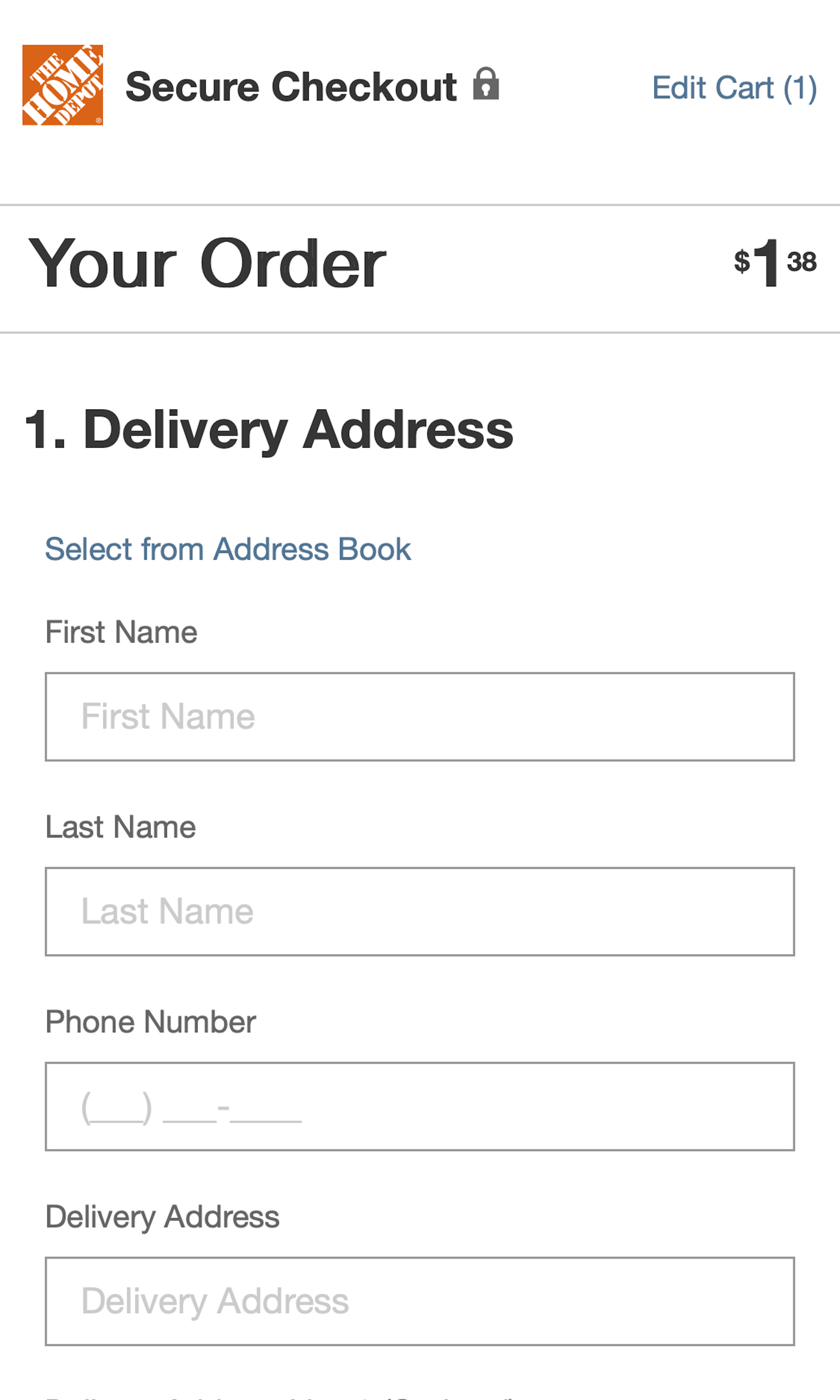
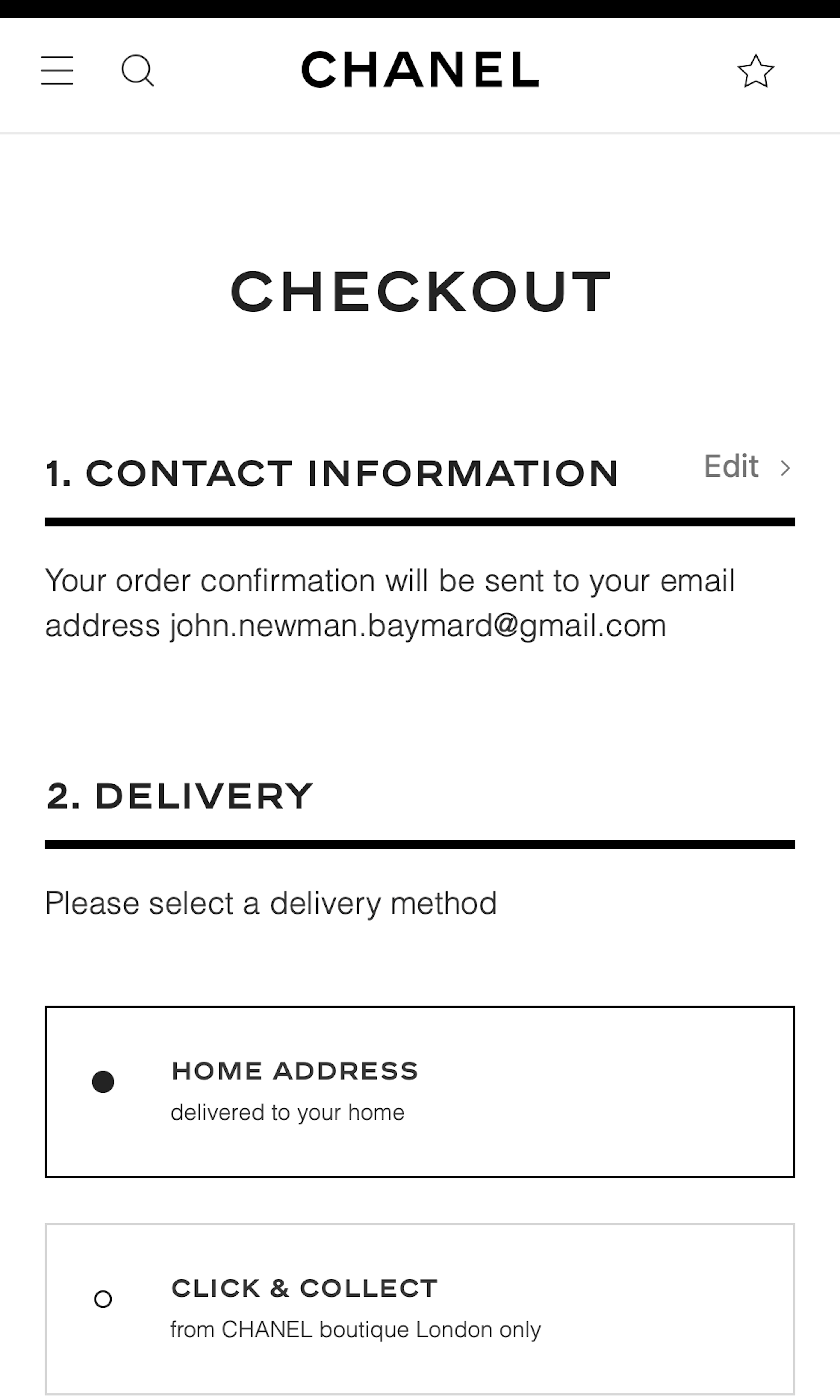
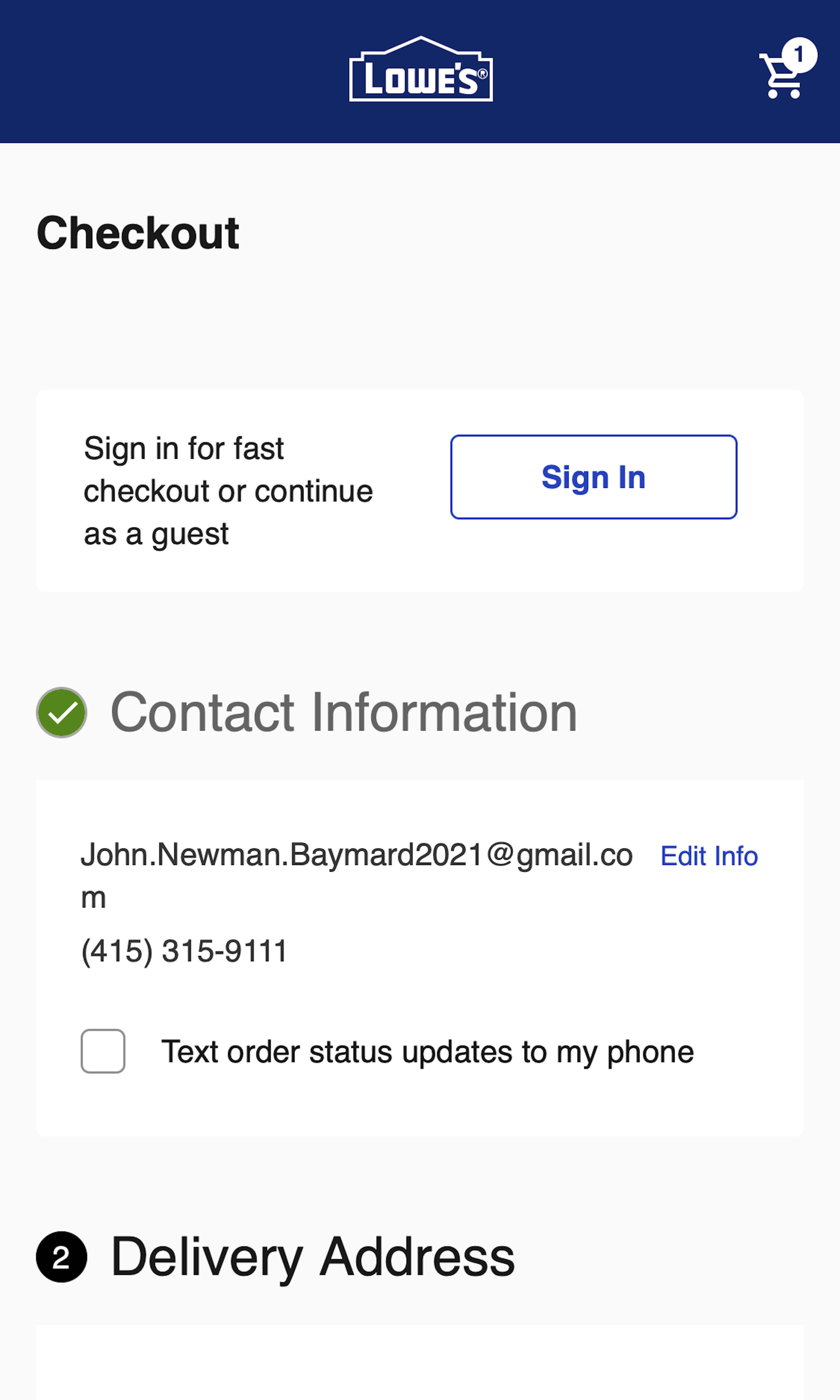
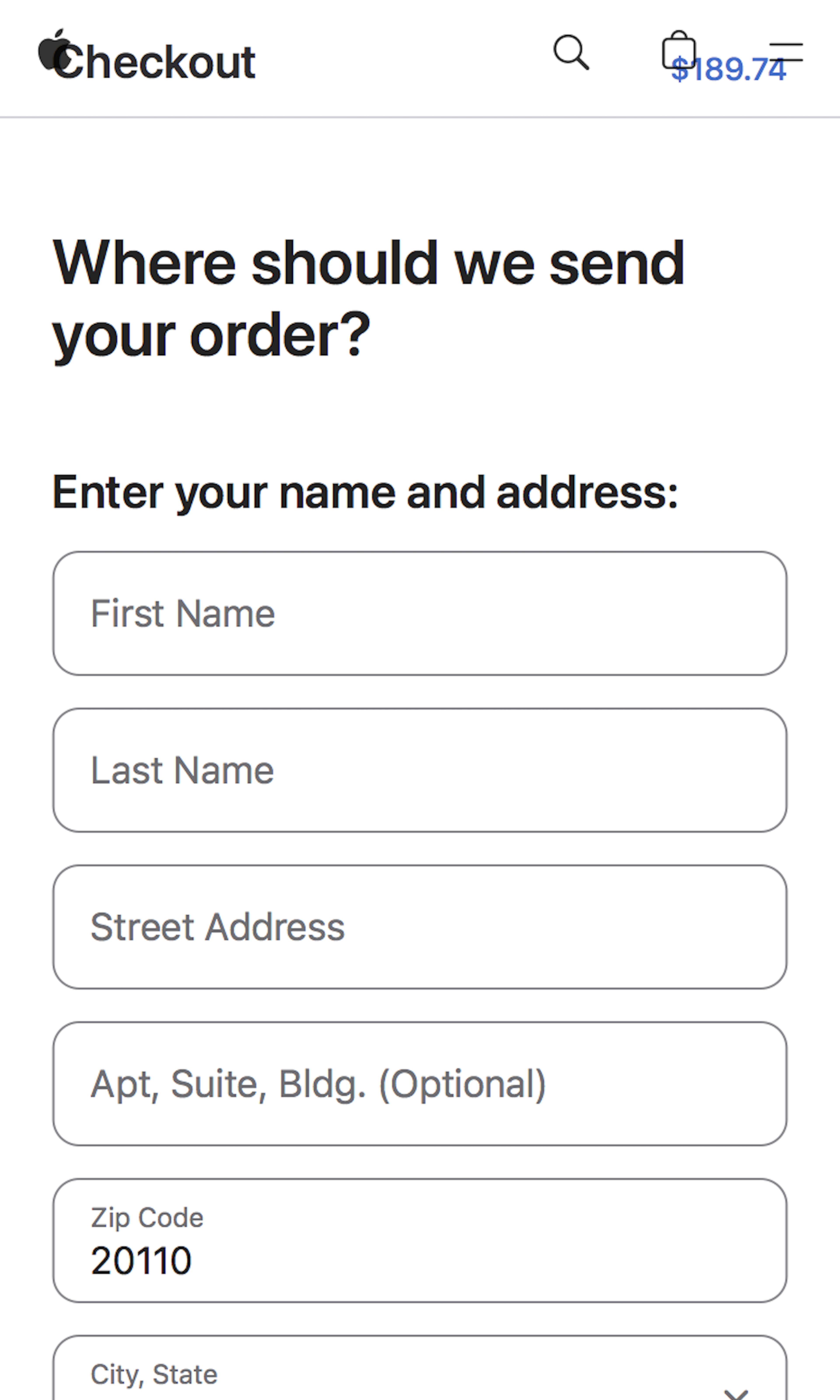
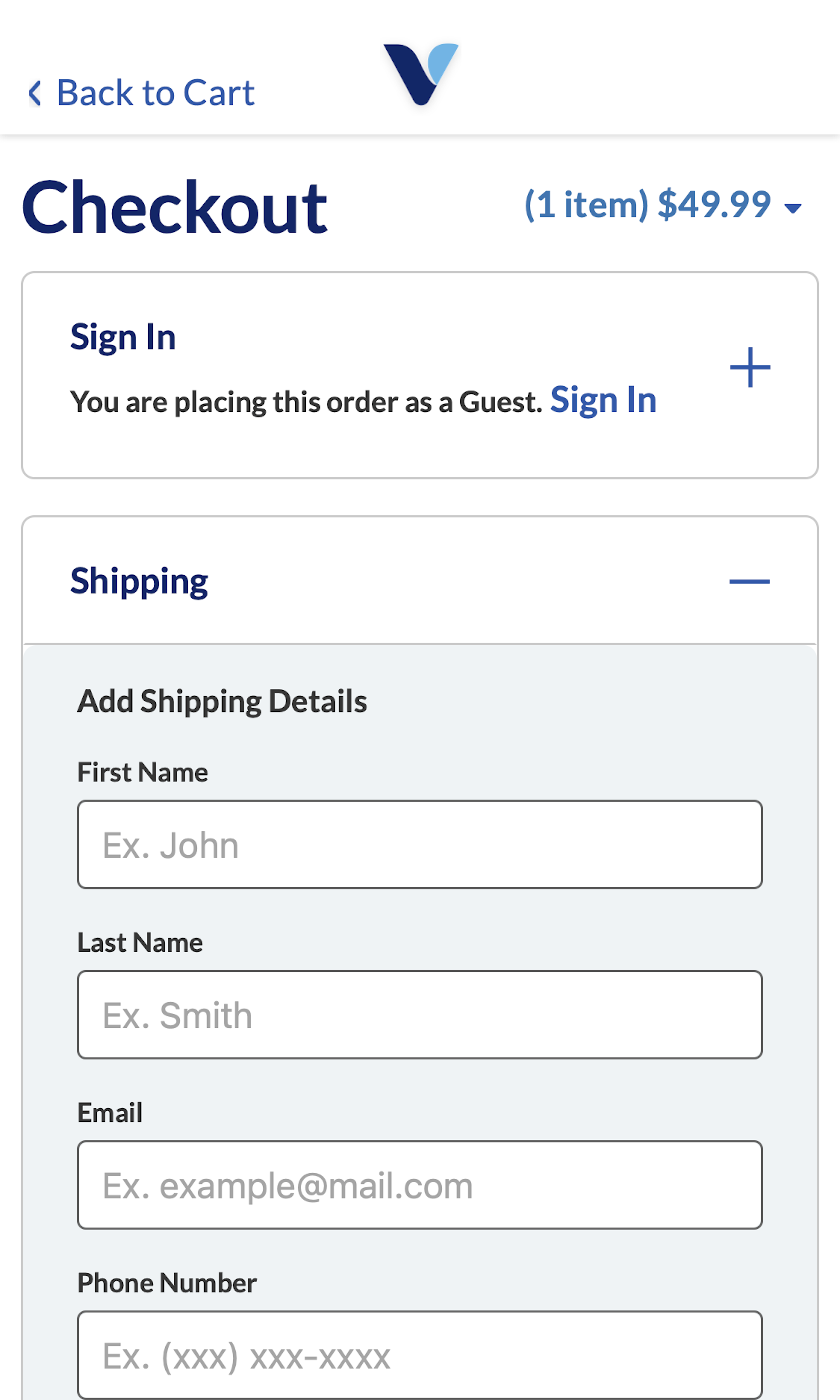
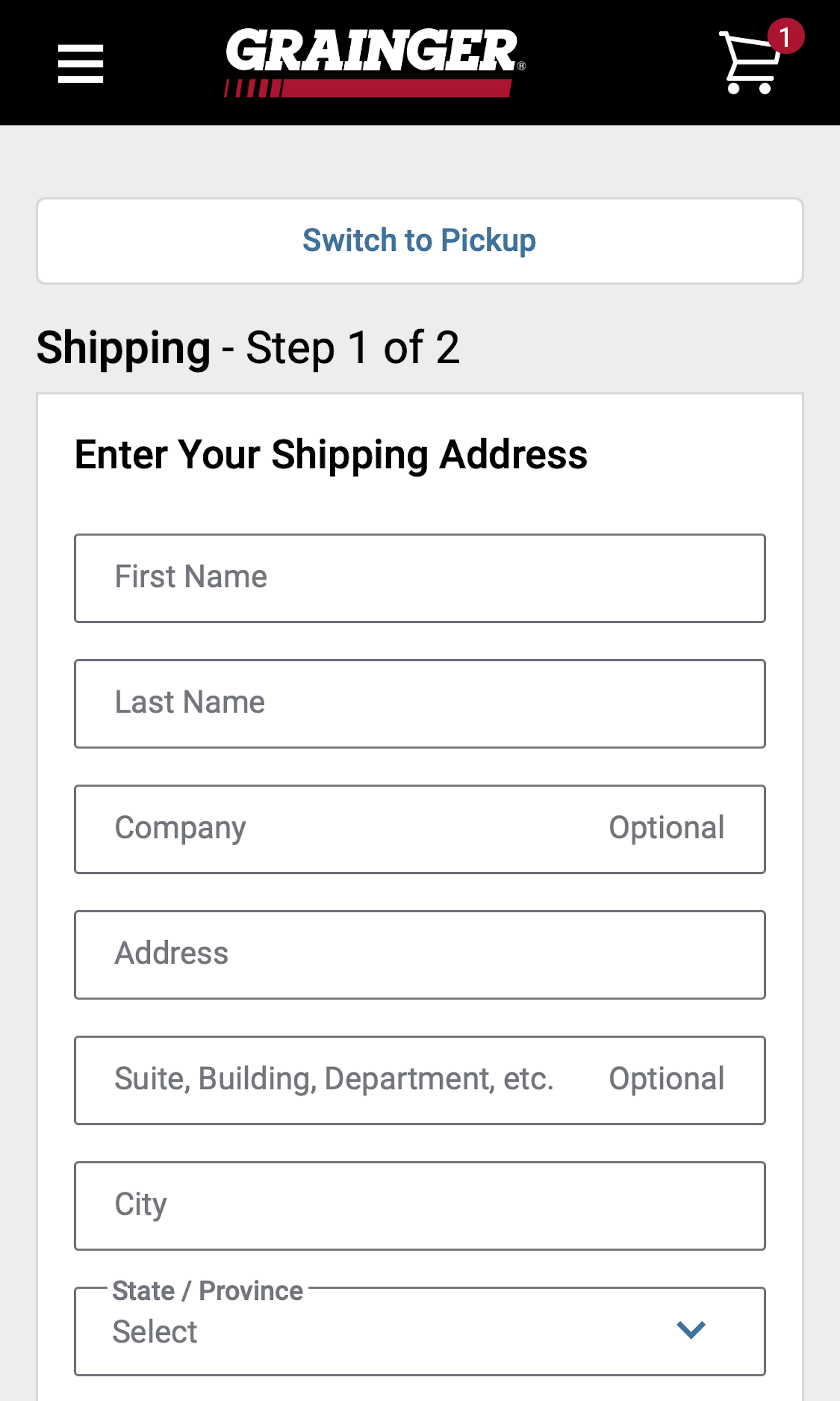
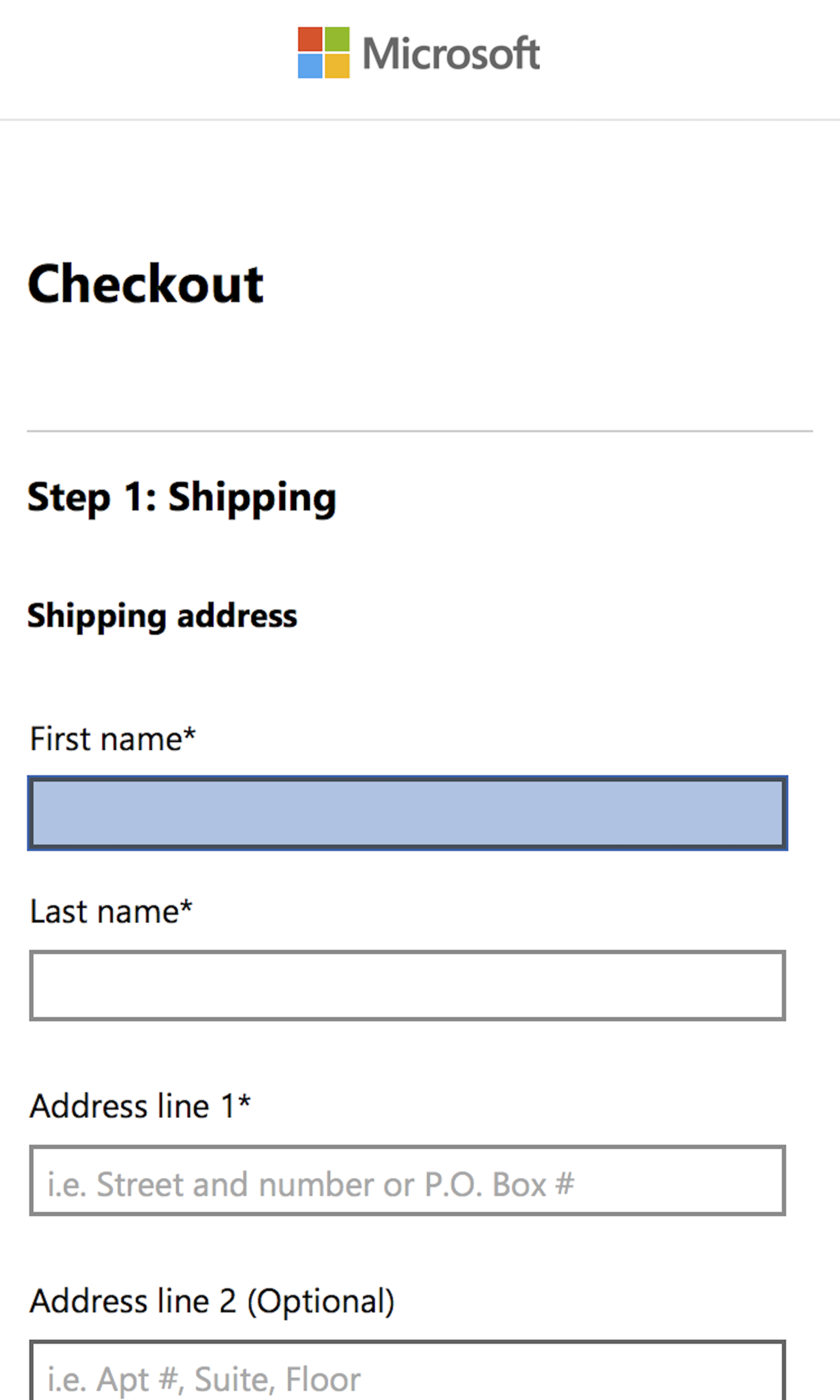
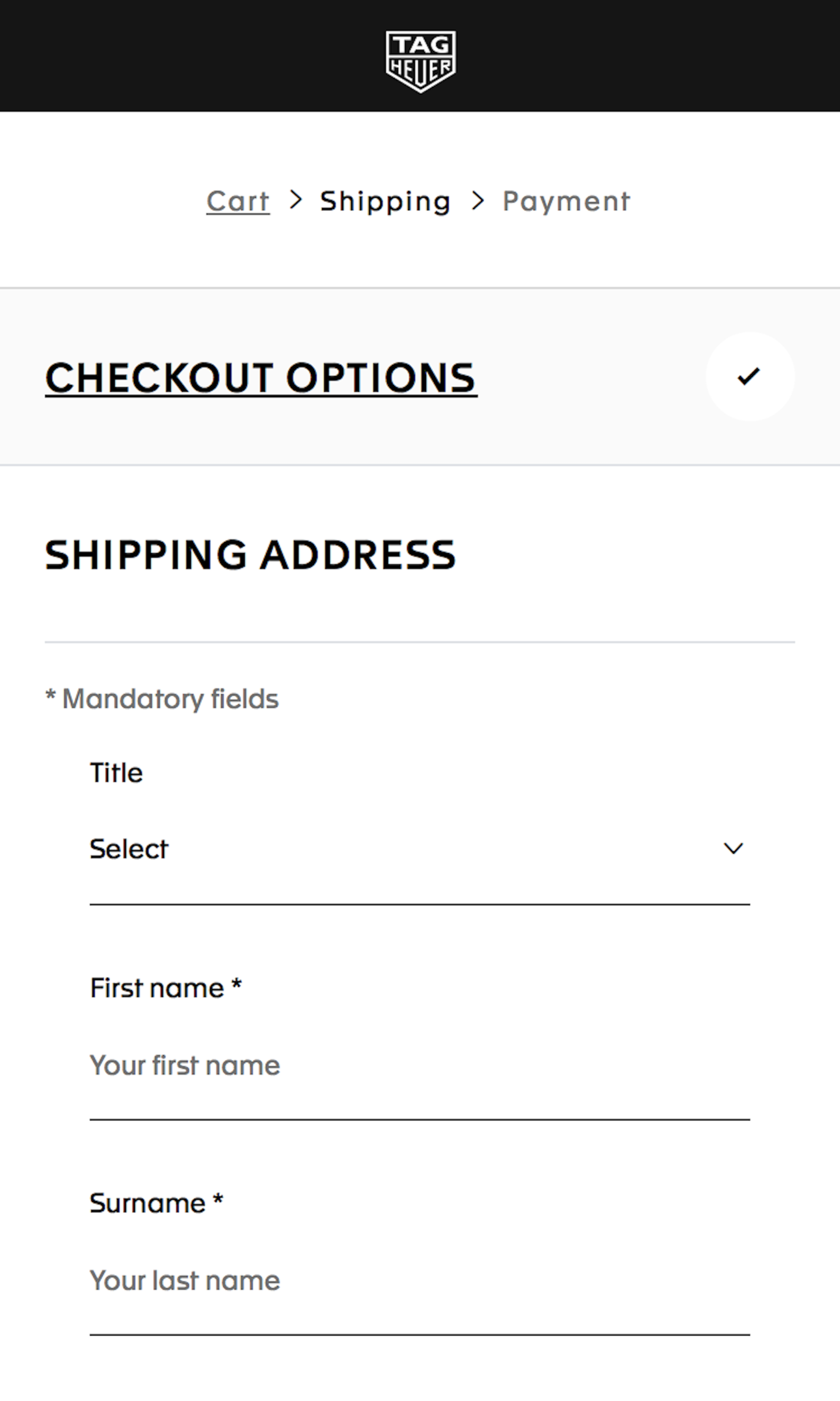
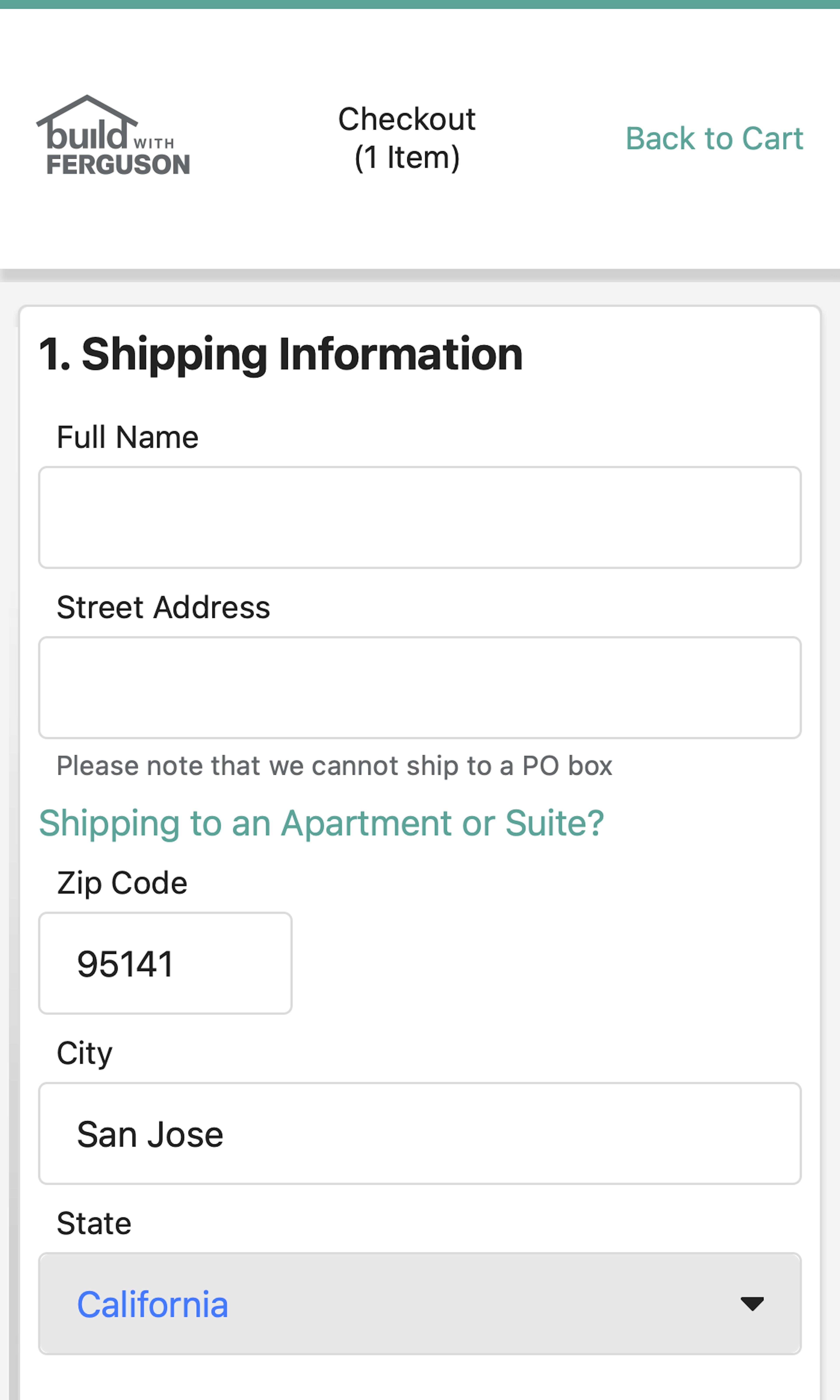
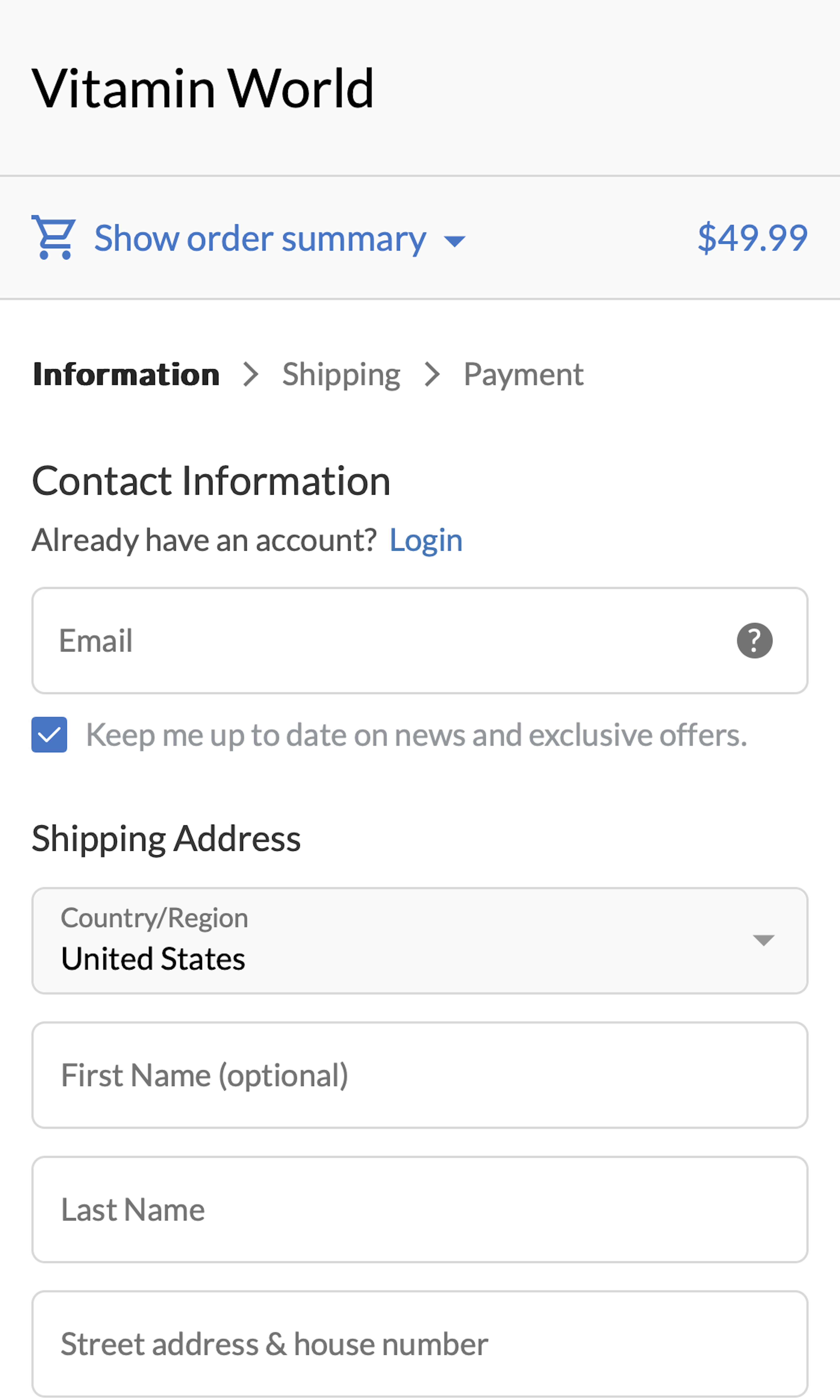
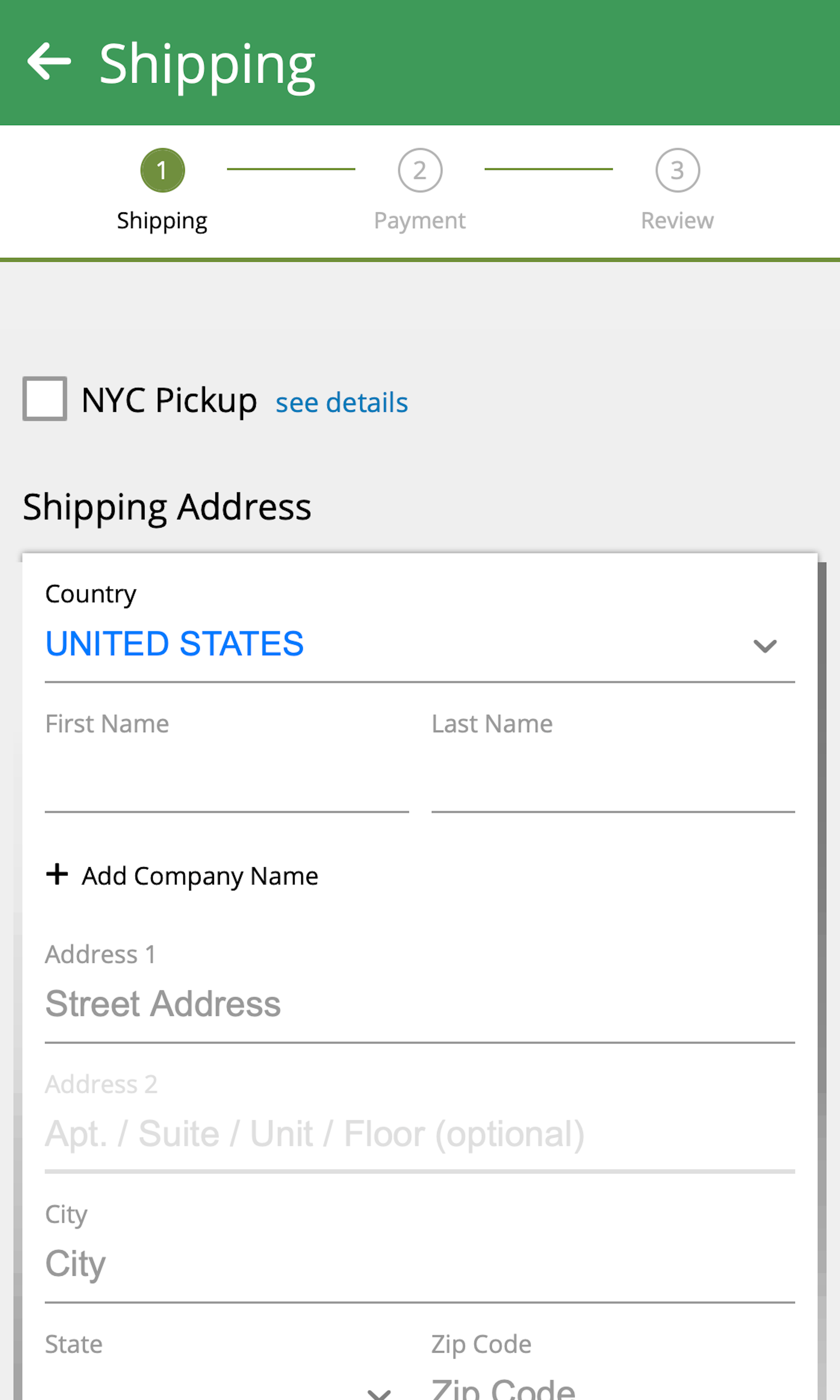
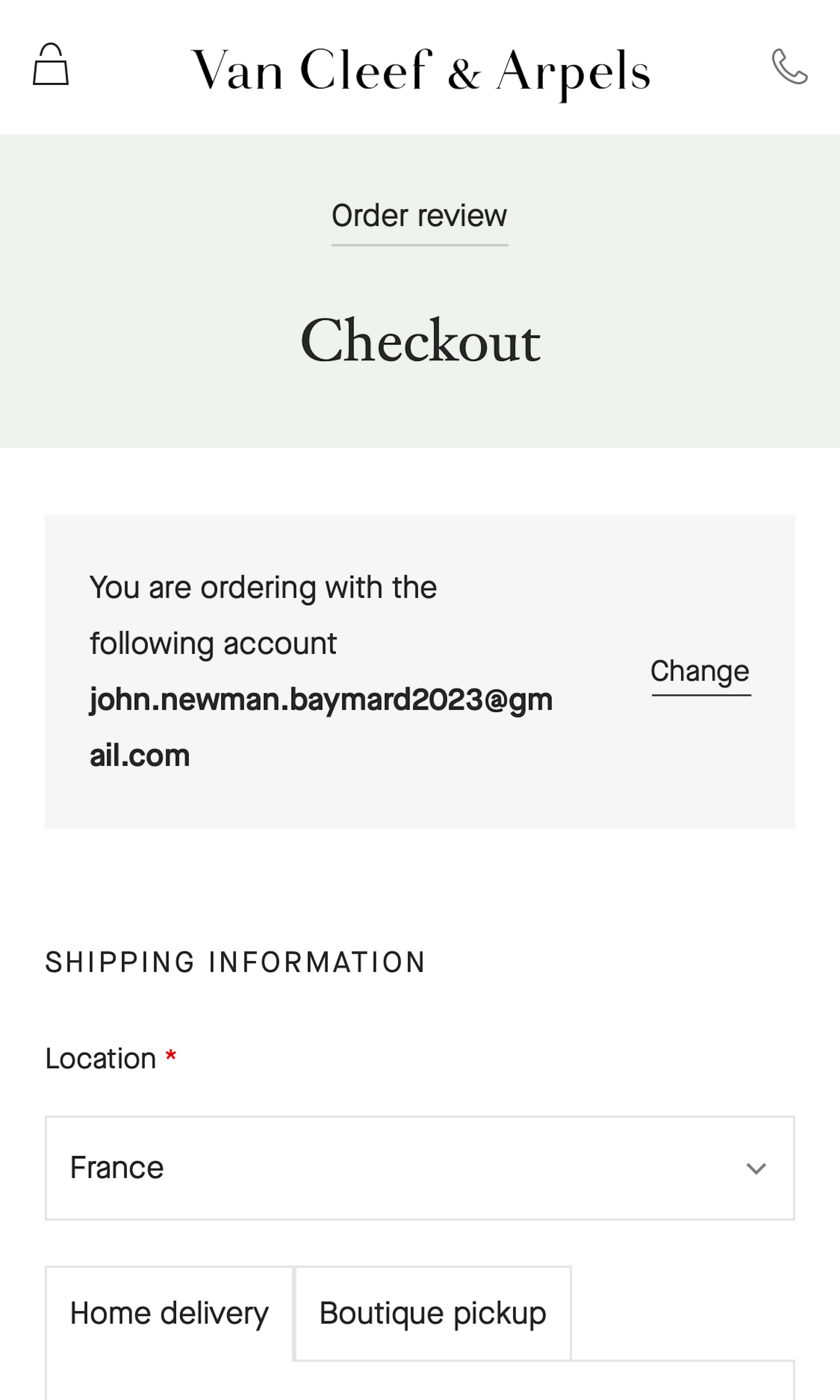
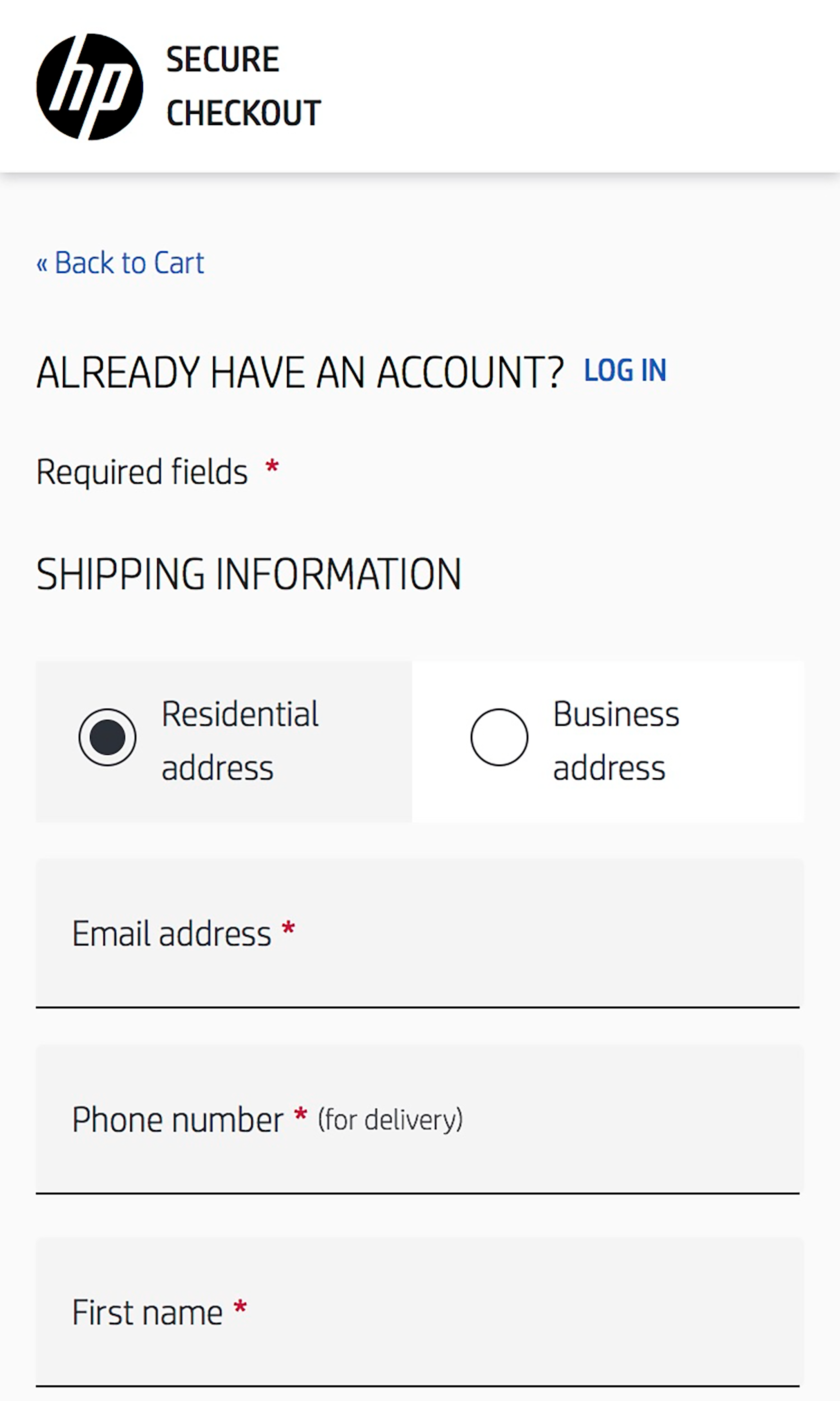
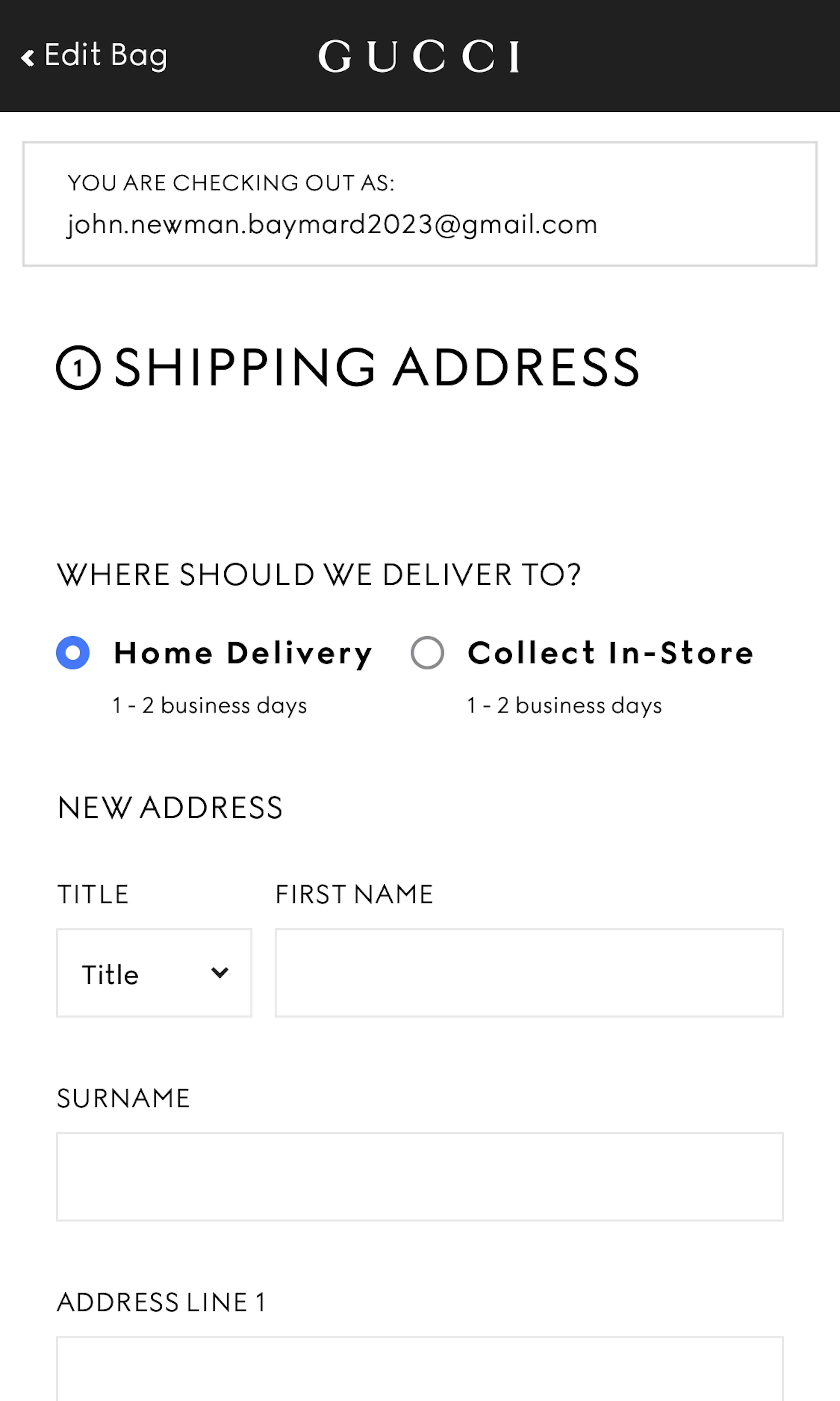
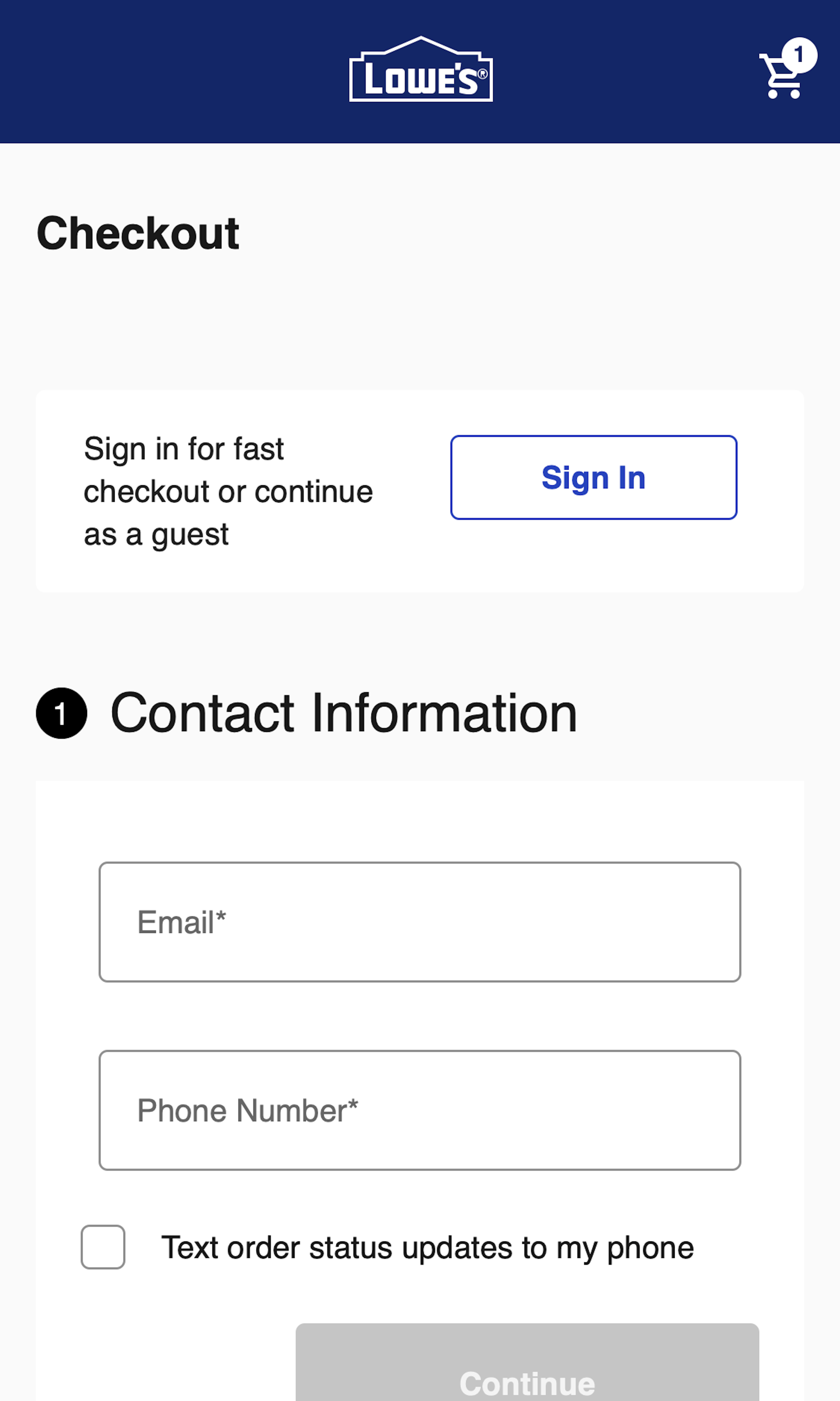
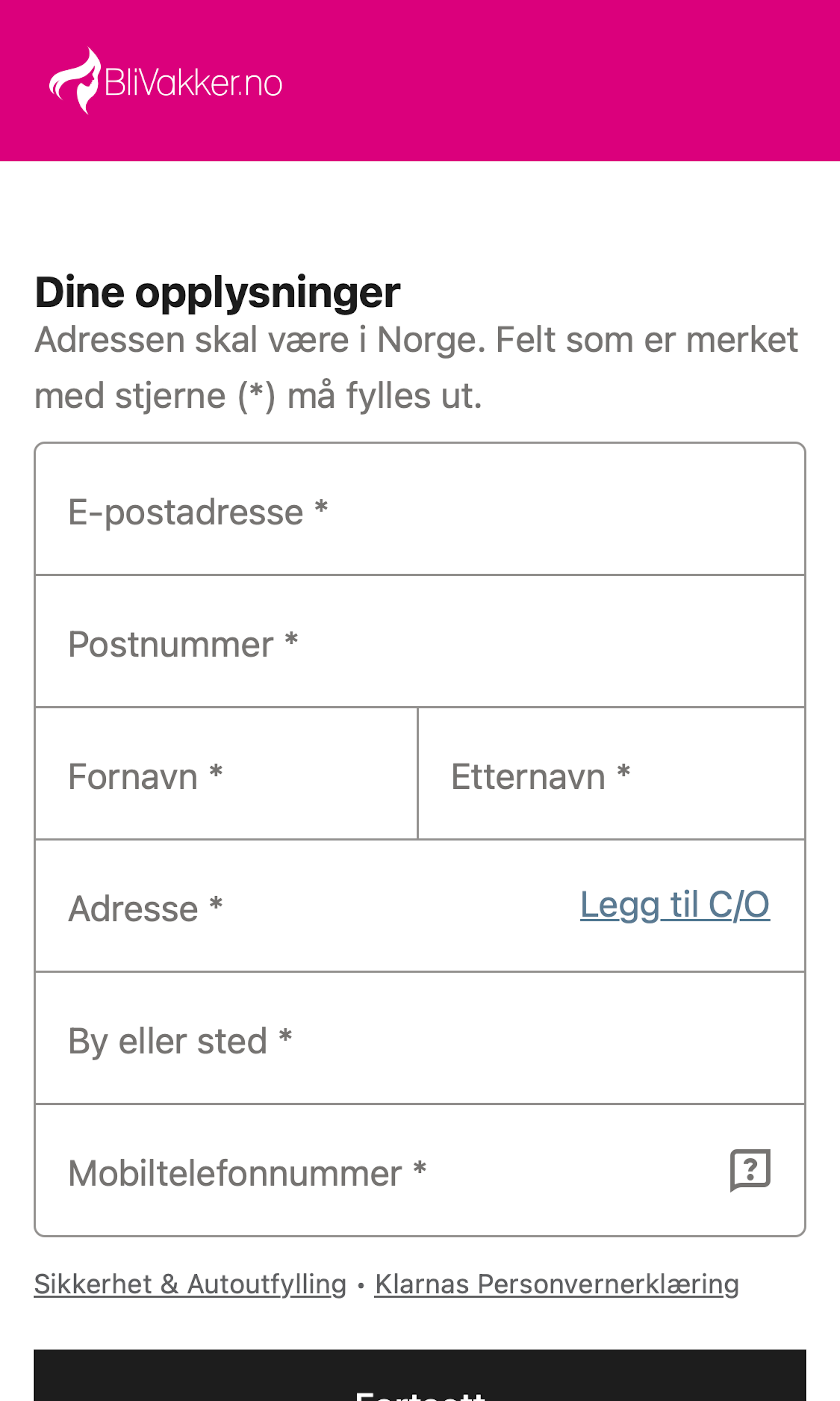
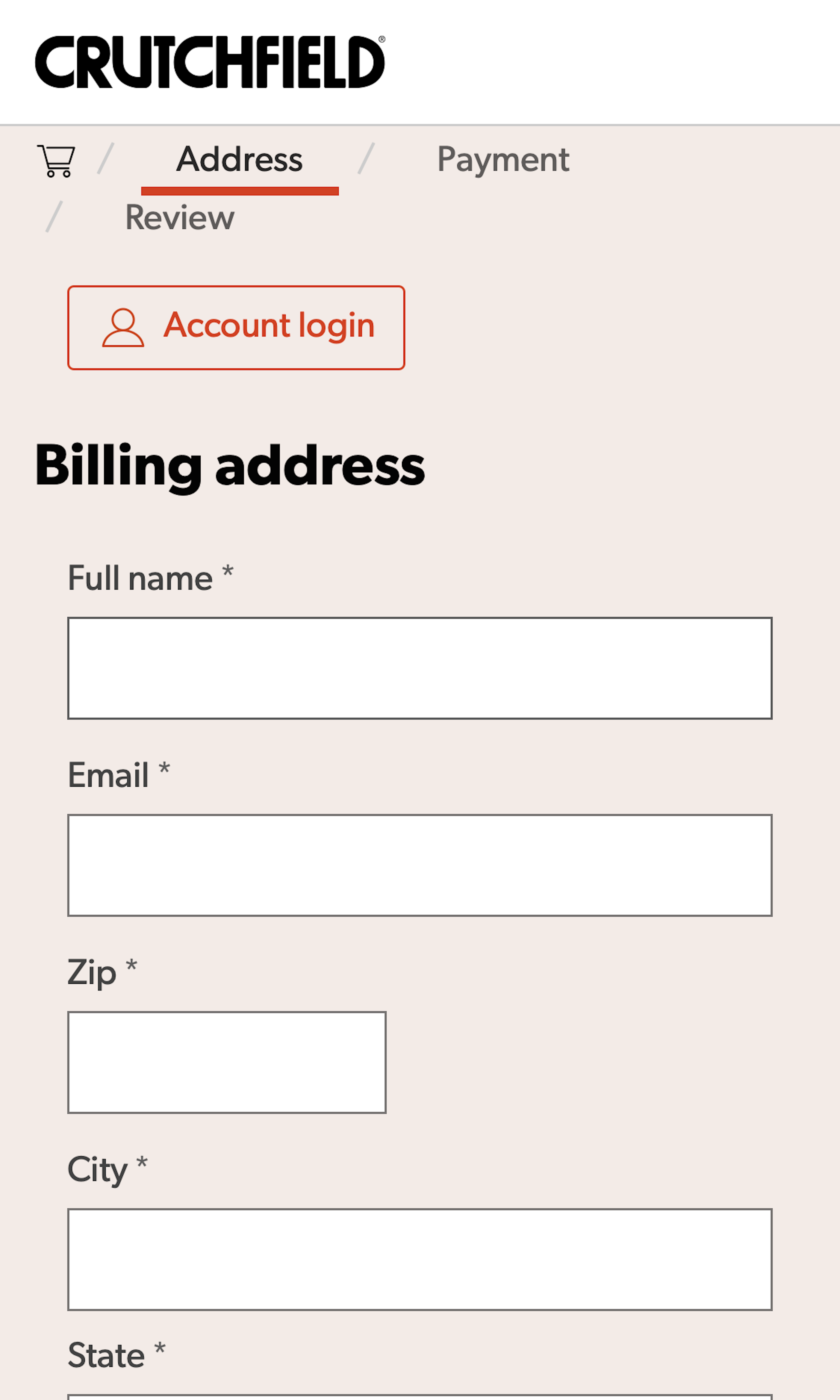
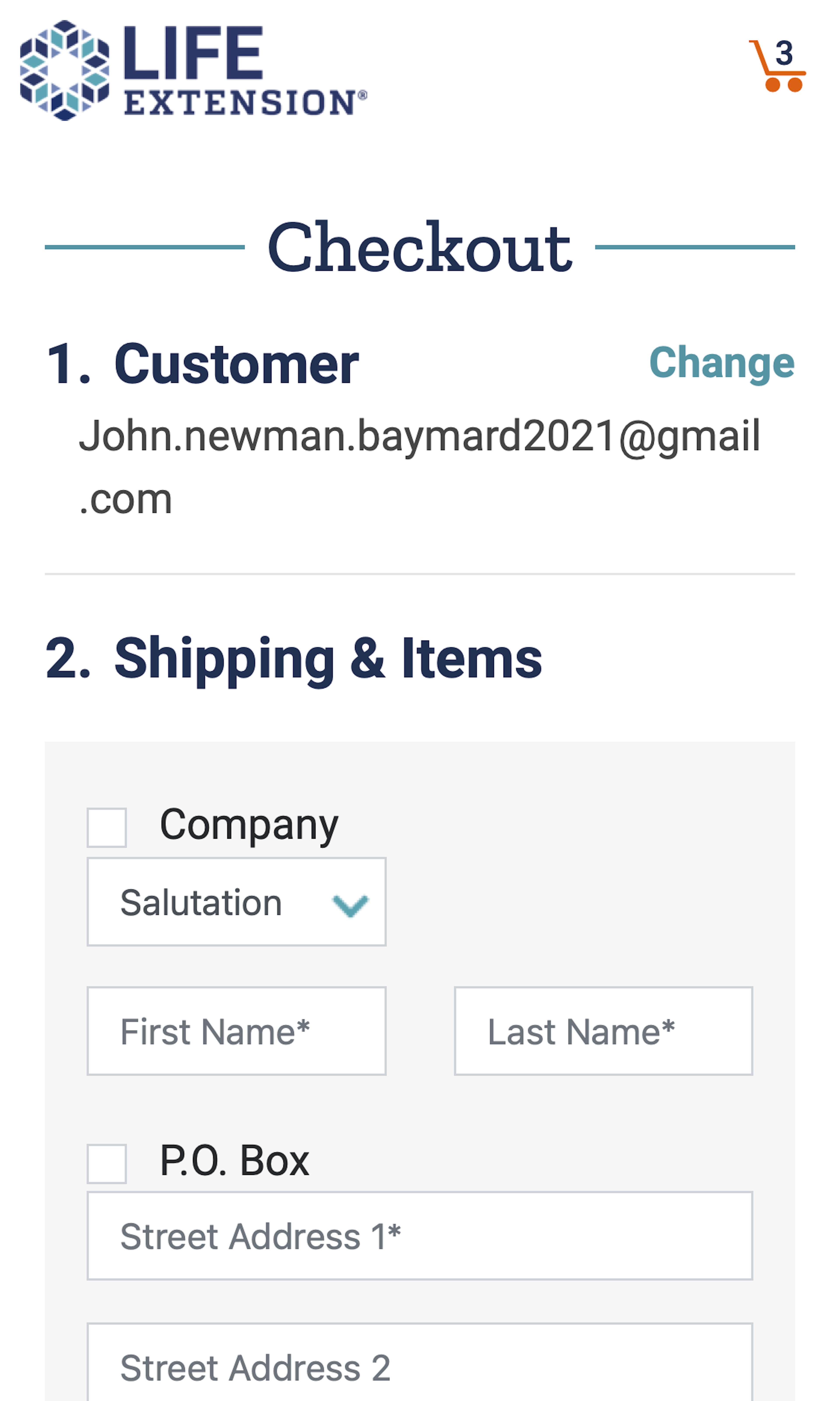
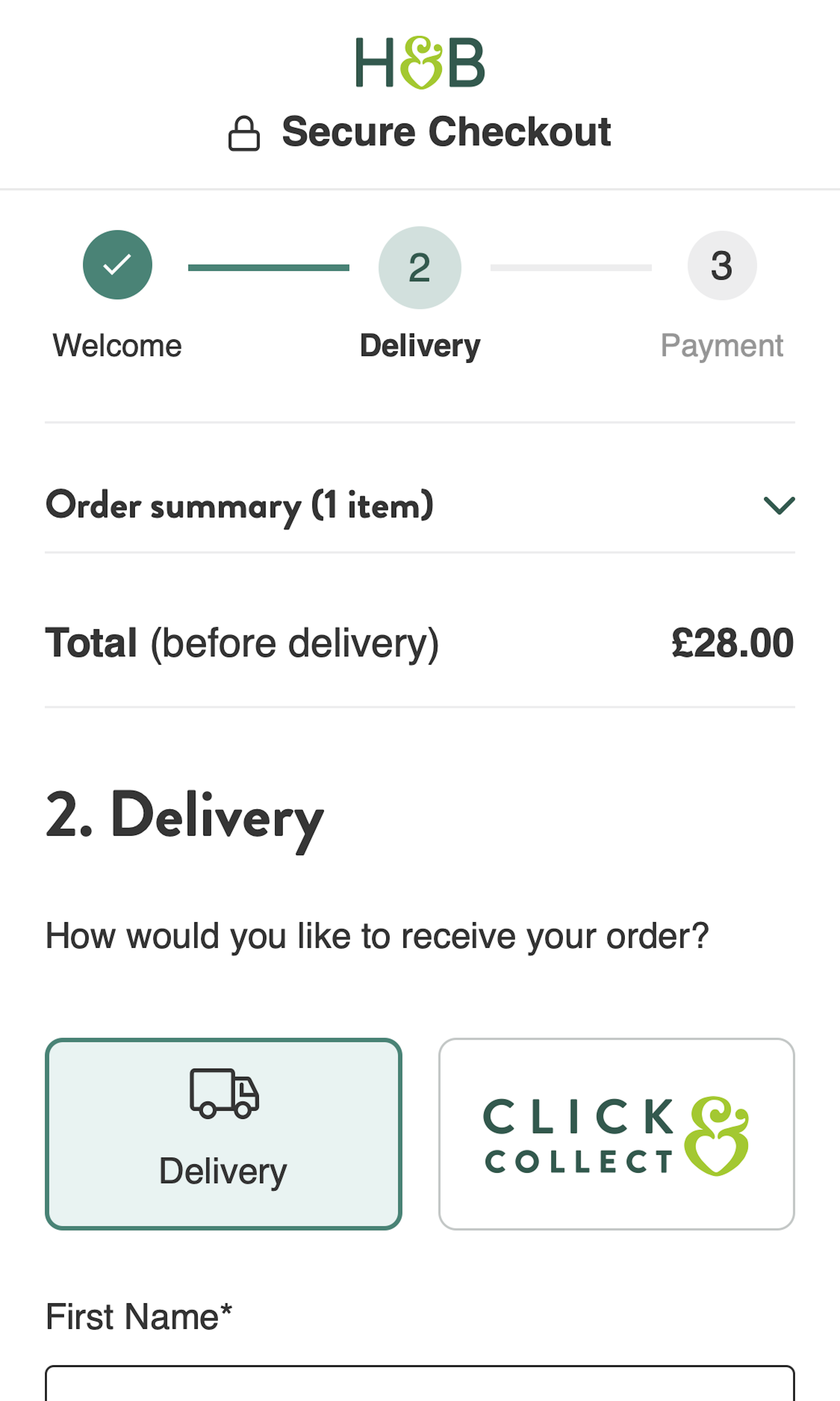
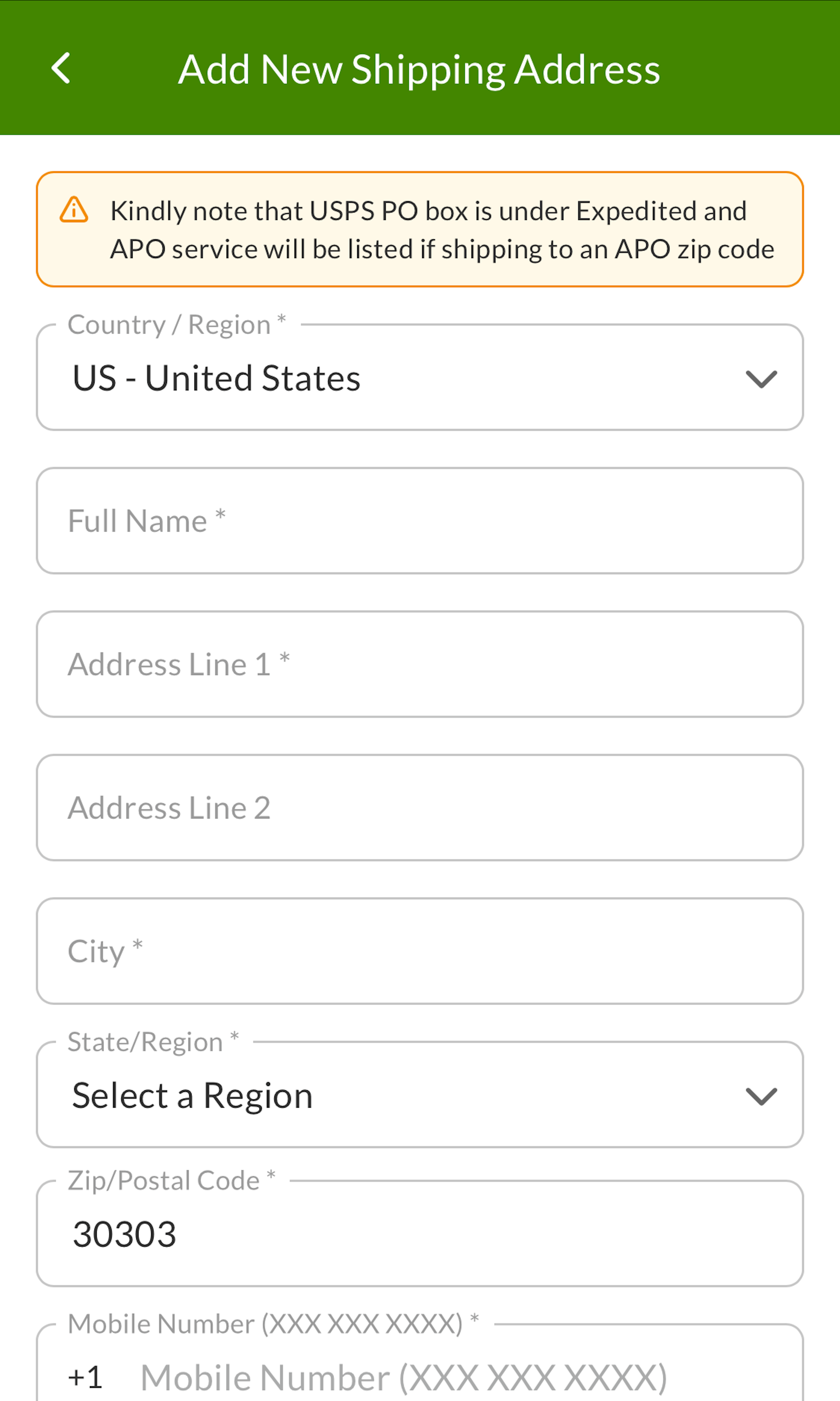
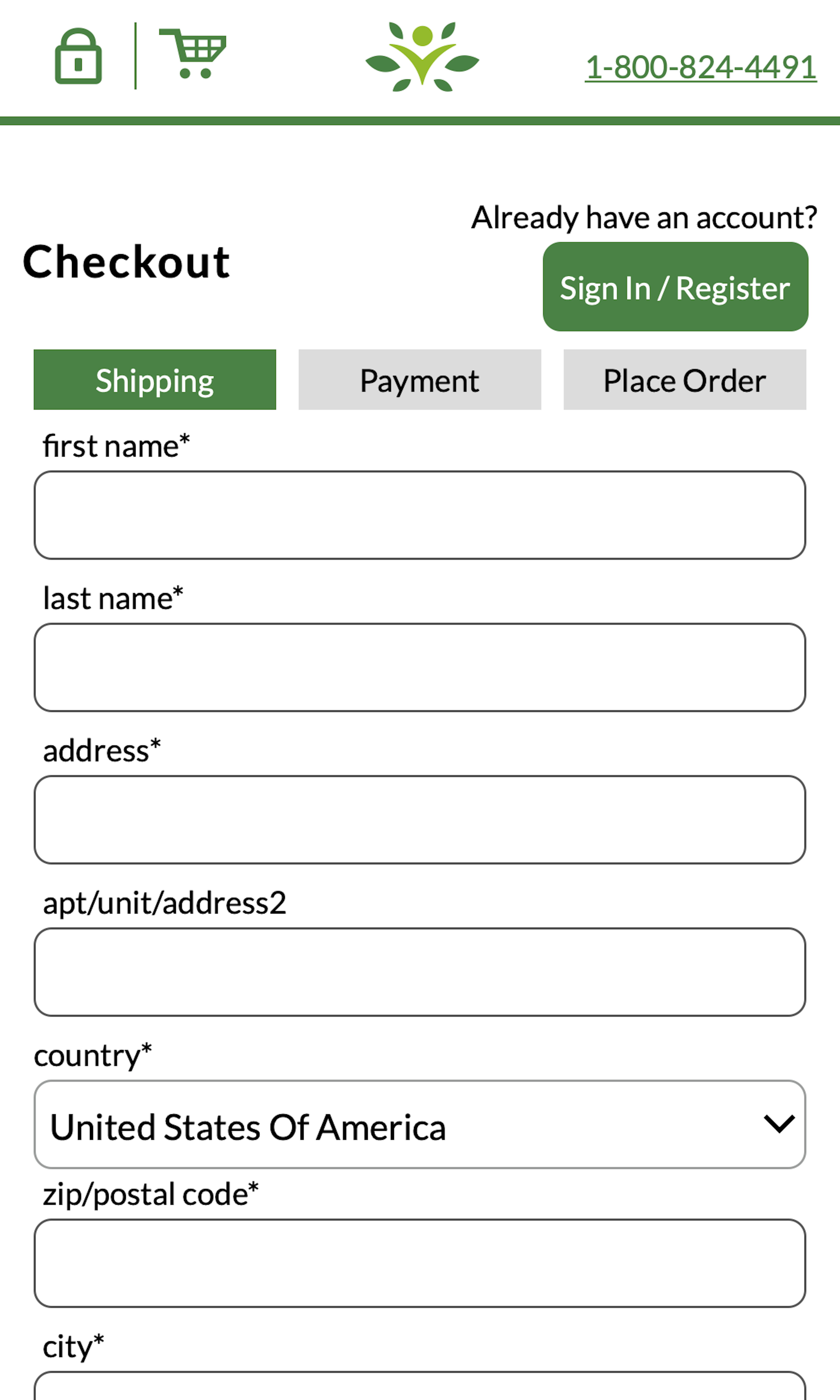
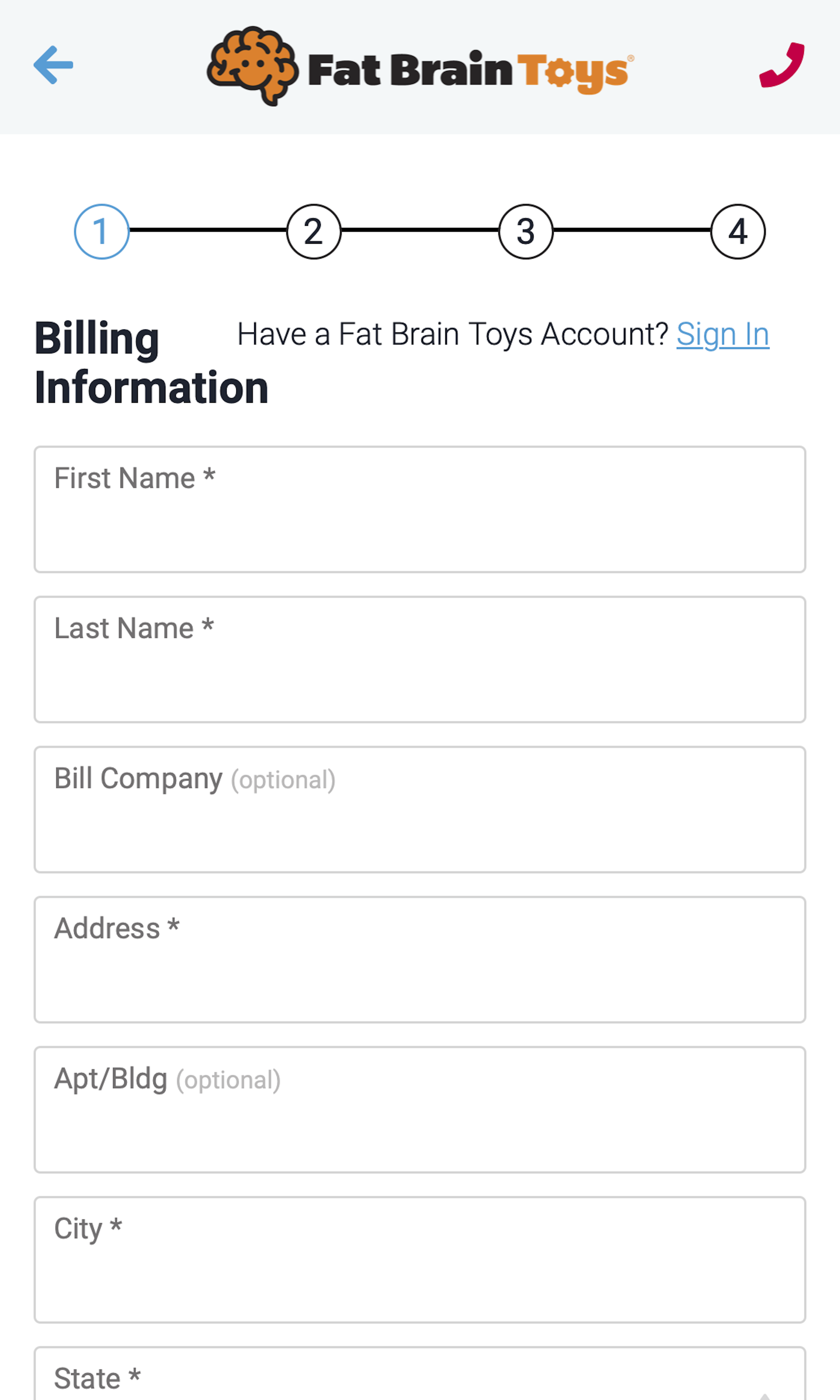
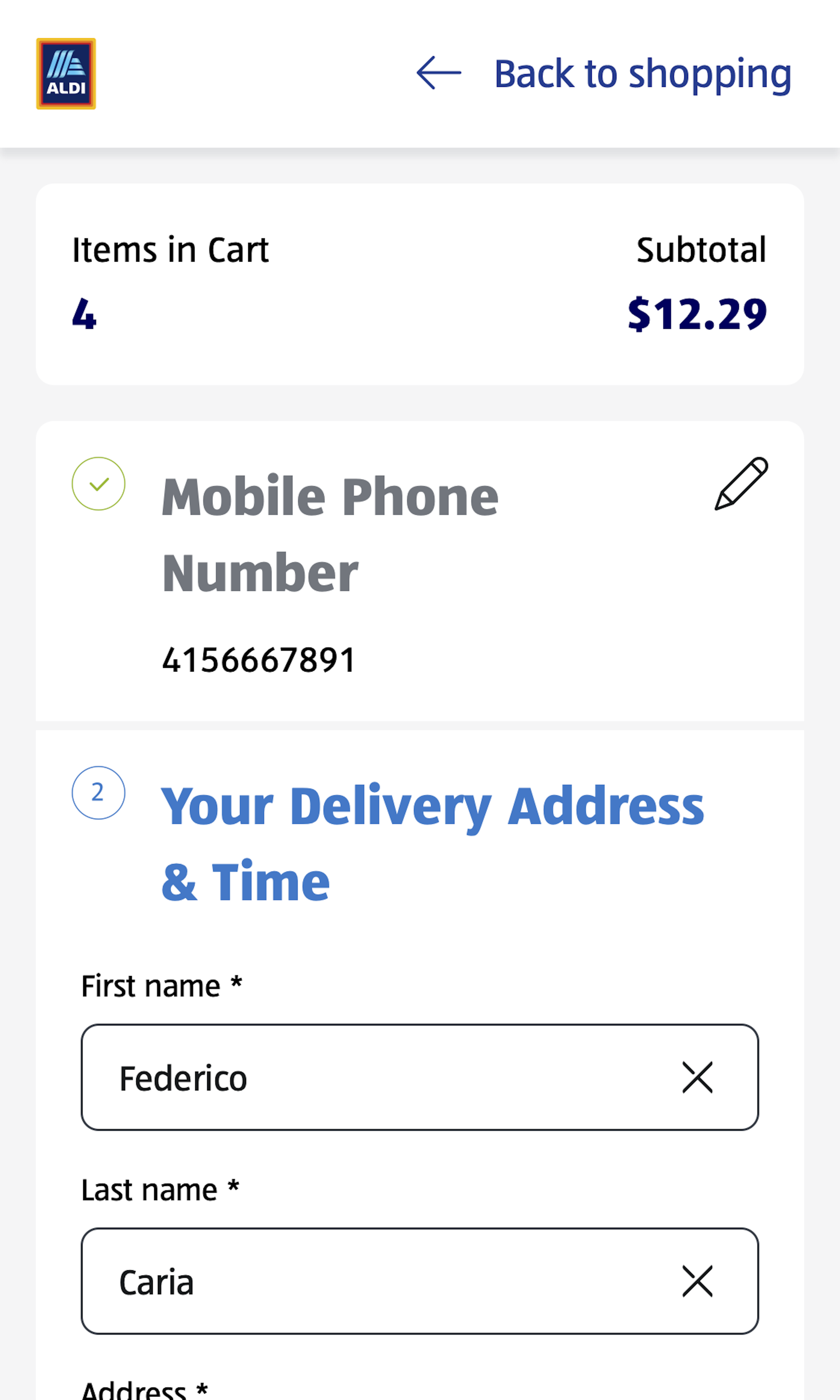
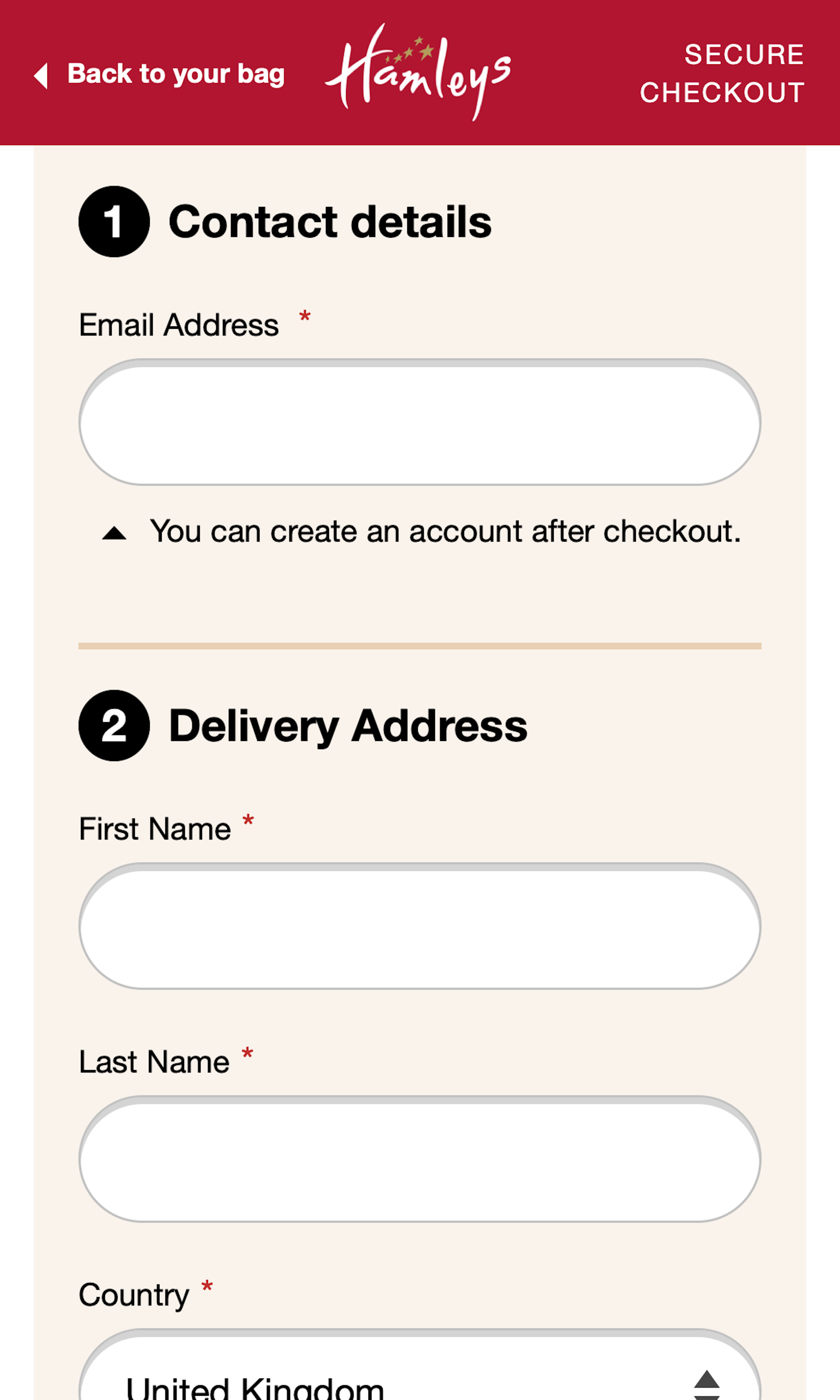
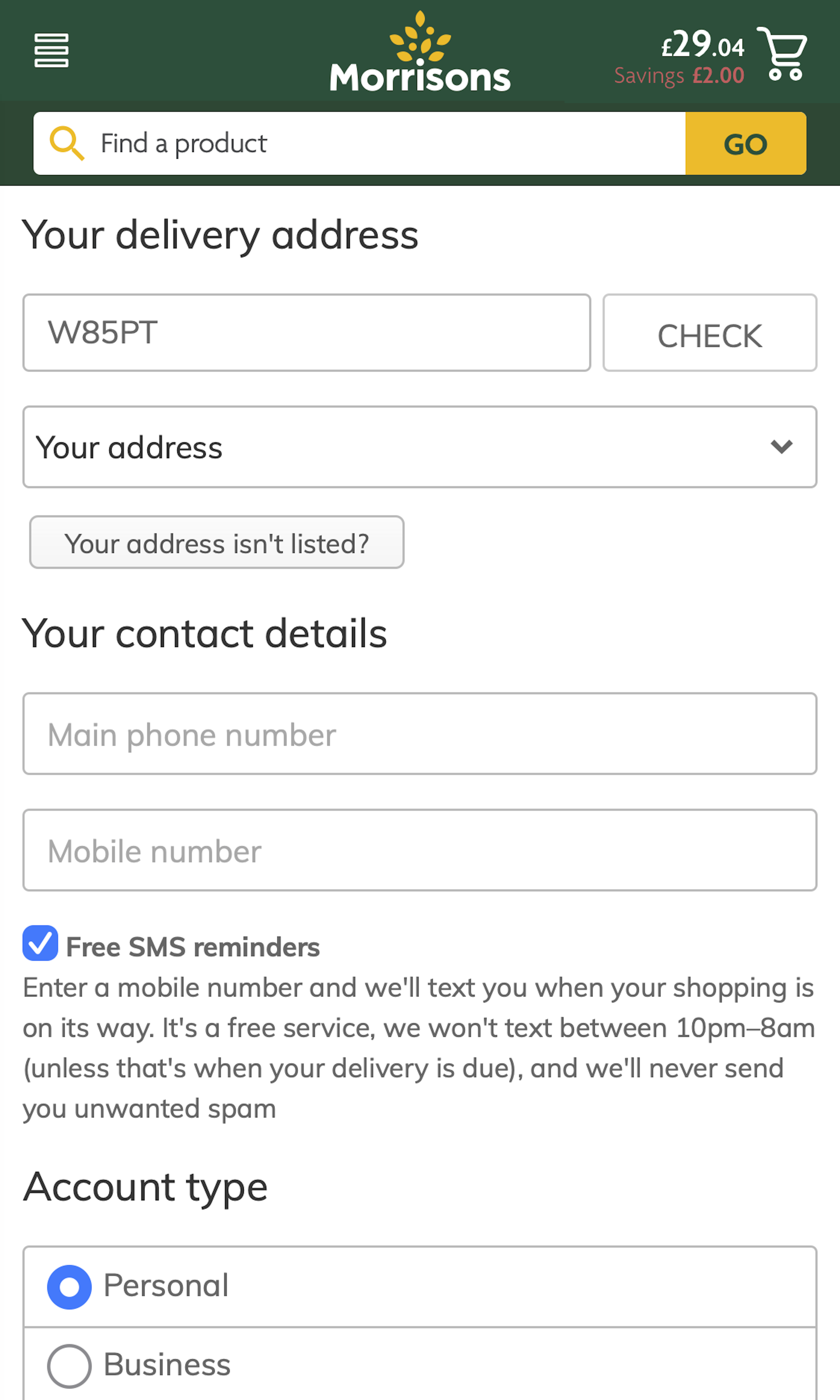
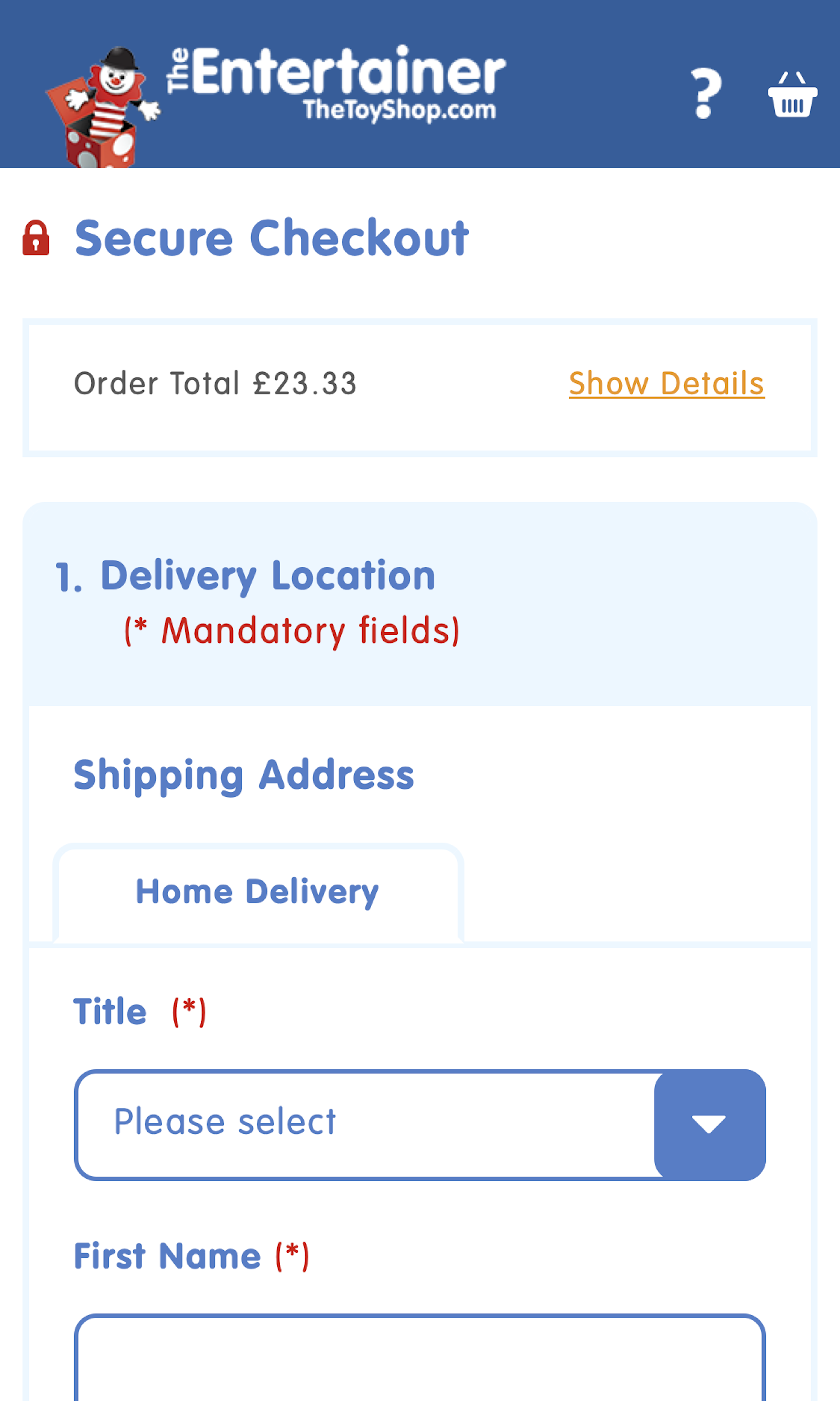
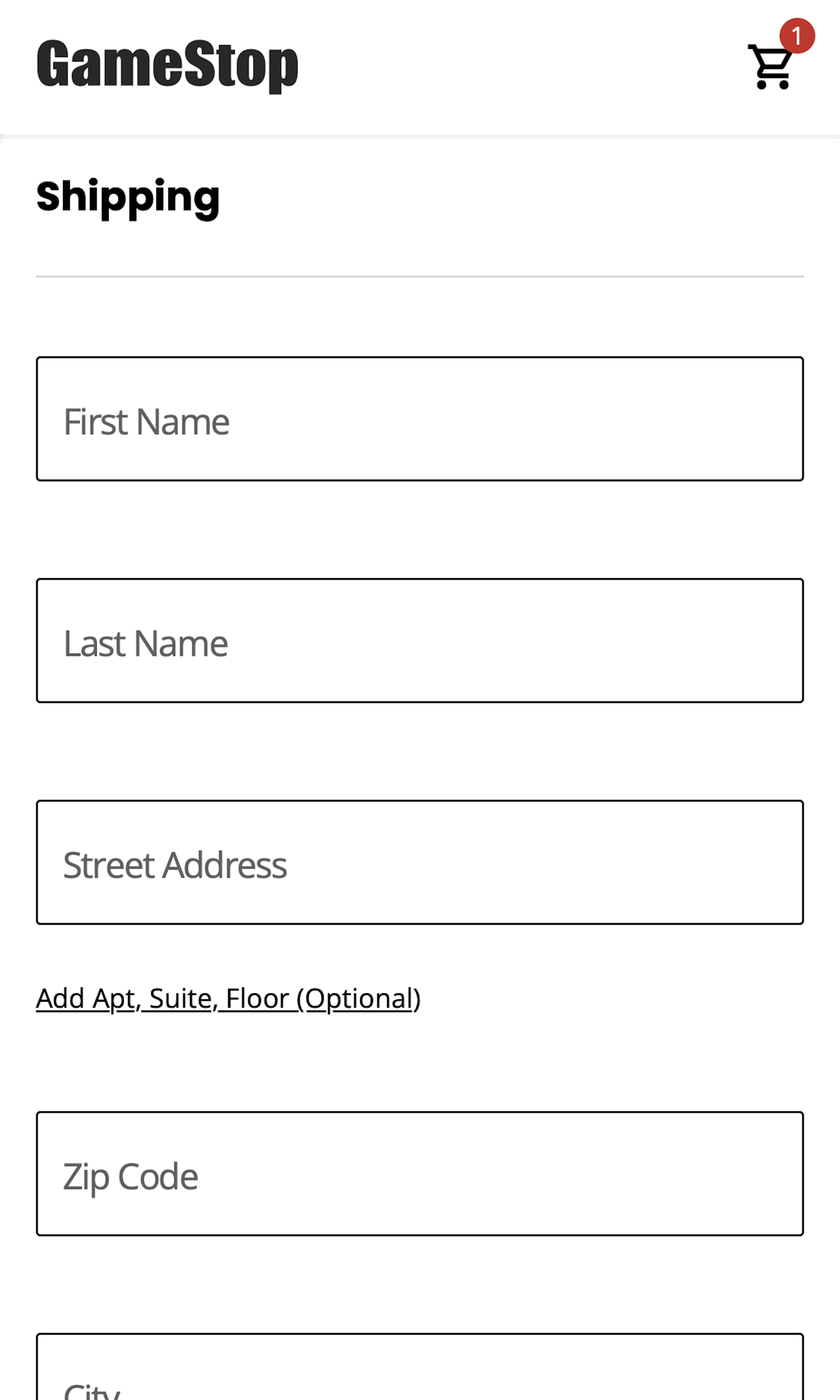
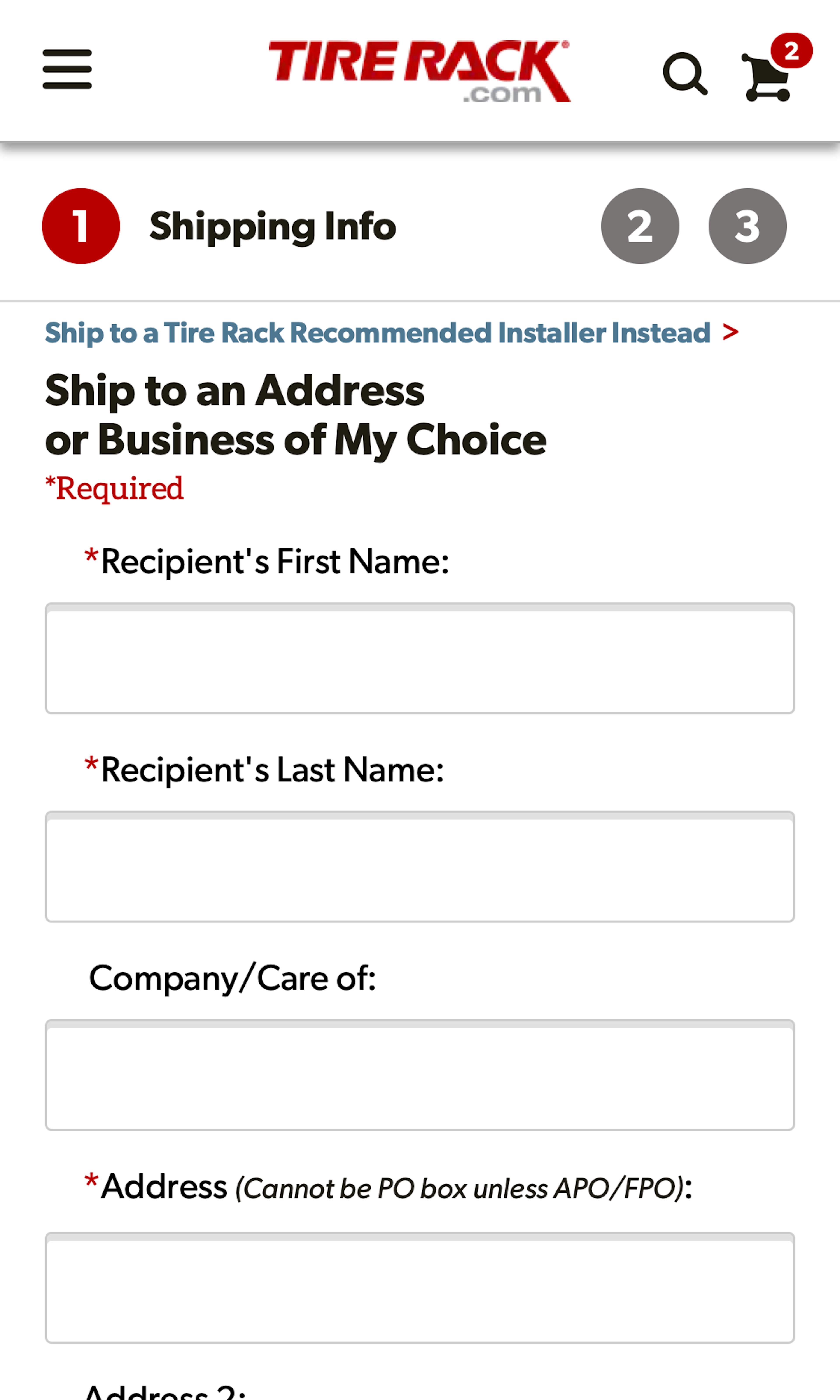
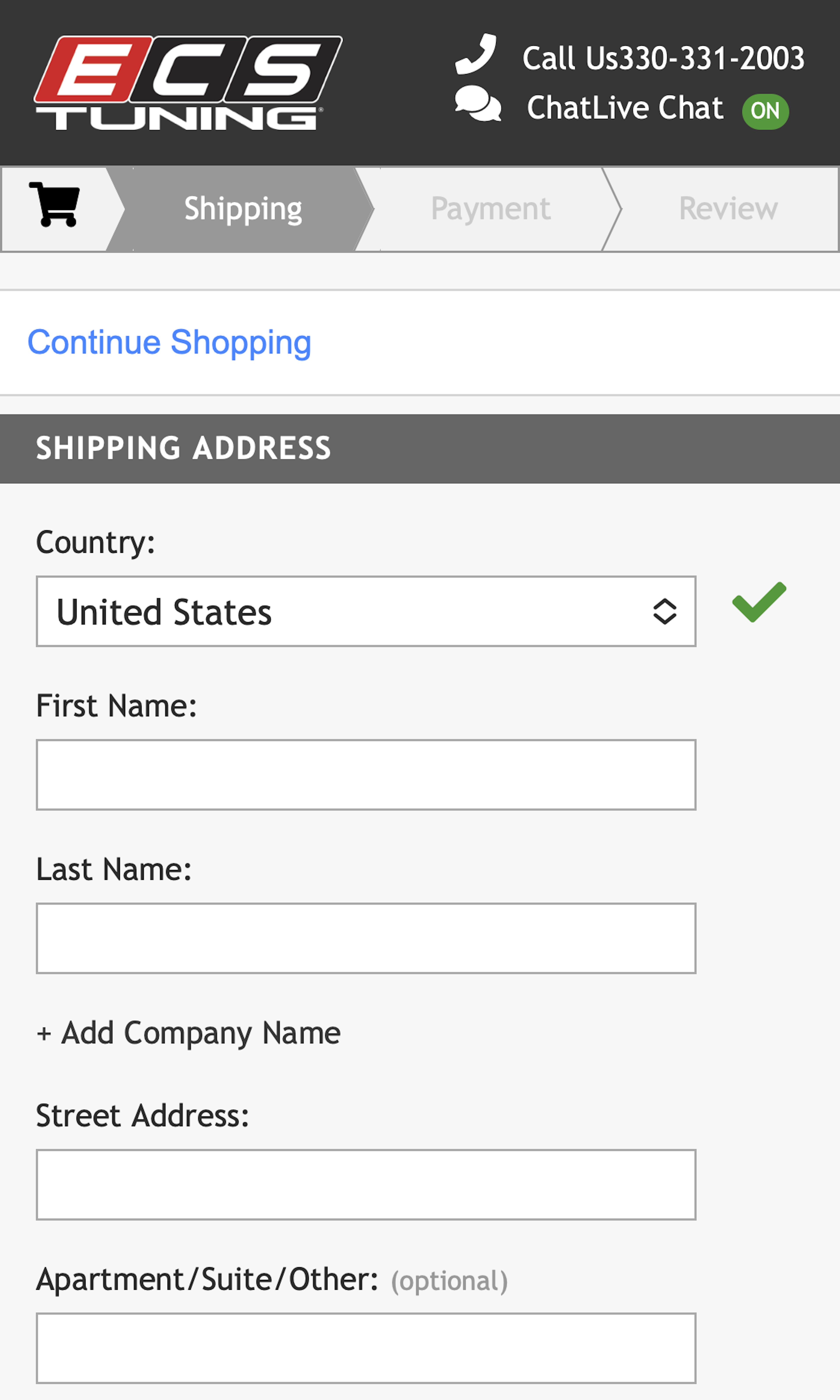
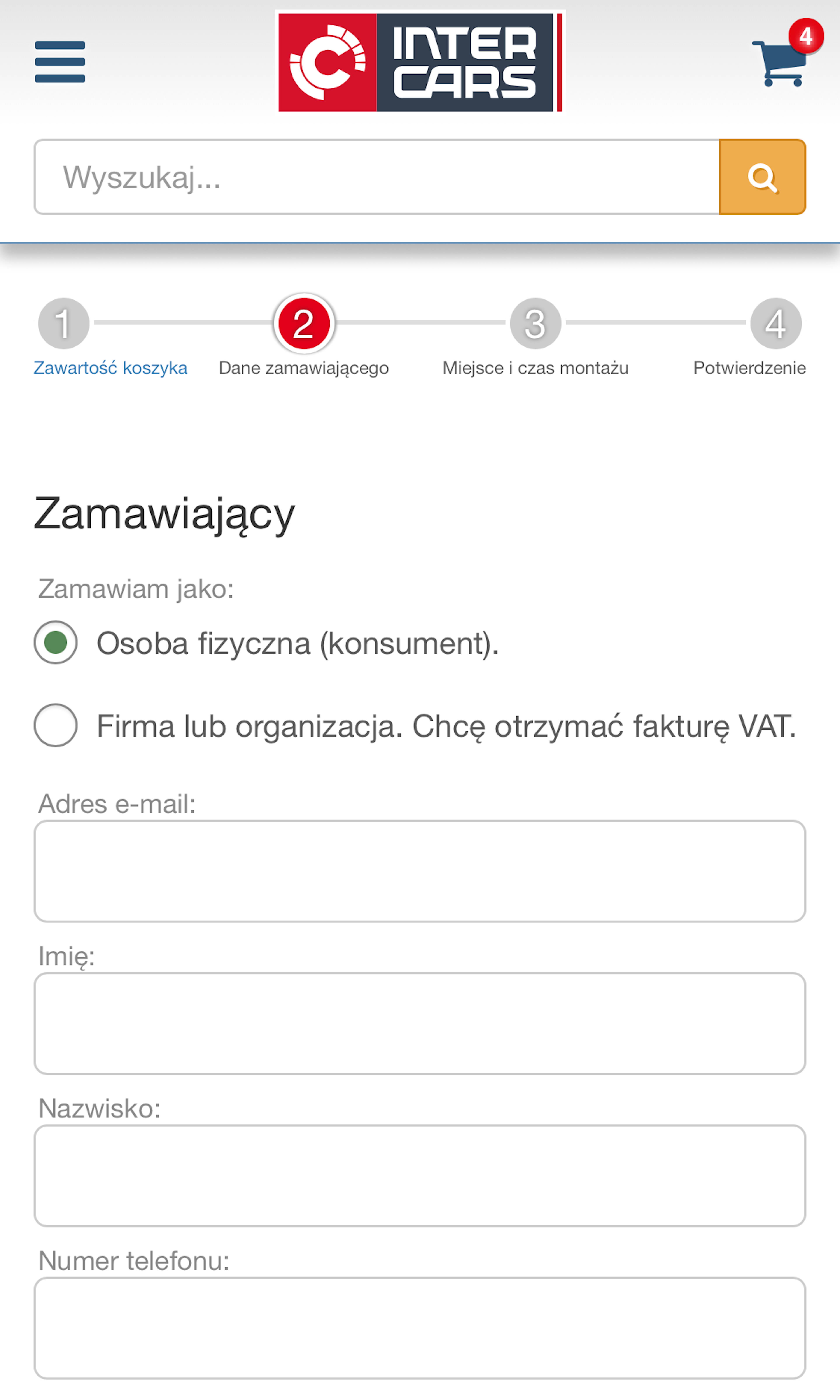
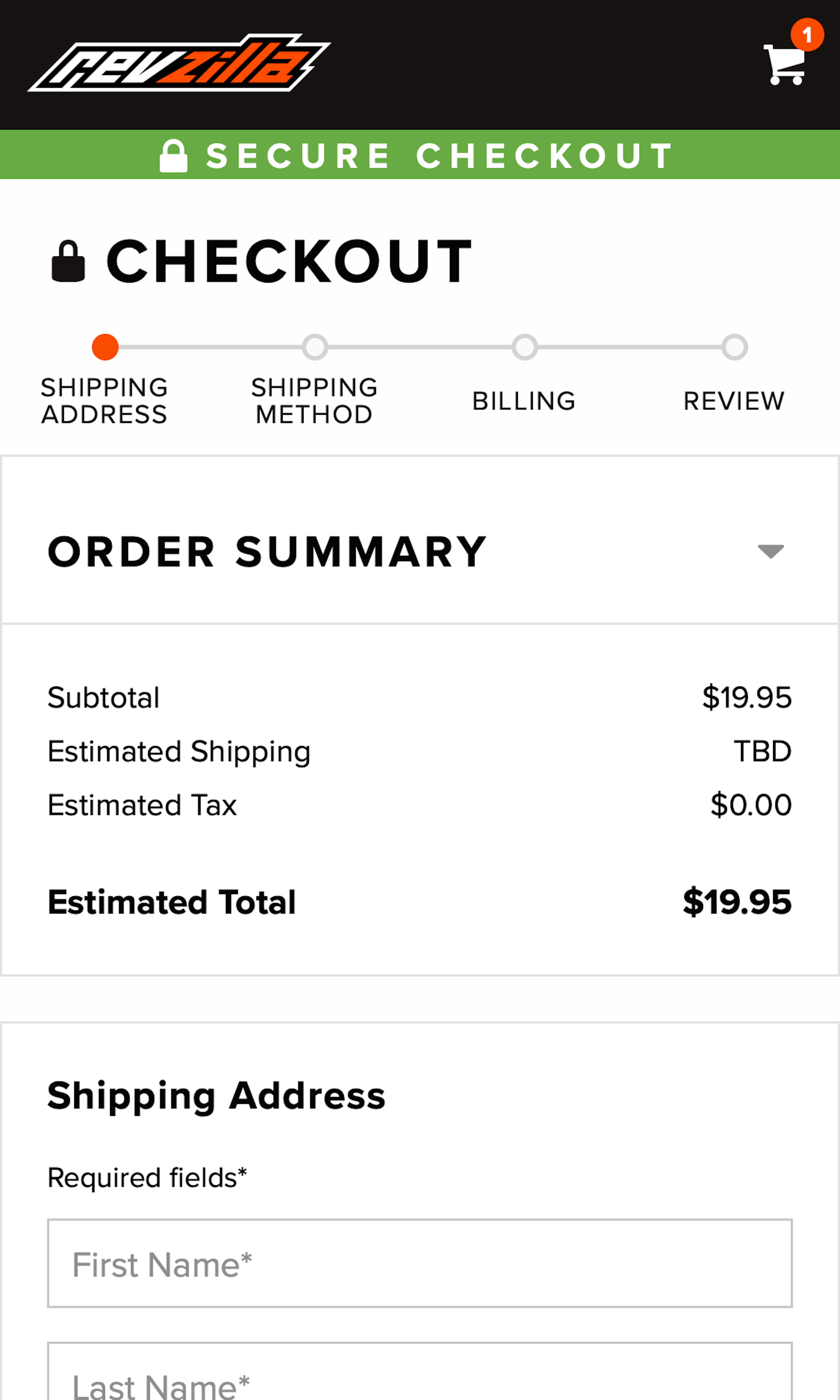
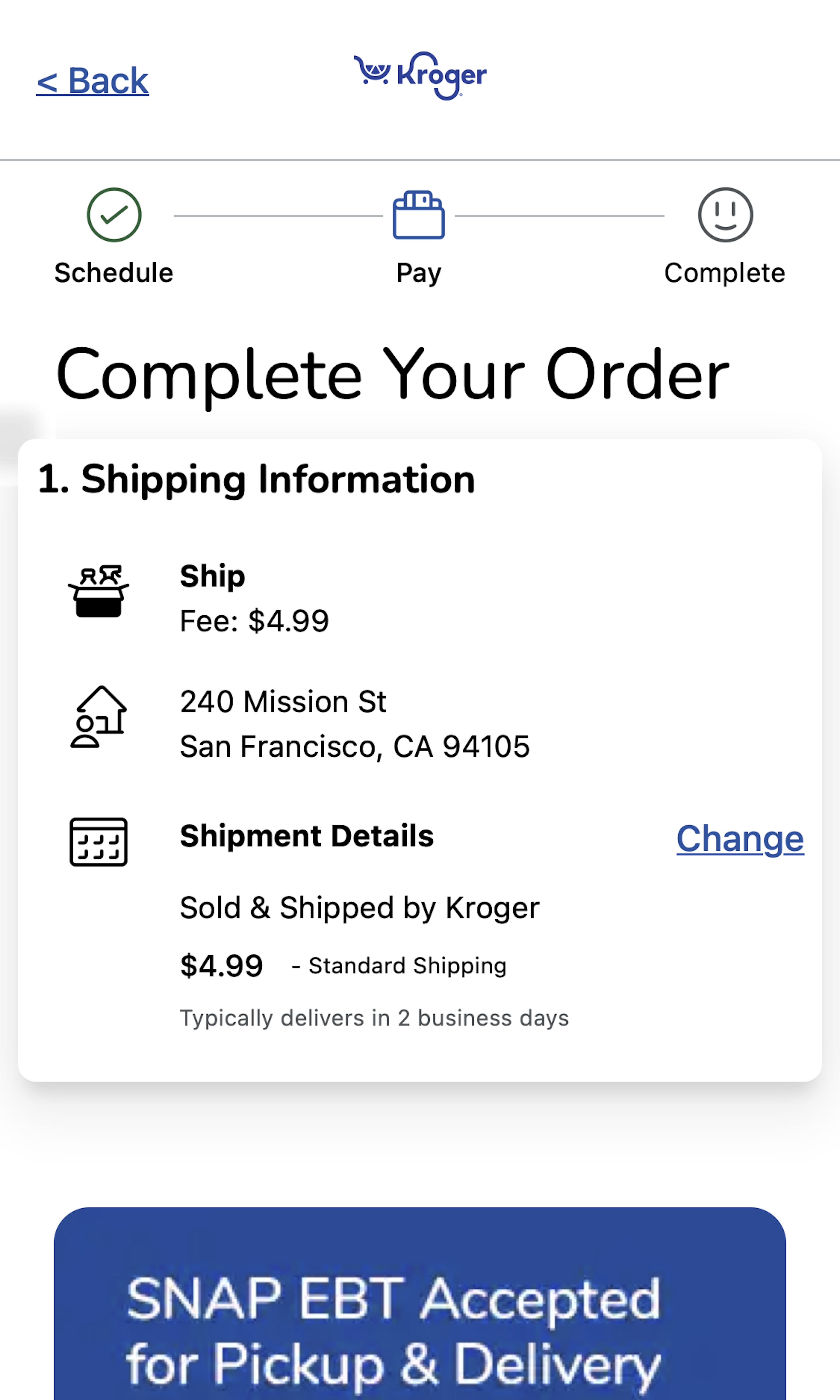
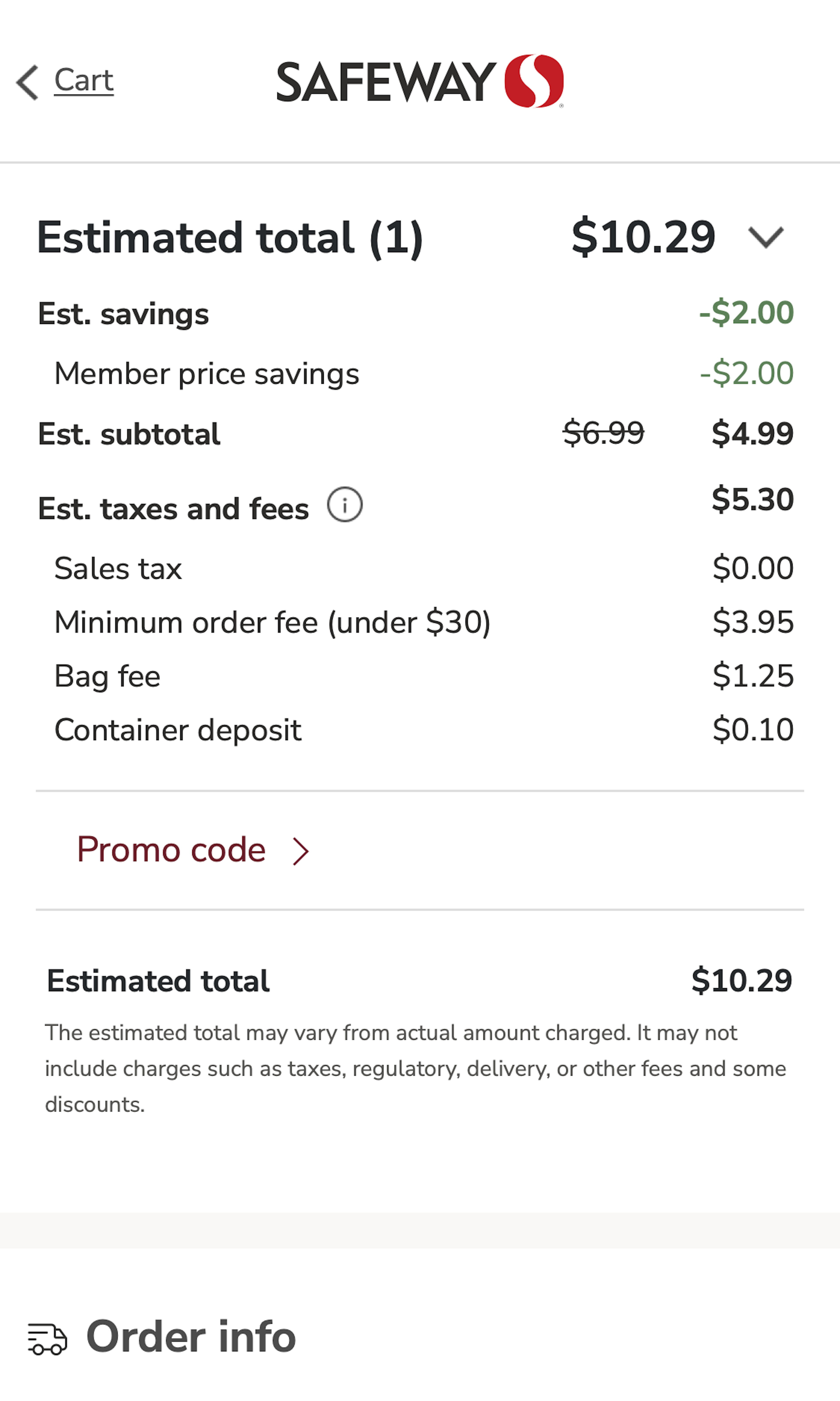
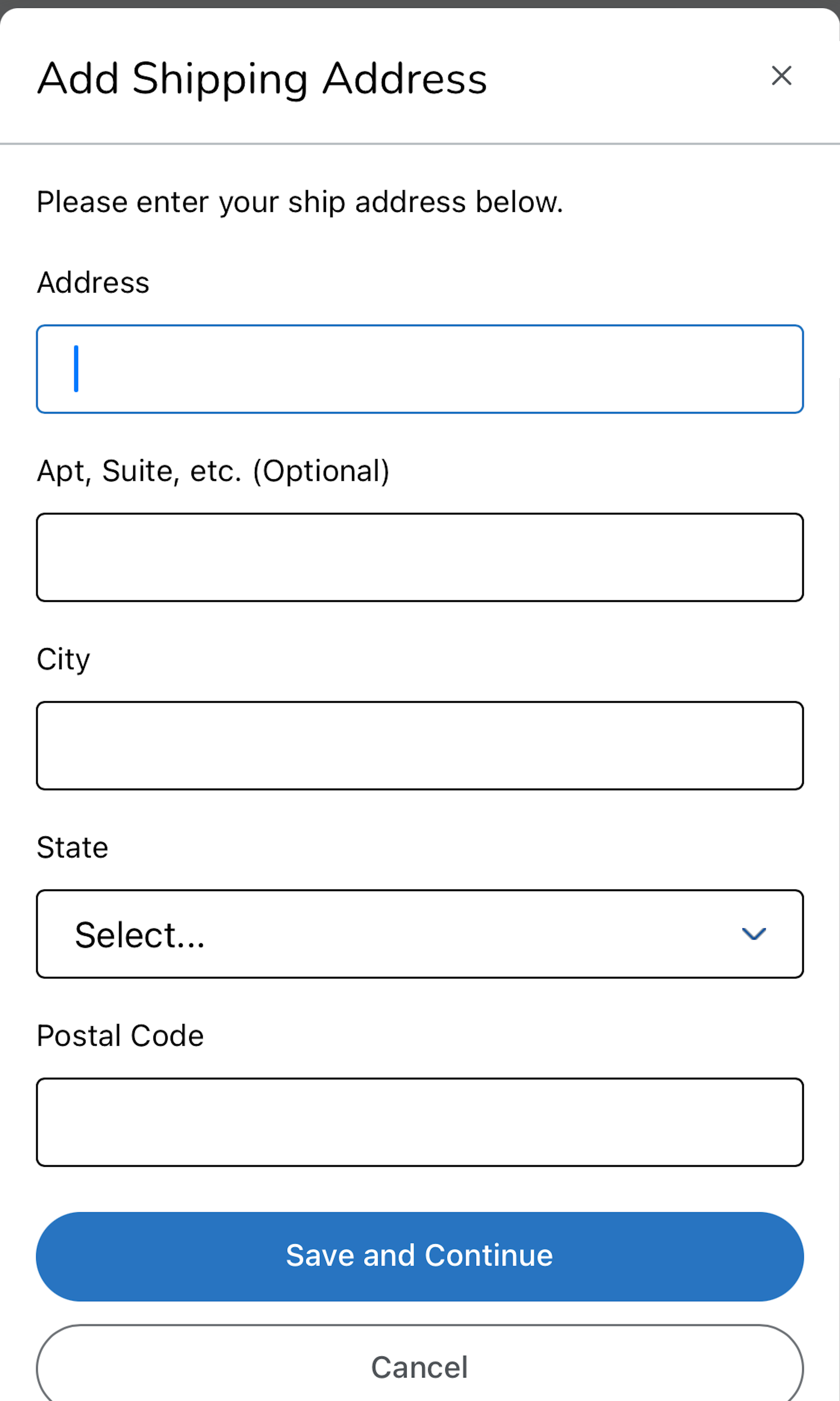
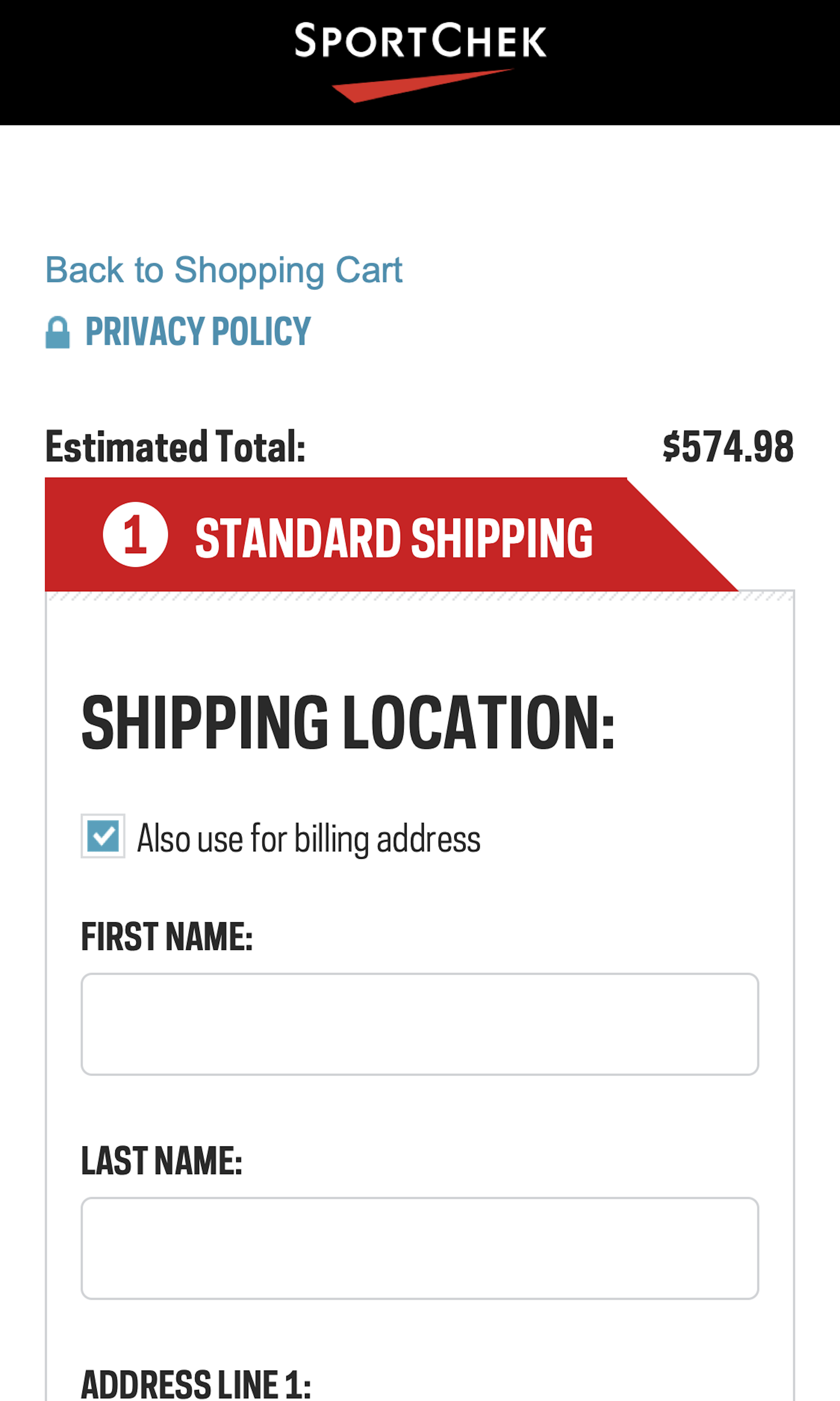
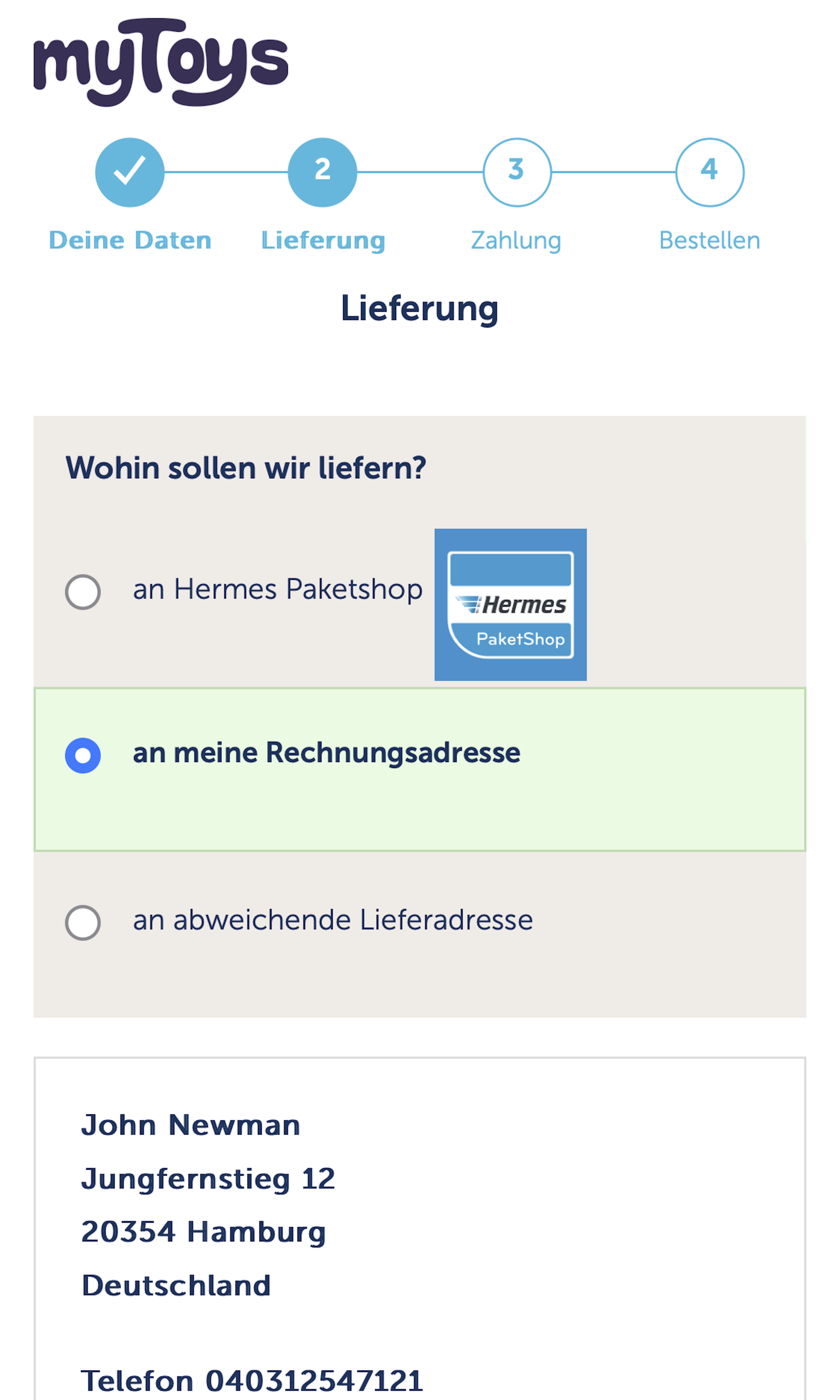
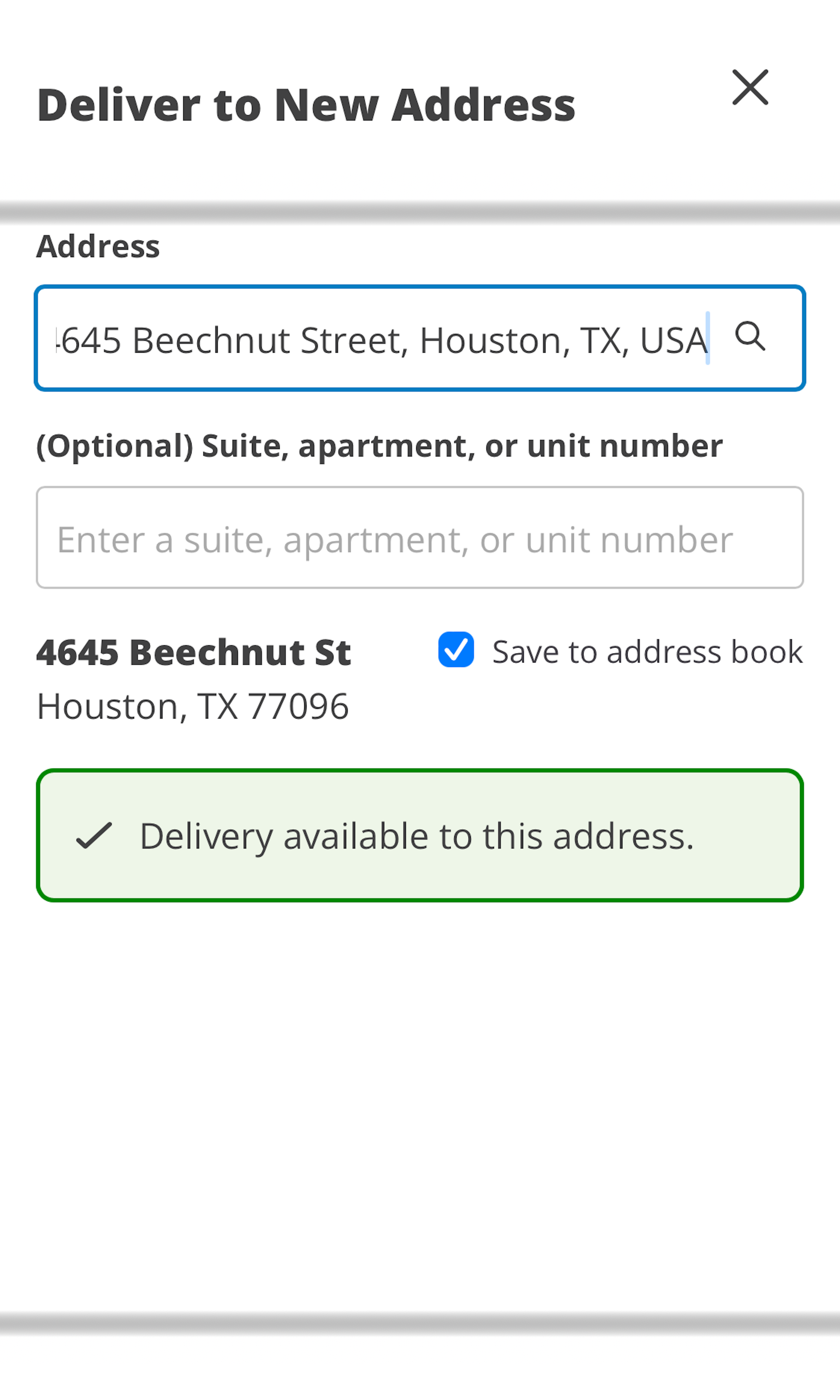
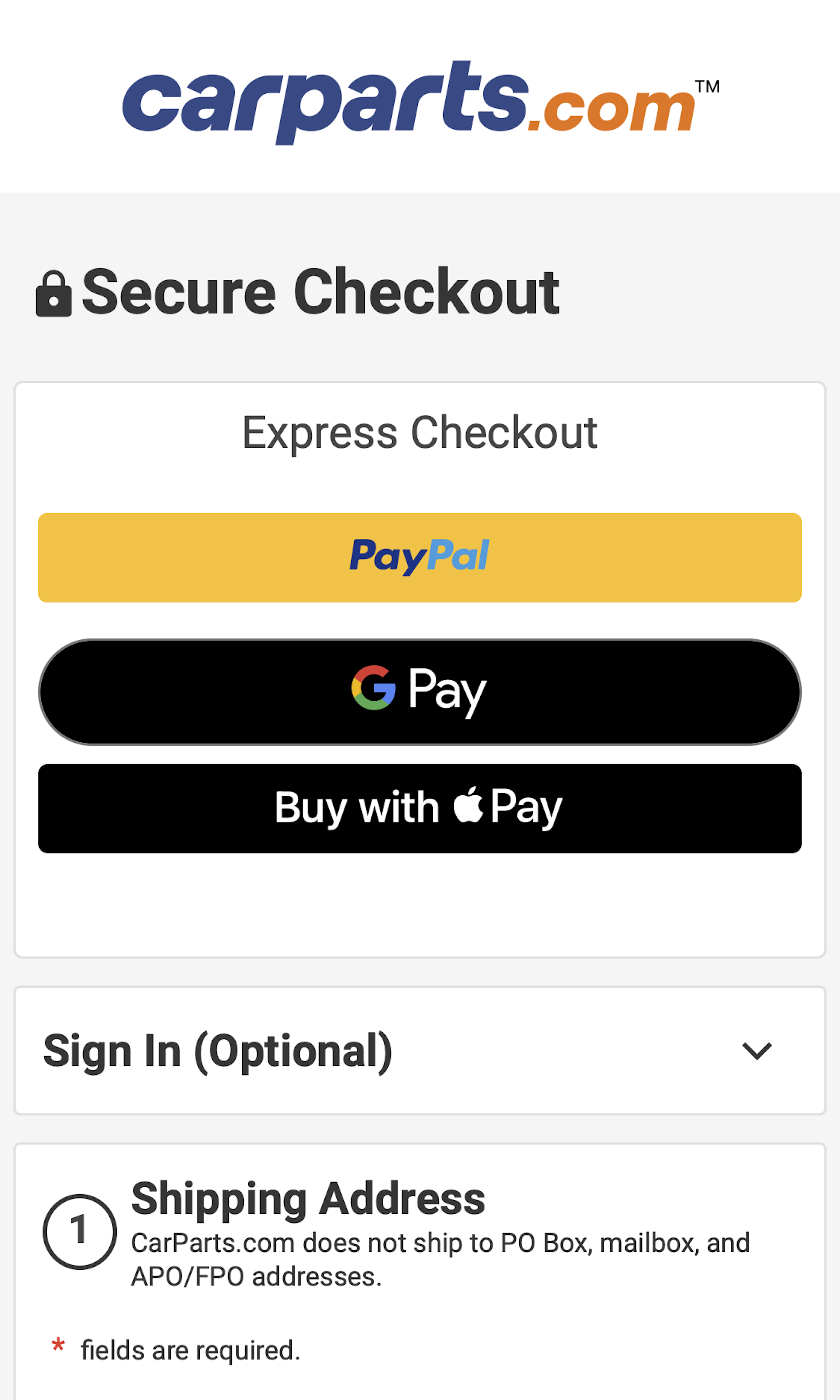
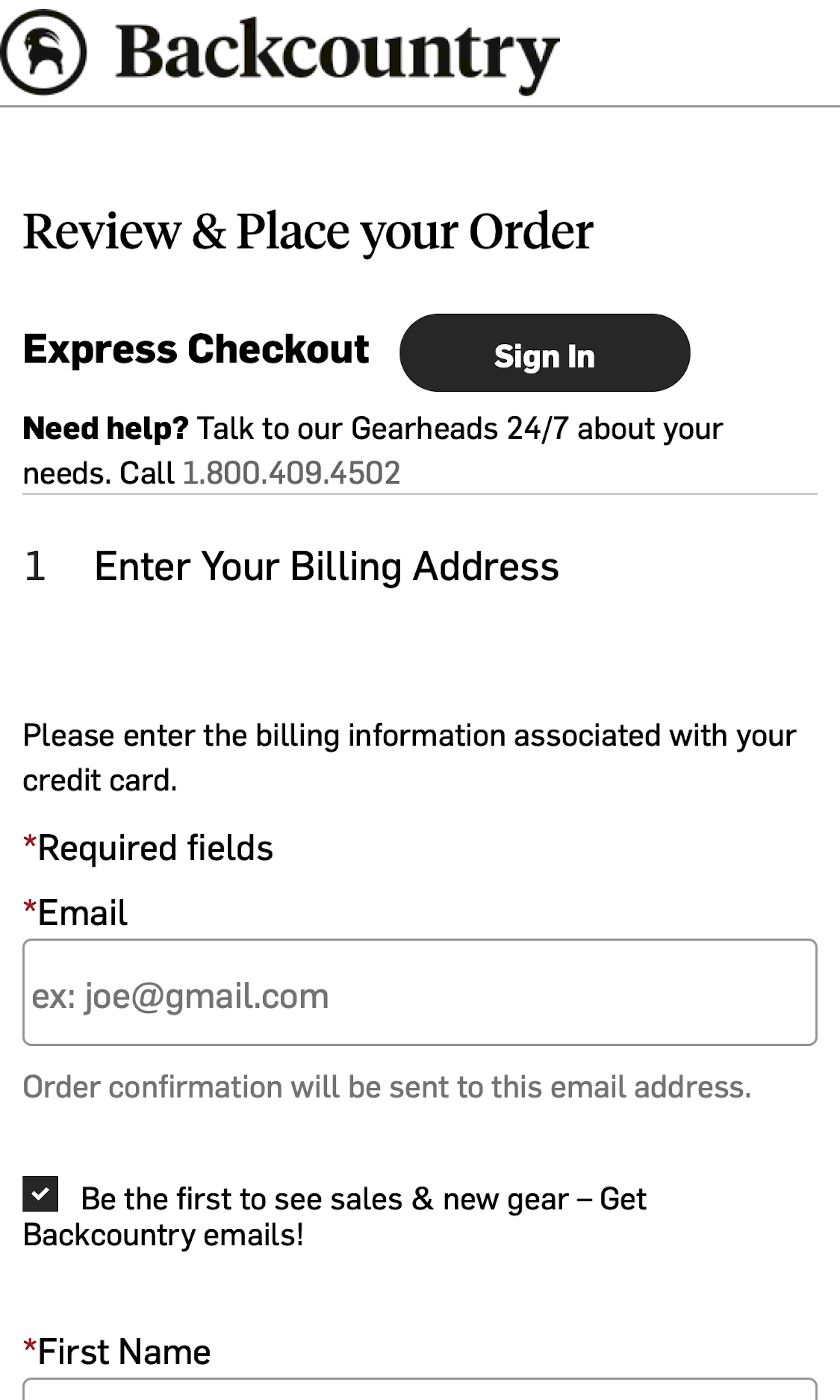
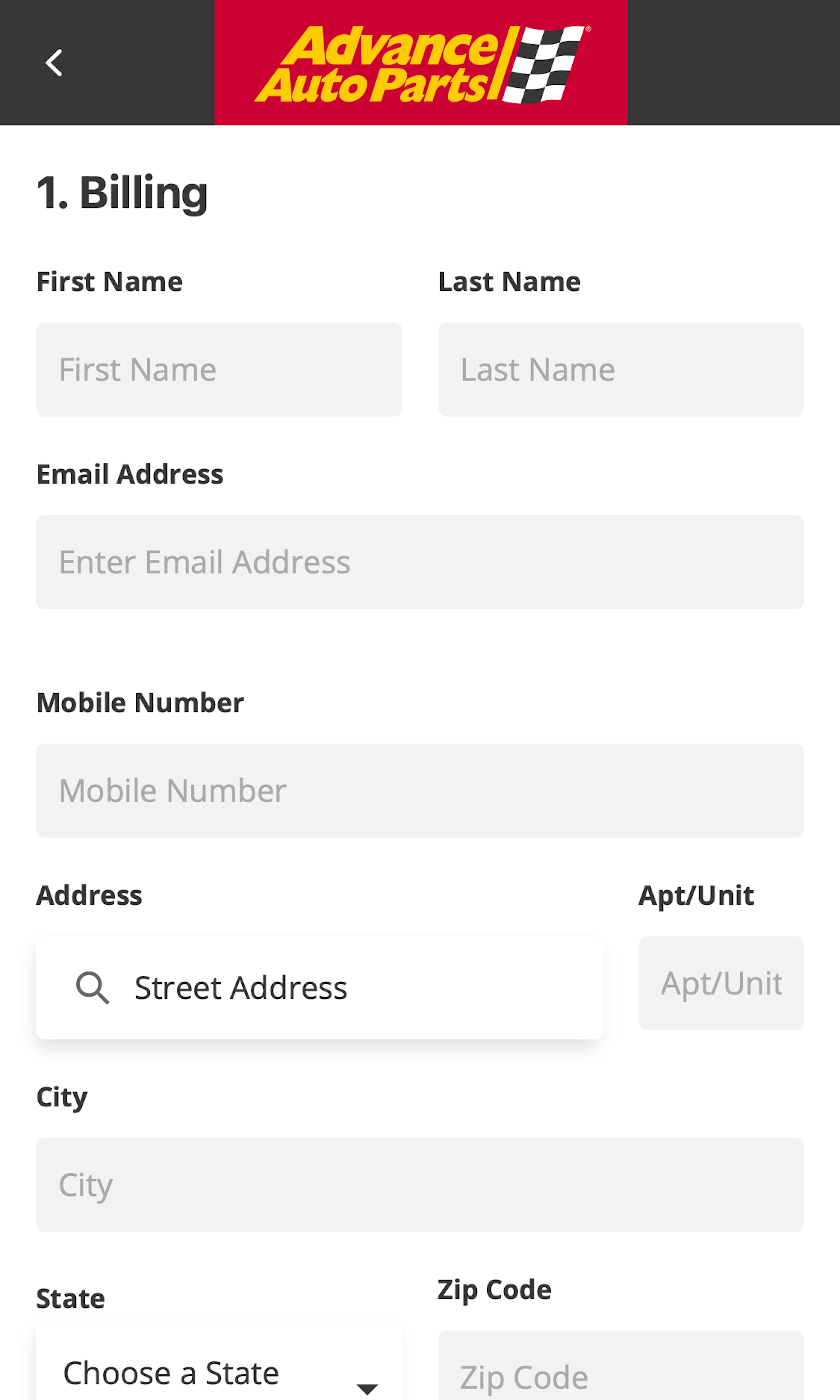
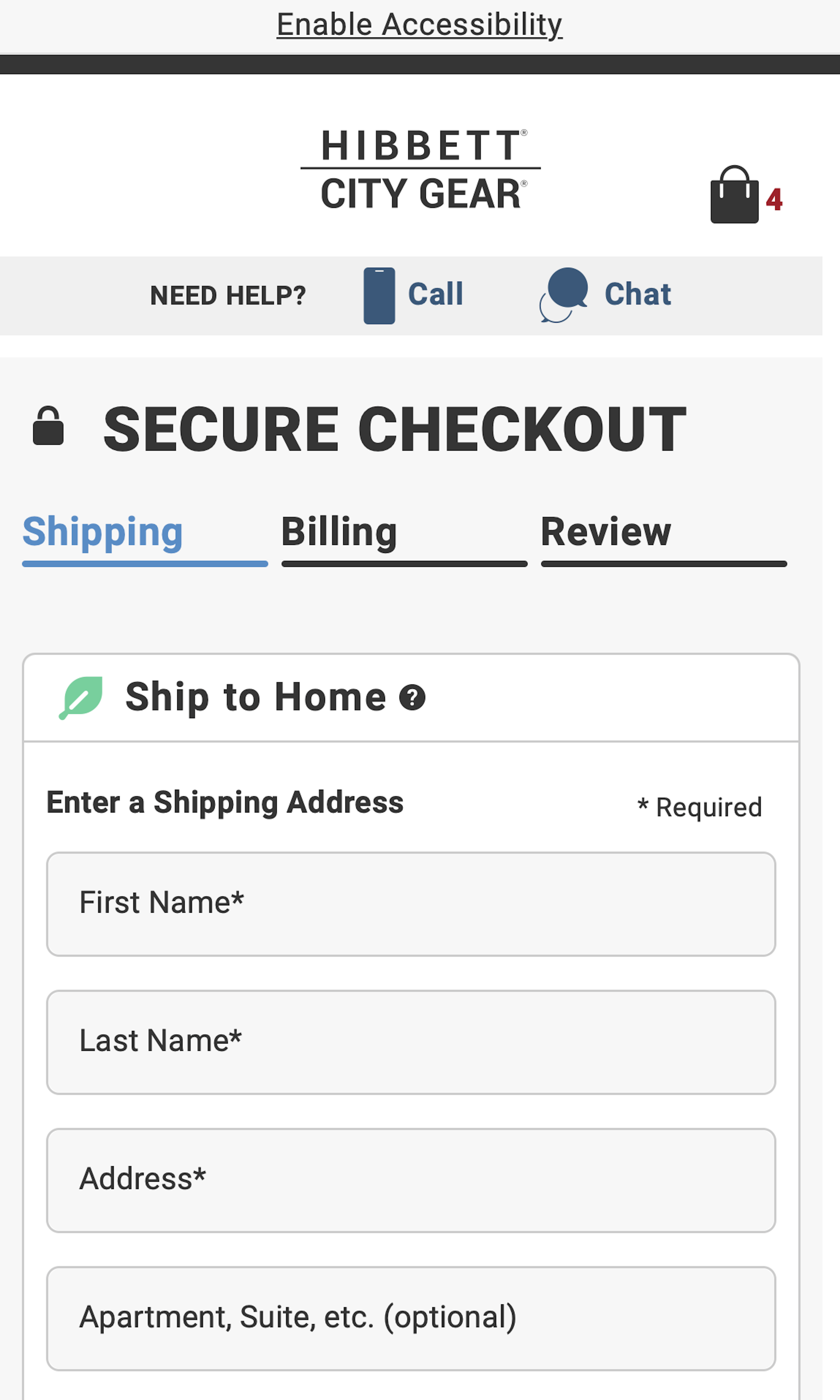
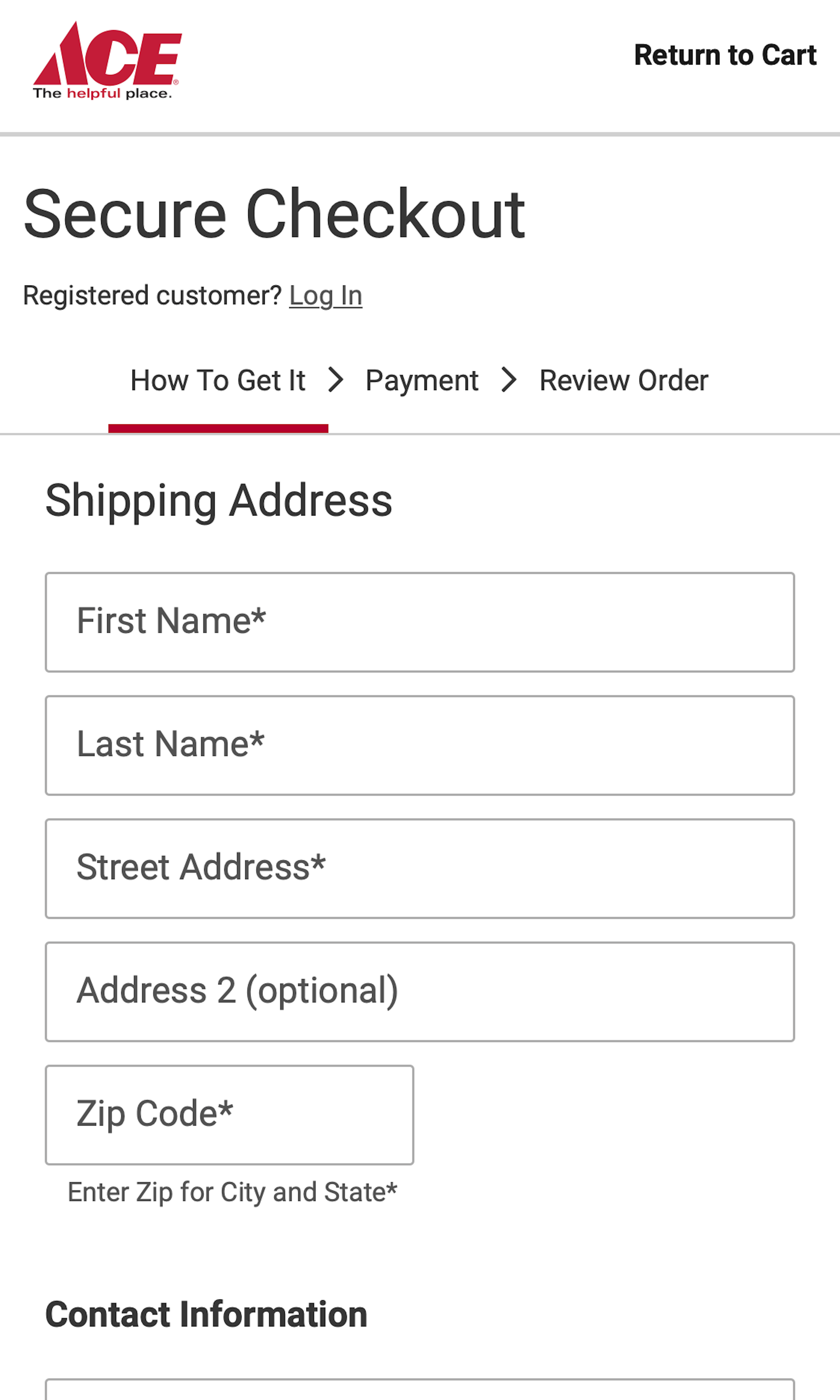
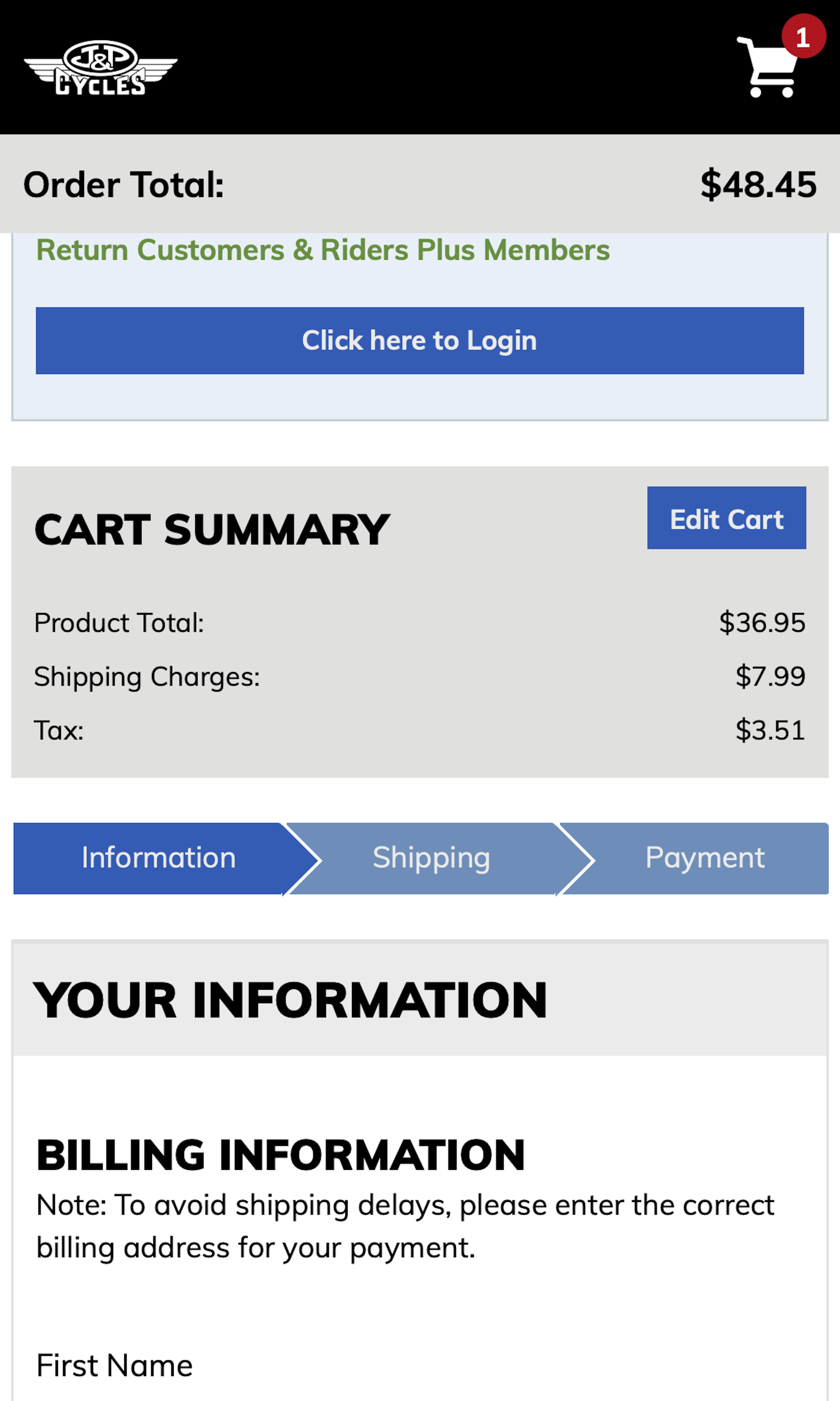
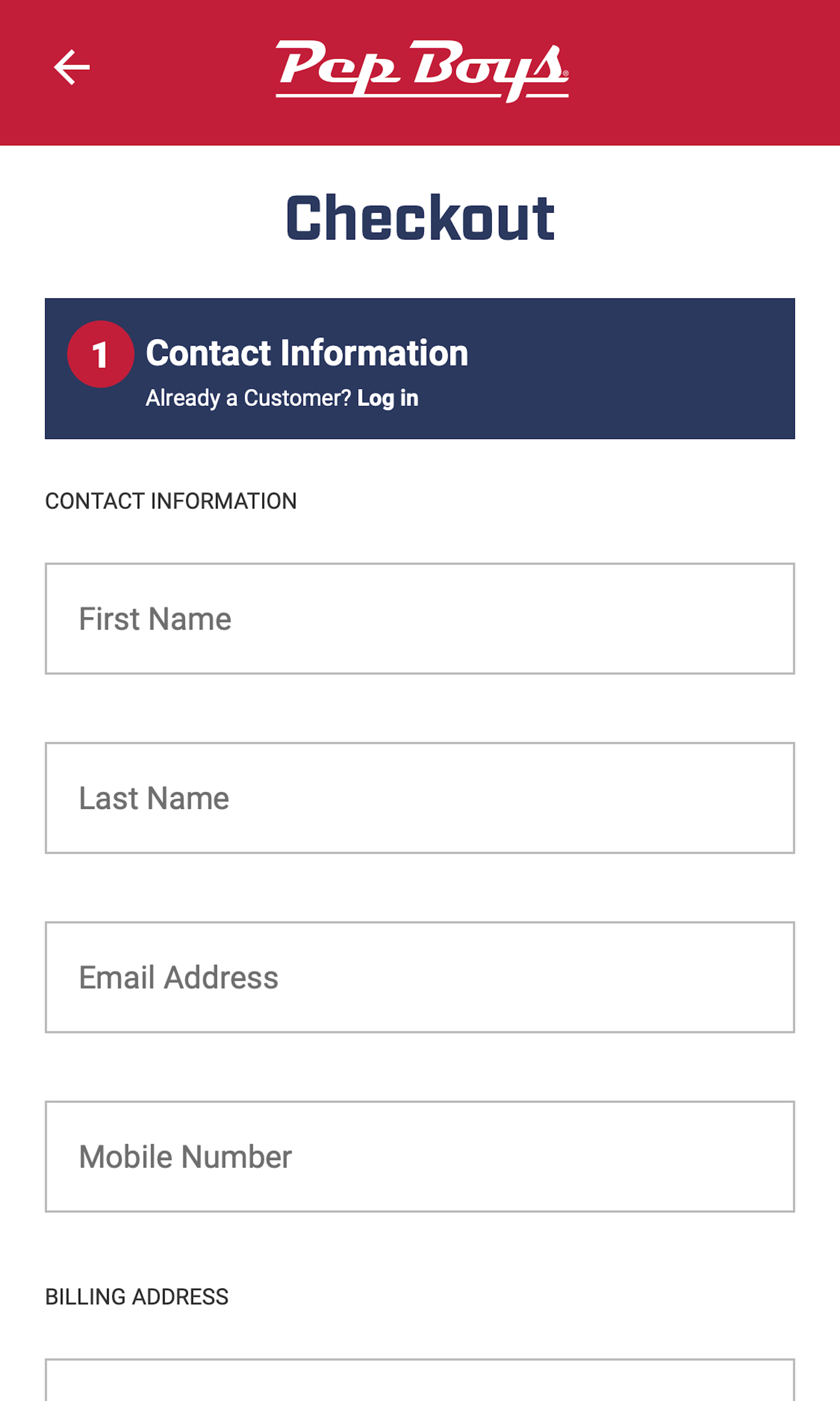
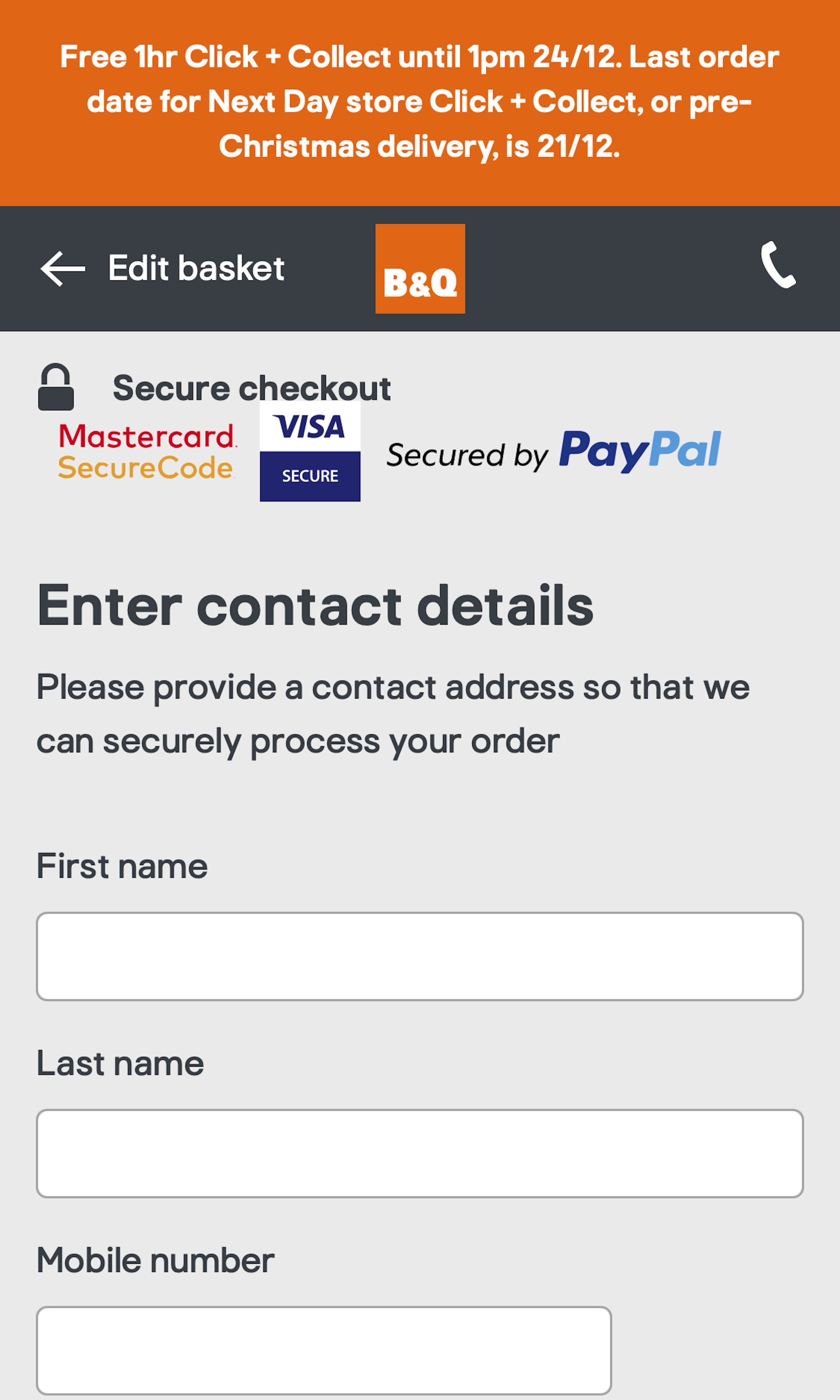
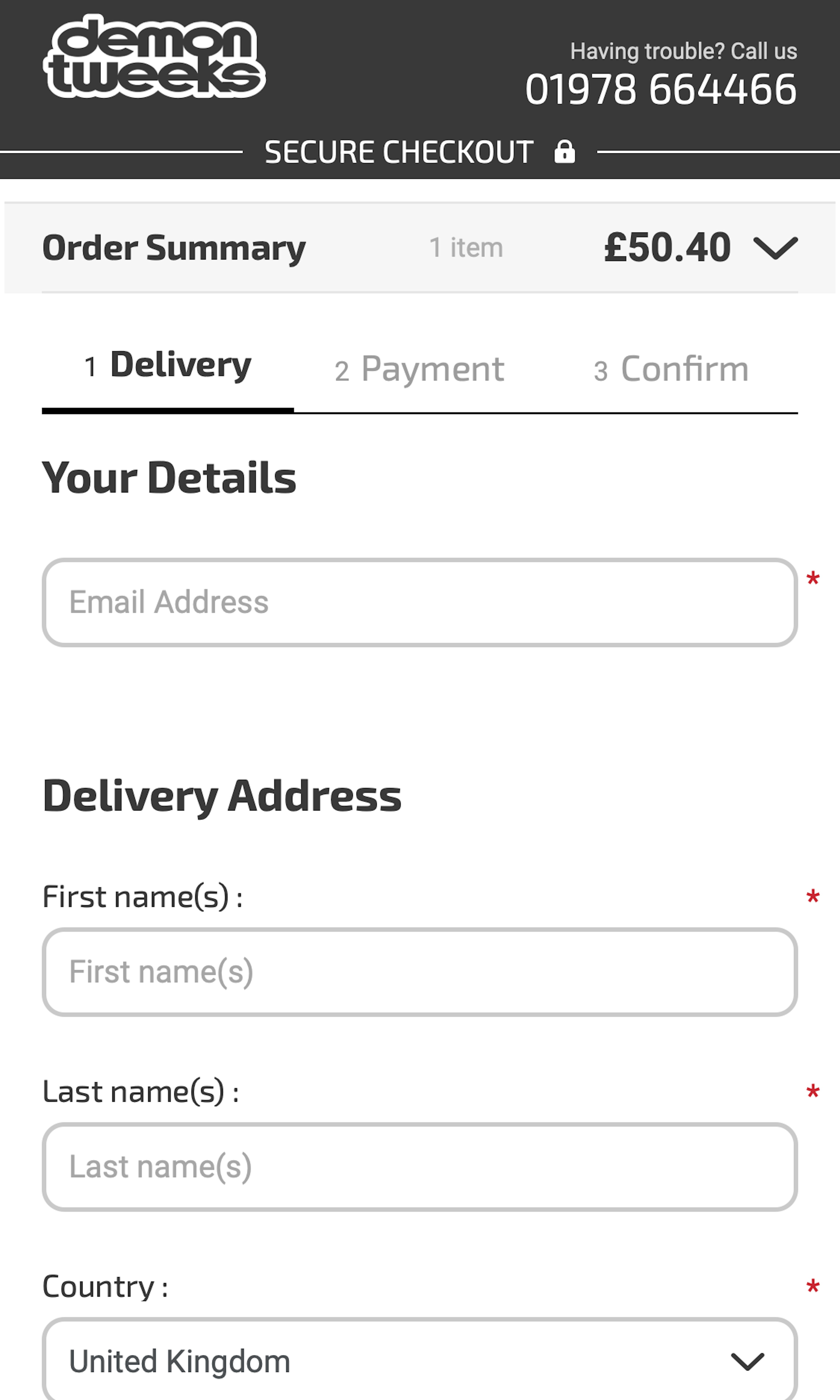
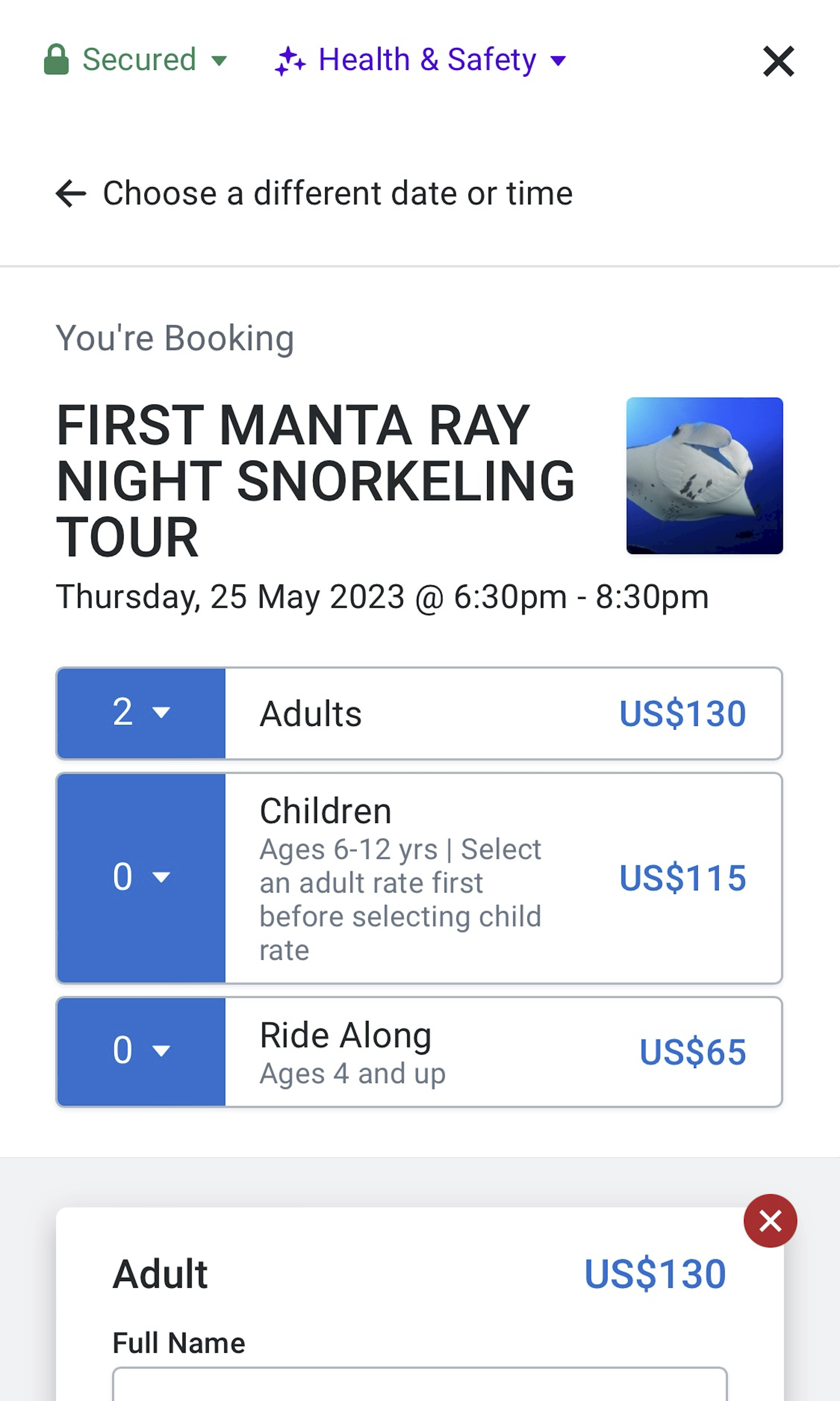
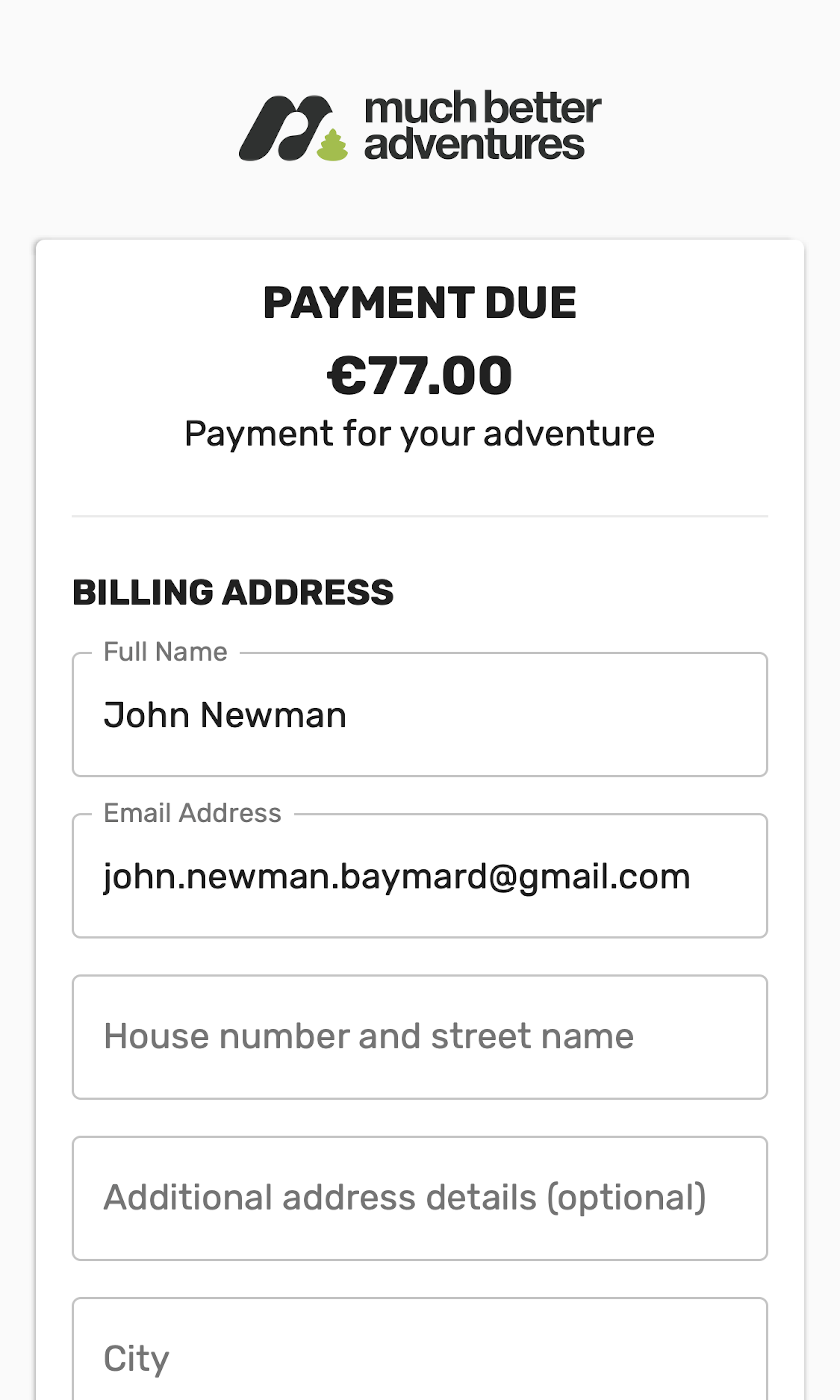
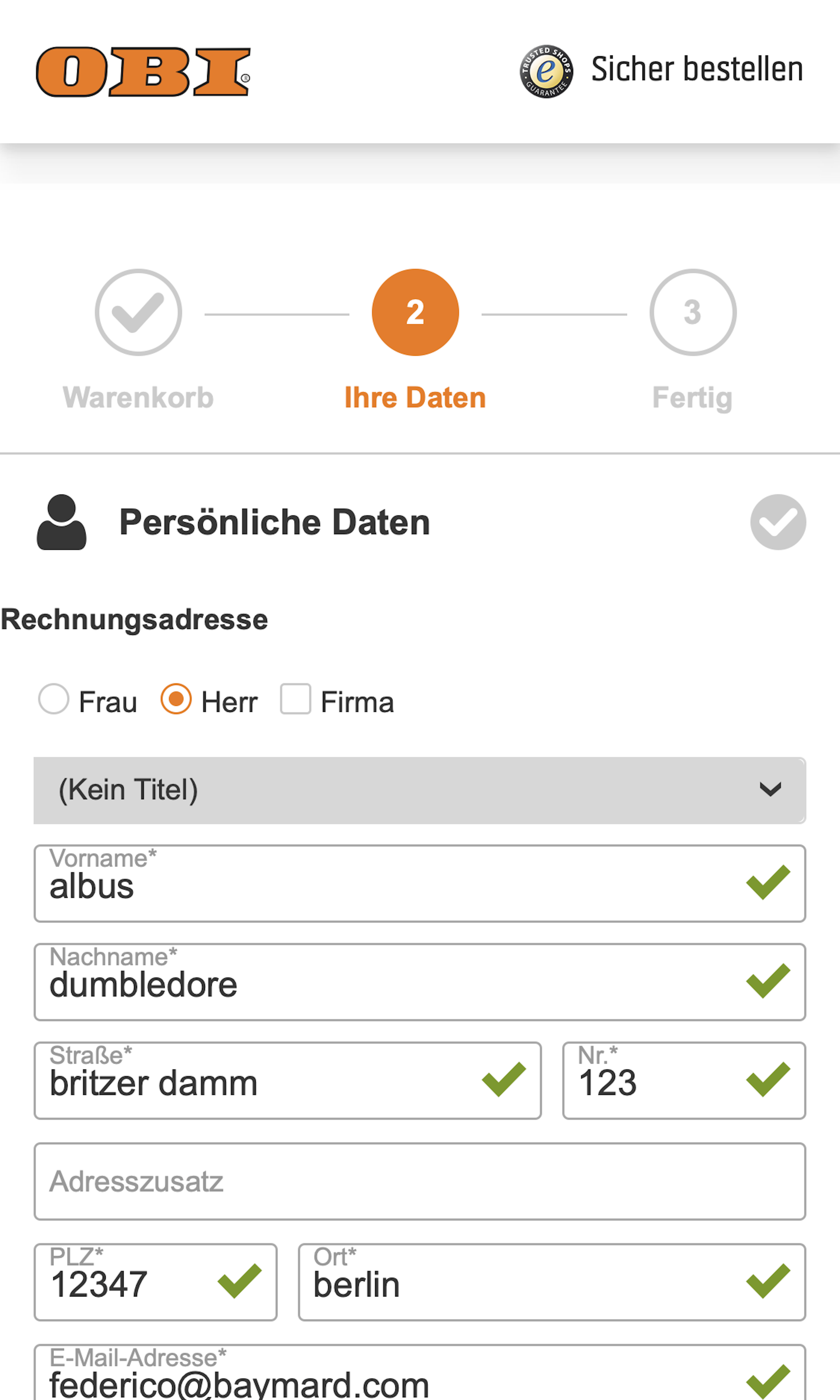
During the checkout flow typing the shipping address constitutes the majority of all typing users will have to do. While it’s important to simplify the amount of form fields in both desktop and mobile checkouts, we in testing observe the impact to be much greater on mobile, as mobile users will typically only be able to see 2–3 form fields at a time (due to the touch keyboard taking around 40% of the already small screen).
More ‘Shipping Address’ Insights
-
Desktop Examples: Besides the mobile examples below, we also have 110+ desktop examples of Shipping Address implementations.
-
Learn More: Besides exploring the 90 mobile “Shipping Address” design examples below, you may also want to read our related articles “‘Touch Keyboard’ Implementations Have Improved Just 9% Since 2013”, “6 Mobile Checkout Usability Considerations”, “Always Explain Why the ‘Phone’ Field Is Required (58% of Sites Don’t)”, and “Checkout Optimization: From 16 Form Fields to 8 Fields (keynote presentation)”.
-
Get Full Access: To see all of Baymard’s 351 mobile research findings you’ll need Baymard Premium access. (Premium also provides you full access to 130,000+ hours of UX research findings, 650+ e-commerce UX guidelines, and 140,000+ UX performance scores.)


User Experience Research, Delivered Weekly
Join 37,000+ UX professionals and get a new UX article every week.
User Experience Research, Delivered Weekly
Join 37,000+ UX professionals and get a new UX article every week.
Explore Other Research Content
379 free UX articles based on large-scale research.
244 top sites ranked by UX performance.
Code samples, demos, and key stats for usability.