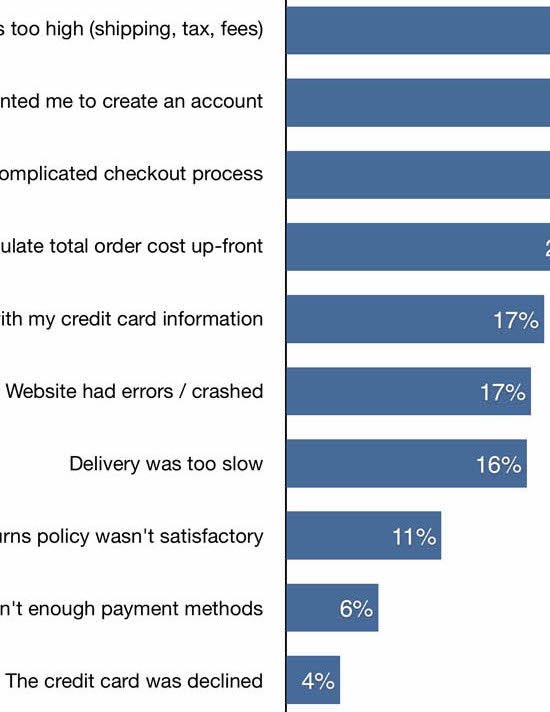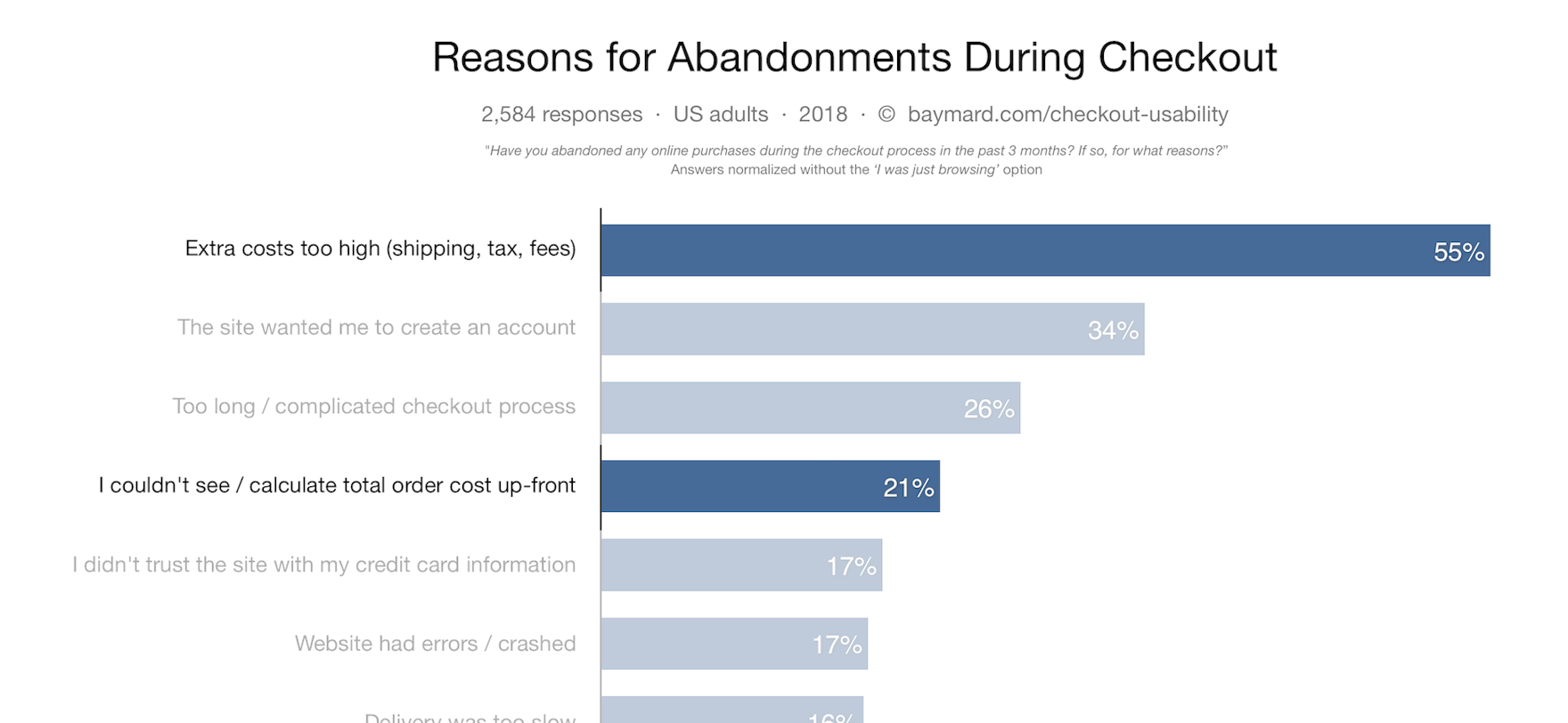
Our large-scale Product Page UX research study shows that 64% of users begin thinking of shipping costs as early as the product page, and our Checkout study shows 55% of users have abandoned orders in the last quarter because the extra order costs (mainly shipping costs) were too high.
Despite the importance of upfront shipping costs, our Product Page benchmark reveals that 32% of e-commerce sites only display their “Free Shipping” on product pages via a banner or site-wide header. Both are methods that cause a large part of users to overlook the “Free Shipping” option entirely. In fact, during our usability testing as many as 27% of users missed it.
In this article, we’ll cover the research findings from our latest Product Page study that relate to users’ experience with displays of free shipping information. In particular, we’ll address the following:
- Why only placing free shipping information in banners or site-wide headers is a mistake
- Where free shipping information should then be placed to ensure users see it
- Another major pitfall to avoid when displaying free shipping information
‘Free Shipping’ vs. Users’ Banner Blindness
At Crutchfield, 27% of subjects missed or had difficulty finding the “Free Shipping” information on the product page, despite spending time carefully exploring the page. Many users won’t spend nearly as long exploring product pages, and are thus likely to miss the free shipping information when it’s only placed in a banner.
Of the many issues we’ve uncovered in the 8 years we’ve been researching the e-commerce user experience, the issue of banner blindness has been one of the issues that’s been there since the beginning. The core of the issue is that users routinely skip banners as they’re scanning webpages. Many users associate banners with ads, internal site promotions, or other nonessential content, mainly because users have throughout years of general web usage been trained to ignore banners.
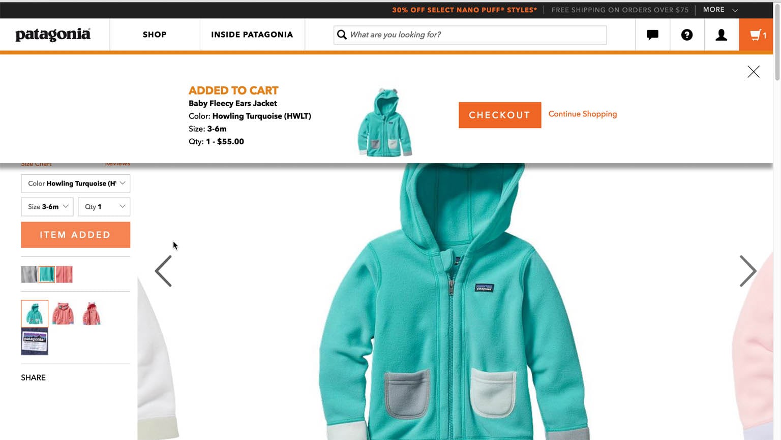
“I’m adding to the cart to see if I can see shipping, it’s not clear whether I am paying for shipping or not.” This test subject never found the “Free Shipping” text in the site-wide page header (in the upper-right corner) and added a product to the cart to see if shipping information would be displayed at that point.
Placing “Free Shipping” text promotions only in site-wide headers can also pose problems for users. As is the case with banners, some users tend to ignore text in headers, assuming that the text concerns generic options which are not relevant to the product they’re currently viewing. Additionally, text in headers can often be difficult to spot due to the amount of other information contained in the headers: links, shopping cart icons, search fields, site navigation, etc. tend to take user focus away from any notifications of “Free Shipping.”
Of course, it depends to some extent on the design of the information in the header and the particularities of a specific site, but the core finding from testing was that a significant amount of users (as many as 27%) won’t see information placed only in banners or headers.
Where Users Are Most Likely to See ‘Free Shipping’ Information
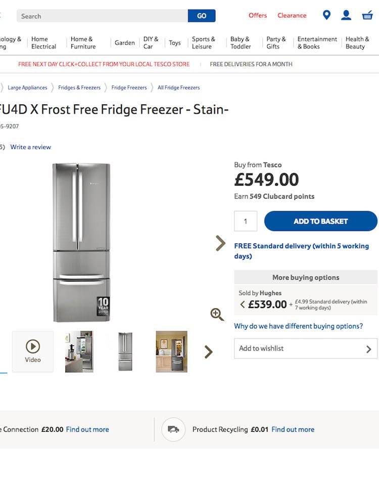
To ensure users are able to easily find “Free Shipping” information, our testing showed that it should be placed near the “Buy” section. The “Buy” section is the area of the interface where users add a product to the cart (usually ended with an “Add to Cart” button). Testing revealed that the “Buy” section tends to attract attention from users, which is perhaps not surprising, given that users must interact with, at the very least, the “Add to Cart” button in the “Buy” section to progress to the checkout.
Free shipping information can still be included in site-wide headers or as a banners, but should always be duplicated near the “Buy” section to make it highly visible to users. The placement near the “Buy” section also clarifies to users that this product specifically qualifies for free shipping and isn’t just a generic promotion — an important aspect to avoid misleading users.
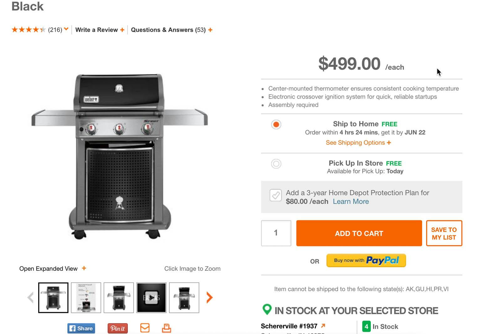
“I don’t need all of this right here,” a test subject said at Home Depot, referring to the extensive shipping and store pickup selector and info, three-year warranty upsell, “Save to My List” option, and PayPal payment button. Packing too much into the “Buy” section will be overwhelming for some users.
An important implementation detail is to place free shipping information near, but not in, the “Buy” section. Testing and benchmarking have showed that “Buy” sections tend to become bloated with upgrade offers, extended warranties, wishlist features, and so on (56% of sites have bloated “Buy” sections), to the point where they become distracting to users as they’re attempting to add a product to the cart. Relegating some information, like free shipping notices, to just outside or around the “Buy” section is therefore generally recommended.
Another Major ‘Free Shipping’ Pitfall to Avoid
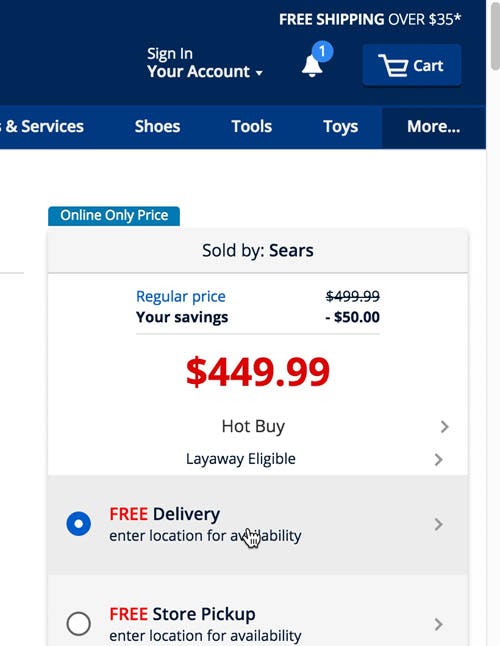
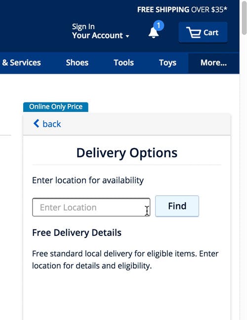
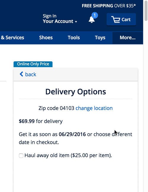
“I can see here it’s free delivery.” This test subject based her initial assumption of free delivery of patio furniture at Sears on a “Free Delivery” label in the “Buy” section. After entering her zip code, the subject was disappointed to find out that shipping wasn’t in fact free: “$70…So it’s not free…It was a little misleading to say “Free Delivery”.” At Sears, 63% of test subjects were misled by notices of “Free Shipping” and “Free Delivery” on the product page.
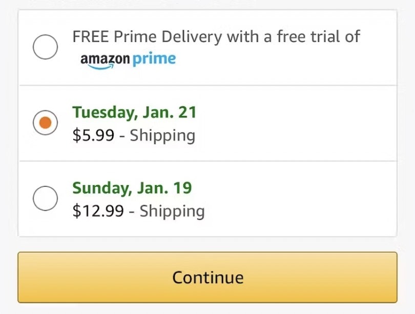
Placing free shipping information near the “Buy” section is an excellent way of ensuring most users will see the information. However, testing revealed that a minority of sites (11% in our latest product page benchmark) make the mistake of using sneaky or conflicting free shipping text, where “Free shipping” is advertised but in fact shipping is not free, or is only free if certain hard-to-spot qualifications are met. This can cause users to be severely disappointed or upset when they find out, whether through a shipping estimator on the product page, in the cart, or later in the checkout, that there will be a fee for shipping (which likely contribute to the abandonment rate due to “Too high extra costs” cited at the beginning of this article).
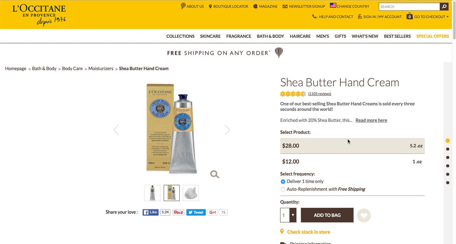
“I can see it’s ‘Free Shipping on any Order.’” This test subject noticed the “free shipping” banner and assumed that the order she placed would qualify for free shipping. Only later in checkout was it revealed that there’s a threshold of $49 to qualify for free shipping. Note the very small asterisk at the end of the free shipping text banner.
Many sites that promote “free shipping” add an asterisk or “see details” after the text to alert users to the condition or conditions that apply to qualify for free shipping. However, in practice the majority of users will miss this explanatory text — subjects during testing often missed the conditions for free shipping, which were frequently hidden behind a link.
Additionally, when a link is provided it is usually in a much smaller font, making it easy for users to miss as they scan the page. Especially when the condition to qualify for free shipping is simply a spending threshold — for example, “Spend $75 to qualify for free shipping” or “Orders over $75 ship for free” — that information can easily be communicated to users wherever the “Free Shipping” notification is placed on the product page.
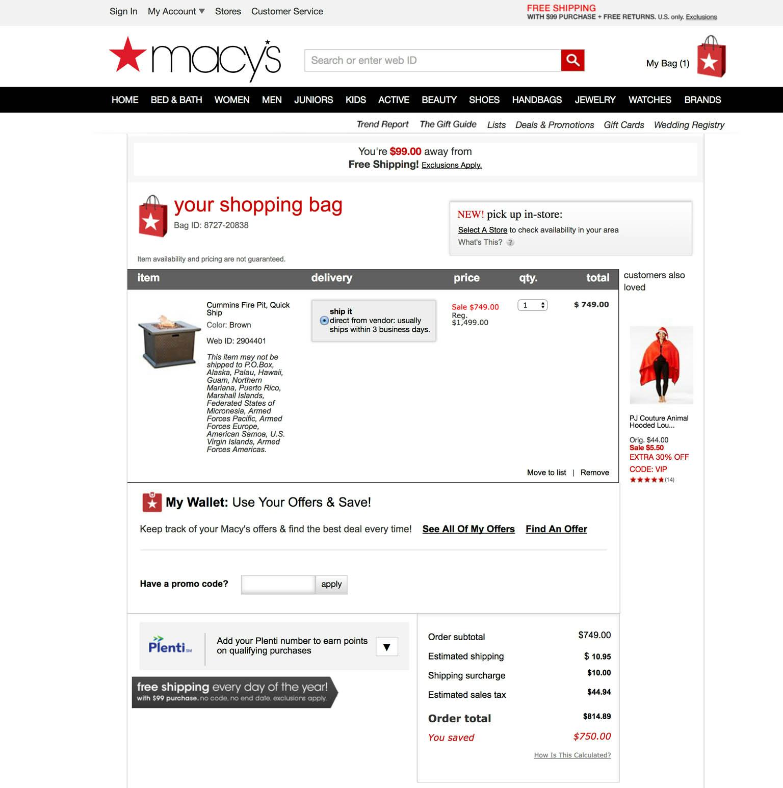
Note how Macy’s strongly indicates that shipping is free for orders above $100, both in a banner in the page header and another in the lower-left corner, yet at the same time adds both shipping fees and a surcharge to the order, resulting in a highly contradictory interface. When offers don’t apply they should be dynamically hidden to take the user’s current context into account.
Confusing or contradictory “free shipping” information should be avoided, whether it’s placed in banners, site-wide headers, near the “Buy” section, or in the checkout. Furthermore, notices of “Free Shipping” should be dynamically removed or updated based on a user’s current context. For example, if a user has added products to the cart but doesn’t yet qualify for free shipping, the notices of “Free Shipping” should be updated to reflect this (e.g., “Spend $35 more to qualify for free shipping”).
When users see “Free Shipping” advertised — and then have that contradicted by shipping fees, or by additional shipping fees for oversized items — many will feel unsure of what the actual, final shipping cost will be. This can lead some to abandon due to too-high extra costs, while others may decide to call or chat with customer service, putting needless strain on support.
Ensuring Most Users Spot ‘Free Shipping’
Many users will be happy to see the product they’re considering purchasing is available for free shipping. However, to ensure that users actually see the “Free Shipping” information make sure that:
- “Free Shipping” is placed near the “Buy” section,
- “Free Shipping” is not only relegated to site-wide banners or headers,
- Any qualifying conditions, such as a minimum purchase threshold, are clearly spelled-out, near where the free shipping information is displayed if possible, and
- Contradictory “Free Shipping” information is removed or dynamically updated to reflect the user’s current context.
If implemented correctly, most users will see the free shipping information, while at the same time they won’t be distracted from their primary goals on the product page: exploring and evaluating products.
This article presents the research findings from just 1 of the 650+ UX guidelines in Baymard Premium – get full access to learn how to create a “State of the Art” e-commerce user experience.