Key Takeaways
- Our extensive native mobile app usability testing verified that 98% of product-finding guidelines for mobile websites also apply to native mobile apps
- 342 native mobile app guidelines were identified that inform the UX design of mobile apps
- Quantitative data on native mobile app and mobile site usage rates indicate that users are more likely to use a mobile site than the corresponding mobile app for purchasing
- While there are differences between mobile sites and mobile apps, these are minimal and largely confined to specific, minor UI variations
At Baymard our research team has spent over 800 hours usability testing and researching native mobile apps for e-commerce.
This Mobile Apps UX research is based on more than 200 qualitative user/app usability test sessions following the “Think Aloud” protocol (1:1 remote moderated testing). Throughout the test sessions, the users had over 900 issues with the layout, content, or features in native mobile apps.
The test mobile apps were chosen to reflect those provided by leading sites in the Apparel (ASOS, Urban Outfitters, and Banana Republic), Mass Merchant (Amazon, Target, and Walmart), Home & Hardware (Home Depot, Build.com, and Lowe’s), and Health & Beauty (Sephora, Walgreens, and Ulta) industries.
Analysis of the test data revealed that 342 of 348 guidelines in our mobile website catalog were verified to apply equally to native mobile apps.
In this article we’ll introduce 3 high-level findings for mobile apps, discussing
- How, for most sites, overall usage rates for native mobile apps are lower than those for corresponding mobile sites
- How similar the user experience is on mobile websites and mobile apps
- How some design and performance features are unique to mobile apps
Native Mobile App Usage Rates
To set the context for the native mobile app testing, it’s important to know how many users are likely to use a site’s mobile app rather than the corresponding mobile website.
Therefore, to better understand the importance of mobile apps in general, we conducted a quantitative study of 3,536 US e-commerce shoppers.
We asked respondents to
- specify their top-5 e-commerce sites,
- indicate whether they have installed the mobile app on their devices for these top sites,
- and to state how frequently they use the mobile app to make purchases instead of using the mobile website.
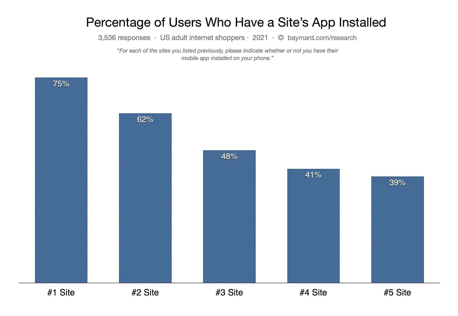
The chart above shows the percentages of respondents who have their top sites’ mobile apps installed on their devices.
The proportion that have installed the mobile apps ranges from a high of 75% for a respondent’s #1 site down to 39% for a respondent’s #5 site.
Perhaps more interesting than the percentage of mobile app installs, however, is the usage rate of the mobile app to make purchases compared to using the mobile website.
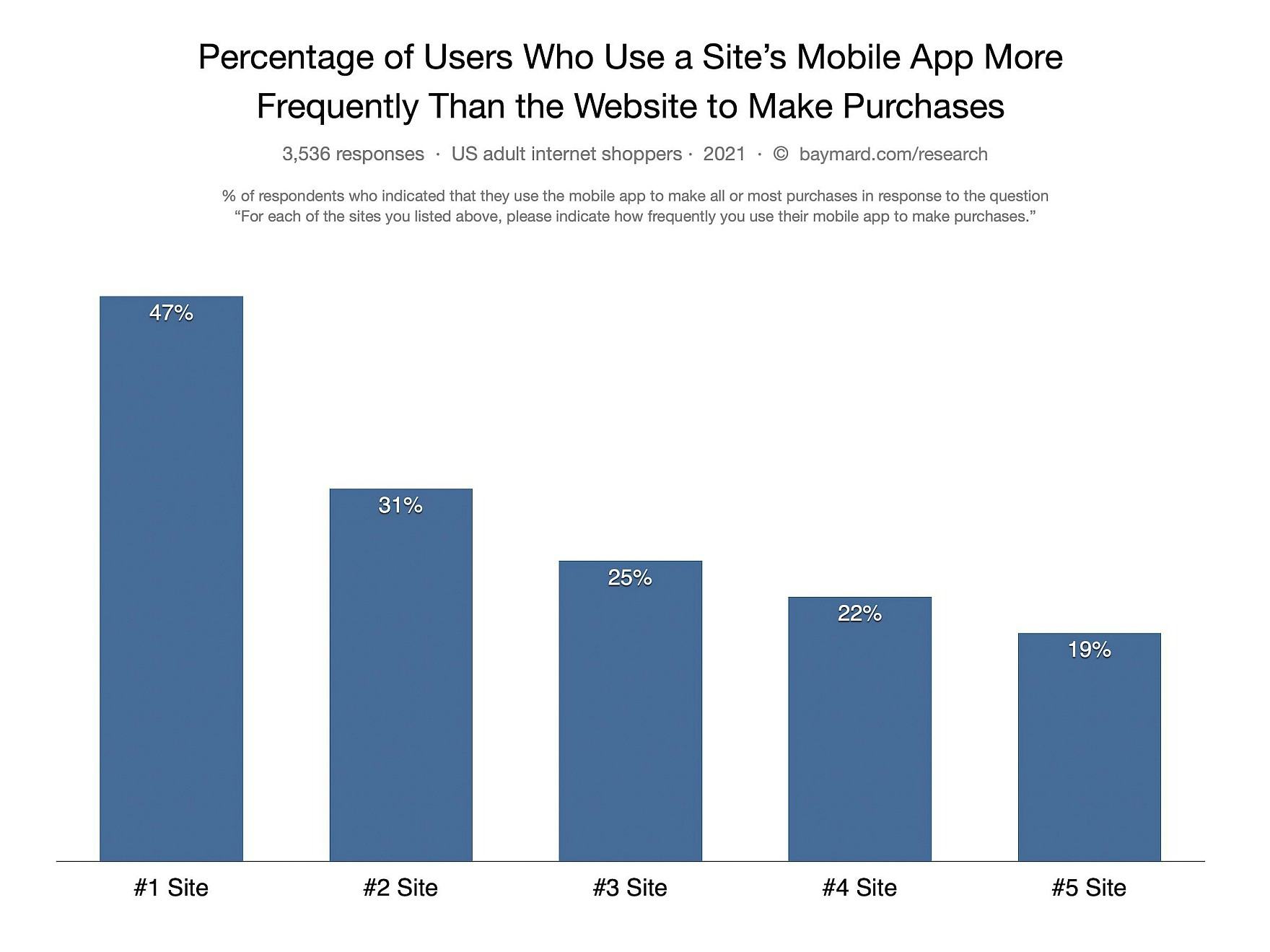
For respondents who have the mobile app installed on their mobile devices a majority (63%) indicated that, for their #1 site, they are more likely to use the mobile app to make purchases, rather than the website.
However, as the first chart showed only 75% of users have installed the app for their #1 e-commerce site. Therefore, this percentage drops to 47% however when considering all of a website’s users — not only those who’ve installed the mobile app.
Thus, even if you’re a user’s #1 e-commerce site, only 47% of these users will use the mobile app to make most of their purchases, while a slightly larger number (53%) will still prefer to use the mobile website.
Furthermore we see that the percentages drop significantly as we get to a user’s #2 site (only 31% of users are more likely to use the mobile app instead of the mobile website), #3 site (25%), #4 site (22%), and #5 site (19%).
It’s clear that the mobile app utilization rate across all website users is fully dependent on the degree to which your site and brand is so important that you can be among your website visitor’s top-5 sites to shop at.
True success would require a top-3 position for your average website visitor.
This prompts the following question: How likely is it that any particular site will actually be a user’s #1 site?
This will obviously be highly brand and site specific. But to provide a more generalized perspective on this question, we asked the US respondents to list the top-5 e-commerce sites they most commonly shop at.
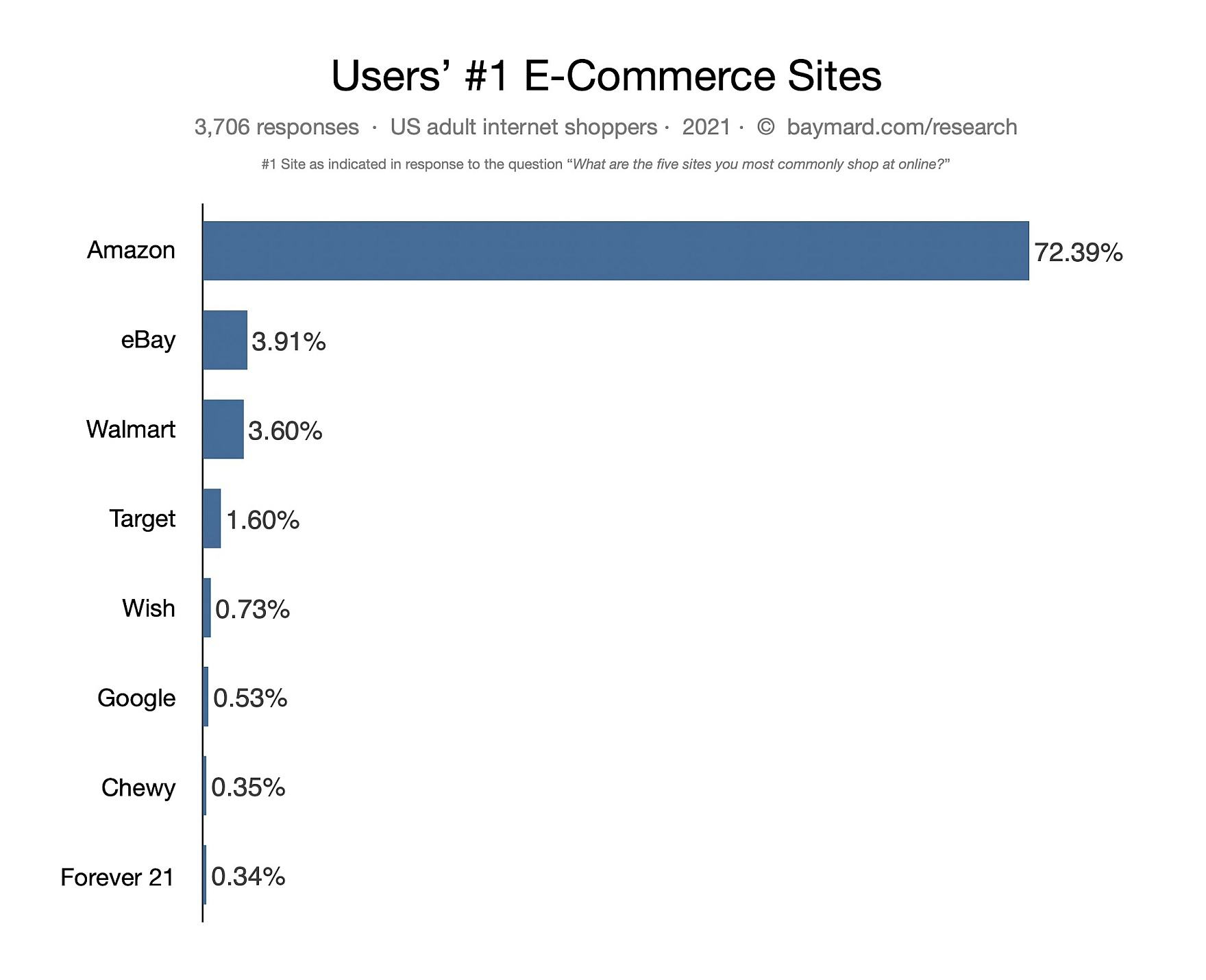
Results indicated that 72% of respondents identified Amazon as their #1 site, followed by a steep drop-off to eBay (4%) and Walmart (4%).
The remaining 20% of respondents’ #1 sites were scattered among a variety of different e-commerce sites.

Looking at respondents’ #2 sites, we again see Amazon, Walmart, and eBay as the top-3 sites cited by respondents as the e-commerce site they shop at the most. Similar results are seen for respondents’ #3–#5 sites.
To sum up, these results indicate that, unless you’re Amazon.com (and to a much lesser extent Walmart or eBay), it’s unlikely that the majority of users at your mobile website will have downloaded your site’s mobile app, and it’s even more unlikely that they’ll use the mobile app to make purchases instead of the mobile website.
(Note: these numbers are broad averages and only for B2C retail e-commerce. Factors like industry, customer demographics, how strong a brand connection customers have to the site, and what other features and benefits the mobile app has for users that the website doesn’t can make these numbers vary greatly for the individual e-commerce brand. )
Furthermore, our 1-1 mobile usability testing revealed that there can be significant costs to aggressively pushing mobile apps to users on a mobile website.
When considered alongside the survey data, it’s clear that those costs of creating and deploying mobile apps should first be fully understood within an individual site’s particular context, then measured and quantified, and then held up against the benefits of potentially getting more mobile app users.
“Unless you’re Amazon.com (and to a much lesser extent Walmart or eBay), it’s unlikely that the majority of users at your mobile website will have downloaded your site’s mobile app, and it’s even more unlikely that they’ll use the mobile app to make purchases instead of the website.”
In addition, both the type of products sold and the site’s brand need to have a strong enough connection with the website visitors to be realistic for the brand to be among the top-5 sites that the website’s users shop the most at.
This is by no means to say it’s impossible to have a popular mobile shopping mobile app, or that e-commerce sites shouldn’t offer a mobile app that users can seek out themselves — many sites likely should have a mobile app.
Indeed, frequent mobile app users are often fans of the site’s brand, and value the convenience of being able to repeatedly shop via a familiar mobile app. Therefore, revenues per user can be higher from mobile apps than from mobile sites.
Consequently, stats for mobile app sales (per user) can exceed those of mobile websites, but this is due to factors other than any differences between the design and usability of mobile websites and mobile apps.
In the end, the survey results provide some perspective on whether it — for the average e-commerce site — is indeed a good strategy to try to push all of the mobile website visitors into the mobile app instead.
(Read our primer on user experience research to understand the terms and methods.)
The UX Recommendations for Mobile Apps and Mobile Sites Are Essentially the Same
Given the comparative usage stats for mobile websites and mobile apps, it’s important to realize that the design patterns and features that make up a good mobile app user experience are almost identical to those for mobile websites.
Indeed, the main finding of the qualitative mobile app research study was that 98% of our mobile site guidelines were found to apply to mobile apps as well.
For example, subpages were observed to cause issues during mobile website and, similarly, subpages were observed to cause issues during mobile app testing.

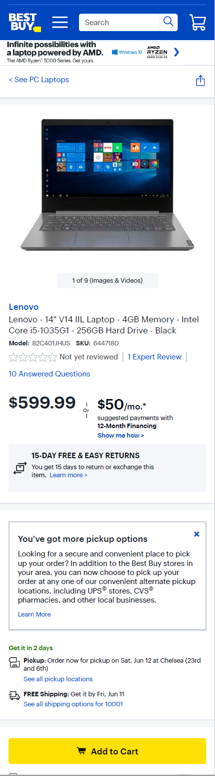
While the visual design and UI can differ between mobile apps (for example the Best Buy app, first image) and mobile websites (second image), user goals and their experience largely don’t. In fact, 98% of guidelines in the mobile site platform in our Premium catalog were found to apply equally to mobile apps and mobile websites.
Considering that almost all of the content that has to be provided to support the e-commerce journey is the same on mobile websites and mobile apps, a strong alignment between mobile websites and mobile apps is perhaps to be expected.
For example, content such as product details and images, and features such as search query support and filters, impact the user experience similarly across all platforms.
Furthermore, the design patterns that impact the user experience that are specific to the mobile context — such as mobile form design, spacing and hit areas between elements, and support for mobile keyboards — do so equally on both platforms.
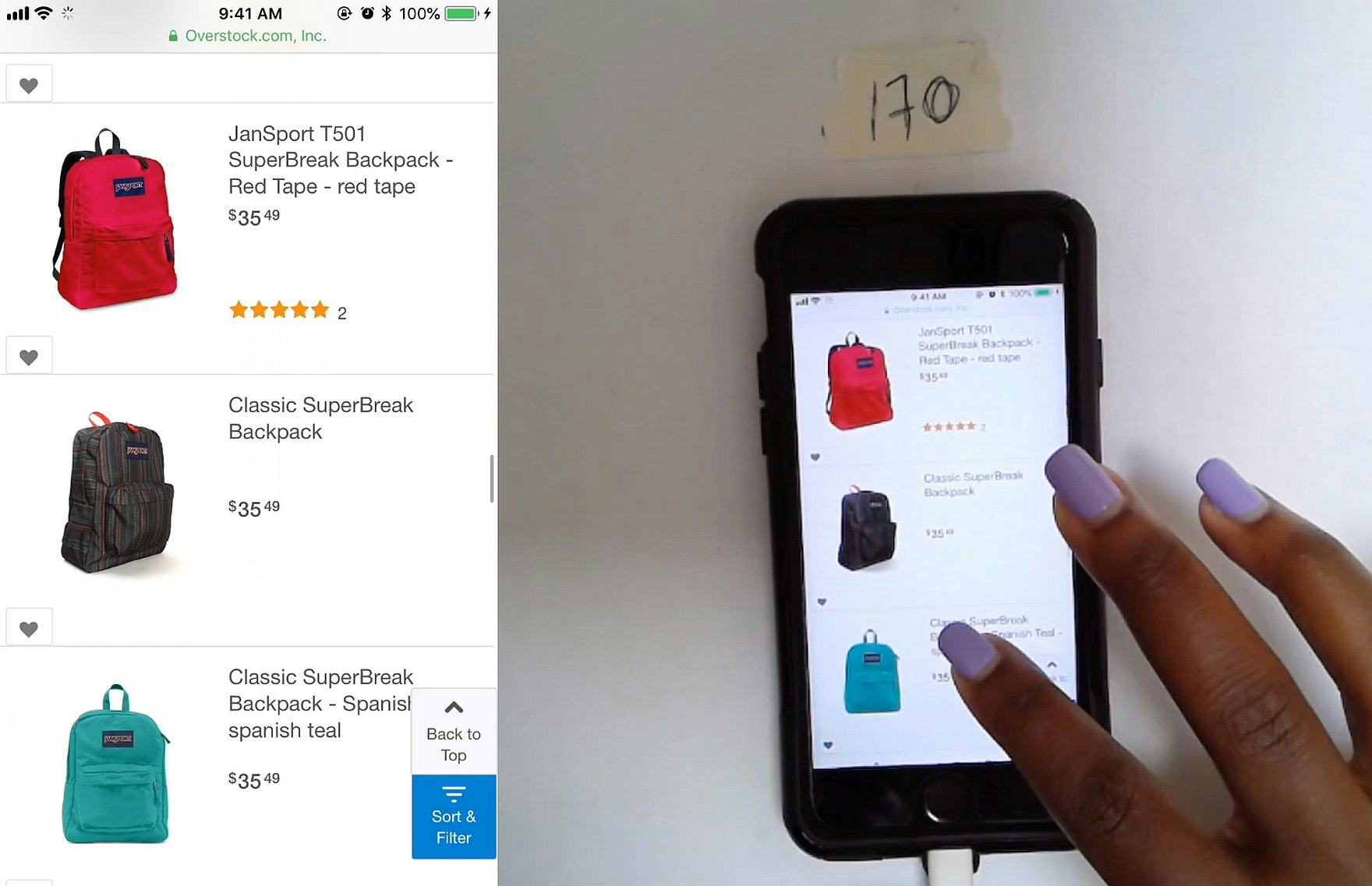
Most issues encountered during mobile app testing (first image) were identical to those in mobile website testing (second image) — such as the problems associated with not combining variations of products in one product list item.
Moreover, the overarching issues mobile website users have are also shared by mobile app users — for example, inadvertent or unregistered taps or selections.
Thus, from a UX recommendation and improvement perspective, when considering issues users are likely to encounter and ways to optimize the UI, what applies for mobile websites can almost certainly apply for mobile apps — with a few important distinctions.
Mobile App Design & Performance Differences
While the issues encountered by users during mobile app testing and mobile website testing were the same, there were design and performance differences in 4 specific areas:
- App speed vs. mobile website speed
- Sticky navigation
- Multiple “request” overlays at start-up
- Personalization
1) App Speed vs. Mobile Website Speed
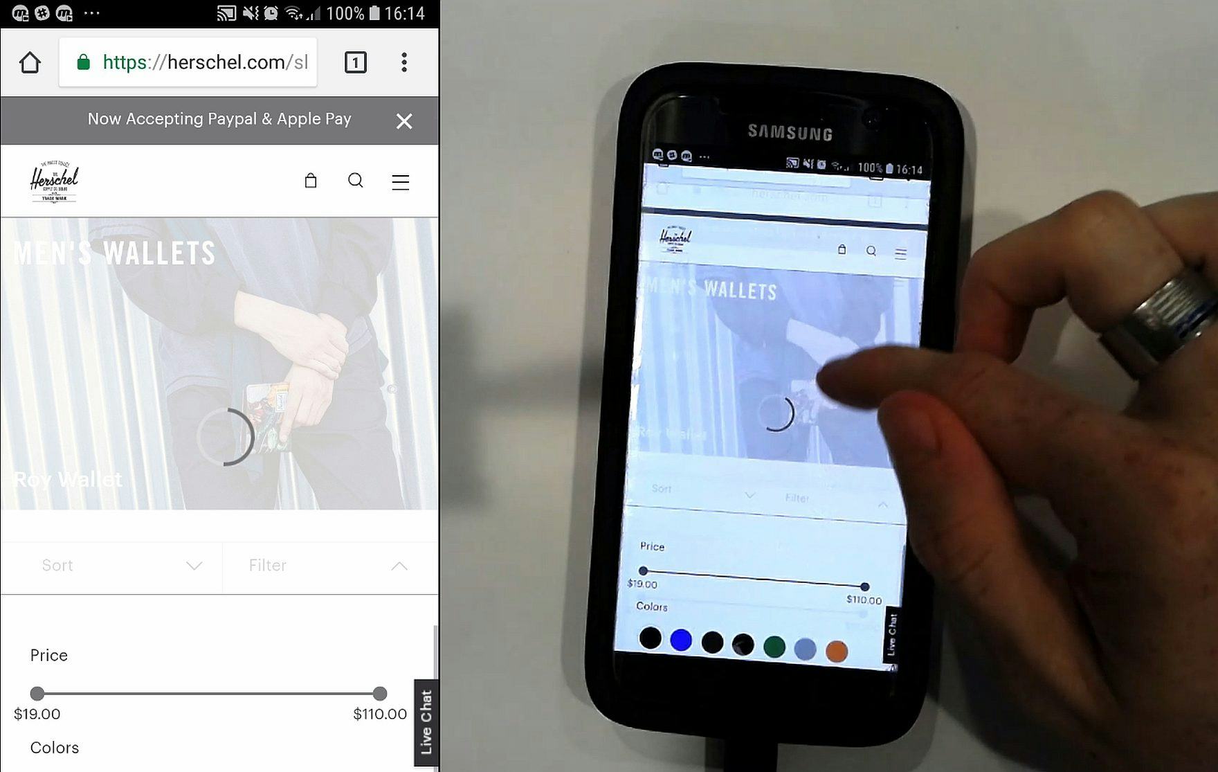
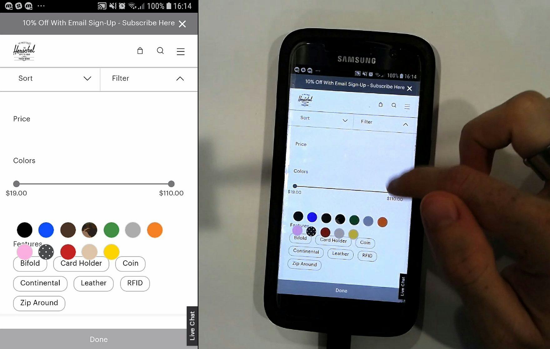
“Okay. I don’t know what just happened there. It feels like I didn’t click on anything and it just kind of…let’s clear all [filters] and start again. Okay — ‘Black’…oh and you can…it seems to be jumpy.” During our mobile site testing, this user on Herschel decided to abandon after slow-loading features (first image) led to layout issues, such as the color swatches being displayed on top of the “Features” filters (second image).
One of the most common issues observed in our mobile website testing was slow response times.
Many mobile website users experienced delays after tapping on links and buttons, and pages were often slow to load.
Moreover, not only was the issue common, but it was severe, and led to several abandonments during mobile website testing.
However, in mobile app testing it was notable how fast the response times were, with just a handful of test users experiencing minor delays.
Thus, in general app testers were able to focus more on product finding and checking out, compared to dealing with a site’s technical quirks and or speed issues.
2) Sticky Navigation


Three examples of sticky nav panels users encountered during testing, from the ASOS mobile app (first image), the Banana Republic mobile app (second image), and the Ulta mobile app (third image).
Sticky nav panels placed at the bottom of the viewport are pervasive in mobile apps, but generally absent from mobile sites (which more often have a “hamburger” menu item to access the navigation).
App testing revealed that, overall, the performance of the sticky navigation in apps vs. the hamburger menu item access on mobile websites was largely the same.
However, one observed slight advantage of sticky nav panels is that users don’t need to access the main navigation menu to access some features.
Mobile app users can therefore take shortcuts to features like “My Account”, store finders, and wishlists.
This gives mobile app users a slight speed advantage over mobile site users who will have to access the main menu and tap one or more times to reach the page or feature they need.
While these shortcuts save time, and also cut down on the potential for inadvertent or missed taps, it should be noted that mobile website testers generally had few issues when accessing the main navigation, and thus the sticky navigation in apps is likely to provide only minimal performance improvements.
3) Multiple “Request” Overlays at Start-Up
During testing, almost all mobile app test users expressed annoyance at the number of overlays shown at start-up for notifications, location tracking, and account sign up.
This sentiment confirms the general dislike for nonuser-initiated overlay dialogs observed over many years of testing (e.g., this doesn’t apply to overlays displayed after a user adds a product to the cart, for example).
Indeed, overlay dialogs contribute to users’ sense of a mobile app being “pushy” and trying to get information from them before they’ve even had a chance to interact with the content.
Of course, many mobile app users are repeat users, and could welcome notifications for deals and offers and might be comfortable with location tracking when they are familiar with the mobile app.
However, given the negative sentiment towards overlays during the first launch of mobile apps, sites should consider the timing of such offers more closely. For example:
- Ask for location permissions only when users indicate an interest in accessing a location-dependent feature (e.g., store pickup)
- Ask users to enable notifications only after their first purchase in the mobile app, when they have explicitly shown a positive sentiment towards the site and its products and when the benefits of notifications can be fully explained and understood
4) Personalization Features
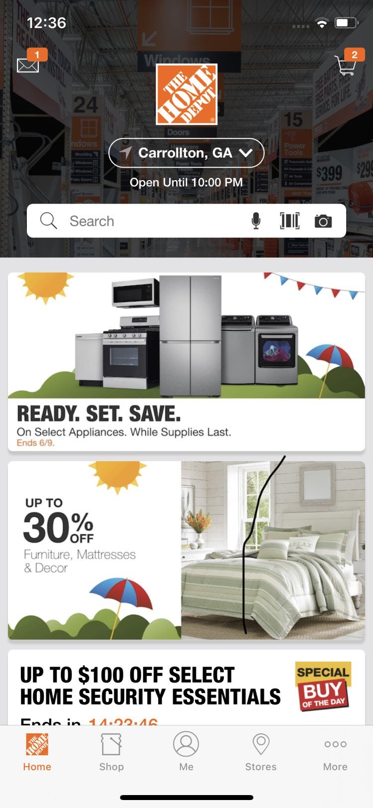
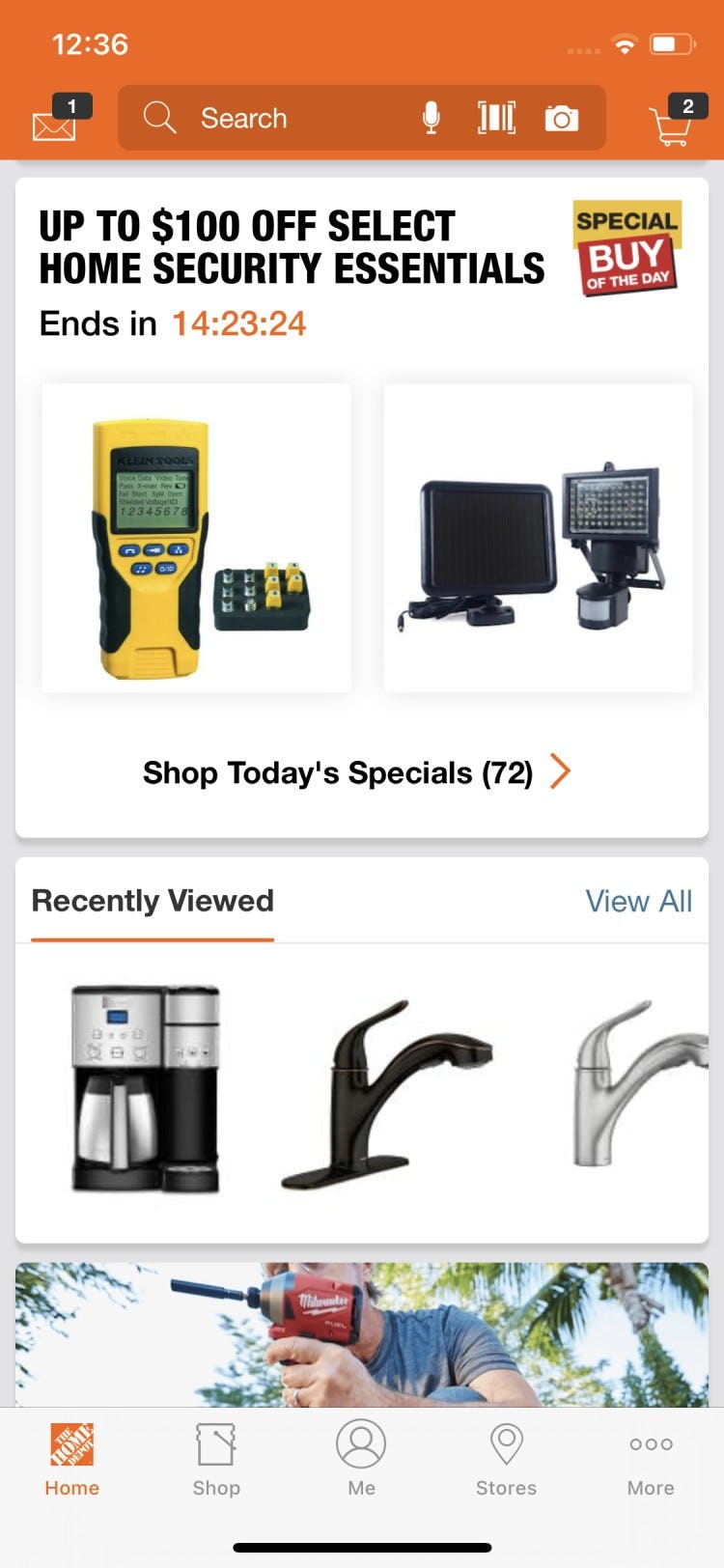
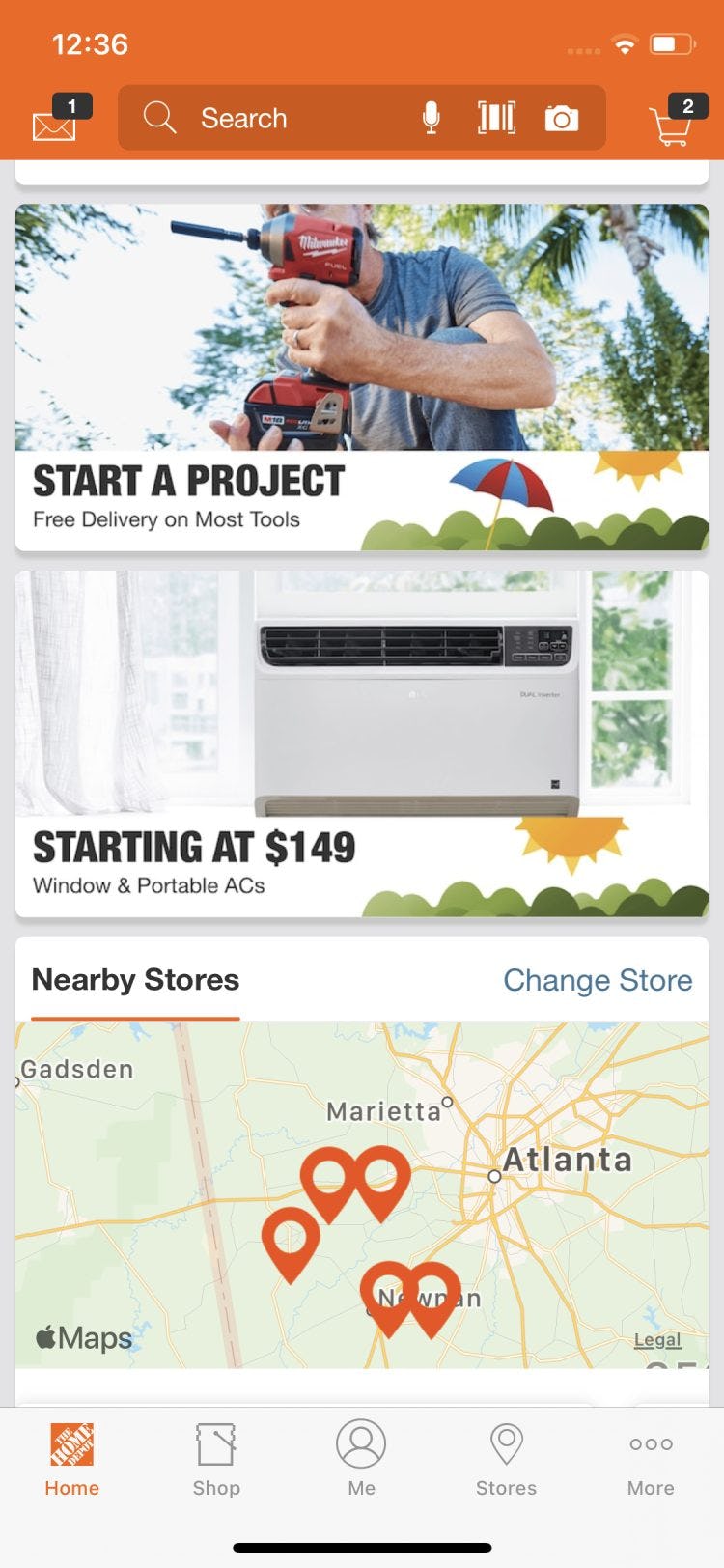
Most repeat mobile app users are likely to be continuously signed in, so sites can easily provide personalized content. For example, a Home Depot mobile app user can immediately see opening times of local stores (first image), “Recently Viewed” items (second image), and a map showing all stores in the local region (third image).
Because most mobile app users will be repeat visitors and signed into their accounts, personalization features are generally easier to implement than on mobile websites where users are less likely to be constantly signed in.
This is because not all mobile website users will want to or be able to remain signed in, due to concerns around accepting and saving cookies.
Perhaps most helpfully, checkout for signed in mobile app users can be a quick and easy process since stored address information and payment details can be used repeatedly.
Furthermore, mobile app users can typically be shown offers from local stores, be allowed to store items in carts for later comparison, and be shown recently viewed items more seamlessly than users on mobile websites.
Additionally, recommendations can be shown based on past purchases; for example, favored styles of clothing or brands of beauty products that won’t be shown for mobile website users that are not signed in.
Optimizing the User Experience in Mobile Apps
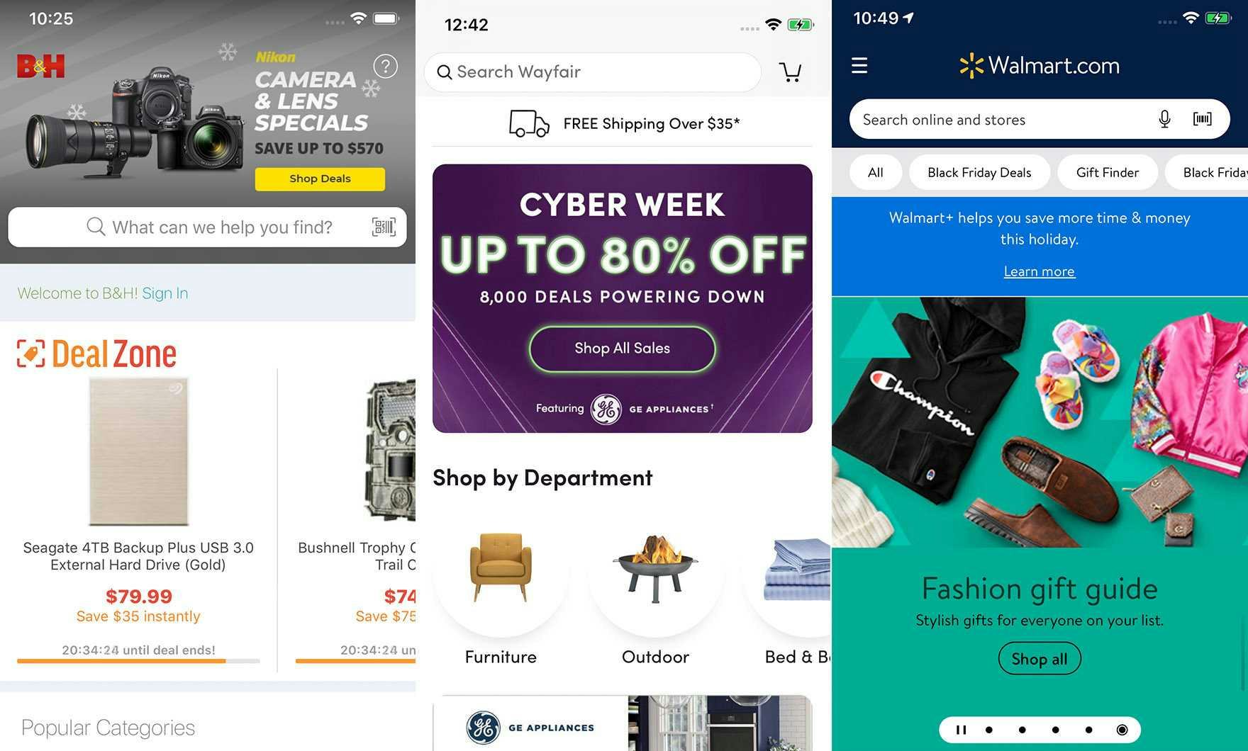
The highest-rated mobile apps in our mobile app benchmark are B&H Photo (first image), Wayfair (second image), and Walmart (third image).
While the stats on usage of native mobile apps indicate that many users will use mobile websites to make purchases, it’s nonetheless reassuring that the recommendations for designing a great user experience are so similar for both platforms.
In fact, our research shows that the factors driving the design of a good user experience for mobile apps and mobile sites are almost identical**, despites differences in underlying technology, UI design, and UX statistics.
98% of mobile web product-finding guidelines apply also to mobile apps, and no moderate or severe mobile app platform-specific usability issues were observed during more than 800 hours of mobile app research.