On this page there’s 6 highlights (view in Baymard Premium) outlining what Macy’s are doing right and wrong.
(Tip: use the arrows above or on your keyboard to navigate all 825 intermediary category page examples.)
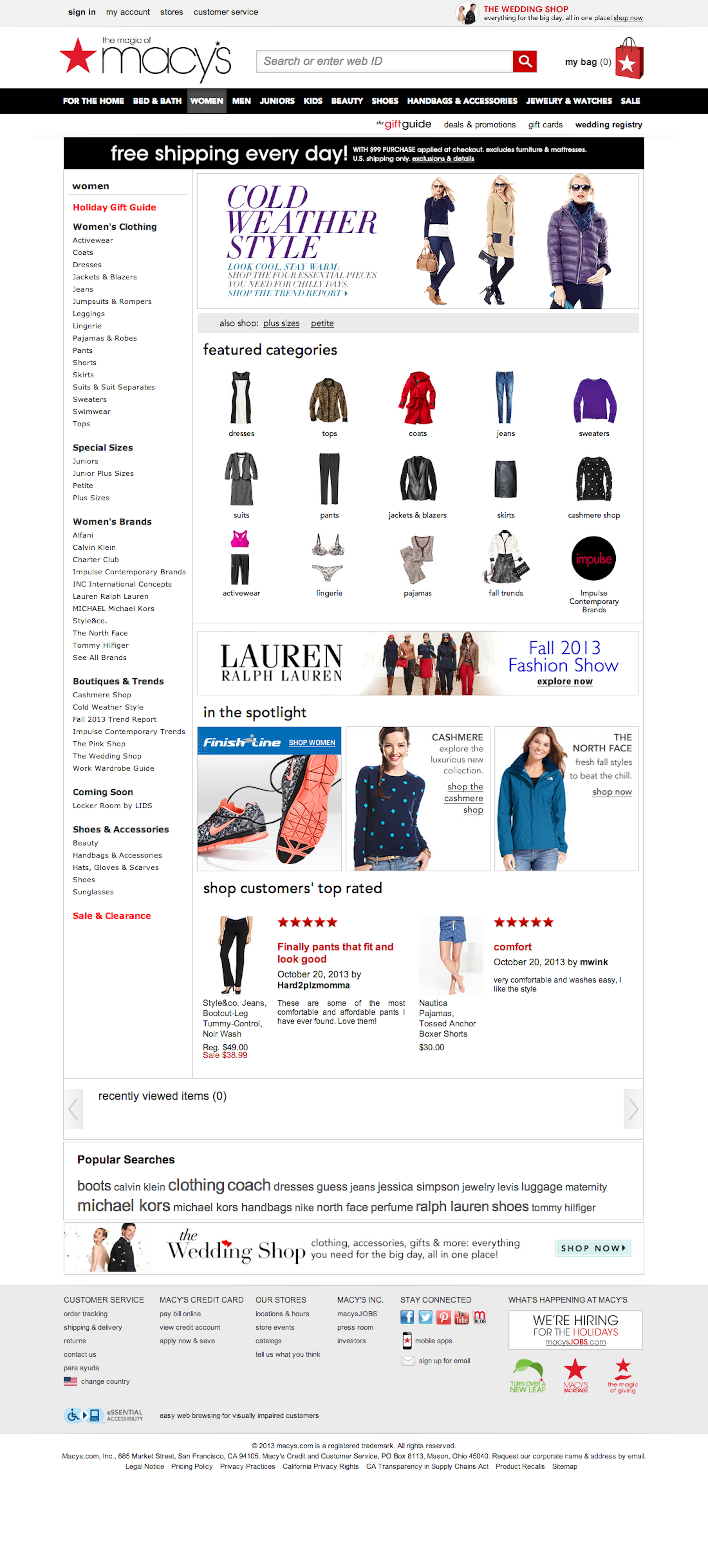
The screenshot was taken on October 25, 2013 and depicts Macy’s Intermediary Category Page. In total, we’ve reviewed 87 of Macy’s page designs. To see them all, visit the full Macy’s UX case study.
Research Guideline #312
Importance: Impactful · Multi-Platform
Dig deeper: Editor’s note, Underlying UX research
This content is only available in Baymard Premium — get full access
Research Guideline #260
Importance: Detail · Single-Platform
Dig deeper: Underlying UX research
This content is only available in Baymard Premium — get full access
Research Guideline #307
Importance: Impactful · Multi-Platform
Dig deeper: Editor’s note, Underlying UX research
This content is only available in Baymard Premium — get full access
Research Guideline #311
Importance: Impactful · Multi-Platform
Dig deeper: Underlying UX research
This content is only available in Baymard Premium — get full access
Research Guideline #273
Importance: Detail · Single-Platform
Dig deeper: Editor’s note, 1 extra image, Underlying UX research
This content is only available in Baymard Premium — get full access
Research Guideline #268
Importance: Impactful · Multi-Platform
Dig deeper: Underlying UX research
This content is only available in Baymard Premium — get full access