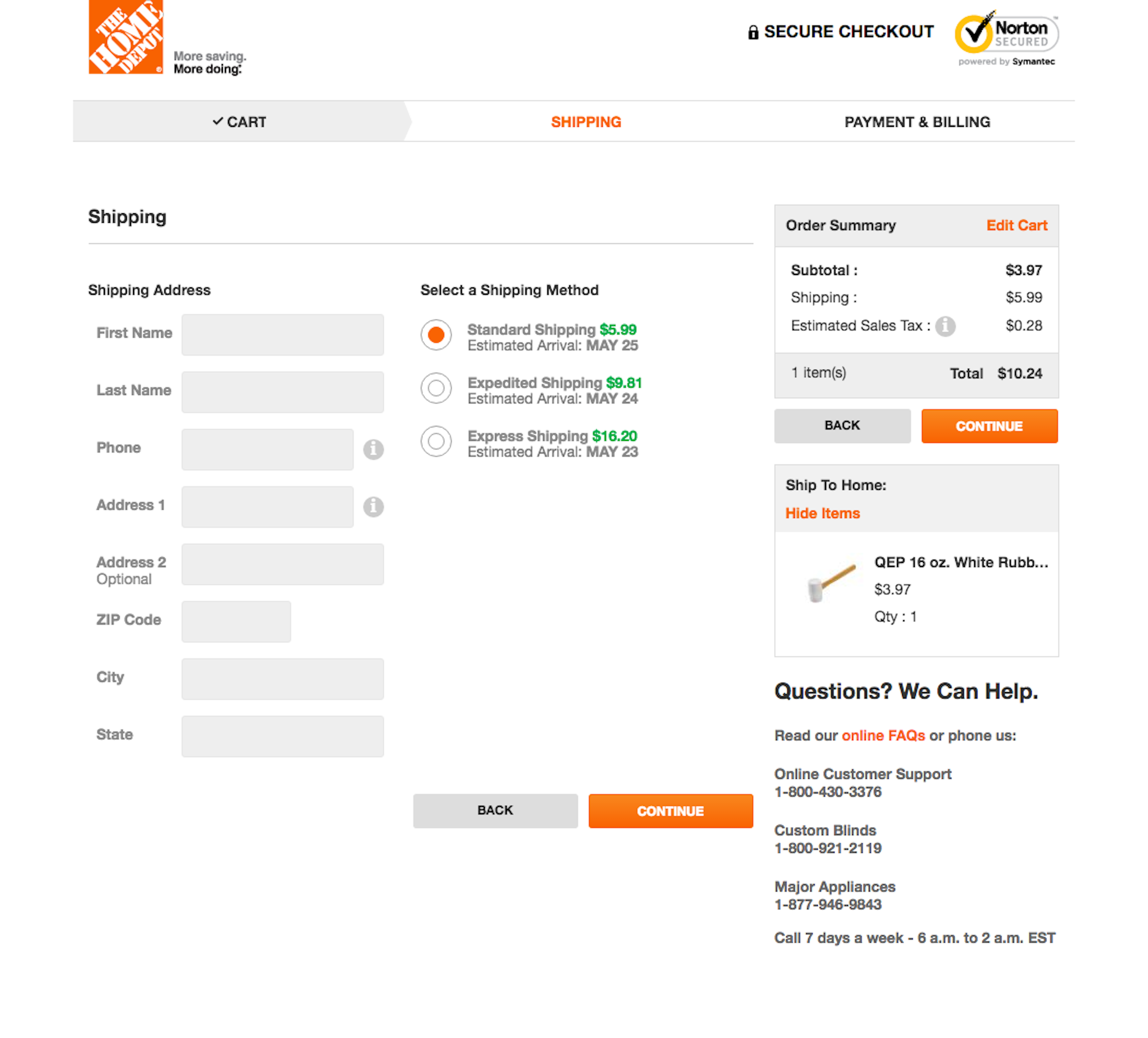
On this page there’s 30 highlights (view in Baymard Premium) outlining what Home Depot are doing right and wrong.
(Tip: use the arrows above or on your keyboard to navigate all 1274 customer info & address examples.)
The screenshot was taken on May 17, 2016 and depicts Home Depot’s Customer Info & Address. In total, we’ve reviewed 96 of Home Depot’s page designs. To see them all, visit the full Home Depot UX case study.
