The new Facebook timeline is a dramatic departure from the current profile view.
There’s many things to like about it: good use of metaphor, a sense of space, and a simple navigation model – all of it presented in an aesthetically pleasing package.
This article aims to highlight some of the thoughts and observations we made on first look.
It’s a Good Metaphor

The new Facebook Timeline design.
The metaphor works really well. A line cutting down the middle of the screen, with all the events from your life tied to it in chronological order, from the day you were born up to the present. A timeline of your life. (Or at least your Facebook presence).
Interestingly, this timeline model works exceptionally well digitally – interactive and forever expanding, yet still easy to use.
It would be interesting to see a newspaper such as the New York Times organize their homepage the same way, or have a historical event cataloged in a similar style.
Just Scroll
The timeline features a deceptively simple navigation model: you can go up, or you can go down. Down goes back in time. Up brings you towards the present.
This means the space you’re navigating within is very tangible. While the link-based navigation can be helpful, you don’t actually need it – you simply scroll in the direction you want to go.
Unlike a typical online navigation model, you don’t click a link to get to a page, then click another link to get to yet another page, and then click a third link to get back to the first page again (or was that actually the second page you just returned to? Or a completely new one?). No, on the timeline you just scroll.
Scrolling is the navigation.
Sense of Place and Direction
Despite the insane amount of information being displayed on this one single page, you rarely feel lost. This is likely because the triad for creating a sense of space is fulfilled:
- Where have I been?
- Where am I now?
- Where can I go?
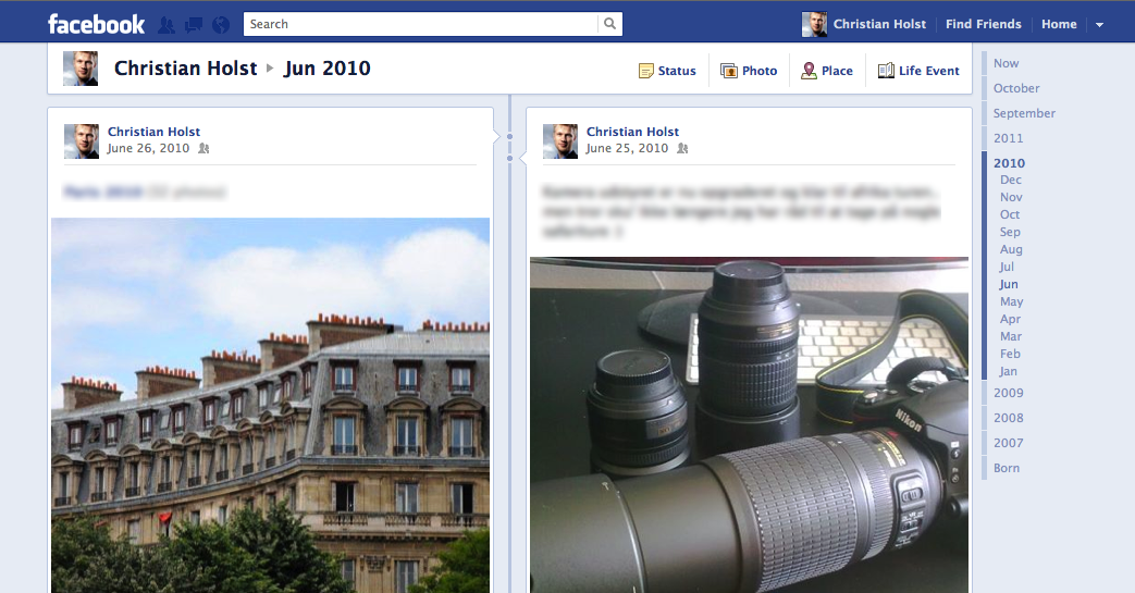
A dynamically expanding and collapsing “calendar” navigation (showing all years and the 12 months of the year you’re currently looking at), combined with a header displaying year and month, gives you a good idea of where you’re currently at (#2). The flood of timestamps – one on each event – doesn’t hurt either.
The simple navigation model of just scrolling down to go back in time and scrolling up to go forward in time, means you always know where you’re coming from (#1) and where to go (#3).
This is an excellent example of how to create an illusion of space in the online realm.
It Looks Great
Even though everything is very blue (seriously, the background is one shade of blue, header and links another, timeline a third) this new design looks and works great.

Certain events are only displayed as a dot until you hover and a dialog opens with the actual content.
Simple timeline events (e.g. a “Like” with no comments) are collapsed to make the timeline less cluttered. Visual posts (photos, maps, etc.) on the other hand are typically expanded, making the overall timeline seem more interesting and alluring as there’s a good ratio between visuals and text.
Massive amounts of user-generated content, all presented in a neat and intuitive package. Elegant.
It’s Scary
It’s a little scary just how much Facebook knows about you. We always knew this, but in the old design things quickly disappeared from your Wall. “Out of sight, out of mind” right? Well, it’s not out of sight anymore. The new timeline design makes it painfully clear just how much personal data Facebook stores about you.
It’s a very powerful visualization which could make some people even more considerate of how much (or little) they share going forward.
Conclusion
The new timeline design is really interesting. From a UX perspective it’s deceptively simple. Many things to like. Some to dislike.
What’s your take?