E-Commerce UX Research Articles
The below 350+ e-commerce UX articles are all based on Baymard’s 130,000+ hours of UX research. The articles represent just 5% of Baymard’s Premium research database. Join 37,000+ UX professionals and get a new article every week by email.
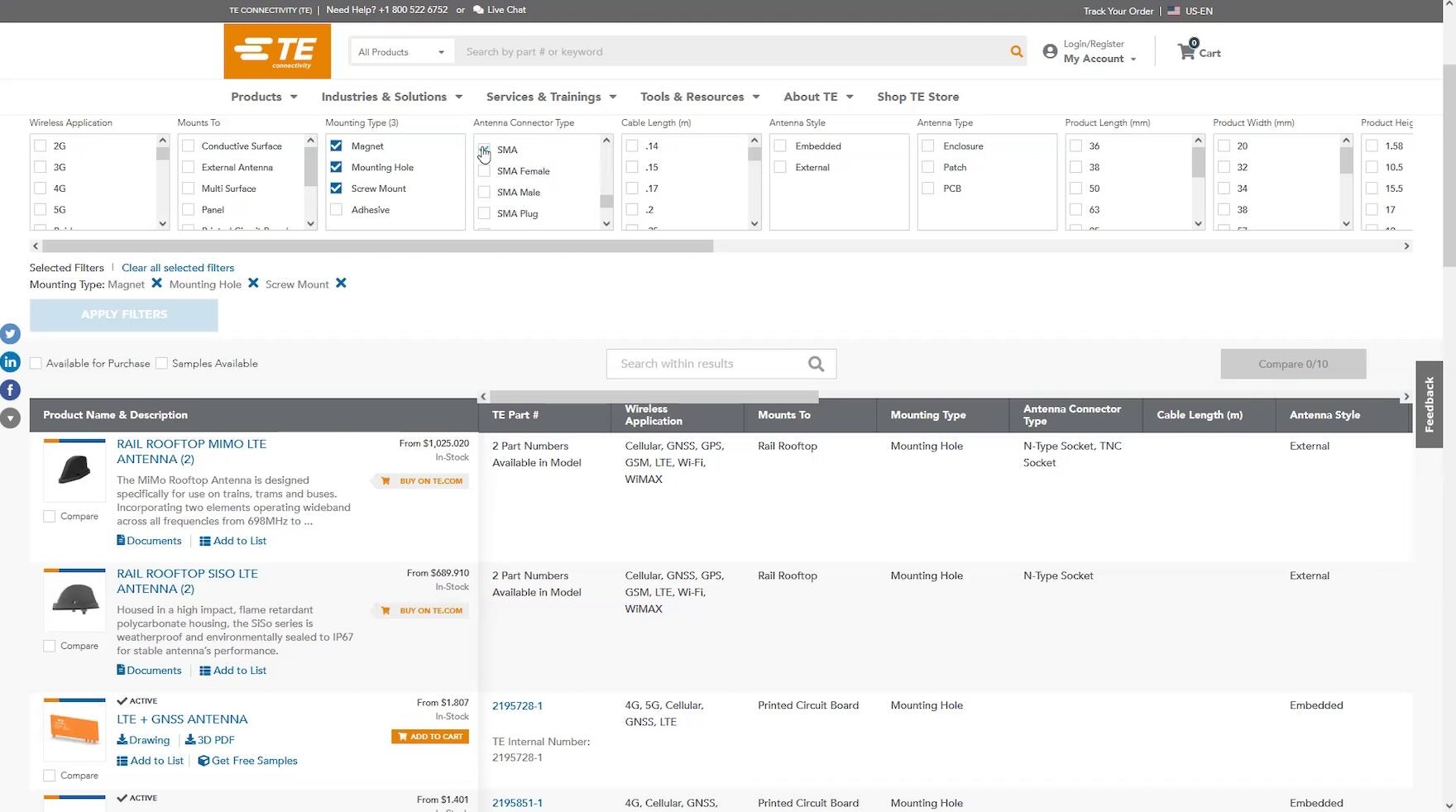
B2B Electronics: Always Allow Users to Search Long Lists of Filter Options
Our UX testing found that long lists of filter options in desktop list views are challenging to scan to locate desired options. See our latest B2B Electronic Components & Machinery findings.
April 23, 2024
Mass Merchant Sites: New UX Benchmark with 6,000+ Performance Scores and 6,000+ Best Practice Examples
April 16, 2024
B2B Electronics: Use “Product Tables” to Display Product Listings on Desktop
April 10, 2024
Luxury Goods Sites: New UX Benchmark with 3,500+ Performance Scores and 2,500+ Best Practice Examples
April 2, 2024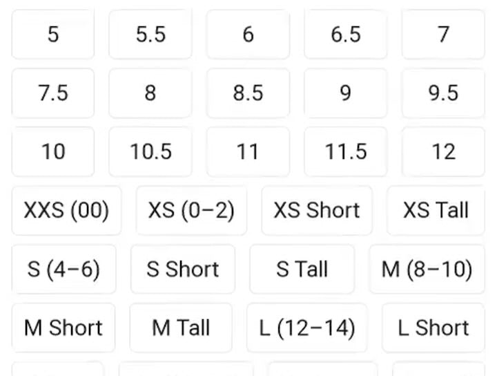
Apparel E-Commerce: Visually Group and Clearly Label Size Filter Options
March 26, 2024
Vitamins & Supplements Sites: New UX Benchmark with 3,500+ Performance Scores and 2,500+ Best Practice Examples
March 19, 2024
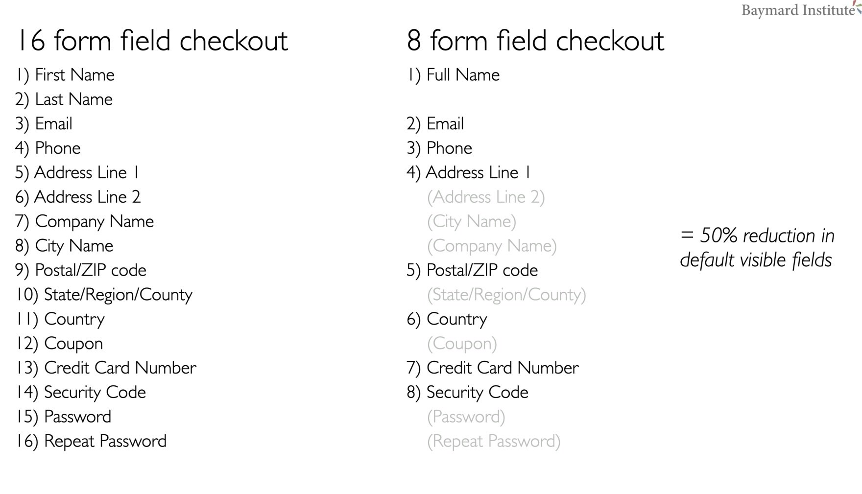
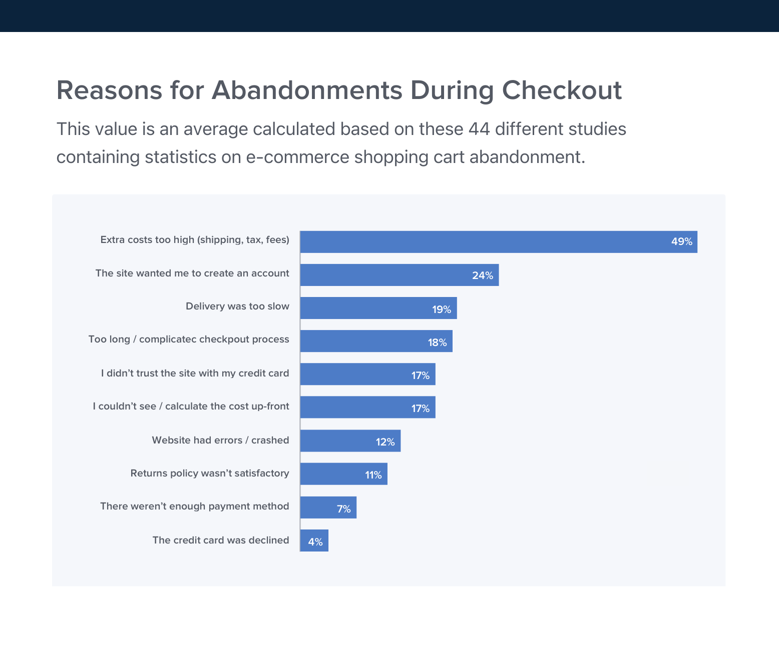
Checkout Optimization: 5 Ways to Minimize Form Fields in Checkout
Our latest usability research reveals that 26% of users have abandoned an order due to a "too complicated checkout flow" – yet we also find that most sites can reduce the number of form fields by 20-60%.
Featured
2024 E-Commerce Checkout: Expanded and Updated Checkout Research Findings
March 13, 2024
New 2024 Order Tracking & Returns UX Benchmark with 950+ Performance Scores and 850+ Best Practice Examples
March 5, 2024
Always Explain Industry-Specific Filters (62% Don’t)
February 27, 2024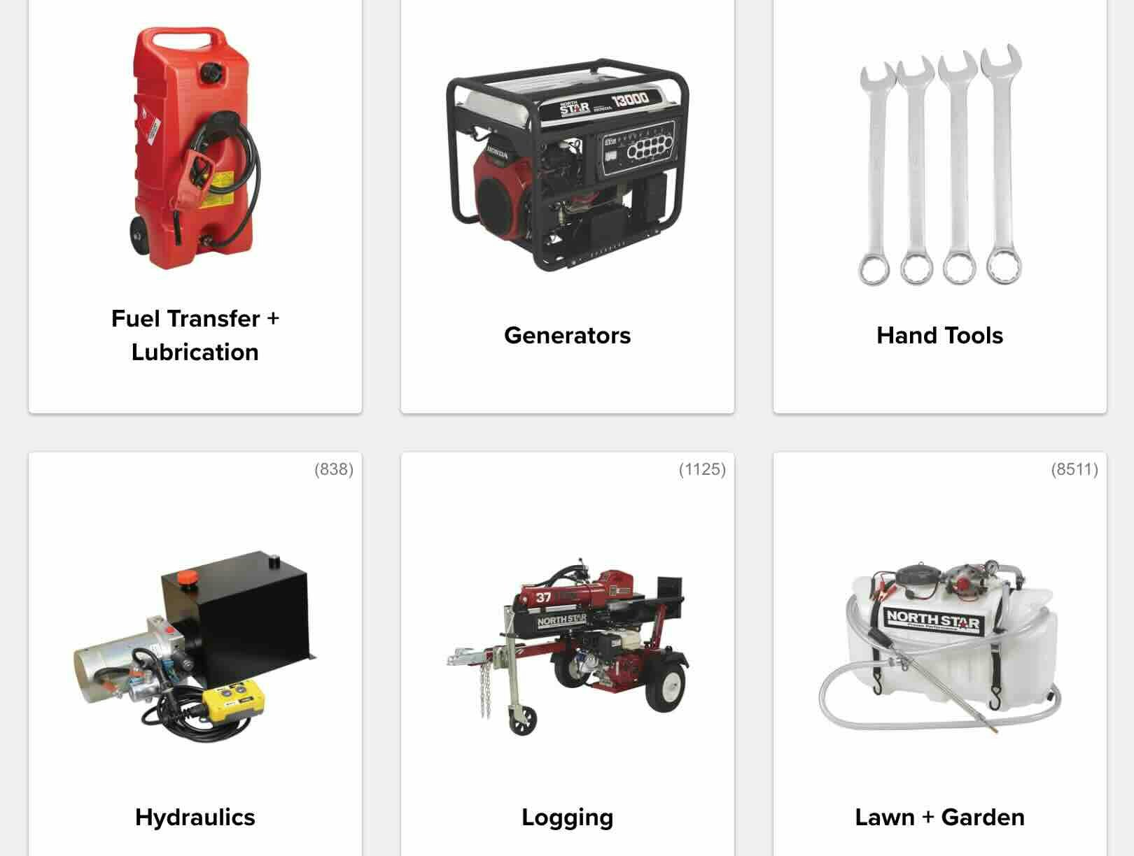
Home & Hardware Sites: New UX Benchmark with 2,500+ Performance Scores and 2,000+ Best Practice Examples
February 13, 2024
Retain Data in Sensitive Credit Card Fields after Validation Errors (34% Don’t)
February 6, 2024
The Current State of Homepage UX – 8 Common Pitfalls & Best Practices
Our latest Homepage UX benchmark reveals that even given the generally decent performance of e-commerce sites, there’s still room for improvements. Here are 8 common Homepage UX pitfalls & best practices.
Featured
User Experience Research, Delivered Weekly
Join 37,000+ UX professionals and get a new UX article every week.
Explore Other Research Content
244 top sites ranked by UX performance.
14,000+ annotated designs for systematic inspiration.
Code samples, demos, and key stats for usability.