
Ecommerce UX Research Articles
The below 450+ ecommerce UX articles are all based on Baymard’s 200,000+ hours of UX research. The articles represent just 5% of Baymard’s research database. Join 60,000+ UX professionals and get a new article every week by email.

Use a Fake “Editing” Flow When Updating Credit Card Details (78% Don’t)
When users need to update their credit card details at a site, most think to “edit” their details — which is technically not allowed. Learn how to support users in managing their payment data.
June 2, 2026 (Updated)
AI Heuristic UX Evaluations with a 95% Accuracy Rate (Human-Level Accuracy)
May 28, 2026 (Updated)Popular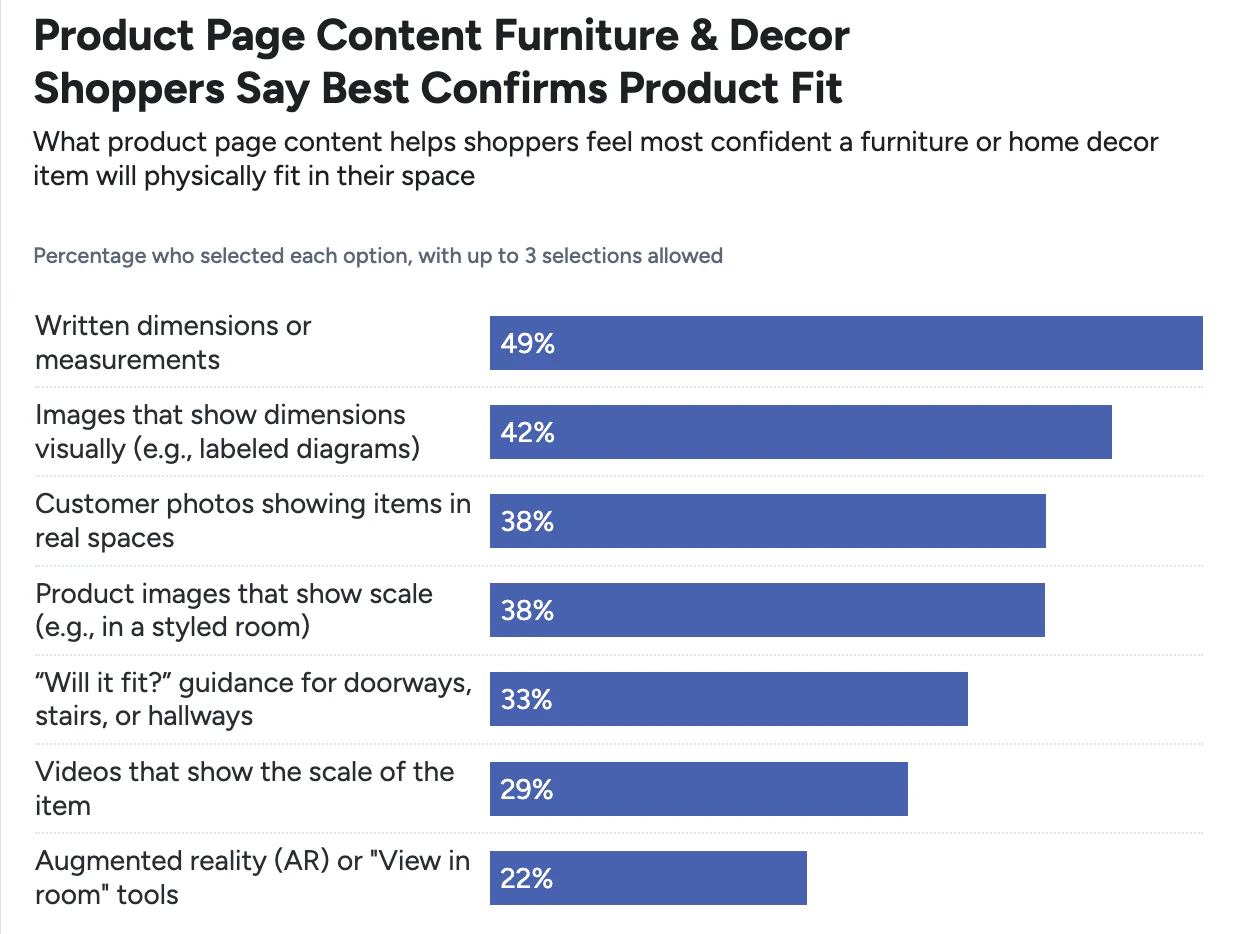
Furniture & Home Decor Quantitative UX: 3 High-Level Takeaways from 30+ Charts
May 19, 2026
Display “Applied Filters” in an Overview (28% Don’t)
May 13, 2026 (Updated)
Always Provide 6 Key Order-Tracking Details on the Ecommerce Site
May 5, 2026 (Updated)Popular
Ecommerce Search UX 2026: 8 Search “Query Types” UX Best Practices (56% of Sites Have Issues)
April 29, 2026 (Updated)

Mobile UX Trends 2025: 9 Common Pitfalls & Best Practices
Our latest Mobile UX Benchmark consists of 150+ leading ecommerce sites with 52,000+ usability scores and 40,000+ implementation examples. Here are 9 common pitfalls.
Featured
Online Grocery Ecommerce UX 2026: Expanded & Updated Research Findings
April 22, 2026
Mobile App UX Trends: The Current State of Ecommerce App UX (11 Common Pitfalls & Best Practices)
April 14, 2026 (Updated)Popular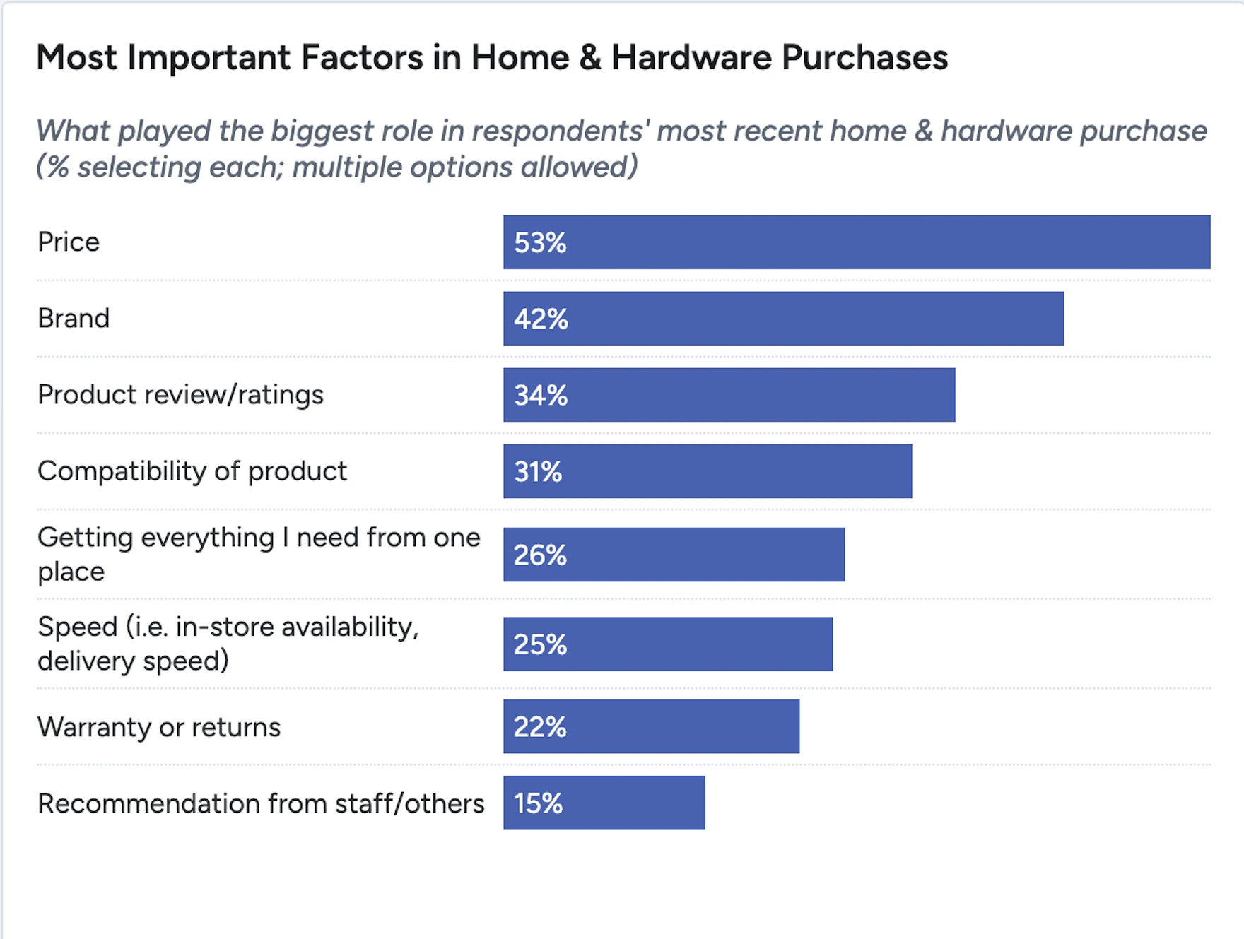
Home & Hardware Quantitative UX: 3 High-Level Takeaways from 30+ Charts of Key Findings and Actionable Insights
April 8, 2026
Electronics & Office UX Benchmark: 5,000+ Performance Scores and 3,900+ Best Practice Examples
March 31, 2026
Mobile App UX Benchmark 2026: 3,300+ Performance Scores and 2,500+ Best Practice Examples
March 24, 2026

Homepage and Category Navigation UX 2025: 67% of Mobile Sites Have Mediocre-to-Poor Performance
Our latest Homepage & Category Navigation UX benchmark reveals that the performance for up to 67% of leading US and European sites is “mediocre” to “poor”. Here are 11 UX best practices.
Featured
User Experience Research, Delivered Weekly
Join 60,000+ UX professionals and get a new UX article every week.

Explore Other Research Content

326 top sites ranked by UX performance.

18,000+ annotated designs for systematic inspiration.

Code samples, demos, and key stats for usability.