2024
B2B Electronics: Always Allow Users to Search Long Lists of Filter Options
April 23, 2024
Mass Merchant Sites: New UX Benchmark with 6,000+ Performance Scores and 6,000+ Best Practice Examples
April 16, 2024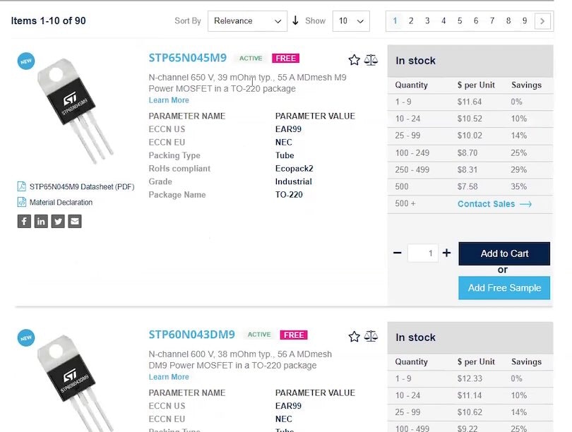
B2B Electronics: Use “Product Tables” to Display Product Listings on Desktop
April 10, 2024
Luxury Goods Sites: New UX Benchmark with 3,500+ Performance Scores and 2,500+ Best Practice Examples
April 2, 2024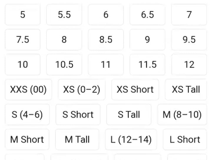
Apparel E-Commerce: Visually Group and Clearly Label Size Filter Options
March 26, 2024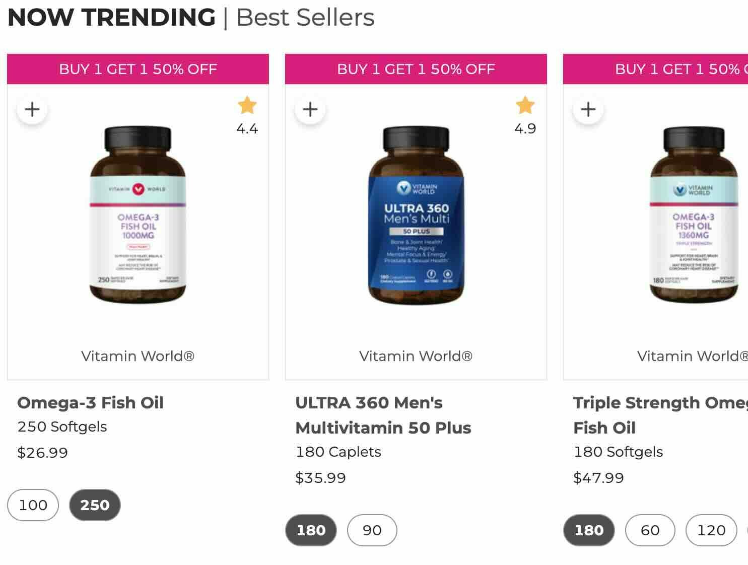
Vitamins & Supplements Sites: New UX Benchmark with 3,500+ Performance Scores and 2,500+ Best Practice Examples
March 19, 2024
2024 E-Commerce Checkout: Expanded and Updated Checkout Research Findings
March 13, 2024
New 2024 Order Tracking & Returns UX Benchmark with 950+ Performance Scores and 850+ Best Practice Examples
March 5, 2024
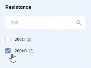
Always Explain Industry-Specific Filters (62% Don’t)
February 27, 2024
Home & Hardware Sites: New UX Benchmark with 2,500+ Performance Scores and 2,000+ Best Practice Examples
February 13, 2024
Retain Data in Sensitive Credit Card Fields after Validation Errors (34% Don’t)
February 6, 2024
Electronics Sites: New UX Benchmark with 3,000+ Performance Scores and 2,500+ Best Practice Examples
January 30, 2024
Always Allow Users to Combine Multiple Filtering Values of the Same Type — an ‘OR’ Logic (15% of Sites Don’t)
January 23, 2024Popular
Online Grocery: New UX Benchmark with 3,500+ Performance Scores and 2,900+ Best Practice Examples
January 16, 2024
Usability Testing of Inline Form Validation: 31% Don’t Have It, 4% Get It Wrong
January 9, 2024Popular
2023
Baymard: 2023 and 2024
December 20, 2023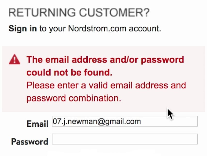
Improve Validation Errors with Adaptive Messages (98% Don’t)
December 14, 2023Popular
Top 1% E-Commerce UX Awards — 2023 WINNERS
December 5, 2023Popular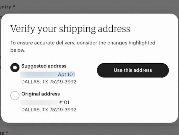
Have an Address Validator (47% Don’t)
November 28, 2023
Consider Promoting Important Filters (61% Don’t)
November 21, 2023
Generalizability of UX E-Commerce Research
November 14, 2023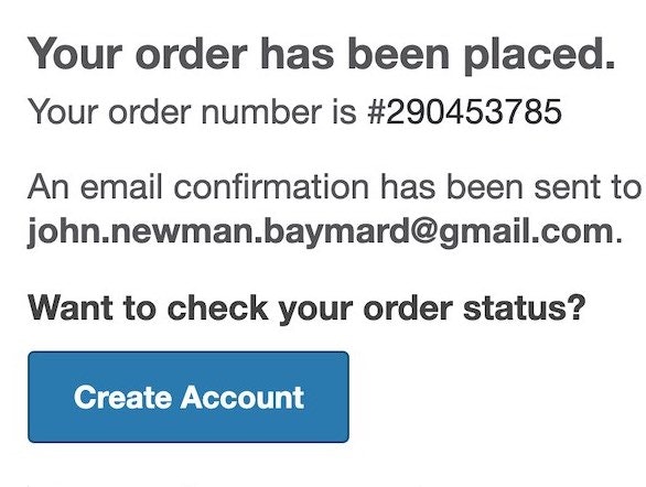
6 Ways to Get More Out of Your Order Confirmation Page
November 8, 2023Popular
Form Field Usability: Avoid Extensive Multicolumn Layouts (16% Make This Form Usability Mistake)
October 31, 2023Popular
The Current State of E-Commerce Product Page UX Performance (15 Best Practices)
October 24, 2023Popular
Testing ChatGPT-4 for ‘UX Audits’ Shows an 80% Error Rate & 14–26% Discoverability Rate
October 18, 2023Popular
Toys Sites: New UX Benchmark with 2,600+ Performance Scores and 2,200+ Best Practice Examples
October 10, 2023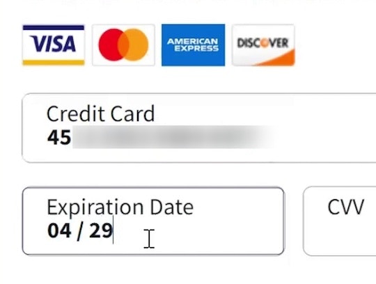
Format the “Expiration Date” Fields Exactly the Same as the Physical Credit Card (72% Don’t)
October 3, 2023Popular
Always Collapse Completed Accordion Checkout Steps into Summaries
September 27, 2023Popular
Save Account Creation for the Confirmation Step (42% Don’t)
September 19, 2023Popular
Grocery UX: Dynamically Update the “Add to Cart” Button to a Quantity Selector after Item Added
September 12, 2023
Payment Method UX: Designing Payment Selection
September 5, 2023Popular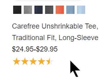
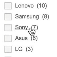
Always Show the Number of User Ratings in List Items (5% Don’t)
August 29, 2023
2 Key Design Principles for Product Listing Information (64% Get at Least 1 Wrong)
August 22, 2023Popular
Travel Tours & Experience Booking Sites: New UX Benchmark with 2,500+ Performance Scores and 1,500+ Best Practice Examples
August 15, 2023
Make All Color Swatches Available in Mobile List Items for Visually Driven Product Types (57% Don’t)
August 8, 2023Popular
Avoid “Quick Views” for Spec-Driven Product Types (21% Don’t)
August 1, 2023
Health & Beauty Sites: New UX Benchmark with 1,500+ Performance Scores and 1,200+ Best Practice Examples
July 25, 2023
Display “Price Per Unit” For Multiquantity Items (86% Don’t)
July 18, 2023
New 2023 On-Site Search UX Benchmark with 1,000+ Performance Scores and 1,400+ Best Practice Examples
July 11, 2023
Include All Order-Fulfillment Options in the Fulfillment-Selector Interface (50% Don’t)
July 6, 2023
Use “Delivery Date” Not “Shipping Speed” (41% Don’t) — From UX Research to Implementation Roadmap
June 27, 2023
The Current State of Homepage and Category Navigation UX (12 Common Pitfalls)
June 21, 2023Popular
New Online UX Training Platform with 3 Different UX Degrees — All Based on Baymard’s Extensive UX Research
June 13, 2023
Sports Sites: New UX Benchmark with 2,600+ Performance Scores and 2,200+ Best Practice Examples
June 6, 2023
Product Listing UX: What Information to Display in Product Listings (50% Get It Wrong)
May 30, 2023Popular
New Insurance UX Benchmark with 1,700+ Performance Scores and 1,200+ Best Practice Examples
May 23, 2023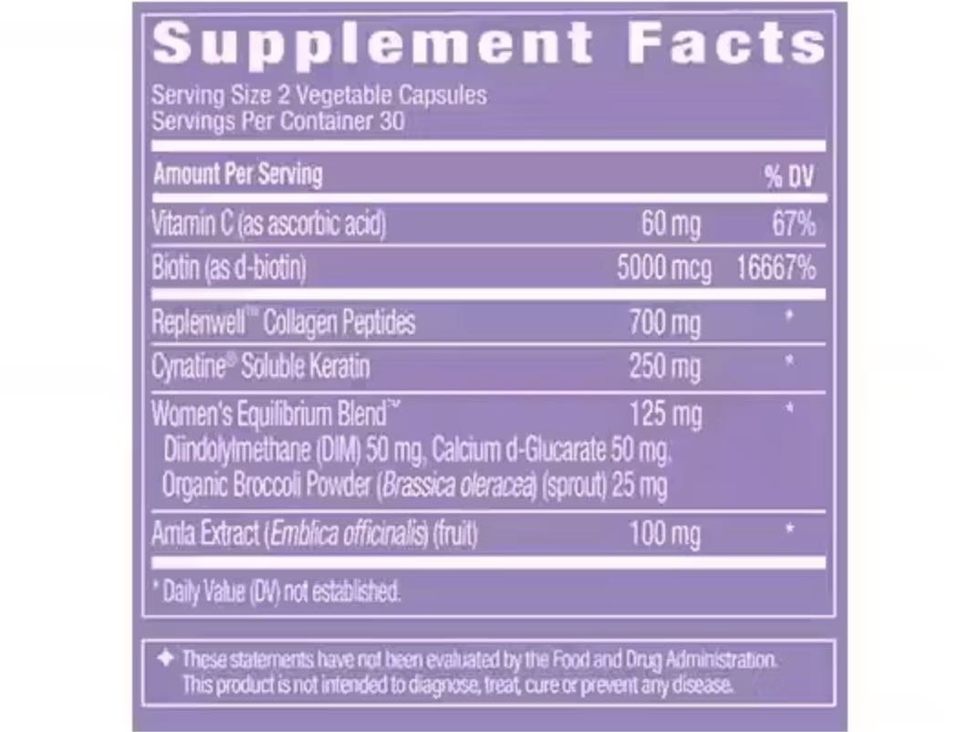
Always Provide a “Supplement Facts Label” Image in the Main Image Gallery of Vitamins & Supplements Sites
May 16, 2023
New 2023 Mobile Apps UX Benchmark with 2,200+ Performance Scores and 2,200+ Best Practice Examples
May 9, 2023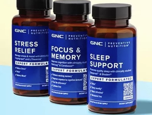
3 High-Level Takeaways from 1,800+ Hours Testing Vitamins & Supplements Sites
May 2, 2023
The Current State of E-Commerce Product List UX Performance (15 Best Practices)
April 25, 2023Popular
New Automotive Parts & Specialty UX Benchmark with 5,000+ Performance Scores and 4,000+ Best Practice Examples
April 20, 2023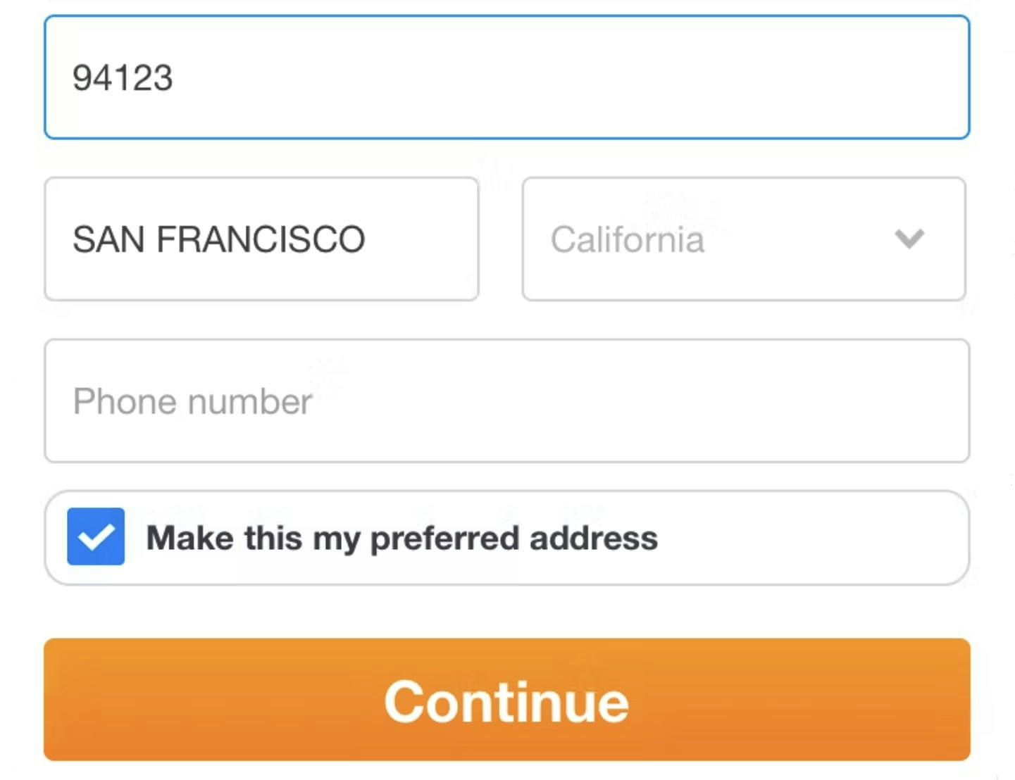
Checkout Usability: Autodetect “City” and “State” Inputs Based on the User’s Postal Code (28% of Mobile Sites Don’t)
April 11, 2023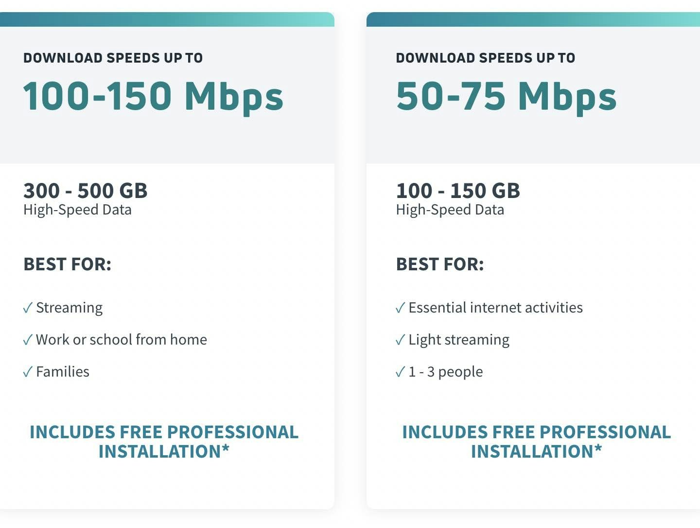
New Internet Service Providers (ISP) UX Benchmark with 2,200+ Performance Scores and 1,600+ Best Practice Examples
April 4, 2023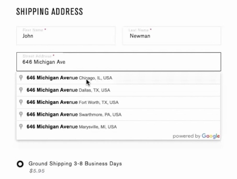
Provide a “Fully Automatic Address Lookup” Feature (55% Don’t)
March 24, 2023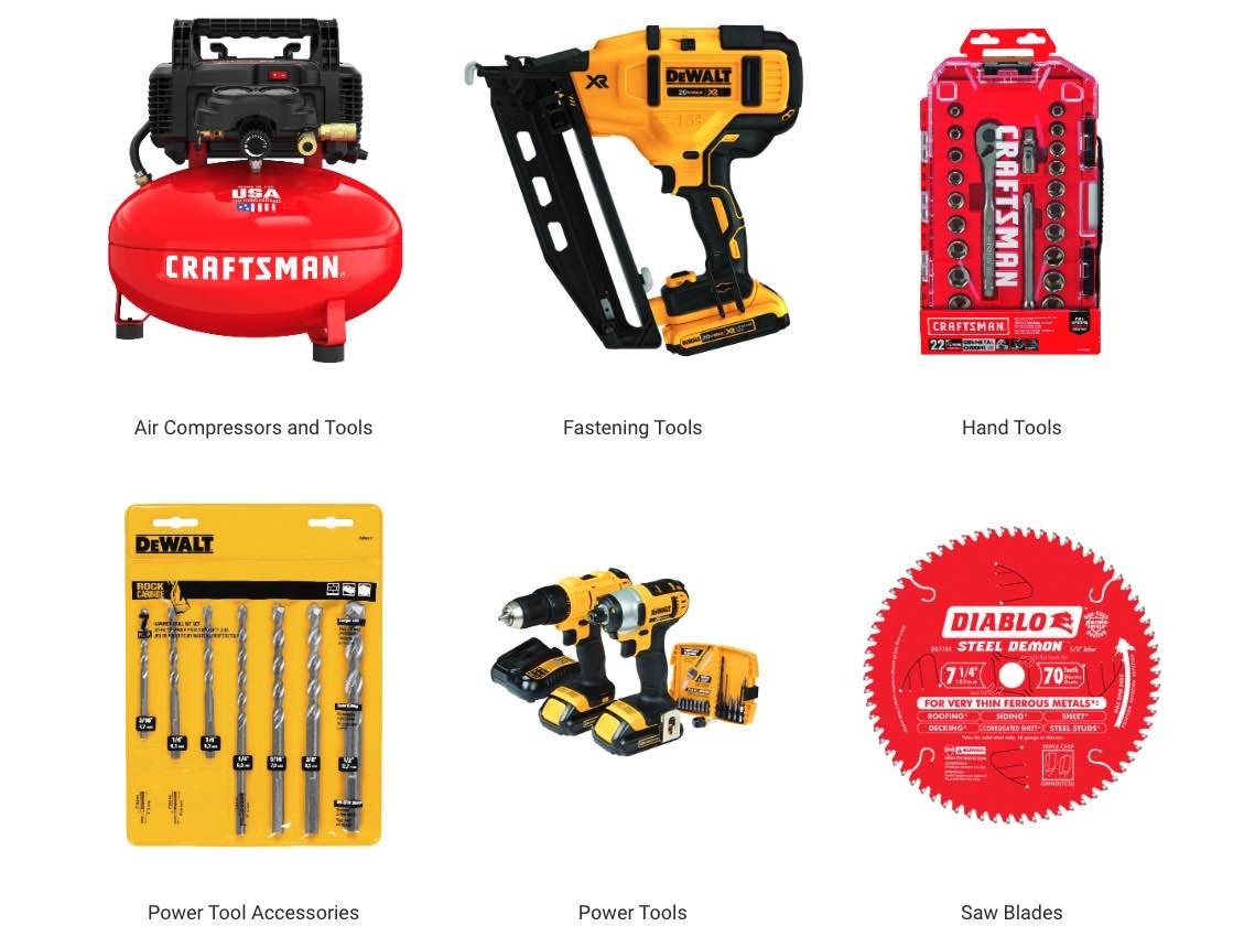
Home & Hardware Sites: New UX Benchmark with 2,700+ Performance Scores and 2,300+ Best Practice Examples
March 23, 2023
Always Have a Map on the “Tour Details” Page Indicating the Departure or Meeting Point for the Tour
March 21, 2023
New 2023 Mobile Customer Accounts UX Benchmark with 1,600+ Performance Scores and 1,100+ Best Practice Examples
March 15, 2023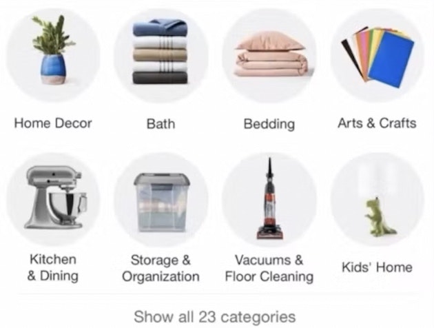
Consider Providing “Intermediary Category Pages” (13% Don’t)
March 7, 2023
New 2023 Homepage & Category UX Benchmark with 3,000+ Performance Scores and 2,500+ Best Practice Examples
February 28, 2023
Always Link to Third-Party Sources of Reviews, Aggregate Ratings, Awards, and Endorsements on Tours and Experiences Sites
February 22, 2023
New 2023 Product Lists & Filtering UX Benchmark with 6,100+ Performance Scores and 4,400+ Best Practice Examples
February 14, 2023
3 High-Level Takeaways from 1,700 Hours Testing Travel Tours and Experience Booking Sites
February 7, 2023
Provide a Hover Delay of 300–500 MS for Hover-Based Drop-Down Menus (60% Don’t)
January 31, 2023Popular
Make Product Categories the Top-Level Navigation Items on Mobile Sites (33% Don’t)
January 24, 2023Popular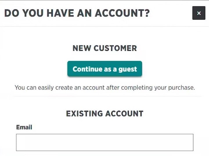
Make “Guest Checkout” the Most Prominent Option (47% Don’t)
January 17, 2023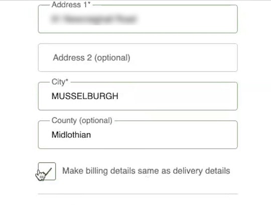
Use “Shipping Address” as “Billing Address” by Default (16% of Mobile Sites Have Implementation Issues)
January 10, 2023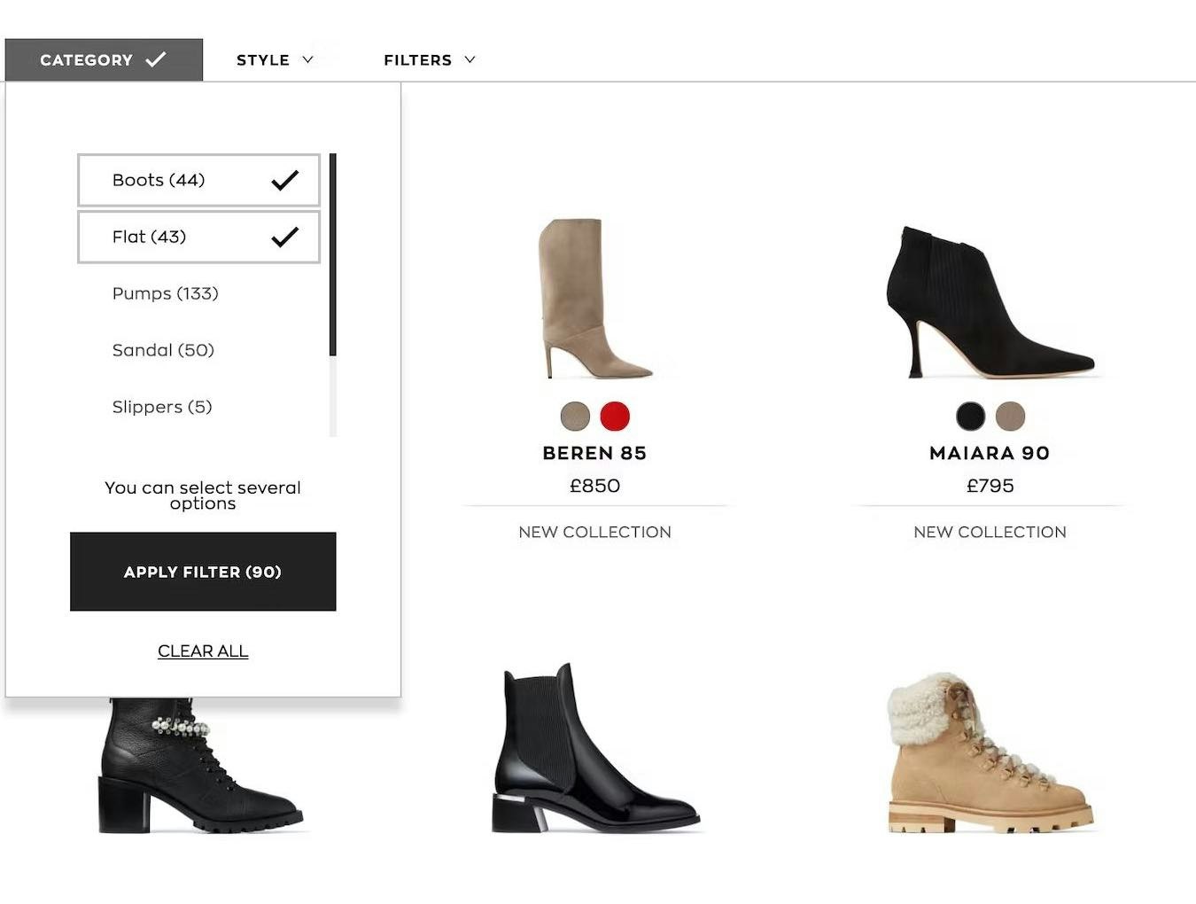
Overcategorization of the Product Catalog Can Lead to Abandonment (Yet 75% Get It Wrong)
January 3, 2023Popular
2022
Baymard: 2022 and 2023
December 21, 2022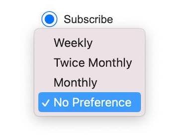
Allow Users to Choose the Frequency of Newsletter Emails (80% Don’t)
December 13, 2022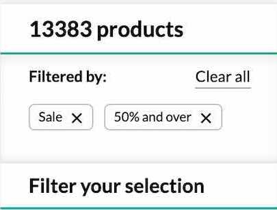
Consider Having a “Sales” or “Deals” Filter-Based Category (32% Don’t or Have Implementation Issues)
December 7, 2022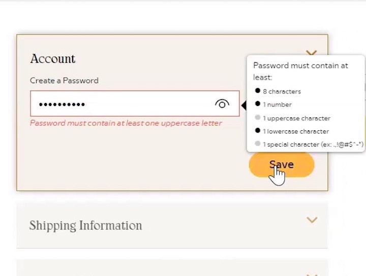
Avoid Unnecessarily Complex Password-Creation Requirements (82% Don’t)
November 29, 2022
B2B Medical & Pharma Sites: New UX Benchmark with Over 4,500 Performance Scores and 3,500+ Best Practice Examples
November 22, 2022
Have a “View All” Option in the Main Navigation at Each Level of the Mobile Product Catalog (Only 24% Get It Right)
November 16, 2022
Mobile Apps: New UX Benchmark with Over 3,700 Performance Scores and 2,800+ Best Practice Examples
November 9, 2022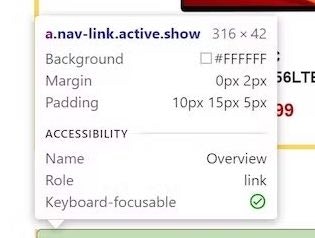
E-Commerce Accessibility: Specifying UI Elements Using “Roles”
November 1, 2022
European Sites: Updated UX Benchmark with over 4,950 Performance Scores and 4,100+ Best Practice Examples
October 25, 2022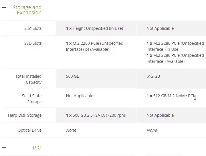
4 Ways to Optimize the Comparison Feature for Scanning
October 19, 2022Popular
Meal Kit Sites: New UX Benchmark with over 3,300 Performance Scores and 2,200 Best Practice Examples
October 11, 2022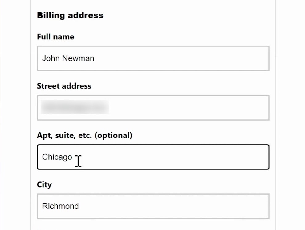
Form Usability: Getting ‘Address Line 2’ Right
October 4, 2022Popular
B2B Electronic Components and Machinery Sites: New UX Benchmark with Over 4,800 Performance Scores and 3,600 Best Practice Examples
September 29, 2022
Use Buttons or Buttons Plus an Open Text Field for Updating Cart Quantity (61% Don’t)
September 20, 2022
Product Comparison UX: Always Provide Comparison Features for Spec-Driven Industries (17% Don’t)
September 6, 2022
E-Commerce Accessibility: Specifying UI Elements Using “Names”
August 30, 2022
DTC UX: Avoid Intermediary Category Pages
August 23, 2022
Make the Travel Accommodations “Booking” Search Feature the Primary Content on the Homepage (25% Don’t)
August 16, 2022
Provide “Quick Views” for Visually Driven Products (50% Don’t)
August 9, 2022Popular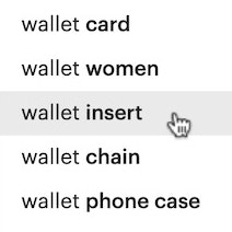
9 UX Best Practice Design Patterns for Autocomplete Suggestions (Only 19% Get Everything Right)
August 2, 2022Popular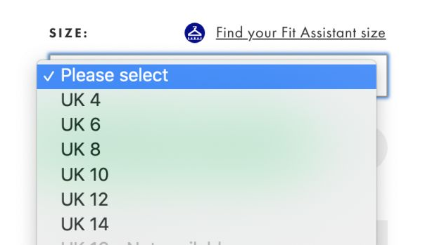
5 UX Best Practices for Apparel E-Commerce (94% Get One or More Wrong)
July 26, 2022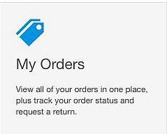
Accounts & Self-Service UX: Consider Having an “Icon-Based” Dashboard (81% Don’t)
July 21, 2022
Deconstructing E-Commerce Search UX: The 8 Most Common Search Query Types (42% of Sites Have Issues)
July 14, 2022Popular
83% of Apparel Sites Don’t Provide Sufficient Sizing Information — 10 Best Practices on Sizing
July 6, 2022
35% of SaaS Sites Fail to Make the Service’s UI Sufficiently Prominent to Prospects
June 23, 2022
Consumables Subscription Service Sites: New UX Benchmark with over 3,000 Performance Scores and 2,300 Best Practice Examples
June 14, 2022
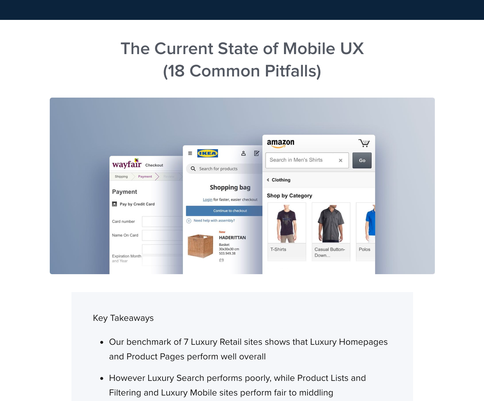
Mobile UX Trends: The Current State of Mobile UX (15 Common Pitfalls & Best Practices)
June 7, 2022Popular
Make It Clear Where Hit Areas in Visual Elements Lead: 33% of Sites Don’t
May 30, 2022
How to Display Price Discounts on the Product Page: Avoid These 4 Pitfalls (18%+ Have One or More)
May 25, 2022
Readability: The Optimal Line Length
May 10, 2022Popular
Baymard Update: New UX Benchmark for Takeout & Food Delivery Mobile Sites and Mobile Apps
May 3, 2022
Baymard Update: New UX Benchmark for Travel Accommodations Websites (OTAs, Hotels, Vacation Rentals)
April 22, 2022
Consumables Subscription Services Site UX: Avoid This Major CTA Pitfall
April 19, 2022
3 UX Best Practices for Consumables Subscription Services Websites — Based on 1,200+ Hours of UX Testing
April 12, 2022
Grocery and Food Delivery Site UX: Allow Users to Add “Past Purchases” to the Cart from the Homepage
April 5, 2022
3 High-Level UX Takeaways from 1100+ Hours of Testing Leading Food Delivery and Takeout Sites
March 29, 2022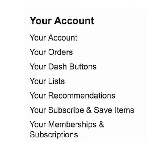
The Current State of Accounts & Self-Service UX: 5 Common Pitfalls & Best Practices
March 18, 2022Popular
Use a 3-Level Information Hierarchy for the “How It Works” Page for Consumables Subscription-Service Sites
March 8, 2022
3 High-Level UX Takeaways from 950+ Hours of Testing Leading Meal Kits Sites
March 1, 2022
Direct-to-Consumer UX Benchmark: 5 Common DTC Pitfalls
February 22, 2022
The Optimal Layout for Hotel & Property Rental Search Results & 3 Pitfalls to Avoid
February 8, 2022
Travel Accommodations UX: 3 High-Level UX Takeaways from 992 Hours of Testing Leading Travel Accommodations Sites
February 1, 2022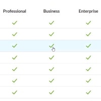
SaaS UX Benchmark: 5 Pitfalls to Avoid
January 25, 2022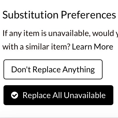
Online Grocery UX: 3 Ways to Make Setting Grocery Substitution Preferences Easier
January 18, 2022
Online Grocery UX: 5 High-Level UX Takeaways from 1,100 Hours of Testing Leading Grocery Websites
January 11, 2022
DTC E-Commerce: User Reviews Are Much Less Important for DTC Sites
January 4, 2022
2021

Baymard: 2021 and 2022
December 21, 2021
SaaS UX: 5 Ways to Improve the Scannability of the Plan Matrix
November 16, 2021
250+ New Examples Added from Large-Scale Testing on European Sites
November 9, 2021
The Current State of Checkout UX - 18 Common Pitfalls & Best Practices
November 8, 2021Popular
Checkout Optimization: 5 Ways to Minimize Form Fields in Checkout
November 4, 2021Popular
Baymard Update: 13 New Case Studies and 3 New 2021 Benchmarks (Checkout, Product Page, and On-Site Search UX)
October 12, 2021
Accessibility for E-Commerce: 3 Best Practices For Navigational Links (73% of Sites Fail)
October 5, 2021
DTC UX: Niche Direct-To-Consumer Sites Rarely Need On-Site Search (Should Invest Elsewhere)
September 21, 2021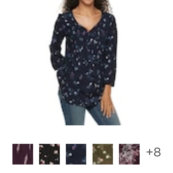
Combine Variations of Products into One List Item (12% Don’t)
September 7, 2021
Offer Relevant Autocomplete Suggestions for Closely Misspelled Search Terms and Queries (69% Don’t)
August 31, 2021
How To Make “Decorative” and “Functional” Images Accessible to All Users (52% of Sites Don’t)
August 17, 2021
Accessibility in E-Commerce: Use ‘ALT’ Text to Communicate the Core Content of “Informational” Images (55% of Sites Don’t)
August 10, 2021
Always Provide the Full Scope for Links on Mobile Homepages (58% Don’t)
August 3, 2021
17 Common UX Pitfalls Telco Websites Suffer From
July 27, 2021
12 Common UX Pitfalls ‘Online Grocery’ E-Commerce Sites Suffer From
July 20, 2021
The Current State of Homepage UX – 8 Common Pitfalls & Best Practices
July 13, 2021
94% of the Largest E-Commerce Sites Are Not Accessibility Compliant
June 29, 2021
Direct-to-Consumer Research: 5 Effective Ways for DTC Sites to Tell Their ‘Brand’ & ‘Product’ Stories
June 22, 2021
New UX Research Study on Native Mobile Apps (incl. app usage rates)
June 15, 2021
15 Common UX Pitfalls Luxury Retail E-Commerce Sites Suffer From
June 8, 2021
Always Provide a Submit Button Adjacent to the Search Field on Mobile (21% Don’t)
June 1, 2021
New Research Study on Direct-to-Consumer UX
May 25, 2021
Baymard Update: New Industry UX Benchmarks for Luxury, Telco, and Grocery
May 18, 2021
New Research Study on “Digital Subscriptions” (SaaS) UX
May 11, 2021
Always Sort Product Lists by Diversity-Based “Relevance” (24% Don’t)
May 5, 2021
Allow Sorting by “Price”, “User Rating”, “Best-Selling”, and “Newest” (64% Don’t Allow All 4)
April 20, 2021
6 List Item Attributes to Include for Cross-Sell Recommendations (68% of Desktop Sites Are Missing One or More)
March 23, 2021
10% of E-Commerce Sites Have Product Descriptions That Are Insufficient for Users’ Needs
March 9, 2021
Always Persist Users’ Search Queries (37% Don’t)
February 23, 2021
Always Use “Buttons” for Size Selection (28% of Desktop Sites Don’t)
February 9, 2021
Understanding Mobile E-Commerce UX: 5 Overarching Issues
January 26, 2021Popular
6 Ways to Improve the Relevance of Cross-Sells in the Cart (52% of Desktop Sites Don’t Do Enough)
January 12, 2021
2020
Baymard: 2020 and 2021
December 18, 2020
5 Ways to Provide a Superior Gifting UI and Flow
December 15, 2020
Provide Images of Accessory, Apparel, and Cosmetic Products on a Human Model
December 1, 2020
Return Users to the Same Place in the Product List When Returning from the Product Page (13% Don’t)
November 17, 2020
Mobile UX: Avoid Using Subpages within the Product Details Page (26% Don’t)
November 2, 2020Popular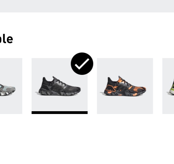
Always Use Thumbnails to Represent Additional Product Images (76% of Mobile Sites Don’t)
October 20, 2020Popular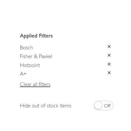
Display “Applied Filters” in an Overview (32% Aren’t Using the Best UX Practices for Filtering)
October 6, 2020Popular
6 Important Aspects of Well-Performing Mobile Product Page Breadcrumbs
September 21, 2020Popular
Inspirational Images Should Link to All Depicted Products (9% of Sites Don’t)
September 8, 2020
Baymard Update: 117 New ‘Mobile UX’ Guidelines and 9,000+ Mobile Examples Uncovered During 2020
September 1, 2020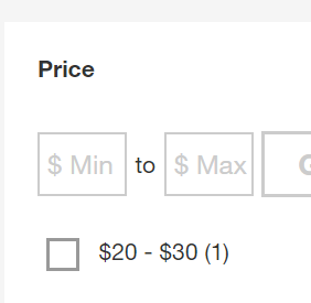
5 Essential Filter Types Users Need on Product Listing Pages (57% Don’t Offer All 5)
August 18, 2020
Allow Users to Upload Images with Their Review (34% of Sites Don’t)
August 4, 2020
4 Design Patterns That Violate “Back” Button UX Expectations – 59% of Sites Get It Wrong
July 20, 2020Popular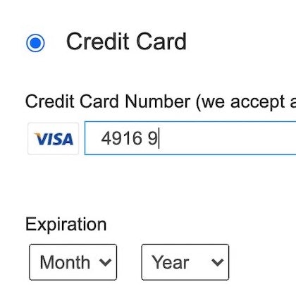
5 ‘Credit Card Form’ Implementations That Make ‘L.L. Bean’ Best-in-Class
June 30, 2020Popular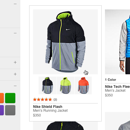
Product Lists: Display Extra Product Info and Images on Hover (70% of Sites Don’t)
June 2, 2020
Highlight the User’s Current Scope in the Main Navigation (66% of Sites Don’t)
May 19, 2020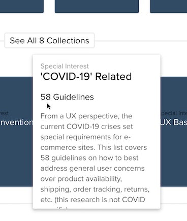
Six ‘COVID-19’ Related E-Commerce UX Improvements to Make
May 5, 2020Popular
25% of E-Commerce Sites Don’t Have Product Images with Sufficient Resolution or Level of Zoom
April 2, 2020
Phone Number UX: Always Explain Why the ‘Phone Field’ Is Required
March 16, 2020Popular
Use a Fake ‘Editing’ Flow When Users Try to Update Their Stored Credit Card (84% of Sites Don’t)
February 5, 2020Popular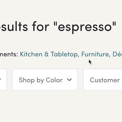
Search UX: Autodirect or Guide Users to Matching Category Scopes (46% Get It Wrong)
January 21, 2020
Product List UX: The Number of Products to Load by Default (52% Get it Wrong)
January 7, 2020Popular
2019
Baymard: 2019 and 2020
December 19, 2019
Where to Send Users after They ‘Sign In’ or ‘Reset Password’ (34% of Sites Get It Wrong)
November 12, 2019
Footer Links Should be Divided into Distinct Semantic Sections (13% of Sites Don’t Use These Footer Best Practices)
October 30, 2019
These Three (Popular) Approaches to Implementing ‘Live Chat’ are Often Highly Disruptive for Users
October 15, 2019
Baymard Institute - Our 10 Year Anniversary
September 29, 2019
Filter List Design: Have Filters for All Displayed List Item Info (38% Don’t)
September 17, 2019
Mobile E-Commerce UX: Deemphasize ‘Install App’ Ads or Avoid Them Entirely
August 20, 2019Popular
E-Commerce Sites Need to Respond to Some or All Negative User Reviews (87% of Sites Don’t)
August 6, 2019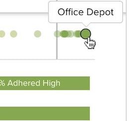
5 ‘Order Review’ UX Implementations That Make Office Depot Best-in-Class
July 15, 2019Popular
Checkout Optimization: From 16 Form Fields to 8 Fields (keynote presentation)
June 21, 2019Popular
The ‘Order Returns’ Experience is Critical for Customer Retention — Yet 54% of Sites Have a Returns Interface with Substantial UX Issues
June 3, 2019Popular
UX Research on Product Page Videos: Where and How to Embed Them (35% Get it Wrong)
May 14, 2019
9 UX Requirements for a User-Friendly Homepage Carousel Design (If You Need One)
April 30, 2019Popular
Product Page UX: Data Should Be Synchronized Across Product Variations (28% Don’t)
April 18, 2019
Self-Service UX: Integrate All Order Tracking Info and Events Within the E-Commerce Site Itself (56% Don’t)
April 2, 2019Popular
Self-Service UX: Distinguish Primary from Secondary Paths in the ‘My Account’ Drop-Down (71% Don’t)
March 20, 2019Popular
E-Commerce Search Needs to Support Users’ Non-Product Search Queries (15% Don’t)
March 5, 2019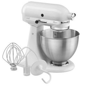
PDP UX: Provide an ‘Included Accessories’ Image and Clarify That Optional Accessories Are Extra (44% Don’t)
February 19, 2019
Search UX: 6 Essential Elements for ‘No Results’ Pages
February 4, 2019
Have Direct Links to ‘Return Policy’ and ‘Shipping Info’ in the Footer (20% don’t)
January 16, 2019
2018

Baymard: 2018 and 2019
December 19, 2018
Product Page UX: Include Descriptive Text or Graphics for Some Product Images (52% Don’t)
November 28, 2018
Drop-Down Usability: When You Should (and Shouldn’t) Use Them
November 13, 2018Popular
PDP UX: Core Product Content Is Overlooked in ‘Horizontal Tabs’ Layouts (Yet 28% of Sites Have This Layout)
October 17, 2018Popular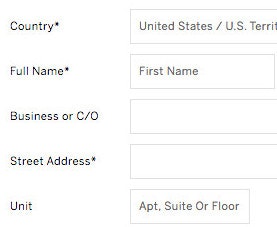
E-Commerce Checkouts Need to Mark Both Required Fields and Optional Fields Explicitly (Only 14% Do So)
October 2, 2018Popular
Self-Service UX: Promote In-Store Returns Alongside Mailed Return Options
August 21, 2018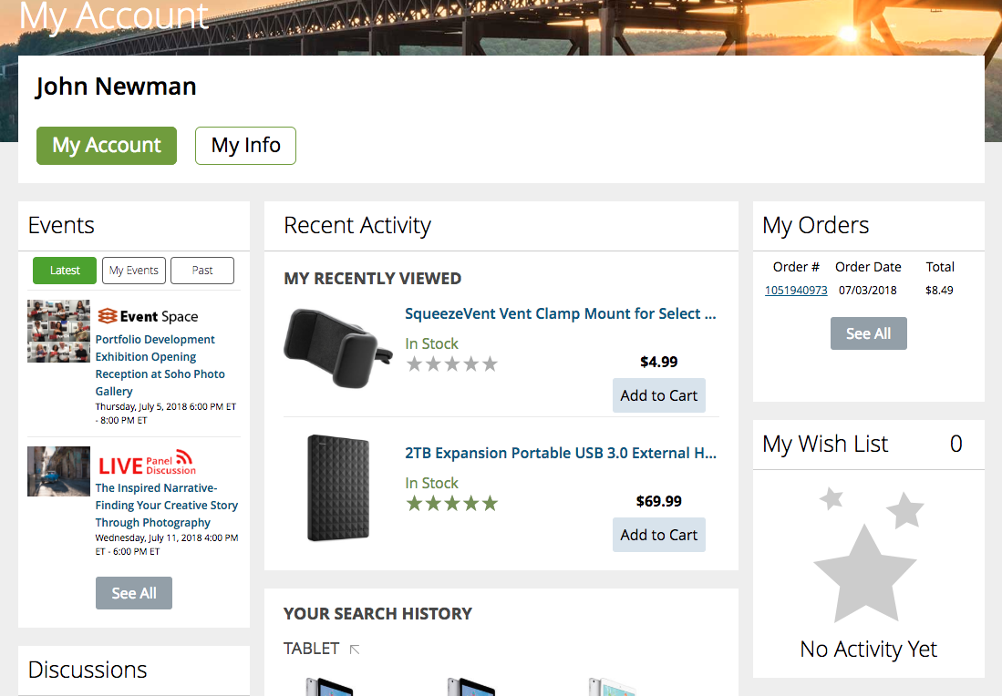
Dashboard Design: Dashboard Cards Must Be Highly Consistent and Appropriately Styled
August 8, 2018Popular
New Research Findings on ‘Accounts & Self-Service’ UX
July 9, 2018
Order Cancellation Request: Have a ‘Cancellation Requested’ Order State
June 18, 2018
A Completely New Baymard is Ready for You and Your Team
June 12, 2018
Mobile Web: Scale Product Images Proportionally in Mobile Landscape Mode (52% of Sites Don’t)
May 22, 2018
Structuring Product Page Descriptions by ‘Highlights’ Increases User Engagement (Yet 78% of Sites Don’t)
April 24, 2018Popular
Product Spec Sheets: 4 Ways to Make Spec Sheets More Scannable for Users (50% of Sites Get It Wrong)
March 27, 2018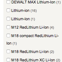
E-Commerce UX: Post-Process Vendor-Supplied Product Data (52% Don’t)
March 6, 2018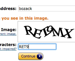
CAPTCHAs Have an 8% Failure Rate, and 29% if Case Sensitive
January 18, 2018
2017
Baymard: 2017 and 2018
December 18, 2017
Remove Select Features When There’s Only One Option Left (14% Don’t)
December 12, 2017
Consider Using Localized Input Masks for ‘Phone’ and Other Restricted Inputs (64% Aren’t Taking Advantage of Input Masking)
November 28, 2017Popular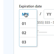
5 Common Usability Pitfalls of Custom Designed Drop-Downs (31% Have Drop-Down UI Issues)
November 14, 2017Popular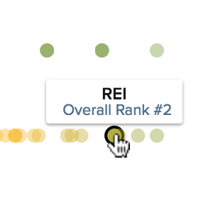
7 Product Page UX Implementations that Make REI Best-in-Class
October 18, 2017Popular
In-Person Training
September 5, 2017
Product Pages: ‘Free Shipping’ Should Not Only Be in a Site-Wide Banner (32% Get It Wrong)
August 22, 2017
Ratings Design UX Research: 5 Requirements for the ‘Ratings Distribution Summary’ (65% of Sites Get it Wrong)
August 8, 2017Popular
Allow Users to Purchase Temporarily ‘Out of Stock’ Products by Increasing the Delivery Time (68% Don’t)
July 18, 2017Popular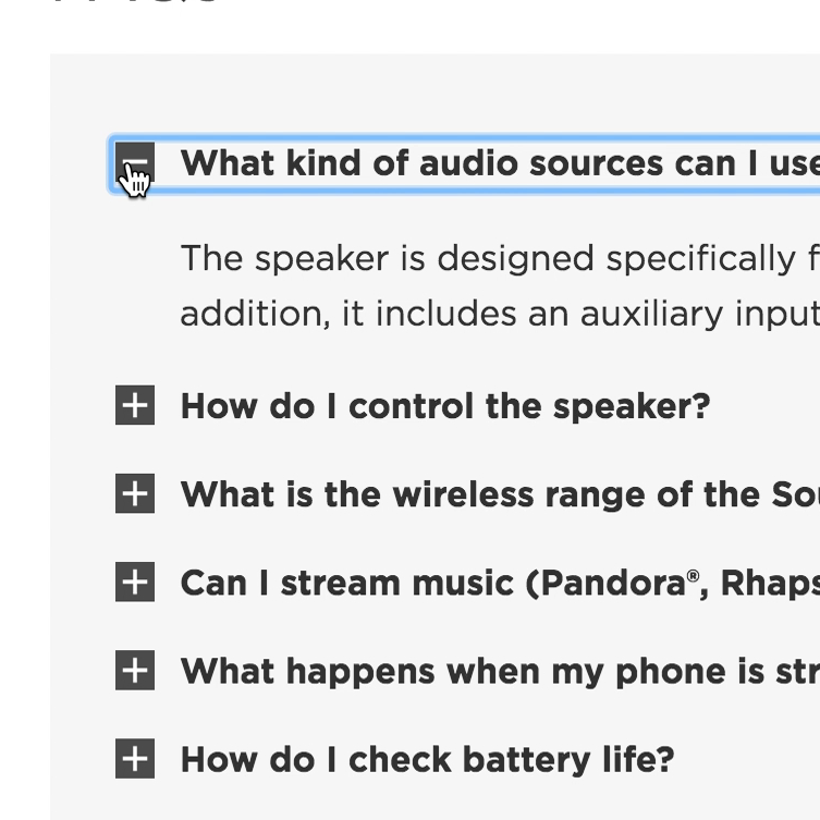
Product Page UX: Provide Both Site-Authored FAQs and Community-Driven Q&As (70% Get it Wrong)
July 4, 2017
Product Pages Need to Show ‘Estimated Shipping Costs’ (Yet 43% of Sites Don’t)
June 20, 2017
Truncating Additional Images in the Gallery Causes 50-80% of Users to Overlook Them (30% Get it Wrong)
June 6, 2017Popular
Product Page UX: All Products Need at Least One ‘In Scale’ Image (28% Get It Wrong)
May 30, 2017Popular
Product Page Usability: 82% of Sites Have Severe UX Issues (New Research Study)
May 23, 2017
3 Strategies for Handling Accidental ‘Taps’ on Touch Devices
March 28, 2017Popular
7 Navigational Implementations that Make Kohl’s Best-in-Class
February 28, 2017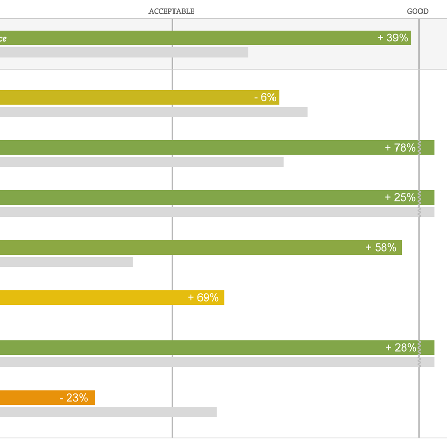
The Current State of Homepage & Category UX (Performance Is Up 39% Since 2013)
February 7, 2017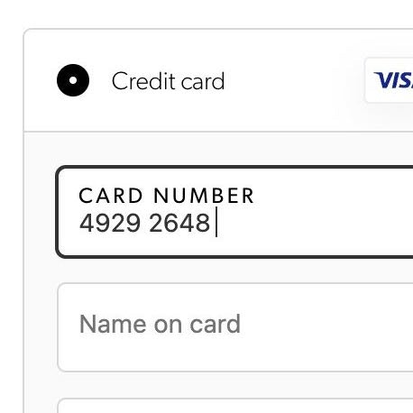
The ‘Credit Card Number’ Field Must Allow and Auto-Format Spaces (80% Don’t)
January 11, 2017Popular
2016
Baymard: 2016 and 2017
December 27, 2016
How Users Perceive Security During the Checkout Flow (Incl. New ‘Trust Seal’ Study 2023)
October 5, 2016Popular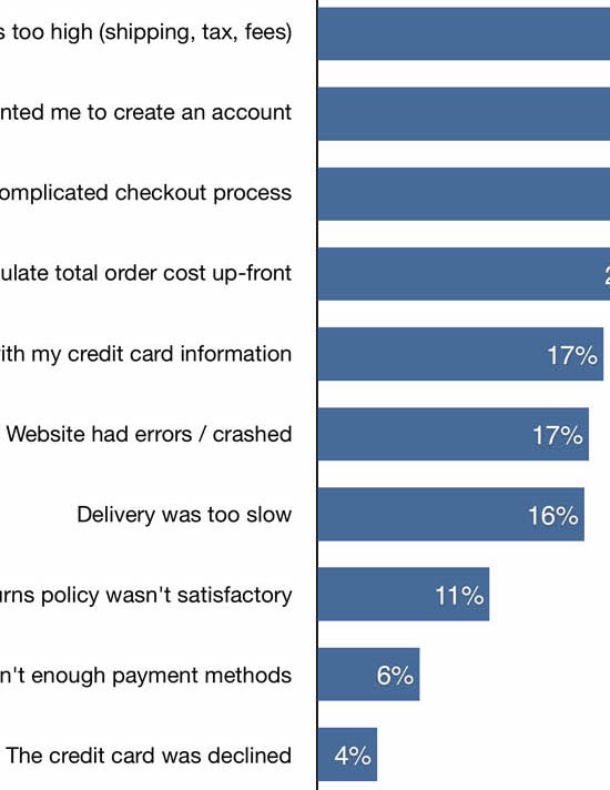
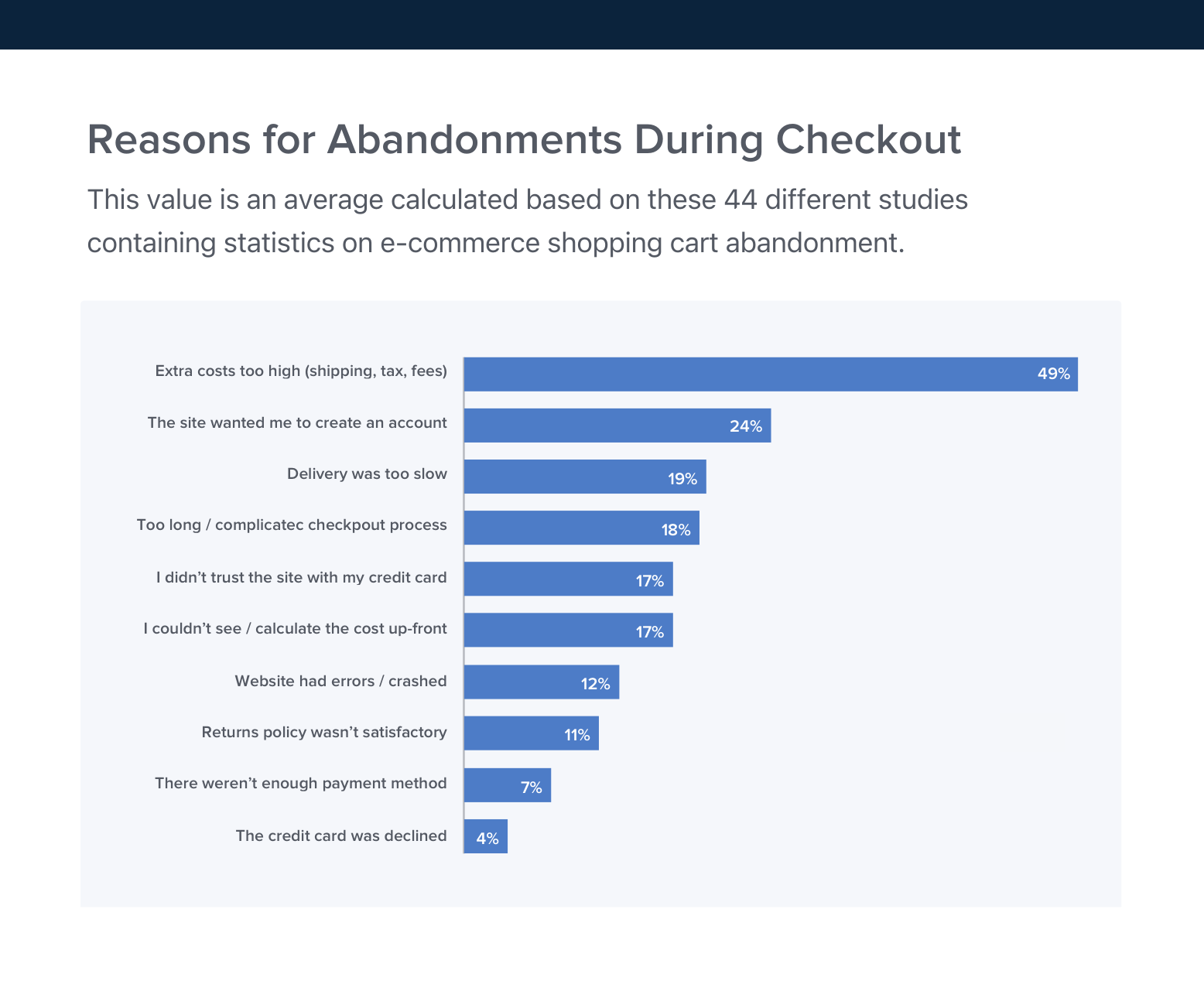
Reasons for Cart Abandonment – Why 68% of Users Abandon Their Cart (2023 data)
September 21, 2016Popular
Hover UX: Use Synchronized Hover Effects & Unified Hit-Areas (76% Don’t)
August 16, 2016
External Article: 10 Requirements for Making Homepage Carousels Work for End-Users
July 6, 2016
How Layout Bugs Keep Haunting E-Commerce Sites – It’s Time to Fix This
June 28, 2016
Product Thumbnails Should Dynamically Update to Match the Variation Searched For (54% Don’t)
May 24, 2016
Product List and Category Navigation: Highlight Items Already in the User’s Cart (96% Don’t)
April 19, 2016
UX Research: 7 Reasons B&H Photo’s Mobile Site is Best-in-Class
March 8, 2016
External Article: Testing Pagination Against Infinite Scrolling and ‘Load More’ Buttons
March 1, 2016
42% of Mobile Homepages Risk Setting Wrong Expectations for Their Users
February 17, 2016Popular
Mobile Usability: Allow Users to ‘Search Within’ Their Current Category (94% Don’t)
February 2, 2016
Mobile Gestures: 40% of Sites Don’t Support Pinch or Tap Gestures for Product Images
January 12, 2016
2015
Baymard: 2015 and 2016
December 29, 2015
‘Touch Keyboard’ Implementations Have Improved Just 9% Since 2013 (60% Still Get it Wrong)
December 15, 2015Popular
The State of Mobile Checkout & Form Usability
December 2, 2015
The State of Mobile E-Commerce Search and Category Navigation
November 17, 2015
Mobile E-Commerce Usability Benchmark
November 3, 2015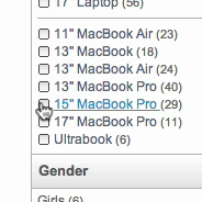
6 Use Cases for Compatibility Databases on E-Commerce Sites
October 6, 2015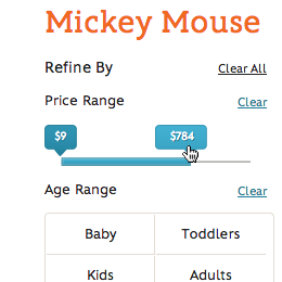
Improve Form Slider UX With These 5 Requirements for Slider Interfaces
September 15, 2015
Responsive Upscaling: 11 Ideas for Large-Screen E-Commerce Design
August 18, 2015Popular
7 Filtering Implementations That Make Macy’s Best-in-Class
July 1, 2015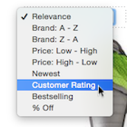
Don’t Base ‘Customer Ratings’ Sorting on Averages Only
June 16, 2015
Contextual List Item Information – A New E-Commerce Personalization Technique
May 19, 2015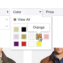
Filter UI Design: A Horizontal Toolbar Can Outperform the Traditional Sidebar
May 5, 2015Popular
External Article: The Current State of E-Commerce Filtering
April 20, 2015
Category-Specific Sorting: A New Way to Sort Products
April 14, 2015
E-Commerce Product List Usability: Report & Benchmark
March 3, 2015
When to Override Native UI Components
January 27, 2015
2014
Baymard: 2014 and 2015
December 22, 2014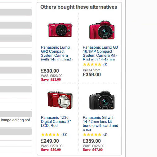
Product Page Usability: Recommend Both Alternative & Supplementary Products (Only 42% Get it Right)
November 25, 2014
Accordion UX: The Pitfalls of Inline Accordion and Tab Designs
October 21, 2014
Fixing Bugs – the Next ‘Big Thing’ in E-Commerce?
October 7, 2014
Form Usability: Validations vs Warnings
September 23, 2014
Faceted Sorting - A New Method for Sorting Search Results
September 2, 2014
External Article: The Current State of E-Commerce Search
August 18, 2014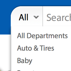
E-Commerce Sites Need Multiple of These 5 ‘Search Scope’ Features
August 13, 2014
E-Commerce Search Field Design and Its Implications
July 30, 2014
E-Commerce Sites Should Include Contextual Search Snippets (96% Get it Wrong)
July 15, 2014
E-Commerce Search Usability: Report & Benchmark
June 3, 2014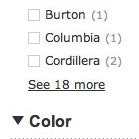
6 Guidelines for Truncation Design
May 21, 2014Popular
Avoid Inline Scroll Areas (26% Get it Wrong)
May 6, 2014Popular
Avoid These 5 Types of E-Commerce Graphics
March 4, 2014Popular
Sub-Sub-Category Links: a Vital Feature in E-Commerce Navigation (52% Get it Wrong)
February 18, 2014
Homepage Usability: Can Users Infer the Breadth of Your Product Catalog?
February 4, 2014
Featured Products Should Also Link to Their Categories (43% Get it Wrong)
January 21, 2014
Inspirational Images Should Link to All Depicted Products
January 7, 2014
2013
Baymard: 2013 and 2014
December 27, 2013
E-Commerce Sites Need 2 Types of Breadcrumbs (68% Get it Wrong)
December 10, 2013Popular
External Article: 7 Guidelines For Better Navigation And Categories
November 11, 2013
E-Commerce Navigation: Show Sibling Categories for Easy Scope Adjustment (47% Get it Wrong)
October 29, 2013
Homepage & Category Usability: Exploring the Customer’s Product Finding Experience
October 15, 2013
6 Mobile Checkout Usability Considerations
October 1, 2013Popular
ROCI: Return On Click Investment
September 10, 2013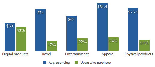
Mobile Commerce Spending Patterns (2013 Survey Results)
August 27, 2013
How to Recoup 30% of “Card Declined” Abandonments
August 13, 2013
Users Continue to Double-Click Online
July 25, 2013Popular
The “Just Copy Amazon” Fallacy
July 2, 2013
Mobile Form Usability: Never Use Inline Labels
June 4, 2013Popular
Mobile Product Lists Need Very Distinct Hit Areas
May 21, 2013
How Should Your Mobile and Desktop Sites Differ?
May 7, 2013
Drop-Down Mobile UX: Never Use Native Drop-Downs for Navigation
April 23, 2013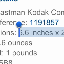
Mobile Product Pages: Always Offer a List of Compatible Products
April 2, 2013
Field Label UX: Place Labels Above the Field
March 19, 2013Popular
M-Commerce Usability: Exploring the Mobile Shopping Experience
March 12, 2013
Mobile Form Usability: Avoid Splitting Single Input Entities
February 12, 2013
Which Site Seal do People Trust the Most? (2013/2016 Survey Results)
January 22, 2013
Social Media: Analyze Affordances, Not Features
January 8, 2013
2012

Baymard: 2012 and 2013
December 26, 2012
A Holistic View on the Current State of Checkout Usability
November 20, 2012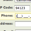
Add Descriptions To Checkout Form Labels (92% Get It Wrong)
November 6, 2012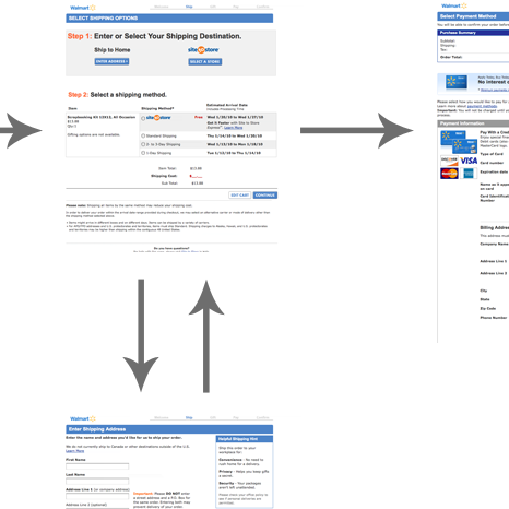
Why Your Checkout Process Should Be Completely Linear
October 3, 2012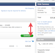
Accordion Style Checkouts – The Holy Grail of Checkout Usability?
September 18, 2012Popular
Checkout Usability Benchmark
September 5, 2012
Visually Reinforce Your Credit Card Fields (89% Get it Wrong)
August 21, 2012Popular
Checkout Experience: Don’t Require Seemingly Unnecessary Information (61% Get it Wrong)
July 31, 2012
Checkout Usability: Don’t Use “Apply” Buttons (72% Get it Wrong)
July 11, 2012
3 Types of False Simplicity
June 6, 2012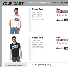
A Consistent Shopping Experience With Product Thumbnails
May 22, 2012
Designing With Metaphors & Skeuomorphs
May 8, 2012
UI: Proper Indicators for Hidden Elements
April 25, 2012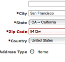
Idea: Error-Fields Only
April 10, 2012
8 Limitations When Designing For Mobile
March 21, 2012Popular
UX: 7 Types of Product Images
March 6, 2012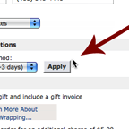
Checkout Usability: Apply Changes Immediately and Near the Input
February 22, 2012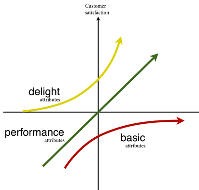
UX and the Kano model
February 7, 2012Popular
UI: Getting the Details Right
January 24, 2012
Copywriting: How to Write Useful (Yet Intriguing) Headlines
January 10, 2012
2011

Baymard: 2011 and 2012
December 27, 2011
UI: Adding Subtle Textures for Depth
December 6, 2011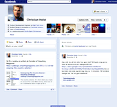
UI: Thoughts on the New Facebook Timeline Design
November 16, 2011
16 Ways to Make Your Website Seem More Trustworthy
November 1, 2011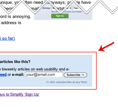
User Expectations Trump “Persuasive Design”
October 11, 2011
Jobs’ Impact on the Design & UX Industry
October 9, 2011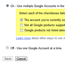
Google’s (for now) Novel Approach to “Must Read” Instructions
September 20, 2011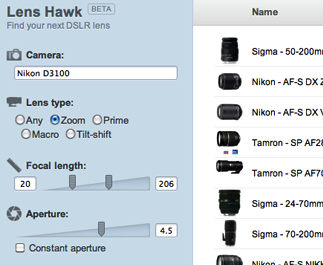
Case: 7 UX Considerations When Designing Lens Hawk
September 6, 2011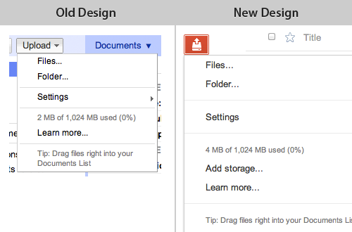
Design Trend: Interfaces with Less Information
August 16, 2011
E-Commerce Without the Website
August 2, 2011
Observation: Users Will Go Far to Avoid Repeat Form Errors
July 12, 2011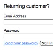
E-Commerce Copywriting: Returning Customer?
June 28, 2011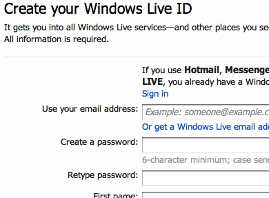
Account ‘Sign Up’: Ask to Confirm E-mail, Not Password
June 16, 2011
Poor Copywriting – the UX Problem That Will Never Go Away?
June 7, 2011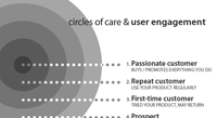
Circles of Care: Segmenting User Engagement
May 24, 2011
Responsive Web Design and Mobile Devices
May 7, 2011
One Page Checkouts – the Holy Grail of Checkout Usability?
April 26, 2011Popular
10 Ideas for Crafting a Better ‘About’ Page
April 14, 2011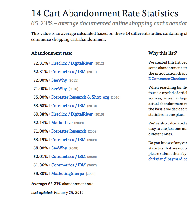
14 Cart Abandonment Statistics - Please Submit More
March 31, 2011
Home Page Strategy: Category vs. Product
March 22, 2011
UX Lessons Learned from Buying Petfood
March 15, 2011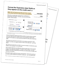
E-Commerce Checkout Usability: Exploring the Customer’s Checkout Experience
March 1, 2011
A/B Testing: Begin with a Problem and Hypothesis
February 16, 2011
9 Ways to Simplify ‘Sign In’
February 8, 2011
19 Ways to Simplify ‘Sign Up’
January 31, 2011Popular
E-Commerce: Why Customers Abandon Their Shopping Cart
January 19, 2011
User Expectations: Create an Illusion of Space
January 7, 2011
2010

Baymard: 2010 and 2011
December 28, 2010
Mobile: Venturing Into Responsive Design
December 21, 2010
E-Commerce Home Page Focus
December 14, 2010
Mobile: Thoughts on Native apps vs Web apps
December 7, 2010
Scannability: How to Highlight Text on the Web
November 30, 2010
Redefining the Customer Experience with Augmented Reality
November 22, 2010
“What’s this?” Link & Tooltip
November 9, 2010
The Serial Position Effect in Web Design
October 23, 2010
HTML5: Anchor Content, Not Anchor Text
October 13, 2010
From Sketch to Website (Hint: Skip Photoshop)
October 5, 2010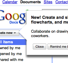
3 Examples of Inline Help
September 24, 2010
Top 11 E-commerce Usability and Optimization Resources
September 12, 2010
Form Field Usability: Matching User Expectations
August 31, 2010
Visual Balance: Dealing with Variable Headline Lengths
August 24, 2010
Formatting Links for Usability
August 17, 2010
Conversion: Reducing Sign Up Friction
July 28, 2010
4 User Interface Sketching Pitfalls
June 24, 2010
The Conversion Rate Optimization Industry in 2015
June 6, 2010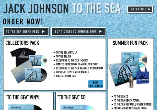
Why Jack Johnson’s Splash Screen(!) is Great
May 26, 2010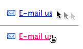
Links and the Hover State
May 17, 2010
Comparing Conversion Rates is Nonsense
May 9, 2010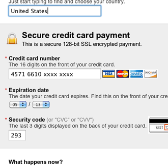
Customers Perceive Only Parts of a Checkout-page as Being Secure
April 28, 2010
Google Chrome and the Importance of Good Copywriting
April 16, 2010
Handling Technical Glitches Without Losing Sales
April 10, 2010
How Google Keep their iPhone Visitors Coming Back
March 30, 2010
People Think Registration Leads to “Spam”
March 25, 2010
Contextual Words like “Continue” are Usability Poison
March 15, 2010
Review of Rework
March 2, 2010
Silverback: Screen Recording for Usability Studies
February 24, 2010
Why People Buy Online
February 14, 2010
People Still Double-Click Online
February 4, 2010
A Preparation Checklist for Conducting Web Usability Studies
January 26, 2010
Links and the Visited State
January 12, 2010
2009

Video: CAPTCHA Done Wrong
December 13, 2009
Decoration - the Enemy of Good Web Design
December 3, 2009
Making a Slow Site Appear Fast
November 28, 2009
Video: Designing a new Website
November 21, 2009
How to Lower Your Chargeback Rate
November 13, 2009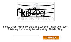
CAPTCHA Can Kill Your Conversion Rate
November 4, 2009
Designing a new Website #3: Finished Layout
October 24, 2009
Subliminally Directing Visitor Attention Towards Your Page’s Goal
October 20, 2009
Designing a new Website #2: Design Drafts
October 13, 2009
Designing a new Website #1: Priority Lists
October 10, 2009
How I Increased Newsletter Sign-Up Rate 274%
October 4, 2009
Conversion Design: the Real Purpose of Web Design
September 29, 2009
User Experience Research, Delivered Weekly
Join 37,000+ UX professionals and get a new UX article every week.
Explore Other Research Content
244 top sites ranked by UX performance.
14,000+ annotated designs for systematic inspiration.
Code samples, demos, and key stats for usability.