40 Homepage & Category UX Articles
These articles are based on observations and test findings from our usability research on homepage, category and navigation design.
The Current State of Homepage UX – 8 Common Pitfalls & Best Practices
Our latest Homepage UX benchmark reveals that even given the generally decent performance of e-commerce sites, there’s still room for improvements. Here are 8 common Homepage UX pitfalls & best practices.
Featured
The Current State of Homepage and Category Navigation UX (12 Common Pitfalls)
June 21, 2023Popular
Consider Providing “Intermediary Category Pages” (13% Don’t)
March 7, 2023
New 2023 Homepage & Category UX Benchmark with 3,000+ Performance Scores and 2,500+ Best Practice Examples
February 28, 2023
Provide a Hover Delay of 300–500 MS for Hover-Based Drop-Down Menus (60% Don’t)
January 31, 2023Popular
Make Product Categories the Top-Level Navigation Items on Mobile Sites (33% Don’t)
January 24, 2023Popular

9 UX Requirements for a User-Friendly Homepage Carousel Design (If You Need One)
Homepage carousels are now only used by 28% of e-commerce sites. Our testing shows that a carousel can perform OK with users, but most carousels don’t. We’ve also found a vastly simpler alternative that performs as well.
Featured
Overcategorization of the Product Catalog Can Lead to Abandonment (Yet 75% Get It Wrong)
January 3, 2023Popular
Consider Having a “Sales” or “Deals” Filter-Based Category (32% Don’t or Have Implementation Issues)
December 7, 2022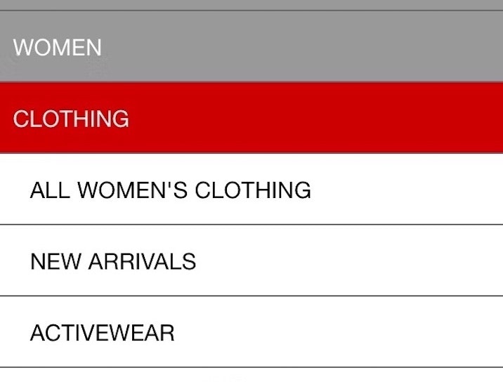
Have a “View All” Option in the Main Navigation at Each Level of the Mobile Product Catalog (Only 24% Get It Right)
November 16, 2022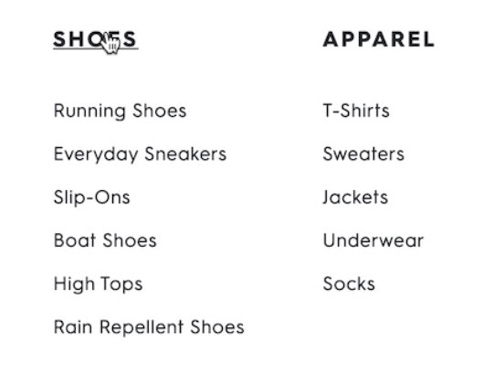
DTC UX: Avoid Intermediary Category Pages
August 23, 2022
Mobile UX Trends: The Current State of Mobile UX (15 Common Pitfalls & Best Practices)
June 7, 2022Popular
The Current State of Homepage and Category Navigation UX (12 Common Pitfalls)
Our latest Homepage and Category Navigation UX desktop benchmark reveals that the performance for the average top-grossing US and European site is “poor”. Here are 12 common UX pitfalls.
Featured
Make It Clear Where Hit Areas in Visual Elements Lead: 33% of Sites Don’t
May 30, 2022
Direct-to-Consumer UX Benchmark: 5 Common DTC Pitfalls
February 22, 2022
250+ New Examples Added from Large-Scale Testing on European Sites
November 9, 2021
Always Provide the Full Scope for Links on Mobile Homepages (58% Don’t)
August 3, 2021
The Current State of Homepage UX – 8 Common Pitfalls & Best Practices
July 13, 2021
Direct-to-Consumer Research: 5 Effective Ways for DTC Sites to Tell Their ‘Brand’ & ‘Product’ Stories
June 22, 2021
New Research Study on “Digital Subscriptions” (SaaS) UX
May 11, 2021
6 Important Aspects of Well-Performing Mobile Product Page Breadcrumbs
September 21, 2020Popular
Inspirational Images Should Link to All Depicted Products (9% of Sites Don’t)
September 8, 2020
4 Design Patterns That Violate “Back” Button UX Expectations – 59% of Sites Get It Wrong
July 20, 2020Popular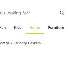
Highlight the User’s Current Scope in the Main Navigation (66% of Sites Don’t)
May 19, 2020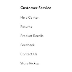
Footer Links Should be Divided into Distinct Semantic Sections (13% of Sites Don’t Use These Footer Best Practices)
October 30, 2019
9 UX Requirements for a User-Friendly Homepage Carousel Design (If You Need One)
April 30, 2019Popular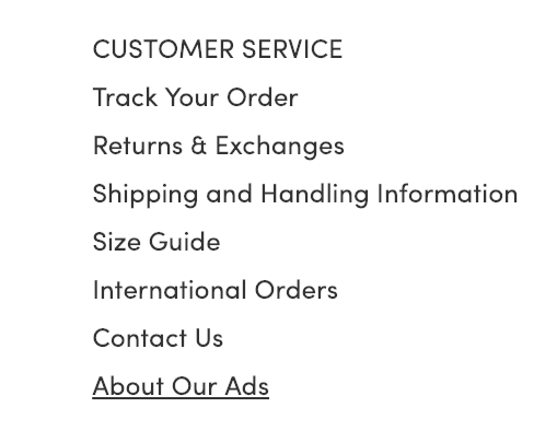
Have Direct Links to ‘Return Policy’ and ‘Shipping Info’ in the Footer (20% don’t)
January 16, 2019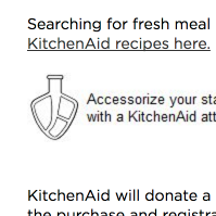
7 Navigational Implementations that Make Kohl’s Best-in-Class
February 28, 2017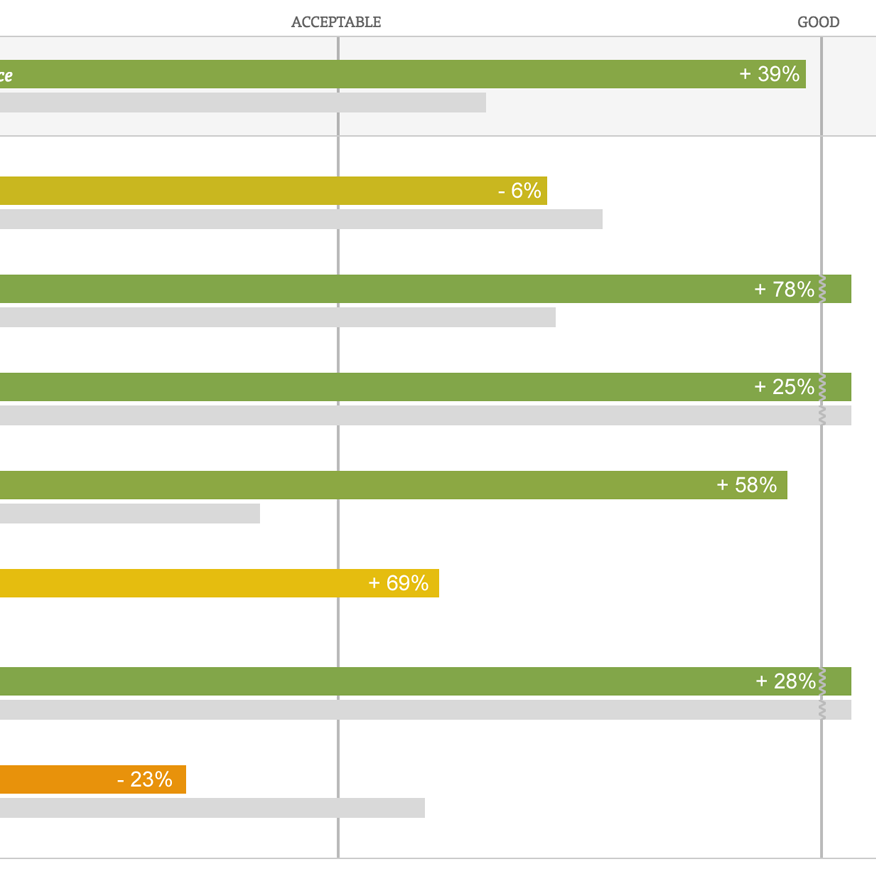
The Current State of Homepage & Category UX (Performance Is Up 39% Since 2013)
February 7, 2017
Responsive Upscaling: 11 Ideas for Large-Screen E-Commerce Design
August 18, 2015Popular
6 Guidelines for Truncation Design
May 21, 2014Popular
Avoid Inline Scroll Areas (26% Get it Wrong)
May 6, 2014Popular
Avoid These 5 Types of E-Commerce Graphics
March 4, 2014Popular
Sub-Sub-Category Links: a Vital Feature in E-Commerce Navigation (52% Get it Wrong)
February 18, 2014
Homepage Usability: Can Users Infer the Breadth of Your Product Catalog?
February 4, 2014
Featured Products Should Also Link to Their Categories (43% Get it Wrong)
January 21, 2014
Inspirational Images Should Link to All Depicted Products
January 7, 2014
E-Commerce Sites Need 2 Types of Breadcrumbs (68% Get it Wrong)
December 10, 2013Popular
External Article: 7 Guidelines For Better Navigation And Categories
November 11, 2013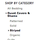
E-Commerce Navigation: Show Sibling Categories for Easy Scope Adjustment (47% Get it Wrong)
October 29, 2013
Homepage & Category Usability: Exploring the Customer’s Product Finding Experience
October 15, 2013
Home Page Strategy: Category vs. Product
March 22, 2011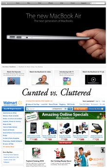
E-Commerce Home Page Focus
December 14, 2010
Want to learn more about this topic?

Explore Other Research Content

244 top sites ranked by UX performance.

14,000+ annotated designs for systematic inspiration.

Code samples, demos, and key stats for usability.