
User interface details matter to the overall user experience.
Many users may not consciously notice these details on your site yet they do have an impact on the overall user experience. When everything feels just right the perception of your site and brand is improved.
In this article we’ll look at 5 different types of UI details you should pay attention to.
(Check out UI vs UX for definitions of these key terms.)
Spatial Indicators
An easy way to establish virtual space is by using spatial indicators throughout your design. These are essentially any type of indicator that suggests space.

This jQuery plugin makes heavy use of spatial indicators, with a set of dots at the bottom to indicate the number of slides and arrows for next / previous actions.
A good UX example of spatial indicators is the set of small dots you often see at the bottom of a slideshow, with one dot activated for the current slide. These dots indicate how much content there is and where you’re currently at in the sequence (which indirectly suggests how much is ahead and before).

Apple makes good use of arrows in their breadcrumbs to indicate hierarchy.
Another example of spatial indicators is a well-designed set of breadcrumbs that use arrows to imply hierarchy.
Spatial indicators are often subtle and may be rejected as mere decoration, but simple things like using an arrow instead of a middot can be important because an arrow denotes a path or direction, whereas a middot merely denotes separation.
Animations
Animations can be much more than flashing banner ads and fun cartoons. Subtle animations can be used to give the user a sense of direction and space.

Fi use a subtle animation to encourage clicks when you hover their case study call-to-action.

The Facebook iOS app slides the menu in from the left.
Animations can often be used successfully when going from one state to another. For example when you hover some anchor content the text and image change, inspiring the user to click.
Or instead of toggling your menu’s visibility on / off, a sliding animation can provide a sense of direction. This type of animation helps establish a virtual space, letting the user know where he is going and how to get back.
Hitarea
Clicking links make up nearly all navigation. Even when searching we tend to click a (search result) link to get to the page. Clearly the area that affords this interactivity is hugely important, yet it’s often overlooked because browsers provide default behavior for it.

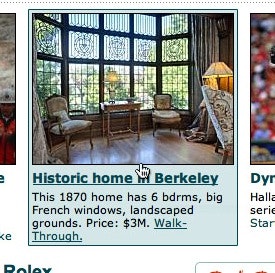
A mock-up of what anchor content could look like at SFGate. Story image, headline, and text snippet, are combined into a single link with a single hover effect and hitarea, becayse they all lead to the same content.
Generally you should consider if your hit areas are big enough. For example, if you designed a big button be sure that all of it can be clicked. And vice versa, making your hit area too big without any visual indications may result in accidental clicks.
In short: the size of your hitarea should align with the design in order to meets user expectations.
Icons
In the new Gmail design icons are used for all the primary buttons. When you hover the icons a tooltip appears explaining the action.
Icons have two special properties, they are:
- Recognizable – this is good, because the user can quickly find a specific icon in an interface due to its high fidelity and uniqueness, making it much easier to discern one option from another (as opposed to pure text options).
- Open to interpretation – this is bad, because some users will misinterpret your icons. For example, a printer icon might also look like a shredder. If you are making your own icons, or just icon styling, the likelihood for misinterpretations increase as people are not familiar with those icons.
Icons should preferably be used as a supplement to text labels unless the user base will be using the same application every single day and are willing to learn what each icon represents.
Copywriting
When a user interacts with your site one of the most important navigational clues is your copy.
This can be the naming of navigational elements, which not only allow a visitor to navigate your site, but also help new visitors understand what content they may find on your site.
Careful naming of buttons and error messages is critical too since people may misinterpret them if you use contextual or ambiguous words.

During our usability test session 3 out of 10 test subjects misinterpreted contextual words such as “Continue”. In this checkout process some subjects simply read “Continue…” and clicked the button expecting to continue their checkout.
Your headlines should carry information-scent allowing the user to accurately assess what content she will find, yet at the same time the headline must sound interesting to encourage clicks. This is further complicated when your headlines are featured outside the context of your site, e.g. shared on Twitter, which we talked about in our previous article.
Final Words
These kinds of details can help lift a user experience from good to great. However, if you don’t get the basics right these kinds of details are worthless. A solid foundation must be in place for the details to matter.