
18 UX Design Examples: Inspiration for Improving User Experience

Ready to get inspired by outstanding UX design examples?
Once you learn the value of UX, you understand that user experience can be the biggest differentiator between competing products on the market — but what does good UX design actually look like?
UX design is all about researching the needs of the people who will be using your website and then placing those needs at the center of the user experience design process.
Examining concrete UX design examples can help you grasp the specific principles of intuitive, delightful UX design, so you can create a website that engages users and helps them solve problems.
Access 18,000+ Annotated UX Design Examples
Get inspiration for your next UX project with real-world UX design examples, all assessed and annotated using 200,000+ hours of testing insights.
We’ve compiled a list of design examples — selected from Baymard's e-commerce UX case studies — that you can use as inspiration for improving the user experience on your site.
Please consider:
None of the e-commerce sites listed below achieved high performance across all 700+ UX elements in our testing. However, each one offers a few specific areas or functions which serve as examples of good UX design.
What Makes Good UX Design?
Before we dig into the examples of good design, let’s take a look at what we mean by “positive UX design.”
While good UX design is subjective, your goal is to create a positive user experience by using a human-centered approach. Your user’s experience needs to be consistent, error-free, and flexible.
For each user persona, there should be a clear pathway on your website or app, so visitors understand the next step and find it easy to make the next move.
Good UX design ensures visitors have seamless, intuitive, delightful experiences and find value from your website or app.
For e-commerce, good UX means users can easily find the right products and complete purchases. Bad UX, such as issues during the checkout experience, leads to frustrated users and abandoned purchases.
Let’s look at some examples within the e-commerce sites we’ve manually reviewed and ranked for UX performance.
Product Page Design Examples
Product pages are where users make decisions about whether or not they’re buying a product, so it’s critical that the UX is right on these pages.
Furthermore, your product page is typically a template you reuse for every product on your site — so if you have a glaring UX issue on the template, it could lead to a high number of abandonments throughout your site.
Here are some examples of elements within product pages that contribute to a positive user experience.
1. Louis Vuitton: High-Quality Images
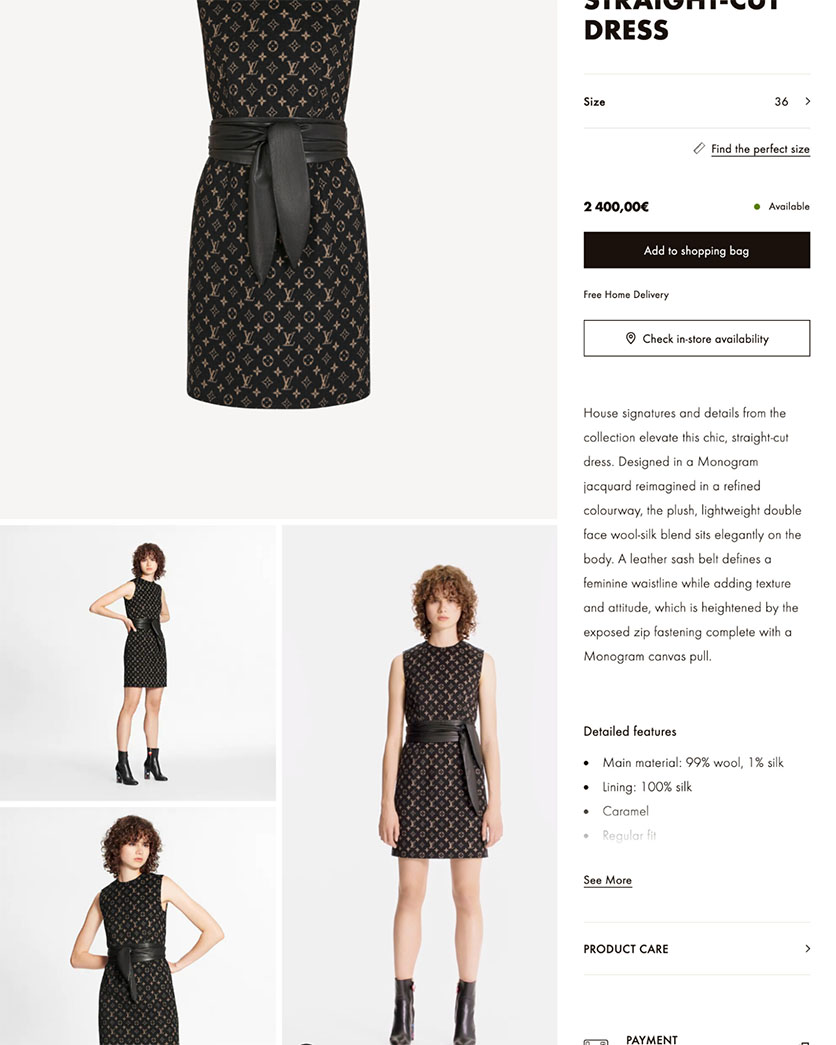
Louis Vuitton’s product pages use multiple high-quality images with a human model in a thumbnail gallery.
Louis Vuitton’s product page includes multiple high-quality images, so users can zoom in and visually explore products. Additional images are visible as thumbnails placed below the main image, immediately apparent to users when they arrive on the page.
Products are shown in scale by using a human model, providing users with confidence about the product’s length and fit.
2. Target: Highlights Key Features
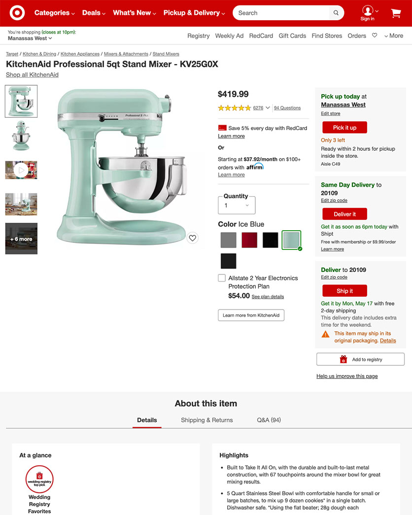
Target's product page highlights key features in the headline and displays “Included Accessories” and product video within the image gallery.
The headline on Target’s product page highlights the key features of this KitchenAid product. The most important feature (“5-quart”) directly follows the product title in the headline.
There is also a clickable image of “Included Accessories” on this page. When accessories are a large contributor to the product’s benefits or costly to purchase separately, knowing what’s included can be a deciding purchasing factor.
While users virtually always explore the image gallery, our testing shows they often miss product videos when they are placed separately. Target’s product page includes a video within the main image gallery with a “Play” icon to let users know it’s available.
3. Crutchfield: Prominent Ratings and Shipping Information
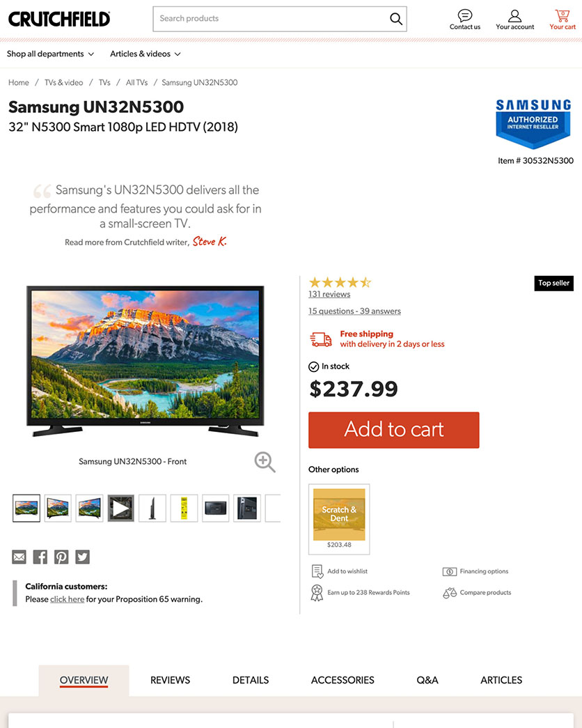
A product page on Crutchfield uses 50% of the screen for the image gallery and prominently displays both ratings and “Free shipping” information.
The Crutchfield product page includes a main image carousel that utilizes more than 50% of the page width. Although it truncates some thumbnail images in the gallery, which may lead some users to overlook them, the carousel has clear controls.
User reviews are featured prominently near the top of the page with a clickable rating average, so users can find the rating design features they rely on to make buying decisions.
“Free shipping” information is clearly visible near the top of the page, in the “Buy” section, instead of a site-wide banner which many users will ignore.
→ Sign up free to free research-backed UX guidelines and start improving your site today.
Homepage UX Design Examples
Although many users land on other pages first (like intermediary category pages or individual product pages), the homepage is still a vital part of your e-commerce site.
It’s the first step for some users to begin their browsing experience, and it also acts as a navigational anchor as people explore your site.
Explore these design examples of brands that get some key UX elements right on the homepage.
4. TAG Heuer: Product Categories in Navigation
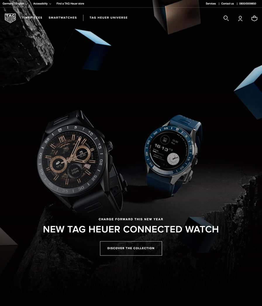
The TAG Heuer homepage uses product categories in main navigation and interlinks with other content sections.
Product categories displayed in the main navigation allow users to immediately see what type of site they’ve landed on and the types of products offered. On TAG Heuer, product categories are on the first level in the homepage’s main navigation.
Users can immediately begin browsing product categories, which is especially important for mobile users.
The TAG Heuer homepage interlinks different content sections so users can easily cross-navigate product guides and the product catalog.
5. Gucci: Bespoke Images
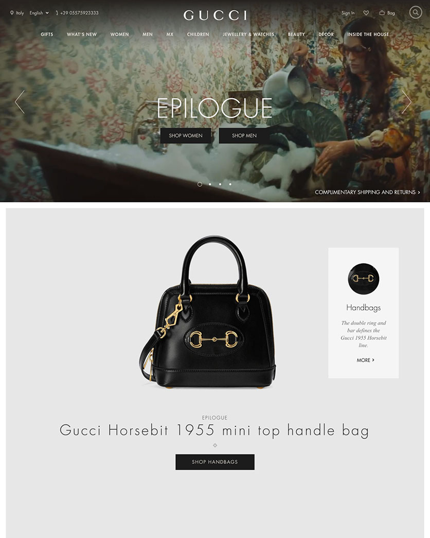
Gucci has bespoke images with clear text overlays on the homepage. It provides a clear visual separation between product navigation and courtesy navigation.
While bespoke images are important for luxury e-commerce sites, text overlays can be difficult to read. The text that overlays the images on the Gucci homepage is legible and easy to read, so users can decide what path to take to continue browsing.
Our testing found that courtesy navigation, which typically includes things like "Create Account," "Help," and “Store Locator,” can distract users from their primary goal of finding suitable products. Gucci’s site-wide courtesy navigation is visually separate, making it easy to locate without adding unnecessary clutter to its product navigation.
6. Dick’s Sporting Goods: Visible Search Field
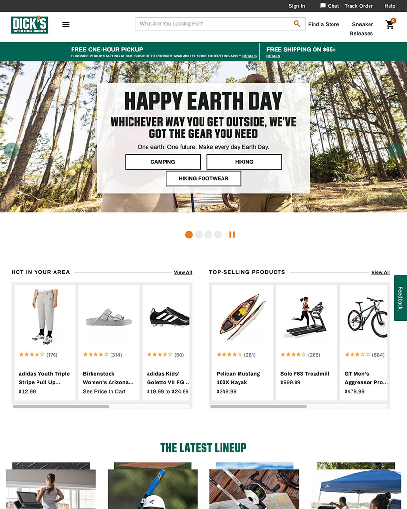
Dick’s Sporting Goods includes a clearly visible search field, unobtrusive live chat option, and no distracting ad-like content on the homepage.
The live chat function on Dick’s Sporting Goods is available via a static link and is initiated by the user to avoid live chat usability issues. Site-initiated live chat dialogs are disruptive and require active dismissal before users can continue exploring products.
The search field design across the top of the homepage is immediately recognizable without being visually overpowering.
This homepage doesn’t include any ads (or content that looks like ads) in prime content locations, and Dick’s avoids pop-up banners or dialog overlays.
Product List UX Design Examples
E-commerce product lists and their filtering and sorting tools have a huge impact on a user’s ability to browse a website’s catalog. In our Product Lists & Filtering usability research, sites with mediocre product list usability saw abandonment rates of 67-90%.
The good news is that small changes can make a difference when it comes to product lists. Sites with a slightly optimized filtering and sorting toolset saw only 17-33% abandonments for users trying to find the exact same types of product. This translates into as much as a 4-fold increase in leads.
Check out these examples to find out how brands are maximizing conversions by providing a positive Product List UX.
7. Chewy: Thematic Filtering
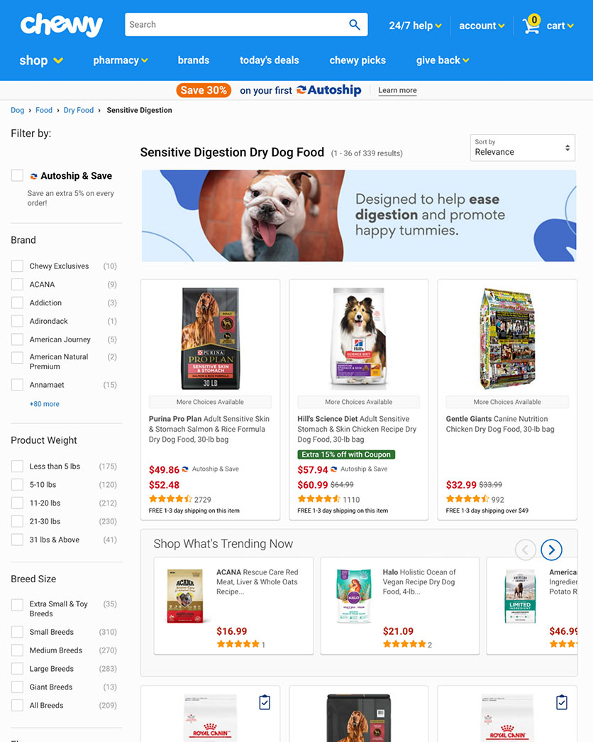
Chewy provides robust thematic filtering and live-updating of the product list as users apply filters.
Chewy’s filtering includes plenty of thematic options to help users find specific products, like breed size, special diet, and health features. As the user applies filters, Chewy live-updates the product list appropriately.
The site also includes hierarchy-based breadcrumbs in its category product lists to make it easier for users to see where they are on the site. If they’ve clicked on a scope that is too narrow, the breadcrumbs provide an easy path back to a broader product category.
8. John Lewis: Visible Applied Filters
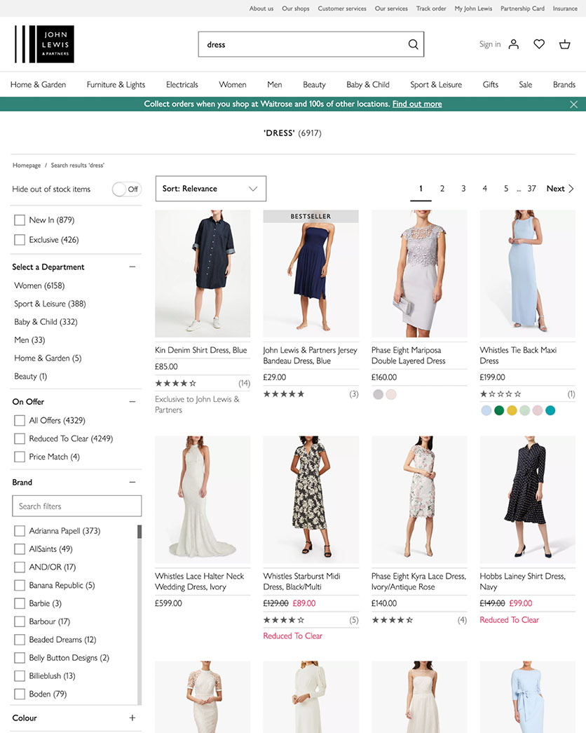
Users can see applied filters and easily adjust selections on John Lewis.
John Lewis displays the applied filters in the sidebar of the search results, and those filters are displayed in their original position. When applied filters are displayed, users can quickly deselect filters as necessary and narrow down the product list to the right selections.
As a department store, John Lewis also carries symptom-dependent products and users have the ability to filter by symptom. This is beneficial for users who are focused on their issue, like “headache” or “dry skin,” and don’t know the name or type of the product to address it.
9. FreshDirect: Highlights Products in Cart
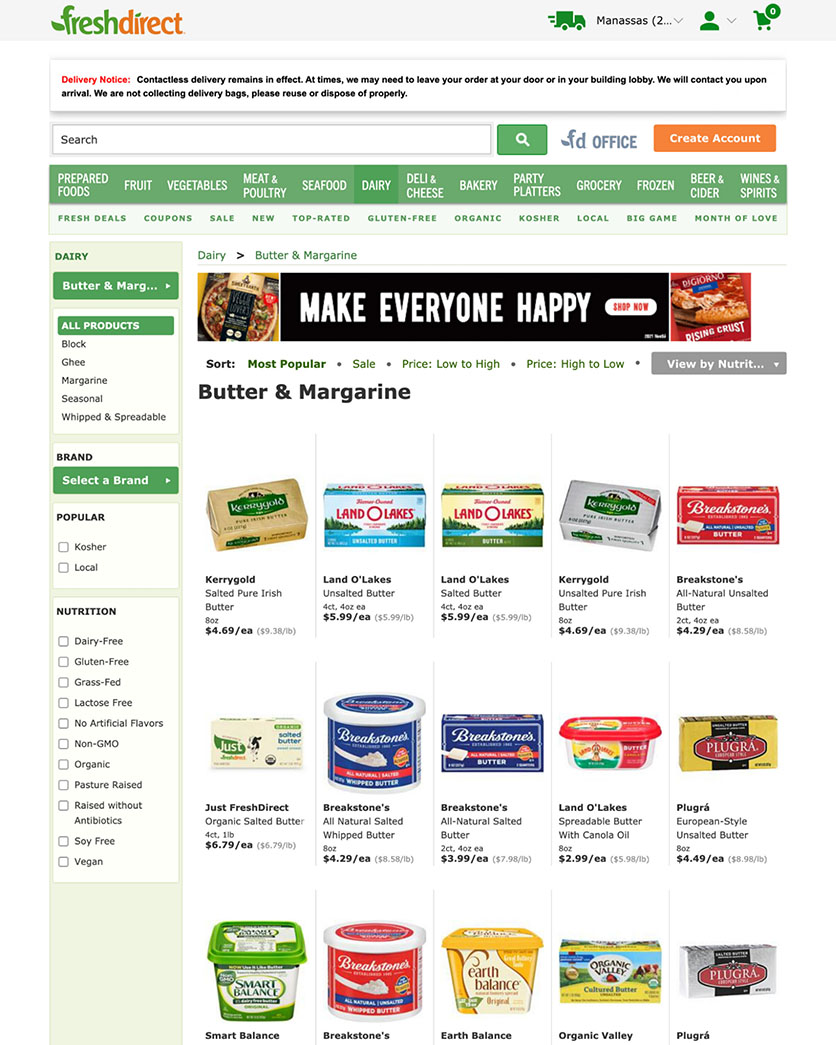
FreshDirect highlights products in the cart in the sorting tool and avoids alphabetical sorting.
When users already have a product in their cart on FreshDirect, that product is highlighted in the product list.
The site also avoids alphabetical sorting by title, name, or description. Alphabetical sorting requires the user to predict the site’s or product manufacturer’s naming schema, and the risk of abandonment in this type of sorting is very high.
Shopping Cart UX Design Examples
If your shopping cart isn’t carefully crafted, it could lead to a high cart abandonment rate.
For example, our quantitative study reveals that 23% of American online shoppers have abandoned orders in the past quarter because they weren’t given an upfront estimate of the total order cost.
These Shopping Cart page design examples can provide guidance on which elements can improve the Shopping Cart UX.
10. Home Depot: Easy to Locate Shopping Cart Link
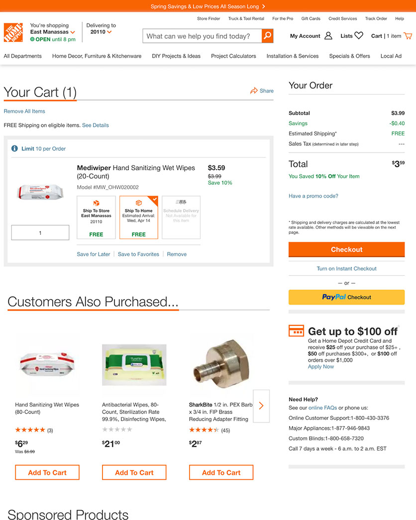
Home Depot’s shopping cart link is easy to locate in the site-wide header. Shipping options in the “Cart” step list the cost, speed, and delivery date, and include “Store Pickup.”
The cart link is visually emphasized in the site-wide header on Home Depot so it’s easy for users to find. The cart icon contrasts with the background color and includes plenty of white space around it.
Home Depot displays detailed shipping options at the “Cart” step to improve the checkout UX, listing cost estimation with speed and delivery date.
“Store Pickup” is included as an alternative shipping option, where users will not overlook it.
11. Disney: Detailed Gift Options in Cart
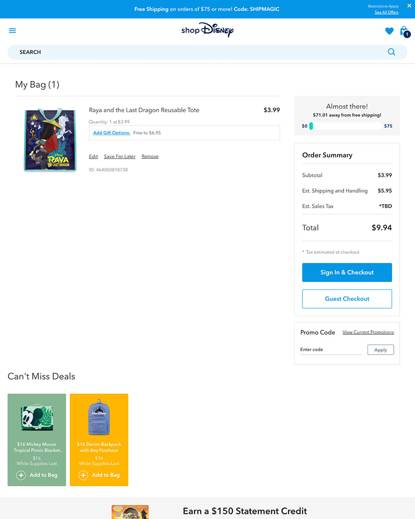
Disney includes detailed gift options at the “Cart” step and allows users to add personalized gift messages.
On Disney’s site, users can easily designate their purchase as a gift during checkout steps, as well as include a personalized gift message with their order.
The gifting UI includes a detailed explanation of the gifting features, including any additional fees, such as wrapping services.
12. Apple: Checkout Provides Full Cost Estimate
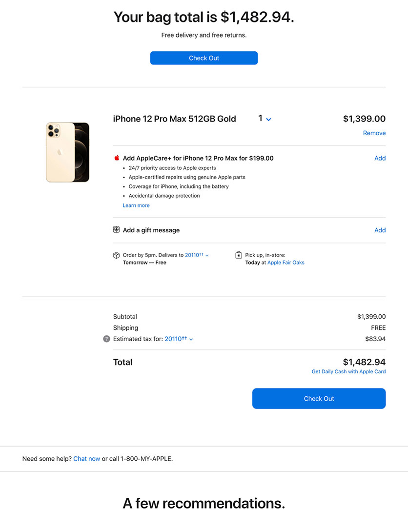
Apple’s checkout provides a full cost estimate in the “Cart” step and includes “Store Pickup” in shipping options.
Users expect a total cost estimate before they initiate the checkout flow. Apple provides full order cost in the “Cart” step, including estimated shipping and tax.
The website also clearly labels and describes omnichannel delivery options like “Pickup in store” without using jargon the user will have trouble understanding. There’s also a clear indication of the earliest in-person pickup time.
Apple’s Cross-sell suggestions and promotions aren’t generic — they’re highly relevant to what the user currently has in their cart.
Mobile UX Examples
Shoppers browsing on compact screen sizes pose a constant challenge for e-commerce UX designers who need to work around mobile’s limited page context.
Here are some examples of brands that offer good examples of mobile UX elements and features.
13. Vodafone UK: Static Content Sections
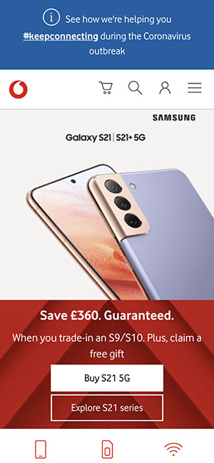
The mobile site for Vodafone UK helps users avoid accidentally leaving the checkout process. It uses static content sections to display products on the homepage.
During the checkout process, accidental taps on the logo can cause users to give up on the order, particularly when it means re-entering data.
Vodafone’s mobile site provides sufficient white space around the company logo, and the icon is placed away from other features on the page. Accidental taps are handled by asking users to confirm their intention to leave.
The homepage also avoids using a carousel, which can cause usability issues on mobile, in favor of static content sections to display products.
14. Nike: Limited Number of Category Choices
Nike's mobile app provides a manageable number of categories to help users find the right products.
Navigation on the Nike mobile app doesn’t include redundant or overlapping category filters, and there’s a "View All" option placed at the top of the menu.
Categories and subcategories are divided into manageable chunks that don’t overwhelm the user.
15. Macy’s: Pinch-to-Zoom Functionality
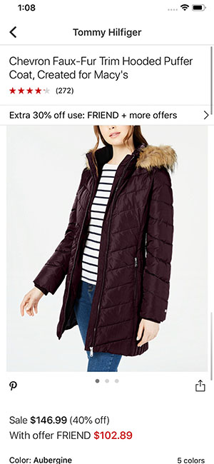
Macy’s mobile app supports pinch-to-zoom functionality and utilizes buttons instead of a drop-down menu for size variations.
Macy’s mobile app supports pinch-to-zoom functionality on product images so users can visually inspect products and read the product information.
All tappable elements include adequate spacing of at least 2 millimeters and aren’t placed at the edge of the screen.
Size variations are represented with buttons rather than a drop-down style selection, and there’s no default size selected.
Bad UX Design Examples
Now that we’ve shown you a number of positive UX design examples, it’s time to look at the flip side. Find out how these major brands are “violating” UX design best practices, and see for yourself how the user experience suffers as a result.
16. Pottery Barn: Homepage Text Overlay
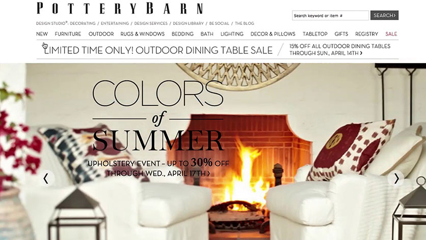
Overlaid text on the homepage of Pottery Barn is difficult to read.
It’s difficult to read the overlaid text on Pottery Barn’s homepage, despite the text being in a reasonably large font compared to the main navigation font size.
The large “S” in “Summer” is obscured by the pillow in the background image. The pillow also makes the first word in the second line of the description, “through,” difficult to read.
17. Currys (UK): Live Chat Dialog
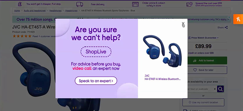
A user had a negative impression of the site due to a live chat pop-up.
The intrusive live chat (or video) dialog on Currys (UK) can make a poor impression on users.
As one user said, “I don’t wanna video call an expert. I think that’s a bit much. It just feels a bit desperate.”
18. Newegg: Tappable Element Issue
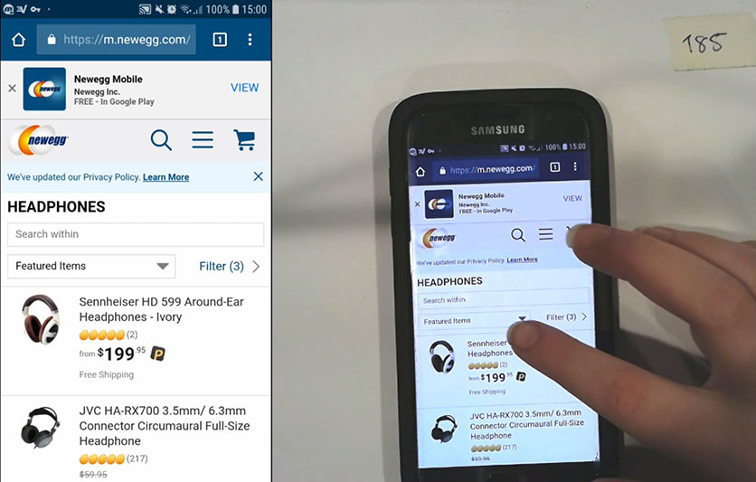
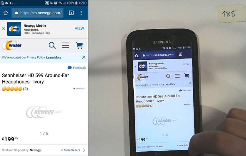
A test participant on Newegg accidentally tapped a product list item while trying to open the sorting tool.
Spacing between tappable elements at Newegg presents a consistent problem for users.
A test participant at Newegg inadvertently tapped a product list item when he was trying to open the sorting tool (first image) and wound up on the product page (second image). The spacing between the sorting tool and the product list item is about 1.1mm.
A different participant had a similar issue as he was trying to open filtering. The link for filtering is slightly better spaced than the sorting widget, but it’s still too close to the product list items, with a spacing of just under 2mm.
Why Is Having Good UX Important?
UX is important because it’s closely linked to conversion rate optimization. Creating a better website user experience is particularly important for e-commerce sites because usability issues are a direct cause of lost sales.
In e-commerce, success relies on users being able to explore products and complete purchases with ease. When users can’t find what they’re looking for, or become frustrated before completing the checkout process, they don’t become customers.
No matter how large or small your company is, making incremental changes to your UX can make it easier for your buyers to find items, fill their carts, complete seamless transactions, and become repeat customers who buy from you again and again.
Use These Examples of UX Design to Incrementally Improve Your Site
We’ve tested and evaluated thousands of page designs against our research guidelines, and each one offers examples of e-commerce best practices both ignored and implemented.
To improve your website’s user experience, it’s helpful to learn from some of the best and worst examples of UX. But remember that even the highest-performing e-commerce sites can make improvements to the user experience.
We’ve shared a number of good UX design examples in this post, as well as some poor examples, to help you understand what recommendations and guidelines look like when they’re implemented during the design process.
To get access to all 200,000 hours of our research findings and see how your site’s UX stacks up against the world’s leading e-commerce sites, check out Baymard Premium.
Research Director and Co-Founder
Christian is the research director and co-founder of Baymard. Christian oversees all UX research activities at Baymard. His areas of specialization within ecommerce UX are: Checkout, Form Field, Search, Mobile web, and Product Listings. Christian is also an avid speaker at UX and CRO conferences.