This is the 5th in a series of 8 articles on checkout usability that combine findings from our checkout usability study and benchmark of the 100 largest e-commerce sites.
One of the worst usability violations we discovered during our user testing was non-linear checkout processes. Sites with a non-linear checkout process left several of the test subjects confused and intimidated. When conducting the original usability study, both Walmart and Zappos had a non-linear checkout process – now, they’ve both changed to a linear process.
When reviewing the top 100 e-commerce sites in 2012 only 3 of sites had a non-linear checkout process: W.W. Grainger, Sony Electronics, and Safeway.
The Pain of Non-Linearity
Having a non-linear checkout process confuses and intimidates customers as it breaks with their mental model of a linear checkout. During the test sessions we saw multiple subjects who began looking for error messages when they saw the same page again – they figured that either a technical- or validation error had happened.
Furthermore, seeing the same page again made the customer feel like she wasn’t making any progress as she had seemingly moved backwards in the process (to a previous page in the checkout process) after just having filled out multiple pages of form fields.
While sticking to a linear checkout process may seem like strikingly obvious advice, certain business and design decisions can increase the chances of inadvertently implementing a non-linear process – which is likely what happened in the following cases.
Three Non-Linear Checkouts
The typical way to “accidentally” end up with a non-linear checkout process is to have steps within steps that loop back to a previous step upon completion. This is in fact what both W.W. Grainger, Sony Electronics, and Safeway have done.
W.W. Grainger (industrial supplies) force their customers to register for an account before being able to purchase. Here’s the flow of their 9-step checkout process for a new customer:
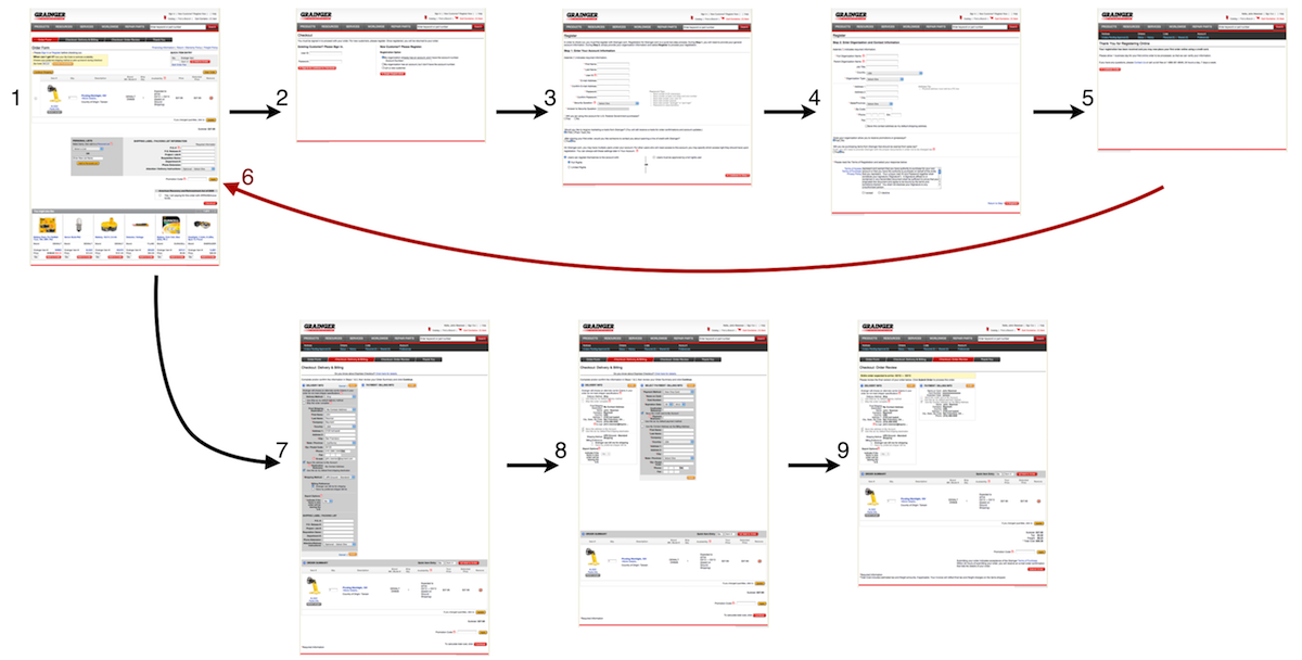
W.W. Grainger has a non-linear checkout process, likely due to its mandatory account creation scheme.
Grainger’s checkout turns non-linear after the customer has created the required account and then sent back to the cart step once again – showing the customer the page he was at some 25 form fields earlier. The customer then has to click the proceed button again (now logged in, just like a returning customer would be), diminishing the user’s sense of progress.
Let’s also take a look at the non-linear Sony checkout process as it’s a slightly different implementation with dialogs for each sub-step.
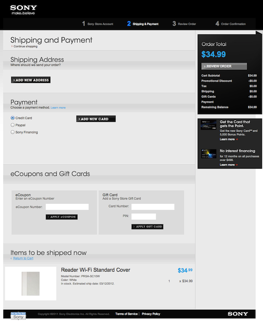
Step 2. of Sony’s checkout process seems simple on the surface but actually has multiple sub-steps.
The initial view of Sony’s “2. Shipping & Payment” checkout step is very sleek when a new customer first sees it. It’s almost completely stripped from intimidating and boring form fields, and the process steps in the top of the page indicate there’s only four steps in total (currently at step 2). But the user will have to go back-and-forth four times between overlay dialogs to complete this “second step” of the checkout.
Below are the steps the user has to go through to:
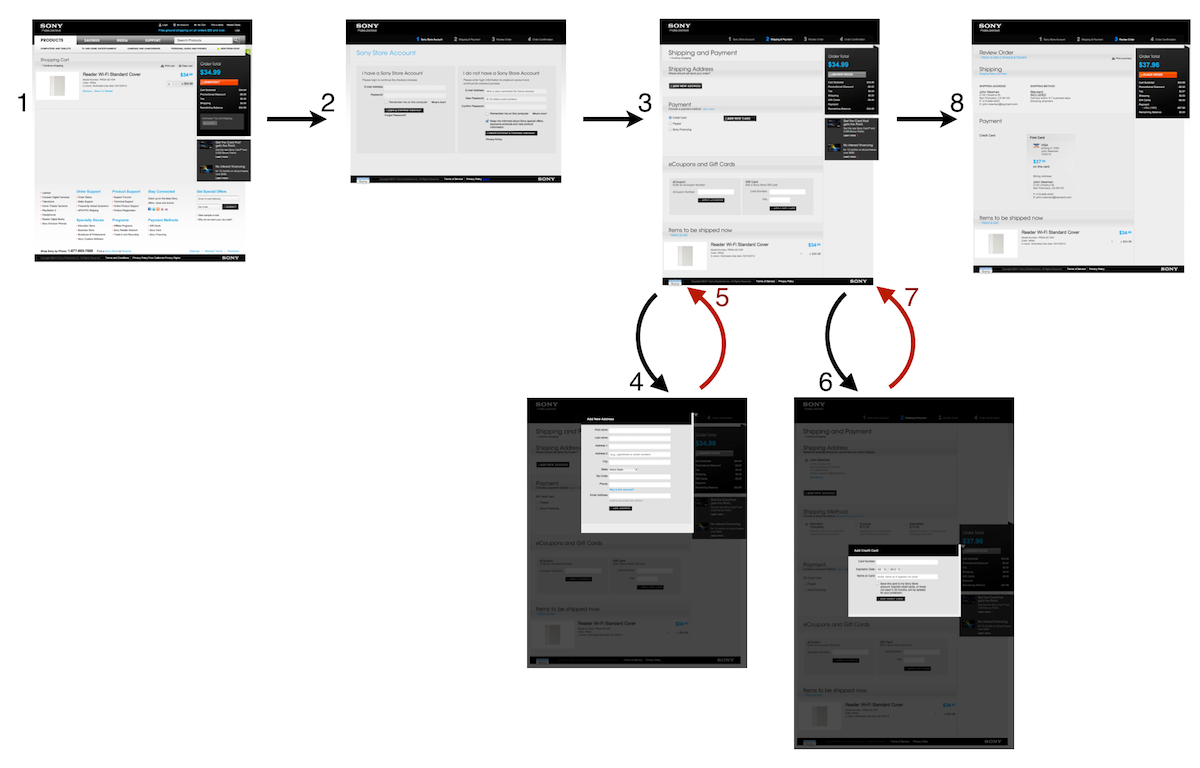
Overlay dialogs are used for most form fields during Sony’s checkout process, resulting in a non-linear checkout process.
Although not as devastating for the user’s sense of progress as the Grainger’s implementation, it still breaks with the user’s mental model of a linear checkout, and does not provide the same level of guidance (“what’s next”) as a linear checkout process would. In much the same way we described in the last article on accordion checkouts, the end-user will most likely experience each of these overlays as a new sub-step as it has its own set of instructions, headers, labels, form fields and primary button. A linear checkout sequence wouldn’t necessarily look as sleek at first glance (false simplicity), but would be much easier to complete for the customer as the main page (currently shown three times) could be removed altogether.
If you want to view screenshots of the non-linear checkout flows in their full length you can see them here: W.W Grainger, Sony and Safeway.
How to Avoid Non-Linearity
The simplest way to avoid a non-linear checkout process is quite obvious: never lead the customer back to a previously shown checkout step. Including the cart step.
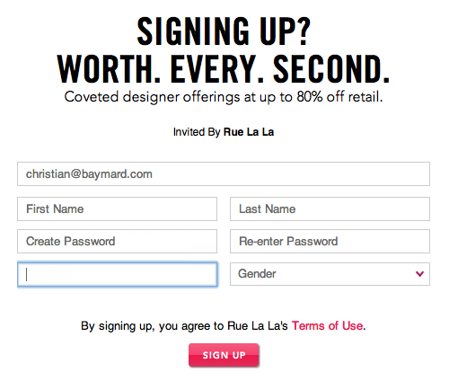
It’s interesting to note that we’ve only ever seen non-linear checkout flows implemented on sites that also require account registration. While it would certainly be possible to design a non-linear guest checkout process, it wouldn’t exactly be natural. On the other hand, if you require an account to be created, it’s easy to see how a designer may direct the customer into an “account creation” flow and then send her back to the checkout process once complete – inadvertently creating a non-linear checkout process. Non-linearity is thus often a design consequence of having a checkout process designed closely around the experience of a repeat account customer and then neglecting to focus on the checkout experience for a first-time customer.
A simple way to achieve a linear checkout experience despite required account registration is to automatically direct the customer to the next checkout step once the account registration is complete. This is in fact the exact implementation model the remaining 21 of the top 100 e-commerce sites with mandatory account creation opted for.
Even if a site’s specific customer context calls for a checkout design that is “optimized” for repeat account customers, any high caliber e-commerce site should then be able to provide an alternate linear checkout flow for their new customers.