
Key Takeaways
- Users often overlook “Apply” buttons in the checkout flow
- If users miss the “Apply” button, they can lose data or get misleading error messages, and may abandon the checkout process altogether
- Avoid requiring users to tap or click “Apply” buttons in the checkout flow, except in cases of entering promo codes or gift card numbers
Video Summary
Across multiple rounds of Baymard’s checkout testing, we’ve repeatedly observed participants overlook “Apply” buttons that are required to save the information the participant has entered.
More importantly, overlooking the “Apply” button often causes them to come to a complete stop to determine the cause of the resulting error message.
At best, users will experience an unnecessary interaction and have a lackluster experience, while at worst, the users’ confusion will contribute to checkout abandonment when they cannot resolve the issue.
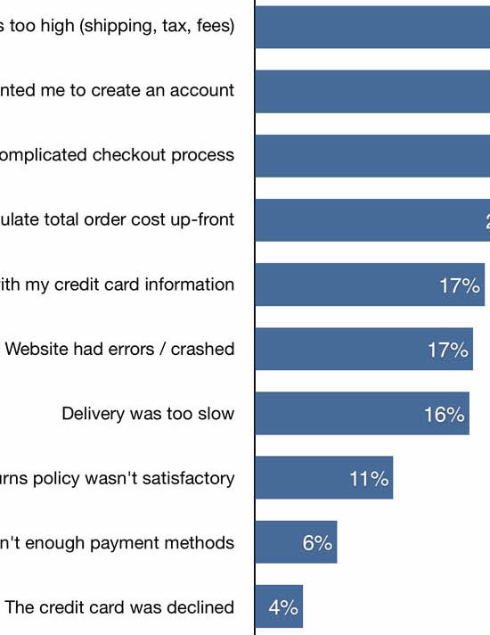
However, our ecommerce UX benchmark shows that 22% of sites still require users to select an “Apply” button to save inputs during checkout.
This article will discuss our latest Baymard research findings on why “Apply” buttons should be avoided for most checkout fields:
-
The problems that can arise from users missing or misinterpreting the “Apply” button
-
The best alternative to the “Apply” button
-
The exceptions when an “Apply” button could be used
Note: our findings for “Apply” buttons differ when users are editing account data; in those instances, they usually want to have some confirmation that they are making a change, either with an “Apply” button or a different visual indicator that the change is being saved.
Users Misunderstand or Overlook “Apply” Buttons Within Checkout

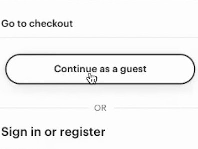
“I’m going to hit ‘Apply’. I’m not sure what that means other than — oh, it just set up the shipping address. Okay.” Presented with two competing primary buttons on the Shipping Address step of checkout — one labeled “Apply”, the other labeled “Continue to Payment Information” — this participant at Best Buy debated which to select before hesitantly deciding on the top one. “Apply” buttons make completing checkout forms slower and less straightforward.

After users enter their addresses at Zalando, they must tap both a “SAVE” button and the “NEXT” button. With an implementation like this one, neglecting to “SAVE” can result in unexpected or misleading error messages or losing the entered data, increasing frustration and the risk of checkout abandonment.
In testing, some participants neglected to tap or click “Apply” buttons after having completed a checkout field, meaning that data would go unsaved.
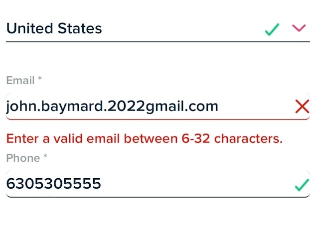
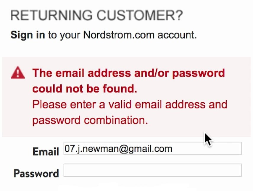
If users do not tap or click “Apply”, the results can vary: some sites generate error messages that are unexpected for the user, and some sites outright delete “unsaved” data — both of which result in increased friction and frustration.
When the input needing to be “saved” is required, users will be stopped from progressing to resolve the error message or reenter the data.
However, when the inputs are not required, users will be allowed to proceed to the next stage of checkout but may never discover that the input did not save, which can cause orders to be placed with incorrect data.


“Okay, and all that information is correct, so we’ll save it…I mean, it’s interesting that they say ‘Save payment’ instead of ‘Run payment’. It’s making me click it twice. There we are.” On the Payment step at CVS, this participant had to click three separate times to move forward with the checkout process, pausing and scrolling confusedly up and down the page each time — first clicking “Save” to save the billing address (first image), then “Save payment” to save the credit card information (second image), and a third time after scrolling up to finally find the “Place order” button (third image).
While some users overlook “Apply” buttons, others will mistake an “Apply” button for the step’s primary button.
This can have severe consequences: as users click on what they think is the step’s primary button, they will instead be redirected back to the same step they are on, breaking the expectation of being taken to the next step.
Seeing the same step after clicking what users think is the “primary” button can lead users to think there’s an error on the page, or that the site is experiencing glitches or performance issues.
Moreover, having “Apply” or “Save” buttons for steps such as entering payment information breaks with user expectations as well as general ecommerce practices, as 78% of sites don’t use “Apply” buttons for typical checkout fields.
Core UX Solution: Avoid “Apply” Buttons in Checkout


During testing at sites with a single primary button at each checkout step (including The Container Store, first image, and Etsy, second image), participants were able to efficiently move forward with data entry, encountering fewer issues and error messages than on sites with separate “Apply” buttons within a single checkout step.

At Best Buy’s mobile site (iOS), users can specify a “pickup person” to get the order once it’s ready. There’s no “Apply button”; the changes are registered when users move forward in the checkout by tapping the primary “Continue” button at the bottom of the page.
Unfortunately, one cannot simply fix the “Apply” button by changing it visually: participants in testing did confuse the “Apply” button with the primary button when they looked similar, but making them visually distinct did not prevent participants’ confusion.
Likewise, participants experienced the same problems when the “Apply” button was given a different name, such as “Save” or “Add”.
Rather than use the “Apply” button, sites should instead auto-update as users enter their data.
Removing the inline “Apply” buttons resolves the issue of users overlooking them, eliminates the risk of “Apply” buttons being mistaken for the primary button, and reduces the number of actions within the checkout form step, simplifying checkout and ensuring the flow that users expect.
The best timing for auto-updating input fields can vary: if there are multiple ways of writing a valid input, auto-updating can be triggered as the user types (e.g., revealing availability of a username or the strength of a password).
However, if there is only one correct way of writing the input (e.g., a coupon code with a defined set of characters), the site should only try to apply the value when the field loses focus or when the input has reached the correct number of characters.
The Exceptions When “Apply” Could Be Used

“Apply” buttons can make sense in certain instances within checkout, such as when applying promo codes or gift card numbers. In these cases, users are not unexpectedly slowed by the presence of “Apply” buttons, as shown here at Caraway.
One potential exception to avoiding “Apply” buttons in checkout is when allowing users to add promo codes or gift card numbers that will impact their overall order costs.
In these instances, users are less likely to overlook the associated “Apply” button or assume their entry will be saved automatically.
Moreover, some users will actually prefer to have “Apply” buttons for these fields, as the light friction of clicking an “Apply” button can help some users feel that they’ve “completed” the task.
However, these fields can be auto-updated as well, as long as confirmation is provided letting users know their entry has been successful.
Whether or not the “Apply” button is used for promo codes or gift card numbers, there should be some form of visual highlighting when such a code is applied and changes the price, delivery date, or availability of the order, since this will clarify the change that has occurred and what caused it.
Of course, the promo code field should always be collapsed or hidden behind a link to avoid distracting users in checkout, and ideally, applicable promotions and discounts should be automatically applied.
A Simplified and User-Focused Checkout Flow

At Apple, each checkout step displays only a single primary button — for example, users do not need to separately “save” their credit card information before moving forward to the Review step — resulting in a seamless and straightforward flow.
In checkout testing, participants often forgot to select the “Apply” button, or confused it with the primary button required to move the checkout process forward.
Thus, dropping the “Apply” button for checkout and instead auto-applying the users’ input is a user-focused solution.
In spite of these findings, Baymard’s ecommerce UX benchmark of the leading ecommerce sites in the US and Europe shows that 22% of sites still require users to select the “Apply” button to save data on checkout pages.
Baymard has been researching and writing about this topic since before 2012, and the core practice has not changed: avoid “Apply” buttons in checkout.
This article presents the research findings from just 1 of the 700+ UX guidelines in Baymard – get full access to learn how to create a “State of the Art” ecommerce user experience.
If you want to know how your desktop site, mobile site, or app performs and compares, then learn more about getting Baymard to conduct a UX audit of your site or app.