Dimitry Fadeyev at UsabilityPost defines False Simplicity this way: “Sometimes, what appears on the surface to be simple is actually far from it”. What is being referred to here is when a User Interface (or a UI element) is made visually simpler, but as a result becomes more complicated to use or understand.
False Simplicity is particularly worth paying attention to in the design and conceptualization phase because it often pass for being “simpler” at first glance, when in reality it actually makes the interface more complicated to use. Let’s take a look at 3 types of “False Simplicity” where you should stay alert for UI design affecting UX.
1) Loss of Context
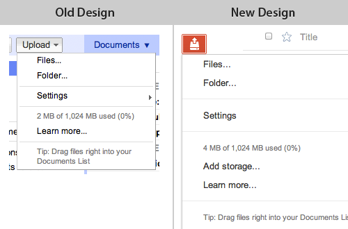
One type of false simplicity arise when you simplify an interface in a way where the user end up losing context. Such loss of context can happen when you oversimplify or outright remove UI elements such as hierarchy indication (indentations, semantic markup, breadcrumbs etc.), navigation history (visited link state), labels, indication of selections, instructions and so on.

RueLaLa combines form field placeholder and label, causing the label to disappear as soon as the user starts typing, eliminating all context for the field.
One specific example of losing context as a result of simplification is forms with labels inside the form fields. You find such an implementation during checkout at e-commerce sites such as RueLaLa (seen above), Apple and J&R.
Having the form field labels inside the form field itself makes for a very simple visual appearance of the form. The form fields however get very difficult to interact with because each field loses its context the second the user starts typing. This not only makes it more difficult to fill in the fields, it also makes it difficult to correct errors in the form since the labels are now missing.
When conducting our checkout usability study we observed that when users had to correct errors in forms with the field labels inside the field, they ended up deleting the entire input just to be able to read the label once again – after which they’d have to re-enter the same information once again with just a couple of characters changed. All form fields ultimately look alike, the only thing that separates two text fields is their context, and this context is mainly set by the field’s label, so when you remove the label as the customer starts typing, it becomes difficult to differentiate one form field from the other. (Update: These issues with inline labels were confirmed in our mobile e-commerce study as well – only, they are even more severe in a mobile context.)
It’s visually simpler but in the end more complicated to use.
2) Ambiguous UI
Another type of false simplicity can arise when you simplify an interactive UI element to a degree where the user can no longer immediately understand what the element does. “Immediately understand” is of course a very loose description since what your specific user group can or cannot understand may vary greatly by previous browsing and computer experience, age, culture, language and so on. But in general the further you move away from a shape and style that follows traditional design and web conventions the more likely you are to end up with a case of False Simplicity due to a UI element that is ambiguous and too open to interpretation.
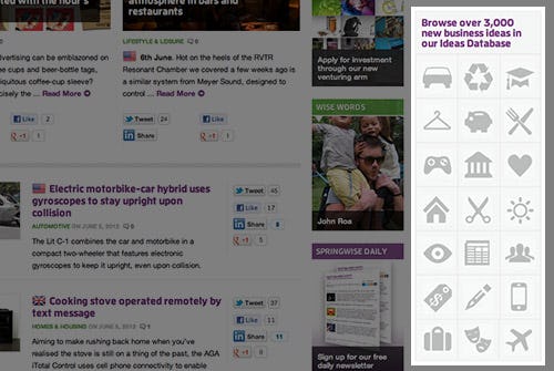
The user must hover each icon in Springwise’s sidebar in order to figure out what they represent.
An example of such simplification could be the category navigation at SpringWise, a business trendspotting blog. The category navigation consists of a set of 21 icons located in the sidebar, each icon acting as a link to a category with a hover title. This icon deck looks super cool but the user has to hover every single one to know what each of them represents unless he can guess the meaning of the icons. E.g. is the travel/tourism category represented by the sun, suitcase or airplane icon? (What’s your guess?)
Icons can be great in an app or website that the user use on daily basis because the initial cost of adoption (due to ambiguity and non-convention) can be paid back in the long run. But when the interface is used less frequently (e.g. twice a month in the SpringWise example) the scenario changes – the cost of adoption increases greatly as the icons will be more difficult to remember when there’s weeks between each encounter, and between each possible return-on-investment.
Again: Visually simpler but ultimately more complicated to use.
(Side note: when using UI elements that rely on hover titles remember that there is no hover state on touch devices so you’ll need to provide an alternative for those users or they’ll have to do a lot of trial and error.)
3) Mismatch Between UI and Task Complexity
It’s aggravating when a simple task is obstructed by an overly complex user interface. I believe much of the success for many business web apps seen these days are propelled by their ability to match simple everyday tasks with equally simple user interfaces. (Something most traditional business and enterprise software has a history of being notoriously poor at).
Another type of False Simplicity can however arise when the opposite is the case. When a rather complex task is given an interface that’s too simple. Simple tasks are best suited to be matched by a simple user interface. But sometimes to solve an advanced task an overly simple interface just doesn’t cut it. Sometimes the user needs the reassurance and confirmation of fine details (even if that means a bit of added complexity) to be able to solve the task at hand.

The new hard drive formatting menu in OS X Lion is a clear case of false simplicity.
An example of such a case is found in OS X Lion when setting the security level for formatting the hard drive. In the recent OS upgrade it went from being a set of radio buttons (top image) to a slider (bottom image). The slider-based dialog only displays the description for the option currently selected. While this is certainly a neat way of removing a lot of descriptions, the user now has to slide between all steps just to figure out what his options are.
For certain everyday tasks this type of simplification might be a good thing - having a slider and removing clutter by only describing the selected option. But setting the security level for formatting your hard drive is hardly an everyday task. It’s something most users won’t do more than once a year (if ever). When it happens most users are likely to want to know a little more about their options and the differences between them in order to make an informed decision (in this case the security vs time spent tradeoff).
This is especially true because the user will have to click an “Options” button to even see these. So the options are already hidden and now the user has explicitly asked for the “Advanced” mode – surely he’s interested in seeing more information about the options. Simplifying an “advanced settings” screen this way creates a mismatch between the task at hand and the UI.
Once again: Visually simpler, but in the end more complicated to use.
Outcome Depends on Use Case
The use case is often what tilts the scale from simplicity to false simplicity. E.g. removing text descriptions in favor of icons might be a good decision in an interface the user will use every day where the initial cost of adoption is paid back over time. But if it’s on a site only used rarely the cost of adoption increases greatly as the non-conventional simplification will be more difficult for the user to remember.
In general watch out for False Simplicity when the simplification might lead to: 1) a loss of context, 2) an ambiguous UI, and 3) a mismatch between UI and task complexity.
With false simplicity it’s worth noting that the interface doesn’t become “broken” and unusable, so don’t expect end users to alert you directly with lots of complaints or remarks. False simplicity instead often leads to extra work and friction for the user: having to delete the input to re-read the form field label (example 1), hover all the icons (#2), or slide back and forth to understand each option (#3).
Good intentions
The general strive for simplicity is great and the intention is good, but beware that sometimes visually simple can actually end up being more complicated to use.
Do you have other examples of False Simplicity? Then post them in a comment.