In our latest usability study on e-commerce checkouts we made an interesting observation: several of the test subjects talked about certain parts of the checkout-page as being “secure” – typically this was around the payment details.
These test subjects thought that one part of the page could be more secure than the rest of the page.

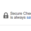
Here several different visual clues are used to make the customer feel more safe about this part of the page.
Any part of a page with security icons, badges and text, and a general “robustness”, was generally perceived as “secure” while other parts without these visual clues inspired less confidence in the test subjects. This is obviously something you want to leverage on your own payment page.
Update October 2016: we have published an updated version with new findings on this topic.
By adding visual clues (such as borders, background color, security icons and badges) around the credit card form fields on your checkout-page, you can make your customers feel more safe when handing over this sensitive information.
From a technical perspective this of course doesn’t make any sense, as all the form fields on an https-page are equally encrypted. However, most people don’t know this and will perceive some parts of your checkout page as more secure than others, whether it’s logical or not.
So be sure to encapsulate the payment details on your checkout-page with a border or background color (or similar), and add security icons and badges to it if possible.
Do you have other tips on how to make customers feel more safe shopping online? Then share them in a comment.