“People have lost everything you know, so I always check a 100 times before I purchase anything”, one of our test subject explained as she meticulously entered her credit card information. Indeed, during our past 7 years worth of large-scale checkout usability testing, we have observed that users continue to feel uneasy about sharing their payment information with e-commerce sites.

In fact, our most recent Checkout Usability study reveals that 19% of users have abandoned a checkout flow during the last 3 months because they “didn’t trust the site with their credit card information” (1,026 respondents, average US adult internet population, 2025). Throughout all of our testing of checkout processes, we’ve consistently observed 2 important user behaviors relating to security:
- Depending on the design, users perceive some parts of a page to be more secure than other parts of the same page.
- The average user’s perception of a site’s security is largely determined by their “gut feeling”, which – beyond how much they trust the brand – is to a large extent observed to be directed by how visually secure the page looks.
In this article we’ll dive deeper into how visual security is best established, how users perceive security in a checkout flow, and we’ll provide new updated results for our “Which Site Seal do People Trust the Most?” study (incl. testing a fake seal).
Users’ Perceived Level of Security in a Checkout Flow
Already back in 2009 we observed that a large proportion of users perceive some parts of a checkout page to be more secure than other parts of the same page. This was re-verified in 2012. And now again in our latest large-scale checkout usability testing.
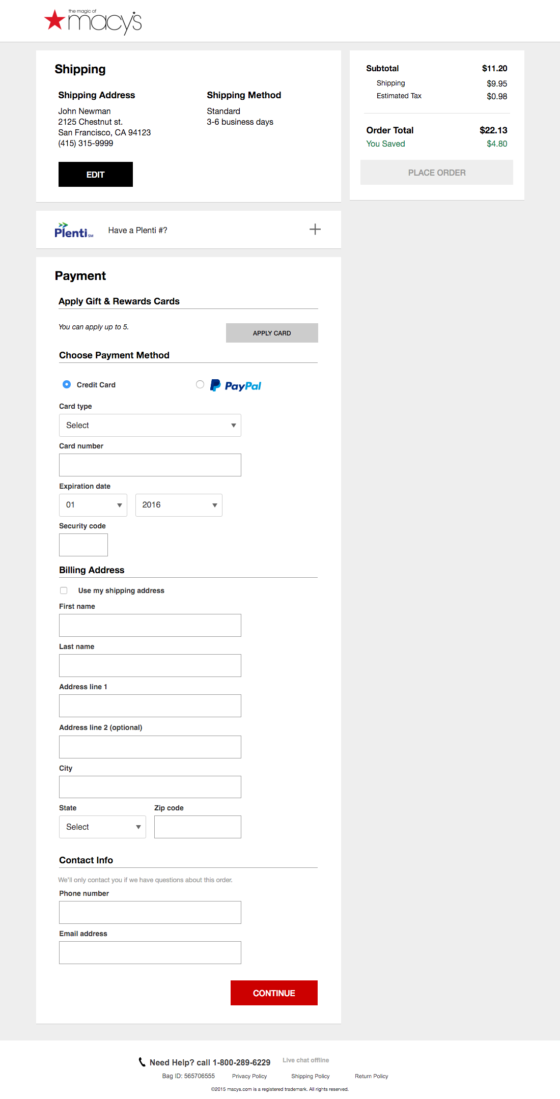
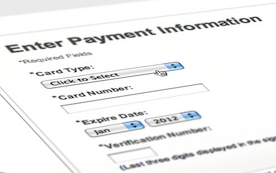
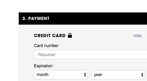
The test subjects generally had less confidence in the security of their credit card details on pages where the credit card form didn’t “look” or “feel” more secure than the rest of the form fields used for less sensitive information. An example of Macy’s is seen here – notice how the credit card fields and address fields look exactly the same.
What we consistently observe is that any parts of a checkout page with trust badges, reassuring microcopy and a general visual “robustness” are often perceived as being “more secure”, while parts without these visual clues inspire less confidence – despite the fact that these fields are all part of the same form on the same page. Now, from a technical perspective, this of course doesn’t make any sense, as all the form fields on an HTTPS-page are equally encrypted. However, the majority of normal web-users do not have this level of technical insight, and are likely to perceive some parts of the checkout page as more secure than others, whether it’s technically true or not.
There’s two additional observations on users’ perceived security that are important to underscore:
- We observe the test subjects to exhibit little to no security concerns during checkout steps that only ask for address, shipping methods, contract info, and similar. The security concerns arise as users are confronted with the credit card interface.
- We see that when testing sites from large brands (i.e. Apple, Microsoft, Walmart) users have few security concerns, even with a minimum of “visual security” simply because they are large corporations and well-known brands (although they are still highly vulnerable to layout bugs). By contrast, when testing sites that are newer, less well-known, or more niche than these major brands, we have however observed users raise security concerns very easily if there are no visual clues. Hence, the more well-known a site or brand is, the less “visual security emphasis” clues are needed.
Let’s take a look at some design tactics that have performed particularly well during our usability testing when it comes to reinforcing the user’s perceived level of security.
Visually Reinforce the Credit Card Section
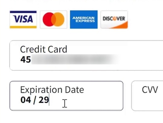
One method we consistently observe to perform well for increasing users’ perceived security of sensitive fields is to visually encapsulate them. This can be achieved simply by using borders, background colors, shading, and other visual styling that will make one part of the form seem more robust than the rest. Remember: this is about perceived security of the fields, not their actual technical security.
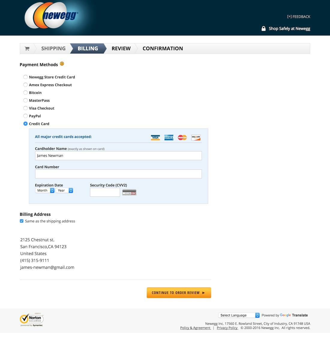
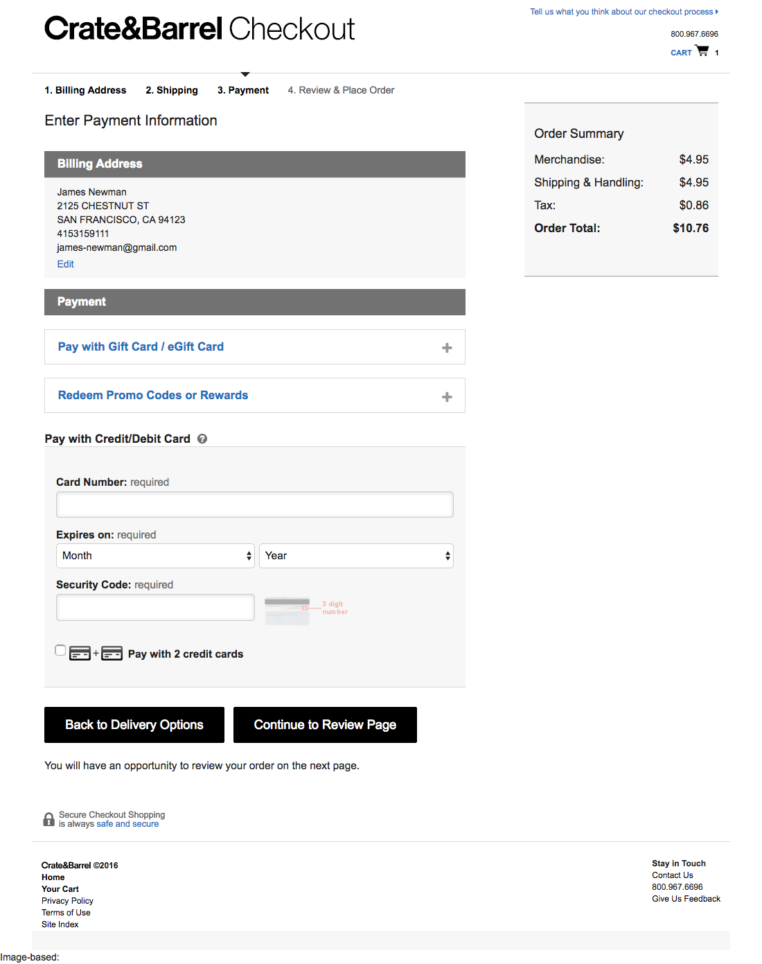
While from a technical security perspective it’s non-sense, note how NewEgg and Crate & Barrel visually reinforce their credit card fields using a style not used for any prior form fields – adding an extra degree of visual robustness to them.
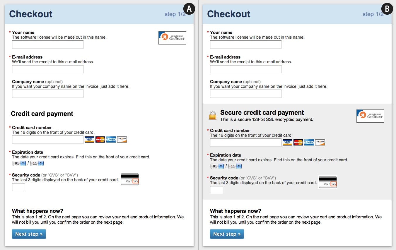
This mockup we created illustrates how a payment form may emphasize its security through visual cues such as microcopy, the use and position of site seals, a padlock icon, along with a visual encapsulation of the sensitive credit card fields via a grey background color.
It’s important to note that the visual reinforcement must be distinct and unique for the credit card fields. If you use a similar style elsewhere during your checkout form for less sensitive information, it will likely be considered generic styling and not yield the desired increase in user confidence. Again, this is about tapping into the user’s perception of the fields, making the user feel that this highly sensitive information will be treated more securely than the fields that contain less sensitive information (like an address or name).
Which Site Seal do People Trust the Most? (2023 Results)
Another visual clue that during testing also proved effective at increasing the perceived level of security (and adding robustness to the encapsulation) is the use of “site seals”, such as trust badges, SSL seals, and similar symbols suggesting trustworthiness.
Now there is a broad range of site seals, each with different meanings:
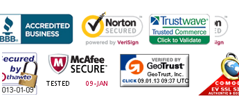
- SSL seals – Some are “SSL seals” which are issued by SSL certificate vendors – like Norton, Thawte, Trustwave, Geotrust, Comodo, etc., and these seals indicate that communication between your browser and the site is encrypted via the Secure Socket Layer (SSL) protocol. In short: it denotes technical security.
- Trust seals – Others are “trust seals”, like Google Trusted Store, BBB Accredited, TRUSTe. These seals typically indicate some sort of verification of the site and its business – in other words, a trusted 3rd-party (like Google, TRUSTe, etc) saying “this is a legit business”. In short: it typically denotes business authenticity.
- Made up symbols – Finally there are visual symbols that aren’t issued by a 3rd-party and are simply “homemade” icons like padlocks or “Secure Checkout” badges. These are effectively visual symbols the site utilizes to make its own claims of security. In short: it’s entirely made up; the site claiming that it is safe.
Generally, we see during testing that adding any visual icon will help increase the user’s general level of perceived security. However, we wanted to look a little deeper into which seals and icons inspire the highest level of confidence in users, and we’ve therefore conducted several quantitative studies testing various site seals. We ran the first study in 2013 and six additiona study between 2015 and 2023, with each asking the same question: “Which badge gives you the best sense of trust when paying online?”
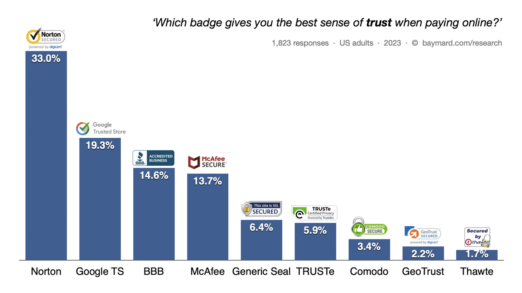
The 2023 test results tell largely the same story as our previous results. The SSL seal from Norton dominates as the seal that establishes the best sense of trust, followed by three trust seals, with several of the SSL seals performing rather low. Looking at the results, it’s very interesting to note that the seals from well-known consumer-facing brands, like Norton and Google, perform very well (even though Google no longer uses the ‘Trusted Store’ seal). This suggests that it’s at least to some extent possible for e-commerce sites to leverage the recognizability of these brands.
Similar to the previous study results, it’s interesting to see that the majority of the most trusted seals are “trust seals”, not SSL seals. This is noteworthy because SSL seals suggest actual technical security of the payment form (preventing man-in-the-middle attacks and network eavesdropping), whereas the trust seals indicate little to no actual technical security. Again, this just re-emphasizes that actual technical security is beyond most users’ understanding, and that users will go with what makes them feel most secure.
.. the homemade seal performed significantly better than the SSL seals issued by established vendors ..
In each test since 2016 we also included a completely “homemade / fake” seal not issued by a 3rd party, with no meaning whatsoever beyond the icon itself. Note how the homemade seal performed significantly better than the SSL seals issued by established vendors except Norton. This suggests that beyond strong brand reconizability, it doesn’t matter too much which actual seal is chosen. Rather what’s most important is making sure there’s some kind of visual seal or icon present to indicate the robustness of the credit card fields.
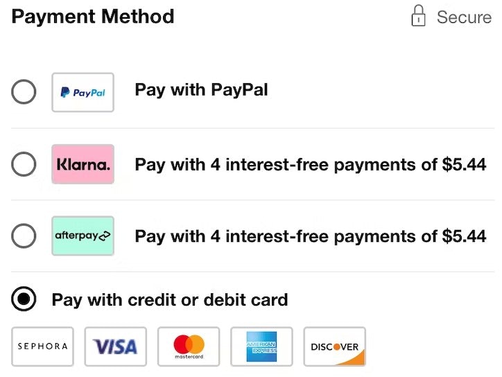
Similar to fake site seals, padlock icons – such as those seen here from Sephora, Etsy, and Nike – are also observed to be part of the toolbox in lifting the user’s perceived level of security (again, despite being entirely made up and not denoting any actual technical security or business legitimacy).
When it comes to placement of the seals and icons, we observe that placing 1-2 icons within the encapsulated area performs well to help the perceived reinforcement of the sensitive fields.
Layout Quirks Erode User Trust
While users’ general lack of deep technical knowledge means we can strengthen the perceived security of the credit card fields through visual cues, even entirely made-up ones, we also observe in testing that this lack of technical understanding can cause unrelated layout quirks to completely erode all sense of security.
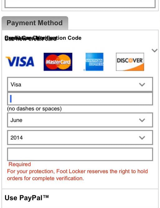
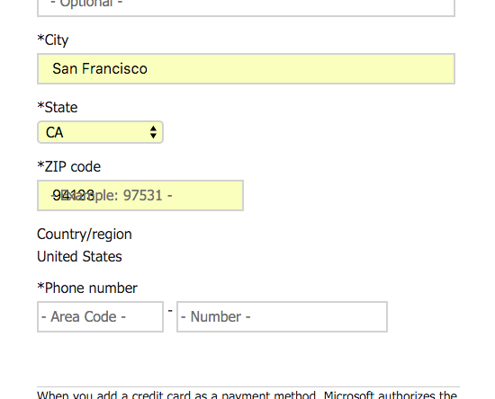
“This looks a bit strange. Especially when you are about to pay”, a subject explained during testing of Foot Locker’s mobile site, “This makes you think of some phishing or whatever.” Layout bugs can make some users believe the site may have been hacked and are thus particularly critical when they appear on key pages and paths (such as the checkout process). In practice we observe layout bugs on most major sites – to the right is Microsoft’s checkout.
During testing we observe how seemingly innocent layout bugs and quirky interactive features cause the test subjects to doubt the security of the site. In fact, some subjects even believed the site had been hacked or wasn’t currently working properly, causing them to abandon their purchase due to a lack of trust in the site. In these instance even the strongest of brands can suffer since the user no longer trusts that the business has control over the site, and indeed we’ve seen subjects abandon sites such as Amazon and Walmart due to layout quirks during their checkout processes.
It’s therefore crucial to scrutinize your checkout flow for even the smallest layout quirks – preferably across a wide range of browsers and devices, every single time there’s code changes to the checkout flow. Even sites with just moderate traffic levels will likely find such efforts worthwhile.
While fixing layout quirks and technical bugs should be almost needless to say, our experience with benchmarking and auditing leading e-commerce sites for 7 years indicate otherwise – something we examine in-depth in: How Layout Bugs Keep Haunting E-Commerce Sites – It’s Time to Fix This.
More Sites Are Visually Reinforcing Their Credit Card Fields
Our 2012 checkout usability benchmark revealed that 89% of sites didn’t visually emphasize the security of their credit card fields, whereas our 2016 checkout usability benchmark shows that it’s now only 66% of the major US ecommerce sites that lack visual emphasis. (It’s worth noting that this significant improvement is despite these being major e-commerce brands which have the lowest need to increase their perceived security.)
In essence our research findings may be boiled down to these two points:
- Users have little technical understanding of form field security and rather go by their perceived sense of security – something that is largely determined by the site’s brand recognizability and any visual cues surrounding the payment form.
- The user’s perceived level of security can be lifted through the use of visual clues like encapsulating the credit card fields with a solid background color, having site seals in close proximity to the card fields, using (effectively “meaningless”) padlock icons, and other visual reinforcements.
This article presents the research findings from just 1 of the 700+ UX guidelines in Baymard – get full access to learn how to create a “State of the Art” ecommerce user experience.