So you have a website designed for standard desktop computers, but you obviously want to keep up with times and make your site mobile-friendly too. However, it isn’t just a matter of scaling down your design – it’s a new platform with a new set of interaction patterns and limitations.
In this article we’ll explore seven eight UI limitations to be aware of when going from desktop to mobile web.
Note: we have a highly related but more recent article on this topic: “Understanding Mobile E-Commerce UX: 5 Overarching Issues“.
1) No Hover State

“Pull down to refresh” is a fairly common feature in native apps, and a few web apps have implemented it too.
On smartphones there’s no hover state (not yet anyways). This can be a challenge for pages with a lot of content or features as the interface quickly gets bloated with links and buttons that would normally only be shown on hover. On mobile, any information or feature must be accessed in either of two ways:
- Visible – the content or feature is accessible from visual means. It may be nested in sub-sections or child pages, but the content is nonetheless accessed from visible navigational elements such as buttons or links.
- Convention – by relying on mobile design conventions you may hide content and only display it when the user employ certain gestures such as swipe or shake, or when the user drags content around such as pull-to-refresh.
The last approach, convention, can help simplify the interface but also runs the risk of obscurity. Essentially you rely on the user to a) know the convention and b) try it out on your site to see if you support it. But if either of those fall flat the user will essentially have no idea that the feature exist, thus such features should either be explained at first visit or be non-essential to the experience of the site.
2) Slow and Error-Prone Typing

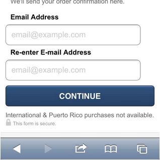
Typing in the name of a human or a street often results in errors on a touch keyboard.
Typing on a touch keyboard is a slow and error-prone exercise so make sure to keep your form fields to an absolute minimum and pre-select clever defaults. Furthermore, you need to consider how you deal with errors in data.
While you’ll certainly need to deal with erroneous data in desktop designs too, there will be even more errors in forms filled out on touch devices due to the touch keyboard and smaller screen size (providing less context and overview). Review pages may be a good idea for longer forms if the user can’t edit the data after it’s been submitted.
Using optimized touch keyboard are key. You may also consider auto-complete functionality, the use of geo-data, inline validation, address validators, and other methods for suggesting and correcting user inputs as they are typed.
3) Less Context

Display name of what exactly?
The smaller screens on touch devices results in reduced context. This tend to make it more difficult for the user to get an overview of the page, compare various options, and remember prior content.
Consider a long form. As the user scrolls down, the title of the form disappears along with previously entered data. Without this context it gets significantly more difficult to interpret the meaning of the currently visible form fields. It also makes it difficult to spot errors retrospectively. In this instance a review or summary screen can help avoid erroneous data while a header fixed to the top of the screen can help maintain context. (A fixed header will of course lower the screen real estate for unique content so if the context of nearby fields is more important then this approach would actually reduce the context.)
4) Inaccurate Clicks

Are we going to click ‘Gamelife’ or ‘Playbook’, or maybe ‘Epicenter’?
On touch devices people use their fingers to click links and buttons on the screen, which significantly decrease the accuracy of clicks. This is also known as the “fat finger problem”.
In practice, this means you must consider the size and proximity of all clickable elements, making sure they’re large enough to reliably touch with a human finger and far enough apart that users won’t accidentally touch the wrong element. Navigation and control bars are of particular importance as they include numerous clickable elements (making accidental clicks more likely) that all have significant consequences to the page (making accidental clicks more critical). During our mobile e-commerce usability study we observed a multitude of sub-problems caused by accidental click, some even leading to abandonments.
One way to deal with accidental clicks is to ask the user to confirm their action but that quickly gets annoying. A much less intrusive (and typically better) approach is having an “Undo” feature that allows the user to revert accidental behavior when it happens as opposed to constantly interrupt the user’s intentional acts.
5) Poor Connectivity

Gmail warns the user about connectivity issues.
It’s not uncommon with intermittent connectivity issues and slow download speeds on smartphones. It’s really a two-pronged issue:
- No connection – While users probably won’t expect offline mode from your website then you should still try to handle lost connections gracefully. AJAX-enabled features are particularly prone to unexpected behavior and silent failures (see navigator.onLine).
- Slow download speeds – If you’re on a mobile EDGE network download speeds will be pretty miserable. In other words, if your site should be usable on slower connections too then be sure to make its footprint as small as possible by implementing aggressive asset caching, using CSS3 effects instead of images, etc.
Of course both of these solutions will improve the experience on all types of networks. Lowering your site’s download footprint will make it super speedy on faster connections. Handling network issues gracefully will of course be much appreciated by the users the few times they do experience network issues on otherwise more stable connections.
6) Slow Hardware

A laggy animation would great diminish the user’s sense of virtual space in Facebook’s app.
While the performance of touch devices is improving rapidly, they are still slow devices compared to desktop computers. This means that page initialization can be upsettingly slow – especially if you execute a lot of Javascript on page load.
Another issue of slow hardware is that transitions and other animations may be “laggy” which – besides being aesthetically unpleasing – may wreck the user’s sense of virtual space (or fail at establishing it in the first place).
In both cases, good programming is paramount. Deferred Javascript execution combined with liberal use hardware accelerated CSS animations will do the trick in most cases when implemented properly.
7) Usage Situation

Distractions such as event notifications make the ‘returnability’ of your site more important than ever.
Since the very nature of smartphones is mobility you have to consider the impact of “real world” distractions – a speaker announcement, walking in traffic, etc. Another and possibly larger source of distractions are the digital interruptions – text messages, phone calls, push notifications, two-taps-away-from-Angry-Birds-syndrome, and so on.
These two sources of interruptions make the “returnability” of your site increasingly important. If a user return to your site after a distraction can they immediately pick up where they left or do they lack essential context? If the page is refreshed will their data still be there despite never submitting the form (see HTML5 localStorage)? Has the session expired?
It’s a new world
This is by no means an exhaustive list, but it should give you an idea of some common UI challenges that arise as you shift from desktop design to mobile. Smartphones have opened up a new and exciting world but we need to be thoughtful when designing for these devices. It’s a different platform with its own limitations and opportunities.
For mobile usability research see the related articles below or the 400-page research report with 147 design guidelines on how to design a high performing mobile commerce site.