
On mobile, should the field label go to the left of or above the field? After completing a large-scale usability study of 18 mobile e-commerce sites, which included test subjects completing more than a thousand mobile checkout form fields, the answer is: above, with one exception.
The Issues with Left-Aligned Field Labels on Mobile
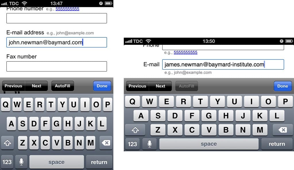
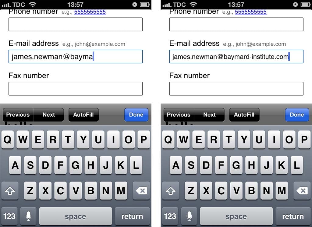
The main issue with left-aligned field labels relates to the smartphone display size and aspect ratio. Quite simply, if a left-aligned label needs to be in front of the field, the narrow screen leaves very little space left for the field itself. This is a severe usability issue since the form field will often not be wide enough to display the user’s entire input; think an e-mail address, which will often exceed 20 characters, or a credit card number which is most often 16 digits, a full name, or an address line consisting of street name and number.
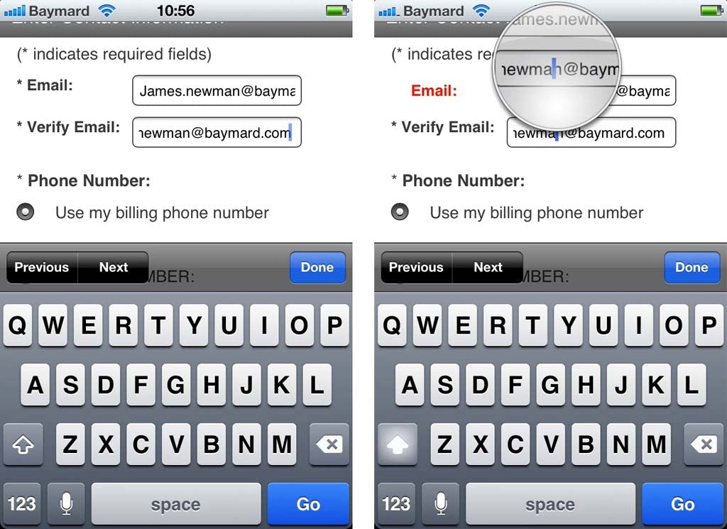
Not being able to see their input caused trouble for numerous of the subjects during testing. First off, it made it much harder for the subjects to spot any typing errors before submitting the form, leading to more erroneous forms being submitted. But more problematic was when a form containing erroneous input was submitted and returned to the subject, as it (predictably) proved very difficult for the subject to spot and fix validation errors when they could not actually see the entire “invalid” input (since it was truncated due to the short field length).
This forced the subjects to fiddle around with the quirky text selection / panning tools. Many subjects ultimately just decided to delete their original input and retype it because they were not able to spot the error or because they simply found it faster to delete everything than to fiddle with the text selection tools.
Given that spelling accuracy decreases on mobile (and the odds of validation errors therefore goes up) due to the tiny touch keyboards, having errors be this difficult to fix, let alone identify, is highly problematic.
Label Above the Field for Better Label Design
The main benefit of placing the label above the field on mobile is that you can have the form fields extend the full width of the display, making them large enough to display the user’s input in its entirety (in a decent input font size).
Additional benefits are the much better opportunities for writing clear and meaningful field labels as they don’t have to be limited to 1-2 words, more space for clearly indicating required / optional, and the possibility to easily include field descriptions (e.g. the important explanation of why you require the customer’s phone number).
The main downside of placing labels above the field is that it takes up more vertical space, which means users have to scroll more – however, during testing the scrolling gesture itself proved very intuitive to the users and not a hindrance to completing a form. Thus it’s only in the case where the form is so short that a complete form overview is achievable with the left-alignment vs. above-alignment (with the keyboard open) that left-alignment might be defensible on mobile in portrait mode (forms for address, payment or account sign-up will hardly ever be this short, while a newsletter sign-up asking just for the user’s e-mail address would).
Dynamically Change Label Position in Landscape Orientation
Now as mentioned in the beginning there’s one exception. It’s landscape orientation.
The keyboard in landscape mode severely limits the actual viewable area. For instance, when in landscape mode on an iPhone 4S, only 33% of the screen displays the actual webpage with the form the user is filling out. On some Android devices it is even worse, e.g. a Samsung Galaxy S Plus in landscape only has 18% of the screen allocated to the actual web page. Both seen below:
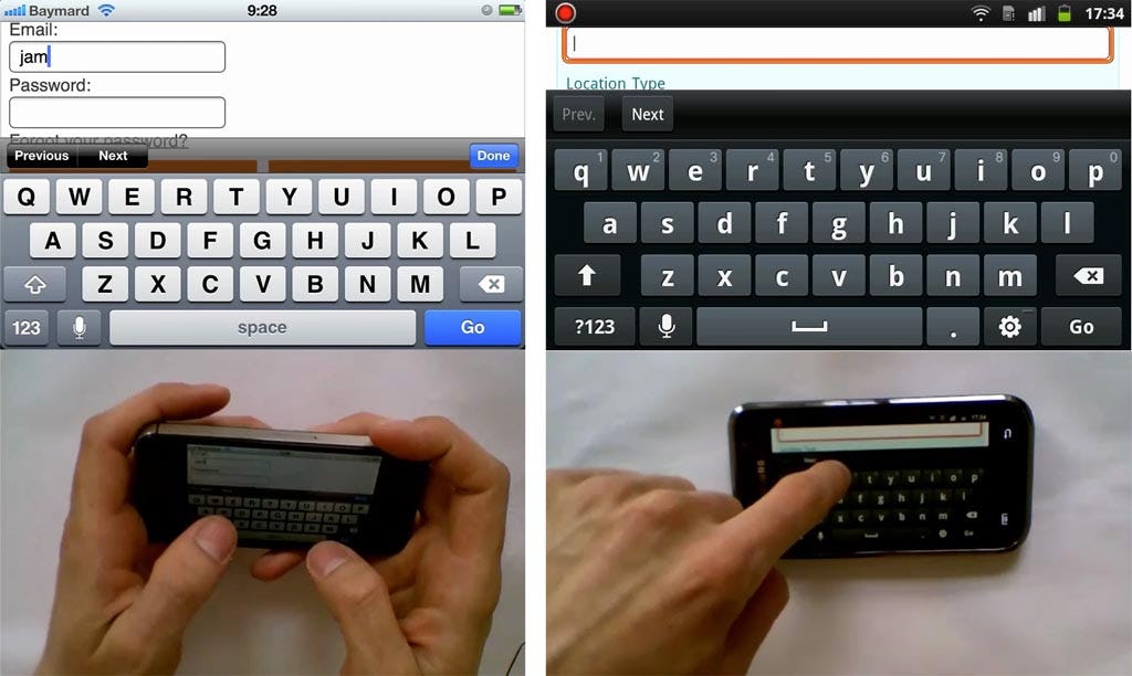
Now just look at those images again. With this little form context viewable the form gets very difficult to complete correctly. In the Android example the field label for the active field (that the test subject is trying to fill out) is not even viewable. This extreme lack of page and form context in landscape mode caused severe issues to the subjects. For instance, in the image to the left, the subject has begun completing the email field believing it’s a part of a checkout contact / address form he has to fill, not noticing that it’s actually the sign-in fields for existing customers with an account (the “checkout as guest” button is out of view).
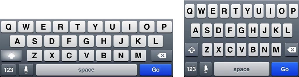
So why would anyone want to fill out forms in landscape mode given these constraints? Well, it is actually perfectly understandable, as the hit area of the keyboard’s letters increases significantly in landscape mode compared to portrait mode. For example, on an iPhone 4S the letter hit area increase by 32% (52px*76px versus 83px*63px), seen below:
Since there is a group of users that strongly prefers the larger touch keyboard, these issues of filling forms in landscape mode should be taken into consideration when designing for mobile. To better accommodate these users, you should consider dynamically changing the label position to be left-aligned when the device is turned to landscape mode. This includes repositioning any form descriptions, tooltips and input examples (possibly below the field, in close proximity).
The problem of too short fields where the input is truncated (which forced us to position the label above the field in portrait mode) is much less of an issue in landscape mode because the screen is so much wider in this orientation. This means there’s room enough for a left-aligned label and an input field that’s long enough to display most inputs (e.g. on an iPhone the ~300pts wide field we had in portrait mode when the label is above, still leaves ~150pts for the field label to the left in landscape mode).
Keep Input Visible Yet Maintain Context
Unlike the discussion of label alignment on desktop sites, which mainly concerns the best eye path for scanning the entire form page, on mobile, the issue revolves around fields being so short that the user cannot see their entire input when a decent sized input font is used. Not only making it very difficult to validate inputs before submission, but also even more difficult to correct them. Therefore, on mobile, the field labels should be placed above the field by default.
Yet the matter is complicated by enormous keyboards when the phone is in landscape mode, with only one third of the screen being dedicated to the actual form (and in some cases even less than that!). Therefore, to alleviate this extreme loss of page context, you should reposition field labels to be left-aligned in landscape mode.
This is a great example of how responsive design thinking can help us, even if we’re working on a stand-alone mobile site. Responsive layout adjustments like these can greatly improve the user experience of your mobile site, e-commerce or not.
You may take responsive design to the next level and dynamically decrease the input font-size a notch as the user’s input approaches the viewable number of characters (like YouTube did with their dynamic headlines). Imagine you have an input field which can display about 30 characters; as the user enters his 25th character you could decrease the input font-size by 10% so that the field would fit a handful extra characters.
Speaking more generally about mobile design, especially m-commerce design, this article illustrates just one of the many complications induced by the new interaction method mobile brings forth (touch input on a 3-4” rotatable screen), and offers a glimpse of how complex mobile e-commerce sites are to design.
This article presents the research findings from just 1 of the 700+ UX guidelines in Baymard – get full access to learn how to create a “State of the Art” ecommerce user experience.