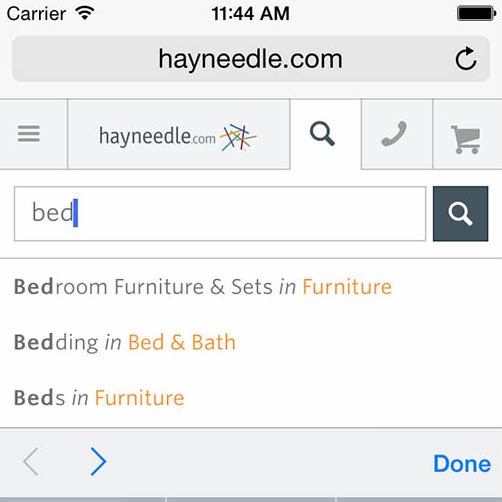

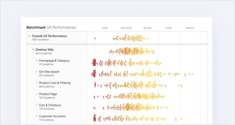
This article focuses on the mobile e-commerce ‘Checkout Process’ and ‘Data Input’. The above graph summarizes our entire benchmark dataset of 5,200 manually assigned usability benchmark scores, plotted across four themes central to mobile e-commerce.
In this second article in our mini-series on the current state of mobile e-commerce usability, we’ll dive deep into the mobile checkout flow and form field usability. (The first article explored the mobile e-commerce search and category navigation user experience.)
Despite the benchmark being based on the mobile sites of 50 major e-commerce sites, the average checkout process and data input (i.e. form fields) experience was seriously flawed. Indeed, many usability issues are so severe that they will prevent users from completing their orders.
Considering the substantial checkout usability issues we’ve been documenting for the past four years in our desktop checkout usability benchmark, it comes as little surprise that mobile checkouts are generally really poor. It’s an evil mix of the wide range of checkout usability issues that are universally applicable regardless of device, blended with the unique constraints of the mobile platform.

The usability tests and benchmarking revealed that “total order cost” is a supremely important topic during checkout yet many sites had poor implementations. For instance, notice how the delivery options on Costco (left) don’t include any information about the speed and cost of each shipping option, essentially leaving the user in the dark about what the differences are between these options. Compare this to Sears (right), where estimated arrival and cost of each delivery option is shown, making it very easy for the user to compare the options (e.g. “do I want to pay $8.50 to get this order by the 5th?”).
From the benchmark dataset of 5,000+ manually reviewed usability scores spread across the mobile sites of 50 major e-commerce sites, it is clear that the average mobile site suffers from severe checkout flow and form design usability issues. The vast dataset allows us to take a step back and view these issues at a broader level.
This article will look at those underlying patterns and general problem areas, and for good measure we’ve scattered a wealth of examples from our usability test sessions throughout the text as well, like the above.
Checkouts & Forms on Mobile
Each dot in the scatterplot represents the summarized score of one site across the 17-35 guidelines within each theme, with the black lines denoting the benchmark average. Red dots indicate “poor” usability, yellow indicate “acceptable” performance, and green denotes “good” usability. (Tip: the mobile benchmark page has an interactive version of this graph.)
When analyzing the benchmark dataset some interesting patterns emerge, exposing the most pressing themes in need of improvement to be the presentation of and interaction with total order cost, shipping options, and account features. There are also pervasive issues with form redundancy, lack of field descriptions, and deficient error messages. All these areas suffer from severe usability issues on the average mobile site, and will frequently lead to unnecessary checkout abandonments and frustrated users.
Considering the crucial nature of the checkout process to any e-commerce site (it is the one sequence of pages that every user must go through on your site in order to buy from you), it is absolutely unacceptable with flaws like this.
Luckily, not everything is in complete shambles. Some aspects of the user’s checkout and form experience are reasonably good, such as input functionality that takes advantage of modern smartphone capabilities, and touch keyboard usability has improved significantly since our 2013 review (Update 15. Feb 2016: article available). Users are generally also provided with a high degree of control over and editability of prior typed data and the average site has a decent Cart page.

This subject was among the 80% of tested users who were unsure which date “this Friday” was. So she decided to count the days on her hand, wanting to make sure she picked the right date. While users will be able to select dates without a graphical calendar interface, having it certainly makes the task a lot easier.
Yet even these areas are far from perfect – there’s still plenty of room for improvement, the improvements just tend to fall within the realm of tweaks and adjustments rather than being complete show-stoppers.
When reviewing your own site, we recommend a healthy dose of humility. If sites with millions of dollars in revenue frequently make severe design mistakes, even the greatest of design teams will probably craft a checkout and form experience that isn’t perfect the first time around.
So let’s take a closer look at the problem areas that sites tend to get wrong.
Mobile Checkout Usability Problem Areas

The performance distribution across the ‘Checkout’ sub-chapters. Red dots indicate “poor” usability, yellow indicate “acceptable” performance, and green denotes “good” usability, while the black lines denote the benchmark average. (Tip: the mobile benchmark page has an interactive version of this graph.)
When it comes to the checkout process, the most pressing issues are found within the themes of Total Cost, Shipping, and Account features.
Most users are very alert to the total order cost, as they intuitively know that the product cost alone is seldom the final order cost. Shipping, tax, and fees will often be added. While this is observed when testing on desktop environments as well, the lack of page overview and users’ hostility towards typing on mobile makes the concept of how Total Cost is addressed particularly important in the mobile context – yet most mobile sites don’t fully account for this.
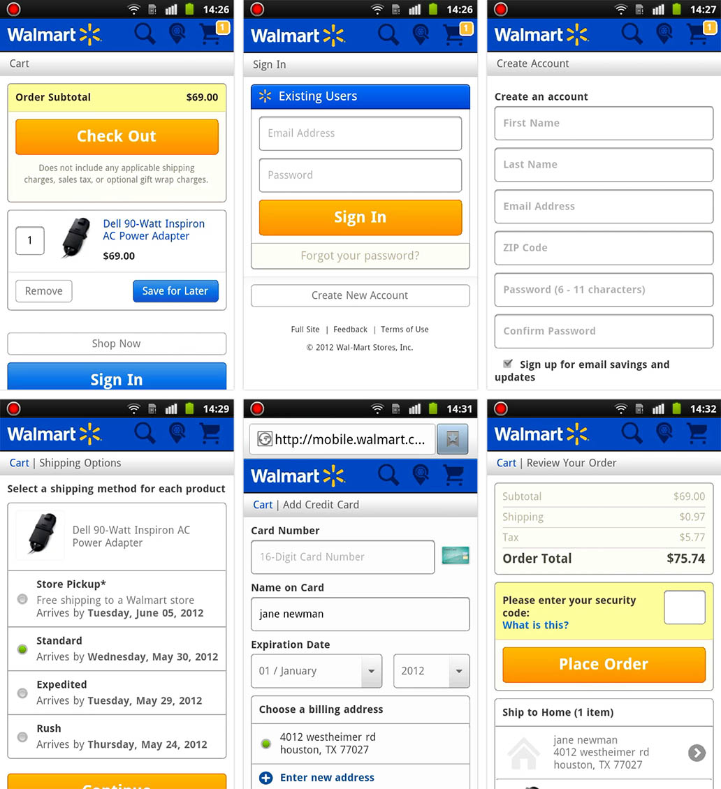
“But they don’t show the shipping price. I’ll just try and continue and see what they add… Argh they force me to go all the way, now I have to enter an address,” a subject explained at Walmart. Notice how the subject has to endure five checkout steps, including typing all his credit card details, before he is told what he will actually have to pay for his order.
For example, 33% of the benchmarked mobile sites fail to display the total order cost – at any point during the checkout – before asking for credit card data. In other words, users are forced to type their entire address and provide their card data without a good idea of how much they will be charged. This is obviously very harmful to the user experience, and during testing turned out to be a direct cause of abandonments as users couldn’t get even an idea of the true cost before being asked to type 10+ fields on a small touch keyboard.
The average site also performs poorly when it comes to Shipping. For instance, 24% of mobile sites don’t show cost and/or speed for all of their shipping options, requiring users to memorize options across multiple checkout steps. Similarly, out of the omni-channel sites that offer Store Pickup (or similar), 47% don’t display the Store Pickup next to the regular shipping options, resulting in the vast majority of the test subjects overlooking the Store Pickup option entirely. This ultimately leads users to overlook options or make undesirable selections during checkout on mobile.

“Normally I would think “guest checkout” would let me through without having to create an account. But here I have to fill in my mail, so I have no idea what that option then is for,” this subject explained when trying to checkout at Buy.com. Most of the test subjects had serious trouble using this page, and many actually ended up thinking account creation was required on Buy.com, even though it isn’t.
The worst-performing sub-chapter for the checkout flow relates to Accounts. While 80% of mobile checkouts offer users the option to do a “Guest Checkout”, 88% of mobile checkouts utilize a page layout that has a very high risk of users overlooking the “Guest Checkout” option – something which happened to 60% of the subjects during testing. Modifying the design of the account selection step is probably one of the most important “quick fixes” for the mobile checkout flow.
Luckily, it’s not all dark and gloomy in the world of mobile checkout processes. Surprisingly many sites have a decent – if not flat out good – Cart page. Also, users are generally provided good control over Editing & Verifying Inputs – which of course is essential as mistyping proved common during usability testing.
Mobile Form Field Usability Problem Areas

The performance distribution across the ‘Data Input’ sub-chapters. Red dots indicate “poor” usability, yellow indicate “acceptable” performance, and green denotes “good” usability, while the black lines denote the benchmark average. (Tip: the mobile benchmark page has an interactive version of this graph.)
Data Input is the general area of form usability, in particular form field usability with sub-themes such as Redundancy & Simplicity, Form Layout, Input Functionality, Field Descriptions, Touch Keyboard, and Error Messages. This is an area where the average site performs mediocre, and only a handful of sites perform well. If looking for mobile form usability inspiration, the best-performing sites are Nordstrom, Staples, and American Eagle Outfitters.
Redundancy & Simplicity is at the core of understanding the context mobile users are in. While typing data will never be enjoyable, particularly on mobile touch keyboards, the form design and features can go a long way in making it as simple and efficient as possible.

“Argh do I have to type all this once again,” this subject complained when he saw all the fields for his shipping address. He selected “Same as billing address” just above the fields but thought he still had to fill in the shipping address fields – why else would they still be there?
While eliminating redundant typing and selections would seem obvious when designing for the mobile platform, the average performance within Redundancy & Simplicity lands somewhere between “acceptable” (yellow) and “poor” (red). It’s worth noticing the distribution of sites, though. More than a third of sites perform “good” (green), whereas a handful of sites completely neglect any notion of simplifying data input – resulting in the poor overall average. Oversights are abundant, for instance:
- 16% of sites, by default, show twice as many address fields as is necessary by showing all users two separate sets of address forms for billing and shipping.
- 28% of sites ask for the same information twice, instead of pre-filling fields where possible,
- 30% have an input for credit card type instead of auto-detecting it based on the typed card number,
And the list goes on. These are all opportunities to reduce input complexity, potentially affording the user just a small sliver of overview and simplicity.

Notice how Kohl’s requires the user to open a drop-down and select their card type, while sites like Crate & Barrel simply auto-detect it based on the user’s card number, saving the user from this selection process. This kind of card type auto-detection can be done by parsing the IIN range of the card number provided by the user.
Form Layout performance is marginally acceptable. This time, though, there are only a few sites performing well, with the majority of sites split between acceptable and poor. During the usability test sessions, the form layout was observed to set strong expectations for the relationship between form fields. Unfitting form layouts caused misconceptions about what a specific page, form, or button was for.
Most sites generally have a decent Input Functionality performance. Input features such as using the phone’s location (e.g., for store lookup), etc., reduce unnecessary fiddling with the phone during inputs. One tweak that 80% of sites still lack, however, is the use of auto-complete inputs instead endlessly long drop-downs for country and state selections.
The Achilles heel of mobile form usability, however, is Field Descriptions, where the average site performs poorly, with several sites having directly harmful implementations. The lack of page overview on mobile, especially with the touch keyboard open, sets very strict requirements for clear labels and descriptions. Multiple site abandonments were caused as users got completely stuck when faced with an input field where descriptions either weren’t in close proximity (e.g., placed elsewhere on the page) or weren’t present at all.

In landscape mode, page context gets pretty minimal once the touch keyboard is activated. This is a screenshot from an iPhone 5s running iOS 9.1 tilted in landscape mode. The touch keyboard takes up a whopping 70% of the screen, leaving the user with just enough viewport to see 1-2 fields at a time, depending on the form layout.
As a rule of thumb, users must be able to complete each field as a separate task with all necessary content in close proximity, as they will often not be able to see anything else on the page while typing. The oversights are numerous, but the most severe missed opportunities include:
- 94% do not consistently indicate both required and optional fields, forcing users to guess which fields they have to fill or do extensive scrolling to reach prior fields – see Mark Both Required and Optional Fields Explicitly.
- 60% do not provide formatting examples or use input masks for inputs where there are multiple formats – see Add Descriptions To Checkout Form Labels
- 65% induce privacy concerns by not explaining how seemingly unnecessary information like phone number will be used and why it is required – see Don’t Require Seemingly Unnecessary Information
- 38% use inline labels that may look sleek but cause a host of interaction issues as we’ve reported on multiple times. A better alternative observed during mobile testing is to place the label above the field to allow for the important full width field.
Touch Keyboard support has improved significantly since 2013, where we benchmarked touch keyboard implementations as well. This makes Touch Keyboard the only sub-area of Data Input where the average site performed well, with several sites having perfect implementations. Over the next weeks we’ll do a future article on how touch keyboard support have matured since 2013 and which areas of improvement still remain.

This subject first entered her phone number but included spaces which provoked a validation error. While this should not cause a validation error at all, the error message itself should at the very least tell the user what the problem is. In this case, the subject thought she might need to add a country code, but that also did not work (middle image). She then removed the country code but during editing, accidentally removed another digit too. So while the phone number was now formatted correctly, it only had nine digits. Alas, at this point the test subject no longer trusted the error message as it had told her the exact same thing for all three input variations, so she instead concluded the site was “broken” and abandoned her purchase.
The average site has a downright poor Error Message experience. This is baffling, because while errors (hopefully) don’t occur for every user, each validation error occurrence is very severe when they do happen, as users are interrupted and technically blocked from completing their order until they’ve resolved the error (usually an input they filled out wrongly the first time around). Yet 92% of sites use the same generic error message “invalid [phone/email/security code/..]” regardless of the error and don’t tell user exactly why it’s wrong and how to correct it – i.e. no use of Adaptive Error Messages.
Furthermore, for shipping addresses, 39% don’t use a recommended address validator, while 18% of the sites that do have an address validator don’t offer a force-proceed option and thereby technically blocks users from purchasing if the validator doesn’t recognize their address (see Validations vs Warnings). This leaves Error Messages as one of the most important areas of improvement for the average site when it comes to Data Input.
Usability Fundamentals Change Slowly
The biggest mobile-specific challenges to overcome in creating a user-friendly mobile checkout and form field experience are:
- Slow and error-prone typing induced by touch keyboards.
- An extreme lack of page overview caused by small screens and touch keyboards taking up as much as 50% of the user’s already tiny viewport.
- The lack of user-focus-hints making attention-based interface adaptations tricky (e.g. lack of hover state, no information about potentially covered parts of the user’s screen, etc).
Throughout this article we’ve seen how various design elements suffer under these three mobile constraints. Long-time readers may notice that these fundamental design challenges correlate well with the 8 design limitations we outlined for mobile all the way back in 2012 – even if three-and-a-half years seems like a century in the rapidly-developing space of mobile devices and designs.
It turns out the mobile platform follows the same fundamental usability trajectory of all other platforms: design trends tend to come and go quickly, and new features may be added frequently, but the fundamental usability challenges of and and user behaviors on the platform often take decades to change. (While we’re not going to write a third article on it, we continue to observe users double-clicking online – even though you’ve never had to double-click a link online, ever!)
Similarly, the extreme lack of page overview on mobile and all the user behaviors and usability issues this provokes will likely continue to be an issue on the mobile platform for years to come, even as the industry continues developing at unhinged speeds. Yes, it will improve over time, just like fewer and fewer people double-click online with every year that goes by, but it will take time.
These fundamental challenges are not solved overnight, which is why creating designs that take them into account is so essential to crafting a great mobile user experience for today and tomorrow.
This article presents the research findings from just 1 of the 650+ UX guidelines in Baymard Premium – get full access to learn how to create a “State of the Art” e-commerce user experience.