This is the 7th in a series of 8 articles on mobile usability that draw on findings from our mobile e-commerce usability report.
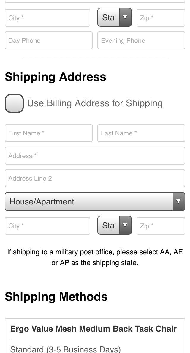
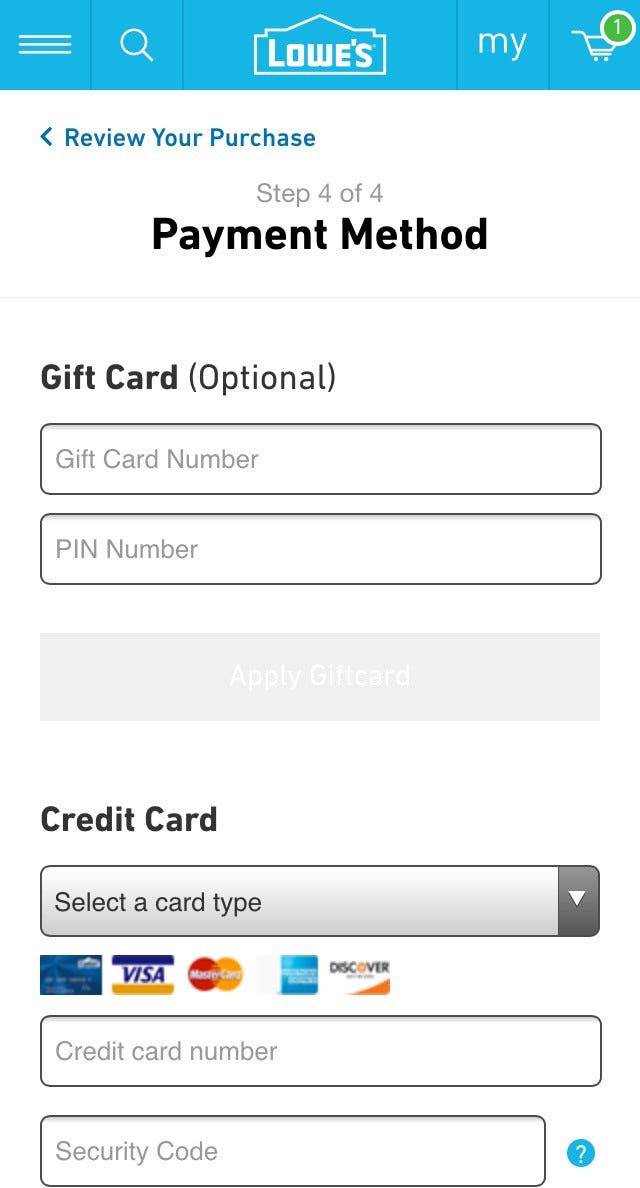
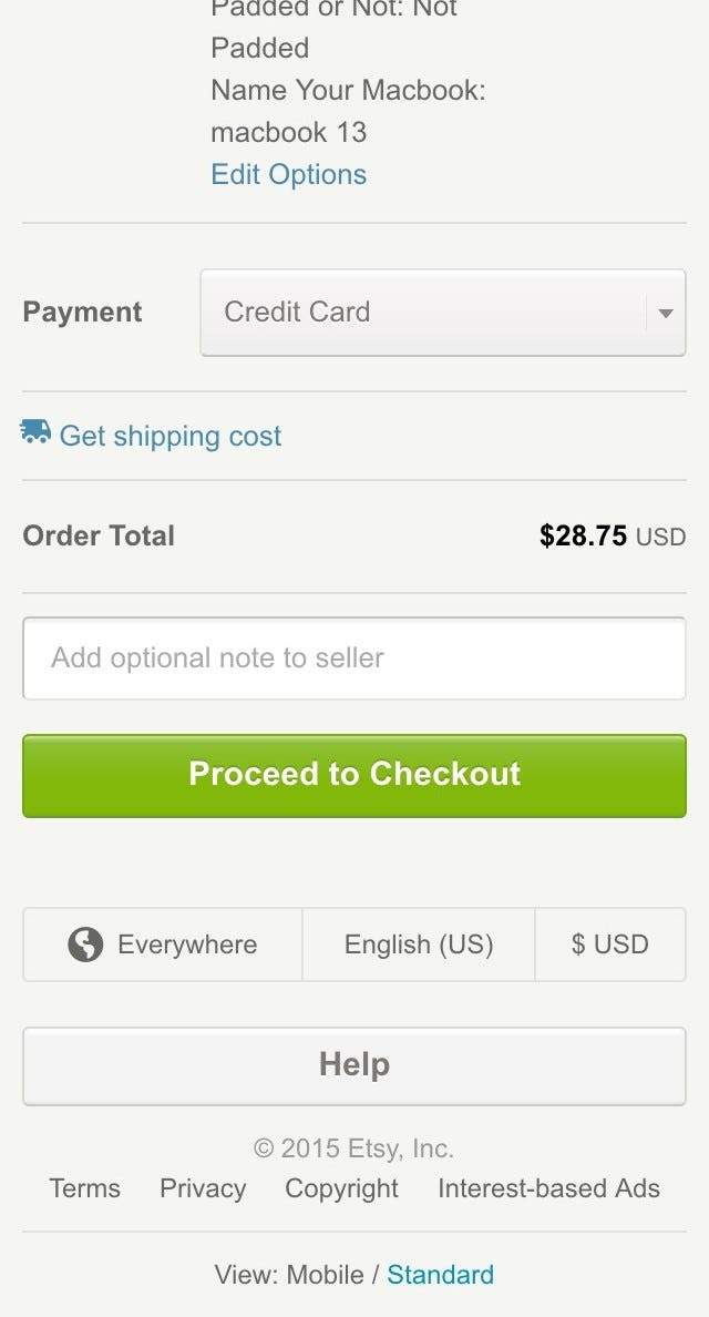
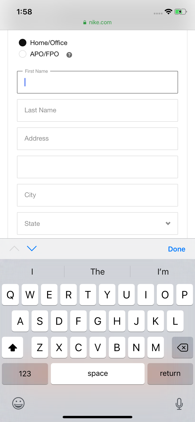
Labels placed inside the form field (aka “inline labels”) are widespread in mobile apps and sites — almost to the point of being a best (mal)practice. Yet in every usability test we’ve conducted inline labels have suffered from major usability problems. Mobile included.
Perhaps the popularity of inline labels on mobile is due to Apple’s extensive use of them, or the great simplistic look they afford, or their space efficiency — most likely it’s a combination of all those factors. And while good looks and space efficiency are valid benefits of inline labels, these are by far outweighed by the major usability drawbacks of inline labels, the most significant of which is the loss of context.
The Problem with a Lot of Mobile Form Design
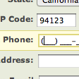
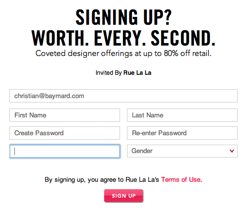
Example of fields with and without labels. Ultimately the label is the only thing that makes one field unique from the next.
At their core, form fields are all alike when it comes to designing forms. They are rectangular boxes on the screen. What distinguishes one field from the next is its label — the label is the defining context for that box.
The problem then arises when the label disappears (as inline labels do when users begin typing, and in some cases even upon entering the field) — suddenly the only context for the field is the user’s own input.
This not only makes it more difficult for users to fill out the fields, it also makes it much more difficult to correct any validation errors they run into.
During the mobile e-commerce research study we observed numerous users struggle with fields that had inline labels. This echoed what we observed during our e-commerce checkout research where users also struggled with inline labels — only the problem proved even more severe on mobile.
During the mobile e-commerce study, inline labels caused severe flow and typing issues and on validation errors the users often deleted their entire input just to see the label again. In a few instances these issues were so severe the users abandoned the site.
Inline labels are a prime example of false simplicity. They look simple, but are in fact very tricky to use. This is especially true when it comes to fixing validation errors.
At Fandango, many users during testing were unsure what to do when they received an error stating “Houston” was an invalid location. Note how, due to the inline label disappearing, users have no context for how they might resolve their error.
For example, during the study, we observed multiple users enter “Houston” as their search query at Fandango, however, this returned a cryptic validation error: “Please enter a valid location.” Why on earth would Houston be an invalid location? Well, it turns out the inline label says “City, State OR Zip Code”, so users will have to write “Houston, Texas”. However, because the inline label isn’t visible anymore, the user has no way of knowing this.
Of course a better error message would have helped too, but being unable to see vital context for the field forces the user to either guess or delete their entire input just to see the label again.
Which of course were the two courses of action the users resorted to — quite understandably to great vexation.
Exceptions
It is this loss of context which makes inline labels a poor choice in most cases. However, there are a few instances where inline labels do have merit.
At Amazon (first image) and LinkedIn (second image), the loss of context caused by using inline labels is much less egregious, as there’s only a single field or two fields to complete.
When there’s only 1–2 fields (for example a search field or perhaps a sign-in form) the user will rarely forget the context as the entry type is singular and frequently executed.
However, as soon as there are more fields, different types of data are needed, or the fields are used infrequently inline labels become problematic. Also, if there are requirements for the field input, inline labels are typically a poor choice even if it is only a single field, as the earlier Fandango “Houston” example illustrates.
It should be underscored that inline placeholder text in and of itself isn’t bad (in fact, it’s a great feature) — it just shouldn’t be used for the primary label. Instead, inline placeholder text is perfect for brief descriptions that may help frame or further clarify the field’s context without being necessary to understand it.
Formatting examples are a good example of where, even though you should accept all formats, it is still a good idea to provide an input example because the user can’t know that you accept all formats and will want to use a safe format to begin with (that is, a formatting example informs the user of what they can safely use).
For example, a phone field in a sign up form should have “Phone number” written as an independent (permanently visible) label and then have, for example, “315 415 7777” as inline placeholder text.
The Exception to the Exception
Inline labels shouldn’t be used for drop-downs either. A great deal of sites with list-sorting features have the label “Sort by” as a drop-down option (in effect an “inline label”) as opposed to a separate permanent label. Despite the sorting drop-down being a single field, this particular type of inline label caused problems during testing.
When users tested 1-800-Flower’s mobile site, some thought the drop-down label “(sort by price)” meant that the list was already sorted by price — even though it clearly wasn’t. It was only after opening the drop-down field that the users realized that “(sort by price)” was the label for the field and not the current sorting.
Users can’t be expected to minutely study labels in order to figure out their meaning — rather the text is hastily scanned to form a quick understand of the interface. As a consequence, when embedding the label as an option in drop-downs, it is easily (mis)interpreted for the current / selected sorting, and this type of inline label should therefore be avoided despite the sorting drop-down being a single field.
Avoid Using Inline Labels in Forms
In summary, the general advice is to avoid inline labels in forms.
The exceptions are single standalone fields or “singular-purpose-two-field-frequently-used forms”, where inline labels may be used if space efficiency and aesthetics are significant concerns.
In the case of drop-down fields or regular text fields where there are input requirements (that may yield validation errors upon submission), the field should always have a separate permanently visible label regardless of the number of fields.
In longer forms of three or more fields, separate labels should always be used too, to ensure the user has the necessary context at hand when filling out the form.
When separate labels are used, the inline placeholder text may be used for formatting examples or other brief descriptions that can help guide the user without being necessary to understand the field.
A final note: some sites are experimenting with “Floating Labels” and similar concepts, where the label sits inside the field but then floats to the top of the field when the user begins typing.
This solves the context issues of inline labels and the pattern thus shows promise. It is, however, worth noting that there’s currently no in-depth usability testing available on the performance or potential side effects of this design implementation.
If experimenting with floating labels or similar designs, it is recommended to pay special attention to the form validation error experience, since many of the “early adopter” sites with Floating Labels haven’t implemented the validation error state very well. Typically, these sites only allow room for very short or no error messages, which is highly problematic. Therefore, make absolutely sure you take great care in implementing the error message state if deciding to pursue a floating label design.
This article presents the research findings from just 1 of the 700+ UX guidelines in Baymard – get full access to learn how to create a “State of the Art” ecommerce user experience.

