
Here’s a simple test: pick up a standard business card. Judge its size. What you’re seeing is roughly the same size as the frame your mobile users have available to view your entire mobile site.
And when it comes to the mobile checkout experience, you should fold that business card in half as the touch keyboard will take up close to 50% of the available screen space in portrait mode. If the user is in landscape mode the landscape keyboard will take up 70-80% of the screen.
Throughout all our usability test sessions of mobile checkouts this extreme lack of page overview was observed to have severe implications on the user’s checkout experience and their ability to even complete a mobile purchase. Users simply get “lost in the page” – especially when filling out forms.
Therefore, to account for this lack of visible context and page overview in your mobile checkout and payment design, closely consider the following 6 mobile checkout insights:
1) Fields Are Out of Context
When users lose their overview of the page they often tend to focus on each form field as a separate isolated task to complete, and not so much a part of a large whole (as they more often do during the checkout process at desktop sites).

It’s therefore critical that all the field labels can be read and understood when read out of context. For example, a label shouldn’t simply read “Phone”, even if placed within a “Billing Info” section header, but should instead be completely context-independent and read “Billing Phone”. This of course goes for any type of field, so it should similarly be “Gift Certificate Pin” instead of just “Enter Pin”, and so on. This way, the user can fill out the form field regardless of whether they remember its context (which is often out of view).
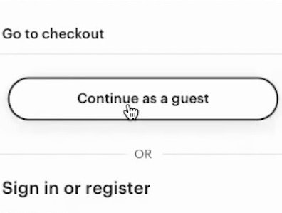
2) Account Selection Step
More than half of the test subjects (60% to be exact) had serious trouble identifying, seeing and selecting the guest-checkout option at the account selection step during checkout. To simplify the initial page impression and set the right expectations of what the user should do at a given step, consider using the principles of progressive disclosure and dynamically collapse the content.
For example, at the account selection step, instead of having 3 separate headers for “Sign-in”, “Create account” and “Guest checkout,” each with their respective fields shown, simply collapse all the content and show 3 clickable headers. This allows the user to instantly get a complete overview of all the available options (“there are three paths you can take, which direction would you like to follow, sir?”).

A simple mock-up showing how all three account-selection options can be displayed in collapsed state (with guest checkout at the top), so that the user can instantly get an overview of all the available options.
See further examples and explanation of the account-step issue in our guest post at Smashing Magazine, Exploring 10 Fundamental Aspects Of M-Commerce Usability (section #6).
3) Basic Mobile Form Usability
The checkout process is dominated by form fields, so naturally any form field usability issues will tend to cause trouble during the checkout process. Some of the most severe issues that arose during testing were due to basic mobile form usability issues such as:

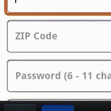
a) Users not being able to see their typed input because the field label was placed to the left of the field, making the field itself too short. For this reason form field labels on mobile should always be placed above the field (except when in landscape mode), as outlined in Mobile Form Usability: Place Labels Above the Field.

b) Users not being able to see the field’s context due to the use of inline labels. While inline labels look simple, they are in fact a perfect example of false simplicity: visually simple but complicated to use. The major usability issue is that the label disappears as the user begins typing (or in really poor implementations, as soon as the field receives focus, see first image), but the issues extend to validation errors (see second image) where users will often have to delete their input just to see the label again, as further described in Mobile Form Usability: Never Use Inline Labels.

c) Users having to endure needlessly many field interactions due to inputs being split into multiple form fields. While the intention of wanting to indicate the desired input format is great, it ends up creating needless friction as it requires an inordinate amount of field interactions. Therefore, make sure you have just a single phone number field, zip code field, and a single “full name” field, as outlined in Mobile Form Usability: Avoid Splitting Single Input Entities.
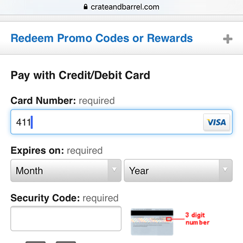
4) Inline help

“This CVV2, I have no idea what that is. On some sites there is a small help to click – but it’s not here. I think I would call my son and ask him.”
Even with context-independent labels placed above the field, users may still become doubtful about certain fields if a set of basic questions aren’t answered. These doubts range from the very severe “What is being asked for?” (seen above), to privacy concerns “Why do you need it?”, to input formatting “How should I format the input?”. Unclear field labels remain one of the most important aspects of both mobile and desktop checkout form usability, alas, it is also one of the most neglected facets with 92% of top 100 desktop e-commerce sites still having room for improvement. For the 15+ most common pitfalls see Add Descriptions To Checkout Form Labels (92% Get It Wrong).
Furthermore, in a mobile checkout, any descriptions, help and field clarifications, must be placed exactly where the doubt is likely to occur. Instructions placed at the top of the page proved to be of little value during testing as the subjects simply overlooked it (again due to the extreme lack of overview described in the introduction). This makes inline help such as click-based tooltips and form field descriptions vital.
5) Optimize For Touch Keyboards
Form usability can be greatly improved by leveraging the various input-optimized touch keyboards available (e-mail, phone, etc). Yet, of the top 50 mobile optimized e-commerce sites, 60% fail to utilize 2 of 5 keyboard optimizations. During our usability testing, this resulted in checkout experiences dominated by validation errors, and even orders submitted with erroneous data.
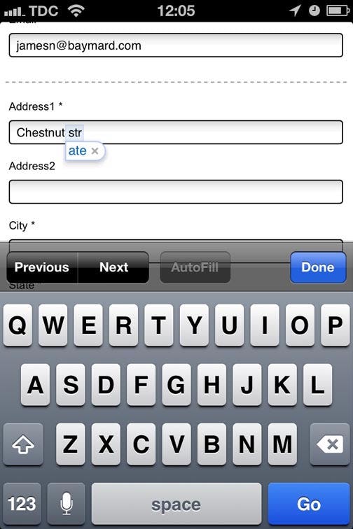
At HP, ‘str’ is auto-(in)corrected to ‘ate’ because they haven’t disabled auto-correction.
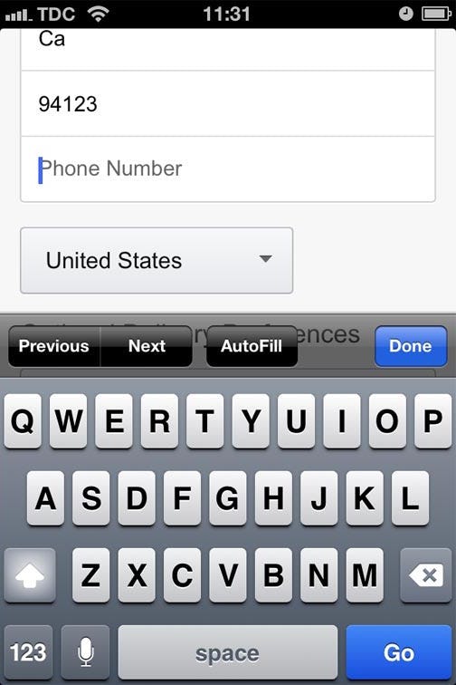
At Amazon, the standard alphanumeric keyboard is displayed instead of the phone-optimized keyboard.
Using these touch keyboards is technically very simple – the difficult part can be to identify all of the candidate fields across a large website. We’ve made a Touch Keyboard Cheat Sheet showing how to set the best combination of keyboard type, inputmode, autocorrect="off", autocapitalize="off" and novalidate for checkout fields such as name, phone, credit card number, address, e-mail, etc. (it also includes a touch keyboard benchmark of the top 50 mobile commerce sites).
6) Auto-detect as much data as possible
Typing on the small touch keyboard is both slow and very prone to errors. So whenever technically possible, auto-detect and auto-complete as much as you can. For country selection this can be IP geo-targeting or at the very least an intelligent country auto-complete.

“This is the sort of thing I really like. Now we’re talking. I don’t know how they did it, but I’m glad they are giving me the option of selecting ‘Houston’ rather than typing it,” a subject rejoiced during checkout at 1-800-Flowers (he had submitted his zip code at an earlier page and 1-800-Flowers used this to suggest a city and auto-select his state)
Things like state and city name can often be auto-detected based on the user’s ZIP-code, so simply ask for user’s ZIP code first and then pre-fill the state and city fields. Luckily there are two freely available plugin’s for just this: Ziptastic and Zippopotam.us
Mobile Checkouts
When designing a mobile checkout think back on that business card. Your users will have to go through a number of pages and fill out a bunch of form fields all within that tiny area, and they typically have the touch keyboard open which cuts the available screen real estate in half! These 6 recommendations are a good place to start in order to deal with this extreme lack of page overview that your users suffer under during the mobile checkout process.
When you have a decent mobile checkout design up and running be sure to test it extensively internally, but also externally, preferably on users within the target audience, using their own device in a realistic context (e.g. at home on the couch). This allows you to uncover issues related to site, audience and context, which are hard to uncover otherwise.
This article presents the research findings from just 1 of the 700+ UX guidelines in Baymard – get full access to learn how to create a “State of the Art” ecommerce user experience.