Update: Read a newer version of this article here.

This is the 4th in a series of 8 articles on checkout usability that combine findings from our checkout usability study and benchmark of the 100 largest e-commerce sites.
Of the top 100 grossing e-commerce sites, 14% use accordion style checkouts. In fact, just after we conducted the checkout usability benchmark yet another of the top 100 sites switched to an accordion style checkout (J.C. Penny). Clearly accordion checkouts are gaining popularity among top e-commerce sites, perhaps most famously by Apple.

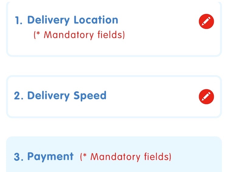
Accordion style checkouts refer to a checkout process in which each step expands as you progress throughout the checkout, with the past steps often collapsing into summaries of previously entered data.
Are Accordion Checkouts Better?
When asking a similar question a year ago for one-page checkouts, we concluded that one-page checkouts aren’t the holy grail of checkout usability. The same goes for accordion checkouts. An accordion checkout can be truly great, but just redesigning your existing checkout in an accordion style won’t make it particularly easy to use in and of itself (although it might look good). It’s what the customer is required to do at each step that makes or breaks the checkout experience.

On average, accordion style checkouts scored 19.2% better in the checkout usability benchmark compared to their traditional counterparts. However, the 14 accordion style checkouts in the benchmark still spanned the entire range from absolute top (American Eagle Outfitters, rank 7) to absolute bottom (Talbots, rank 94), so clearly it isn’t a sure-fire shortcut to good usability. It’s still much more important what you ask your customers to do during the checkout (as well as how you ask them), rather than if it’s a one-page, accordion style or traditional linear multi-page checkout process.
Perceived as Multiple Discrete Steps
During our checkout usability study, the test subjects clearly experienced accordion checkouts as a multi-step process – a perception that was confirmed in our mobile e-commerce study as well. This is in some cases opposite to the conceptual philosophy and technical implementation of accordion checkouts, where the author sees the process as a single page with dynamically collapsing and expanding sections. However, with a new set of form fields and instructions for each section / step it should come as no surprise that users perceive it as multiple discrete steps regardless of the technical underpinnings of the site.

Users perceive accordion checkouts as having multiple discrete steps, which sometimes clashes with the conceptual and technical implementation of sites owners.
Such a disconnect between user expectations and technical implementation can have dire consequences. For example, during our m-commerce study we saw mobile sites such as footlocker.com with an accordion checkout that was technically implemented as a single page. When a test subject hit the browser back button at checkout step 4 (payment) she was sent all the way back to the cart and had to re-enter everything again. This lead to multiple test subjects abandoning the checkout. While this is clearly a poor technical implementation, that could be solved by constantly saving data against the server. However, it is also a poor conceptual implementation, because even if they had retained all the entered information, the test subjects still expected to return to step 3, not the cart.
So if you’re considering an accordion style checkout, make sure you design for multi-step behavior such as returning the customer to the previous accordion section when they use the browser back button as well as storing data during each step-transition.
Expanding on Existing Usability Findings
Our findings seem to align fairly well with those presented by Luke Wroblewski – accordion checkouts aren’t a magic bullet, they neither add or subtract significantly from the usability of your checkout form. However, Luke W. describes accordion style forms as a single page with interactive sections. As discussed in this article, the test subjects in both of our studies displayed a different conceptual understanding of accordion forms: they perceived them as a multi-step process, and thus exhibited “multi-step behavior” such as trying to use the browser back button to return to the previous accordion step / section.
This conceptual divergence may be explained by the test environments – our studies were conducted on real production sites with lots of clutter around the accordion form which easily distracted the subjects. Wroblewski tested mock-ups without any surrounding elements which possibly allowed the subjects to focus solely on the form, which would have made it more likely for them to pick up on this conceptual nuance.