After having written an article on e-commerce checkout design for Smashing Magazine I got a question from Ryan asking about the “controversy of multi-step checkouts vs. one page checkouts”.
Are one page checkouts truly better?
A/B studies do exist where one page checkouts outperform multi-step checkouts significantly. However, these cases often compare a non-optimized multi-step checkout with a new optimized one page checkout.
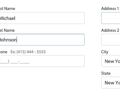
During the research for our checkout usability report we found that users in general had relatively few problems navigating between multiple steps (as long as a few simple guidelines are adhered to) - the usability issues were primarily caused by what the customer had to do at each step.
When A/B testing a non-optimized multi-step checkout (being A) against a one page checkout (B), I’d say if a C version were introduced that took precisely the same form fields as the one page, but split test it across two pages (address on page one, credit card details on page two) - there wouldn’t be much, if any, difference in abandonment/completion rates between B and C.
Why one page checkouts are still a very important concept
There are however 2 very important reasons that one page checkouts are so ‘popular’ to discuss and strive for in e-commerce design.
1) It’s easy to talk about
It has a name, which makes it easy to talk about. This might sound obvious but it’s actually quite important because it gives people a concept to reference. A concept that conveys of simplicity and ease-of-use for the customer.
While it’s true that a one page checkout can be more complex than a 3-step checkout, it’s simply not as easy and persuasive to try and sell “a very lean and well thought out, 3 step checkout process” to management.
2) It makes tough decisions easier
Due to the nature of one page checkouts, it’s often easier to internally agree on limiting the features that go on the checkout page. This is especially important in larger organization where there’s often multiple agendas and friction between departments.
Making drastic decisions such as cutting away features and form fields from a current multi-page checkout can be very difficult. But if the organization’s goal is clear and ambitious: “cutting our 4 step checkout down to a single page” then the difficult decisions of removing features and form fields become much easier, as everyone can easily see how crammed and cluttered the one page would otherwise be.
Conclusion
While a one page checkout won’t necessarily perform better than a comparatively optimized multi-step checkout, one page checkouts are still important as they can make the checkout optimization project easier to discuss and implement.
Image by Michael Whay