Key Takeaways
- Many accordion checkout designs only show step headers when completed
- This forces users who want to review inputted data to reopen previously completed steps
- Collapsing completed steps into summaries resolves the issue
Across multiple rounds of Baymard’s checkout testing, we’ve repeatedly observed participants rely on order summary information to verify their data and selections.
However, unlike traditional multistep checkouts, accordion-style checkouts (where users progress through individual expanding and collapsing sections of data entry) often lack a separate order review step, which is critical for allowing users to fully verify their previously entered data and selections before finalizing their order.
Effectively, without an efficient way to review order information, users of accordion checkouts may hesitate to submit their order or waste valuable time and effort revisiting previous steps.
Yet the accordion checkout can meet the needs of users looking to review their information by collapsing accordion steps into summaries — but many of our test sites failed to support this implementation.
In this article we’ll discuss the following Premium research findings:
- How collapsing accordion steps into just the headers fails to meet users’ needs
- How providing a summary of a just-completed step alleviates the issue
- 1 “Back” button pitfall to avoid for accordion checkouts
How Collapsing Accordion Steps into Just the Headers Fails to Meet Users’ Needs
Across multiple rounds of checkout testing, we’ve consistently observed participants in multistep checkouts reference both running order summary information and order review steps to double-check previous selections or entered data, sometimes finding critical errors that need to be corrected.
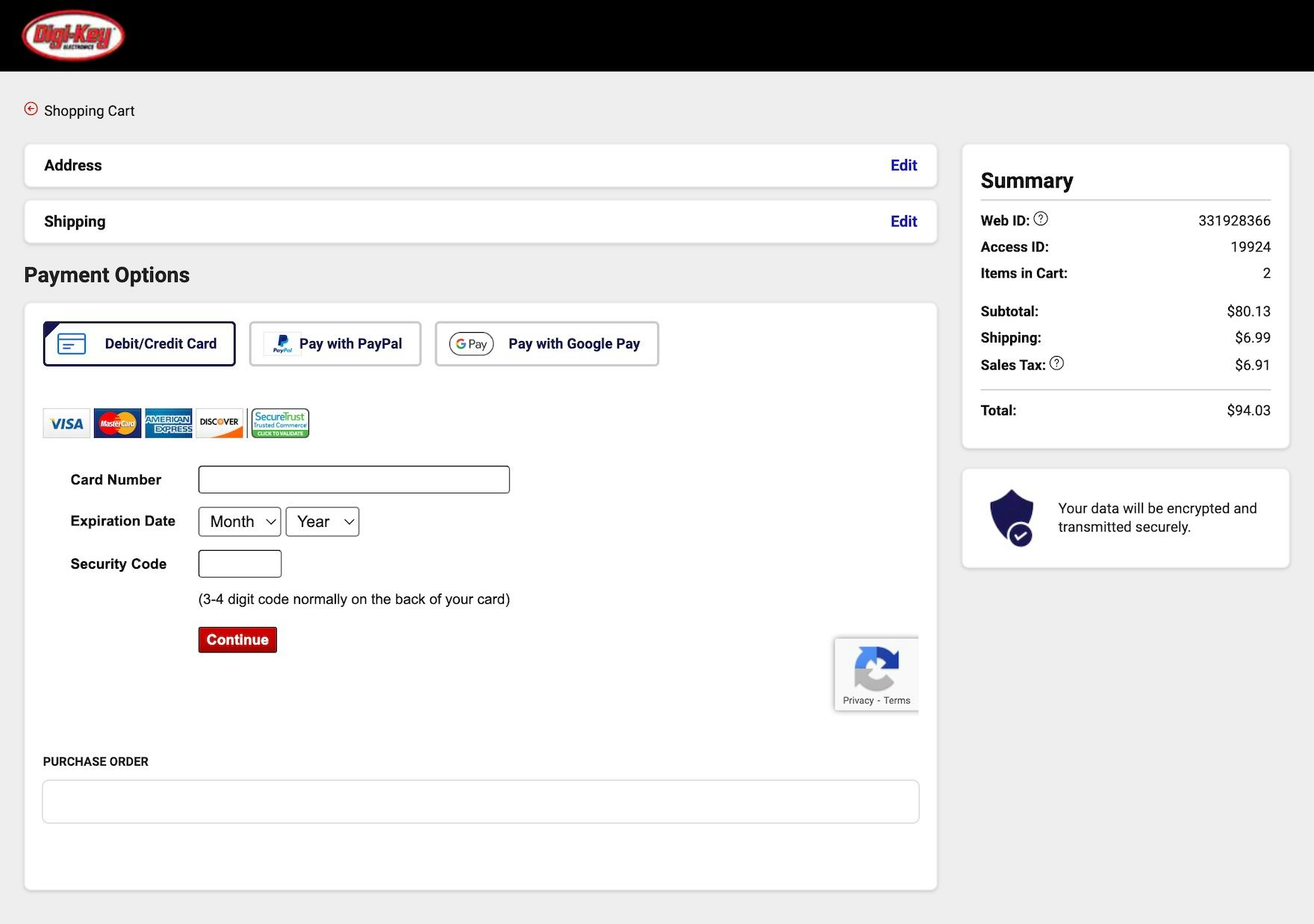
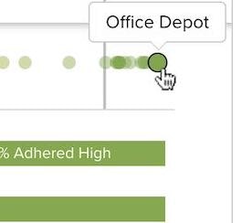
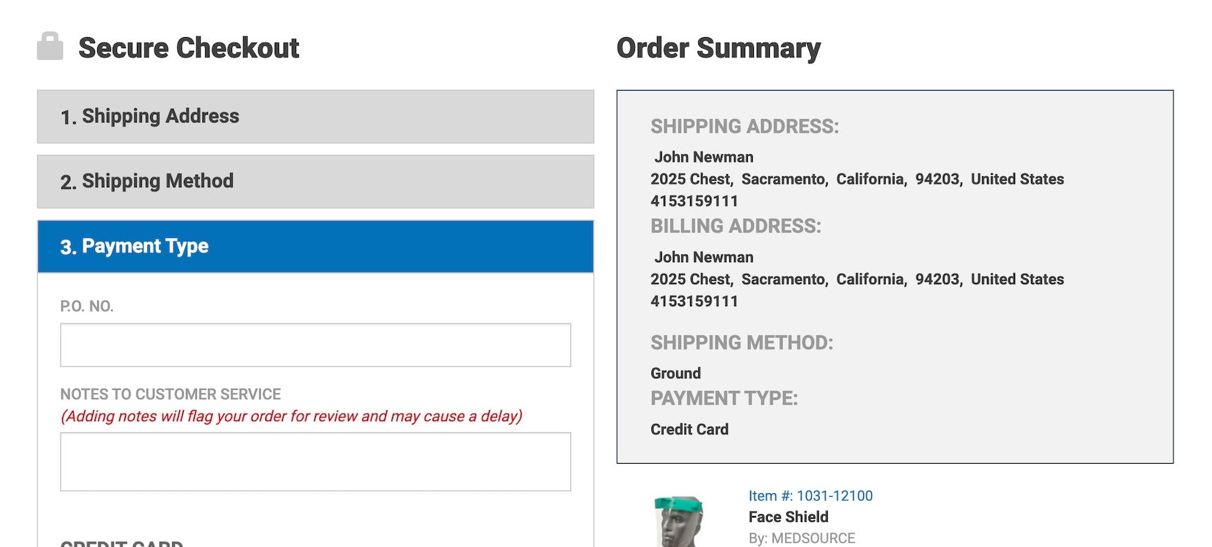
At Digikey, previously completed sections of the accordion checkout do not provide a clear summary of entered information, limiting users’ ability to use the final step of checkout as a true order review summary.
Users in accordion checkouts have a similar need to double-check their inputs.
However, a few test sites made this unnecessarily difficult, as the collapsed, previously completed steps only displayed the heading of the completed section (e.g., “Shipping Address”, “Payment Details”).
When only the section header is provided, users must reopen completed steps in order to review their information.
This adds friction to the accordion checkout, as users have to click “Edit” or a similar link for the step they want to review, wait for the step to open, review their information, and then exit the step to continue checking out.
Users at The Entertainer must tap to reopen previously completed checkout steps to review their previous input, increasing the effort required to simply double-check their information.
On mobile sites this process will be even more arduous, as users must avoid mistaps when trying to tap a link and the limited viewport often makes orientation difficult.
Finally, users who wish to thoroughly double-check all their order information must revisit each previously completed accordion step, manually opening them one-by-one to review each step individually.
This unnecessarily extends the amount of time required to finalize the order and increases the risk of users eventually abandoning (e.g., if the site is slow or has other technical bugs) that compound the issue).
How Providing a Summary of a Just-Completed Step Alleviates the Issue
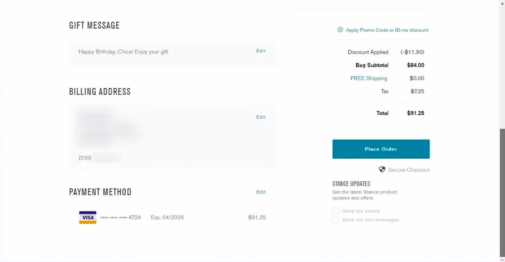
“Okay, so then I’m just reviewing everything, making sure it’s correct.” This participant at Stance quickly reviewed all previously entered data on the final step of the accordion checkout, looking over the previously completed section summaries.

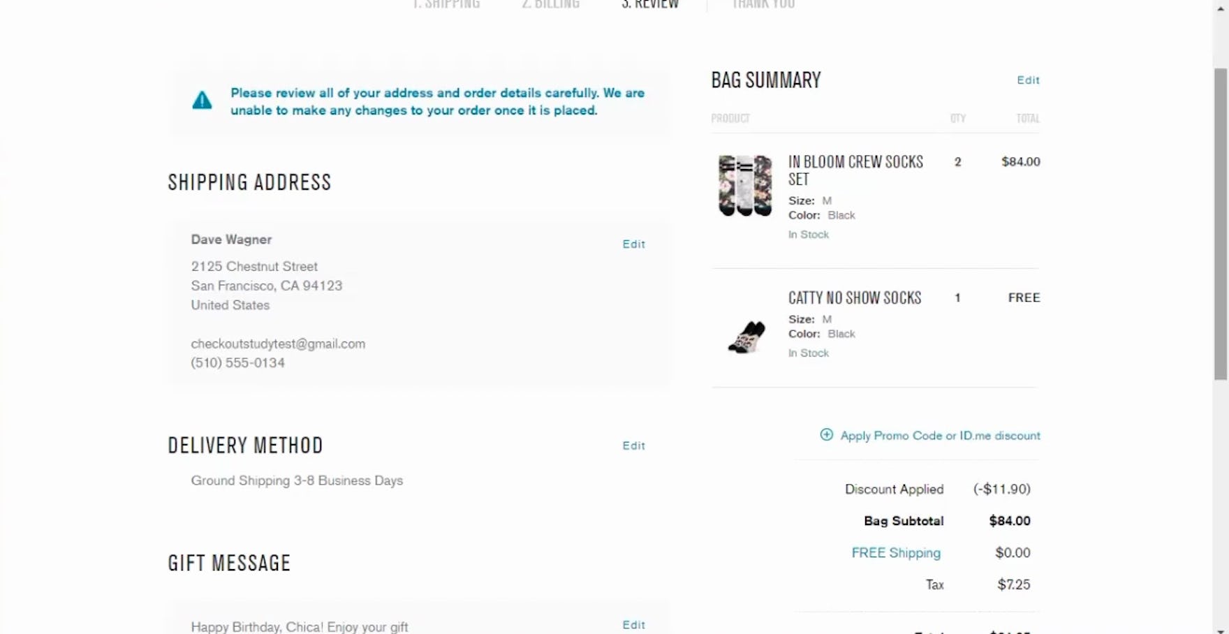
The accordion checkout at Everlane provides a clear overview of previously entered data, allowing users to review their order information as they go.

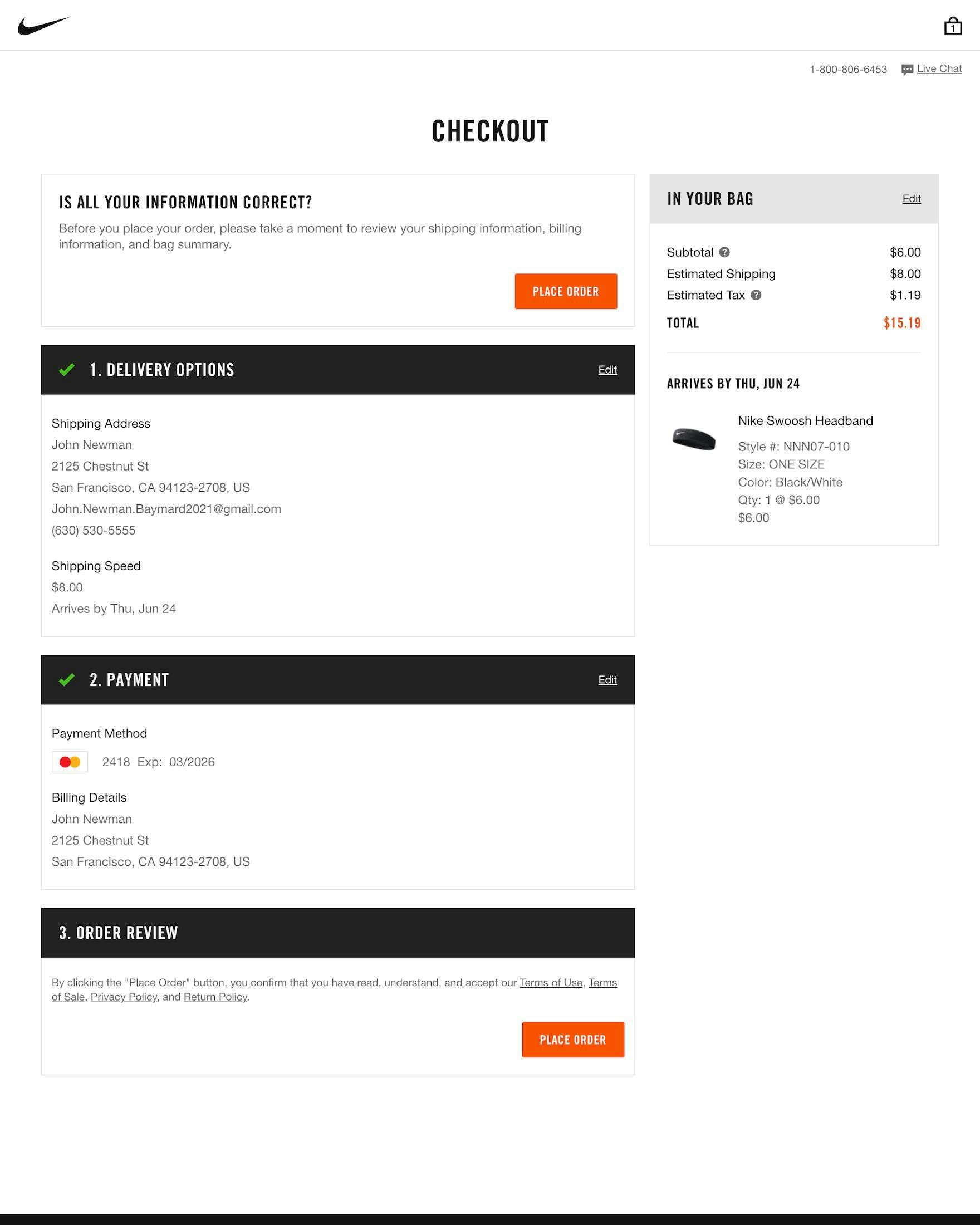
At Nike, the input and selections from each previous checkout step collapse into visible summaries as users progress, as shown here on the payment (first image) and order review (second image) steps.
Therefore, it’s key that accordion checkouts collapse the past checkout steps into summaries, allowing users to review the previously entered information without the need to click to view them.
Doing so helps accordion checkouts efficiently enable users to review their previously entered information in a seamless way.
In fact, during eye-tracking sessions we observed participants routinely scanned the summaries of their prior steps throughout the checkout flow.
Moreover, over time, this practice of collapsing accordion checkout steps into summaries has become an established web convention, making it an expected component of accordion checkouts.
As well, the summaries of past steps help to enhance users’ sense of progression, similar to positive live inline validation.
1 “Back” Button Pitfall to Avoid for Accordion Checkouts
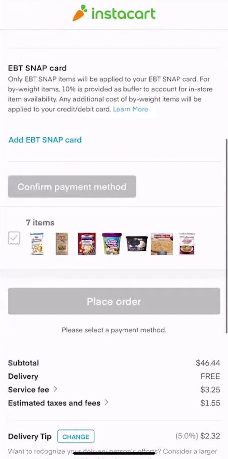
“I think I’m gonna have to go back, but I don’t know what that’s gonna do.” Like many participants across our large-scale UX testing, this participant shopping for groceries on Instacart’s mobile site hesitated to use the browser’s “Back” button during checkout, afraid that it would erase her cart or input data.
Across multiple rounds of usability testing, we’ve observed that users expect the “Back” button to take them back to what they perceive to be their previous page, regardless of whether it is technically a new page or not.
Generally, we’ve observed that if any new view is visually different, or if a new view conceptually feels like a new page, it will be perceived as one — even for accordion checkouts that submit each checkout step without a page reload.
Instead, the majority of users perceive accordion checkouts as a multistep process with summaries.
In practice, this can become problematic on sites where the accordion steps are technically implemented as a single page with one URL, as users wanting to go backwards to a previous checkout “step” (i.e., to edit previously entered information) will often be sent all the way back to the cart if using the browser “Back” button.
Despite the availability of “Edit” links to reopen previous accordion steps, many participants in testing relied on the browser “Back” button to return to previously completed steps, sometimes resulting in unexpected results.
Therefore, it’s key that accordion checkouts ensure that the browser “Back” button takes users back to the previously viewed step — regardless if it’s technically the same or a separate page.
For checkouts that are technically one single page, this “Back” button support can be achieved by using the HTML5 History API.
More specifically, the history.pushState() function allows a site to invoke a URL change without a page reload, meaning the site can align the browser “Back” button behavior to match user expectations.
Ensure Accordion Checkouts Support Users’ Needs to “Double-Check”
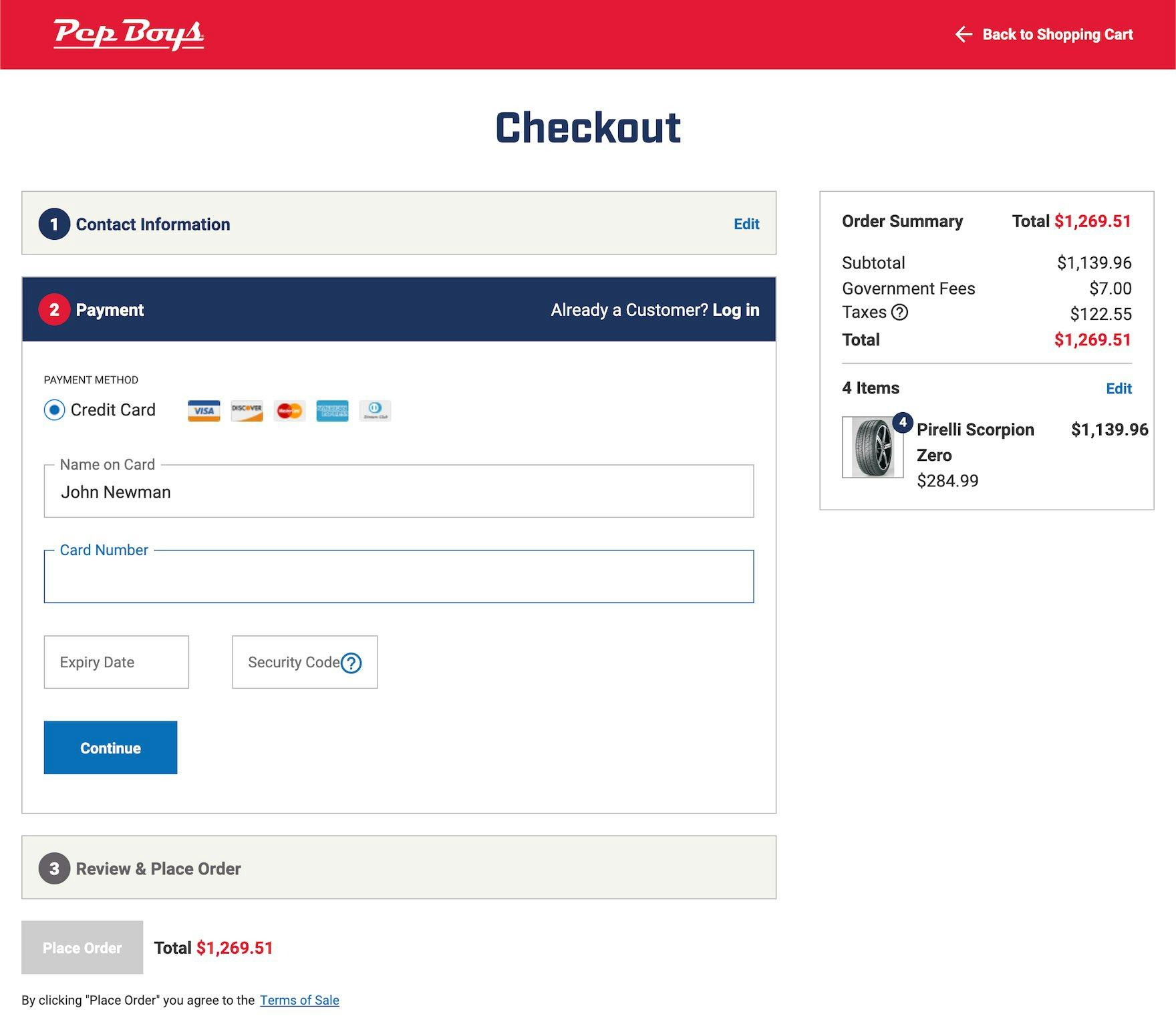
At Pep Boys, users are unable to review previously inputted information, as each accordion section closes with no visible details as users progress through checkout.
For users, a primary benefit of an accordion checkout is being able to complete the entire checkout process on 1 or 2 pages.
Compared to multistep checkouts, this can make accordion checkouts feel less intimidating.
Yet if completed steps collapse and only display the step header, users are robbed of their ability to double-check their inputs.
This leads to a more friction-filled checkout experience as some users will need to reopen multiple steps, while others will proceed with placing an order that has errors — leading to more strain on customer service and a more negative brand perception down the line.
This article presents the research findings from just 1 of the 700+ UX guidelines in Baymard – get full access to learn how to create a “State of the Art” ecommerce user experience.
If you want to know how your desktop site, mobile site, or app performs and compares, then learn more about getting Baymard to conduct a UX Audit of your site or app.