Key Takeaways
- 15% of ecommerce sites do not autoformat the spaces that appear between numbers on users’ physical credit cards
- When credit card spaces are not autoformatted, users become confused and may enter spaces unnecessarily, causing errors and abandonments
- Sites should allow users to type spaces into their credit card numbers and autoformat the spaces whether or not the users type them in, ideally while users are still typing in their numbers
Video Summary
During Baymard’s large-scale checkout usability testing, we observed that a large subgroup of users struggle with correctly typing their 15–16 digit credit card number, and subsequently struggle with verifying that it’s typed correctly.
This was observed to be a direct cause for checkout abandonments as participants got card validation errors due to simple typos.
However, our test sessions also revealed that autoformatting the spaces in users’ card numbers and allowing users to type spaces themselves can greatly improve users’ accuracy when typing their credit card number, and help them to more easily check that their typing is correct.
Yet, our research also shows that 15% of ecommerce sites in our ecommerce UX benchmark currently don’t use this powerful typing aid for their credit card field.
Note that this is an improvement over past years.
The 15% statistic reflects the progress companies have made on this issue since 2019, when 50% of sites failed to implement spaces in the credit card number field, but this improvement also makes noncompliance stand out more than ever.
In this article, we’ll present Baymard’s research findings on the following:
- How users type their card number and why users type or verify their card number in distinct 4-digit blocks
- How autoformatting spaces was observed to raise input accuracy and lower abandonment rates
- Why it causes severe usability issues when sites disallow spaces in the card number input
- How the technical implementation should handle card types with “odd” formatting (AMEX, Diners Club, etc.)
How Users Type Their Card Number
There are two key test observations as to how users behave during and just after they type their card number.
First, participants during testing were often observed to enter their number in the same format in which it is embossed or printed on their physical card.

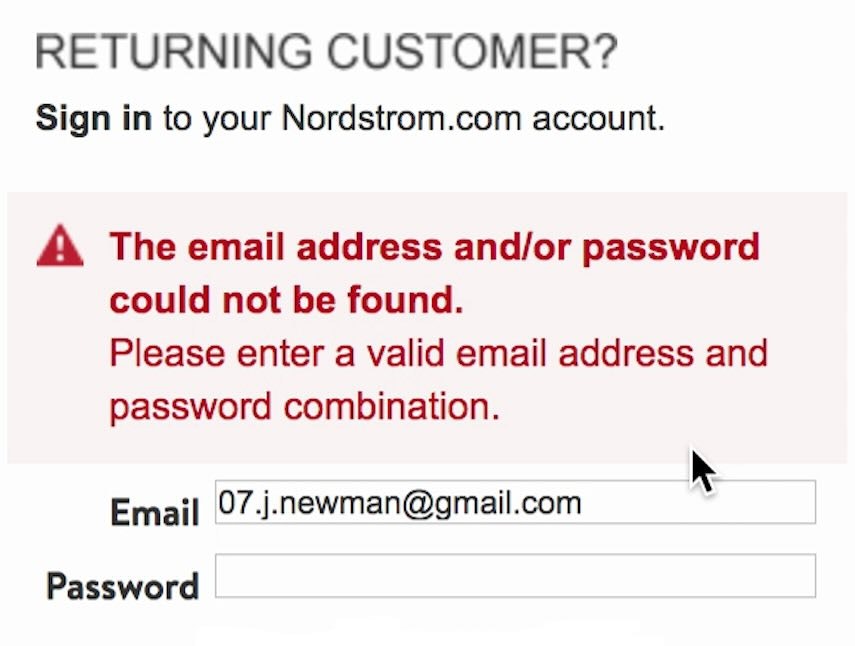
Here at Kohl’s, users are not allowed to enter spaces, which makes it hard for users to check the accuracy of their numbers using their physical cards. Also, users will have no way of knowing that spaces aren’t allowed, which can make users think there is an error when they type in a space and it does nothing.
For most credit cards (although not all; see “Card Types” below), this is a 16-digit string with spaces between every 4th digit.
However, some sites do not allow spaces in the card number field, which causes unnecessary confusion when users realize that they aren’t allowed to type the number as they see it on their physical card.


Second, we observed that test participants often double-checked their credit card number to make sure that it was correct before submitting the page.
This isn’t too surprising, as a single typo when transferring the 15–16 digit numeral string printed on the physical card into the card number form field will cause a validation error.
But in practice, it’s often worse than just an error.
On more than a third of test sites, form field errors resulted in the user’s typed card data being cleared.
When this is the case, an incorrect digit will force users into retyping their full credit card data.
Combined with the often highly generic card validation error messages (see Improve Validation Errors with Adaptive Messages), this can result in checkout abandonments.
Autoformat the “Card Number” with Spaces

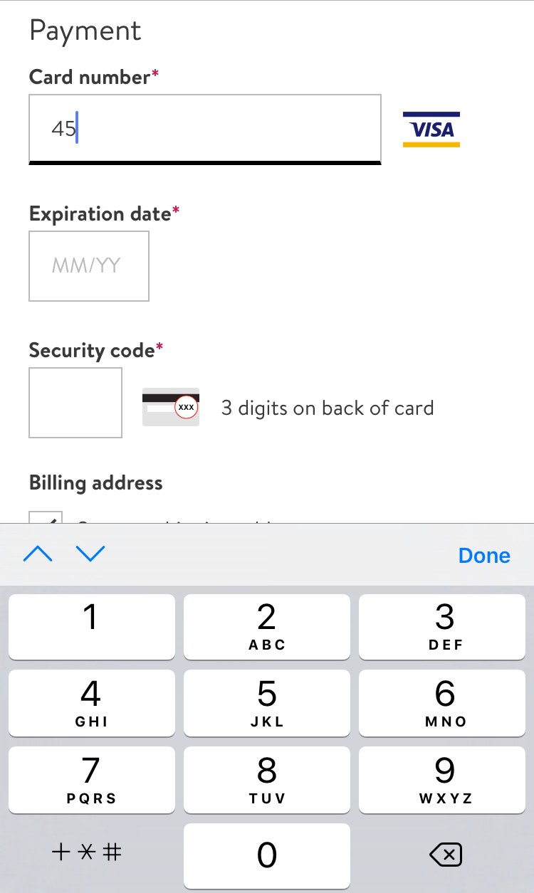
At Adidas, spaces are automatically added after every 4th digit for a VISA card, making it easy for users to check their input as they type.

Likewise, here at Modloft, the spaces in credit card numbers are automatically added as users enter their credit card number.
Fortunately, when testing sites that autoformatted the user’s card number with spaces, participants were observed to have an easier experience typing what they saw printed on their credit card, and it was easier for them to double-check what they had typed.
Consequently, the participants experienced fewer payment validation issues on sites that autoformatted their card number input with spaces compared to those sites that didn’t.
Therefore, if the user is typing a VISA or MasterCard card number, the input should be autoformatted to include a space for every fourth digit.

Lumens also immediately adds the spaces that are seen in the physical version of credit cards, making it easier for users to check the accuracy of the number they have entered.
Autoformatting card numbers should ideally be accomplished while users enter their card number (also known as “input masking”), since the automatically added spaces allow users to more easily enter and check their card numbers.
Additionally, input masking shows users that the card number will be formatted for them, so users don’t have to wait until they leave the field to know that the autoformatting will occur.
Without live formatting, users may enter spaces needlessly and, in some cases, encounter errors for doing so.
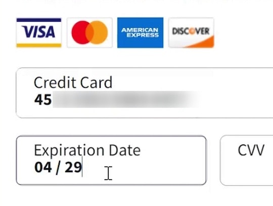
As a side note, it’s worth mentioning that test participants similarly preferred their “Expiration Date” drop-downs to match what’s printed on their physical card, as we covered in Format the ‘Expiration Date’ Fields Exactly as the Credit Card (40% Get it Wrong).
Allow Users to Type Spaces as They Enter Their Credit Card Number

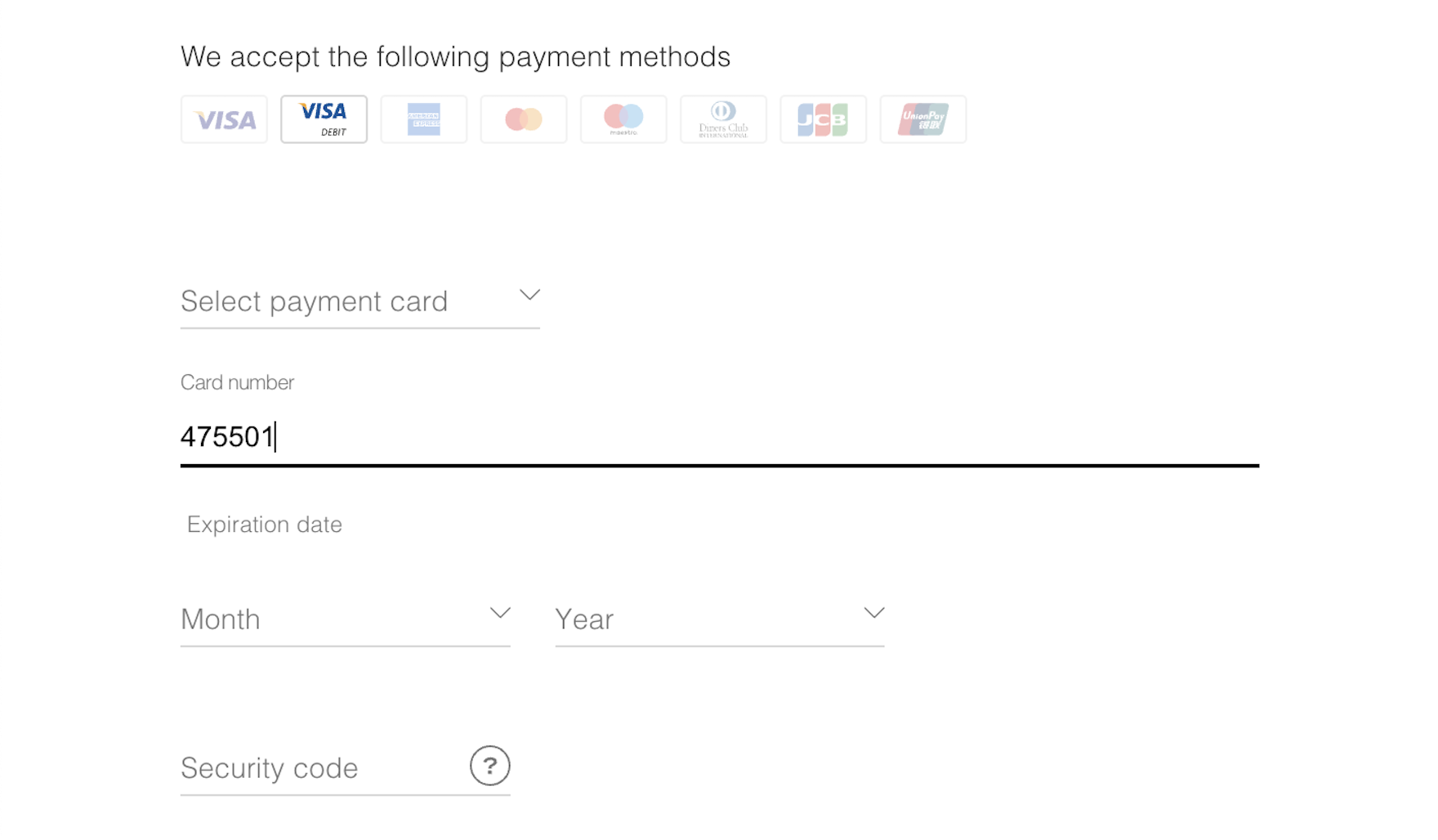
While Grainger doesn’t autoformat the input as users type, they allow users to type in spaces, which is much better than registering spaces as an error or disallowing them entirely.
Providing an input mask and autoformatting the card number field is the ideal solution for end users.
However, at the very least sites must allow spaces in the card number field, so that users are allowed to type exactly what they see printed on their physical card.
Within the “Card Number” field, spaces should not provoke validation errors or be stripped from the displayed input.
Additionally, do not limit the allowable characters in the “Card Number” input field, because it always disallows spacing and can also have major consequences for a smaller subgroup of users, since not all card numbers are 16 digits long.
Although most credit cards are 16 digits, variance exists:
- AMEX (15 digits)
- Maestro (12–19)
- Solo, and Switch (16, 18, or 19)
- China UnionPay (16–19)
Even VISA has reserved the right to use 13–19 digits, whether or not they often do so.
Thus a front-end character limitation is bound to completely lock out the few users with a card number length that deviates from the norm.
Some Card Types Deviate from 4-Digit “Chunking”

Nordstrom automatically registers the user’s card type as they enter it (VISA in the first image, AMEX in the second), and so Nordstrom can adapt to different credit card number lengths and different spacing schemes.
Importantly, autoformatting spaces is not quite as simple as putting a space between every 4 numbers, since a few card types deviate from the system of dividing 16-digit cards into 4-4-4-4 chunks of numbers: the 15-digit AMEX number uses a 4-6-5 chunking and 19-digit credit card numbers generally use 4-4-4-4-3 chunking.
This means that the formatting of spaces, primarily for AMEX card inputs, has to change based on the card type.
Luckily, the card type can be autodetected based on the first digits in the card number, where AMEX cards start with either “34” or “37”.
To ensure a good return on investment, consider only supporting autoformatting for the most common 15- and 16-digit cards, like VISA, MasterCard, JCB, Discover, and AMEX (or any card types that are particularly popular on your site).
Then, you can allow users to type spaces themselves for other cards that deviate from the standard 15- or 16-number chunks (typically Switch, Solo, Maestro, Diners enRoute, Diners Club, and Carte Blanche).
Ensure the “Card Number” Field Doesn’t Stop Users’ Progress

Printful provides a successful example of autoformatting spaces in users’ credit card number.
Given the error-prone process of typing in a credit card number, it’s surprising that 15% of sites don’t aid their users by autoformatting the spaces in users’ credit cards.
Autoformatting all users’ “Card Number” inputs with spaces leads to fewer card validation errors both because it increases the user’s accuracy when typing the card number and makes it easier for them to spot any typos afterwards.
Furthermore, at the most basic level, all sites should allow users to type spaces in the “Card Number” field, neither disallowing the specific “space” input character nor setting an input length limitation (e.g., limiting the field to 16 characters).
Practically, this means that 16-digit cards like VISA, MasterCard, Discover, and JCB should have a space added for every 4th digit users type, while 15-digit AMEX cards should be automatically spaced with a 4-6-5 pattern.
After all, spaces may be small (and invisible), but they are still big enough to disrupt users’ checkout flow.
This article presents the research findings from just 1 of the 700+ UX guidelines in Baymard – get full access to learn how to create a “State of the Art” ecommerce user experience.
If you want to know how your desktop site, mobile site, or app performs and compares, then learn more about getting Baymard to conduct a UX audit of your site or app.