Key Takeaways
- When the site’s credit card expiration field doesn’t match the formatting on the user’s physical credit card, the user’s progress through checkout is slowed
- 72% of e-commerce sites in our benchmark failed to match expiration date fields to how they’re printed on credit cards, causing users to input erroneous info
- Correctly formatted month and year inputs allow users to seamlessly enter their credit card info into the expiration field
In Baymard’s large-scale UX testing of Cart & Checkout, transferring credit card expiration dates from a physical credit card to input fields on a website was observed to be a task necessary for a subgroup of users — notwithstanding the fact that many users rely on browser autofill to input their credit card data.
Moreover, testing revealed that some participants entering their expiration dates into form fields experienced friction when the presentation of their physical card’s expiration date didn’t conform to the numerical format used by the site.
To assist users entering their credit card information into expiration date form fields, sites should format the input fields to exactly reflect the presentation on most physical credit cards.
However, our e-commerce UX benchmark shows that a surprising 72% of sites don’t match the formatting of their expiration date input fields to the credit card information, slowing down users’ progress through the payment flow — or even causing transcription inaccuracies that further provoke validation errors once users submit their data.
This article will discuss our latest Premium research findings on how to display “expiration dates” for checkout payment:
-
Why users have difficulty entering expiration date data into payment form fields
-
How formatting the month and year for the expiration date helps users input their information
-
How using an open text field facilitates entering credit card info for users
Why Users Have Difficulty Entering Expiration Date Data into Payment Form Fields
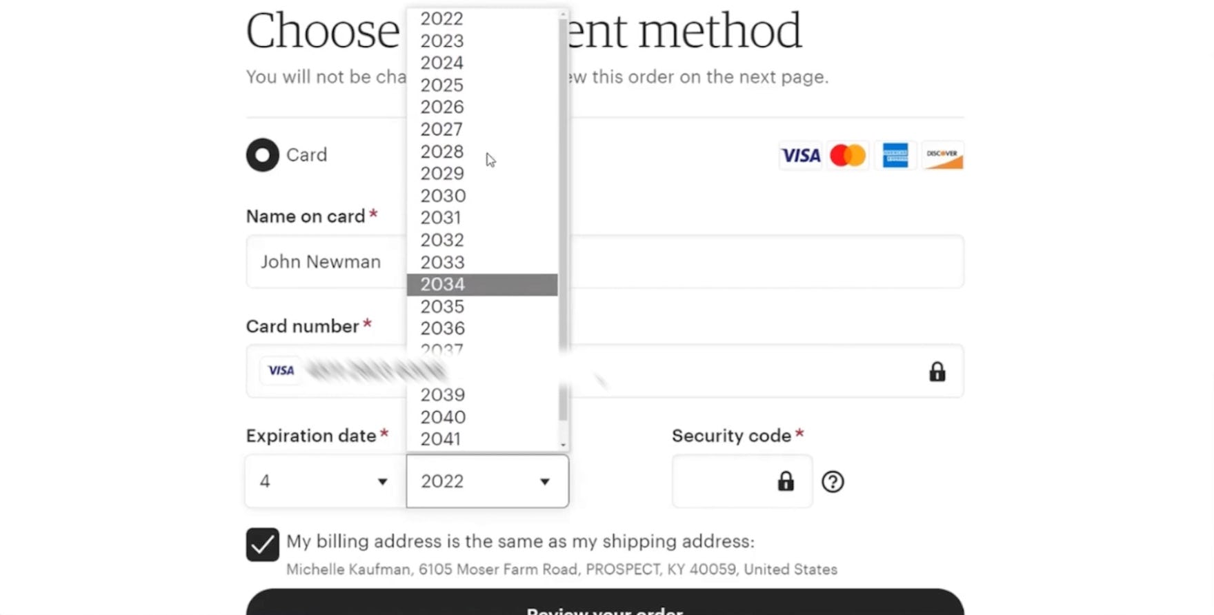
At Hayneedle, a participant began typing the 2-digit year instead of the full 4-digit year (i.e., “29” instead of “2029”), slowing her progress through checkout.
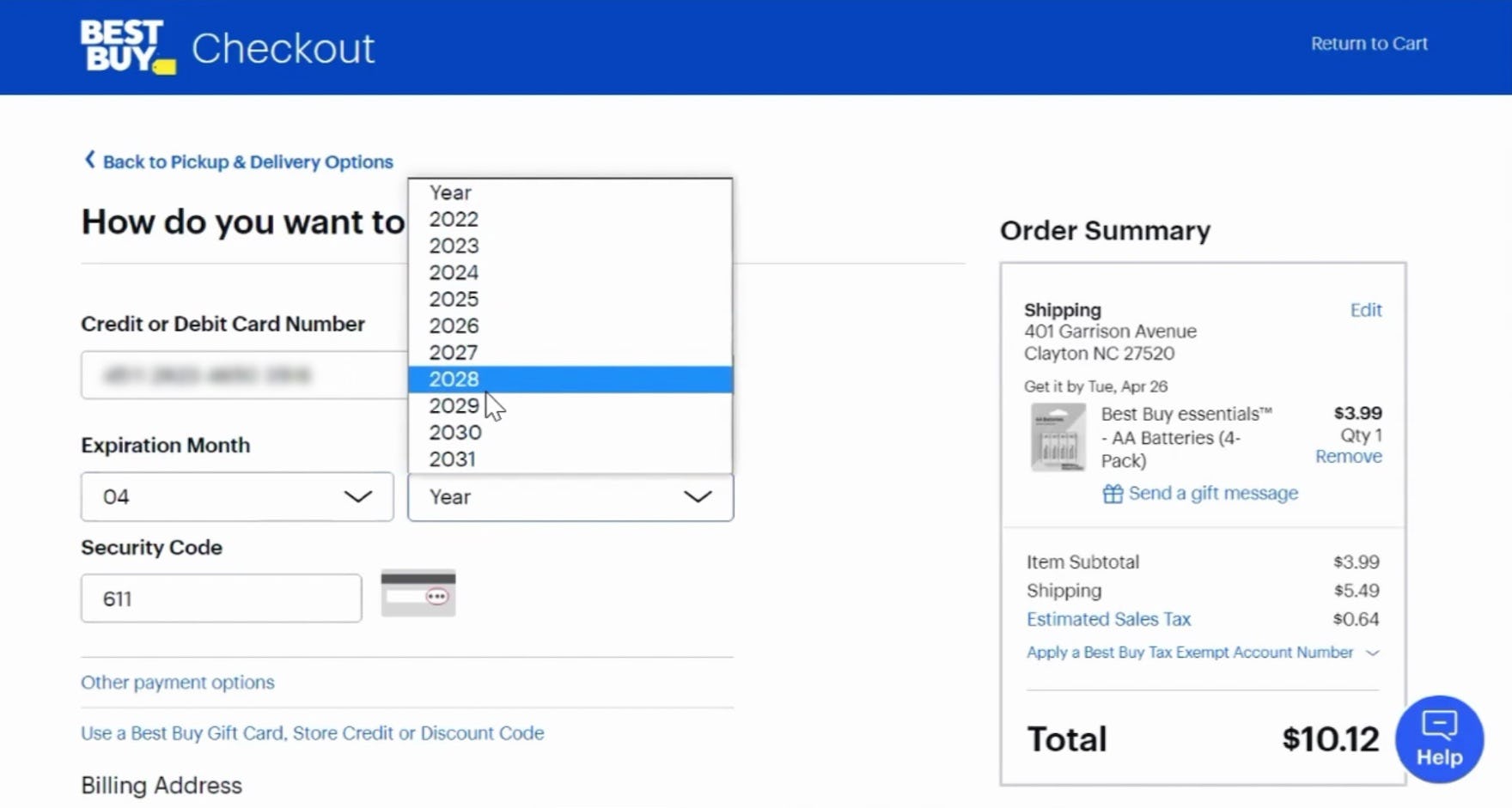
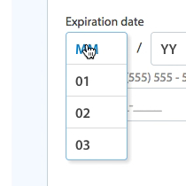
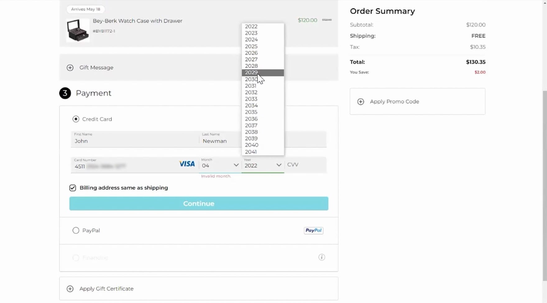
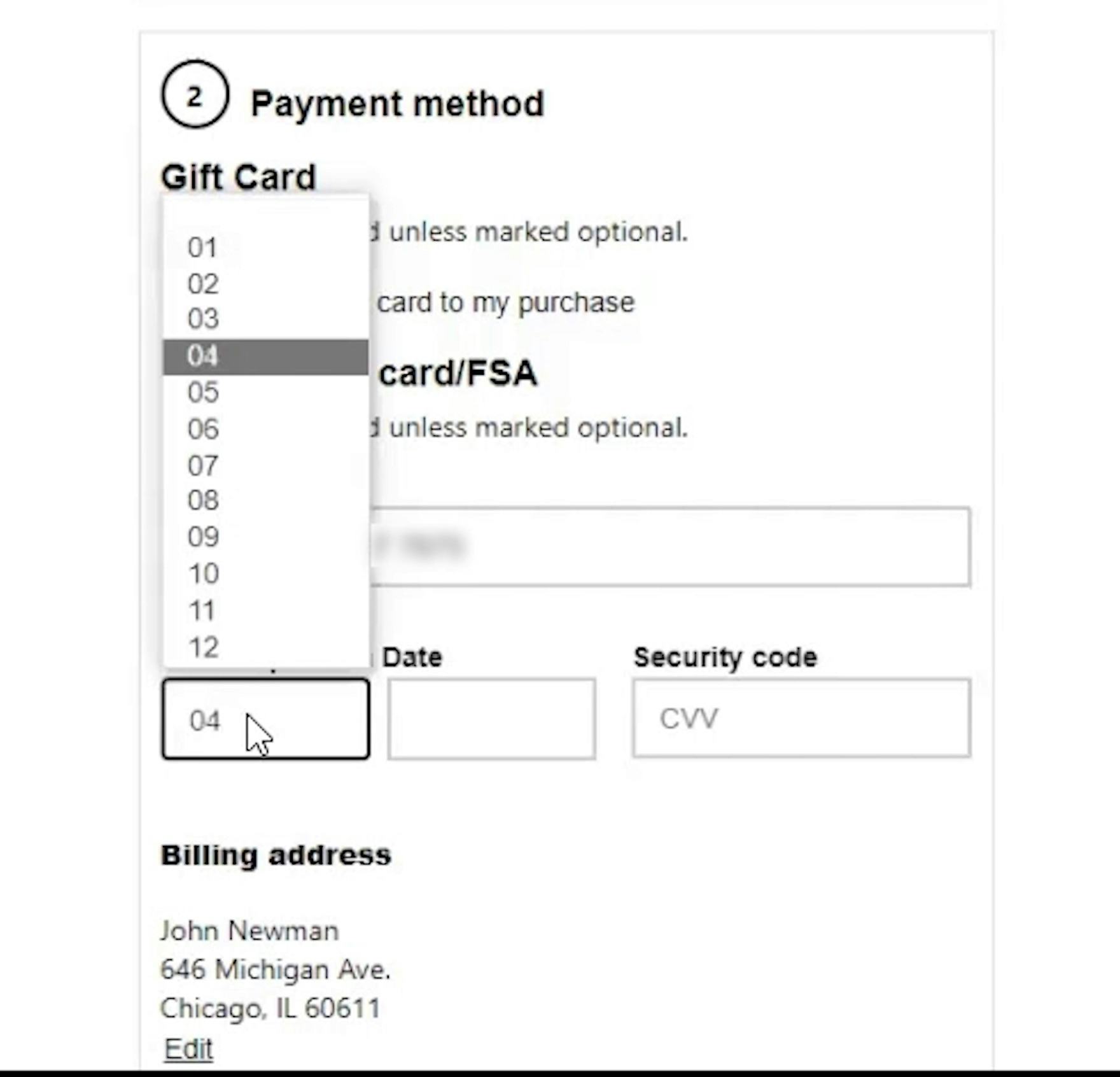
“And what was it? ‘04/29’, okay.” A participant at Best Buy took a while to select the expiration date from within the drop-down menu options, slightly slowing her progress through checkout. Note the discrepancy between what the participant stated was the expiration year (“29”) and the input for the field (“2029”).
For those users who don’t use autofill, entering expiration date information prior to checkout can often be a tedious and frustrating task, as expiration date form field designs diverge greatly from site to site.
Indeed, throughout multiple rounds of checkout usability testing, a small subgroup of participants accidentally entered erroneous “expiration date” information due to nonstandard number formatting in the form fields.
This issue was observed to cause unexpected delays and interruptions for participants trying to input their expiration date.
This issue stems from users attempting to transfer expiration date information contained on their physical card to the corresponding form fields within the payment flow.
During testing, participants were observed having to stop their progress through the payment flow because they had to mentally adjust the formatting of their card info to enter it into the expiration date form fields — with issues only becoming apparent to some of them when they tried to submit their checkout form for payment validation.
This can be a more critical issue for a small subgroup of users, as a simple user error such as a wrong digit in an expiration date field can result in sites giving generic, nondescript validation error messages (see Improve Validation Errors with Adaptive Messages) and potentially even clearing out all of the user’s previous entries in the form fields (e.g., credit card number, expiration date, etc.; see How to Preserve Credit Card Details on Form Errors.)
How Formatting the Month and Year for the Expiration Date Helps Users Input Their Information
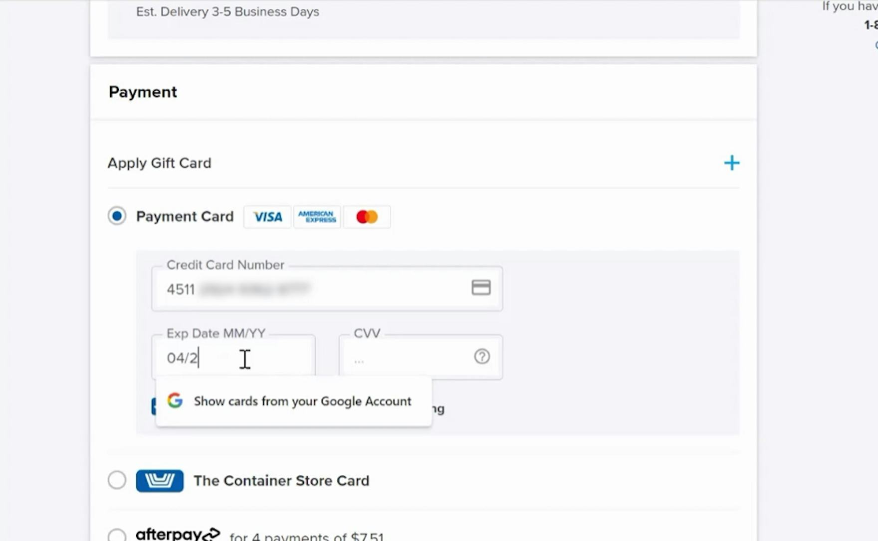
“MM / YY”: This is the most common formatting for the expiration date printed on credit cards, resulting in a 1:1 mapping between the physical card and the virtual fields, and which is good for understanding the input, minimizing deciphering issues, and also for supporting keyboard entries. (To perfect this implementation at Birchbox, the drop-downs should be clearly labeled as “month” and “year” when open, as the relevant label is covered when the drop-down menu is activated).
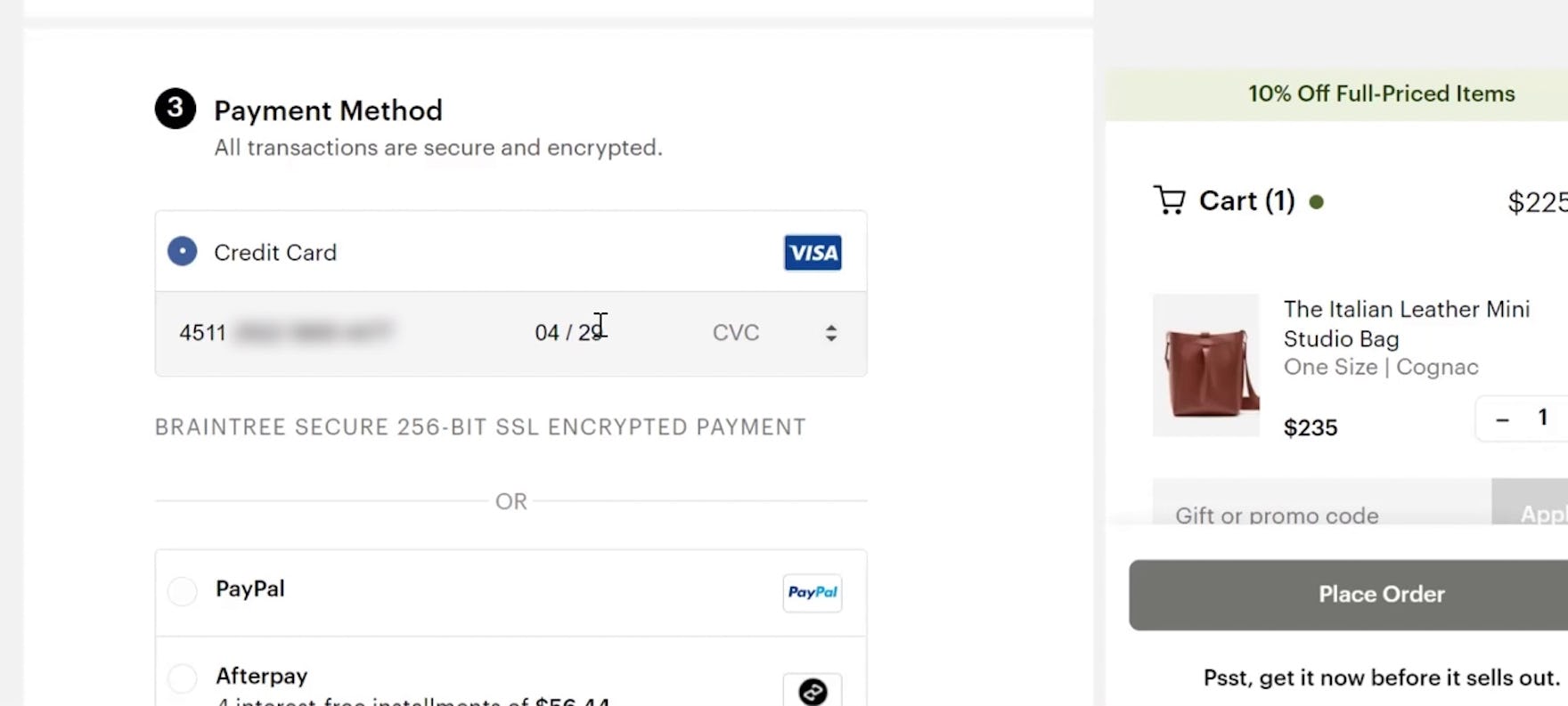
“So I would enter the…expiration, ‘0429’.” At the Container Store, a participant was easily able to enter the expiration date on his card — which was displayed using the industry-standard format.
Therefore, sites should use the current financial industry standard format for expiration dates — a 2-digit month and a 2-digit year (e.g., “MM / YY”) — agnostic of users’ input method (e.g., drop-down menu, open text field, etc.).
This was observed during testing to generally make it easier for participants to enter the correct input because most didn’t need to translate the information on their card to the corresponding fields.
One deviation from the financial industry standard of “MM / YY” that has not been observed thus far to cause usability issues is if the month name comes after the 2-digit month number in the month drop-down (e.g., “03-March”).
This will still allow users to input the expiration month and select the numbers they see printed on their card without having to mentally calculate the month number.
Consider Using an Open Text Field for the Expiration Date
“Yeah, usually they are drop-down menus, but I think it’s easier for me just to go ahead and type it and let it pop up.” A participant at CVS tabbed into the first of the 2-part “Expiration Date” form fields and began typing the expiration month. Note that the site accepted both mouse input — in the form of the drop-down menu shown above the field — as well as text entries from the keyboard.
A participant at Walgreens was easily able to use the keyboard to enter the expiration date in the “Expiration Date” text field.
Importantly, an increasing number of sites have switched to using open text fields for the expiration date field.
Text fields are a more accessible alternative to drop-down menus, as this allows keyboard users to simply tab into the next field and easily enter their expiration date — or use the arrow keys to select an option from the drop-down menu — without having to take their hand away from the keyboard (see also 5 Common Usability Pitfalls of Custom Designed Drop-Downs and The Current State of Checkout UX - 18 Common Pitfalls & Best Practices).
Ideally, expiration date form fields should be presented to users as 2 separate fields (for month and year) that are placed sequentially (i.e., one right after another, on the same line) and with a forward slash in between, or else use a single input field with an input mask (visually separating the values within the same form field; see Consider Using Localized Input Masks for ‘Phone’ and Other Restricted Inputs).
In either case, the field length should match the expected input length (see The ‘Credit Card Number’ Field Must Allow and Auto-Format Spaces).
Note, though, that the open text fields will need to restrict the user’s input to avoid users typing invalid values, while still allowing some degree of input flexibility.
For example, “03” and “3” are valid input values for month, as is “1”; and while “10, 11, 12” are also valid inputs, “13” is an invalid one.
Provide Users with the Formatting They Need to Enter Their Data
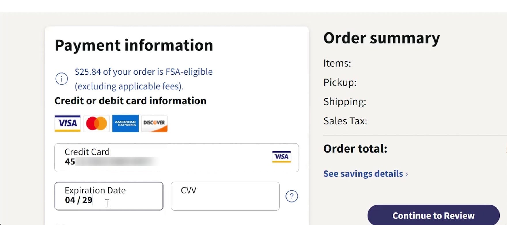
At Everlane, a participant had no issues entering the expiration date in the form field — which followed the industry-standard numbering format for credit card expiration dates.
By formatting the expiration date form fields using a 2-digit month and a 2-digit year, sites can remove the friction for users entering their expiration date information.
However, 72% of e-commerce sites fail to adapt their input fields to the formatting on physical credit cards.
This risks that users experience unnecessary delays in placing their order, and increases the overall friction of the checkout process.
This article presents the research findings from just 1 of the 700+ UX guidelines in Baymard – get full access to learn how to create a “State of the Art” ecommerce user experience.
If you want to know how your desktop site, mobile site, or app performs and compares, then learn more about getting Baymard to conduct a UX Audit of your site or app.