
8 Recommendations for Creating Effective Input Fields
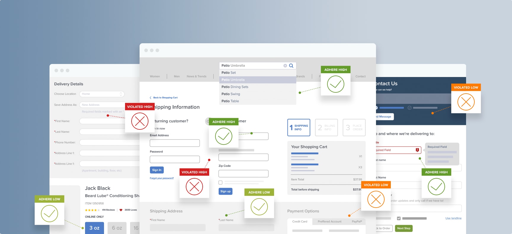
Input fields give users a way to enter information and submit it within your user interface. For e-commerce sites, input fields are an essential element of the checkout UX.
But you’d be surprised at how many things can go wrong with input fields and how much of a UX impact those issues can have.
When you fix issues with input fields, you can optimize your checkout process to create a seamless experience for customers. This leads to more completed purchases and fewer cart abandonments.
In this article, we’re going to explore why input fields are important and the impact they have on website usability. Then we’ll explore the parts and pieces of an input field and provide specific guidelines for improving the input fields in your site.
What Are Input Fields?
Input fields are essential elements of every e-commerce site. No matter what action you want a user to take — whether it’s subscribing, completing an order, or reaching out to contact your help desk — input fields are part of the process.
Input fields have one goal: getting information from your user. In order to accomplish that goal, your website or app needs to ask for the required information, then provide space for the user to enter the input you’ve requested.
Input Field Anatomy
Here are the different components of a text input field:
-
Container: The container helps your user see the input field by creating a contrast between the surrounding background and the field itself. The container could have a fill and a stroke (either around the entire container, or just on the bottom edge). The outlined container could have rounded or square corners.
-
Leading Icon: This is an optional element for input fields, but adding a leading icon to your input field could improve the user experience in certain cases. When you choose a relevant icon, it helps users understand the meaning of the field in one quick glance.
-
Label: The label text tells the users what information you’re requesting. Every input form should have a clear label that helps users understand exactly what input they need to enter. Field labels on mobile work best above the field.
-
Placeholder/Input Text: Placeholder text is located inside a form field. The text can be an additional description or example of the information required for that field. These hints typically disappear when the user begins entering text in the field.
-
Trailing Icon (Optional Element): An optional trailing icon at the end of an input field can help the user do things like validate input or clear the field with one click.
-
Helper Text/Error text (Optional Element): Helper text is an optional input field element that can provide additional information like how the information will be used or guidelines for the information required.
For example, if a user is entering a password into an input field, helper text might provide guidance on the number of characters required. Below a phone number field, helper text might explain the reason why you are asking for this information.
Helper text can also be swapped with error text that provides guidance if users enter incorrect input, like a phone number that doesn’t have enough digits or an incomplete required field.
→ Sign up free to free research-backed UX guidelines and start improving your site today.
Input Field Guidelines
The structure and style of your input fields can have a huge impact on your user experience and, therefore, the conversion rate on your e-commerce site.
What defines a perfect (or near-perfect) input field? Here are some recommendations:
1. Minimize the Number of Form Fields Users See by Default (Guideline #668)
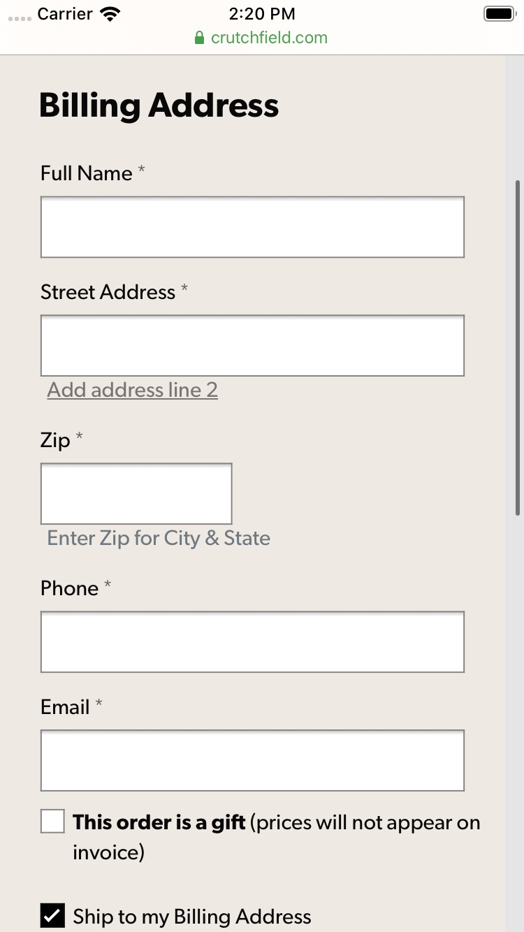
At Crutchfield, great lengths have been taken to minimize the number of form fields in checkout.
Before implementing input field design changes, consider reducing the number of form fields displayed on a page. In our research on e-commerce UX, we consistently see test participants become intimidated when 10-15+ form fields are viewable on a single checkout page.
Most sites can reduce the number of fields on a checkout page by looking for opportunities to:
- Avoid splitting single input identities (Replace “First Name” and “Last Name” with “Full Name)
- Hide infrequently used and optional fields behind a link
- Remove fields when irrelevant to current context
- Implement smart default selections
- Autodetect and prefill field values
If 10-15+ fields are still viewable after simplifying a form, consider reducing intimidation by hiding fields in collapsible sections or splitting checkout into multiple steps.
2. Consider Using Localized Input Masks for “Phone” and Other Restricted Inputs (Guideline #658)
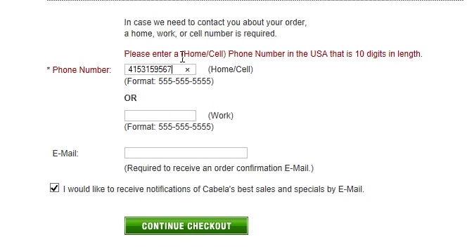
*Participants at Cabela’s didn’t follow formatting examples that were provided as text outside the field. *
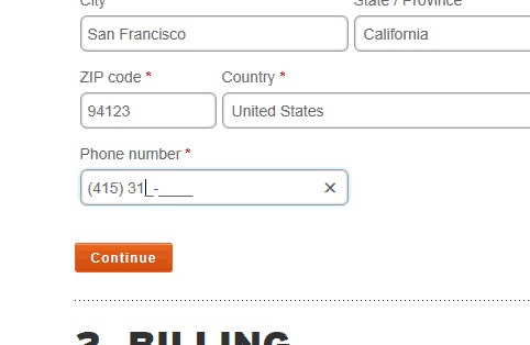
At REI, input masks helped test participants correctly submit formatted and restricted inputs. Initial input hesitation and the number of validation errors both decreased.
Our checkout usability testing revealed that 89% of users entered numerical inputs in several different ways, even when formatting examples showed the required input format. A portion of test participants even hesitated before entering their data because they were worried they would type it in a way that was invalid.
Many users have had prior experiences with validation errors — and those errors often lead to checkout abandonment.
For formatted and restricted inputs, consider using an input mask that autoformats users’ input as they type. This can be a great way to alleviate users’ concerns about incorrectly entering their information.
3. Present Autoselected and Prefilled Values in Open Input Fields (Guideline #572)
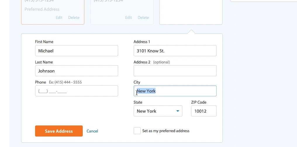
Test participants at Walmart noticed and changed incorrect IP-geotargeted values when they reached prefilled fields for city, state, and zip code during the checkout process.
When possible, prefill fields and values for users to reduce checkout friction. These prefilled values will be correct in most cases, but there will inevitably be some issues. When that happens, your intelligent form should handle the issues as gracefully as possible.
Users often overlook prefilled and autofilled values when they are presented as static text, so we recommend presenting prefilled and autodetected values as open text fields or other interactive form elements.
4. Provide a Dynamic Thumbnail Hint or a Tooltip for the “Security Code” Field (Guideline #584)
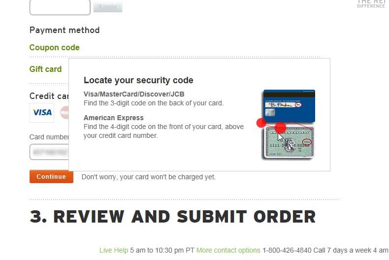
The test participant clicked on the tooltip next to the “Security Code” label during checkout on REI, which loaded a credit card image with the “Security Code” highlighted. After viewing this image the participant provided the “Security Code” and moved on to the next step in the checkout process.
When asked to input their credit card’s “Security Code” in a form field, a significant number of users hesitate or end the checkout process. They weren’t sure what code they were being asked to provide, and 38% of test participants stopped their progress through the checkout flow once they’d progressed to the “Security Code” field.
These users often looked for more information about what was required in that form field.
Provide either an inline thumbnail or a tooltip showing where the “Security Code” can be found on a physical credit card. Always label the form field “Security Code” and avoid abbreviations like “CVV” or “CID.”
5. Luhn Validate the Credit Card Number Field (Guideline #582)
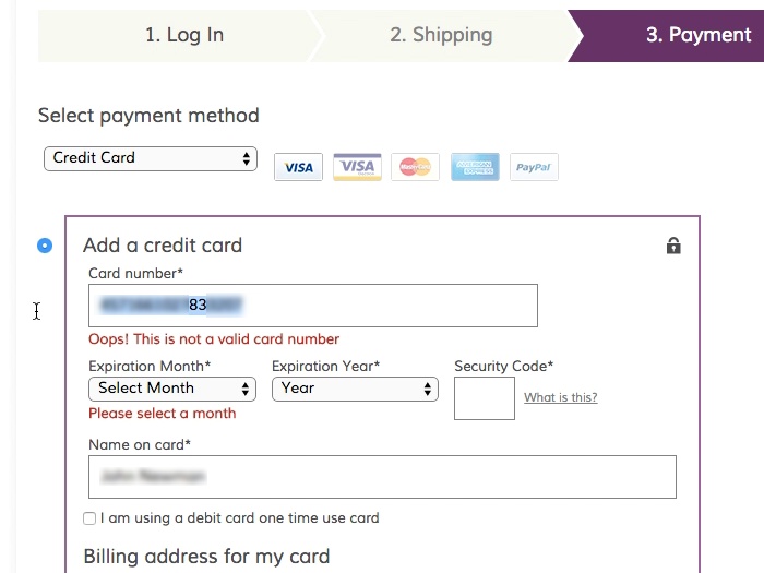
*A test participant at Wayfair entered his credit card number incorrectly, typing “83” instead of “38.” Live Luhn validation of the number immediately alerted the participant that something was entered incorrectly. *
Live inline validation alerts users immediately if their input was entered incorrectly, as opposed to after the form is submitted, when it’s more cumbersome to find and correct errors. But in our research, 53% of sites don’t Luhn validate the credit card number field.
Typing a 15 or 16-digit credit card number string without errors can be difficult for users. Even when broken into smaller chunks, the 15 to 16 digits still have to be typed perfectly to avoid payment validation errors.
All credit card numbers follow a pattern that will allow a simple Luhn/Modulus 10 checksum validation. Luhn validation checks if the card number a user has entered is plausible, providing an immediate opportunity to alert users if they’ve incorrectly entered their credit card number.
This validation check doesn’t submit and verify the card data with the payment processor. It doesn’t verify that that card is valid or has sufficient funds — it can only tell if the typed card number sequence has been incorrectly typed.
However, alerting the user that their credit card number contains a typo allows users to make a quick correction before submitting the payment form.
On your credit card form fields, always Luhn validate the user’s input before the entire card dataset is submitted.
6. Prefill Related Input Fields if a Majority of Users Will Need to Retype Them (Guideline #568)
The majority of users that calculate shipping costs to a specific ZIP code are likely to want to ship their order to that same ZIP. Talbots prefills the state and ZIP code as the shipping address.
For many e-commerce sites, it’s possible to optimize checkout by reducing the number of form fields for users to complete.
Users find it tedious to type the same information multiple times during checkout. It slows down their progress and makes it look like your site is failing to respond to their inputs in smart ways.
This includes situations like:
- The contact email that the user has typed will have to be retyped when reaching the shipping email part of the checkout.
- The customer name in the shipping address will have to be retyped when filling out the cardholder’s name.
- The ZIP code typed in a shipping calculator in the cart step has to be typed once more in the shipping address step.
- The email a user types during newsletter sign-up (before the checkout) has to be retyped as the order email during checkout.
If the majority of users will likely retype the exact same information, prefill related text input fields with information the user has previously provided. This applies to information typed during the entire browsing session.
7. Be Cautious if Restricting Field Input Characters and Formatting (Guideline #659)
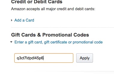
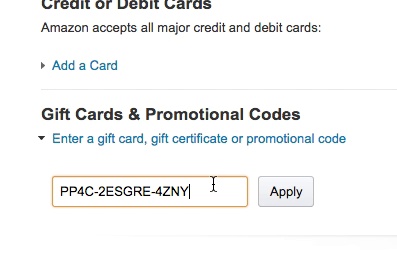
Different users format the same type of input very differently. When test participants were faced with the same formatting on a printed gift card, some typed the gift card number with no spaces, others typed in the gift card number with spaces, and most typed in the information with hyphens. Amazon accepted all versions of the input.
During testing, we’ve repeatedly observed that users interpret input fields differently and type information into fields in very different ways — particularly with number sequences.
Even with clear labels and formatting examples, users may have predetermined ideas about how a value should be typed into a field. For example, users might type a U.S. phone number in any of these formats
- (555) 555-5555
- 555 555 5555
- 555-555-5555
- 5555555555
When provided with a formatting example on a telephone field, 89% of desktop test participants ignored that example and typed in a different variation.
We observed the same behavior with credit card numbers, membership numbers, card expiration dates, gift certificates, date of birth, loyalty account numbers, and social security numbers.
Allow users to input their data in any formatting they want. Be cautious about imposing character restrictions that could cause validation errors that confuse readers. If restrictions are truly needed, provide clear formatting examples or use an input mask.
8. Disable Autocapitalization Where Appropriate on Mobile (Guideline #1103)
Autocapitalization creates usability issues with form fields on mobile touch keyboards.
Autocapitalization of the first letter of a text field is an intelligent default setting for most form fields, and it can be a time-saver. But in some cases, users want to enter lowercase values.
For example, most test participants in our usability testing assumed their email address needed to be entered in all lowercase letters in a form field, so autocapitalizing this input added needless friction to the typing process.
During testing, many users explained that they were unsure if uppercase characters were allowed, or if email addresses were case sensitive. On sites that had disabled autocapitalization in the email field, no participants actively capitalized the first character.
Discover More Best Practices for UX Fields
This is just a sampling of the 580+ UX guidelines in Baymard Premium, where you can find tools to identify your site’s usability issues and in-depth research to help you solve them.
Ready to empower your UX decisions and consistently develop high-performing e-commerce sites with 71,000+ Hours of UX Research?
Then it’s time to get access to all of our actionable recommendations, UX case studies, and benchmarking data.
Find out more about Baymard Premium here.
Research Director and Co-Founder
Christian is the research director and co-founder of Baymard. Christian oversees all UX research activities at Baymard. His areas of specialization within ecommerce UX are: Checkout, Form Field, Search, Mobile web, and Product Listings. Christian is also an avid speaker at UX and CRO conferences.