
This is the 1st in a series of 8 articles on mobile usability that draw on findings from our mobile e-commerce usability report.
During our recent mobile e-commerce usability study we observed subjects struggle with inputs that were split across multiple fields, such as a phone number divided into three fields (area code, central office code, and subscriber number). While the intention is good, these fields proved difficult for the subjects to both understand and interact with on a mobile device.
Specifically, the subjects had a hard time navigating between such fields (Issue #1: Interaction), found it unclear if they were all required (Issue #2: Ambiguity), and sometimes found the division illogical (Issue #3: Perception). In this article we’ll go over each of these three types of mobile form usability issues related to dividing a single input entity into multiple fields.
Issue #1: Interaction
Users generally have a difficult time navigating between fields on mobile devices. Surprisingly few of the test subjects used the ‘Next’ and ‘Previous’ buttons on the touch keyboard – instead they generally navigated to new input fields by tapping them on the screen.

On Macy’s, the phone input is divided into three fields (three-digit area code, three-digit central office code, and four-digit subscriber number), which made the input needlessly difficult to enter. See video clip.
To enter a phone number on Macy’s m-commerce site, you must: 1) Tap field. 2) Switch to numeric keyboard. 3) Type first three digits. 4) Keyboard auto-closes (Macy’s for some reason finds it a good idea to auto-close the user’s keyboard). 5) Tap the next field. 6) Switch to numeric keyboard again. 7) Type the next three digits. 8) Keyboard disappears again. 9) Tap the last field. 10) Switch to numeric keyboard once more. 11) Type the last four digits. (And then, to make matters worse, at the last field, the one place where the keyboard could reasonably auto-close, it does not). Even if the keyboard did not disappear as each field is completed, the number of interactions required to fill a phone number in the three fields remain the same (you’d still need to either tap the field on the screen or the ‘next’ button on the keyboard), and the typing flow of the 10 digit phone number would still be abruptly stopped twice. Not to mention all the issues related to editing a phone number split across multiple fields (in case the user spots an error).
While the intention of dividing the phone number into multiple fields is good and indeed serve as a very strong input formatting example, it simply does not work very well on mobile. (On a desktop site where advancing between fields is easier for users the division might be acceptable; our full-site checkout usability study showed no conclusive data on this.)
Issue #2: Ambiguity
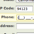
Another issue arising from dividing an input entity into multiple fields is the ambiguity of required vs optional fields. Our research studies show that you should always clearly indicate both required and optional fields (with explicit markup for both), however, almost all sites indicate this in the label. This presents a design issue when some parts of the divided input field are required and others are not, as seen on Southwest’s mobile site below:

On Southwest the ZIP code input is divided into two fields (the basic five-digit code followed by the four additional ZIP+4 digits), however, it’s only the first field that is required while the second field is optional, but the user really has no way of knowing this from Southwest’s form design.
Of course one way to solve the issue Southwest runs into is by adding “required” and “optional” labels below each field or as inline text, but why divide the fields in the first place? It adds unnecessary complexity to the form design and suffers from the interaction issues described in the previous section. Also, suddenly changing the position of “required” and “optional” labels will result in an inconsistent form design unless you of course change it for all fields in the form which seems like a rather drastic design change just to be able to divide a ZIP code input across two fields.
Issue #3: Perception
Lastly, there is an issue of perception where an input is commonly presented as separate fields even though users perceive it as a single coherent entity. This is true of “name” fields that are often split into “First name” and “Last name” fields.
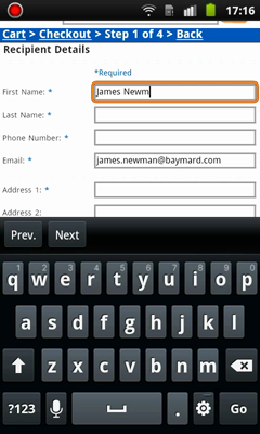
Toys’R’Us ask for “First name” and “Last name” instead of a single “Full name”. We saw countless subjects enter their full name in the “First name” field, only to discover they had to split it into separate fields.
During both our E-Commerce Checkout Usability and M-Commerce Usability studies users consistently considered their name a single whole – I am not “James” and “Newman”, I am “James Newman”. Therefore, users often enter their entire name in the “First name” field and then upon advancing to the next field, discover that they must now enter their last name. They then go back to delete their last name from the “First name” field, only to advance to the “Last name” field again to complete it.
While numerous sites ask for the user’s name in two or more fields it simply is not good usability. Of course it can be difficult to discover this if you’re not doing usability tests since all subjects we observed noticed and corrected the error before submitting the form (thus not showing up in most form tracking web statistics). It is therefore not a critical error to make but it does introduce needless friction to the checkout experience. Amazon seems to have reached the same conclusion and instead asks for the user’s “Full name”:

Amazon only uses a single name field on both their desktop and mobile sites, which matches the user’s perception of their name as a single entity.
Another issue related to multiple name fields concerns middle names and titles. If “First name” and “Last name” are separate fields then logically “Middle name” and “Title” should be separate fields too. Suddenly you end up with four fields instead of a single field, or a subpar experience where the user will have to guess whether their middle name should be appended to the “First name” field or prefixed in the “Last name” field. With a single “Name” field you avoid this issue altogether as users simply enter their name from start to end, including any middle name(s) and titles.
Conclusion
As we can see, seemingly innocent and sometimes even common divisions of a single input entity into multiple fields can lead to interaction issues, required vs optional field ambiguity, and misalignment between the user’s perceptions and your site’s form design.
On desktop sites, there may be instances where dividing a single input entity across multiple fields may be acceptable if all the fields are either required or optional and there’s no misalignment between user perception and form design. However, on mobile – even under those narrow circumstances – you should avoid splitting single input entities across multiple fields due to the interaction issues previously discussed.
This article presents the research findings from just 1 of the 700+ UX guidelines in Baymard – get full access to learn how to create a “State of the Art” ecommerce user experience.