
140 Mobile UX Articles
These articles are based on observations and test findings from our usability research on mobile.
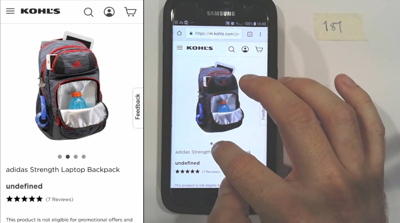
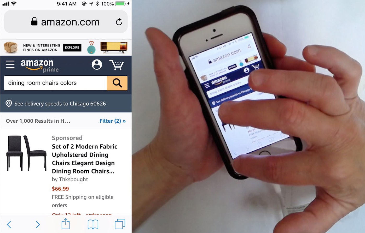
Always Use Thumbnails to Represent Additional Product Images (76% of Mobile Sites Don’t)
Product images are key in users’ decision-making. Why, then, are product page image thumbnails — ubiquitous on desktop — so rare on mobile? See our latest usability test findings on image gallery thumbnails:
Featured
Mobile UX Trends 2026: 10 Best Practices
July 14, 2026 (Updated)Popular
Avoid Using “Horizontal Tabs” for the Main Product Page Sections (29% Don’t)
July 8, 2026 (Updated)Popular
Flight Booking & Airlines Quantitative UX: 3 High-Level Takeaways from 30+ Charts
June 24, 2026
Apparel & Accessories Quantitative UX: 3 High-Level Takeaways from 40+ Charts
June 12, 2026
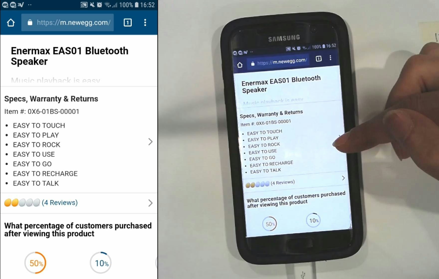
Always Signpost Hidden Thumbnails in Image Galleries
June 10, 2026 (Updated)Popular
6 Important Aspects of Well-Performing Mobile Product Page Breadcrumbs
Mobile users rely on breadcrumbs to understand where they are and navigate the site hierarchy — yet 36% of e-commerce sites don’t provide full category paths, while others make it difficult to find breadcrumbs.
Featured
Use a Fake “Editing” Flow When Updating Credit Card Details (78% Don’t)
June 2, 2026 (Updated)Popular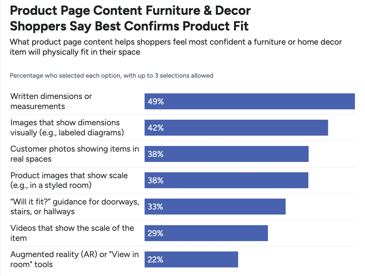
Furniture & Home Decor Quantitative UX: 3 High-Level Takeaways from 30+ Charts
May 19, 2026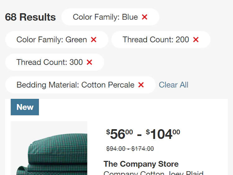
Display “Applied Filters” in an Overview (28% Don’t)
May 13, 2026 (Updated)
Always Provide 6 Key Order-Tracking Details on the Ecommerce Site
May 5, 2026 (Updated)Popular
Ecommerce Search UX 2026: 8 Search “Query Types” UX Best Practices (56% of Sites Have Issues)
April 29, 2026 (Updated)
4 Design Patterns That Violate “Back” Button UX Expectations – 59% of Sites Get It Wrong
Our large-scale usability testing reveals that users expect the "Back" button to take them back to what they perceive to be their previous page, which often differs from site behavior.
Featured
Online Grocery Ecommerce UX 2026: Expanded & Updated Research Findings
April 22, 2026
Mobile App UX Trends: The Current State of Ecommerce App UX (11 Common Pitfalls & Best Practices)
April 14, 2026 (Updated)Popular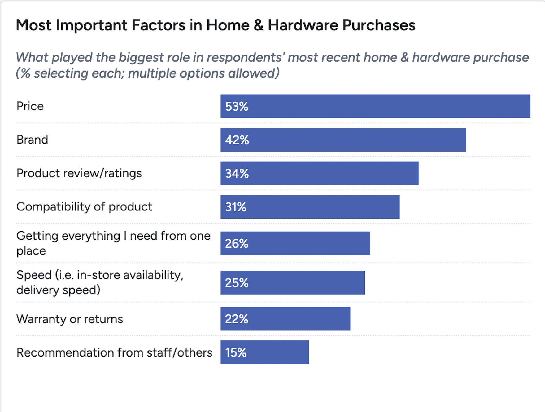
Home & Hardware Quantitative UX: 3 High-Level Takeaways from 30+ Charts of Key Findings and Actionable Insights
April 8, 2026
Electronics & Office UX Benchmark: 5,000+ Performance Scores and 3,900+ Best Practice Examples
March 31, 2026
Mobile App UX Benchmark 2026: 3,300+ Performance Scores and 2,500+ Best Practice Examples
March 24, 2026
Mobile UX: Avoid Using Subpages within the Product Details Page (26% Don’t)
26% of sites use subpages for some mobile product page content — but this leads to a severe issue of users overlooking the content entirely. See our latest test findings on mobile product pages.
Featured
Product Page UX 2026: 10 Pitfalls and Best Practices
March 18, 2026 (Updated)Popular
New Health and Beauty UX Research: 3 High-Level Takeaways from 3,000+ Hours of Testing
February 25, 2026
The Baymard Ecommerce UX Awards 2025 - Recognizing the Top 1% of Sites
December 16, 2025
Announcing Baymard’s New Theme: Loyalty Program UX
December 9, 2025
Vitamins & Supplements UX Benchmark: 3,500+ Performance Scores and 2,500+ Best Practice Examples
December 4, 2025

Mobile UX Trends 2026: 10 Best Practices
Our 2026 Mobile UX ecommerce benchmark shows the vast majority of sites have a mediocre mobile UX. Find out more and discover 10 mobile ecommerce UX best practices.
Featured
Checkout UX 2025: 10 Pitfalls and Best Practices
November 25, 2025 (Updated)Popular
Ecommerce Gifting UX: 4 Ways to Provide a Superior Gifting UI and Flow
November 20, 2025 (Updated)Popular
Introducing a New Baymard Research Focus: Quantitative Insights
November 4, 2025
Homepage and Category Navigation UX 2025: 67% of Mobile Sites Have Mediocre-to-Poor Performance
September 30, 2025 (Updated)Popular
10 Cyber Monday UX Best Practices
September 16, 2025 (Updated)Popular
Product List UX 2025: 8 Common Pitfalls & Best Practices (80% Have Serious Issues)
September 9, 2025 (Updated)Popular
Accounts & Self-Service UX 2025: 5 Common Pitfalls & Best Practices
August 14, 2025 (Updated)Popular
Phone Number UX: Always Explain Why the “Phone Field” Is Required (39% Don’t)
July 29, 2025 (Updated)Popular
4 “Online Grocery” Ecommerce UX Best Practices
July 15, 2025 (Updated)Popular
Small Catalog DTC UX Benchmark: 2,500+ Performance Scores and 1,700+ Best Practice Examples
July 8, 2025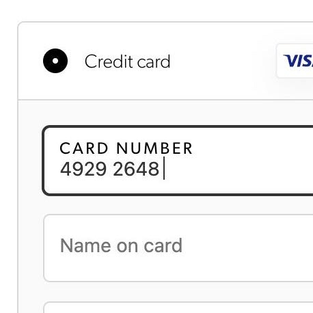
The ‘Credit Card Number’ Field Must Allow and Auto-Format Spaces (80% Don’t)
June 5, 2025 (Updated)Popular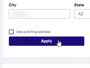
Checkout UX: Avoid “Apply” Buttons for Most Fields (22% of Sites Don’t)
May 14, 2025 (Updated)Popular
4 Ways to Improve UX for Ecommerce Mass Merchant Sites
April 29, 2025
5 Best Practices for Communicating Sustainability in Ecommerce
April 22, 2025 Popular
Ecommerce Homepage UX: Can Users Infer the Breadth of Your Product Catalog?
April 10, 2025 (Updated)Popular
10 UX Requirements to Follow for a User-Friendly Homepage Carousel Design
April 3, 2025 (Updated)Popular
4 Ways to Improve the Post-Checkout UX
March 25, 2025
7 UX Fixes Every SaaS Marketing Website Needs
March 18, 2025
5 UX Best Practices for Apparel E-Commerce (90% Get One or More Wrong)
February 25, 2025 (Updated)Popular
Search UX: 5 Proven Strategies for Improving “No Results” Pages
February 18, 2025 (Updated)
Digital Subscriptions & SaaS UX Benchmark: 2,300+ Performance Scores and 1,600+ Best Practice Examples
February 11, 2025
Online Grocery UX Benchmark: 3,500+ Performance Scores and 2,700+ Best Practice Examples
February 6, 2025
Drop-Down Usability: When You Should (and Shouldn’t) Use Them
January 28, 2025 (Updated)Popular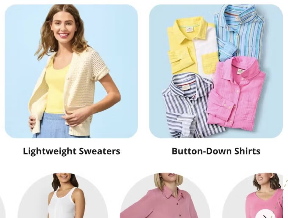
Apparel & Accessories UX Benchmark: 7,000+ Performance Scores and 6,000+ Best Practice Examples
January 7, 2025
Baymard Year In Review 2024
December 18, 2024
New Furniture & Home Decor UX Research: 3 High-Level Takeaways from 2,500 Hours of Testing
December 12, 2024
Top 1% E-Commerce UX Awards — 2024 WINNERS
December 10, 2024
Always Provide 3 or More Product Thumbnails in Product Lists and Search Results
November 5, 2024 Popular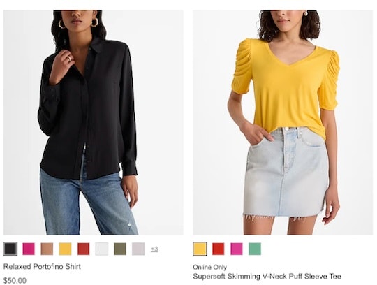
New Apparel & Accessories UX Research: 3 High-Level Takeaways from 1,765 Hours of Testing
October 30, 2024
Furniture & Home Decor UX: Always Provide a “Dimensions” Image
October 15, 2024
Always Integrate Social Media Visuals on the Product Page for Relevant Products (67% of Sites Don’t)
October 2, 2024
Apparel & Accessories Sites: Always Provide an Aggregate “Fit” Subscore in the Reviews (33% Don’t)
September 24, 2024
2024 E-Commerce Product Finding: Expanded and Updated Research Findings
September 17, 2024
Furniture & Home Decor UX Benchmark: 5,000+ Performance Scores and 5,400+ Best Practice Examples
September 3, 2024
Apparel & Accessories UX Benchmark: 5,500+ Performance Scores and 4,700+ Best Practice Examples
August 13, 2024
Apparel and Accessories Sites: Prioritize Investment in Category Navigation and Curated Paths over Search
July 23, 2024
Digital Subscriptions & SaaS UX Benchmark: 2,300+ Performance Scores and 1,600+ Best Practice Examples
July 16, 2024
Use “Visual” Filters for Visually Distinct Product Attributes
July 9, 2024
Travel Accommodations UX Benchmark: 1,900+ Performance Scores and 1,500+ Best Practice Examples
July 3, 2024
Checkout Optimization: 5 Ways to Minimize Form Fields in Checkout
June 26, 2024 Popular
Food Delivery & Takeout UX Benchmark: 3,000+ Performance Scores and 2,000+ Best Practice Examples
June 19, 2024
Always Allow Users to Navigate across User Reviews via Reviewer-Submitted Images
May 28, 2024
Always Explain Industry-Specific Filters (62% Don’t)
February 27, 2024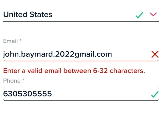
Usability Testing of Inline Form Validation: 31% Don’t Have It, 4% Get It Wrong
January 9, 2024 Popular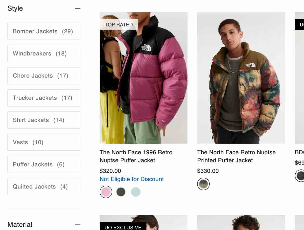
Baymard: 2023 and 2024
December 20, 2023
Improve Validation Errors with Adaptive Messages (98% Don’t)
December 14, 2023 Popular
Top 1% E-Commerce UX Awards — 2023 WINNERS
December 5, 2023 Popular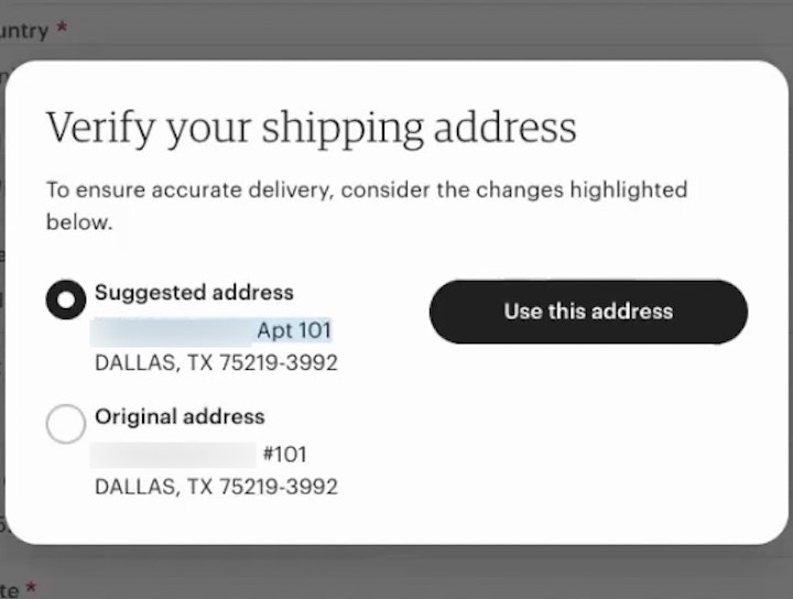
Have an Address Validator (47% Don’t)
November 28, 2023
Consider Promoting Important Filters (61% Don’t)
November 21, 2023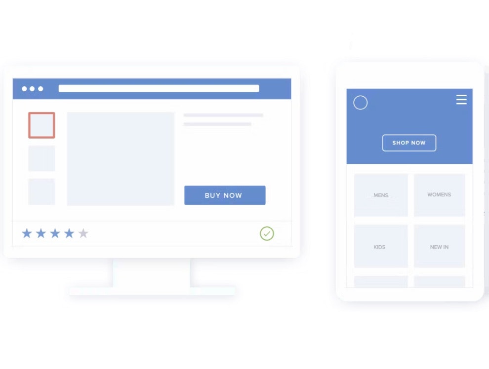
Generalizability of UX E-Commerce Research
November 14, 2023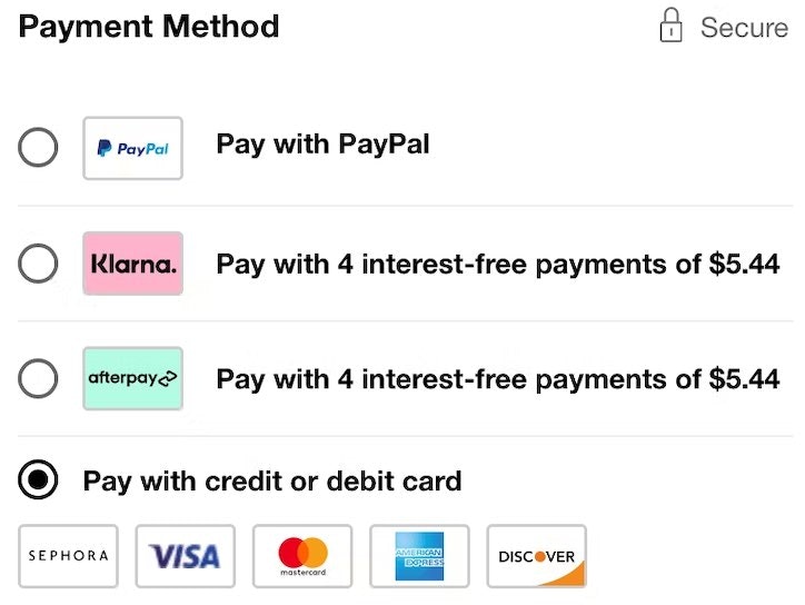
Payment Method UX: Designing Payment Selection
September 5, 2023 Popular
Make All Color Swatches Available in Mobile List Items for Visually Driven Product Types (57% Don’t)
August 8, 2023 Popular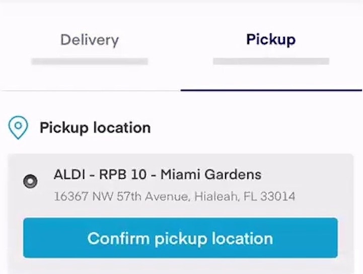
Include All Order-Fulfillment Options in the Fulfillment-Selector Interface (50% Don’t)
July 6, 2023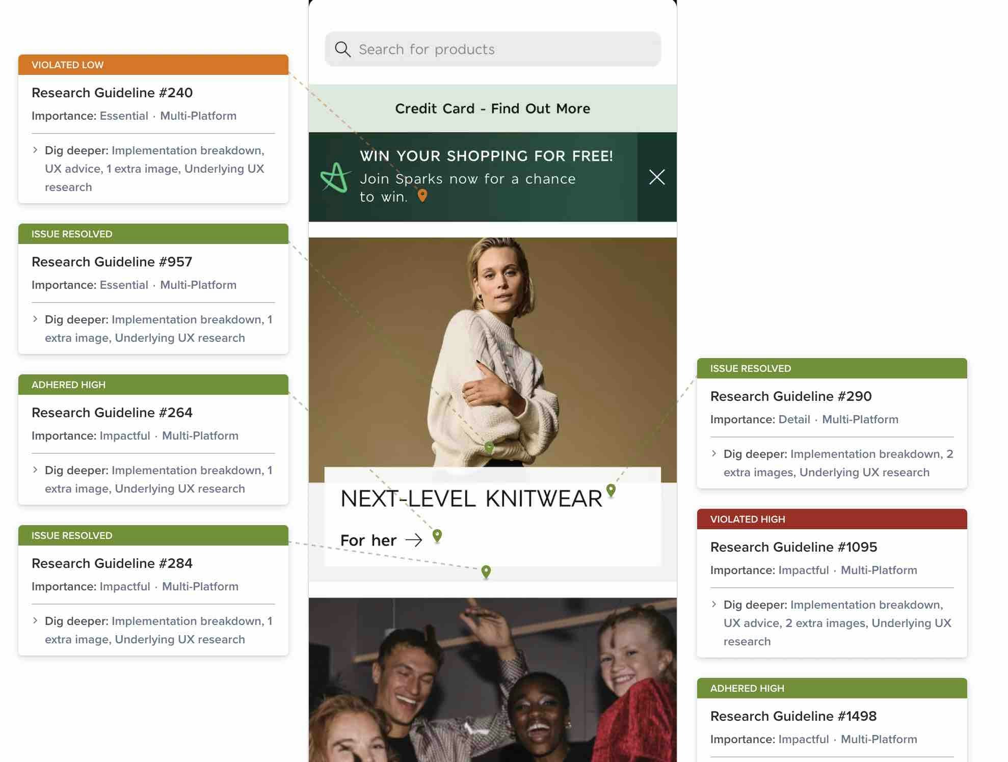
New 2023 Mobile Apps UX Benchmark with 2,200+ Performance Scores and 2,200+ Best Practice Examples
May 9, 2023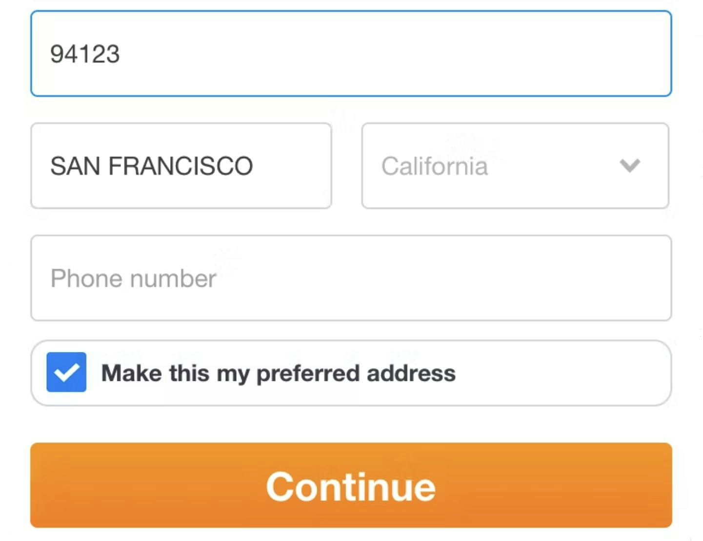
Checkout Usability: Autodetect “City” and “State” Inputs Based on the User’s Postal Code (28% of Mobile Sites Don’t)
April 11, 2023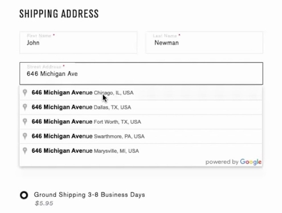
Provide a “Fully Automatic Address Lookup” Feature (55% Don’t)
March 24, 2023
New 2023 Mobile Customer Accounts UX Benchmark with 1,600+ Performance Scores and 1,100+ Best Practice Examples
March 15, 2023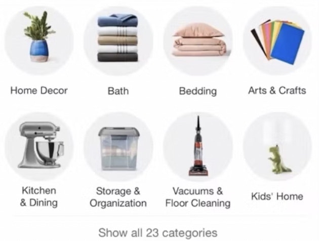
Consider Providing “Intermediary Category Pages” (13% Don’t)
March 7, 2023
Make Product Categories the Top-Level Navigation Items on Mobile Sites (33% Don’t)
January 24, 2023 Popular
Use “Shipping Address” as “Billing Address” by Default (16% of Mobile Sites Have Implementation Issues)
January 10, 2023
Have a “View All” Option in the Main Navigation at Each Level of the Mobile Product Catalog (Only 24% Get It Right)
November 16, 2022
Mobile Apps: New UX Benchmark with Over 3,700 Performance Scores and 2,800+ Best Practice Examples
November 9, 2022
Provide “Quick Views” for Visually Driven Products (50% Don’t)
August 9, 2022 Popular
9 UX Best Practice Design Patterns for Autocomplete Suggestions (Only 19% Get Everything Right)
August 2, 2022 Popular
Make It Clear Where Hit Areas in Visual Elements Lead: 33% of Sites Don’t
May 30, 2022
3 High-Level UX Takeaways from 1100+ Hours of Testing Leading Food Delivery and Takeout Sites
March 29, 2022
Online Grocery UX: 5 High-Level UX Takeaways from 1,100 Hours of Testing Leading Grocery Websites
January 11, 2022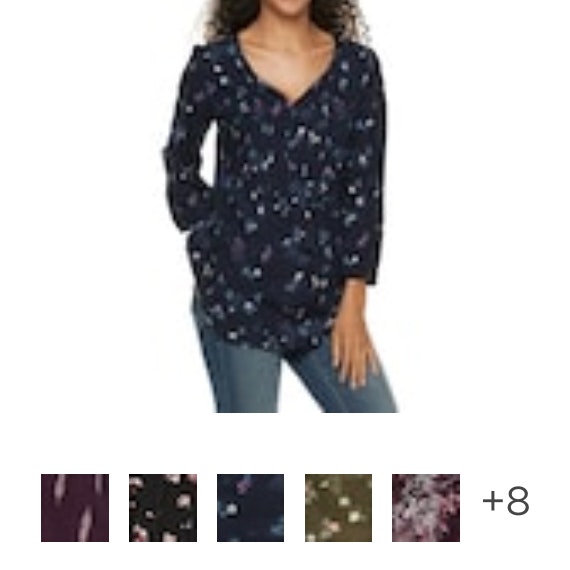
Combine Variations of Products into One List Item (12% Don’t)
September 7, 2021
Offer Relevant Autocomplete Suggestions for Closely Misspelled Search Terms and Queries (69% Don’t)
August 31, 2021
Always Provide the Full Scope for Links on Mobile Homepages (58% Don’t)
August 3, 2021
17 Common UX Pitfalls Telco Websites Suffer From
July 27, 2021
The Current State of Homepage UX – 8 Common Pitfalls & Best Practices
July 13, 2021
New UX Research Study on Native Mobile Apps (incl. app usage rates)
June 15, 2021
Always Provide a Submit Button Adjacent to the Search Field on Mobile (21% Don’t)
June 1, 2021
Always Sort Product Lists by Diversity-Based “Relevance” (24% Don’t)
May 5, 2021
Allow Sorting by “Price”, “User Rating”, “Best-Selling”, and “Newest” (64% Don’t Allow All 4)
April 20, 2021
6 List Item Attributes to Include for Cross-Sell Recommendations (68% of Desktop Sites Are Missing One or More)
March 23, 2021
10% of E-Commerce Sites Have Product Descriptions That Are Insufficient for Users’ Needs
March 9, 2021
Always Persist Users’ Search Queries (37% Don’t)
February 23, 2021
Always Use “Buttons” for Size Selection (28% of Desktop Sites Don’t)
February 9, 2021
Understanding Mobile E-Commerce UX: 5 Overarching Issues
January 26, 2021 Popular
Provide Images of Accessory, Apparel, and Cosmetic Products on a Human Model
December 1, 2020
Return Users to the Same Place in the Product List When Returning from the Product Page (13% Don’t)
November 17, 2020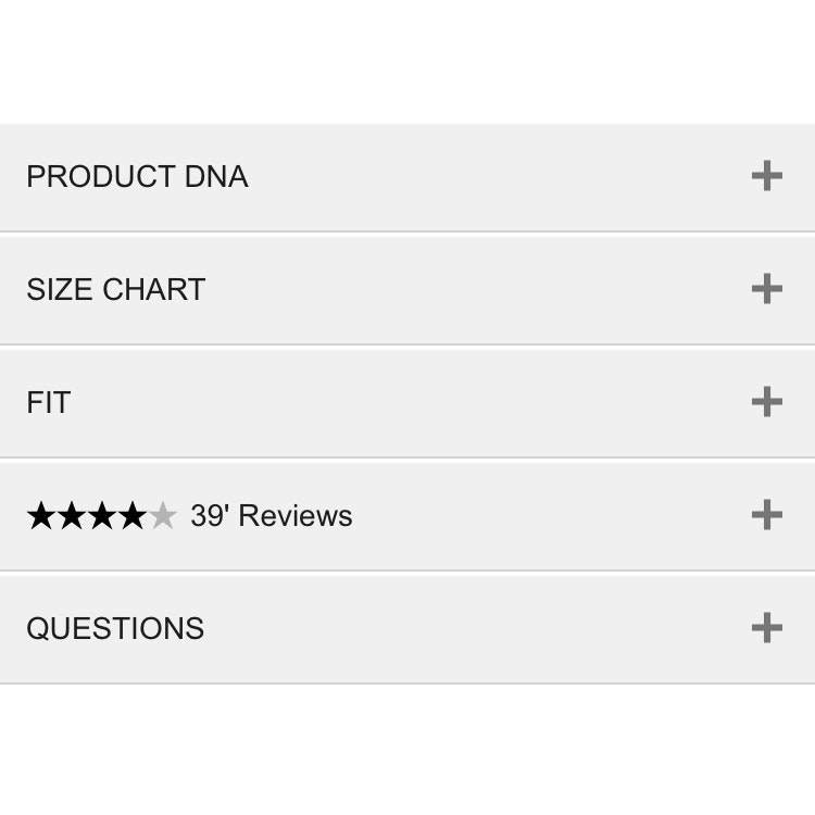
Mobile UX: Avoid Using Subpages within the Product Details Page (26% Don’t)
November 2, 2020 Popular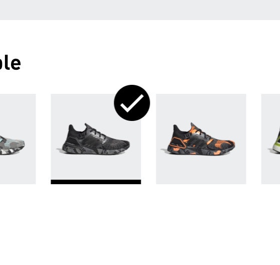
Always Use Thumbnails to Represent Additional Product Images (76% of Mobile Sites Don’t)
October 20, 2020 Popular
6 Important Aspects of Well-Performing Mobile Product Page Breadcrumbs
September 21, 2020 Popular
Inspirational Images Should Link to All Depicted Products (9% of Sites Don’t)
September 8, 2020
Baymard Update: 117 New ‘Mobile UX’ Guidelines and 9,000+ Mobile Examples Uncovered During 2020
September 1, 2020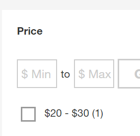
5 Essential Filter Types Users Need on Product Listing Pages (57% Don’t Offer All 5)
August 18, 2020
Allow Users to Upload Images with Their Review (34% of Sites Don’t)
August 4, 2020
4 Design Patterns That Violate “Back” Button UX Expectations – 59% of Sites Get It Wrong
July 20, 2020 Popular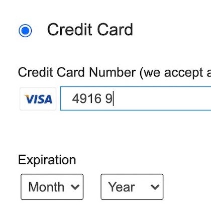
5 ‘Credit Card Form’ Implementations That Make ‘L.L. Bean’ Best-in-Class
June 30, 2020 Popular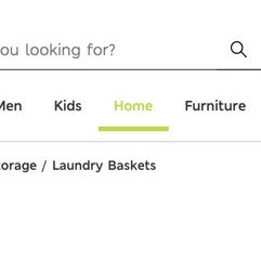
Highlight the User’s Current Scope in the Main Navigation (66% of Sites Don’t)
May 19, 2020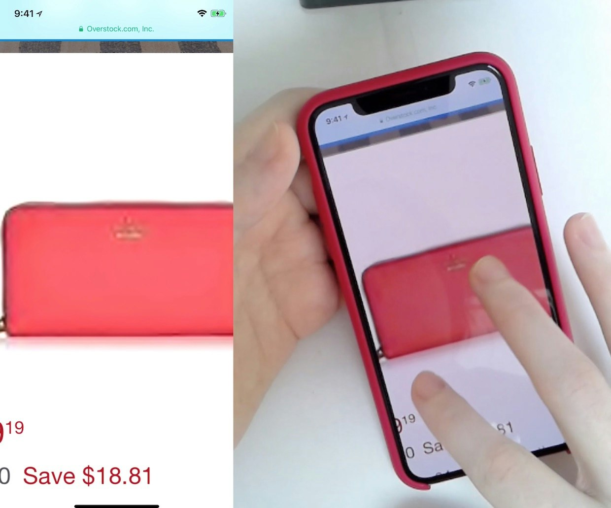
25% of E-Commerce Sites Don’t Have Product Images with Sufficient Resolution or Level of Zoom
April 2, 2020
Search UX: Autodirect or Guide Users to Matching Category Scopes (46% Get It Wrong)
January 21, 2020
Product List UX: The Number of Products to Load by Default (52% Get it Wrong)
January 7, 2020 Popular
Footer Links Should be Divided into Distinct Semantic Sections (13% of Sites Don’t Use These Footer Best Practices)
October 30, 2019
These Three (Popular) Approaches to Implementing ‘Live Chat’ are Often Highly Disruptive for Users
October 15, 2019
Filter List Design: Have Filters for All Displayed List Item Info (38% Don’t)
September 17, 2019
Mobile E-Commerce UX: Deemphasize ‘Install App’ Ads or Avoid Them Entirely
August 20, 2019 Popular
Mobile Web: Scale Product Images Proportionally in Mobile Landscape Mode (52% of Sites Don’t)
May 22, 2018
3 Strategies for Handling Accidental ‘Taps’ on Touch Devices
March 28, 2017 Popular
UX Research: 7 Reasons B&H Photo’s Mobile Site is Best-in-Class
March 8, 2016
42% of Mobile Homepages Risk Setting Wrong Expectations for Their Users
February 17, 2016 Popular
Mobile Usability: Allow Users to ‘Search Within’ Their Current Category (94% Don’t)
February 2, 2016
Mobile Gestures: 40% of Sites Don’t Support Pinch or Tap Gestures for Product Images
January 12, 2016
‘Touch Keyboard’ Implementations Have Improved Just 9% Since 2013 (60% Still Get it Wrong)
December 15, 2015 Popular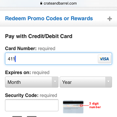
The State of Mobile Checkout & Form Usability
December 2, 2015
The State of Mobile E-Commerce Search and Category Navigation
November 17, 2015
6 Mobile Checkout Usability Considerations
October 1, 2013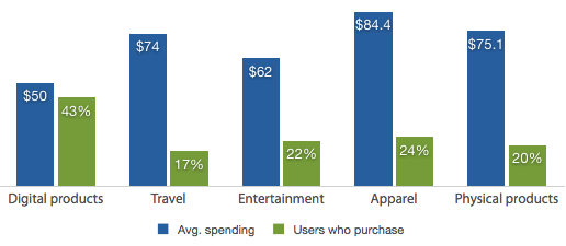
Mobile Commerce Spending Patterns (2013 Survey Results)
August 27, 2013
Mobile Form Usability: Never Use Inline Labels
June 4, 2013 Popular
Mobile Product Lists Need Very Distinct Hit Areas
May 21, 2013
How Should Your Mobile and Desktop Sites Differ?
May 7, 2013
Drop-Down Mobile UX: Never Use Native Drop-Downs for Navigation
April 23, 2013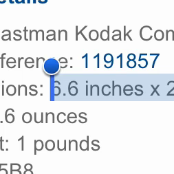
Mobile Product Pages: Always Offer a List of Compatible Products
April 2, 2013
Field Label UX: Place Labels Above the Field
March 19, 2013 Popular
M-Commerce Usability: Exploring the Mobile Shopping Experience
March 12, 2013
Mobile Form Usability: Avoid Splitting Single Input Entities
February 12, 2013
8 Limitations When Designing for Mobile
March 21, 2012
Want to learn more about this topic?

Explore Other Research Content

334 top sites ranked by UX performance.

18,000+ annotated designs for systematic inspiration.

Code samples, demos, and key stats for usability.