
Form Design: 6 Best Practices for Better E-Commerce UI
Form design affects users at a critical moment -- when they are attempting to complete a purchase.
Our large-scale research reveals an average increase of 35% in e-commerce conversion rate with checkout flow improvements, many of which include better form design.
In this article, we’ll start by talking about what form design is and the unique components of forms to consider during the UX design process.
We’ll also provide some form design best practices compiled from our extensive UX research and usability testing.
These are the same techniques used by high-performing e-commerce sites to create well-designed forms that ease users through a seamless checkout.
What Is Form Design?
Form design is the process of creating a user interface on a website where visitors can input and submit their information. Forms affect the UX during processes like creating an account or checkout, so it’s essential to ensure a user-friendly design.
Well-designed forms enhance website usability, making a great impression on users by showing that your brand is helpful, thoughtful, and enjoyable to work with. Poorly designed forms lead to frustrated users, abandoned carts, and even increased complaints to your customer service team.
Form Components
Before we dive into best practices, let’s get clear on the individual components of a form. The typical form has the following components:
- Structure: The structure of the form includes the order of the fields, the logical connections between the fields, and the form’s appearance on the page.
- Input Fields: Input fields enable users to provide information. These fields include things like text fields, checkboxes, sliders, radio buttons, or anything else designed for user input.
- Field Labels: Field labels consist of microcopy that tells users what individual input fields mean, and what type of input is expected.
- Action Button: The “submit” button is a common action button. When the user taps or clicks on a button, the form performs an action, like submitting the data.
- Feedback: When a user inputs information, the form provides feedback about the result of that interaction. Feedback could be positive, indicating a form was submitted successfully or a transaction was completed. Feedback can also be negative, such as, “The credit card number you’ve entered is invalid.”
- Assistance (Optional): Many forms include explanations of how to fill out the form. For example, a message at the top of the form can explain what type of input is expected, or provide guidance about certain fields.
- Validation (Optional): The validation process checks the user’s input and ensures that it is valid.
→ Sign up free to free research-backed UX guidelines and start improving your site today.
Best Practices for E-Commerce Form Design
Online forms are the primary gateway between a user and an e-commerce business, directly in the path of site visitors who want to become customers.
But too many online forms are too confusing, long, or invasive to be effective. Since form usability plays such a major role in the checkout experience, it’s a logical place to start optimizing conversion rate.
We’ve found opportunities for design improvements in almost every checkout flow we’ve tested, including many of the top-performing e-commerce sites in the US and Europe.
Below is a selection of form design best practices for a better UI and improved UX on your e-commerce site.
To help you optimize every element of your checkout flow, you can find more guidelines and hundreds of checkout page design examples analyzed for usability in Baymard Premium.
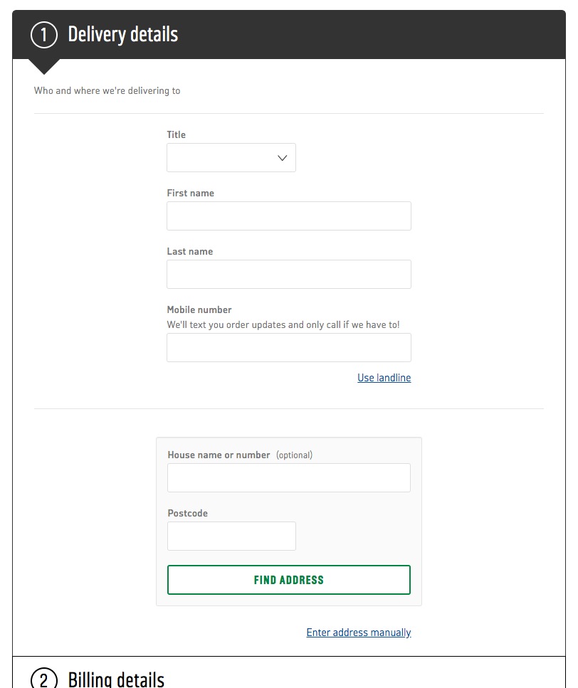
Avoid Multi-Column Form Layouts
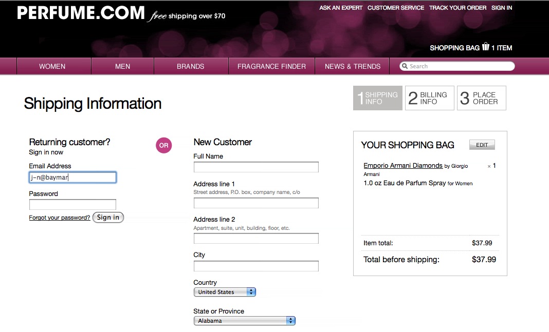
When form fields were presented in two columns on Perfume.com, test participants had difficulties understanding the relationship between the fields. This form was interpreted in three different ways: 1) All the form fields should be completed in order to create an account, 2) “Email Address” and the right column should be completed to use ‘Guest Checkout’, and 3) either the left or right column should be filled out.
Some e-commerce sites use multi-column form layouts in an effort to shorten pages, but these forms have proved troublesome during our usability testing. Multi-column forms are inconsistent and prone to misinterpretation, but our benchmark reveals that 16% of e-commerce sites use a multiple-column form design.
Avoid multi-column form structure and instead, use a single primary column to display form fields. If you have multiple credit card and address fields on the same line, that may be acceptable in certain circumstances.
Reduce the Number of Visible Fields on a Checkout Form
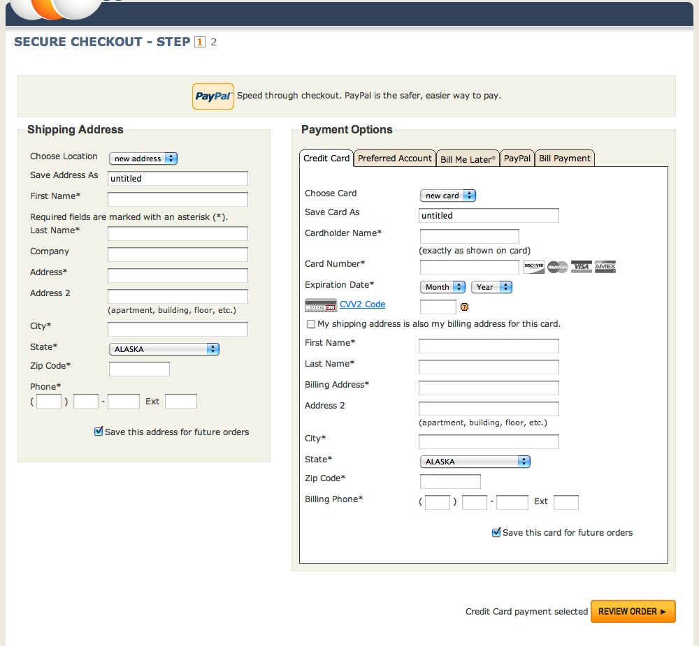
“It looks pretty chaotic when you first enter the page…it might actually cause you to bail if you were in a hurry”, a participant said when landing on NewEggs’s “one-page” checkout form. The two-column form design and the uncollapsed billing address result in an intimidatingly large amount of fields on this form.
According to our research data, 18% of users have abandoned a cart in the previous quarter due to a checkout form that was perceived to be too long or complicated. During usability testing, participants became intimidated by checkout forms with 10 to 15+ fields.
Look for opportunities to reduce the number of fields on your checkout page:
- Avoid splitting single input identities (for instance, using one field for a phone number, instead of separate fields for country code, area code, and main phone number)
- Remove all fields that aren’t relevant to the current context
- Hide fields that are optional or infrequently used behind a link
- Autodetect and prefill field values when possible
If 10 to 15+ fields are still viewable after you’ve made attempts to simplify a form, consider reducing intimidation by splitting checkout into multiple steps or hiding fields in collapsible sections.
For most checkouts, taking these steps can result in a 20 to 60% reduction in the default visible form fields and elements.
Add Descriptions to Form Field Labels (Above the Field)
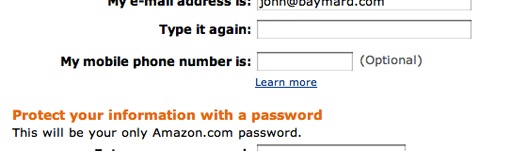
Amazon uses a “Learn more” link to explain why they’re asking for the customer’s phone number.
Field labels help users make sense of what information to enter, and how to enter it. Some common sources of confusion include:
- Phone number format
- What to enter in fields labeled “Address 1” and “Address 2”
- Where to find “CVV” on a credit card
- Password requirements
When personal information is being requested, descriptive labels can ease discomfort by explaining how the information will be used and why it’s required.
Without form field descriptions, many test participants in our usability testing were confused and resorted to guessing or contacting customer support for help in filling out checkout forms. Others simply abandoned their purchase.
Consistently add clear form field descriptions throughout the checkout process to eliminate confusion and improve UX.
Argos avoids issues caused by inline labels by providing labels above form fields.
When the label disappears as the user starts typing, errors become difficult to correct and users can become confused about what they’re supposed to enter in the form. Avoid inline labels and be cautious when implementing floating labels on your forms.
Instead, position labels above fields, so they remain visible once users have started typing. Inline placeholder text is a useful feature, but it doesn’t replace the need for a clear label.
Use Buttons for Size Selection
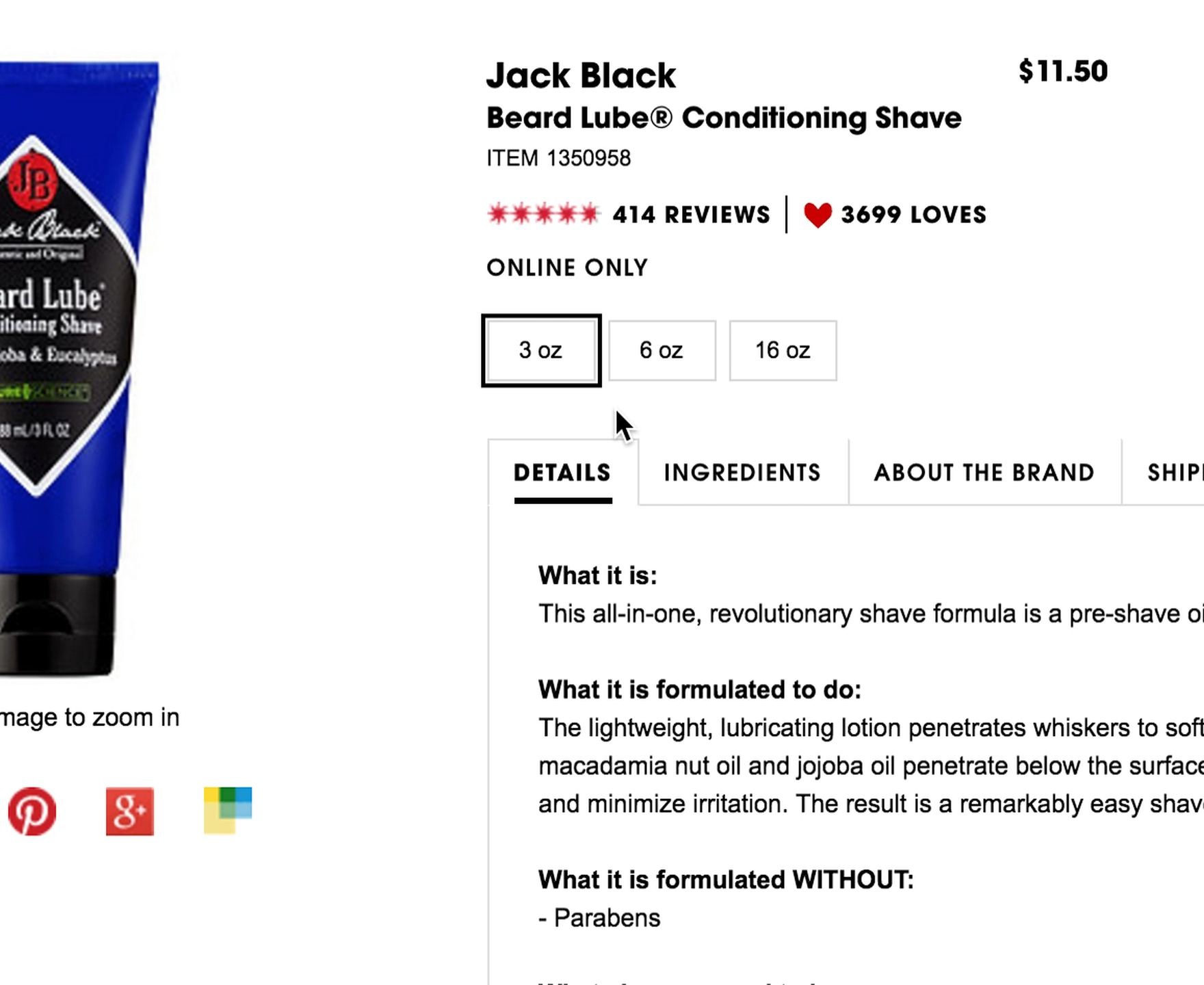
On a Sephora product page for shaving cream, 80% of users clicked the different size selectors and noted how the different sizes were reflected in the product price.
During large-scale UX testing, we observed that users were likely to overlook a size selector on a product page if the selector was presented as a drop-down menu. If they did activate a drop-down menu, they were often surprised or disappointed by the range of available sizes.
This is particularly frustrating for users who spend considerable time exploring a product before realizing their preferred size is out of stock.
Size buttons present a clear usability improvement over displaying size options within drop-down menus. The practice of using buttons for size selection has increased in popularity. Currently, 71% of current desktop benchmark sites use size buttons, up from 63% in 2017.
Use buttons for size selection on product pages to help users understand their options while reducing the likelihood of wasted effort and error.
Improve Autocomplete Suggestions
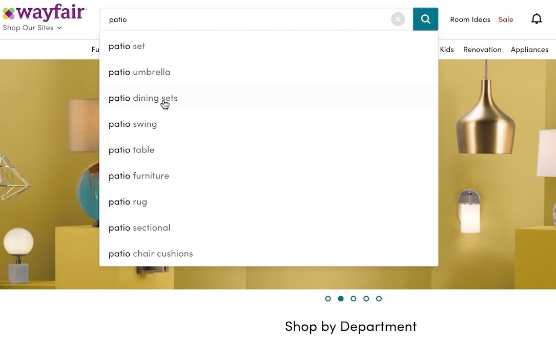
Wayfair’s desktop site limits the number of autocomplete suggestions to 9. This is a compact autocomplete list users can view at a glance, fostering easier and faster decision-making.
Our latest benchmark data reveals that 96% of major e-commerce sites offer search autocomplete. However, 27% of sites have an autocomplete implementation that has several severe usability issues, so autocomplete often performs poorly with users.
To truly lend a helping hand with your autocomplete functionality as you are designing forms:
- Keep the list of suggestions manageable
- Avoid scrollbars in the results
- Highlight the active suggestions
- Make it easy to remove the current input
You can find more suggestions in our in-depth article on autocomplete UX design.
Execute Validation Flawlessly
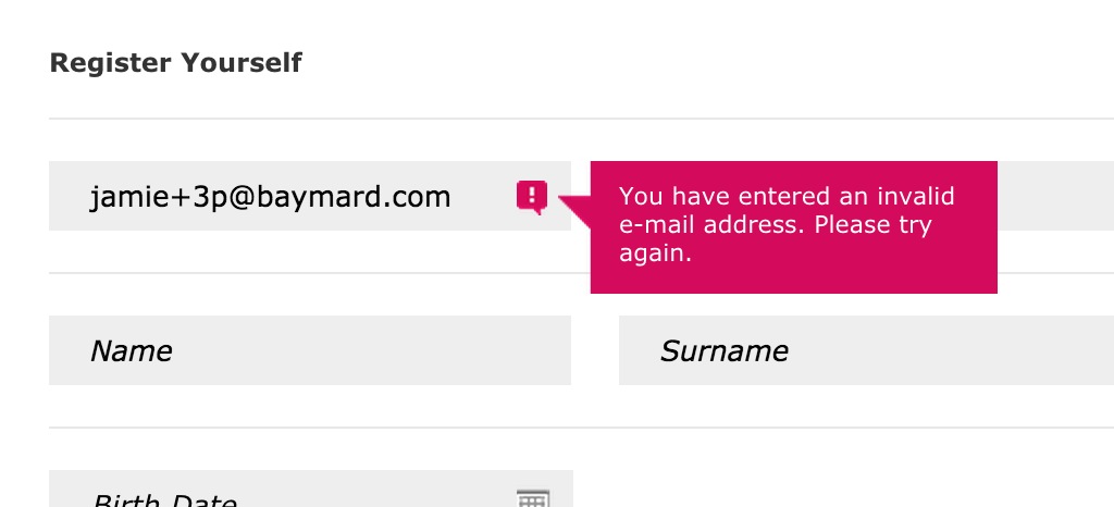
This e-mail validator rejects any input with a ‘+’ character in it. The plus sign may be an uncommon character in e-mail addresses, but it isn’t invalid. This validator unfortunately locks out any user with an e-mail like this. In this situation, a warning would have been a better option.
Validations are a great way to check form field input and reduce errors later in the checkout process by ensuring that:
- Required fields aren’t left empty
- Numeric inputs are indeed numbers
- Dates are within required ranges
- Phone numbers have the correct number of digits
But for validation to be effective and not annoying or discouraging for users, the validation rules must be implemented flawlessly without invoking false negatives.
In some cases, it may be appropriate to pair validation with warnings like “Are You Sure?” that alert the user to potentially erroneous input without preventing them from proceeding.
Find the right balance of form validations versus warnings in your form design, to ease users through checkout and avoid errors.
Practicing Intuitive Form Design
Users may be reluctant to fill out a form for a myriad of reasons, so it’s critical to make the process as easy and painless as possible. Small changes can make a big impact on your form’s user experience. By working to follow UI design best practices, you can incrementally improve e-commerce conversions.
For thousands of ideas to improve UX in the checkout flow or any element of your e-commerce site, check out Baymard Premium.
When you sign up, you’ll get access to the 580+ UX design guidelines and 71,000 hours of research used by many of the world’s leading sites -- plus onboarding support and private Q & A sessions with a senior UX researcher to get you started.
Research Director and Co-Founder
Christian is the research director and co-founder of Baymard. Christian oversees all UX research activities at Baymard. His areas of specialization within ecommerce UX are: Checkout, Form Field, Search, Mobile web, and Product Listings. Christian is also an avid speaker at UX and CRO conferences.