This is the 3rd in a series of 8 articles on mobile usability that draw on findings from our mobile e-commerce usability report.
When testing 18 of the largest mobile commerce sites compatibility-dependent products in particular proved to be difficult to find for the test subjects. A “compatibility-dependent product” is any product that is dependent on being compatible with another product that the store also sells or the customer already owns, e.g., an adaptor for a laptop or a case for a digital camera.
These are typically high-profit accessory products and it therefore makes good sense both usability- and business-wise to make it easy for users to find such compatibility-dependent products.
Finding Compatible Products on Mobile
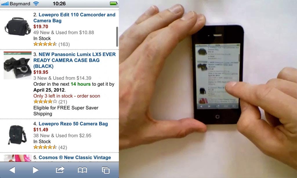
While finding the right product in general wasn’t an easy task for subjects during testing, it required a significant amount of extra effort (research, navigation, verification) from the test subjects to find compatible products. As a result, they often only reluctantly looked for compatability products, and did so with limited success.
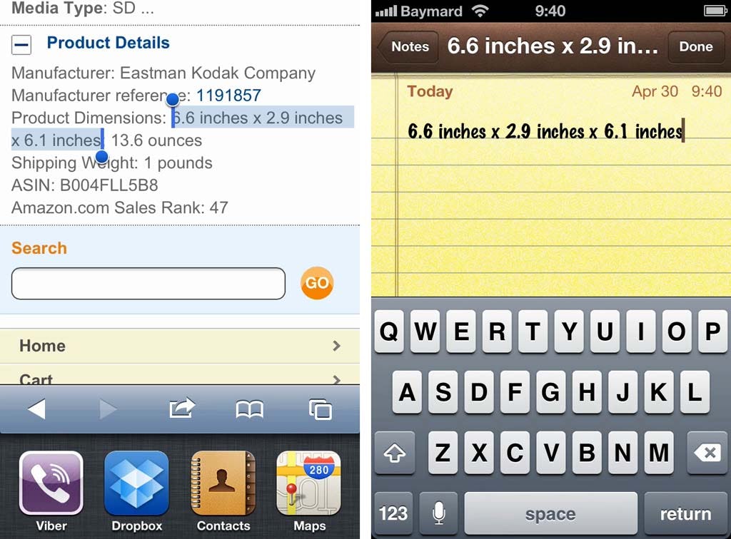
Since a list of compatible products was not listed, this subject resorted to copy-pasting the camera dimensions into the iOS “Notes” app so he could compare them against the camera bags later.
If a list of compatible products are not shown, the user has to write down or memorize various product details, for instance, the dimensions of a camera, and then browse various camera bags, looking at their inner dimensions to determine if the products are compatible. During testing numerous subjects miscalculated or misinterpreted product dimensions and consequently discarded products because they deemed them incompatible (or at least were unsure if they were compatible). Even products that in the product description or title explicitly stated that they were compatible with the item in question were discarded if the dimensions looked off.
While this could also be a daunting task on desktop, there are some vital differences, in particular in terms of overview of the options, tabbed browsing, and ability to view multiple windows next to each other. On mobile the subjects focused very intensely on one product at a time (as opposed to full-site product finding which often involves tabbed browsing, multiple searches in parallel, etc.), which made it cumbersome to validate a long list of products up against a specific set of compatibility attributes (e.g. internal dimensions).
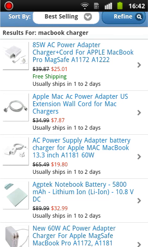
A search for “Macbook charger” yielded good results, but this subject did not know what the 60W and 85W options represented and was unsure if only one of them would be compatible with his Macbook.
Other times the issues weren’t related to locating and comparing the compatibility attributes, but rather understanding them at all. This was particularly true of technology products where many of the test subjects were confounded by various technical compatibility aspects, such as the power rating of a laptop charger (as seen above) or the regional limitations of a Blu-ray player.
In all these instances, showing a list of compatible products would have helped the user greatly in finding (and ultimately buying) these compatibility-dependent accessories.
A List of Compatible Products
It is recommended to display a list of compatible products on the product page. This can be implemented in many different ways and there’s not one preferred design; however, it is important that the compatibility list is easy to find and scan.
If you carry the items, they should furthermore be links so the user can go straight from e.g. camera to a compatible camera bag. If you don’t carry the items in your store, it is still advisable to show a compatibility list. For example, even if you don’t sell a particular Asus laptop, it will be very helpful for the user to see this laptop listed as a compatible product when looking at an Asus charger, as it will allow them to identify their own laptop in the list and thus feel confident that the two are compatible without worrying about the technical details.
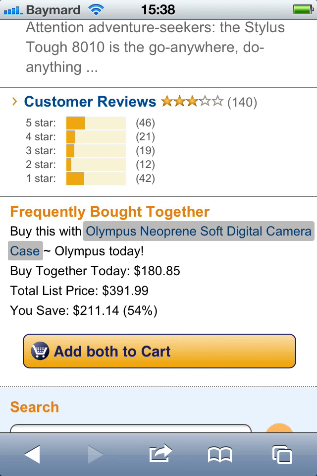
At the product page of a digital camera, Amazon presents the user with a compatible camera case, and links to the product page to make it easy for the user to further investigate the product.
When listing compatible products it is very important to be consistent in the inclusion or exclusion of model series vs. specific models. For example, do you list just the model series “Dell Inspiron” or do you list the specific model names “Inspiron 5150, Inspiron 8600, ..”? The subjects got very confused on the sites that on one page listed model series and on another specific model names, as they suddenly started doubting if the series name included their specific model as well. Therefore, consistency is important in this regard (at least within the same category of products).
Finally, you may consider showing compatible products in the cart too, especially if you redirect the user to the cart when they add a product to it (since they in this instance won’t be able to open any compatible products listed on the product page they were directed away from). Just make sure that when listing compatible products in the cart they are very clearly separated from and secondary to the actual cart contents (to avoid the two being confused), and that the list is placed below the “Proceed to Checkout” button (to ensure the user instantly and always knows how to proceed if they are happy with their current items).
Compared to Full-Sites
When comparing to desktop usability research this is a very interesting observation, as users perceptions of such compatibility cross-sells differs between full-sites and mobile sites. On mobile, users are mainly positive, as the listed products are perceived as quick cross-navigation. On desktop, the reception is more chilled and it is more often seen as ads for other (compatible) products - although still found useful when needed.
Therefore, avoid any temptation to remove such compatibility “cross sells” from your mobile site in an effort to simply the product page, as this really will be false simplicity. In fact, depending on your current full-site cross sells and your industry, you might consider experimenting with the opposite for your mobile e-commerce site, adding more thorough and extensive compatibility cross-sells lists on your mobile product pages.
Adding compatibility lists to your product pages, especially with products you carry, is clearly a no-brainer given the typically high profit-margin on these types of accessory products. Do however take note of the ‘compatibility’ part; this more positive attitude towards compatibility cross-sell lists doesn’t necessarily apply to more generic cross sell lists.
This article presents the research findings from just 1 of the 700+ UX guidelines in Baymard – get full access to learn how to create a “State of the Art” ecommerce user experience.

