Help text: either it’s there when you don’t need it, or you can’t find it when you do need it. Let’s take a look at 3 different ways Google, Amazon and 37signals solve this problem.
1) Google: Callout dialog

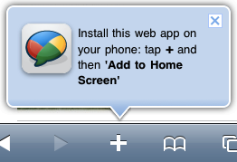
Google uses this clever dialog in many of their products to call attention to new features.
A big inline dialog with an arrow pointing right at the feature. Google uses this in a lot of their products when introducing new features and it provides an amazingly clear context for the description.
The dialog is obtrusive and requires you to take one of three actions: “Close”, “Remind me later” or “Learn more”. The last option is interesting – by having a “Learn more” link in this dialog, Google can keep the description brief and explain it in further detail to those interested.
Obviously this is not suited for general help that you always want to show the user, but if you’re introducing a new feature and want to promote it and help your existing user get started, this approach is a good candidate.
Good for…
- Introducing features. When you launch a new feature, this kind of callout dialog with a short description and a “Learn more” link is a great way to get your users off to a good start. (It could also be useful for introducing first time users to the app’s 1-3 most important features.)
- Setting a clear context. When you visually tie the description to the feature, the context of it becomes very clear to the user. You don’t need to explain where the feature is or what it looks like – you can use all your text on describing its benefits and functionality instead. Unlike the typical text description, there’s no disconnect between description and feature.
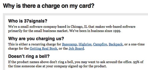
2) Amazon: What’s this?

What’s this? You’ll see this question all over Amazon’s website. Clicking them opens a pop-up window with a in-depth description of the feature.
A link, posing a simple question: “What’s this?”
This link is typically placed next to the header of a feature, and clicking it will open up a help text that explains the section or feature.
Because a link is small and unobtrusive, existing customers who already know about the feature won’t be distracted, yet anyone curious to learn more can go straight to the relevant help page. And because the help is in a separate area, you can write a more in-depth description if needed.
Good for…
- Unobtrusive help. Because the help isn’t directly embedded in the interface, it won’t distract people. This makes it great for features that the majority of the users a) already know how to use, or b) will intuitively know how to use.
- Learning by doing. By hiding away the help text you encourage your users to play around with the feature rather than read instructions about it. So this is a good strategy if a feature is best learned through interaction.
- Browsing. When the user doesn’t enter any data in the screen, they’re not worried about “breaking” anything. This means users will be more comfortable interacting with and exploring the feature without really understanding what it is since they aren’t afraid of breaking something or losing their data.
3) 37signals: Embedded instructions

In this screen from Basecamp, embedded instructions help guide the user through a feature that’s not used very often. Descriptive labels, examples, explanations – it all helps.
Brief help text permanently embedded in the interface. Writing full sentences explaining a feature or the outcome of actions your user is about to take can be a powerful concept. It will help new users understand things better and reassure existing users in what they’re about to do.
Surprisingly many websites and web applications nowadays have extremely short labels with no explanations next to their form fields. Unless you intrinsically understand the feature, you’re lost. With embedded instructions you replace the “Name” label of your form with “Name the project”, and perhaps you even add an example or two as well (see above screenshot). This guides the user through the screen.
This is of course a UX writing balancing act. When dealing with simple screens and features that are used frequently (e.g. adding a to-do item to a task manager), embedded help may be overkill. However, for screens that aren’t used frequently and features that aren’t necessarily intuitive, embedded help can be a great choice.
Good for…
- Reassuring user in his actions. Embedded help text is great for constantly reminding and validating your user’s actions. The user will feel confident about the outcome of e.g. clicking the submit button in your “Invite a new user” form.
- Forms and data manipulation. Screens where the user has to fill in data can be scary – if they click the wrong button the data is lost. Bad design, sloppy coding and spotty internet connections have left users terrified of losing all their input whenever they submit a form. Embedded help text can help reduce the number of errors your users make when filling out the form and will reassure them when it’s filled out correctly.
- Features that are seldom used. If your website has many features, it can be difficult for your users to remember how each of them work. Especially the ones that aren’t used very often. In these cases embedded help text is a great way to explain the feature once more and users won’t mind spending an extra minute reading up on it.
Choose one..
Think about the scenario your users are in: what’s the best way for them to learn the feature? Is it important for them to know about the feature before using it or can they safely play around without destroying anything? Is it okay to distract users a little bit in this screen or should you get out of their way?
If you have any ideas or other examples, then post a comment.