Key Takeaways
- Our large-scale testing shows that errors are inevitable when it comes to checkout
- What matters is how users are — or are not — helped to address the error
- 98% of sites in our benchmark don’t use error messages targeted specifically at the exact problem that triggered the error — despite the back-end logic knowing the issue
Video Summary
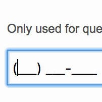
Even when taking logical steps to minimize the number of users who run into validation errors — for example, indicating both required and optional fields, providing explanatory text, and showing input masks — some degree of error messaging will be unavoidable.
Across multiple rounds of Baymard’s large-scale checkout testing, we’ve repeatedly observed that the content of the error message itself is vital to user’s ability to quickly recover from the error and get back on track.
In the worst scenarios, participants in testing were unable to resolve the issue preventing them from continuing due solely to vague or generic error messages, ultimately forcing them to abandon the process.
Yet our e-commerce UX benchmark shows that nearly all sites — 98% — use generic error messaging.
As a result, overly general error messages force the burden of determining what the problem is — and what needs to happen for the issue to be resolved — onto users, turning what may have been merely a small speed bump into a major roadblock.
In this article we’ll discuss our Premium research findings related to error messaging in checkout:
- How users can get completely stuck on errors
- How “Adaptive Error Messages” help users move past errors
How Users Can Get Completely Stuck on Errors
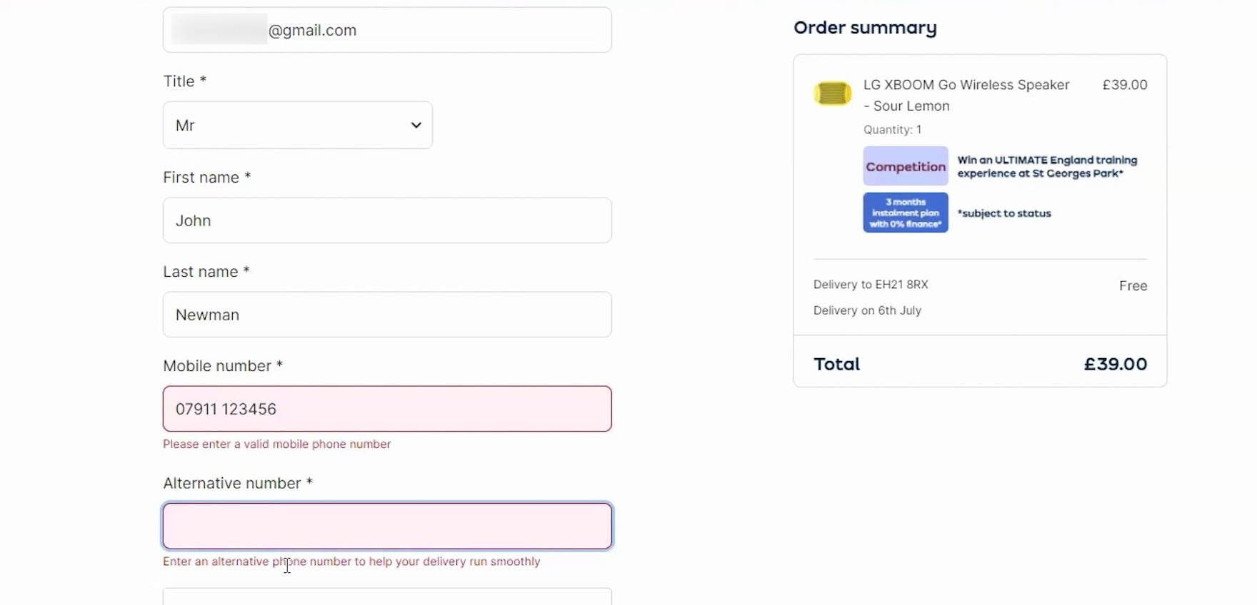
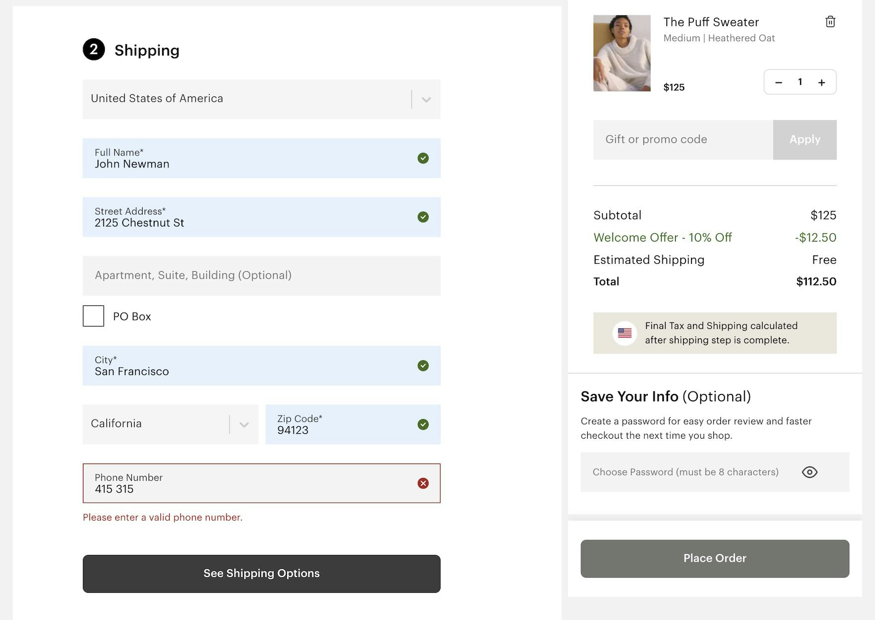
“It doesn’t like that phone number. Do you want me to put ‘+44’ in front of it or something like that? I wouldn’t have thought so, but I don’t know why that’s not working…I’d go to another site at this stage. It’s obviously not working.” During testing at Appliances Online (UK), this participant could not determine how to resolve the issue with the “Mobile number” field based on the vague error messaging. In fact, the site would not accept input with a space.
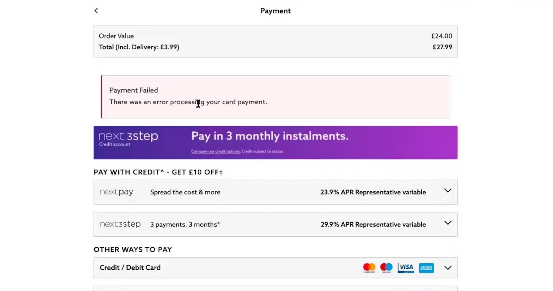
“I would be thinking that I’m not sure what’s going on if it’s failed. I don’t know what’s going on, so I would like to check on my bank to make sure I have the right amount of money. I’m not too sure. It seems like something’s wrong here.” This participant at Next UK worried his payment method had insufficient funds or issues needing resolution through the bank, while the real issue was a minor entry error. The generic error message, “There was an error processing your card payment”, did little to help him understand the exact issue that caused the payment to fail.

The generic error message at GameStop suggests that the issue is that users have not entered a phone number — when the real issue is the phone number is incomplete and does not have enough digits to be valid.
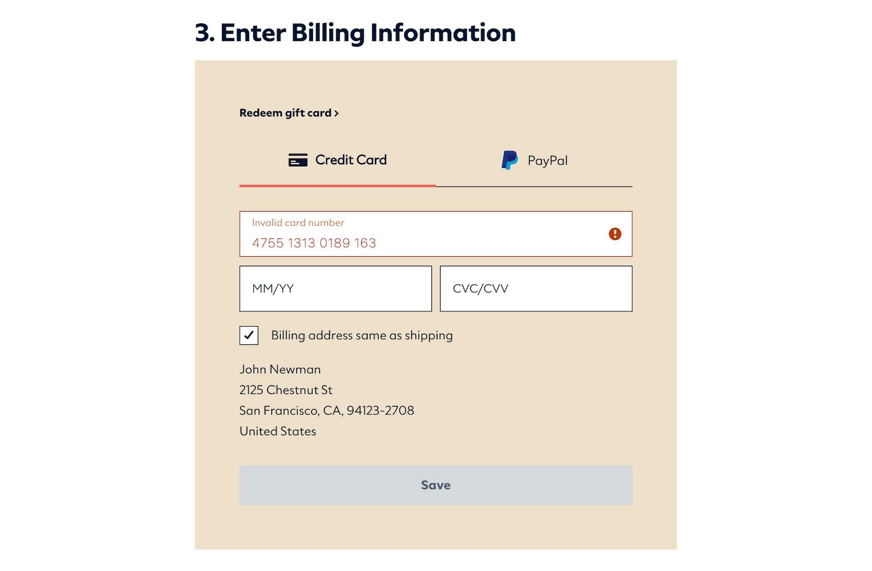
The error messages at Dollar Shave Club (first image) and Everlane (second image) state only that the input is “invalid” without indicating why or how to fix the precise problem, putting the onus on users to scrutinize their input and determine the exact issue for themselves.
In reality, many e-commerce sites have only one or two possible error messages per field.
For example, an email field may have messages that read “The email is invalid” (or “Provide a valid email address”) when the input is incomplete or poorly formatted and “Email cannot be blank” when the field is left empty.
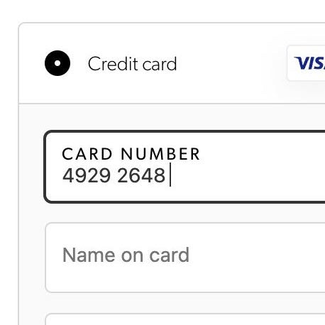
Hence, users submitting “john.newman@gmail.c”, “john.newman*gmail.com”, or “john.newman@gmailcom” would all get the same “The email is invalid” message — despite the fact that the back-end error logic knows exactly what is wrong with the user’s input (as it otherwise wouldn’t be able to invalidate it).
By not providing users with specific information to correct their errors, the time that it takes for users to correct an error increases exponentially.
In testing, we observed participants take up to five minutes to resolve simple errors for tasks such as signing in, solely due to vague error message wording.
More critically, when the error message is generic, it greatly increases the chances that a subset of users will misunderstand the cause of the error and try to resolve it in the “wrong” way, compounding the problem and leading to increased frustration.
“But this message could mean absolutely anything. That systems error could be corruption on your phone line, problem at Currys, problem at the bank, problem at their bank, problem at your bank, your bank problem at MasterCard or Visa. It doesn’t really say anything.” Unclear error messaging when credit cards were declined were a common problem observed during testing EU sites. When users can’t work out what the problem is, they could easily abandon their efforts.
While many participants in testing ultimately recovered from form field issues even with generic error messages, a subset of participants experienced a more extensive delay or became completely stuck.
Thus, while not a pervasive issue, the severity of each instance is extremely high.
In reality, users who are unable to understand why the error occurred or users who are unable to resolve the error, because of the generic message, will technically be locked out from completing their order, as they cannot proceed due to the validation error.
Hence, those users who do become confounded by a vague error message are almost guaranteed to abandon their order.
How “Adaptive Error Messages” Help Users Move Past Errors
During testing at Lowe’s mobile site (iOS), this participant received a specific error message that helped him quickly find the issue with his address entry.
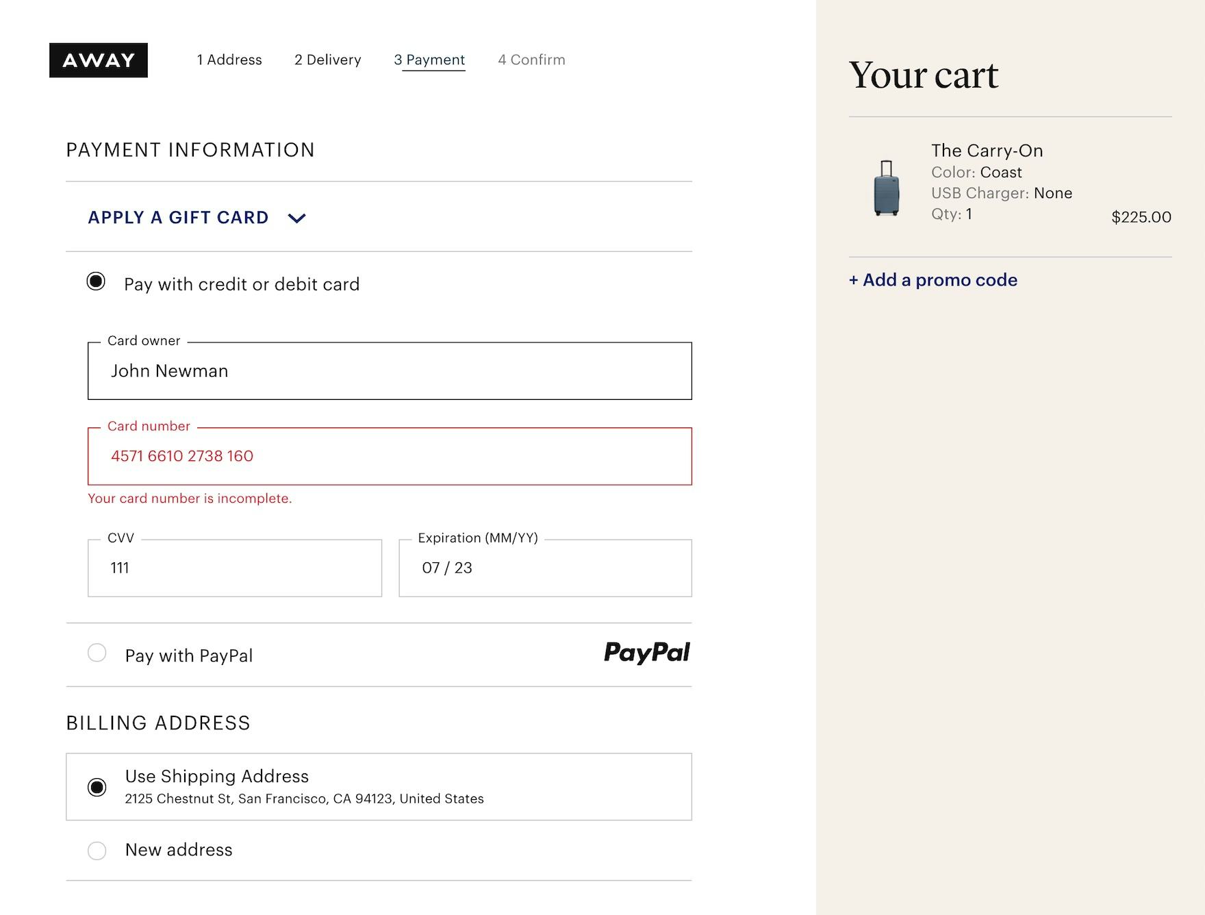
The error message at Away clearly communicates the precise issue with the card number — “Your card number is incomplete” — rather than a more generic message like “Your card number is invalid”.
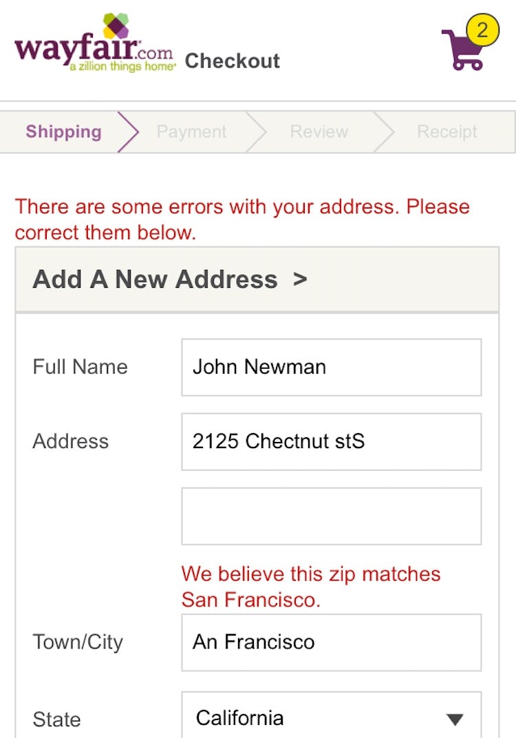
An earlier version of Wayfair’s mobile site lets users know that the zip code entered appears to be for “San Francisco”, rather than the user-misspelled “An Francisco”.
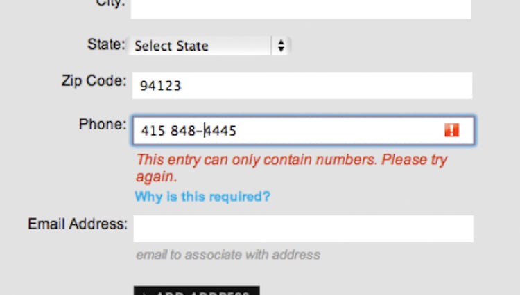
Instead of saying “Provide a Valid Phone Number”, note how Sony says that the entry can only contain numbers, as the error here is that the input contains special characters. (Although, ideally, it shouldn’t cause an error in the first place.)
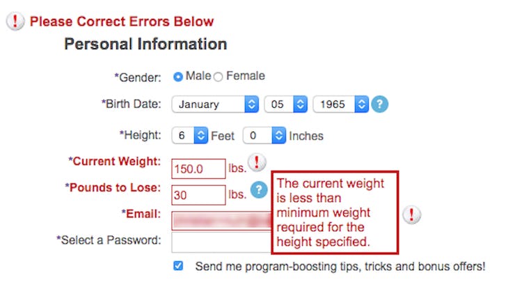
For more complex, site-specific fields such as for a weight-loss program, note how the error message adapts and describes the exact cause of the error; that the weight typed is below minimum for the specified height.
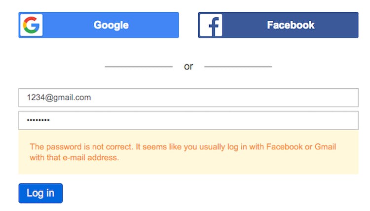
Note how Doodle, instead of just saying “invalid login”, helps users along if they try to sign in via the email and password fields, but have an account tied to a social media account. Users are provided with a message stating, “It seems like you usually log in with Facebook or Gmail with that email.”

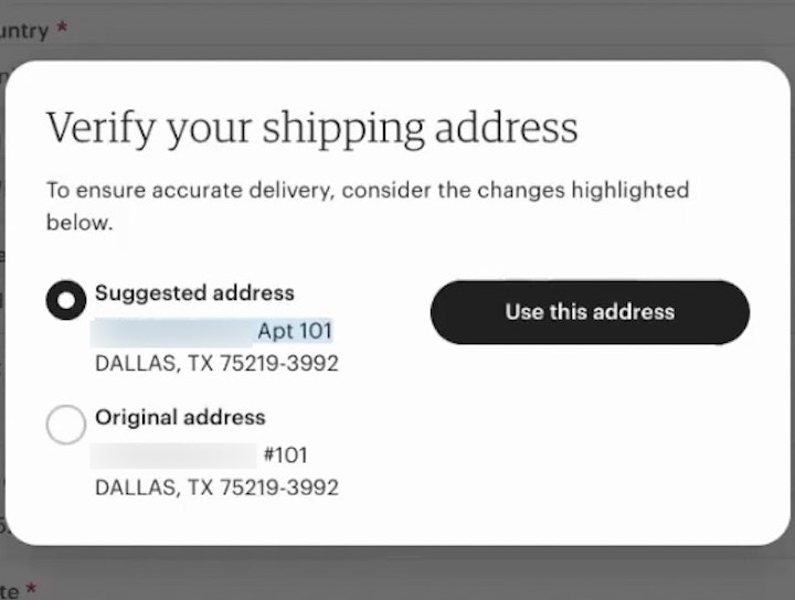
Target similarly clarifies the address-validation errors, with a message worded just for the instances where users have left out a street or apartment number.
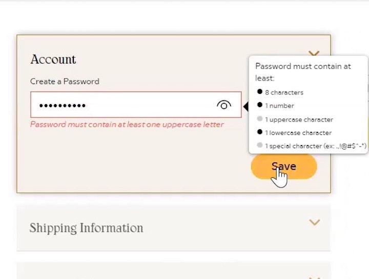
To give users the clearest indication of the issue and how to resolve it, sites should instead use “Adaptive Error Messages”.
Rather than providing the same generic message for all validation errors, “Adaptive Error Messages” change depending on the exact subrule that invoked the validation error, using this detail to provide the user with instructions on how they can correct their input.
In other words, “Adaptive Error Messages” dynamically change to best match the user’s situation.
For example, if a user inputs, “john.newman@gmail” in an email field, an adaptive validation error message would read, “This email address is missing part of the domain (such as ‘.com’).”, whereas if they had typed “john.newmangmail.com” the message would read, “This email address is missing the @ character”.
Letting the user know why an error occurred makes it easier for them to fix it.
During testing, errors that gave specific details improved the error-recovery time for all users — but most importantly it dramatically reduced the number of participants who got completely stuck and had to give up on completing their purchase.
While it may seem resource-intensive to have multiple error messages per field, the hard work has already been done, as the back-end validation logic already has all rules for a valid and invalid input defined on a field-level basis.
In practice, providing “Adaptive Error Messages” is about letting users know on the front-end what the back-end error logic has already specified.
To prioritize resources, consider starting by closely tracking all validation errors that occur within the checkout flow.
With better error tracking, sites can start by implementing “Adaptive Error Messages” for the two groups of validation errors that a) occur most frequently and b) have the highest checkout abandonment rate after receiving an error.
While it’s possible to write specific microcopy for up to 160+ error messages for a single form field, we see in practice that specifying at least 4–7 messages for the most complex inputs — like site-specific or unconventional form fields, card number, cardholder name, security code, password, phone, and email — goes a long way towards improving the error-recovery process.
![“Oh, I forgot [part of] the email. I’m like, I know I’m entering [the password] right!” This participant made a mistake while entering her email address when signing in to her account at Overstock but focused heavily on the password field after receiving an ambiguous error message. While such a message makes it more difficult for bots or hackers to verify the validity of stolen usernames, it also makes it more difficult for returning users to successfully sign in.](https://baymard-assets-cdn.imgix.net/research/media_files/attachments/92251/original/research-media-file-68667089a3cb71f5b3dd25d80ab2fe67.jpg?auto=format&dpr=2&fit=max&q=50&w=880)
“Oh, I forgot [part of] the email. I’m like, I know I’m entering [the password] right!” This participant made a mistake while entering her email address when signing in to her account at Overstock but focused heavily on the password field after receiving an ambiguous error message. While such a message makes it more difficult for bots or hackers to verify the validity of stolen usernames, it also makes it more difficult for returning users to successfully sign in.
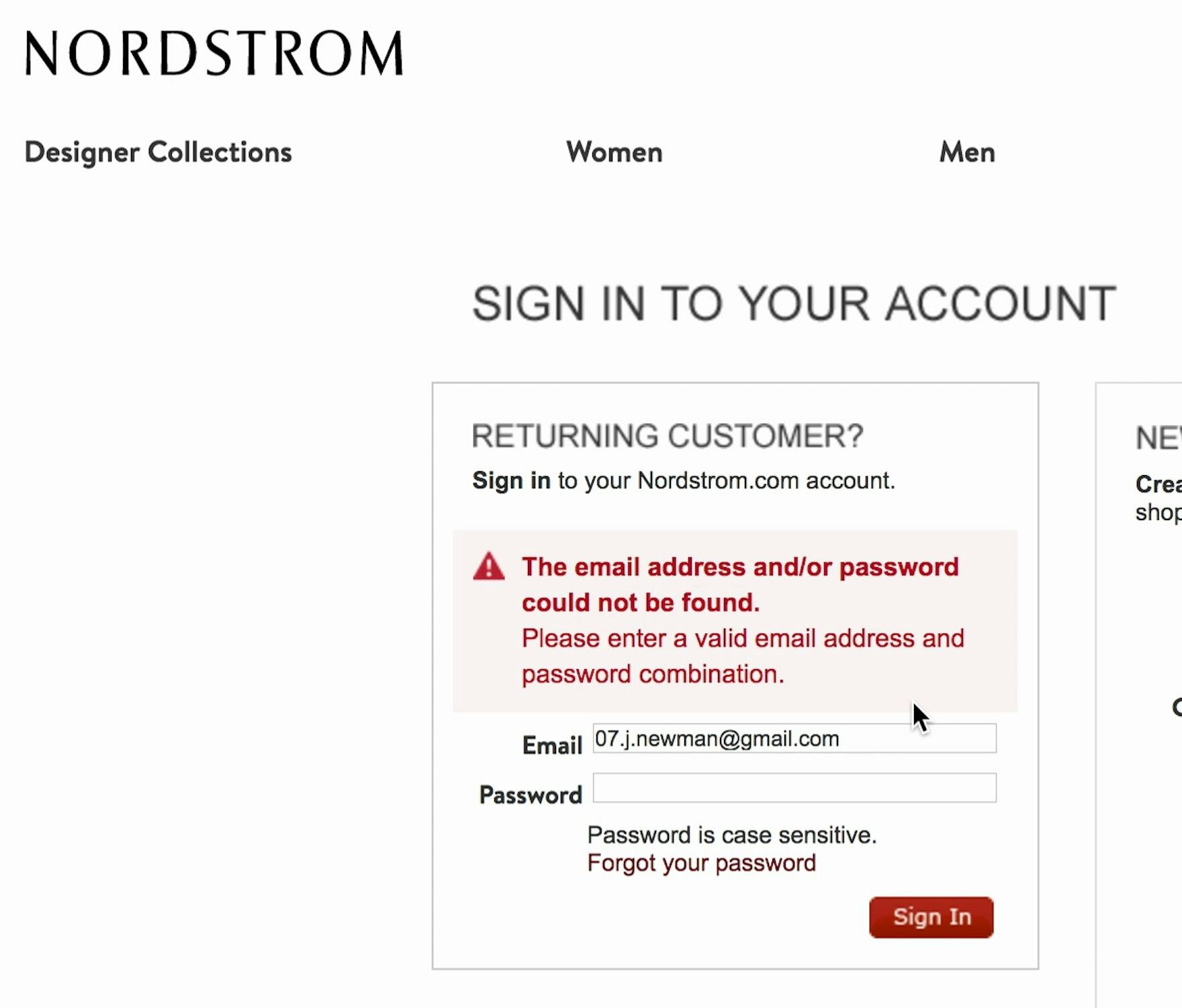
At Nordstrom a participant received an unhelpful error message: “The email address and/or password could not be found”. Generic error messages such as this make it difficult for users to recover.
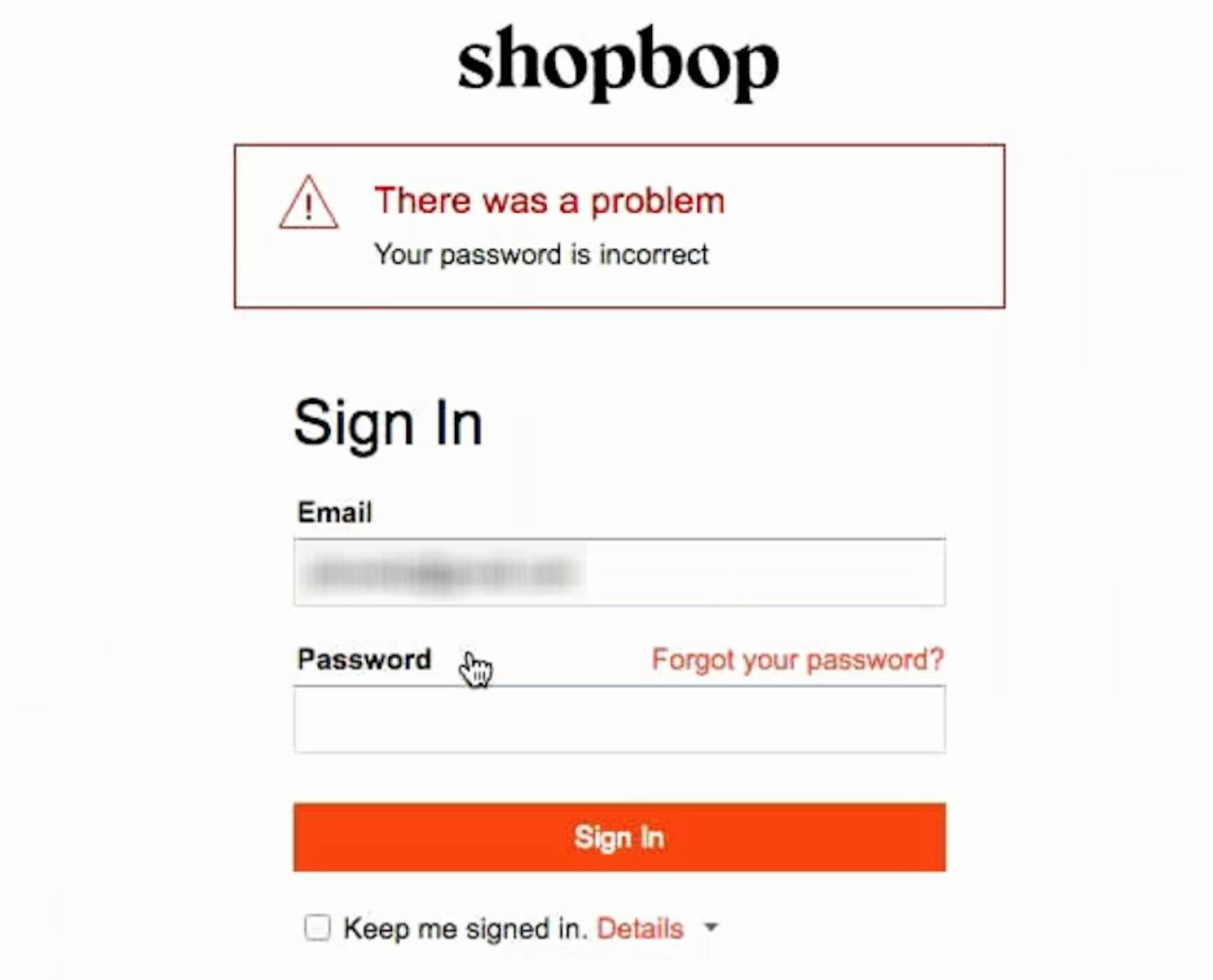
On the other hand, at Shopbop a participant received an error message stating that “Your password is incorrect”. Helpful error messages such as this allow users to focus on the field that caused the error.
Finally, one common concern for providing “Adaptive Error Messages” is that communicating specific issues with credential fields (email and password) introduces a degree of security risk: telling the requester that the email address exists in a company database effectively allows anyone to scrape the entire customer email address list if other security measures aren’t also in place.
Therefore, sites should implement common measures for sign-in attempts/password resets to make it more difficult to scrape such data, including maximum cadence (tries per minute), maximum attempts, tries per IP address, etc.
If unable to implement basic security measures like these, it can be prudent to not provide adaptive error messages for sign-in and password reset UIs, instead reserving “Adaptive Error Messages” for other form fields (and see our article on password requirements for further discussion of password security).
Tailor Error Messages to the Specific Subissue that Triggered It

Instead of simply saying “Provide a valid phone number” users at B&H Photo are provided with “Adaptive Error Messages’’, custom to the specific subissue that caused the validation logic to trigger. Here users are informed that “Phone Number is too short”.
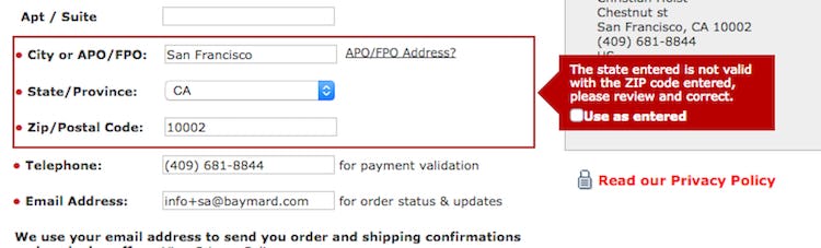
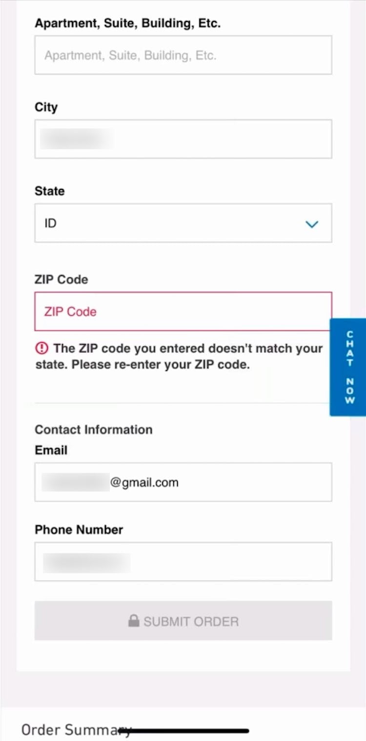
Similarly, instead of saying “Invalid ZIP code”, users were given the much more specific error “The state entered is not valid with the ZIP code entered”.
Our large-scale testing has shown that, inevitably, errors will occur as users progress through checkout.
After all, it’s quite easy to make a typo when rushing to input checkout data — especially for users on mobile devices.
Instead of focusing on eliminating errors entirely, sites should ensure that when users encounter an error they are provided with the information they need to know specifically what went wrong with their input.
Yet our e-commerce UX benchmark reveals that only 2% of sites use “Adaptive Error Messages” — increasing error-recovery friction for their users, as well as checkout abandonments.
This article presents the research findings from just 1 of the 700+ UX guidelines in Baymard – get full access to learn how to create a “State of the Art” ecommerce user experience.
If you want to know how your desktop site, mobile site, or app performs and compares, then learn more about getting Baymard to conduct a UX Audit of your site or app.