During our mobile e-commerce usability study we observed that more than 50% of users tried to “search within” their currently navigated category path, in an attempt to “filter the product list on my screen with a search query”. Yet, 94% of mobile e-commerce sites do not support such behavior – and will instead perform a site-wide search query.
During testing the issues related to ‘search within’ behavior and site support thereof was observed to be the direct cause of site abandonments. Interestingly, this user behavior finding lies at the intersection between category navigation, filtering and search.
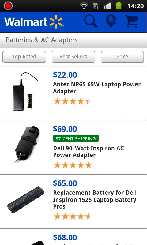
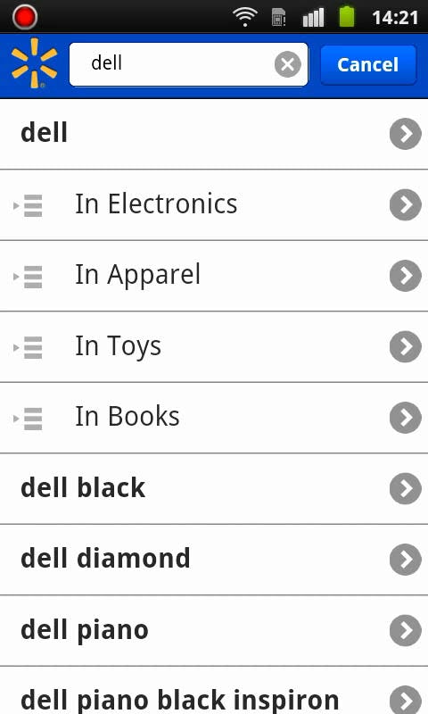
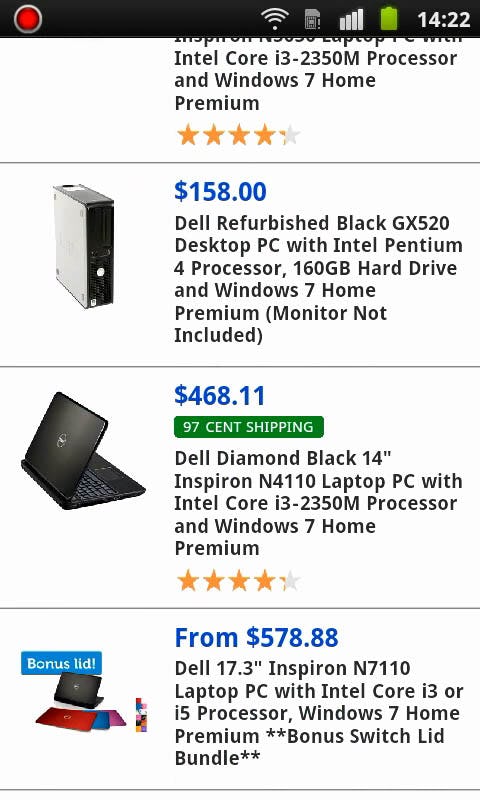
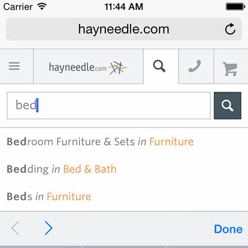
At Walmart, one of the test subject were looking for a spare adapter to her Dell laptop and navigated to the highly relevant category ‘AC Adapters’ (first image). Since she only wanted to see adapters for Dell laptops, she proceeded to the search field and typed “Dell” (middle image). Unfortunately, she got a set of site-wide search results, showing mainly Dell computers (last image).
Also, this behavior appears to be most important to support on mobile sites – the test subjects during our large-scale usability study of desktop e-commerce search did not exhibit nearly the same proclivity to ‘search within’ their current category as the test subjects in our mobile e-commerce study. This is unfortunate because our mobile benchmark shows the average mobile site fails to support to ‘search within’ behavior – in fact, 94% of the benchmarked mobile sites hadn’t implemented this feature.
In this article we’ll present our mobile usability research findings on this “search within current category” behavior, including both the mobile and desktop aspects. Furthermore, we’ll showcase 3 different types of design solutions from a few sites that do support this behavior.
Users Assume the Site Will ‘Search Within’
The most common scenario where we’ve observed test subjects trying to ‘search within’ their current category, is when they’re on a mobile site and begin browsing the site’s category navigation, moving down the hierarchy until they reach a product list. Once the subjects reached the product list many of them would scan the products and quickly decide that the selection was too broad, prompting them to look for ways to further refine the product listing. This typically made them scroll back to the top of the page where they would immediately spot a large empty search field – which more than 50% of the subjects believed would ‘search within’ that product category (as opposed to searching the site’s entire product catalog).
In fact, to some of the test subjects this expectation of “searching within the current category” was so strong that they even expected it despite the site’s search field placeholder text objectively suggesting otherwise (e.g. “Search [BestBuy].com”).
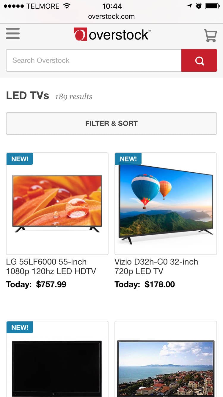

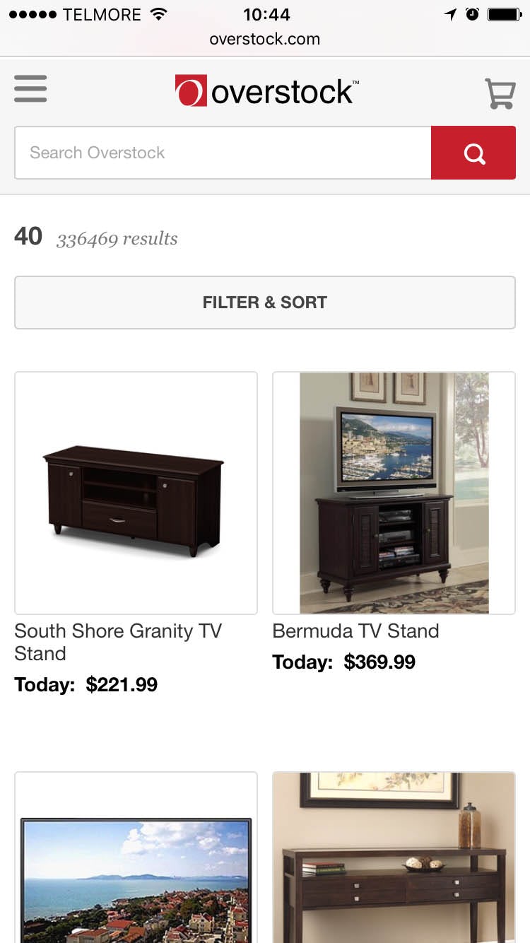
When encountering designs like the one seen here from Overstock, the majority of the subjects who had first navigated to a category, such as “TVs” (first image), would go on to enter search queries such as “40”, believing this would narrow the TVs seen in the product list to only display 40-inch TVs (middle). However, Overstock performs a site-wide search, yielding a list of highly irrelevant results.
However, on 94% of mobile sites this “search within” behavior is not supported, as their search field performs a site-wide query or only suggests generic category scopes. During testing this caused severe product finding issues as it led to unintentional scope jumping, yielded irrelevant search results, triggered poor filtering options, and caused the subjects to unintentionally leave the category they had navigated to.
When first seeing a list of categorized products, and then seeing a search field above it, it’s only natural that users assume the two are related. As one of the test subjects explained after performing such a search and learning that it was not connected to his category:
“When I search – when I am in a category – then to me it seems logical to search within that category.”
Once we appreciate this user context, it’s easy to understand how users make this conclusion. In fact, it seems a perfectly reasonable assumption once we adopt the user’s point of view. Yet it can be difficult to imagine when we’re in the shoes of a site designer or developer, and search statistics rarely provide the necessary insights to discern it. This may explain why so many sites fail to support this user behavior.
3 Types of Solutions
While our usability testing clearly showed that mobile users should always be allowed to “search within” their currently navigated category, the findings didn’t dictate a dominant design. Instead three design solutions proved equally effective: a top autocomplete suggestion vs. a scope selector vs. a dedicated “search within” field.
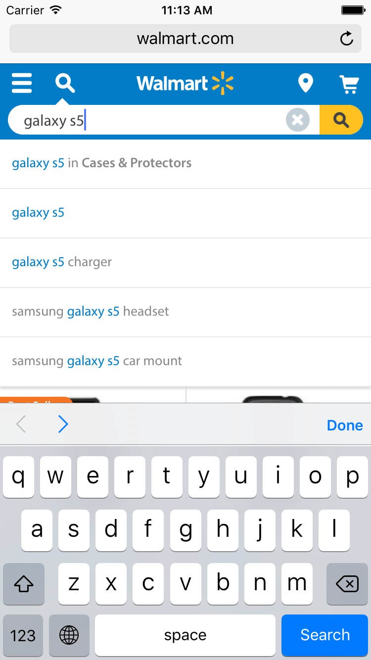
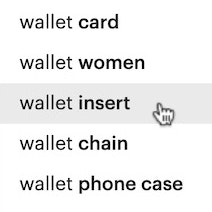
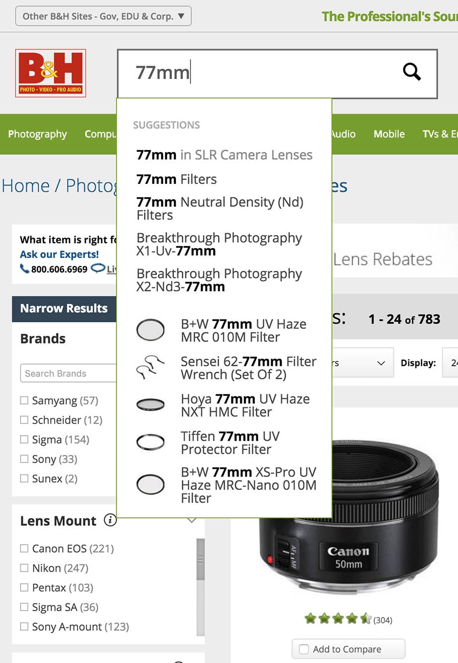
1) Autocomplete: Here the user is suggested to perform their ‘galaxy s5’ query in the currently navigated ‘Cases & Protectors’ category, enabling the user to easily “search within” yet without sacrificing the option of performing the ‘galaxy s5’ query site-wide, in case the user had decided to look for the actual phone or other types of accessories. (Note: this is a mock-up of what the autocomplete solution could look like at Walmart.)
1) Autocomplete. The user’s currently navigated category scope can be added to the already existing search autocomplete suggestions. Given that 74% of mobile sites already have a search autocomplete interface in place, using the autocomplete to suggest searching within the user’s current category will likely be a simple addition for most sites.
The benefit of using the autocomplete is that it allows for other search scopes to be suggested as well, and it doesn’t add any new interface elements to the site. For sufficient exposure it’s important that the user’s current category scope is suggested as the first option in the autocomplete.
(Tip: we also have an article dedicated to our general findings on Search Autocomplete design.)

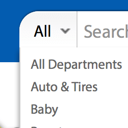
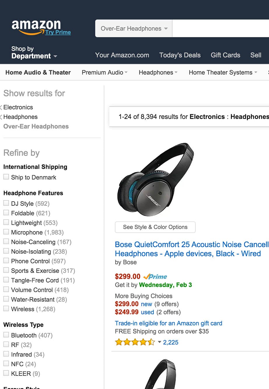
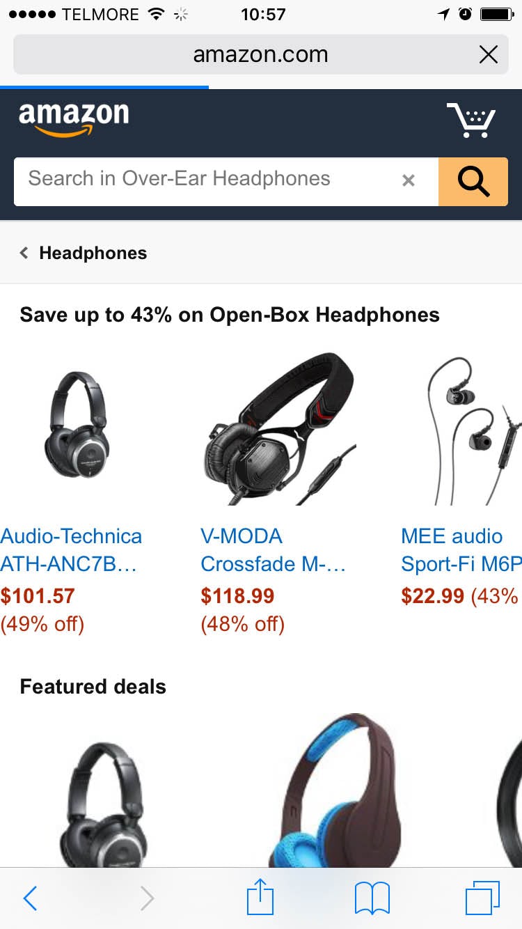
2) Search Scope: The support for users searching within their current category is taken one step further at Amazon where the search field auto-updates to the user’s current category as they navigate the site hierarchy.
2) Search Scope. Another option is to scope the search field itself. This is typically implemented via a “manual” search scope selector (often a drop-down embedded in or placed next to the search field), which then defaults to the current category but may be changed if the user decides to do so. Such manual search scope selectors are especially popular at large e-commerce sites with varied product catalogs, such as mass merchants. Among mass-merchant sites most sites have such a search scope selector on their desktop site – typically implemented as a custom drop-down integrated in the search field.
If a search scope is applied but there isn’t a manual scope selector (as seen in the above example on Amazon), it is extremely important to have a highly fine-tuned logic for auto-changing “wrong” scopes on the results page, as it will otherwise introduce a new issue: users wanting to perform a site-wide search cannot figure out how to do that! It’s perhaps worth mentioning that our desktop search benchmark found that 45% of e-commerce sites fail to implement such auto-scope change logic (Search guideline #367).
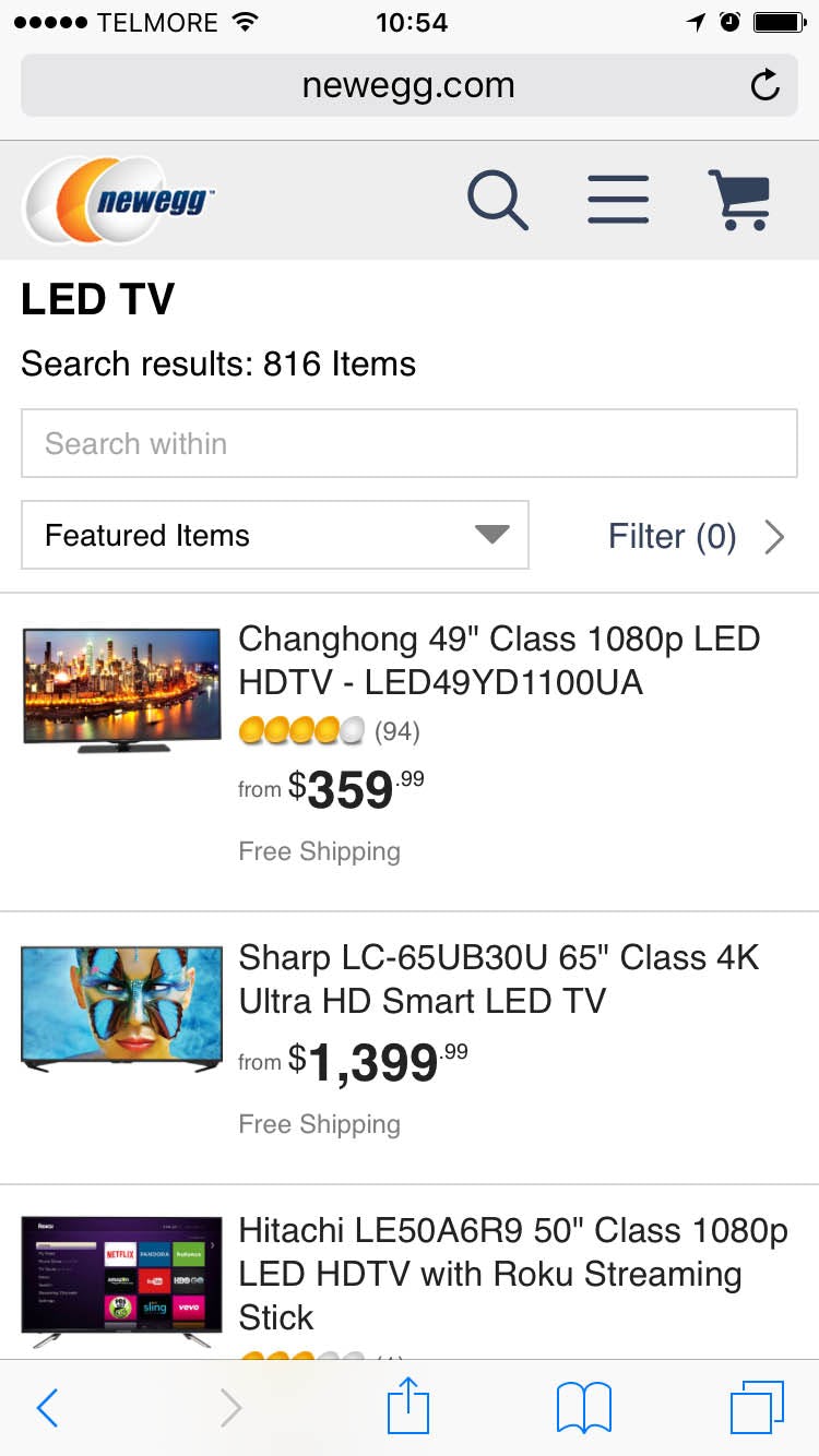
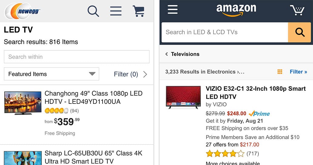
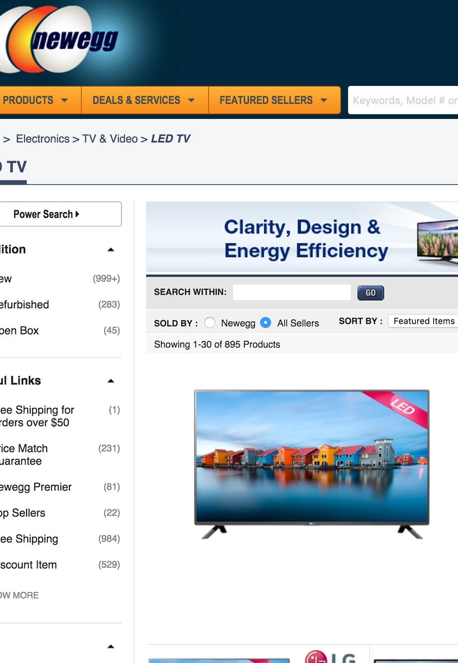
3) A dedicated ‘Search With’ field: At NewEgg users are allowed and encouraged to search within the current navigated category, yet still have the option to access the site-wide search option in the site’s header.
3) ‘Search Within’ Field. Another option is to have a dedicated “Search Within” search field. This has the benefit of encouraging users to “search within” instead of applying traditional filters, which can provide your users with incredible control over the product list by effectively acting as a freeform open-text filtering tool – granted that your site has a great search engine.
Indeed, such strong encouragement towards search requires that your site has a top-tier search engine with flawless support for Feature Search Queries – which we found 56% of large e-commerce sites to lack.
Desktop vs. Mobile
The expectation of being able to search within the currently navigated category was observed to a far greater extent during our mobile usability study compared to our desktop search study.
This is likely because mobile users frequently lack page overview, and therefore much more frequently misinterpret the context of and relationships between in-page features compared to desktop users. Furthermore, filtering and sorting options are often expanded in desktop designs, while they tend to be collapsed in mobile design, giving the search field much more prominence in many mobile designs, and often with much lower visual separation between product list and search field.
Based on the severity and frequency of the issue, we therefore recommend that mobile platforms always support “search within” (via one of the 3 design solutions explored above) – whereas we for desktop platforms only have it as a “consideration”, something that can lift the user’s search experience but isn’t directly harmful if omitted.
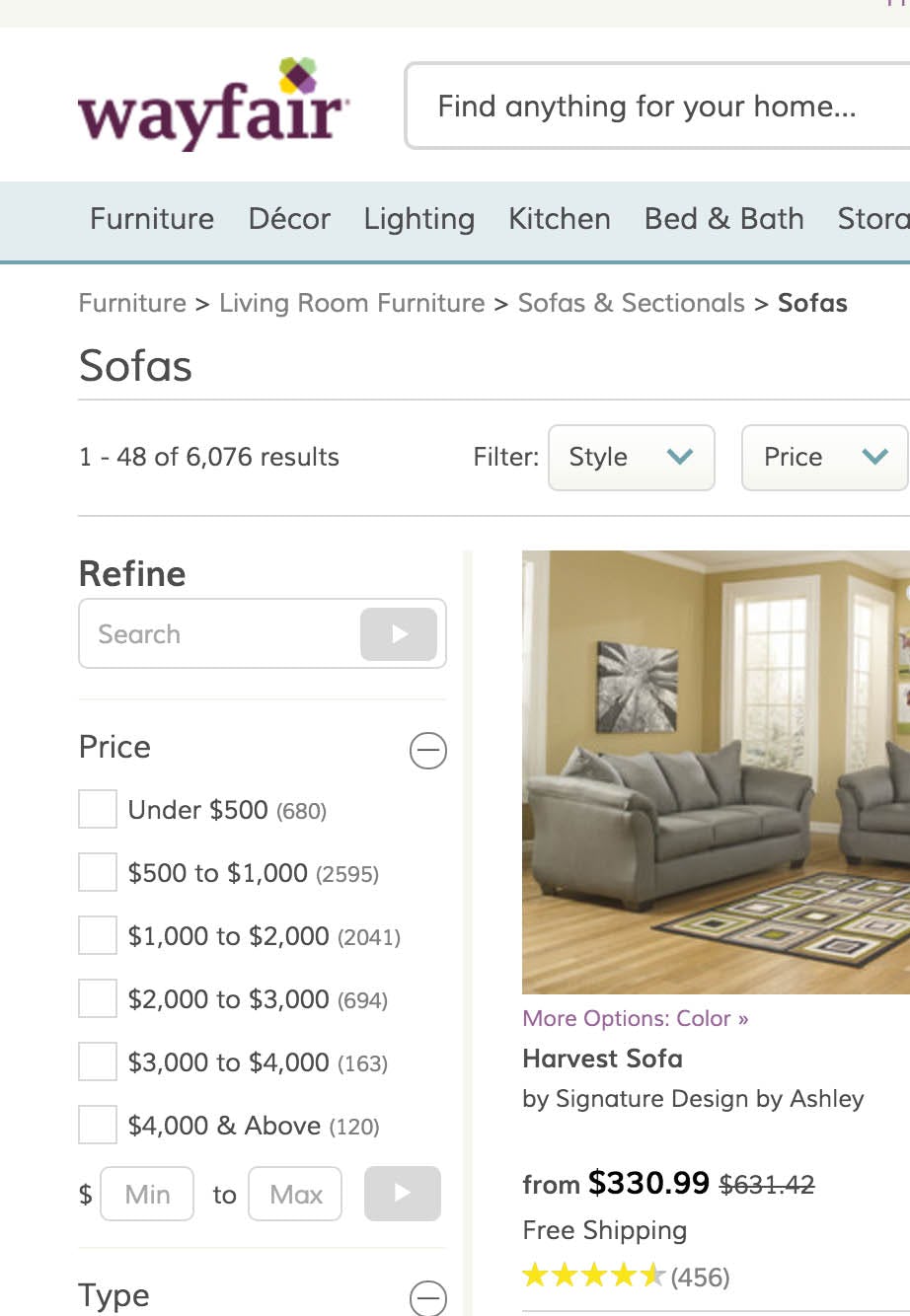
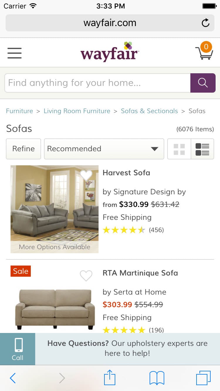
Some companies like Wayfair actually have a ‘search within’ feature on their desktop site, but then remove it from their mobile site. A severe case of false simplicity, since mobile is the very platform where it’s needed the most.
Of course, since the “search within” feature is required on mobile, having the feature implemented on desktop as well will often be technically straightforward – especially on responsive sites –since the underlying technology can typically be reused.
You may even pick from the above three design solutions based on your current implementation, for example:

If you don’t support “search within” on neither your mobile nor your desktop site, then design solution #1 – recommending the currently navigated category as search scope in the autocomplete suggestions – is an obvious choice because it integrates seamlessly into both designs as it doesn’t require user interface changes (i.e. no new elements to add to the page design).
Mass merchants, where the majority of sites have a manual search scope selector at their desktop site, will likely be able to easily extend this to their mobile counterpart by adopting design solution #2, Search Scope.

Sites that already have an extra dedicated “search within” field as part of their desktop filtering tools, may choose to adopt design solution #3 and simply merge the desktop implementation over to their mobile site. For responsive sites, make sure the layout reflows so that the “search within” field is positioned above the product list and separate from the filtering tool.
At the end of the day, what’s important is that you support the “search within current category” user behavior. Therefore go with whichever implementation you find easier or more appropriate to your site design, because it doesn’t matter which of the three design solutions you adopt, so long as you adopt one of them.
This article presents the research findings from just 1 of the 700+ UX guidelines in Baymard – get full access to learn how to create a “State of the Art” ecommerce user experience.