Key Takeaways
- Autocomplete features are provided at 80% of e-commerce sites — yet only 19% get everything right when it comes to designing the feature for end users
- While many autocomplete issues are shared between desktop and mobile platforms, some issues are prevalent in one platform or another
- Following 9 autocomplete design best practices will help users navigate the feature and proceed with product exploration
Search “Autocomplete Suggestions” (also known as “predictive search”) has remained a popular feature to provide on e-commerce sites over the past 10 years.
Our e-commerce UX benchmark reveals that search autocomplete is provided on 80% of e-commerce sites (largely unchaged from 72%, when we first benchmarked this in 2014).
Despite search autocomplete suggestions being common, our e-commerce UX benchmark also reveals that only 19% of sites get all the implementation details right for the autocomplete feature.
As a result, many users will struggle to use the autocomplete feature to its full potential — and risk missing out on relevant products.
In this article, we’ll cover our Premium research findings on how to implement 9 UX best practices for autocomplete, across both desktop and mobile platforms.
Note: while our testing also led to extensive findings on the needed autocomplete logic, this article focuses exclusively on the design of the autocomplete feature, as that’s technically far easier for most sites to change. If you have Baymard Premium, see the Autocomplete research topic for all research findings.
3 Platform-Agnostic Autocomplete UX Best Practices (Applies to Both Mobile and Desktop)
The observed issues and solutions discussed below were observed during both desktop and Mobile e-commerce UX testing to apply in both the desktop and mobile contexts.
However, depending on the issue and specific implementation the impact can be greater in one or the other.
1) Keep the Autocomplete List Manageable
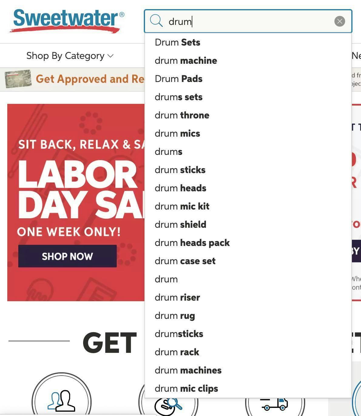
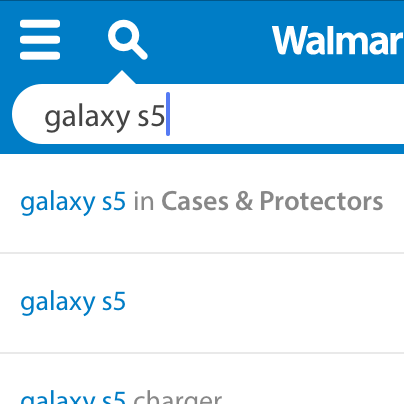
Sweetwater displays 20 autocomplete suggestions on desktop, including some redundancies (e.g., “drumsticks” and “drum sticks”) that can make it overwhelming for users to review and select a relevant suggestion.
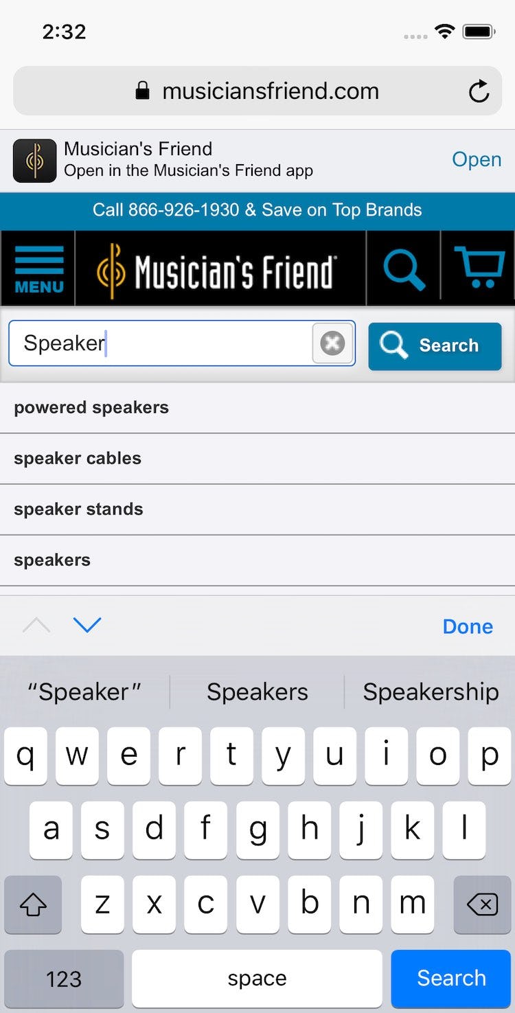
At Musician’s Friend, a total of 15 autocomplete suggestions display, where 4 are visible and the rest flow behind the keyboard. The lengthy list can cause users a degree of choice paralysis.
Both desktop and mobile UX testing revealed that providing too many autocomplete suggestions was observed to cause choice paralysis in users.
Indeed, whenever autocomplete suggestions start to exceed around 10 items on desktop (and fewer on mobile — around 8), users tend to either begin to ignore suggestions (at which point the additional suggestions become mere noise) or spend an inordinate amount of time reading suggestions (effectively halting their search process).
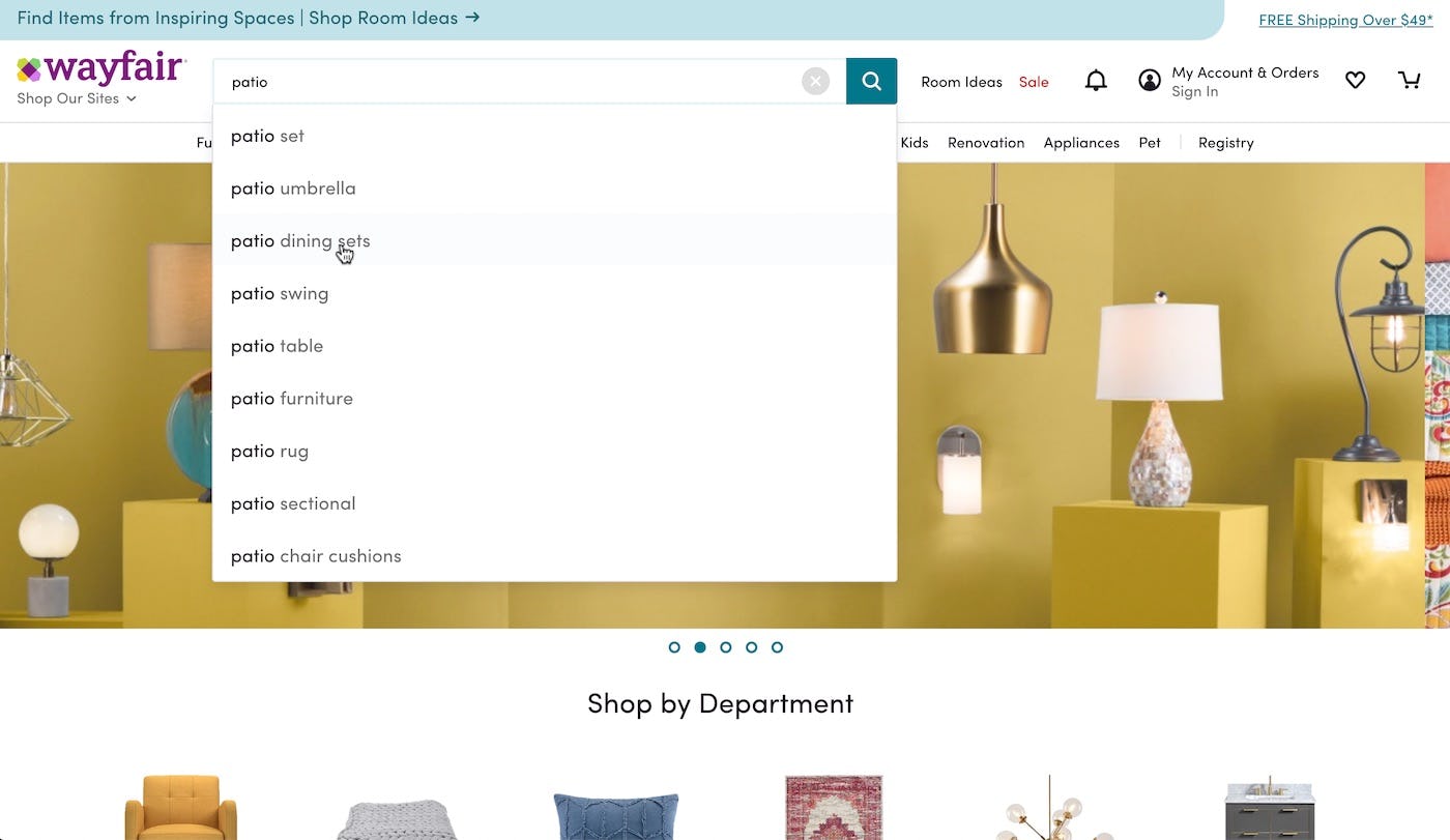
Wayfair’s desktop site limits the number of autocomplete suggestions to 9, making for a compact autocomplete list that users can view at a glance, which fosters easier decision-making.
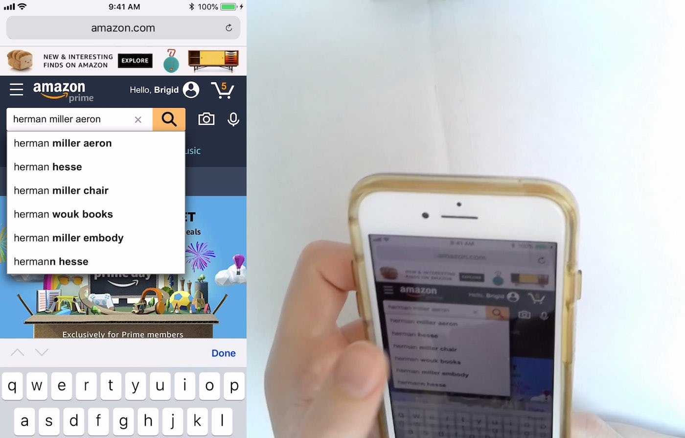
Amazon’s mobile site presents a manageable list of 6 autocomplete suggestions that also happen to fit within the default viewport. The short list can reduce the user’s cognitive load, speeding the search interaction overall.
Therefore, the number of autocomplete suggestions displayed to desktop users shouldn’t exceed 10, while a target of 4–8 will work for most mobile users.
After all, in the end testing revealed that most users are likely to select from among the first few suggestions. Thus having more autocomplete suggestions won’t aid most users looking for search guidance.
2) Style Category Scope Suggestions Differently from Query Suggestions
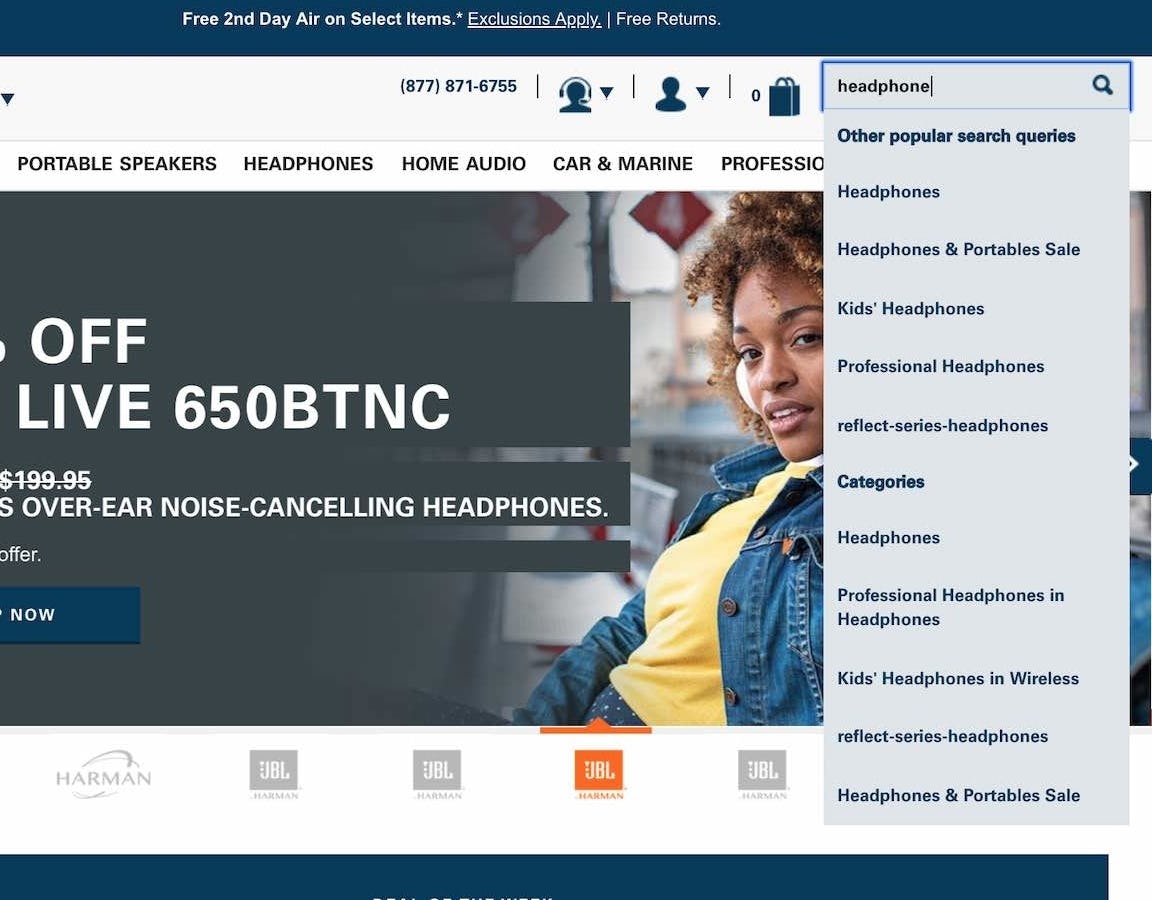
While Harman does offer autocomplete category scope suggestions (e.g., “Professional Headphones in Headphones”, “Kids’ Headphones in Wireless”), the font styling for the category scopes has no differentiation from the other query suggestions, making it difficult for users to distinguish the unscoped from the scoped suggestions.
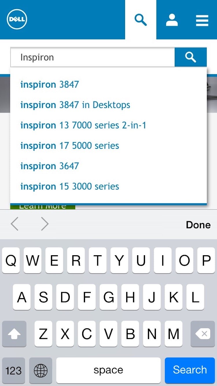
All of Dell’s suggestion text has an identical font style. This makes it harder for users to discern the scope text from the query text (e.g., see the first 2 suggestions, “inspiron 3847” and “inspiron 3847 in Desktops”).
Some sites provide not only query suggestions but also query suggestions within a category scope — for example, “red rugs in Bathroom”.
These more specific queries can be very helpful to users, as the search results will be more tailored to their specific category of interest.
Yet if the existence of search scopes isn’t clear in the autocomplete query suggestions, testing showed that they’ll be overlooked by many users.
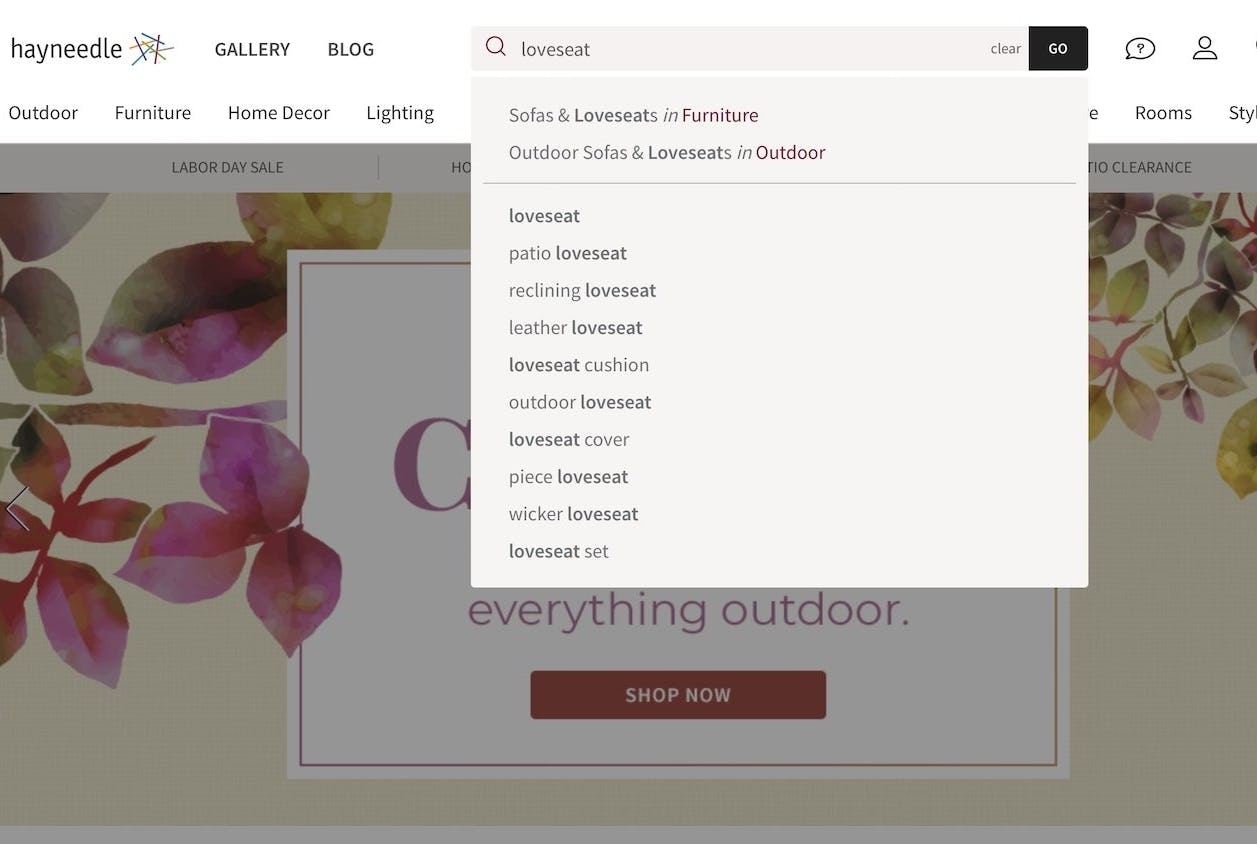
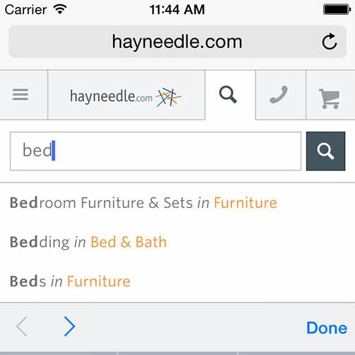
Hayneedle’s autocomplete styling includes a distinct font color for category scopes that provides visual contrast from the query suggestions (e.g., “Sofa & Loveseats in Furniture”). A horizontal line also separates scoped and unscoped suggestions. The styling helps users identify the scope suggestions while giving them control over the broadness of their query (restricting search to a category vs. conducting a search sitewide).
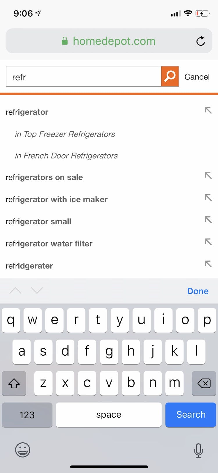
At Home Depot, autocomplete scope suggestions (e.g., “In Top Freezer Refrigerators”) are indented beneath the suggestion and italicized to distinguish them from the sitewide suggestions.
Therefore, scope suggestions in autocomplete should be given a unique style so users can easily determine what is (and isn’t) part of the actual search query suggestion.
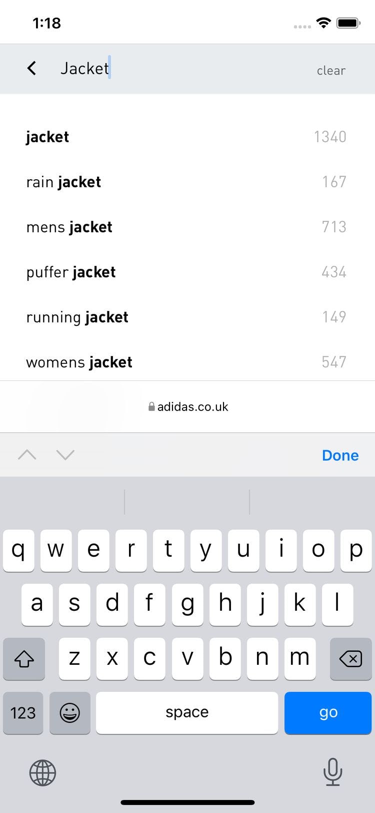
Adidas includes the number of matches in autocomplete. Along with category scope suggestions, alternate data such as the number of matches should also be styled differently from query suggestions.
Distinct styles make the query suggestions easier to scan because users can visually distinguish query suggestion text from category scope suggestion text.
Notably testing didn’t reveal any particular styling to be better than another for category scope suggestions; common alternate styles such as using italics, a different font color, and text indentation were all observed to provide enough of a visual cue for participants.
3) Highlight the Suggested Query Text
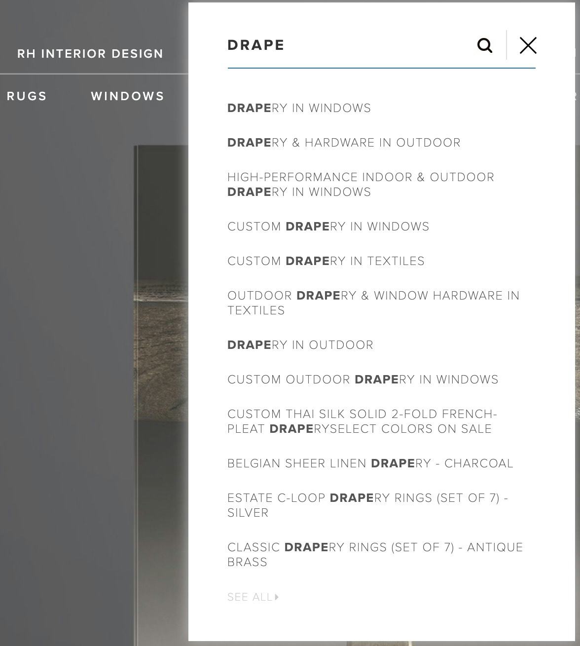
Restoration Hardware’s desktop autocomplete bolds the characters the user has already entered, leading to numerous repetitive highlights (“Drape”), which makes it difficult for users to easily pick out the suggestion that best matches their desired query.
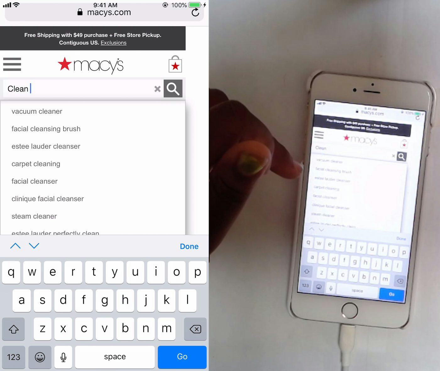
At Macy’s, there’s no differentiation between the user’s typed text and the additional suggested text, which makes scanning the autocomplete suggestions difficult.
Autocomplete typically offers query suggestions that are a combination of a match to the text as entered by the user (e.g., “Backp”) and a corresponding predictive suggestion (e.g., “Backpack”).
Styling the two aspects of the query suggestion uniquely can help users understand the distinction, while reducing the visual burden by helping them gloss over repeat words — in effect, giving users less to read.
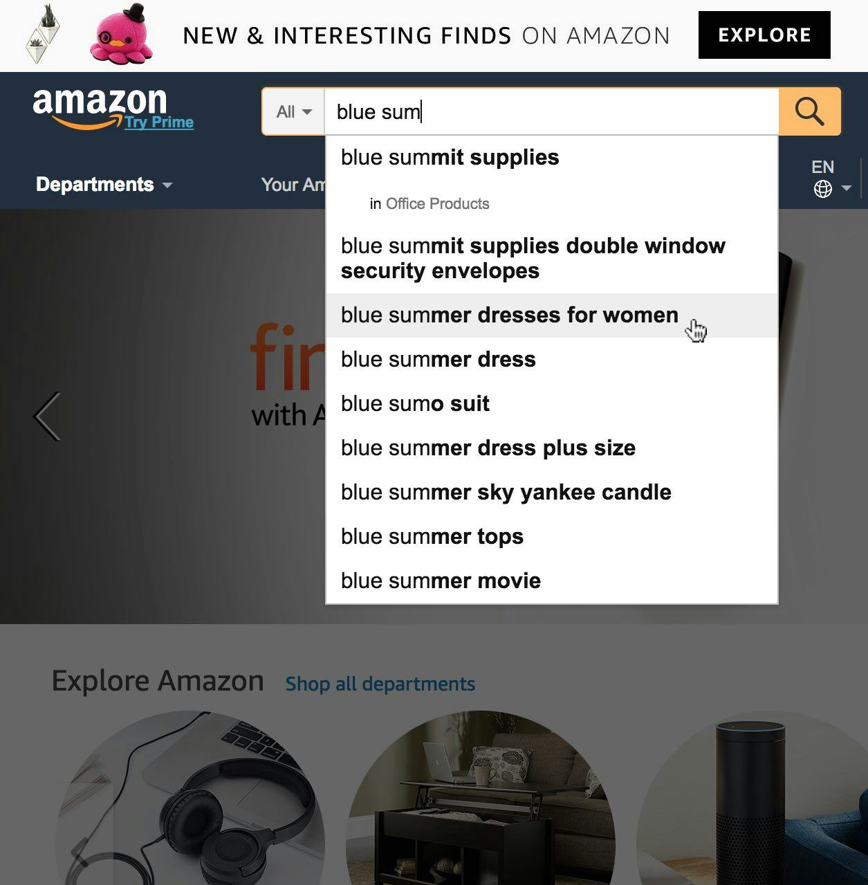
At Amazon, the autocomplete suggestion text that is an exact match for the in-progress query typing (“blue sum”) uses a regular font, while the predictive portion of the suggestion uses a bold style — drawing attention to the query possibilities rather than to known text that users have typed.
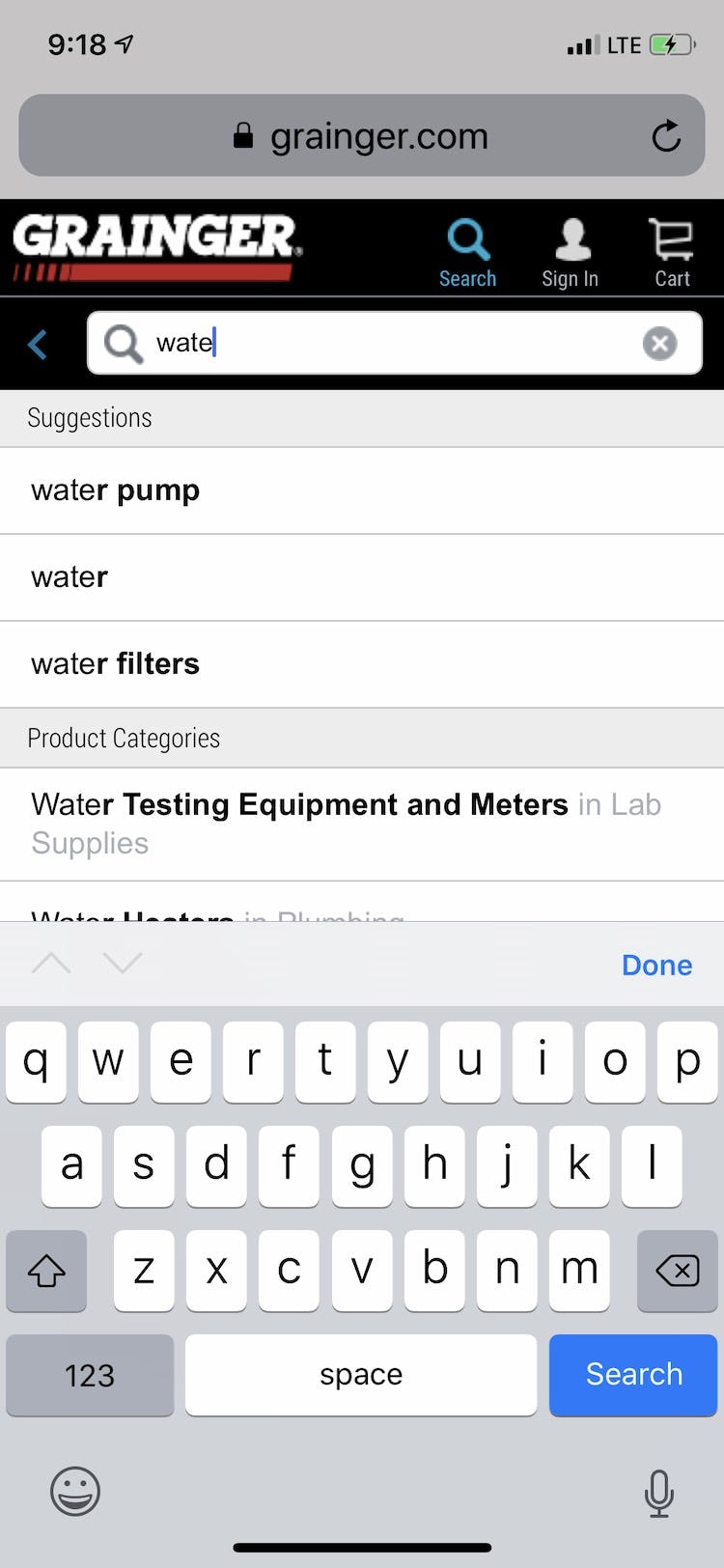
Grainger’s autocomplete uses bold styling to emphasize the predictive aspect of the query suggestion, helping users focus on the most relevant terms to complete their query.
So rather than repetitively highlighting the characters the user has entered in each and every autocomplete suggestion, emphasize the predictive portion to help users “fill in the blanks”, underscoring what’s different in each suggestion.
After all, the user is already well aware of the characters they have entered themselves.
This furthermore helps highlight the differences between the autocomplete suggestions, making it easier to scan the differences in the list and thus easier for the user to compare them in an instant.
4 Desktop-Specific Autocomplete UX Best Practices
The issues and solutions below are classified as “desktop specific”, though some issues also have the potential to occur in the mobile context. However, these issues weren’t observed during mobile testing.
4) Avoid Scrollbars
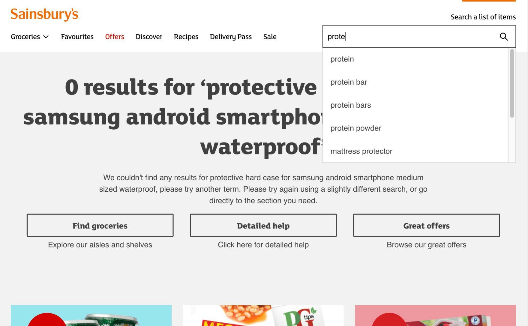
At Sainsbury’s, autocomplete is confined to a fixed-height interface that results in a scrollbar when the number of query suggestions exceeds the height of the interface. Inline scrolling is particularly difficult for users due to unintentional clicks, scroll hijacking, and hidden content.
Having a separate scroll area within an already interactive feature like autocomplete is a recipe for increased user friction.
Indeed, our research studies show that inline scroll areas often cause a wide range of interaction issues and should therefore generally be avoided.
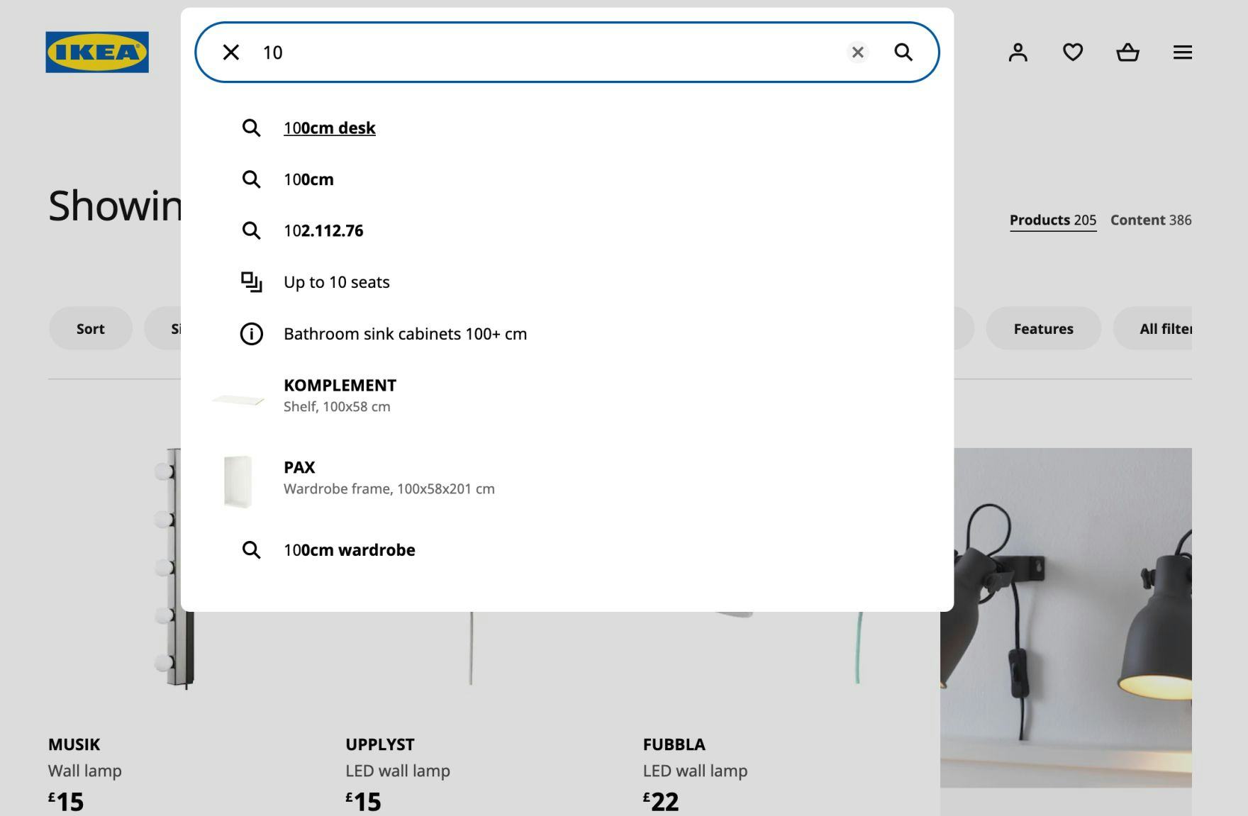
At IKEA, all query suggestions are visible without scrolling. The interaction difficulties caused by scrollbars are eliminated, and users can focus on considering query suggestions, rather than struggling with an inline scrolling interface.
Therefore, scrollbars in autocomplete should be avoided in favor of simply having the feature expand to its natural size.
Avoiding scrollbars dovetails well with best practice #1 above — by keeping the list manageable, most sites can often avoid scrollable areas.
5) Reduce Visual Noise within Autocomplete
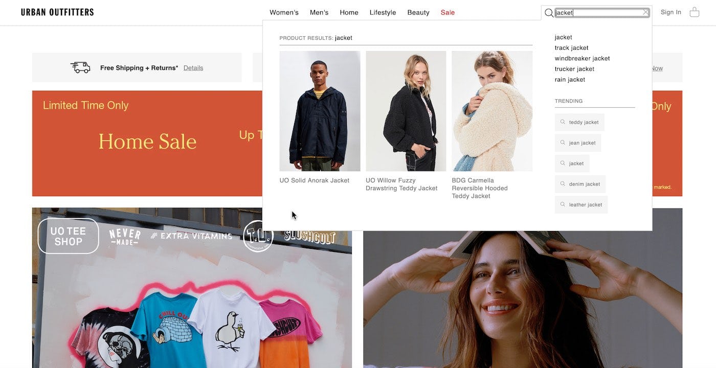
Urban Outfitters’s autocomplete feature includes product suggestions and trending searches that visually overpower the actual autocomplete suggestions, which can distract users from starting their search.
Many autocomplete designs are overly complex — going overboard with padding, separators, alternating row colors, and additional content (e.g., product suggestions, articles, etc.).
As a result, testing revealed that users are likely to become distracted, with a reduced ability to focus on the actual query suggestions.
In particular, desktop autocomplete features were observed to succumb more often to a “piling on” of added elements within the autocomplete feature due to the additional screen space available.
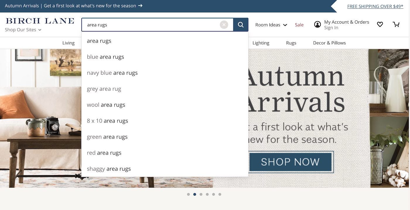
Birch Lane leverages a simple autocomplete design that is fully dedicated to presenting autocomplete suggestions. Limiting or removing extra content and design elements helps users maintain focus on beginning product exploration.
Therefore, to help users focus on the autocomplete suggestions lower the visual noise by avoiding unnecessary content and features within autocomplete.
6) Highlight the Active Suggestion
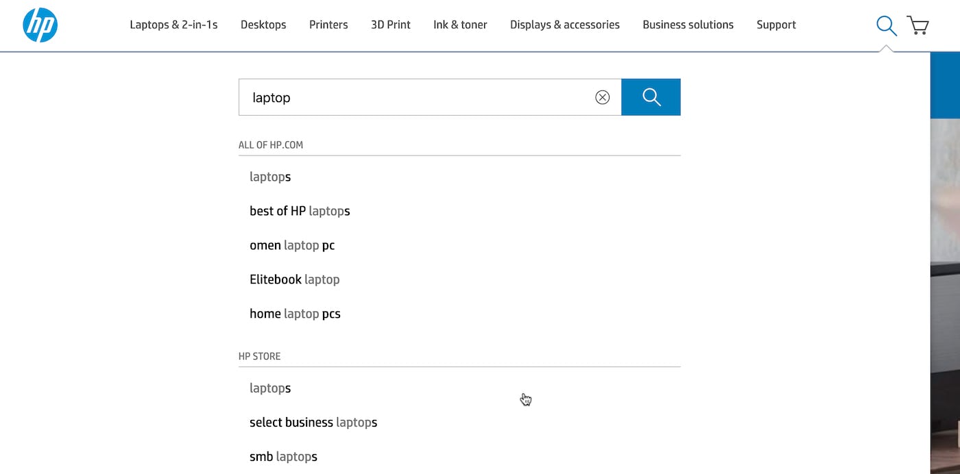
While HP does invoke the hand cursor on hover, the active autocomplete suggestion is otherwise unhighlighted. Using only the mouse hover point to show the active suggestion makes users connect the hand cursor to the suggestion without visual cues and puts needless burden on users (especially when the cursor and suggestion are far apart).
Failing to clearly indicate the active autocomplete suggestion makes it more difficult for users to know which suggestion is currently active.
During testing, a lack of visual feedback resulted in participant hesitation when navigating the autocomplete feature and even led to some mistaken selections.
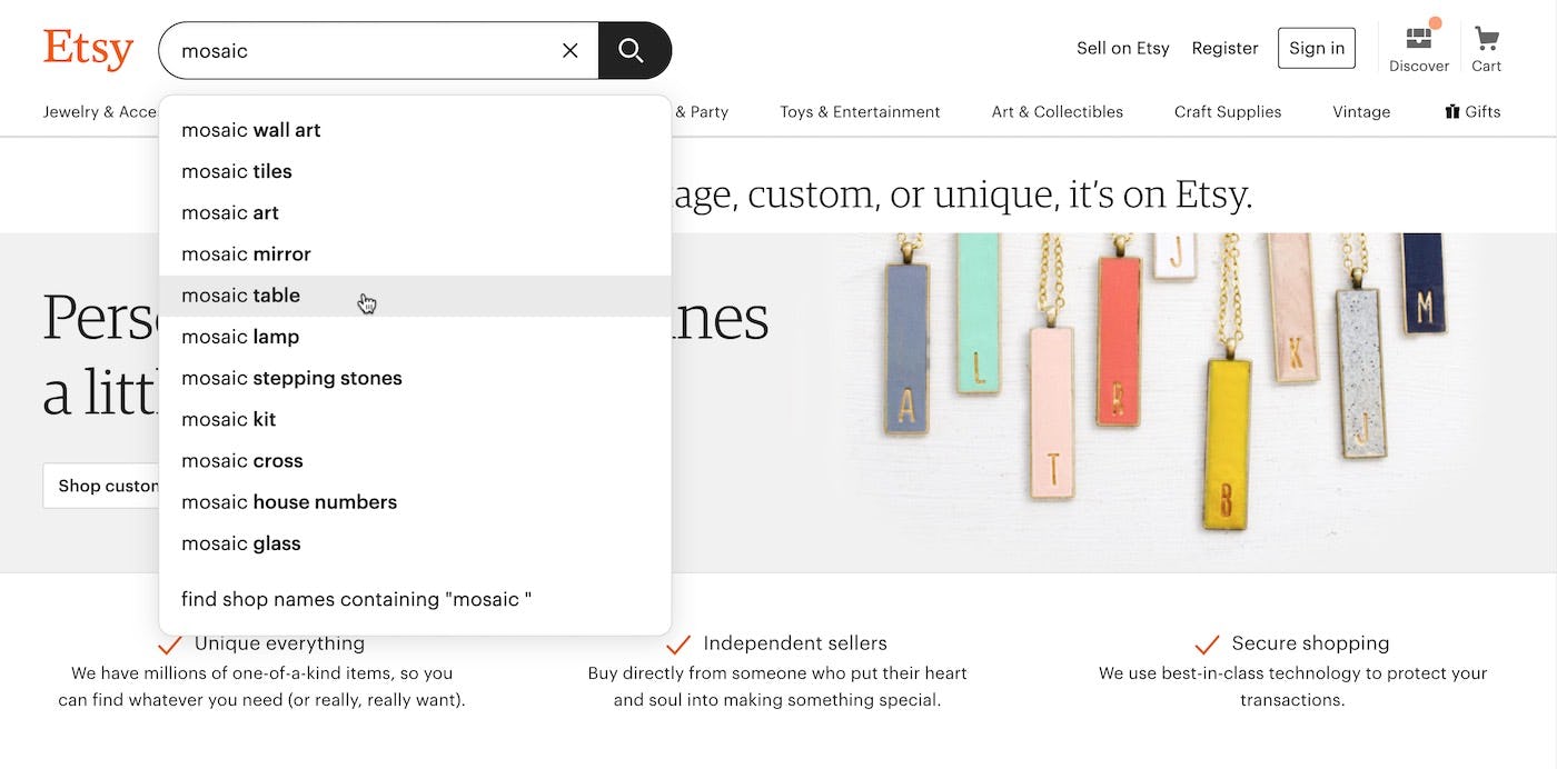
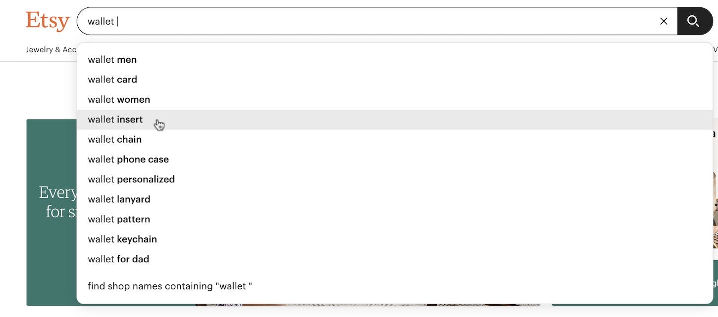
At Etsy, the active autocomplete suggestion uses background shading and the hand cursor is invoked, making a clear visual connection between the suggestion and the mouse hover point. The shading eliminates any doubt about where a user currently is, whether they are hovering with their mouse or using their keyboard.
Therefore, it’s important to apply background shading for emphasis on mouse hover.
This visually clarifies to users the active suggestion.
Additionally, invoking the “hand” cursor on mouse hover of the autocomplete suggestions makes it 100% obvious to the user that these are links that will perform a search if clicked.
Incidentally, over the years operating systems and major sites such as Google have trained users that autocomplete suggestions can be navigated, modified, and submitted with keyboard inputs.
It’s therefore important to support keyboard navigation — and do it in a way that aligns with user expectations.
More specifically, this means the up and down arrows should navigate the autocomplete suggestion while the return key should submit the currently focused suggestion. Ideally, the list also “loops” back to the beginning when the user reaches the end of the suggestions.
A detail that proved important during testing was to copy the suggestion to the search field when it received keyboard focus.
This not only helped the less-experienced users more easily grasp the autocomplete concept but also allowed the users to “continue” the suggested query, adding in further details before submitting it (e.g., adding a query qualifier such as “lenses” to a suggestion for “Nikon D7100”).
7) Design the Autocomplete Feature to Have Visual Depth
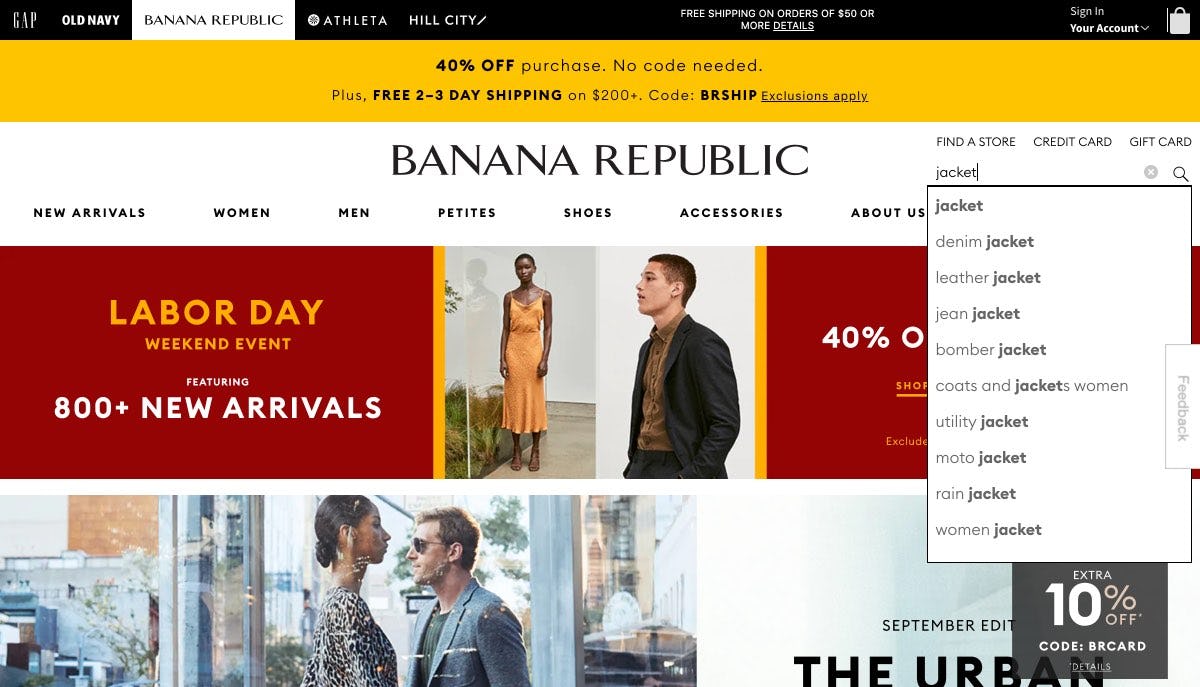
While Banana Republic does include a border surrounding the autocomplete feature, the page background is not darkened. Without background dimming, the rotating homepage carousel, neighboring ads, and other page content have equal prominence to autocomplete, which could distract users attempting to review autocomplete suggestions.
There are many components to a web page that vie for the user’s attention at all times.
In particular, ads, promotions, and other prominent features and stylings can make it difficult for users to get an overview of their options — and focus on the autocomplete feature when they access it.
When autocomplete is active at Target’s desktop site, the page background is dimmed, making it much easier to focus on the autocomplete feature. Highlighting the autocomplete feature elevates its prominence, which helps users focus on their query and move more quickly into product exploration.
Therefore, beyond adding a border to the autocomplete feature, darken the page background as well.
Darkening the page background while autocomplete is active gives it stronger emphasis, minimizing elements (e.g., ads, carousels, and other page content) that could distract users from considering autocomplete suggestions.
This brings the attention and focus to the autocomplete feature.
2 Mobile-Specific Autocomplete UX Best Practices
Similar to the desktop-specific issues, the issues below were observed primarily or exclusively during mobile testing, although some also have the potential to occur on desktop.
8) Reduce Visual Competition from External Elements
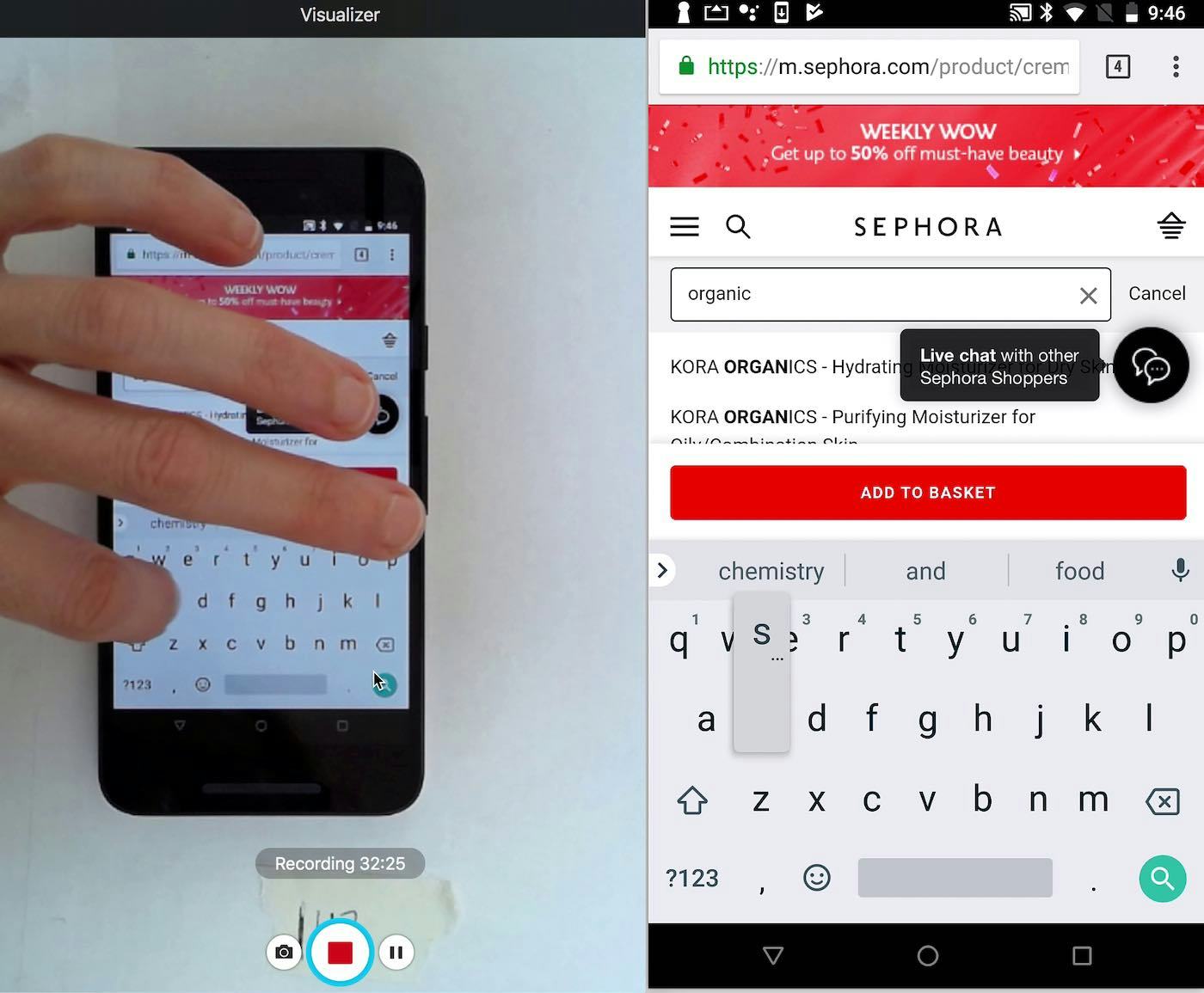
A participant at Sephora had to contend with an ad, a sticky “Add to Basket” button, and live chat icons while autocomplete was active. All of these elements left space to display only 2 partially obscured suggestions. She continued typing her query in full, leaving autocomplete unused. When other elements crowd autocomplete, users can’t easily read suggestions, causing some to skip use of autocomplete suggestions altogether.
Elements that encroach into the autocomplete feature can compete for users’ attention, distracting users from devising their queries.
Bear in mind that mobile autocomplete’s visible suggestions are, minimally, often sandwiched between the search field at the top and the mobile keyboard below.
When other UI elements (e.g., sticky headers, the main nav, buttons, live chat features, “Install app” ads, etc.) display in addition to the autocomplete feature, it leaves an even smaller fraction of the screen available for the display of suggestions.
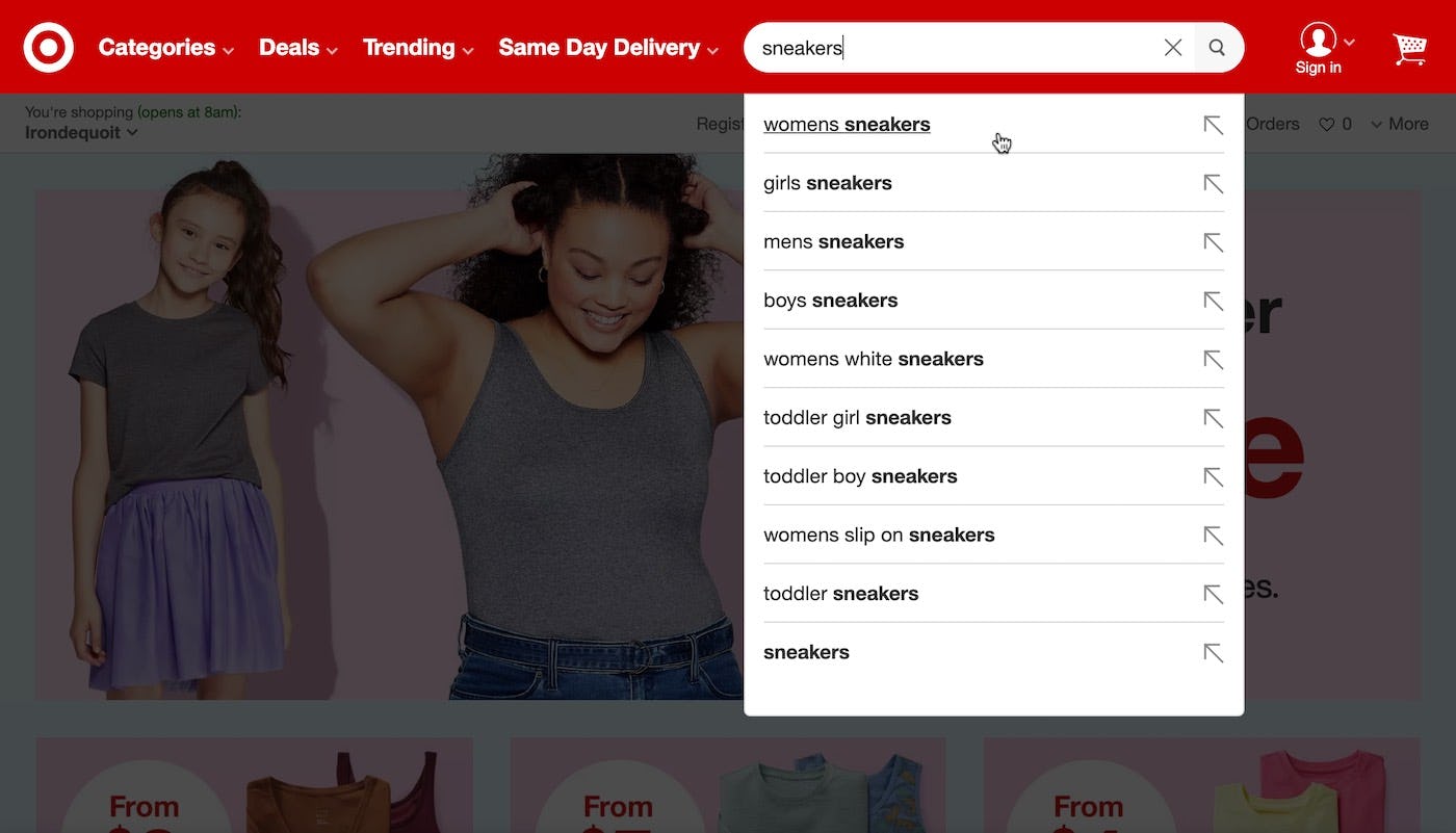
Amazon’s autocomplete feature doesn’t have to compete with other elements for attention. Autocomplete suggestions have also been optimized to fit within the viewport, giving users a good overview of suggestion options.
On the other hand, minimizing distracting elements can help users focus on autocomplete and move more smoothly into product exploration. (While the same general principle applies to desktop, competition from external elements wasn’t as observed in our desktop testing, likely due to greater available space for other design elements.)
9) Provide Adequate Spacing for Autocomplete Suggestions
“I’m not sure I know what’s going on here…” A user at Sephora attempted to find “lipstick” and was presented with autocomplete suggestions in a small font size with limited line spacing. She inadvertently selected an unintended suggestion. Presenting autocomplete suggestions with insufficient spacing can contribute to inadvertent selections.
If a user is unable to easily select the autocomplete suggestions, it becomes unnecessarily difficult for them to navigate the autocomplete feature.
During our mobile testing, autocomplete suggestions separated by insufficient spacing and styled in small font sizes made it difficult for participants to view and select suggestions.
Indeed, when inadequate spacing and small font sizes are combined, it contributes to mistaps that leaves some users puzzled upon arrival at unexpected results pages.
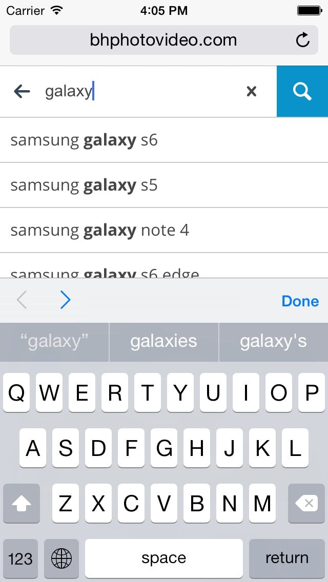
At B&H Photo, the autocomplete feature uses an appropriately large font size, hit area, and spacing, as well as dividing lines to separate suggestions. Sufficient font sizes and spacing help users more easily read and select autocomplete suggestions.
Therefore, to help resolve interaction issues within autocomplete, ensure suitable spacing between tappable elements, provide hit areas of an appropriate size, and use an appropriately large font size (all basics of mobile e-commerce UX).
Finally, presenting autocomplete suggestions in title case (or “headline-style”) makes for easier readability than all uppercase text.
Getting the Details Right for Autocomplete
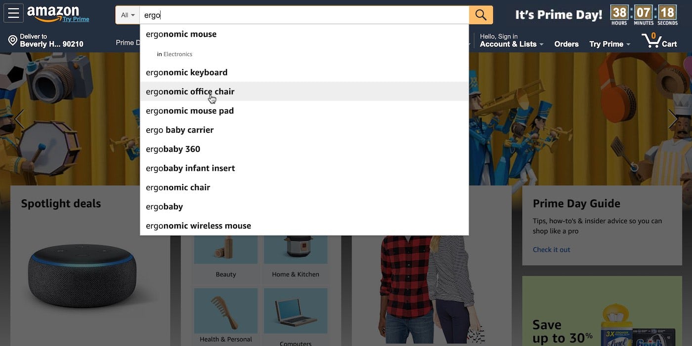
Amazon’s desktop and mobile autocomplete features adeptly tackle the autocomplete recommendations. For example, in the desktop example, scrolling is avoided, category scope suggestions are styled differently (“in Electronics”), the active suggestion is highlighted and the hand cursor is invoked, the autocomplete feature is given prominence by dimming the page background, and suggestions are kept manageable (first image). On mobile, also notice how the number of suggestions are kept manageable and are fewer in comparison to desktop, allowing all suggestions to fit within the default viewport (second image). Further, in both the desktop and mobile example, the differences in the suggestions are highlighted.
Clearly, there’s quite a list of details to get right when it comes to designing the autocomplete feature for both desktop and mobile contexts.
This is quite natural, considering autocomplete features are interactive and highly transient in nature, resulting in a fairly advanced user interaction.
Designers do have some leeway when it comes to the aesthetics of the autocomplete feature, but because autocomplete functionality already confronts users with what can be quite complex interactions, it’s particularly important to adhere to best practices, as even minor deviations from these standards may throw users off course.
To recap, in both desktop and mobile contexts, autocomplete designs should adhere to the following 3 best practices:
1) Keep the autocomplete list manageable
2) Style category scope suggestions differently from query suggestions
3) Highlight the suggested query text
In the desktop context autocomplete should adhere to the following 4 best practices:
4) Avoid scrollbars
5) Lower the visual noise within the autocomplete feature
6) Highlight the active suggestion and allow for keyboard navigation
7) Design the autocomplete feature to have visual depth
Finally, in the mobile context autocomplete should adhere to the following 2 best practices:
8) Reduce visual competition from external elements
9) Provide adequate space for query suggestions
Yet our e-commerce UX benchmark shows that only 19% of sites get everything right — leaving nearly all users with suboptimal autocomplete experiences, whether on desktop or mobile sites.
Tip: you can also browse 446 different autocomplete designs from major e-commerce sites in our free Page Design tool.
This article presents the research findings from just a few of the 700+ UX guidelines in Baymard – get full access to learn how to create a “State of the Art” ecommerce user experience.
If you want to know how your website performs and compares, then learn more about getting Baymard to conduct a UX Audit of your site.