Key Takeaways
- The homepage content causes some users to misinterpret the site type
- Some users will leave the site if they don’t see the product type they are looking for
- Ensure the homepage conveys product diversity by showcasing 40–50% of product types
Key Stats
- 22% of ecommerce sites showcase an inadequate range of products on the homepage
- 33% of users in Baymard’s survey said they’d start by scrolling the homepage when casually browsing for a visually driven product, over any other browsing strategy
Video Summary
First-time users on a site rely heavily on the main navigation options and the homepage content to determine which type of site they’ve landed on and how broad or narrow a product range it offers.
However, Baymard’s ecommerce UX benchmark shows that 22% of the sites showcase an inadequate range of products on the homepage.
Some users who don’t see the product type they are looking for will assume it is not available on the site — risking a preventable lost sale.
This article will discuss the latest Baymard research findings on why users misinterpret the product range on the homepage — and how to avoid it:
- Why users misinterpret the product range
- How displaying diverse product types helps users identify the type of site
- Why it’s harder for mobile users to grasp the full catalog
Why Users Misinterpret the Product Range


“Seems like a lot of the stuff that they’re advertising is primarily for men…most of the default stuff on the homepage is for men. Just based on the pictures.” At Nicce, a female participant was hesitant to explore the site because she thought that it carried mostly men’s clothes — whereas in fact the site catered equally to men and women.


“I always struggle to find anything. They don’t really offer any products here until I scroll so much and only then I can see the newest collection.” Because the Boohoo (UK) homepage focused more on displaying sale items and new products rather than highlighting the diversity of products, participants such as this one were unable to quickly work out the scope of the product catalog.
First-time users often look to the main menu and the homepage to figure out what the site type is and how extensive the product range is.
For example, 33% of users in our survey said they’d start by scrolling the homepage when casually browsing for a visually driven product, over any other browsing strategy (2025 survey of 1,167 online US shoppers).
However, during testing, many participants misinterpreted the site type or underestimated the site’s product range because an overly narrow selection of product types was displayed on the homepage.
“Seems like a lot of the stuff that they’re advertising is primarily for men…most of the default stuff on the homepage is for men. Just based on the pictures.” (Participant, 2024 Apparel & Accessories Study)
For example, a user who only sees soccer gear featured on the homepage of a sporting goods site might mistakenly assume that other sports items — such as bikes or badminton rackets — are not available.
Although many users will keep exploring via the main navigation or search, some will leave — these are users who might have stayed had the homepage better showcased the product range.
How Displaying Diverse Product Types Helps Users Identify the Type of Site

SportChek does a great job highlighting a wide range of product categories on its homepage, while “Trending Searches” helps users narrow their focus.

Keyboards, amps, recording equipment — another example of a broad mix of product types displayed on the homepage, helping users get a feel for the breadth of Guitar Center’s product catalog.
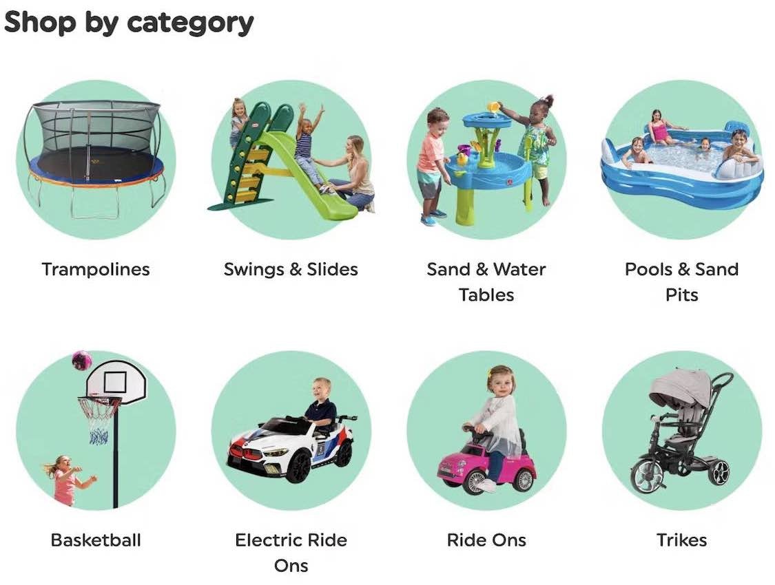
To make sure users don’t misinterpret or underestimate the site’s product range, ensure a wide selection of different product types are featured on the homepage.
In short, a glance at the homepage should convey product diversity.
Of course, important categories should claim a significant portion of the homepage screen’s real estate, but other products should also be highlighted so new visitors don’t underestimate the site’s product range.
Essentially, users shouldn’t conclude that only a few product types are offered if in fact many are.
Testing demonstrated that sites should showcase at least 40% of their product types.
While every product type won’t be featured, at least users will get an overall sense of the site’s product breadth.
Featured product types may include either categories or specific products, as featuring one or the other won’t impact users’ ability to accurately understand the site’s product range.

Chewy features a clear overview of available product categories on its homepage.
Since images naturally draw attention, many users look to homepage images to get a sense of the site’s product catalog.
While elements like graphics and typography can also help highlight the product catalog, images tend to be the most engaging — so it’s important that the featured products are represented by an image or at least a thumbnail.

At Overstock, a carousel is used on the homepage. Carousels are a popular way to promote product diversity, but aren’t sufficient on their own.
That said, a homepage carousel, if used, should not be the only or primary route to showcase product breadth, as most users won’t see all the slides in a homepage carousel, even if it autorotates.
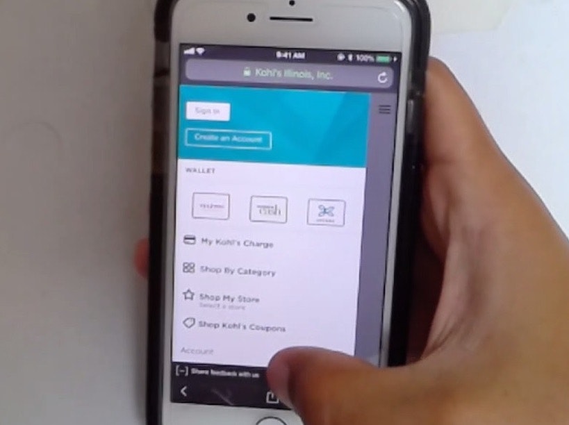
Why It’s Harder for Mobile Users to Grasp the Full Catalog


On Fat Brain Toys’s mobile site, many of the categories in the main menu (first image) are also featured as eye-grabbing image links on the homepage (second image), helping users scrolling through the homepage to glean the range of product types available.
On a mobile homepage, it’s even more important to highlight the different types of products users can find on a site.
Unlike desktop sites where product categories can be visible in the main navigation at all times, mobile and app navigation can’t rely on always-visible menus or hover-based dropdowns to showcase product variety.
Mobile and app users are therefore reliant on the homepage to infer the site type until they access the main navigation.
However, similar to desktop, any featured link on mobile must provide its full scope so users don’t unwittingly get into overly narrow scopes when tapping a path on the homepage.
Allow Users to Easily Infer the Product Breadth

B&H Photo makes good use of image thumbnails to visually represent its wide range of available products.
By ensuring a wide selection of different product types on the homepage, sites can be certain that users understand the product range at a glance.
However, our large-scale UX testing of ecommerce sites reveals that 22% of ecommerce sites showcase an inadequate range of products.
As a result, some users will mistakenly assume the site doesn’t carry the product type they want — and may leave to find what they need elsewhere.
The litmus test is easy: does a quick glance over your homepage adequately convey your store’s product diversity?
If not, first-time visitors may be drawing false conclusions about the scope of your site’s product catalog.
This article presents the research findings from just a few of the 700+ UX guidelines in Baymard – get full access to learn how to create a “State of the Art” ecommerce user experience.
If you want to know how your desktop site, mobile site, or app performs and compares, then learn more about getting Baymard to conduct a UX Audit of your site.