Key Takeaways
- Large-scale testing reveals that a subgroup of users seek out “Sales” product lists
- Yet our e-commerce UX benchmark shows that 16% of sites don’t make it easy to find “Sales” lists, or don’t provide such lists at all
- Moreover, an additional 16% of sites implement “Sales” product lists incorrectly — risking users end up misinterpreting the product catalog
Our large-scale product-finding testing has consistently shown that there’s a subgroup of users keenly interested in finding items “on sale”.
Some users enter the site and immediately are concerned with finding the latest deals.
Others, after having explored the site’s products for a while, decide to seek out sale items.
In either case, testing revealed that having a “Sales” or “Deals” filter-based category is key to helping interested users quickly locate sale items.
Yet our e-commerce UX benchmark reveals that 16% of sites don’t have a “Sales” or “Deals” filter-based category, while an additional 16% of sites that do provide a “Sales” or “Deals” navigation option get this implementation wrong.
In this article we’ll discuss our latest Premium research findings on category navigation UX:
- Why “Sales” product lists are sought by some users
- What to consider when deciding how to organize a “Sales” filter-based category
- How to avoid a major pitfall when it comes to implementing a “Sales” navigation option
Why “Sales” Product Lists Are Sought by Some Users
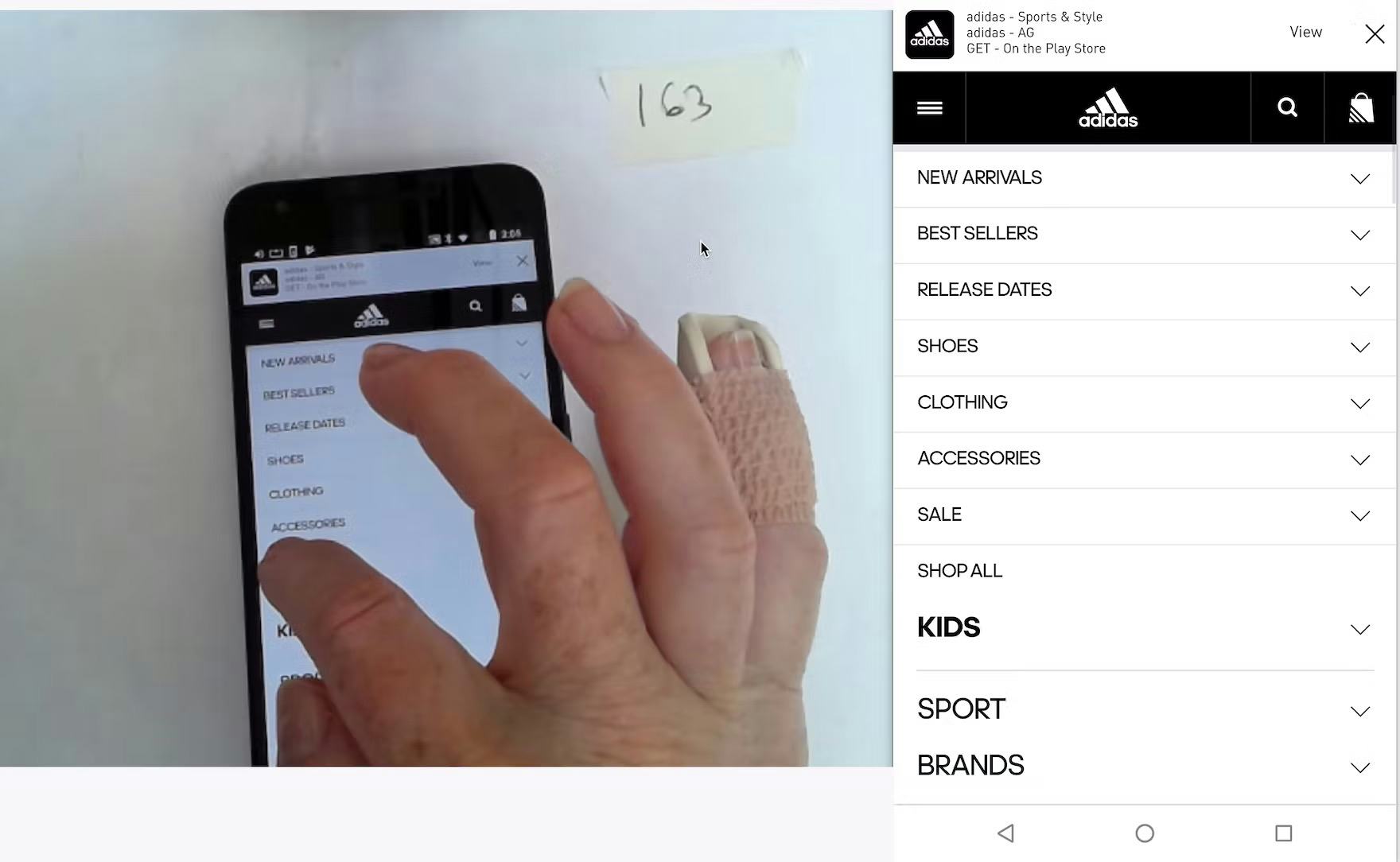
“I like sale shoes. I don’t really care if they’re the latest.” A participant at Adidas opted to explore the “Sale” navigation option first. Many users have a strong desire to “get a deal” and thus are eager to see what’s on sale on a site.
Our testing has repeatedly shown that, not surprisingly, price is a crucial consideration for users shopping on e-commerce sites.
Yet while the purchase price is important, many users want to feel like they’re “getting a deal” by purchasing a product that has been discounted.
During testing, finding products that were listed as “on sale” was the initial desire of several participants who, after arriving at a site, immediately hunted for the “on sale category”.
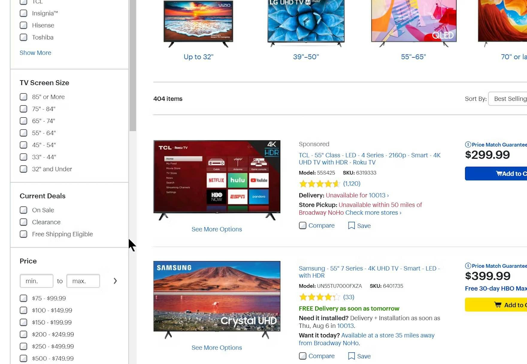
At Best Buy, users are provided with 3 “Sales” filters: “On Sale”, “Clearance”, and “Free Shipping Eligible”.
Note that, while having “On Sale” filters is the first step to helping users who are interested in deals find relevant products, that’s not enough.
This is because users will have to first find product lists that have “On Sale” filters.
Instead, filter-based categories should be considered as they allow access to discounted items in prefiltered product lists from the home page or the main navigation.
What to Consider When Deciding How to Organize a “Sales” Filter-Based Category
An important consideration when providing a “Sales” filter-based category, or any filter-based category, is deciding at what level in the hierarchy the filter-based category should be implemented.
For example, if wanting to provide users with a “Sales” filter-based category, should this be shown at the top level, alongside other top-level product categories (e.g., “Mens”, “Womens”, “Sales”), or should it be nested in the relevant subcategory (e.g., “Mens” > “Pants” > “Jeans” > “Chinos” > “Sales”)?
Testing was inconclusive with regards to this question, as participants in general easily accessed the “Sales” filter-based category at both the top level and when it was nested within subcategories.
However, the level of hierarchy chosen to provide the “Sales” filter-based category does affect the product list or intermediary category page users get.
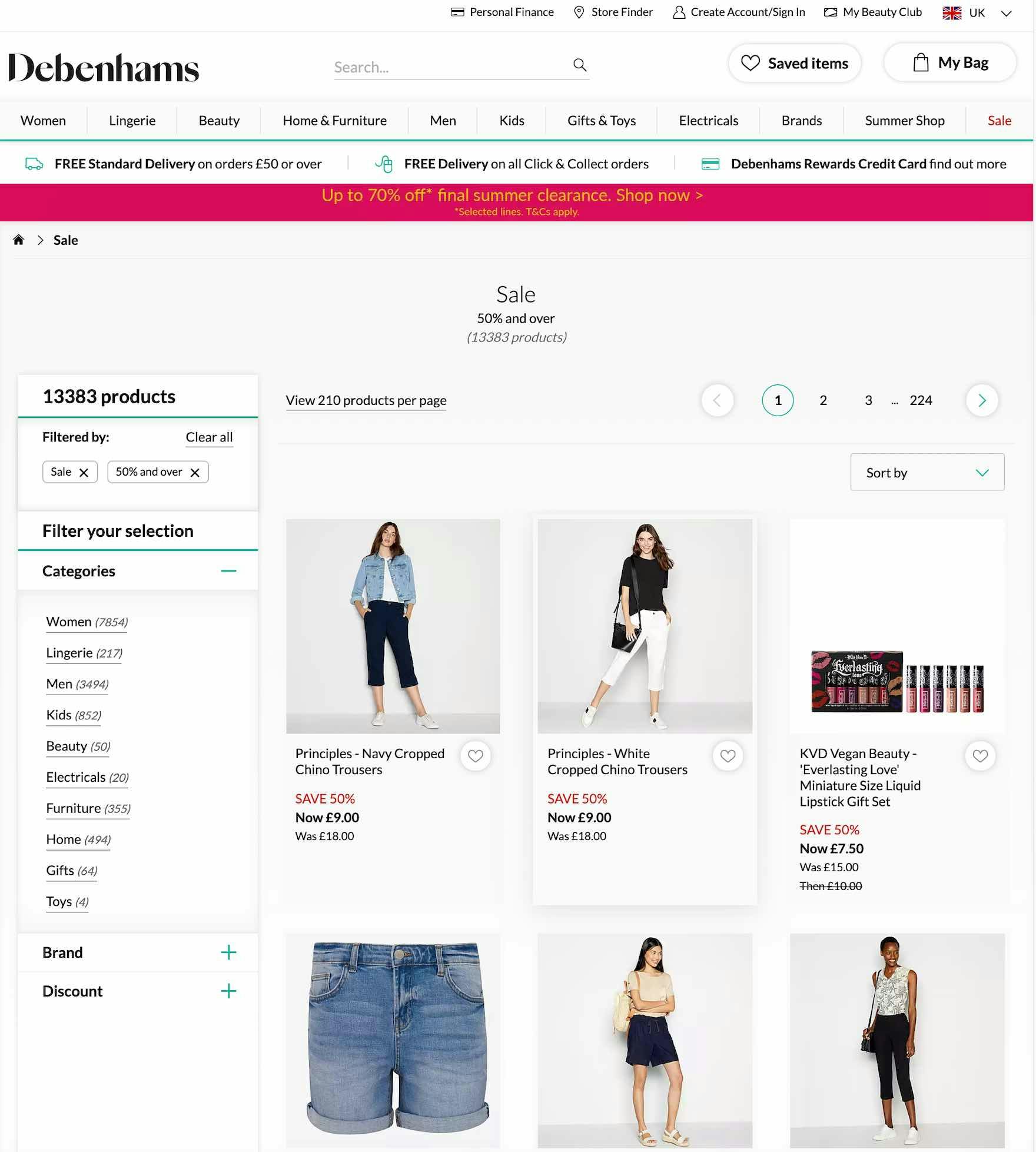
At Debenhams, when users click the homepage ad (first image) they see the entire product catalog with a “Sale” filter applied (second image). At over 13,000 products, the list is massive, but users can decide to filter it down using, for example, the “Categories” filters.
When a “Sales” filter-based category is implemented at the top level of the hierarchy, users may get a massive product list, which could be overwhelming, but which can be filtered down to something more manageable.
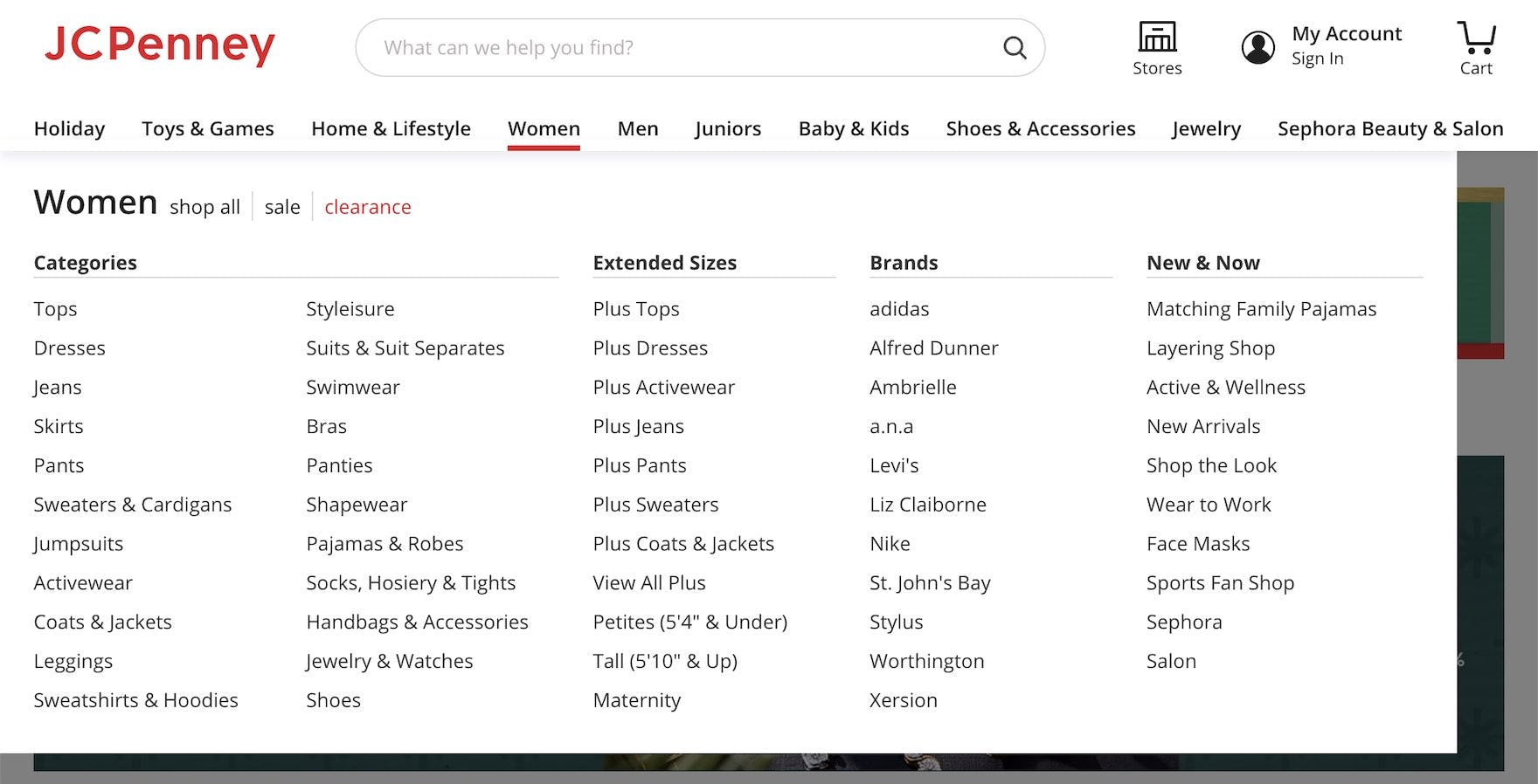
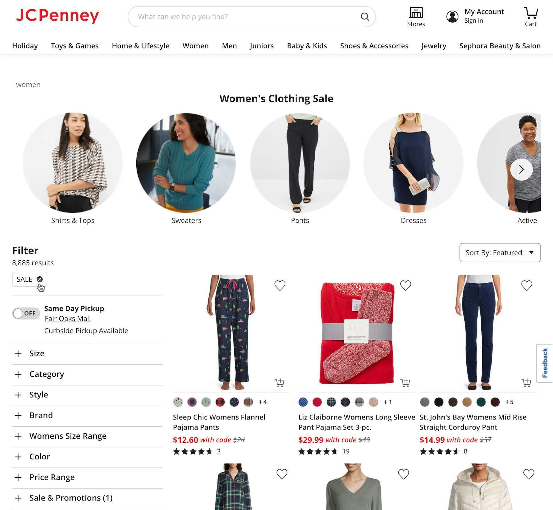
At J.C. Penney, the “Sale” list is nested in the “Women” category (first image). The resulting product list is thus more tailored specifically to “Women’s sales items” (second image).
On the other hand, when nested within a subcategory, a “Sales” filter-based category will be specific to the product type the user is currently considering — resulting in a much more focused product list — but the “Sales” filter-based category will likely receive less exposure, as only those users who’ve drilled down to the relevant subcategory will be able to find it.
If opting for the first approach, filtering tools — such as essential filter types and product type–specific filter types — must be comprehensive and well implemented to allow users to begin to further narrow down the product list with just a “Sales” filter applied.
If opting for the second approach, then it’s important to be consistent in providing “Sales” filter-based categories for all relevant product types when there are sufficient products to display.
For example, if there are sufficient “on sale” products to display for both “Men’s” and “Women’s” pants, then the “Sales” filter-based category should be nested within each category.
For mass-merchants it may make sense to adopt this second approach, as a top-level “Sales” filter-based category may be too overwhelming and result in thousands of products, which would require a great deal of filtering from users to get a more relevant product list.
However, a “Sales” filter-based category can be provided at every level of the hierarchy, if desired.
This would give users multiple points at which to access a “Sales” product list, with the downside of potentially cluttering the main navigation.
Sites can also experiment with implementing “Sales” Intermediary Category Pages, where the different product types that are on sale appear as thumbnails.
Implement “Sales” as a Filter-Based Category — Not a “True” Category
When implementing a “Sales” navigation option, it’s important to avoid falling into the trap of overcategorization.
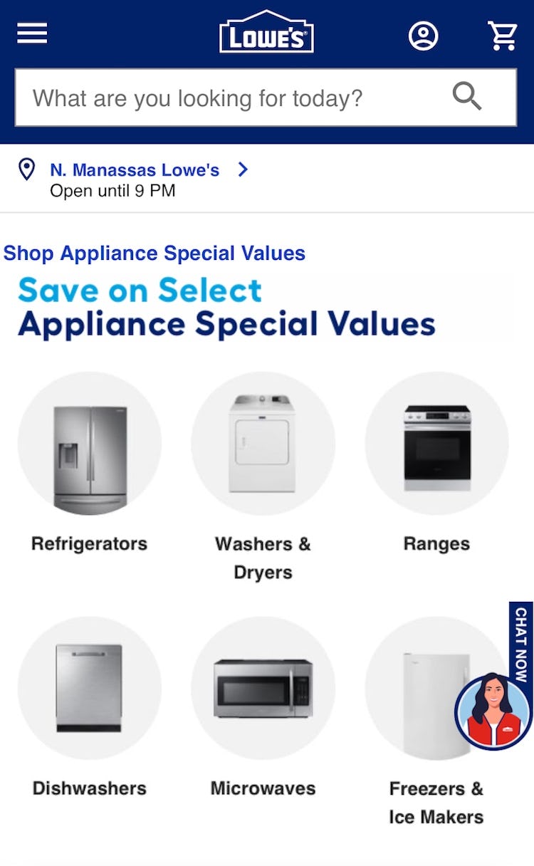
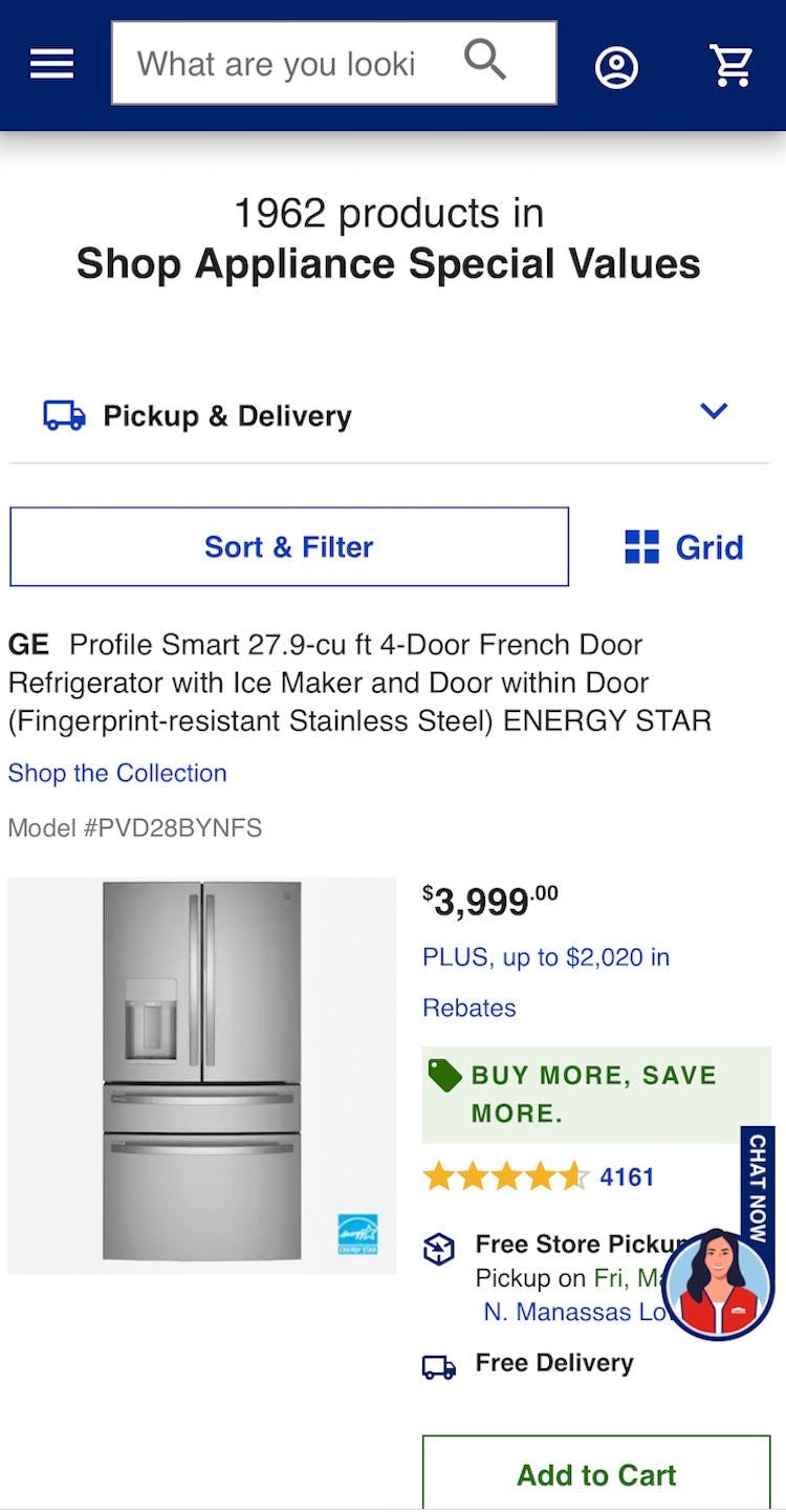
At Lowe’s, users enticed to see sale appliances (first image) risk getting an overly narrow impression of the appliance product list when they arrive at the “Appliance Special Values” list — it’s not easy to find a way to “View All Appliances”, and some users will misinterpret the “Sales” list as representing “All Appliances”.
Our large-scale testing has shown that overcategorization — in this case, implementing “Sales” as a category — tends to silo users, and can lead to them misinterpreting the product list.
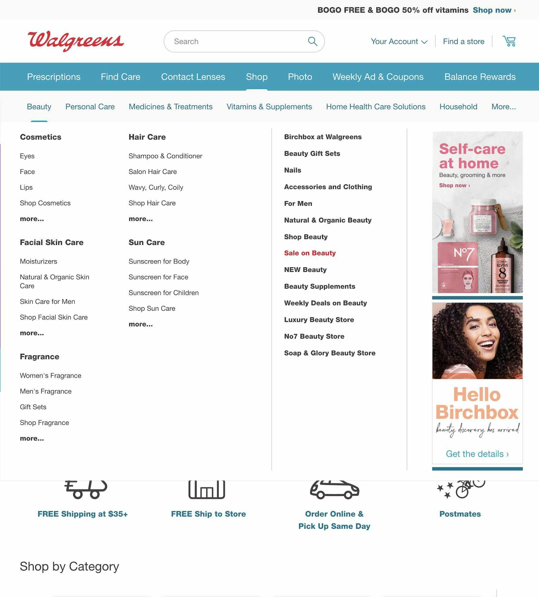
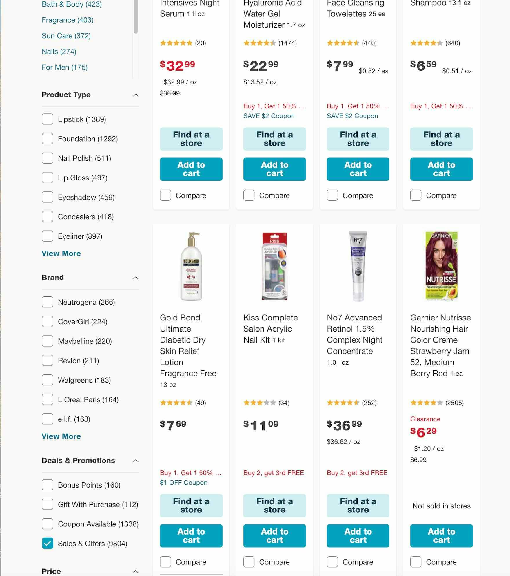
At Walgreens, the “Sale on Beauty” navigation option (first image) leads users to a “Beauty” product list with a “Sales & Offers” filter applied (second image). Users who want a broader product list of all beauty items — not just those on sale — can easily access it by simply deselecting the “Sales & Offers” filter.
Therefore, “Sales” should be a filter applied to relevant product lists — it should never be implemented as a “true” subcategory within relevant product types (though it may appear to be to end users; see below).
For example, users could access “Mens > Pants”, and apply filters “size 32” and “On Sale”, but generally users should not be able to access “Mens > Pants > On Sale”, or “On Sale > Mens > Pants” where “On Sale” is technically implemented as a category.
In testing we observe that if attributes such as “Sales” are implemented as a true category then it will needlessly silo users, some of whom will have difficulty seeing the full product selection if the sale items aren’t of interest.
That said, as alluded to above users don’t care about the technical implementation of “Sales” (though they will be adversely affected if it’s not implemented correctly): they just want an easy way to access on sale products.
Therefore, they can be provided with a filter-based “Sales” “category”: the filter-based category can appear to users to be a regular subcategory — for example, listed in the navigation alongside other subcategories such as “Chinos”, “Jeans”, and “Slacks” (if we continue with our pants example) — but when users select it they should find that “Sales” has been preapplied as a filter to the relevant product list, which they can then remove to get a broader list of products that aren’t on sale.
Give Discount-Seeking Users Easy Access to Relevant Product Lists
“I would go to their actual collections up here [in the main navigation] and start looking for specific things. Or see if…there’s ‘Butcher’s Specials’, you know specials or sales or anything like that.” At Crowd Cow a participant immediately selected “Butcher’s Specials” in the main navigation. “Sales” navigation options will always be popular with a subgroup of users, and it’s important to provide easy access to relevant product lists.
Making it easy for users to access relevant product lists is an important component of providing a user-friendly navigation and product list UX.
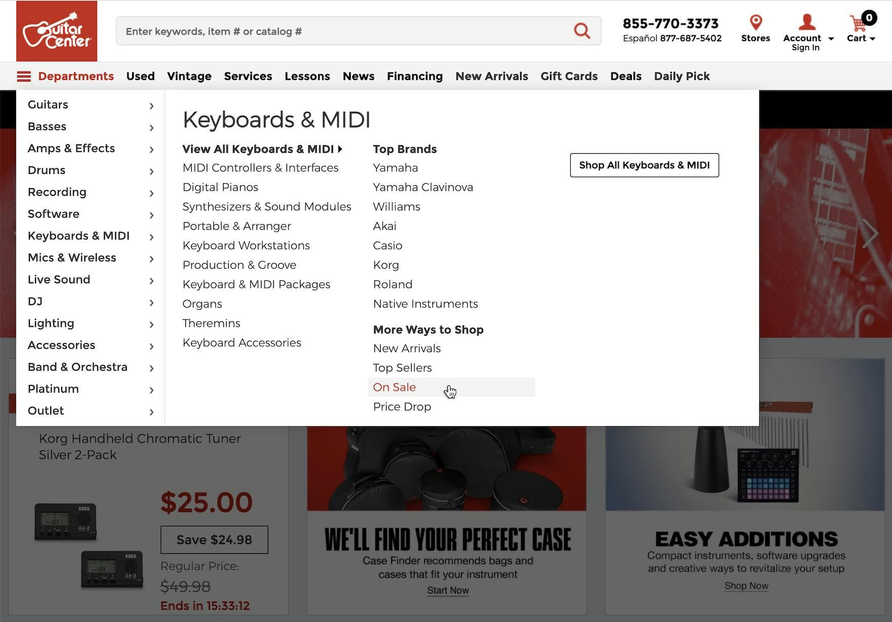
While of course providing access to lists of a site’s product types is expected by users, providing them with curated product lists — as in a “Sales” list — is key to enhancing the performance of the navigation.
That said, to avoid “unforced errors” it’s important that the “Sales” list is technically implemented as a filter-based category to avoid a subgroup of users confusing the “Sales” list for the full product list.
However, this doesn’t mean that the path to the “Sales” list can’t appear to be a typical category to end users, alongside the other main product categories.
Yet despite the benefits of providing a “Sales” filter-based category, our e-commerce UX benchmark shows that 32% of sites don’t, or implement this incorrectly — in the end, making it more difficult for users to find a suitable product.
This article presents the research findings from just 1 of the 700+ UX guidelines in Baymard – get full access to learn how to create a “State of the Art” ecommerce user experience.


![“I would go to their actual collections up here [in the main navigation] and start looking for specific things. Or see if…there’s ‘Butcher’s Specials’, you know specials or sales or anything like that.” At Crowd Cow a participant immediately selected “Butcher’s Specials” in the main navigation. “Sales” navigation options will always be popular with a subgroup of users, and it’s important to provide easy access to relevant product lists.](https://baymard-assets-cdn.imgix.net/research/media_files/attachments/76837/original/research-media-file-acd45e502f0ab9d7db7d8b405ce71804.jpg?auto=format&dpr=2&fit=max&q=50&w=880)
