
Key Takeaways
- Compared to 2024, ecommerce mobile UX performance has improved significantly in 2025
- Yet most sites still rank as “mediocre,” bordering on “poor”
- Avoid the 9 common UX pitfalls identified in this article to improve your site’s mobile UX
Key Stats
- 52,000+ UX elements across 150+ leading ecommerce sites
- 40,000+ best and worst practice examples
- 400+ UX guidelines for mobile sites
Baymard’s 2025 benchmark of mobile ecommerce UX — based on our in-depth Baymard research findings — includes 52,000+ mobile site elements that have been manually reviewed and rated by Baymard’s team of UX researchers.
We’ve also categorized over 40,000 new best and worst practice mobile UX examples from leading ecommerce sites across the US and Europe (with performance verified).
This article will break down that dataset to highlight the current state of Mobile UX and outline 9 common mobile UX pitfalls, along with best practices applicable to most mobile ecommerce sites.
The Mobile UX Benchmark Scatterplot
For this analysis we’ve summarized 52,000+ mobile usability scores over 46 topics and plotted the 150+ benchmarked mobile sites across these in the scatterplot above.
These individual site scores are represented in the scatterplot — meaning each dot represents the summarized UX score of one site, across the guidelines within that respective topic of the mobile ecommerce experience.
The overall Mobile ecommerce UX performance of each individual site is listed in the first row.
The rows that follow are the UX performance breakdowns within the 46 topics that constitute the overall mobile ecommerce performance.
The 2025 Current State of Mobile UX
As the scatterplot shows, the Mobile ecommerce UX performance average for the leading US and European ecommerce site is “mediocre” or worse.
This leaves the majority of sites in a tight cluster where 81% had “mediocre” or worse performance scores.
Also, similar to the 2024 benchmark, still no sites perform either “good” or “perfect”.
This indicates that there remains ample room for improvement when it comes to the ecommerce mobile user experience.
In the following, we’ll provide a more detailed walkthrough of Mobile ecommerce UX performances and their competitive landscape, along with “missed opportunities” to be extra alert for.
In particular, we’ll discuss 9 general mobile UX pitfalls to be aware of for 7 of the 46 topics, across 5 different themes of Mobile UX:
- Mobile Homepage & Category Navigation: Category Taxonomy
- Mobile Homepage & Category Navigation: Main Navigation
- Mobile On-Site Search: Search Query Types
- Mobile On-Site Search: Search Autocomplete
- Product Lists & Filtering: List Item Thumbnails
- Product Page: Product Page Images
- Mobile Site-Wide Design & Interaction: Touch Interfaces
The particular guidelines discussed in this article were chosen because many sites in our benchmark don’t get them quite right.
What’s more, failing to follow these best practices is likely to cause moderate-to-severe issues for users.
(Note: If you have access through your Baymard account, find the full list of best practice guidelines by navigating to the Mobile Web study)
Mobile Homepage & Category Navigation: Category Taxonomy
The category taxonomy is at the core of any ecommerce site.
A site can adhere to every single guideline in the rest of the topics in the Homepage & Category Navigation research theme, but if the category taxonomy is off, users will have trouble finding products on the site.
When it comes to Mobile Category Taxonomy the average site performed “poorly”, with 50% performing “poorly” or worse, and only 28% performing “decently” or better.
This is broadly due to users struggling more to navigate and understand a mobile site’s structure compared to on desktop, which has a more even spread in performance.
This indicates that there are potentially helpful design elements not being provided to mobile users.
In particular, sites get the following issue wrong when it comes to the Mobile Category Taxonomy.
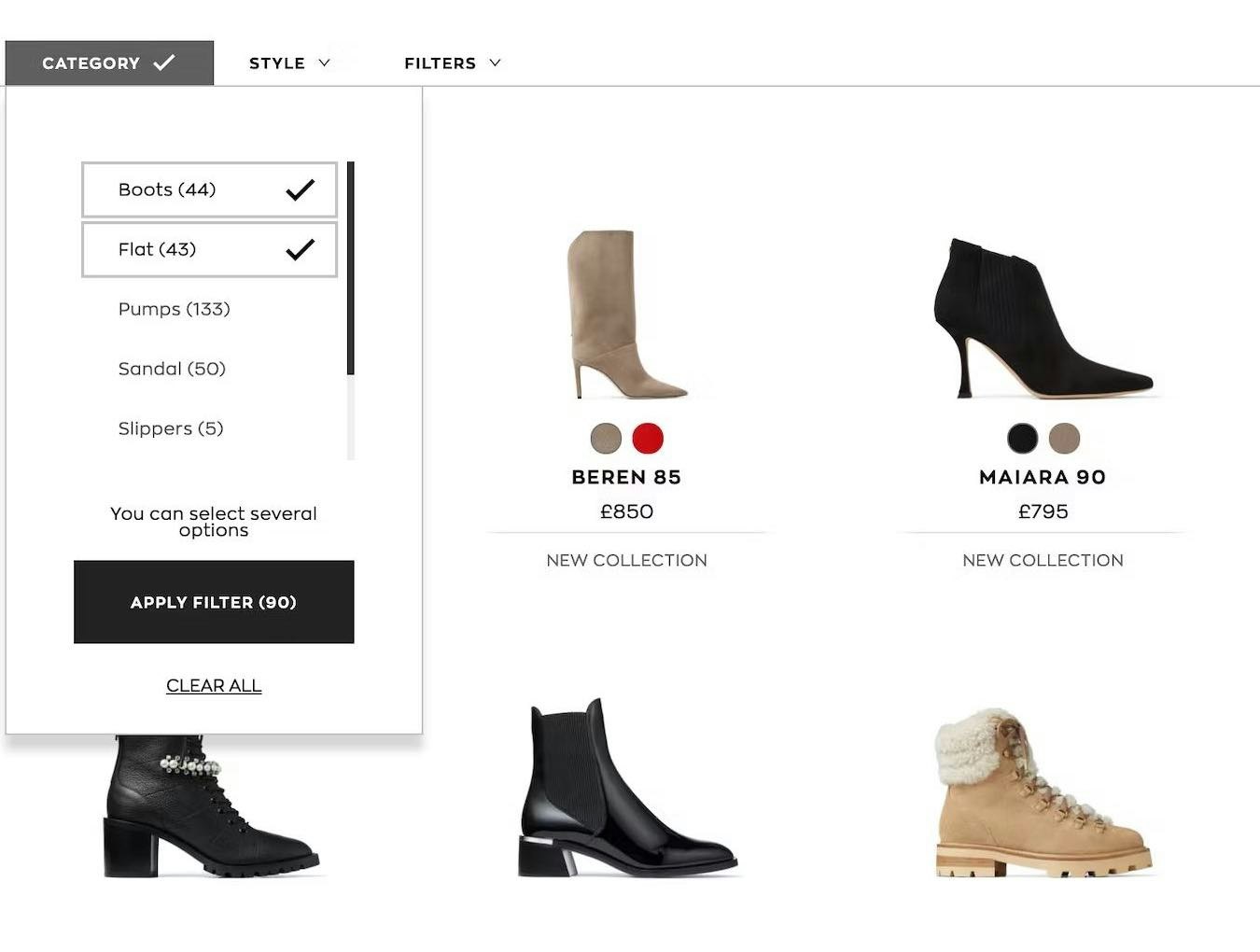
1) 75% of Mobile Sites Incorrectly Implement Product Types with Shared Attributes as Separate Categories


Because different types of refrigerators at Lowe’s are implemented as separate categories (first image). Users without a preference between, say, “French Door Refrigerators” and “Side-by-Side Refrigerators” will struggle to compare and evaluate their features, since they can’t view them together in a single list (second image).
During testing, multiple sites suffered from overcategorization of product types.
This can be detrimental, as it needlessly restricts users’ ability to combine different criteria to get the exact list of products they want.
Overcategorization also hinders users from getting a broad overview of all products of a certain type.
Not surprisingly, this caused many users in testing to abandon sites — frustrated by the confusion and limitations introduced by such mismatches.
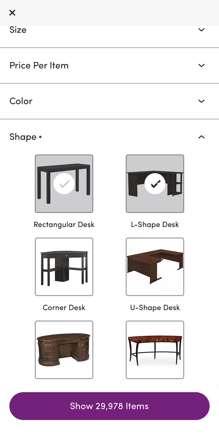
On Wayfair’s app, desk shapes are correctly implemented as filters rather than subcategories. This lets users view “All desks” and easily mix and match desk shapes using these filters.
To avoid overcategorization, product types should be implemented as filters when most attributes (e.g., “brand” and “style”) are shared across the product type.
This gives users greater control over product lists and a better overview of categories and subcategories.
For example, users looking for jeans might initially want “Skinny Jeans” but spot “Skyscraper Jeans” in a list — an option they might have missed if the jeans styles were instead implemented as categories.
Conversely, when product type attributes aren’t shared, then the product types can be implemented as separate subcategories (i.e., as part of the product catalog hierarchy.
For instance, “Sofas” have attributes like “Number of Seats”, “Modularity”, “Integrated Chaise Lounge”, etc., while “Armchairs” have attributes like “Reclinable” and “Swivel” — justifying implementing them as separate categories.
Still, it’s important to note that the vast majority of sites have issues with overcategorization, not undercategorization, and thus most product types should be filters within the same subcategory.
Despite the detrimental impact of this issue on findability, 75% of sites still don’t correctly implement product subtypes with shared attributes as filters (down from 88% in 2023 and 91% in 2024).
Mobile Homepage & Category Navigation: Main Navigation
The Mobile Main Navigation is the weakest topic within the Mobile Homepage & Category Navigation theme, with 69% of benchmarked sites performing either “mediocre” or worse, and only 31% performing “decently” or higher.
This is broadly due to users struggling more to navigate and understand a mobile site’s structure compared to on desktop, which has a more even spread in performance.
In particular, there are 3 issues sites get wrong when it comes to the Mobile Main Navigation.
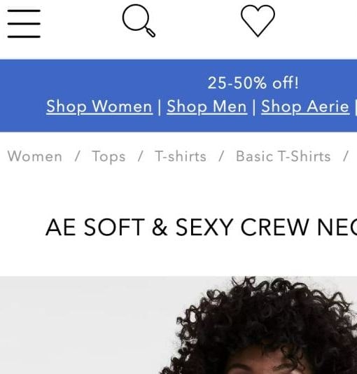
2) 95% of Mobile Sites Don’t Highlight the Current Scope in the Main Navigation


At Anine Bing, the page’s location within the hierarchy is difficult to work out (first image) because the user’s current scope isn’t clearly indicated (second image). As a result, users who land directly on this page hoping to explore similar products will have to guess which main navigation category to click to broaden their scope.
On mobile, there’s typically no permanently visible main navigation.
However, mobile user behavior was observed in testing to be similar to desktop user behavior, in that several participants attempted to open the main navigation to understand where they were within the site hierarchy — especially those who landed directly on a product page from off-site.
When the current scope wasn’t highlighted in the main navigation, participants had a harder time orienting themselves within the hierarchy — placing more strain on both breadcrumbs (which were often absent, inconsistently implemented, or truncated) and on terminology, which then had to perform perfectly to help users understand the site hierarchy.
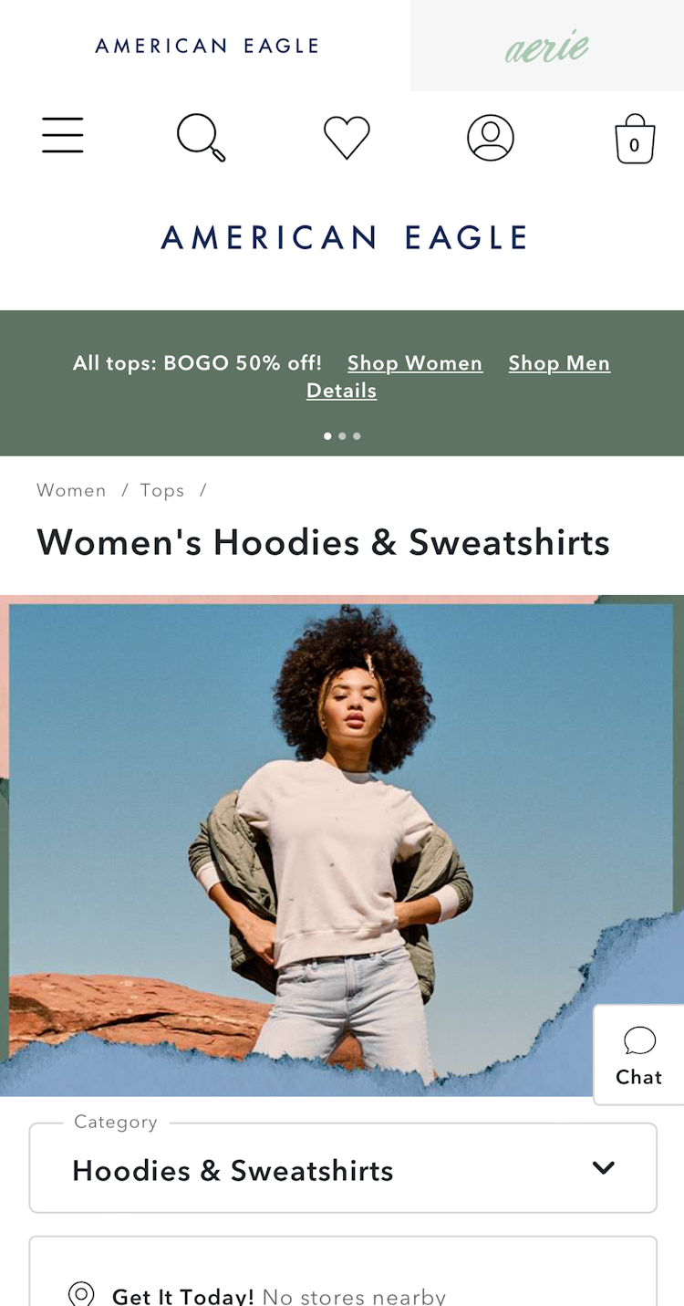

At American Eagle, users quickly understand where the product page fits within the hierarchy (first image), because the current scope ”Tops” is clearly highlighted in the main navigation (second image). This makes it easy for users to broaden their scope and explore similar products.
Fortunately, helping users understand where they are in the main navigation has a relatively “low-effort” solution: simply highlight their current scope within the main navigation.
On mobile, this involves styling the current scope differently from the other primary navigation options within the main navigation viewport (rather than highlighting it in the header, as on desktop).
However, for both mobile and desktop implementations, the main navigation must represent the first level of product categories; highlighting broad labels like “Shop” or “Products” won’t help users determine their actual location within the site hierarchy.
3) 42% of Mobile Sites Don’t Provide a “View All” Option at Each Level of the Product Catalog
![”Let’s see…Oh God, I forgot how stressful looking for a sofa can be. There’s so many options. It can be overwhelming. ‘Sleeper Sofas’ will definitely [be relevant] and ‘Futons & Convertibles’, but it looks like I got to go one at a time there.” When users can’t view products from all relevant subcategories at once, as experienced by this test participant at Raymour & Flanigan, assessing and comparing products can become unnecessarily difficult.](https://baymard-assets-cdn.imgix.net/research/media_files/attachments/154609/original/research-media-file-ecb6b4a8ff54f1b7558d6c90981d0f86.png?auto=format&dpr=2&fit=max&q=50&w=880)
”Let’s see…Oh God, I forgot how stressful looking for a sofa can be. There’s so many options. It can be overwhelming. ‘Sleeper Sofas’ will definitely [be relevant] and ‘Futons & Convertibles’, but it looks like I got to go one at a time there.” When users can’t view products from all relevant subcategories at once, as experienced by this test participant at Raymour & Flanigan, assessing and comparing products can become unnecessarily difficult.

Users interested in paint for interiors at Backdrop can view separate subcategories like ”Standard Finish” and ”Semi-Gloss Finish”, but they can’t access a view of all paint types suitable for interiors. When the ”Interior” menu item is tapped, it simply reveals subcategories below. This makes comparing and evaluating products more cumbersome.
Many mobile users seek the broadest scope possible within a category; for example “All Men’s Shoes” or “All Backpacks”.
However, because hover interactions aren’t available on mobile, sites must decide whether tapping a main category should expand its subcategories or lead to a landing page for that broader category (e.g., a broad product list or an intermediary category page).
In practice, most mobile sites adopt a pattern whereby users drill down the category taxonomy as they tap on a main category option, only reaching a landing page or product list when no further subcategories exist.
Consequently, during mobile testing, some participants struggled to access broader product scope, which made it difficult to find relevant category pages and product listings.
In some cases, some participants became stuck in overly narrow and deeply nested subcategories.

”Wow, that’s a lot of different types of bracelets! I’m just going to click on “All Bracelets”.” A participant at Pandora buying a bracelet for a friend — but unsure what type of bracelet to get her — was pleased that there was a “View All” option in the menu.
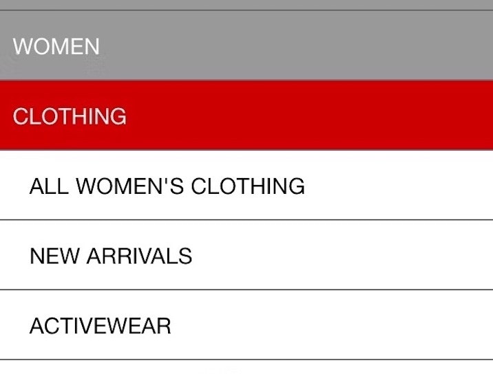
What was observed to perform well during testing was including a “View All” menu item within every level of the product category hierarchy.
For example, a site with the category “Women” and the subcategories “Clothing” and “Coats” would include a “View All” option at each level — such as “View All Women’s”, “View All Women’s Clothing”, “View All Coats”, etc.
This approach provides users with flexibility — they can either keep drilling down to a specific subcategory or stop and view the full product list at any point in the hierarchy.
Mobile On-Site Search: Search Query Types
While Search Query Types make up the backbone of the on-site search experience, the mobile findings in this subarea are nearly identical to the desktop experience, as the search engine is unlikely to deliver different results on the two platforms.
Despite 56% of sites performing “decently” or better, the majority of sites had issues supporting various search queries, such as not accepting or recognizing symbols or abbreviations.
Below is 1 related issue that could be much improved.
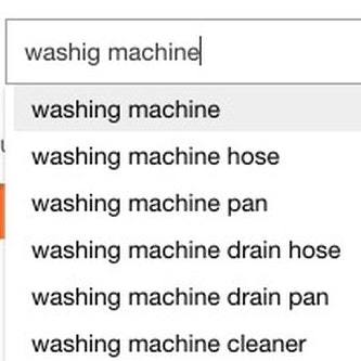
4) 58% of Mobile Sites Don’t Adequately Support “Abbreviation and Symbol” Searches


Because the Hayneedle site doesn’t recognize the abbreviation “3pc” as being equivalent to “3-piece”, users who search using this abbreviation (first image, iOS) might mistakenly believe there’s only 9 results. In reality, the full search term “3-piece sofa” returned 187 items (second image, iOS).
Users rely on a wide range of linguistic shortcuts when searching.
Our testing has revealed that users frequently use abbreviation and symbols in their queries, such as “13in laptop sleeve” or “sleeping bag -5 degrees”.
Among these, abbreviations are by far the easiest to support technically, as they primarily require mapping equivalent terms; for example, “mm” to “millimeters”, or “HP” to “Hewlett-Packard”.
Symbols, on the other hand, can be trickier to interpret, as they may have different meanings based on their context of use and position in the search query.
For example, the hyphen (“-”) might indicate a minus sign (e.g., “sleeping bag for -10 deg.”) or a range (e.g., “sweaters $50-$100”).
In these cases, the symbol not only changes meaning but also serves as a filtering instruction, further refining the results.
Additionally, users often copy and paste product names from various sources during research and comparison shopping, which frequently include symbols (e.g., “Men’s Levi’s® 511™ Slim-Fit Stretch Jeans”).
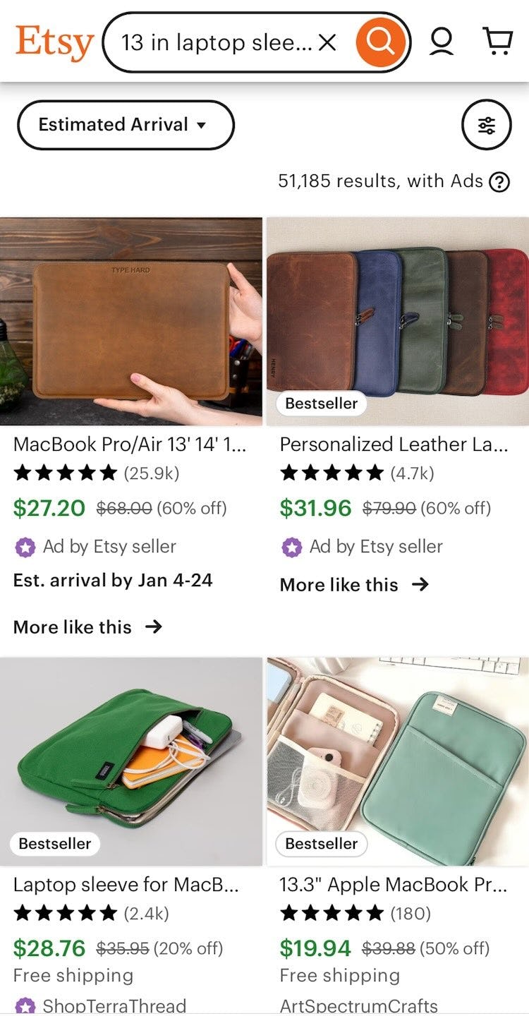


When abbreviations, symbols, and their fully spelled versions are mapped to produce the same results, users are unlikely to miss out on products the site carries. Etsy illustrates this search logic as it returns relevant and similar products for “13 in laptop sleeve”, “13” laptop sleeve”, and “13 inch laptop sleeve”.
It’s important that the search logic can properly interpret alternatives to fully typed words when generating results — or risk giving users the impression that a product simply isn’t available if it doesn’t appear at or near the top of the search results.
Yet 58% of sites fail to support even the most basic abbreviation or symbol searches for units commonly used on the site (e.g., “13 cubic feet fridge” vs. “13 cu ft fridge”, “3 ounce” vs. “3 oz”, “200 GB” vs. “200 gigabyte”).
Mobile On-Site Search: Search Autocomplete
Autocomplete query suggestions are implemented on the majority of ecommerce sites and should be considered a “web convention” for ecommerce search fields.
However, the Mobile Search Autocomplete performance for the average ecommerce site is just above “mediocre”, with only 49% of sites overall performing “decently” or better.
As on desktop, mobile sites that don’t incorporate autocomplete suggestions into their search functionality defy users’ expectations that they will be present.
Additionally, even when providing autocomplete there is 1 key aspect that still needs significant improvement:
5) 77% of Mobile Sites Don’t Include the Category Scope in the Autocomplete Suggestions

A search for “Hardware” at Ace Hardware) gives results for a wide range of items such as cabinets and barn door hardware. However, users have no clear way to narrow the results to one of those categories without navigating to the separate filtering interface. As such, they may not realize that category-specific options are even available.

A search for “jacket” at L.L.Bean (iOS) surfaced results from various departments, such as ”Mens”, ”Women”, and ”Kids”. However, with no immediate or prominent way to refine by category, users may overlook the option to limit results and continue browsing an overly broad set of items.
On mobile, users often struggle when search results span multiple categories.
Since filters aren’t shown by default, there’s no clear prompt to narrow results, especially if promoted categories or filters are missing.
As a result, users faced with hundreds of mixed, often irrelevant items must navigate to a separate filtering interface just to start refining results.
Additionally, if the interface closes instantly after each selection — forcing users to reopen it repeatedly — narrowing the results can quickly feel like a frustrating chore.

Lowe’s (iOS) provides scope suggestions that are both visually distinct and aligned with actual product categories, helping users more easily narrow their search.
To help users narrow results before submitting a search, include category scope suggestions in autocomplete — especially when the query could match items in multiple categories.
The ideal time to prompt users to choose a scope is while they’re typing, as many won’t realize their query spans different parts of the site.
Including scope suggestions at this stage introduces the option right when users need it.

”So yeah, I typed that in and it gives me a couple different options here for either a built-in dishwasher or a countertop dishwasher. So I just selected ‘Built-In’.” Category scope suggestions in the Home Depot app made it easy for this test participant to narrow the scope of search results before submitting the query. Note how the category scope suggestions are indented and use italic text to set them apart.
In addition, scope suggestions should be visually distinct from standard query suggestions. This is often done by indenting the suggestion and adding a prefix like “in” (e.g., “[query] in Furniture”).
Additionally, a unique color can be applied to the suggested category scope to help users easily spot and understand the available scope options.
Product Lists & Filtering: List Item Thumbnails
When it comes to Mobile List Item Thumbnails, the average UX performance is “mediocre”, with 51% of sites falling into the “mediocre” or worse range — and notably 21% performing at a very “poor” level.
The average site’s list items provided users with a sparse number of product thumbnails that often failed to visually communicate useful product information visually.
Notably, sites continue to struggle with the following issue.
6) 70% of Mobile Sites Fail to Provide 3 or More Product Thumbnails in Product Lists and Search Results


“Ooh, this one’s pretty! They have a lot of colors. I’m swiping to the right to see if it will show me other pictures, and it doesn’t! I like when…you don’t have to click into it to see the different pictures.” At Pottery Barn, a participant interested in a sofa was taken aback that additional thumbnails weren’t offered (first image) — and was forced to go to the product page to view more images (second image): “But they do have a lot once we’re in here.”

“‘Ultra stretch high-rise skinny fit jeans’, I like the sound of that!” A participant at UNIQLO paused on the item listing for a pair of jeans that caught her attention — but without any additional thumbnails offered to explore the item further, she resumed browsing without ever returning to that item.
Thumbnails are heavily relied on when users scan lists, and testing revealed that 2 images were often not enough for most users to get sufficient visual information about the product.
Extra images often reveal details that simply can’t be conveyed in any other way — especially for visually driven products or those with multiple features or complex configurations.
For instance, someone shopping for a couch might want a “Cut Out” image to understand its shape, an “In Scale” image to gauge its size, a “Feature Callout” to highlight storage or sleeper functions, and a “Lifestyle” image to see how it fits with other decor.
When sites offer only one or two thumbnails in the product list, users are almost guaranteed to click into the product page to get the full picture — slowing down product comparison and making browsing more tedious.
While two thumbnails may have been enough in the past (we previously recommended just one additional image), testing now shows that many users expect product lists to deliver the richer functionality of a product page — and the desire for more images is a key part of that shift.

At Kate Spade, users could swipe the default thumbnail in the product listings to view 5 additional images of totes.
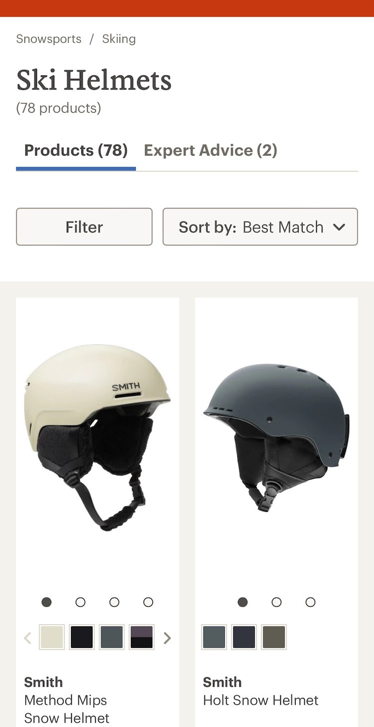
Similarly, at REI, users could access additional images of ski helmets by swiping the thumbnail or tapping the prominent carousel dots.
Therefore, to maximize visual information in product lists and search results, users should be provided access to at least 2 additional thumbnails — since a single extra image often isn’t enough — while 3 or more offer users even greater visual context.
For apparel and accessories, where aesthetics and feature details both matter, 5–15 thumbnails may be necessary to support a full visual evaluation.
Product Page: Product Images
Given how important Mobile Product Page Layout is, it’s surprising that 49% of sites performed at a “mediocre” level or worse—with 63% of those rated as “poor” or worse.
Even though over half of sites scored “decent” or better, the average site still had multiple issues that made product pages feel cluttered or made it unnecessarily hard to find information.
Below is one area where performance could be greatly improved.
7) 63% of Mobile Sites Fail to Add Social Media Visuals to the Product Page

McGee & Co. do not provide users with social media visuals of their products, disregarding users who want to see products in the context of real rooms.
In testing, participants were eager to see social media images from past buyers of the product they were considering, since each social media image represents a unique and verifiable instance of a real person buying and using a product.
Indeed, users expect to see social media content on the product page as a category of visual information in its own right, distinct from both site-provided and reviewer-submitted images, even as they serve overlapping roles.
When that insight is missing from the product page, some users will struggle to be fully confident in the product, and a subset will not feel comfortable purchasing without first leaving the site to seek them out.

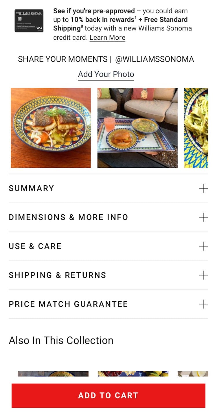
Both IKEA (first image) and Williams Sonoma (second image) curate photos from users who have uploaded them to their brand’s Instagram accounts, helping users decide whether the products are suitable.
Social media is the preferred source of product information for many users, and the place where many buyer journeys begin, so incorporating this content on the product page is increasingly important.
Therefore, to give users ample “visual social proof” from real users, sites should curate social media images from platforms like Instagram and integrate them on their product pages.
In terms of implementation, users respond well when social media images link to a larger, “shoppable” version of the image that provides links or other direct access to the products featured.
Finally, sites are cautioned here not to include many social media posts from paid sources, since an abundance of “paid promotion” posts will diminish the feeling of authenticity the images are meant to convey.
Mobile Site-Wide Design & Interaction: Touch Interfaces
For the topic of Touch Interfaces, the average site performed “poorly” with 76% of sites obtaining “mediocre” or worse performance scores, and 48% of sites with “very poor” performances.
When it comes to other site-wide implementations, most sites are adept at common web conventions, such as correctly placing a prominent cart icon in the right-hand corner, breaking up footer links for scannability, ensuring text on imagery is legible, and minimizing bugs and overlay dialogs.
However, below are 2 implementations that sites still tend to get wrong when it comes to Touch Interfaces.
8) 63% of Mobile Sites Don’t Use the Right Keyboard Layout for Relevant Fields


At B&H, users entering their email address are presented with the standard mobile keyboard (first image). As a result, they must switch repeatedly between the alphabet and symbol layouts to access essential address characters like “@” and “.” (second image) making the process unnecessarily cumbersome.
By adjusting an attribute or two in the input field code, sites can trigger mobile devices to display keyboards that are optimized for the specific input.
For example, a numeric keyboard for credit cards, a phone layout for phone numbers, or an email layout for email addresses.
This not only saves users from manually switching keyboard modes but also helps reduce input errors, especially for numeric fields, where larger keys minimize mistaps.
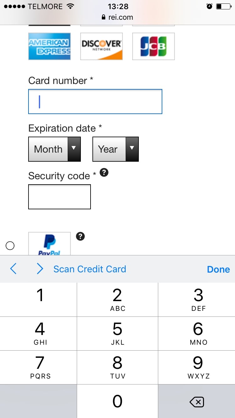
When users enter their card number at REI, a special numeric-optimized keyboard is triggered, featuring buttons that are much larger than those on standard keyboard. This makes input easier and reduces the chance of errors.
There are several ways to trigger numeric keyboard layouts, and while they differ slightly across platforms (iOS, Android, etc.), the most common methods involve the type and pattern HTML attributes.
For numeric fields, for example, use:
<input type="text" inputmode="decimal" pattern="[0-9]*" novalidate autocorrect="off" />
For a full list of recommended field and code combinations across common checkout flows, see baymard.com/labs/touch-keyboard-types.
9) 87% of Mobile Sites Don’t Disable Mobile Keyboard Autocorrect When Appropriate


During mobile testing at Walmart, this participant began typing the first characters of her last name, ”Ri” (first image), only to have them changed to ”To” by her device’s autocorrect feature (second image), forcing her to delete the “correction” and begin again.
Autocorrect is one of several mobile features that can assist — or, in some cases, hinder — a user’s typing, and it can be either enabled or disabled in their device keyboard settings.
When enabled, autocorrect is supposed to automatically correct misspelled words as they are typed or submitted (e.g., correcting “camra” to “camera”).
However, autocorrect often works very poorly for abbreviations, street names, email addresses, person names, and similar words that are not in the dictionary.
The keyboard autocorrect feature has caused significant usability issues throughout multiple years of mobile usability testing, resulting in much erroneous data being submitted as users try to manually override “helpful” autocorrections.
That said, typing is quite difficult on mobile and autocorrection does prove very helpful in scenarios where it corrects invalid input to valid input.
Therefore, autocorrect shouldn’t be disabled on all fields.


At B&H Photo (first image) and Urban Outfitters (second image), users typing in the ”email address” field didn’t have their input improperly autocorrected because this feature was manually disabled.
Instead, use discretion and disable it on fields where the autocorrect dictionaries are weak — for instance, this typically includes names of various sorts (e.g., street, city, person names) and other identifiers (e.g., email address).
The keyboard auto-correct can be disabled by adding the autocorrect attribute to the input tag and setting it to “off,” like this:
<input type="text" autocorrect="off" />
Many Opportunities Exist to Improve Mobile UX
This high-level analysis of the current state of mobile UX focuses on only 9 UX guidelines (spread across 7 of the 46 mobile topics) included in our ecommerce UX benchmark analysis.
The 39 other topics should be reviewed as well to gain a comprehensive understanding of the current state of mobile UX, and to identify additional site-specific issues not covered here.
While no sites in our benchmark have a fundamentally flawed mobile UX, there’s clearly room for improvement, with 81% of sites scoring “mediocre” or worse, and none achieving a truly “state of the art” mobile experience.
Adhering to the 9 Mobile ecommerce UX best practices described in this article is the first step toward improving users’ mobile experience:
- Implement product types with shared attributes as separate filters (75% don’t)
- Highlight the current scope in the main navigation (95% don’t)
- Provide a “View All” option at each level of the product catalog (42% don’t)
- Adequately support “Abbreviation and Symbol” searches (58% Don’t)
- Include the category scope in the autocomplete suggestions (77% don’t)
- Provide 3 or more product thumbnails in product lists and search results (70% don’t)
- Add social media visuals to the product page (63% don’t)
- Use the right keyboard layout for relevant fields (63% don’t)
- Disable mobile keyboard autocorrect when appropriate (87% don’t)
Note that this is an analysis of the average performance across 150+ leading US and European ecommerce sites.
When analyzing a specific site there are almost always a handful of critical UX issues, along with a larger collection of worthwhile improvements to make.
This is the case even when we conduct UX audits for Fortune 500 companies.
This article presents the research findings from just a few of the 700+ UX guidelines in Baymard – get full access to learn how to create a “State of the Art” ecommerce user experience.
If you want to know how your desktop site, mobile site, or app performs and compares, then learn more about getting Baymard to conduct a UX Audit of your site or app.